|
| Group |
Round |
C/R |
Comment |
Date |
Image |
| 41 |
Dec 19 |
Reply |
Lisa, Thanks. I'm glad most people like version 3 as that was the one I am leaning towards. I'll need to work on the bottom as Jan has suggested. |
Dec 26th |
| 41 |
Dec 19 |
Reply |
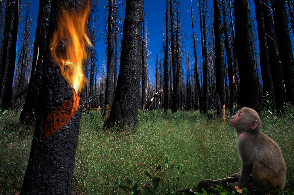
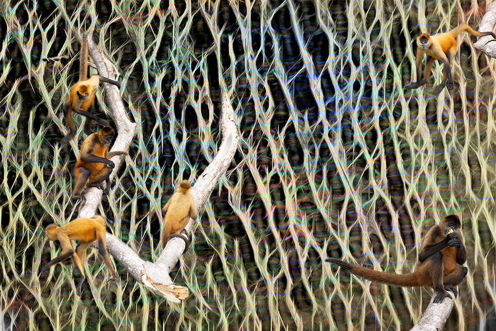
Jan, This is a wonderful suggestion. I did struggle as I only resorted to cutting off the bottom of the monkey in version 3 as the original monkey had too many distracting elements at his bottom. I will play around with your work around as it is great. |
Dec 22nd |
| 41 |
Dec 19 |
Comment |
Maryellen, This is a fun departure, I like it. I've played around a lot with bas relief and other photoshop filters. The contrast between the bright background colors and the black and white camel is a bit jarring for my taste but certainly visually challenging. I might try playing around with the transition between the camel and the background with a glow or drop shadow or something like that to integrate it a little more. I might also try adding back a hint of the original image or some other colors to also blend the image more. Again, as always, these are to my taste, just ideas to consider. |
Dec 14th |
| 41 |
Dec 19 |
Comment |
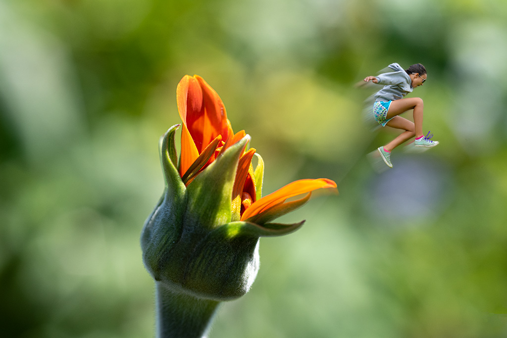
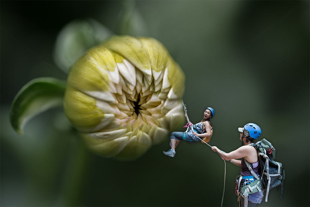
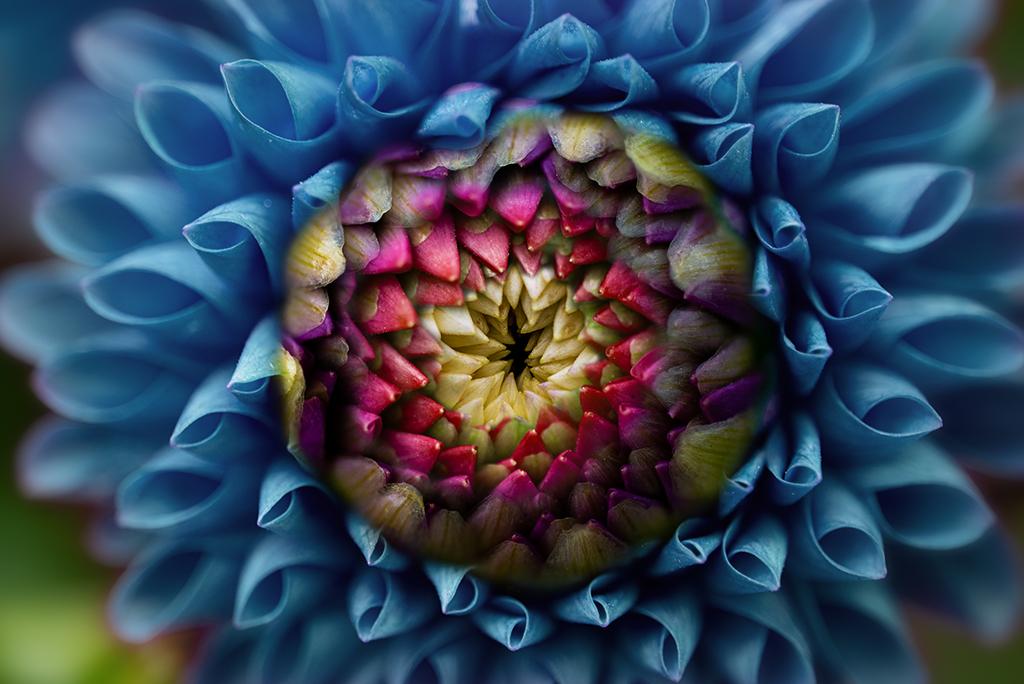
Henry, I really like the direction you are going with these flower images. This one is outstanding. I love the contrast in the lily bud. The way you've worked with transparence in original 3 is great. My suggestions: consider blurring or softening the edge of the stem in the original 1. Consider adding back a little of the opacity of stamen and pistil. Consider exposing a little more of the base of the Lily bud. And lastly consider a slightly less tight cropping of the flower part, i.e. leaving more of the background at the edges. You are becoming a master of this technique, my suggestions are personal preference so take or leave them. |
Dec 7th |
| 41 |
Dec 19 |
Comment |
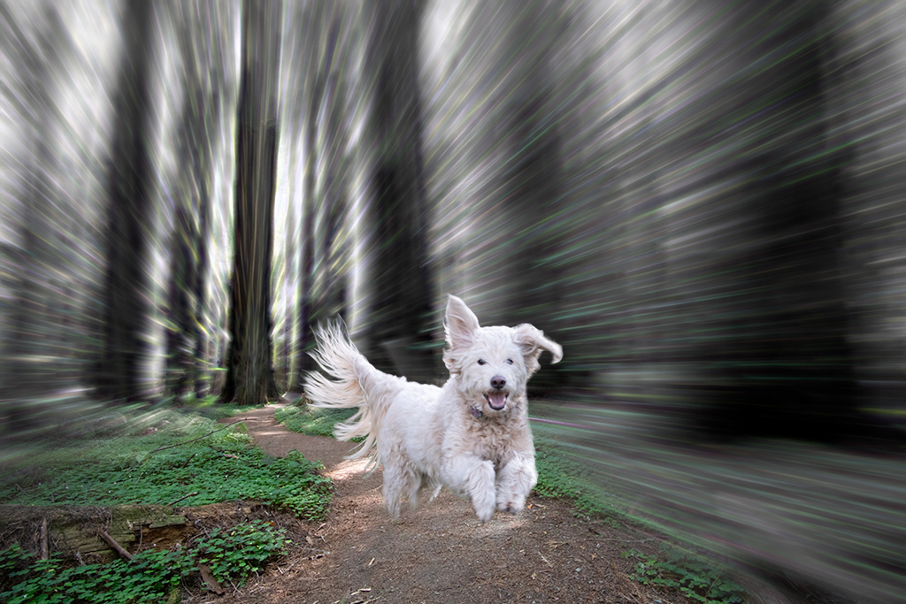
Jan, I love this image. There is a wonderful balance to the shapes, sizes, colors and overall feel of the composition. You did a great job cloning the leash and yes, the dog deserves his own pillar. I have nothing to add other than two thumbs up. |
Dec 7th |
| 41 |
Dec 19 |
Comment |
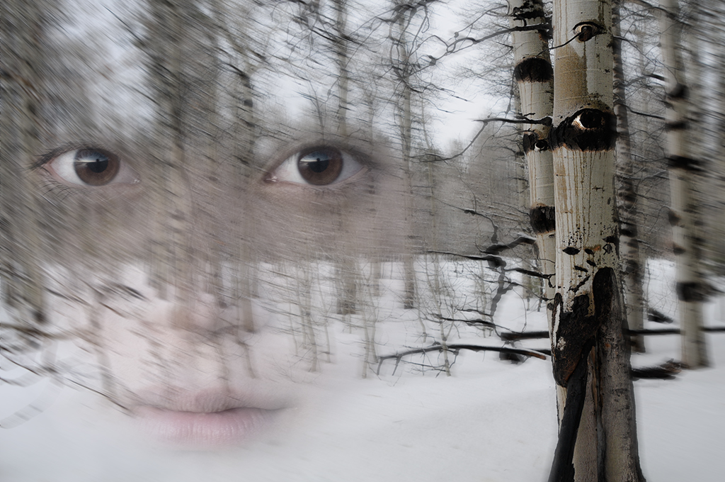
Jim, I am deeply affected by this image. It is masterfully execute and conceptually very compelling. I've made some rather dark images like this and often get negative feedback from people who don't like to be disturbed but I like what you've done here. I don't have a lot to add as it is so thoughtfully executed. I do like the touch of brighter color in the models exposed back skin and wonder if adding just a touch more brightness selectively in the face might add a little more punch. |
Dec 7th |
| 41 |
Dec 19 |
Comment |
I agree with the group, you are a master of this technique. The way you play with geometry and negative space is excellent. I want to challenge you again to push yourself further. This is a complete image, no question. If I were to play with it I might use the liquify brush and work on the edges to render a full frame so that the spherical limitations of this technique are transcended |
Dec 7th |
| 41 |
Dec 19 |
Comment |
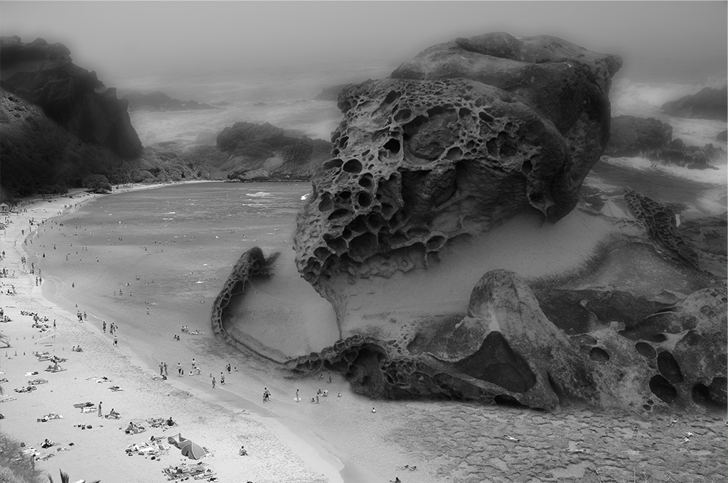
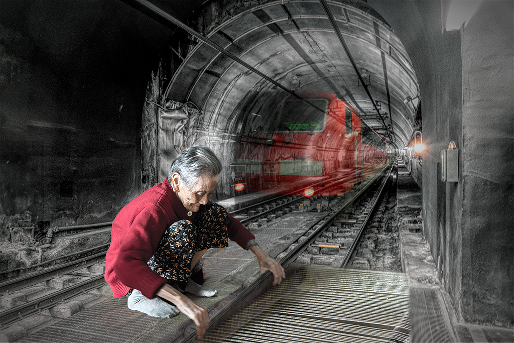
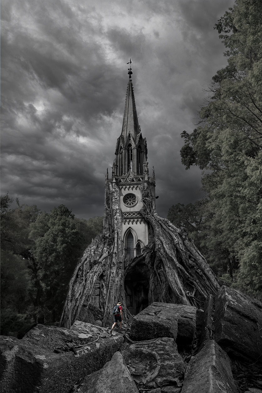
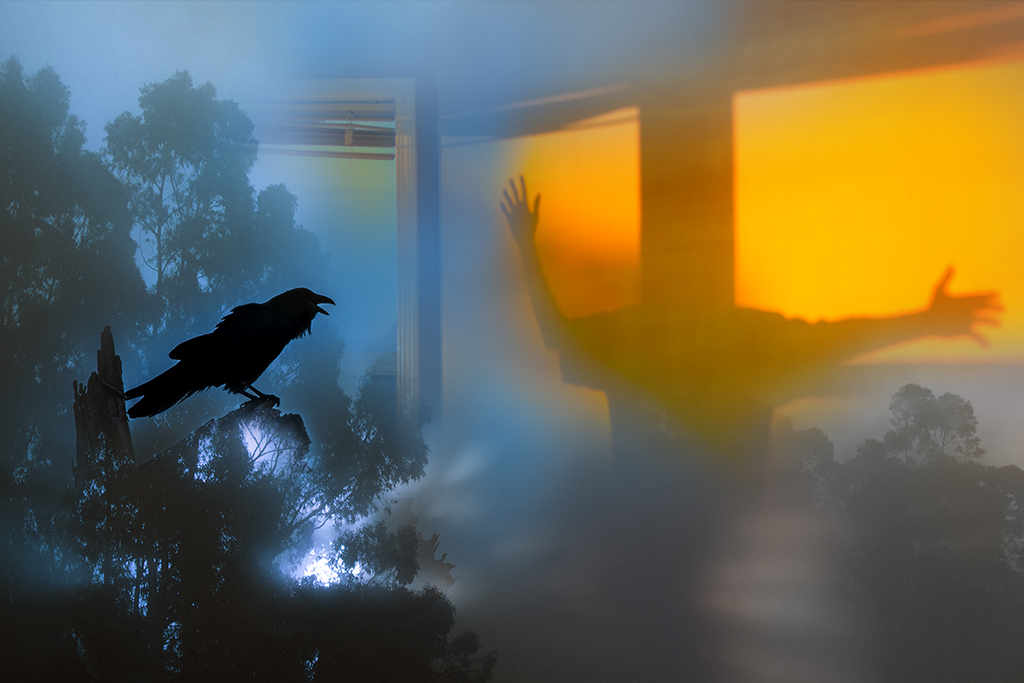
Kathy, This is a very complex and interesting image. It has a haunting dream like quality. I really like the bottom right with the man in front of the tunnel and the eeire image of the ghost like women on the left. The size of the women and placement feels a little off to my eye. I would consider playing around with size, placement and blend modes. |
Dec 7th |
| 41 |
Dec 19 |
Reply |
Thanks Jim. I'll play around with it some more and see what I can come up with. |
Dec 6th |
| 41 |
Dec 19 |
Reply |
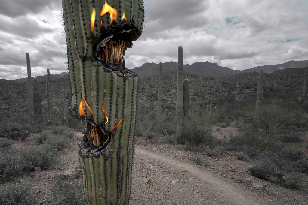
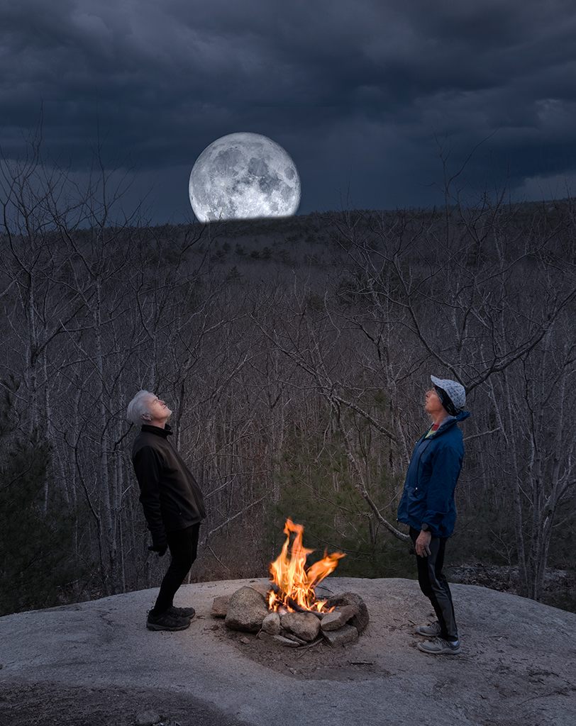
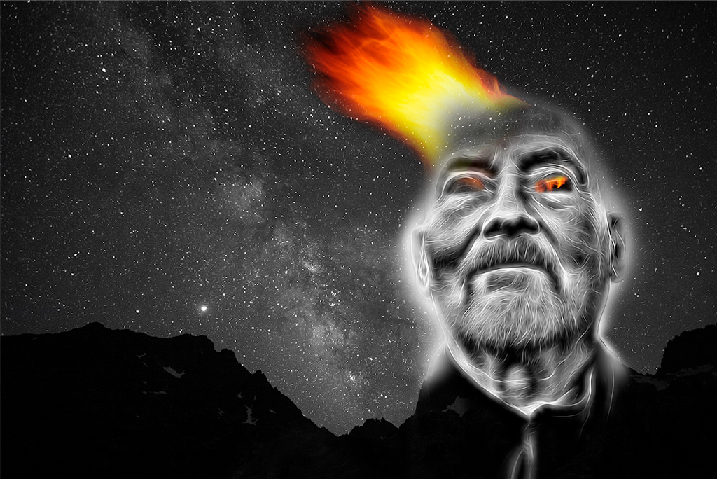
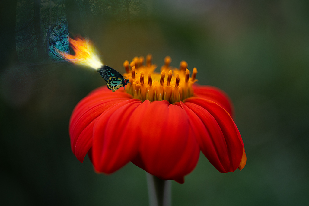
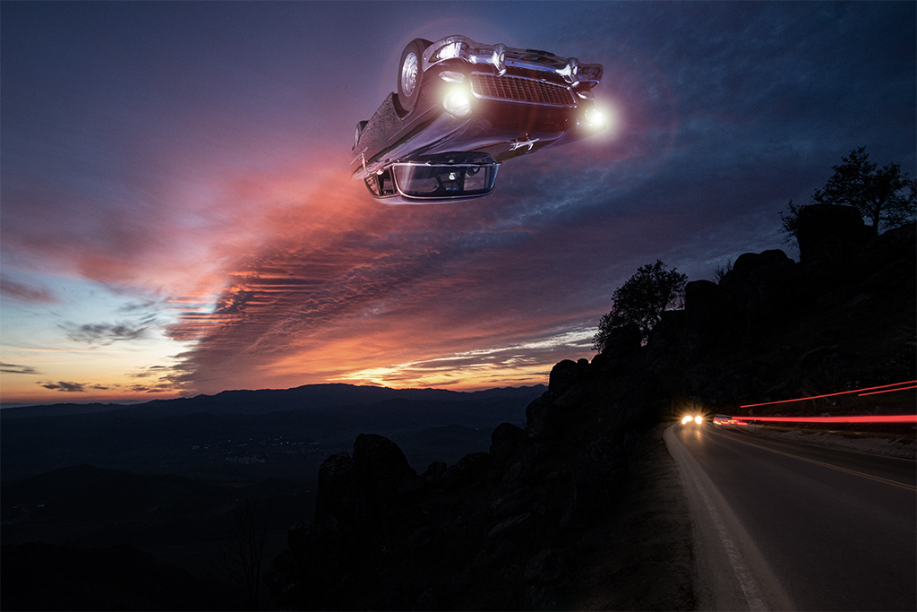
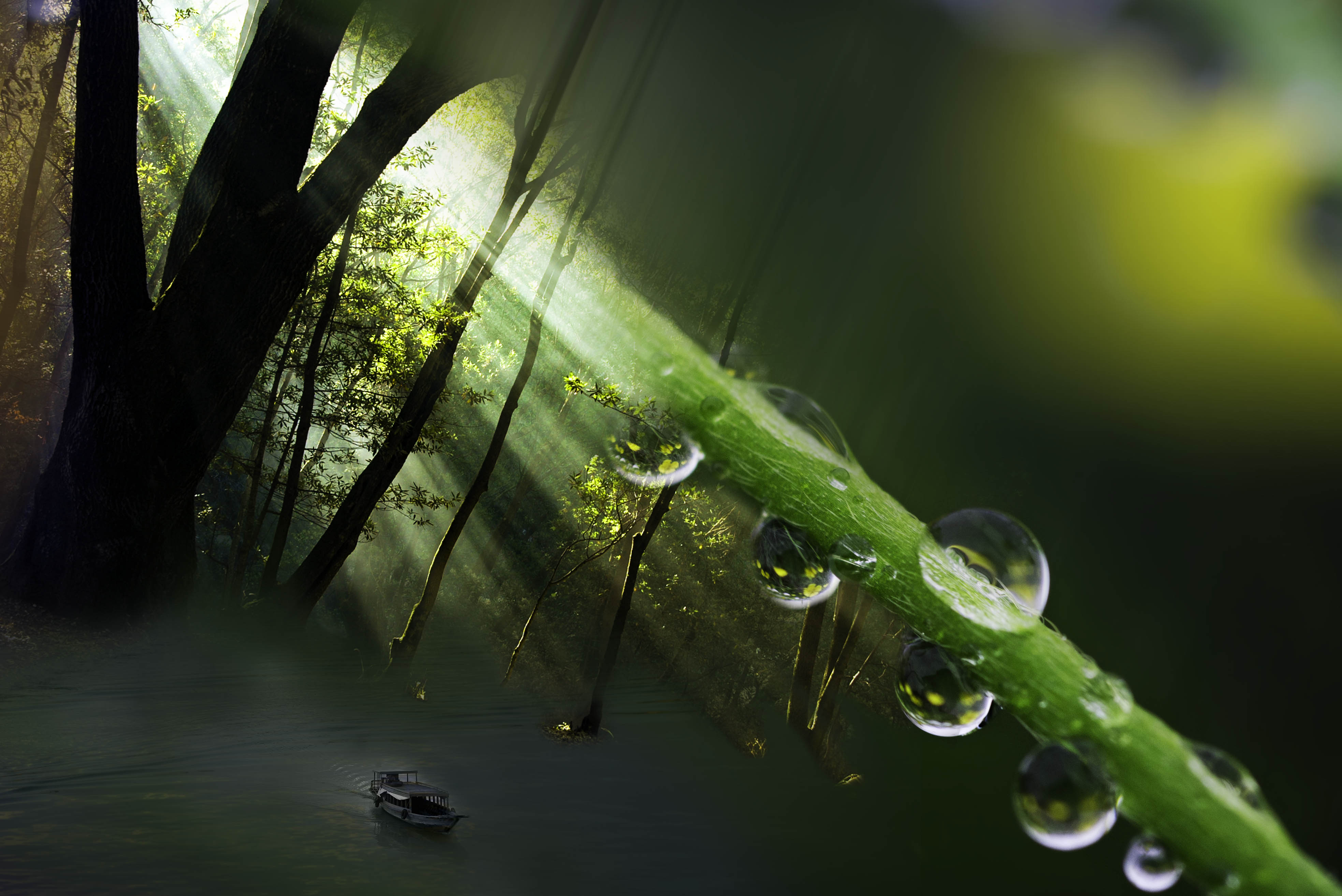
Jim, Welcome and thanks for your feedback. Yes, I struggled with this blend as the base image has so much contrast making it hard to add the monkey without it feeling a bit stuck on. The #3 version feels a little better to me as the face has richer color but it isn't as elegant a blend as I often can do with softer images. I wanted to add something to bring more attention to the fire. If you look back at my April image I had a similar theme inspired by the desert in Tucson. I wanted to see if I could make this image a little more complex but maybe I should leave well enough alone. |
Dec 6th |
| 41 |
Dec 19 |
Reply |
Barbara, Thanks for visiting group 41 and sharing your thoughts, much appreciated. |
Dec 6th |
| 41 |
Dec 19 |
Reply |
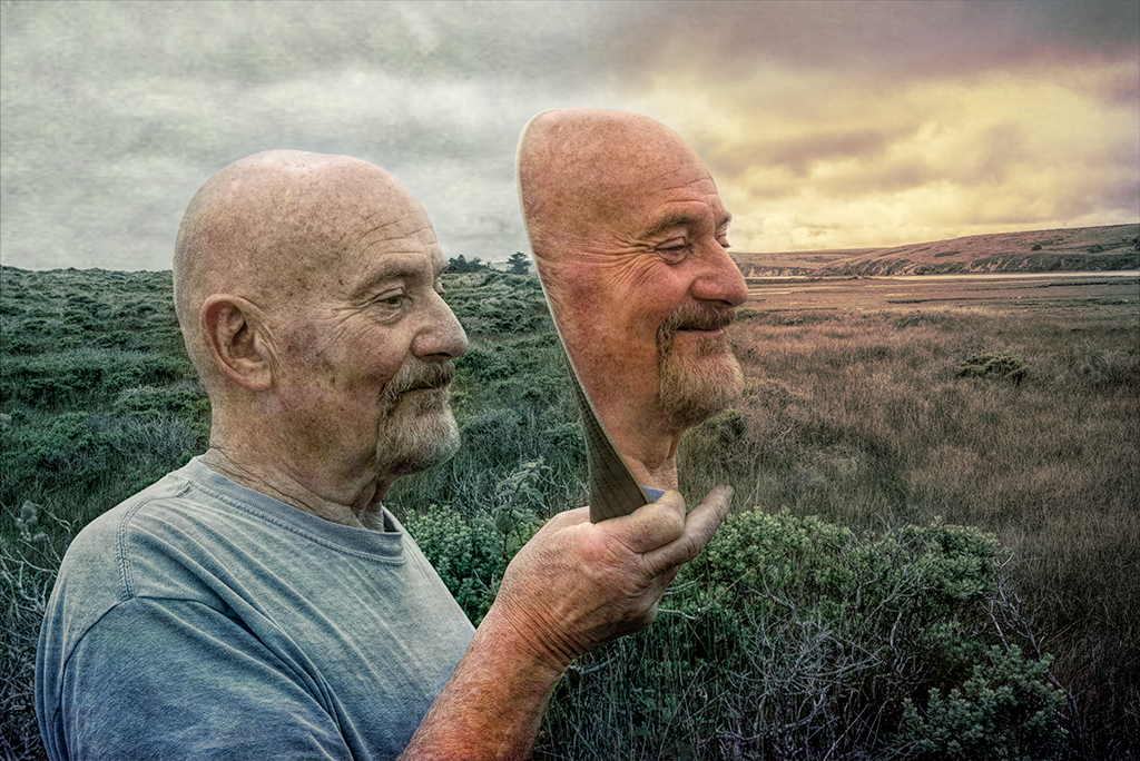
Kathy, These are great suggestions,thanks. I also prefer the monkeys face in #3 but was frustrated the lower part of the body necessitated cutting his body off. I am so glad I shared this one as you have helped me to improve the impact. |
Dec 6th |
6 comments - 6 replies for Group 41
|
| 54 |
Dec 19 |
Reply |
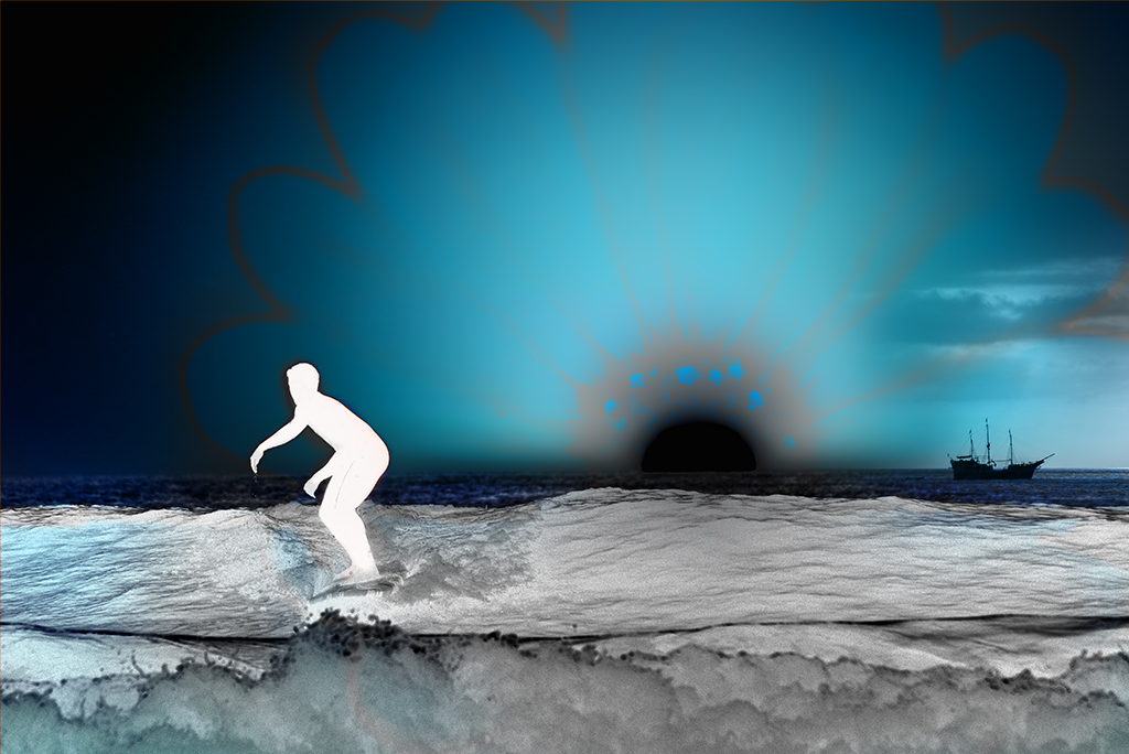
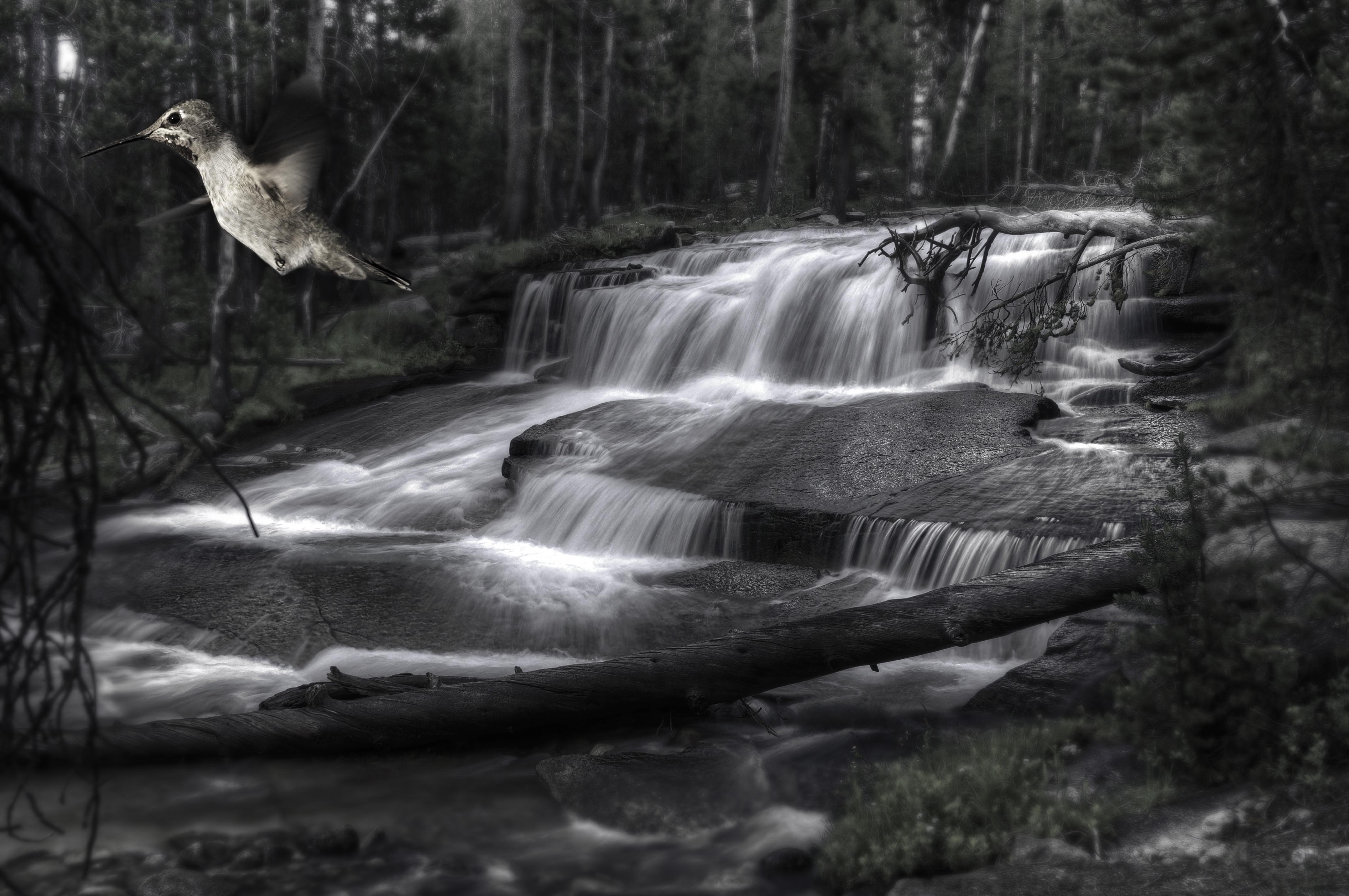
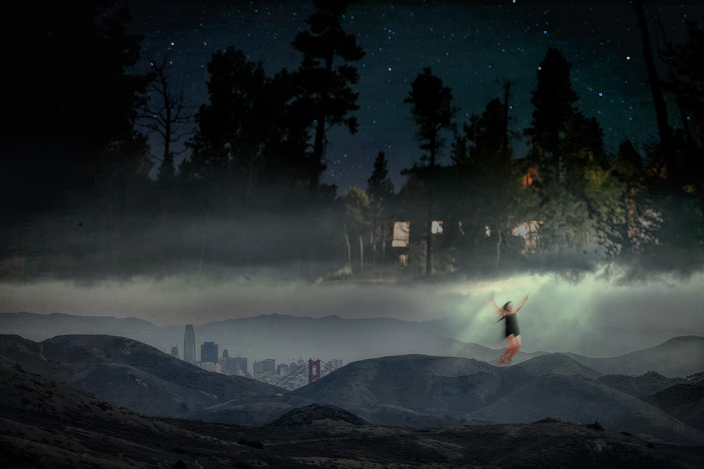
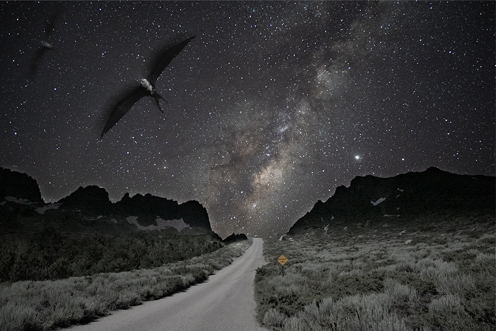
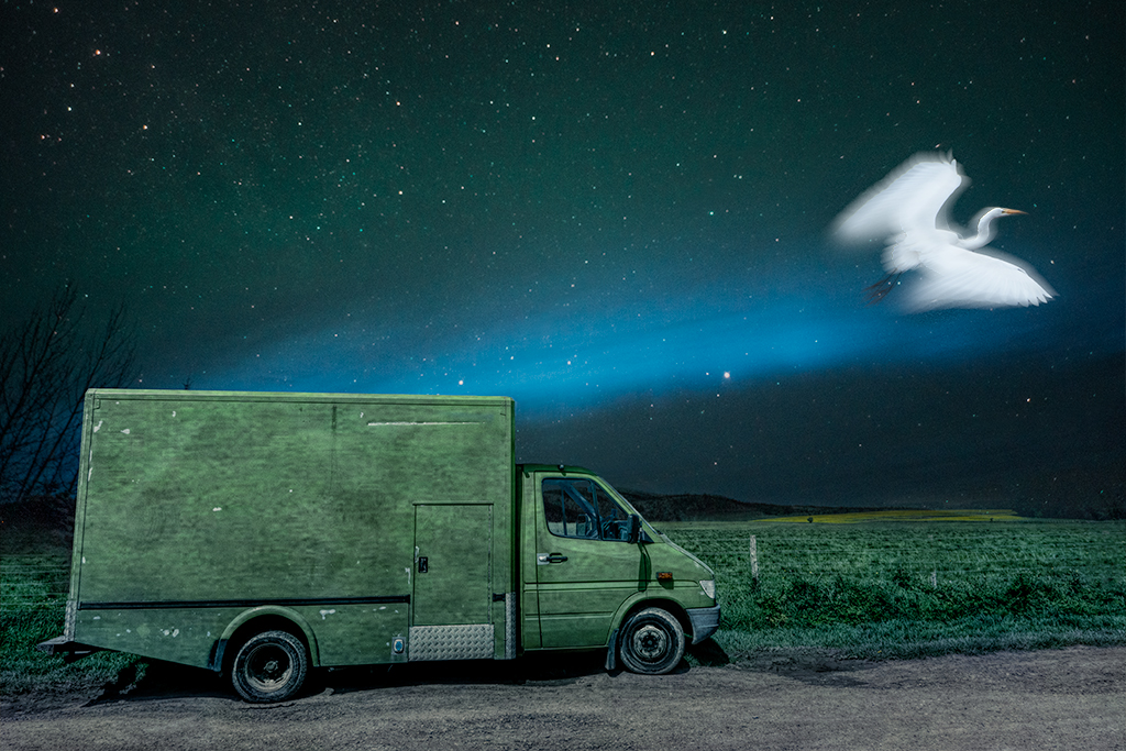
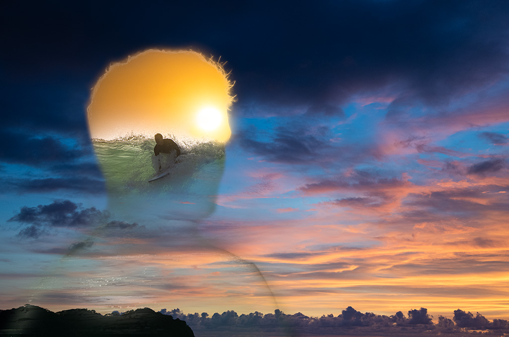
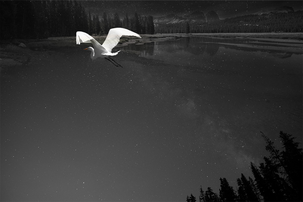
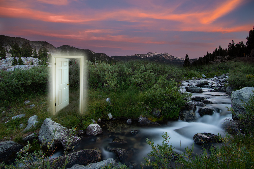
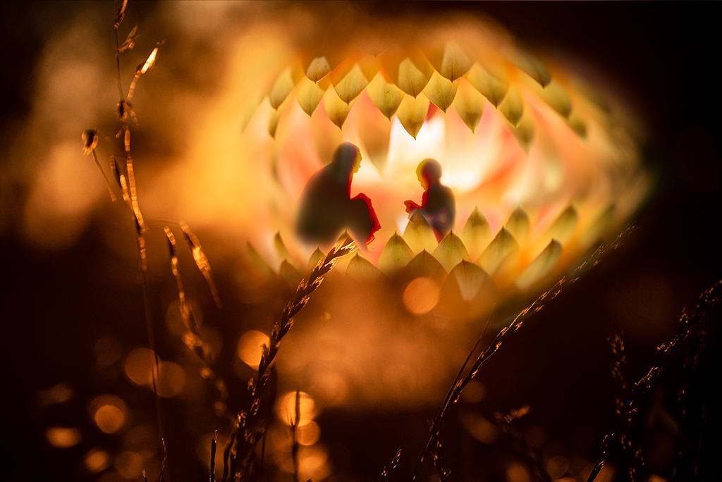
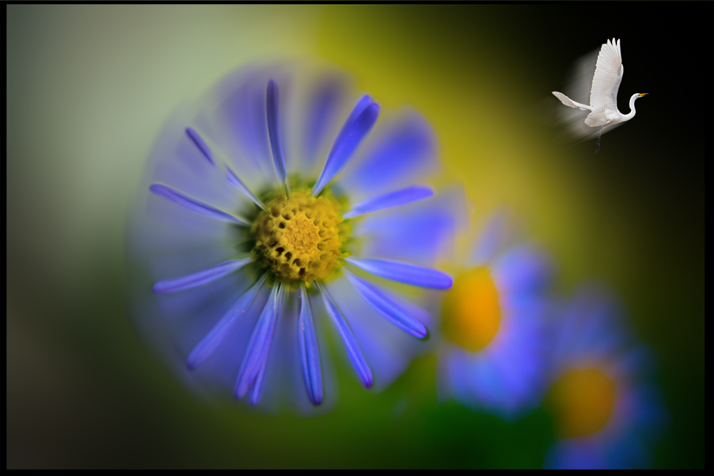
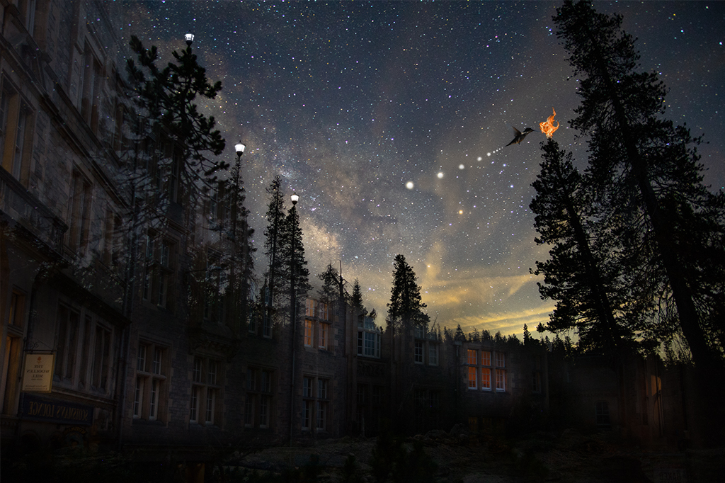
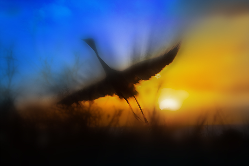
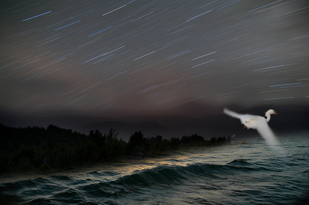
Peggy, As always I appreciate your attention to detail. When you mentioned you'd had trouble seeing the face in the fire, that got my attention as I didn't put a face in the fire! I have been fascinated by pareidolia for years. I think photoshop lends itself to seeing images in images. Clouds and fire are the most common places that occurs for me. I really like this image but find there are so many possibilities it is hard to finish this one off. Fortunately I have some great suggestions here. Another friend of mine suggested having two hummingbirds in the image, the first feeding on the light on the left side of the image and much closer up and another feeding on the light on the right side of the image. I think that may create an even stronger image which I am going to play with too. Your crop suggestion is excellent, thanks. |
Dec 26th |
| 54 |
Dec 19 |
Reply |
Alan, I reworked it a little. Do you think the bird adds or detracts now? |
Dec 16th |
 |
| 54 |
Dec 19 |
Reply |
Aavo, I added the bird as I was trying to create some visual movement towards the right side of the image. After the bird was in the photo I wanted to suggest why it was there. As I look at my image now I do see how I've added too many elements. Since this is a surreal image I wanted to push beyond ordinary logic in the image. I chose the flame for the orange color and to extend the idea of light as the stars are a type of burning fire as is the sunset and in a more controlled way city lights. |
Dec 14th |
| 54 |
Dec 19 |
Reply |
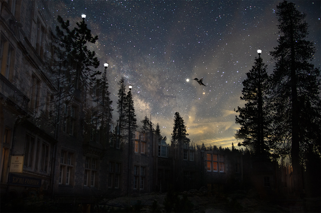
Stephen, I discovered Rob Gonsalves a couple years ago. He may not be as ground breaking as Margritte was but he is clearly a genius and his images are mind bending and impeccably crafted. I think some of his images may have been what unconsciously inspired my photo above. |
Dec 14th |
| 54 |
Dec 19 |
Reply |
Alan, Margritte is my favorite surrealist. I used to belief it was Dali till I realized Margritte's sensibility has inspired my photos more. Thank you for your feedback. I do sometimes get carried away with these images. I hadn't thought to straighten the trees on the right, a great idea. I am going to go back and try simplifying this image, much appreciated. |
Dec 13th |
| 54 |
Dec 19 |
Reply |
Stephen, Thank you for your input. I appreciate you visiting our site and sharing your insight. |
Dec 13th |
| 54 |
Dec 19 |
Comment |
A very nice holiday card Aavo, Merry Christmas |
Dec 13th |
| 54 |
Dec 19 |
Comment |
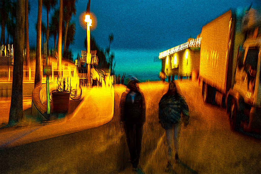
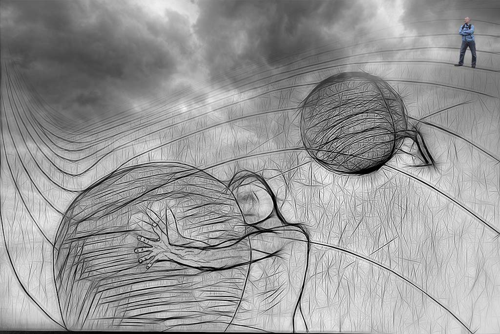
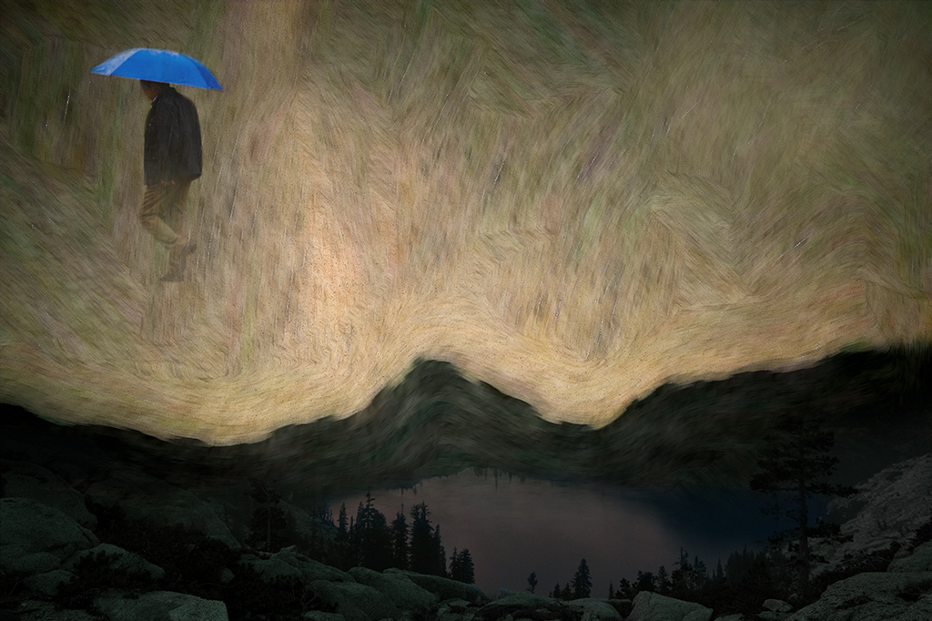
Alan, A very well done image. As Stephen says it also has a strong message. Having seen a rising homeless problem in the bay area I can relate to this image deeply |
Dec 13th |
| 54 |
Dec 19 |
Comment |
Betty, There is a lot of joy in this photo. Happy holidays. |
Dec 13th |
| 54 |
Dec 19 |
Comment |
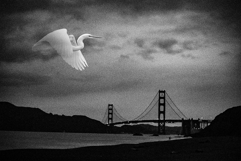
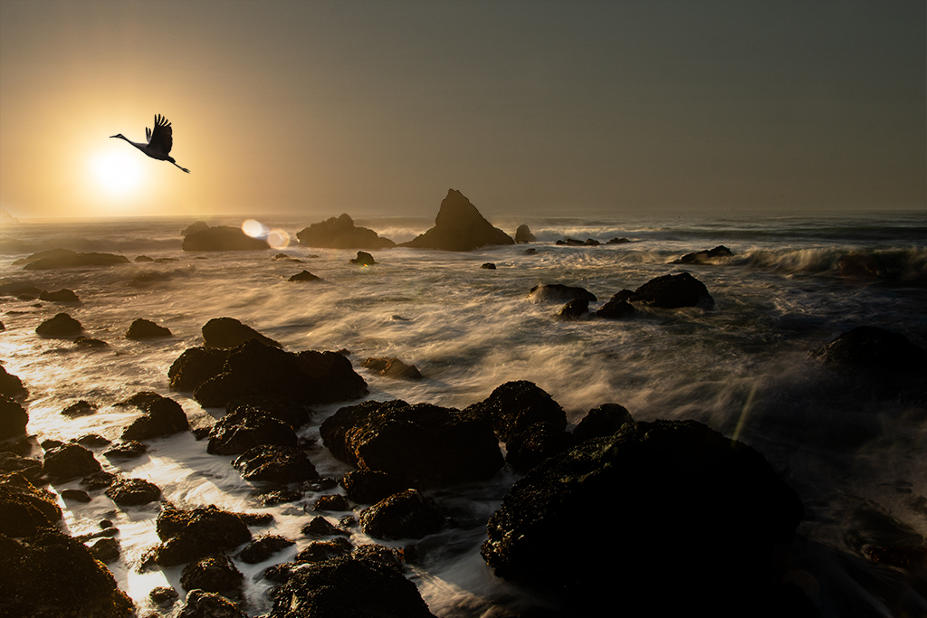
Peggy, I think you are off to an excellent start with this one. I understand your struggle to find the right background. This one is not distracting but doesn't add a lot to the scene. I agree the size of the egg/baby may benefit from some adjustments. I also wonder what your final message will be. Although the idea of a dinosaur feeding its young may be enough, it feels a bit predictable to me and doesn't challenge the viewer. The bird in your image reminds me of a phoenix. If it were my image I would add some flames and play up that theme some as the swooping bird is the most compelling and exotic element you have so far. |
Dec 13th |
4 comments - 6 replies for Group 54
|
10 comments - 12 replies Total
|