|
| Group |
Round |
C/R |
Comment |
Date |
Image |
| 41 |
Nov 19 |
Reply |
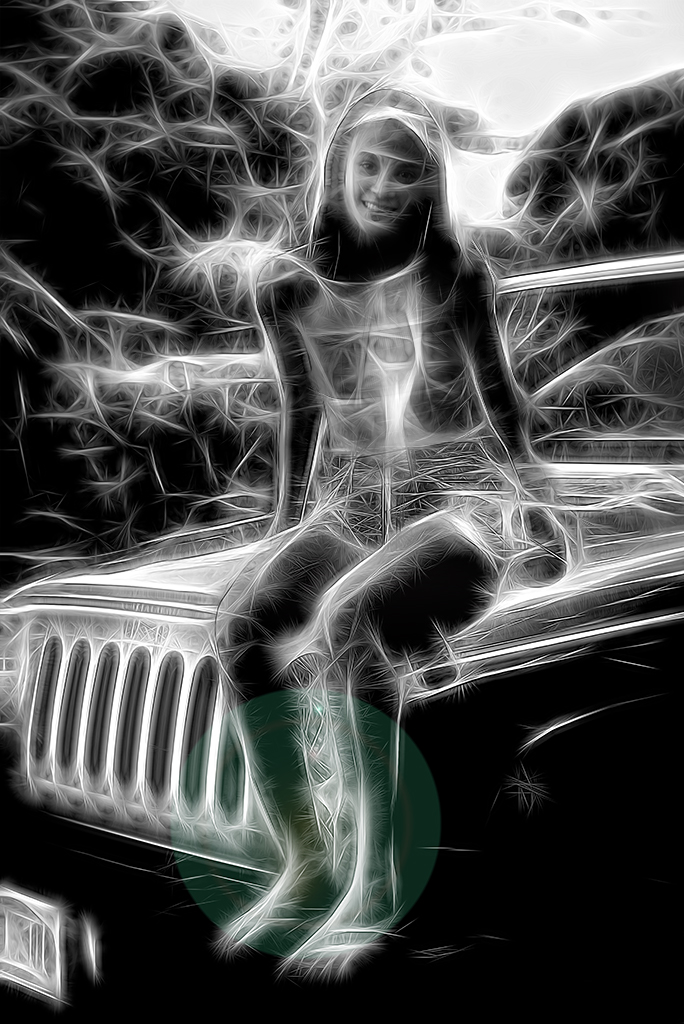
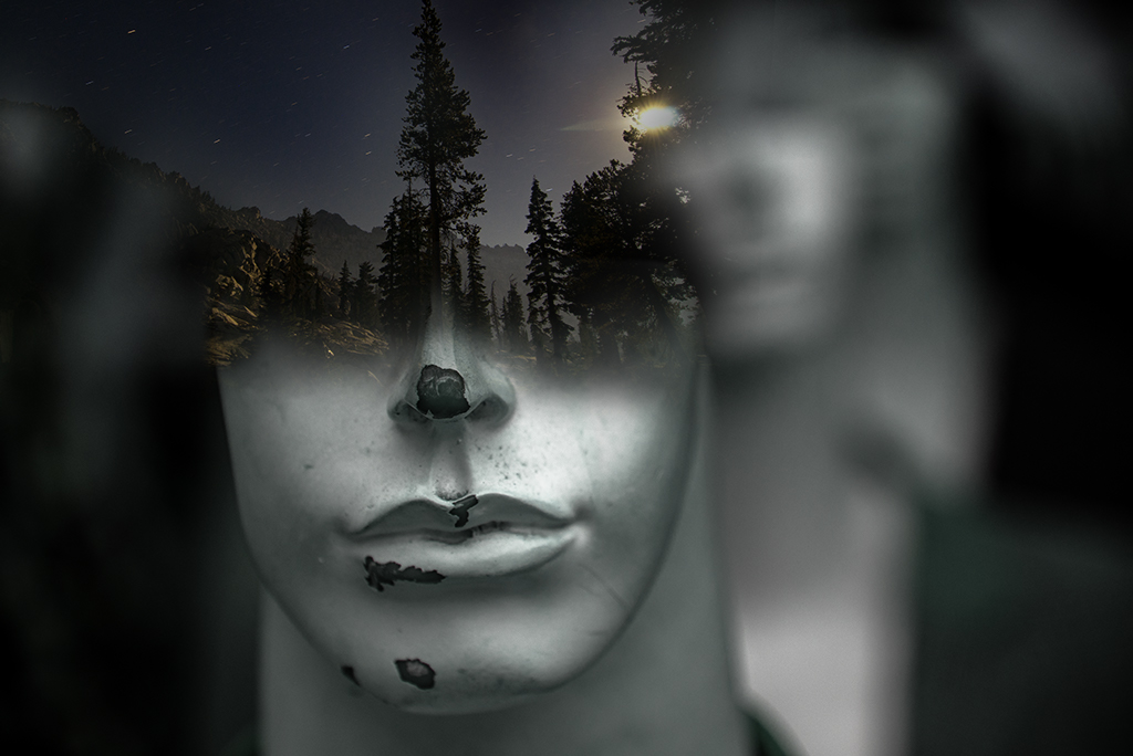
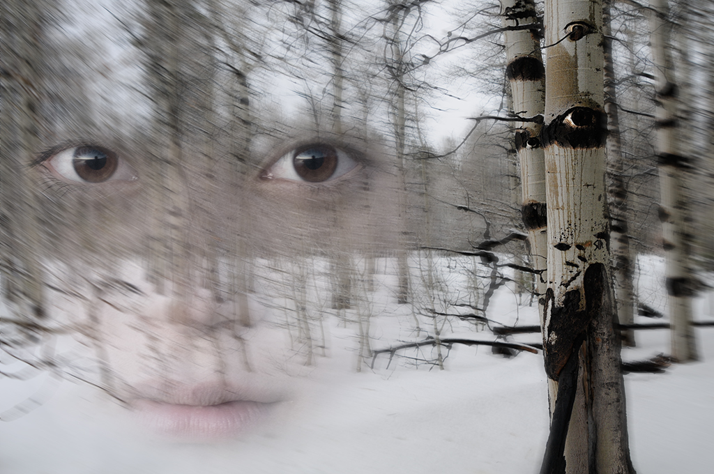
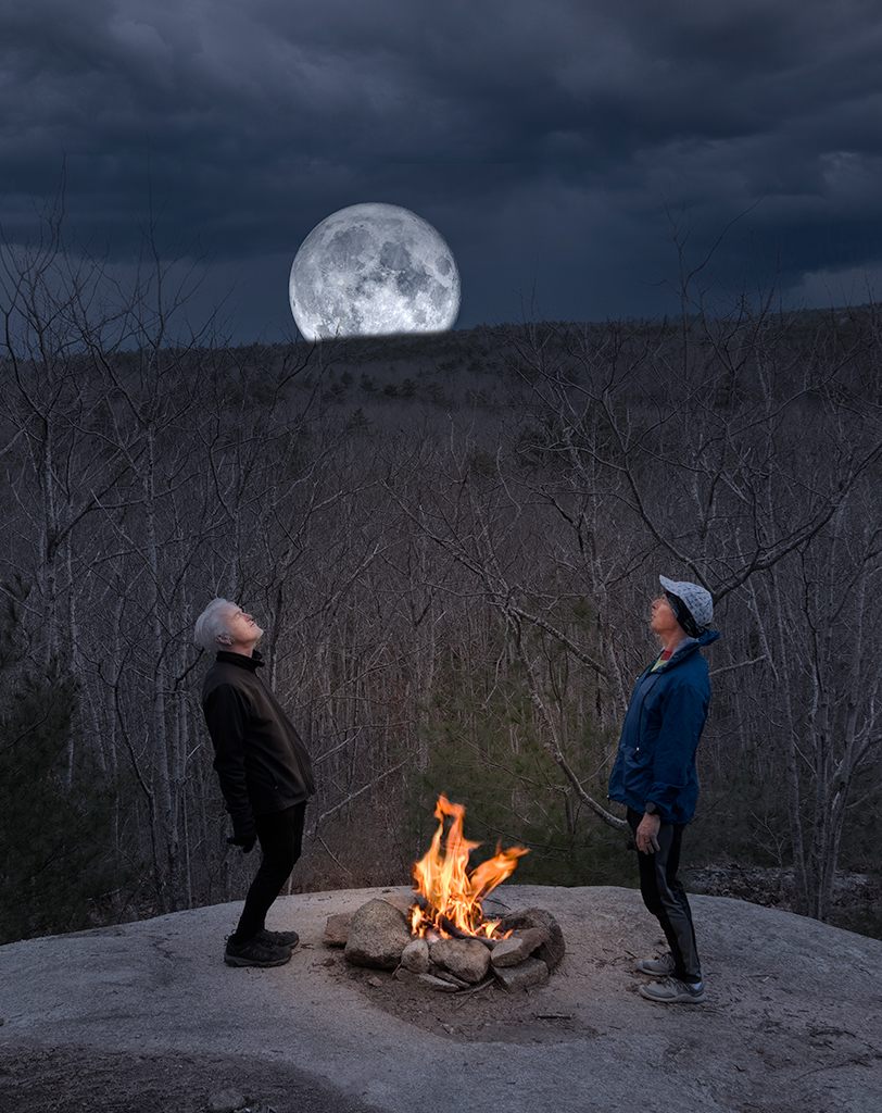
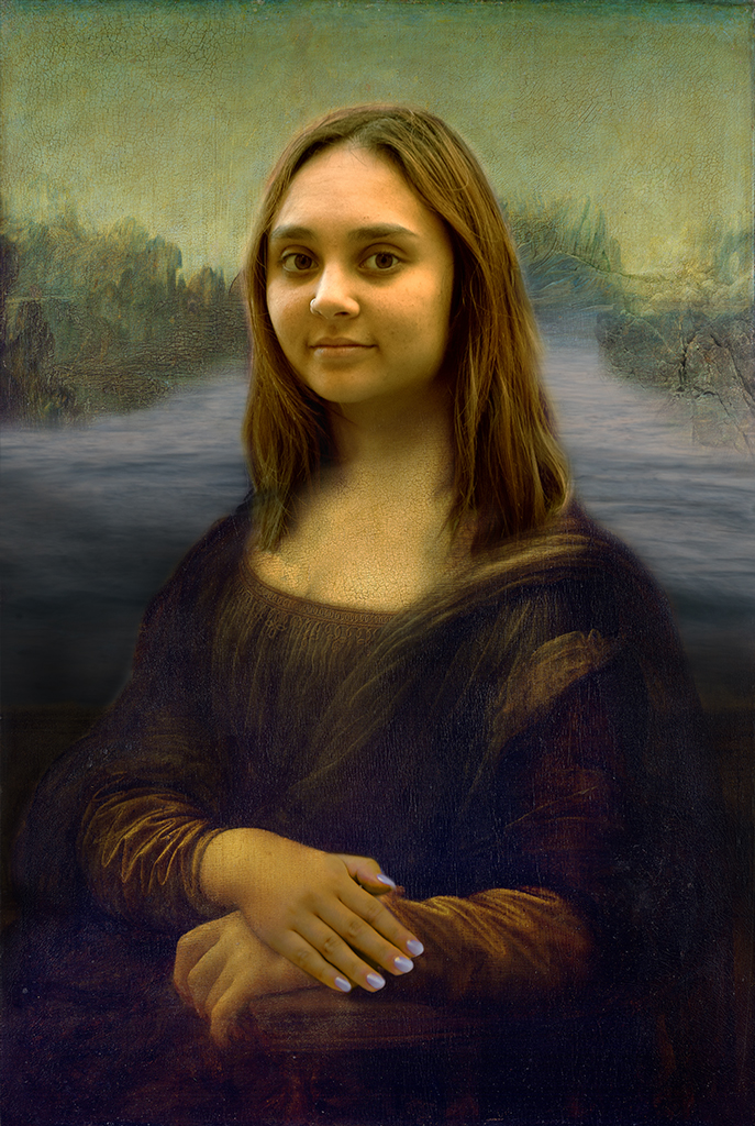
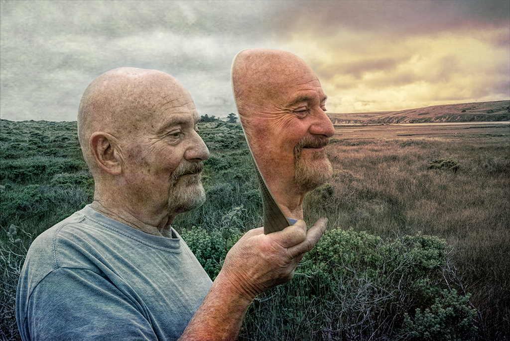
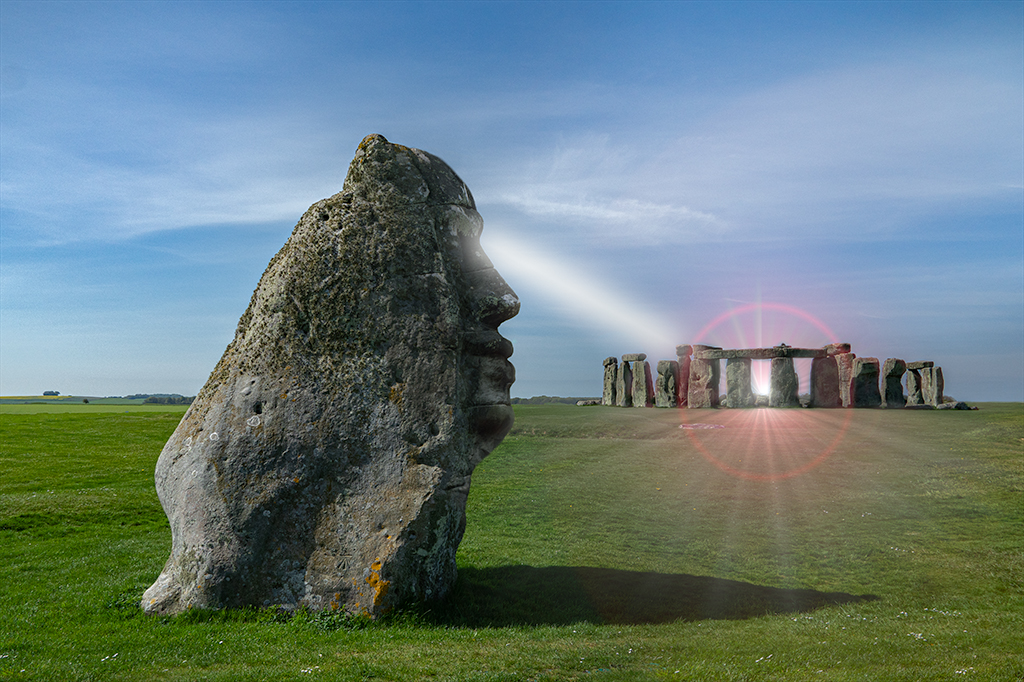
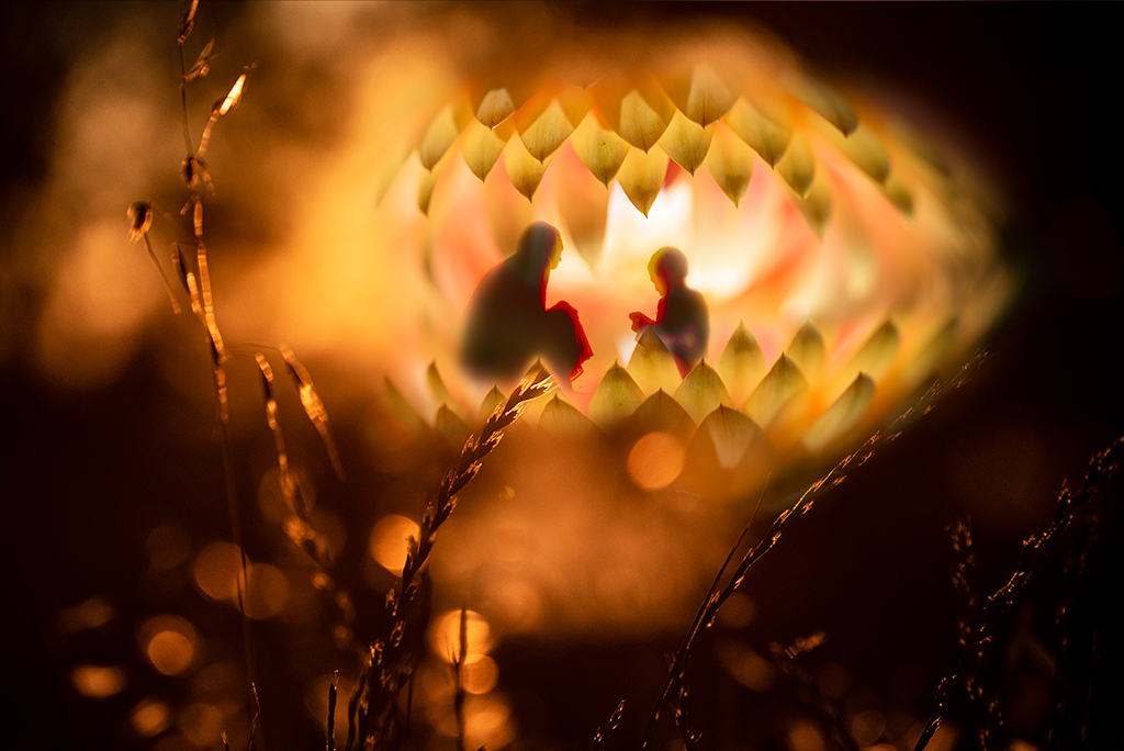
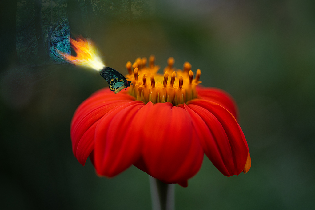
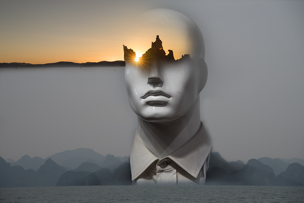
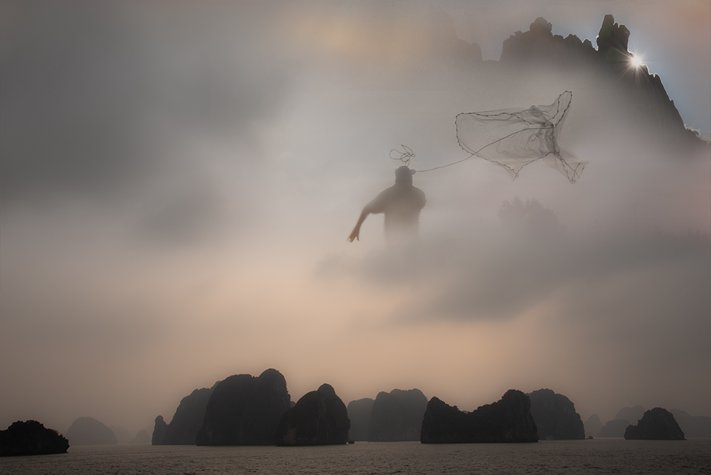
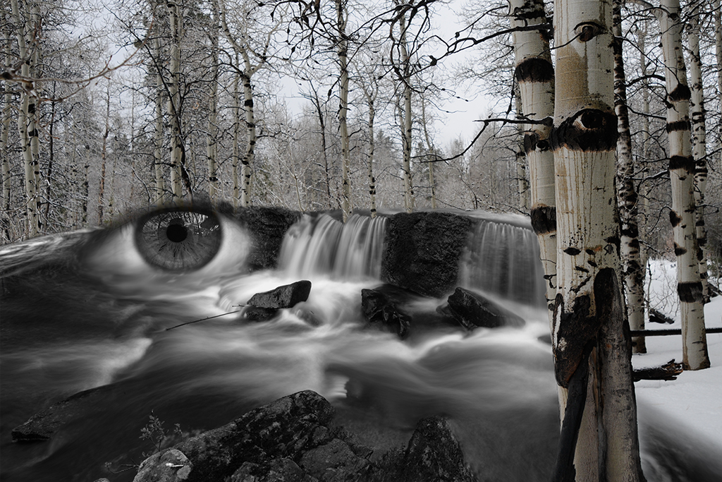
Stephen, Thanks for your additional comments. Yes, I've been playing around with that very idea, i.e. a light at the eye. In fact, when I was taking the original photos of my friend with the sun I tried several variations including the light coming out of the eye. |
Nov 24th |
| 41 |
Nov 19 |
Reply |
Jan, Thanks for taking the time to rework my image. I like what you've done. |
Nov 20th |
| 41 |
Nov 19 |
Reply |
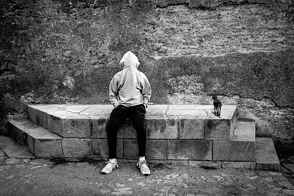
Henry, I like your idea of a slight head tilt, thanks. |
Nov 18th |
| 41 |
Nov 19 |
Reply |
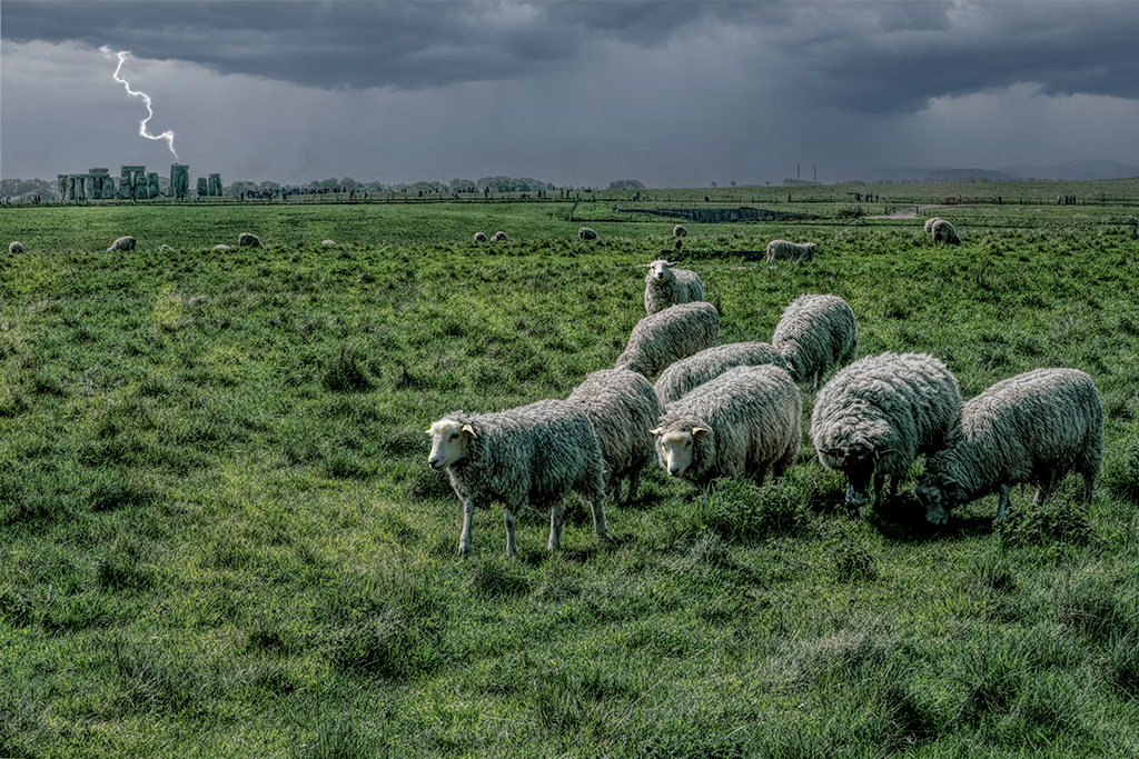
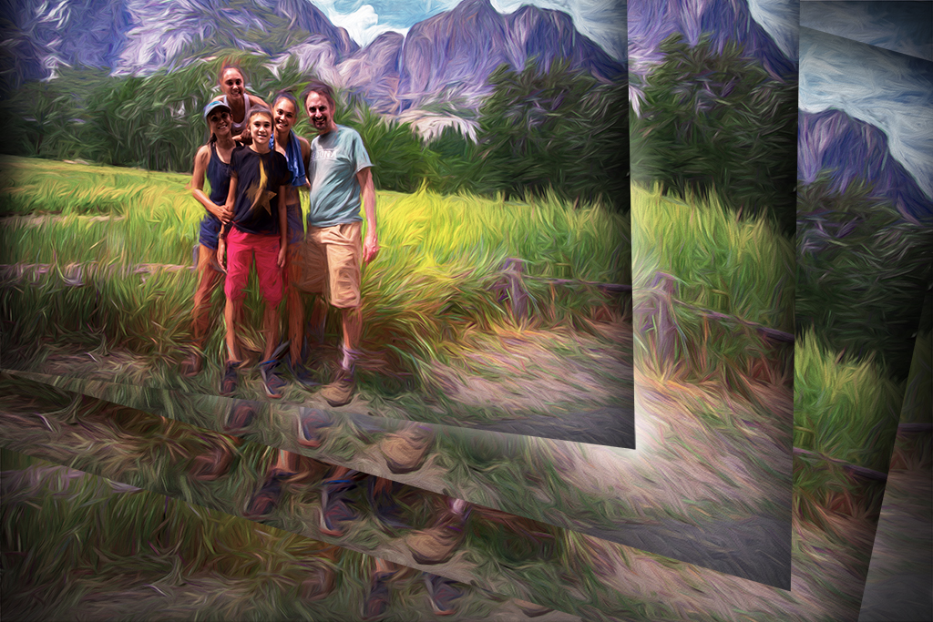
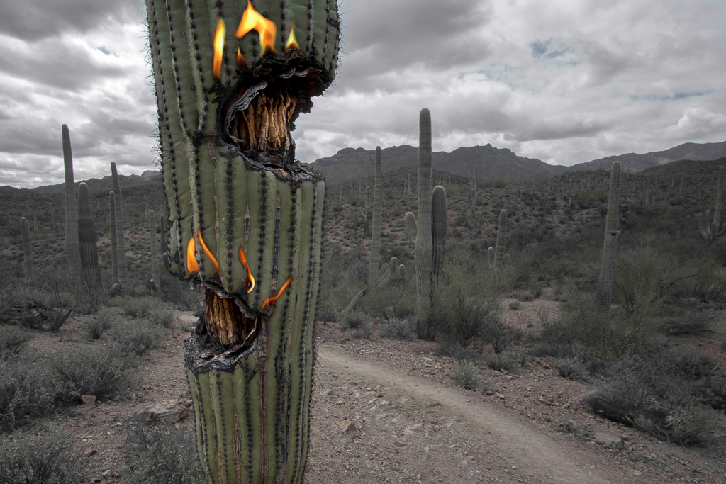
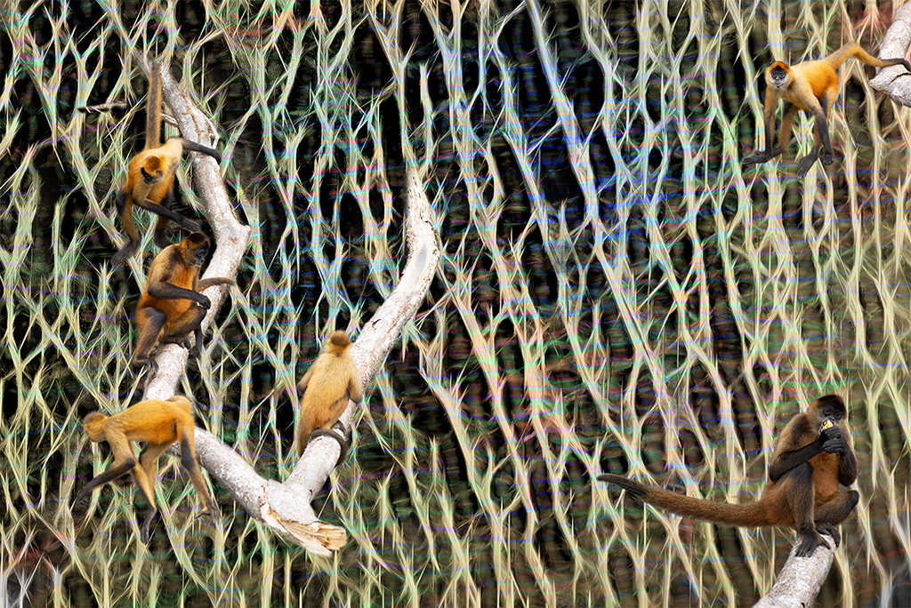
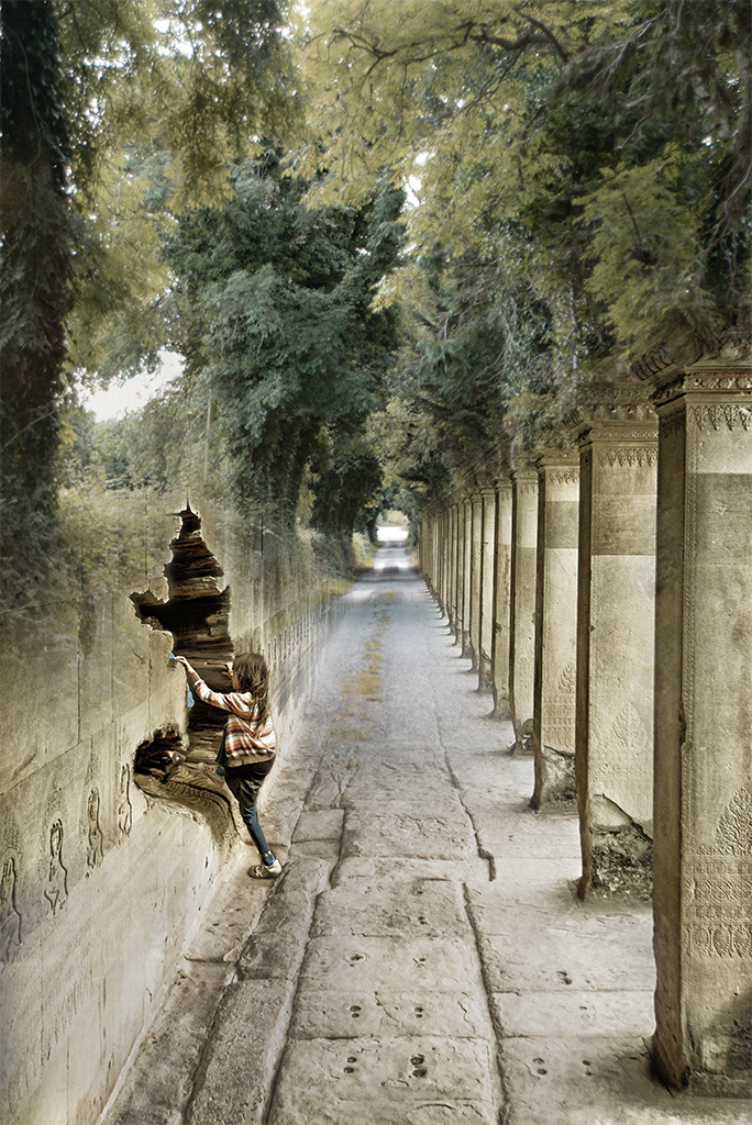
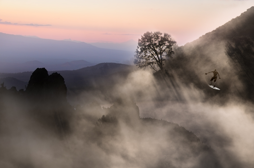
Kathy, Thanks for your input. My other group,54, requires 3 minimum images as a somewhat arbitrary requirement so I have gotten in the habit of using three images for many of my compositions now. I will play around with this some more. |
Nov 18th |
| 41 |
Nov 19 |
Reply |
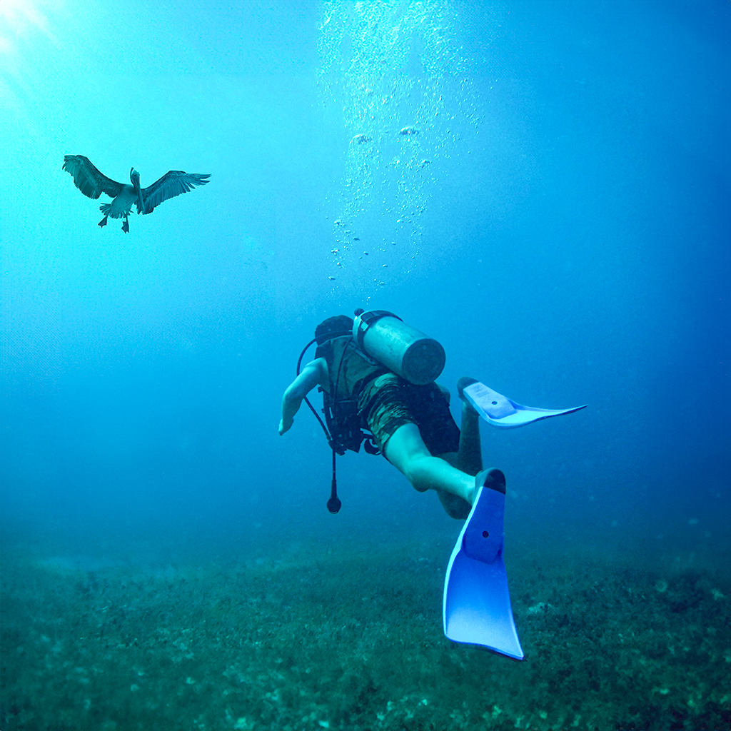
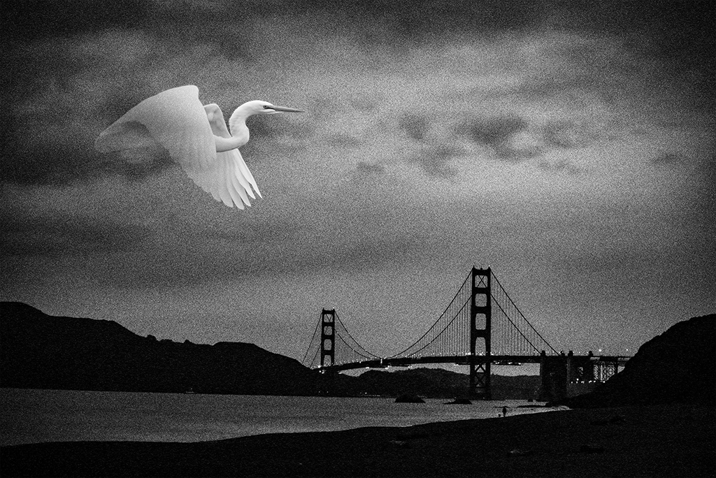
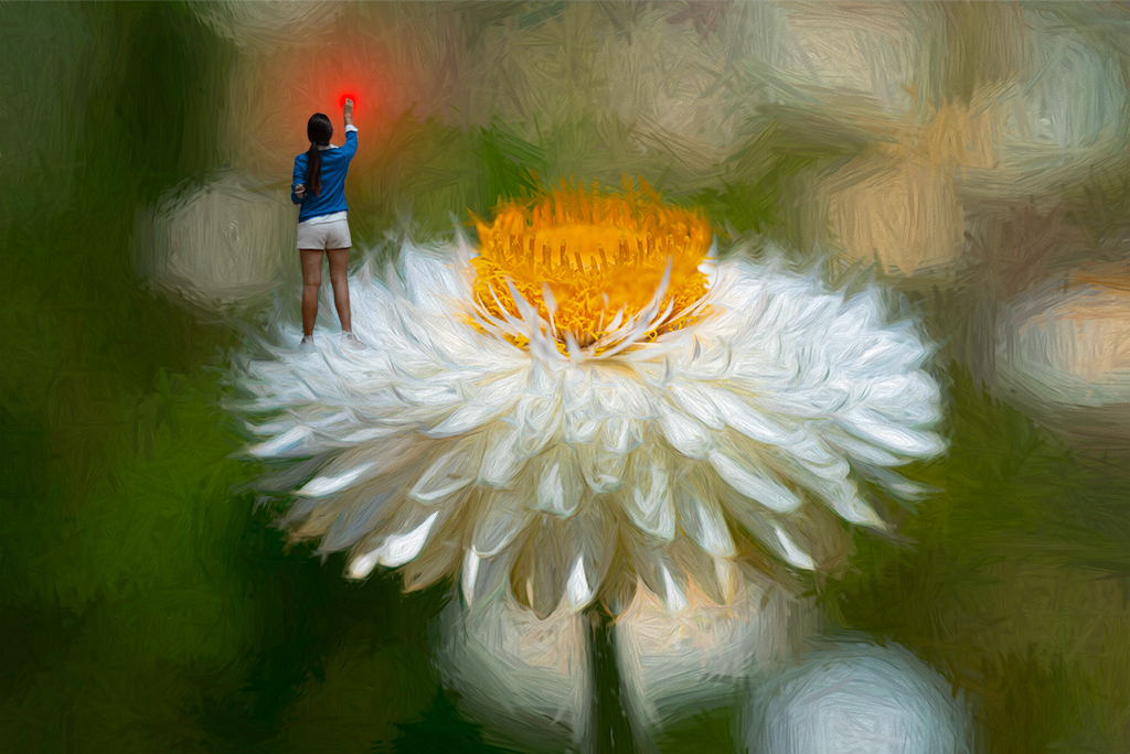
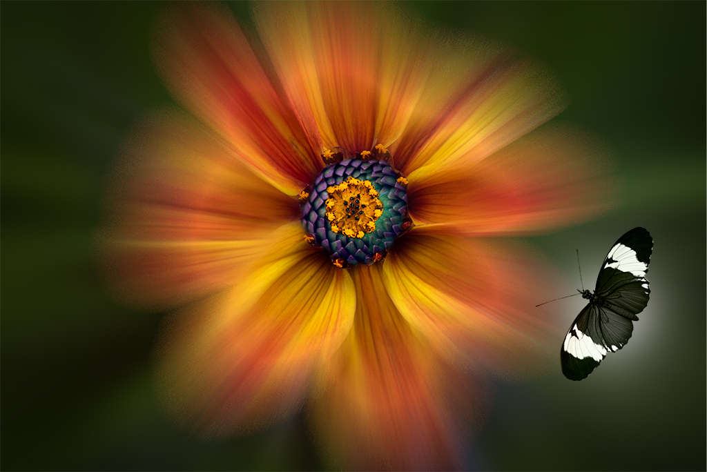
Lisa, Thanks for your comments. I find it funny how often the element that got me interested in the photo, i.e. the star burst, can in the final image be distracting. It's hard to sometimes let go of an idea. |
Nov 18th |
| 41 |
Nov 19 |
Comment |
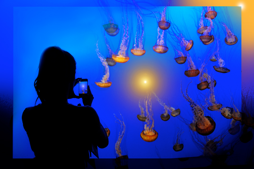
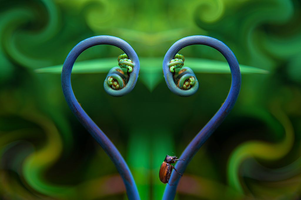
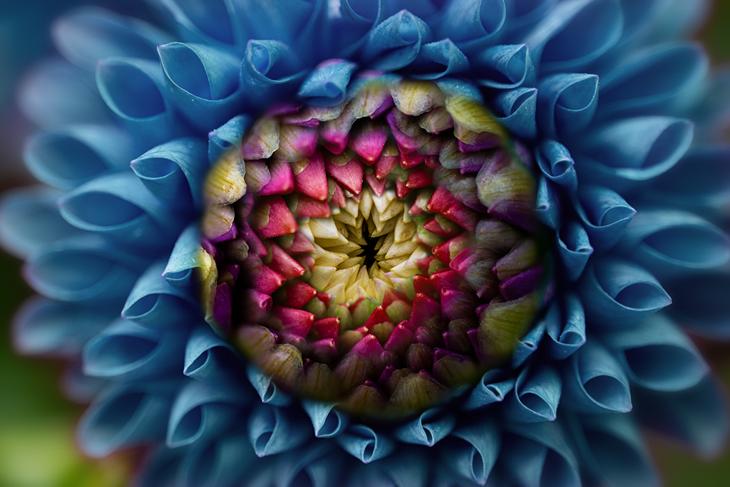
Lisa, As always this is technically well executed. The image doesn't grab me as much as some of your others. A darker blue background might create more punch. I wonder if you might take some chances and use an image like this as a starting point for further explorations. consider opening this image in the liquify filter and play around. |
Nov 12th |
| 41 |
Nov 19 |
Comment |
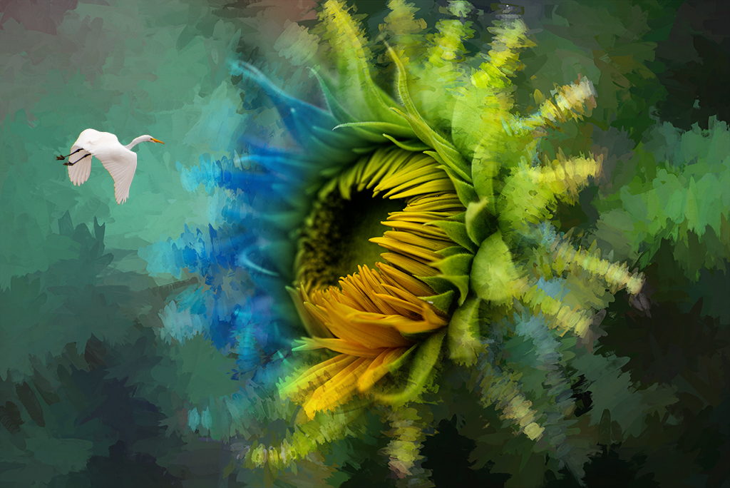
Jan, I really like what you've done with this composition. The colors are wonderful and the theme is fun. As you may have guessed from my photos and comments over time, I tend to prefer less clutter in my images. This image is really strong. I wonder if it would be even stronger if there were a few less foreground elements. |
Nov 12th |
| 41 |
Nov 19 |
Comment |
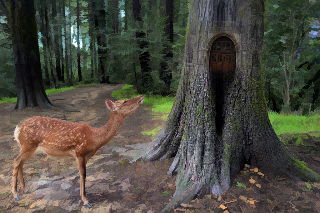
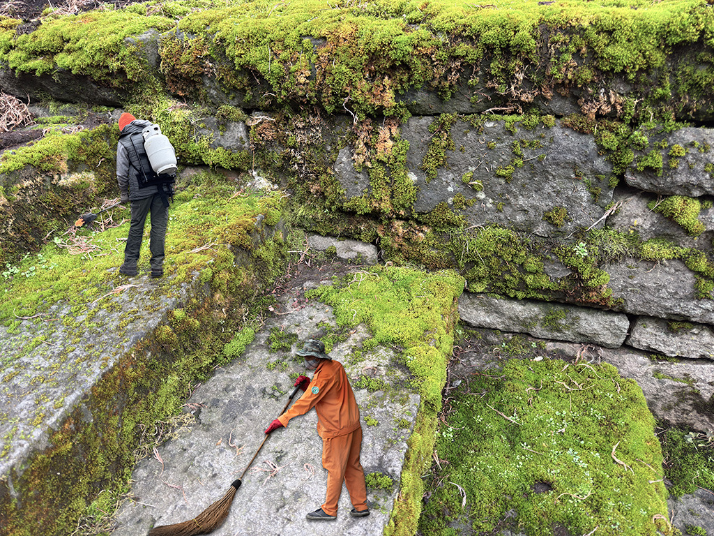
Maryellen, What a wonderful montage. This is a great way to show this street art. |
Nov 12th |
| 41 |
Nov 19 |
Comment |
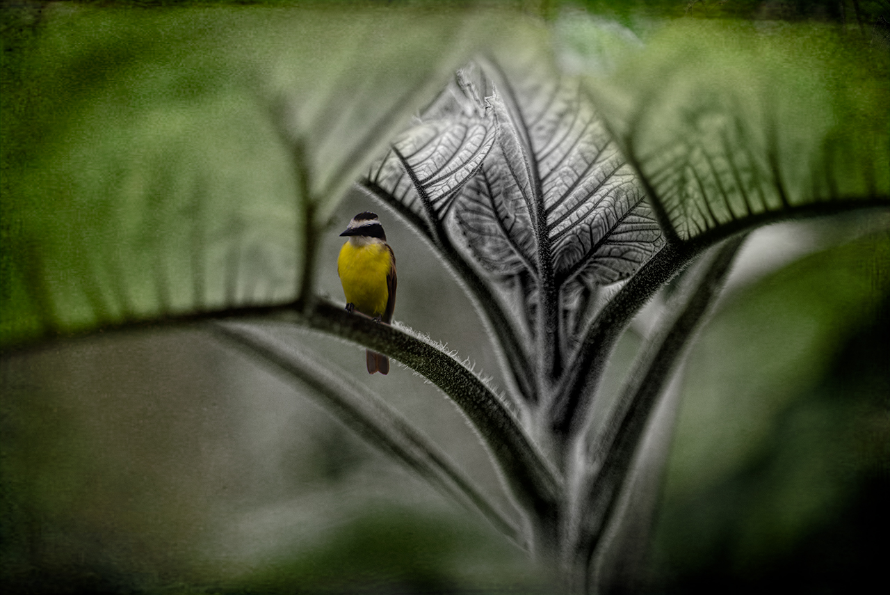
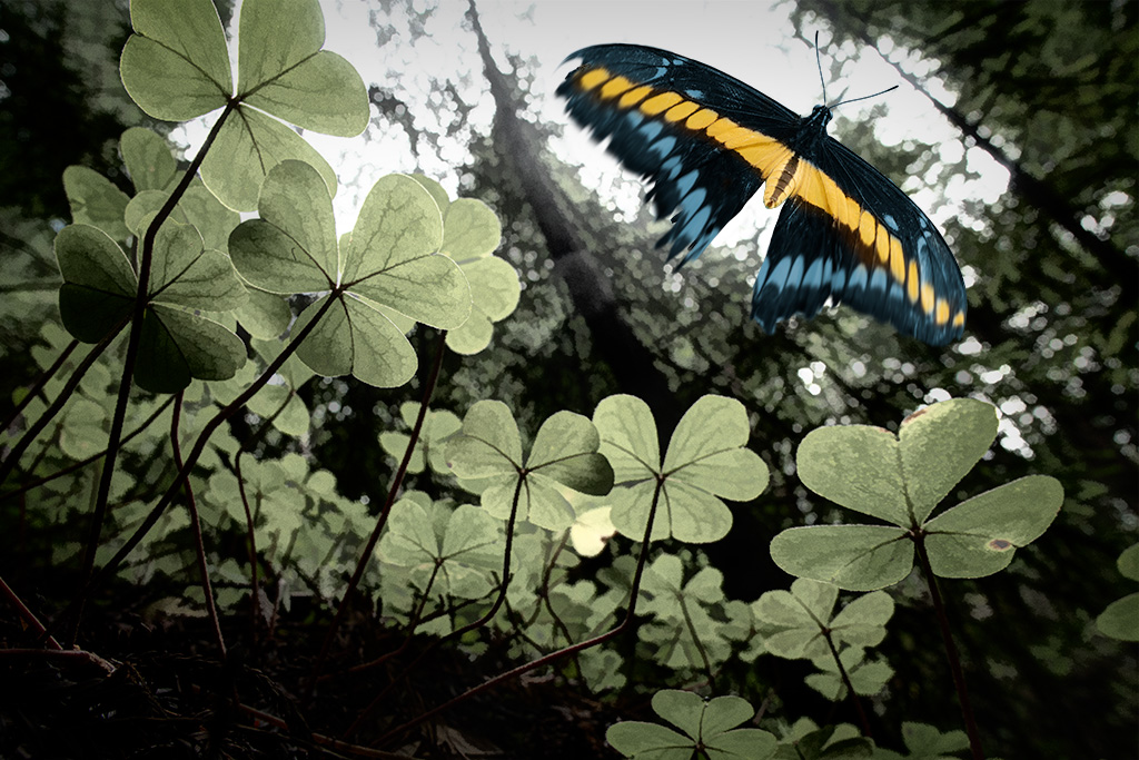
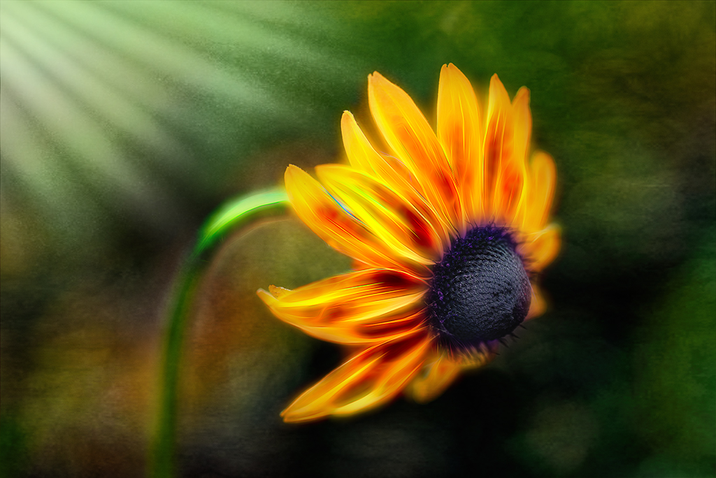
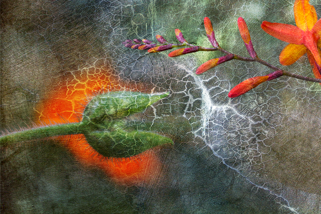
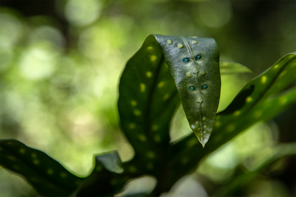
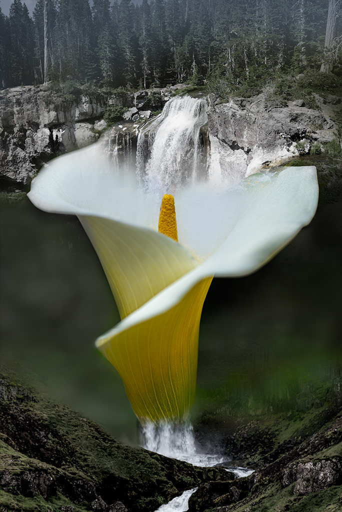
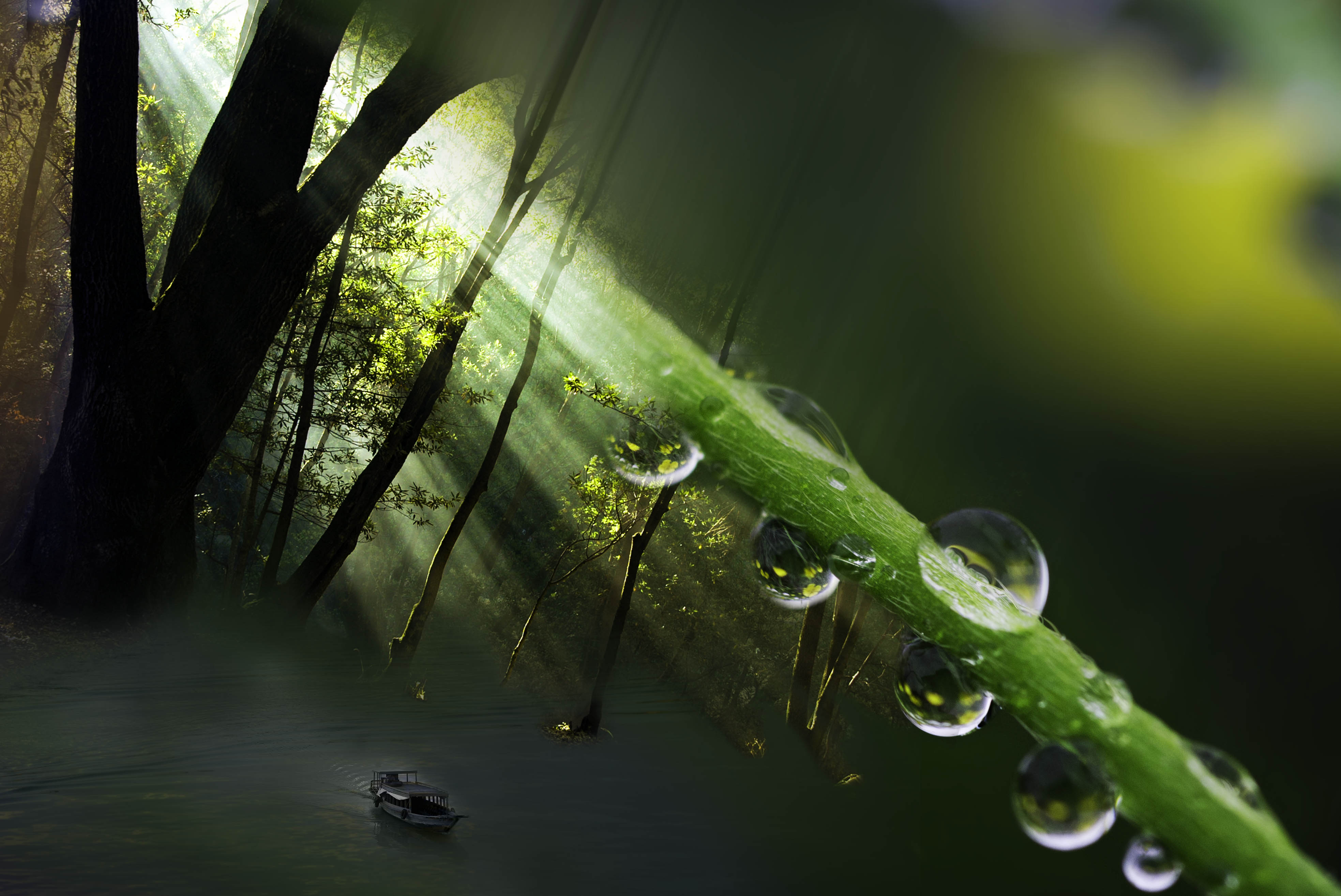
Henry, I like what you've done with this image. The colors are beautiful. The slight blurring of the back ground helps the foreground leaves pop out. The liquify filter creates a nice curving element. My only suggestion is consider a slightly different cropping. The bottom feels too tight, i.e. I'd like to see where the foreground leaves meet and see a little stem at the bottom. |
Nov 12th |
| 41 |
Nov 19 |
Comment |
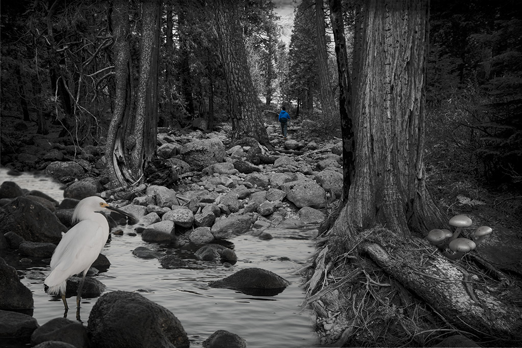
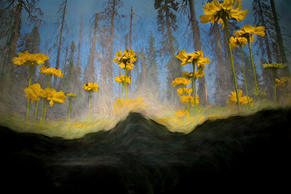
Kathy, You've succeeding in creating a fun and magical image. Your process sounds exhausting, I hope blending 22 layers is fun for you, my computer would slow to a grind with that many layers. |
Nov 12th |
| 41 |
Nov 19 |
Reply |
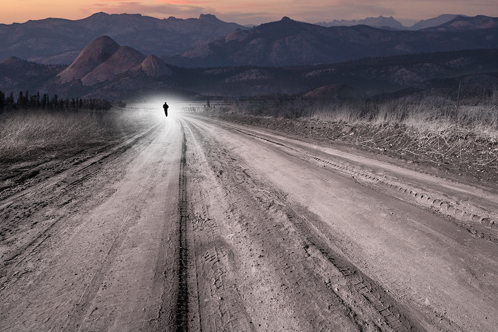
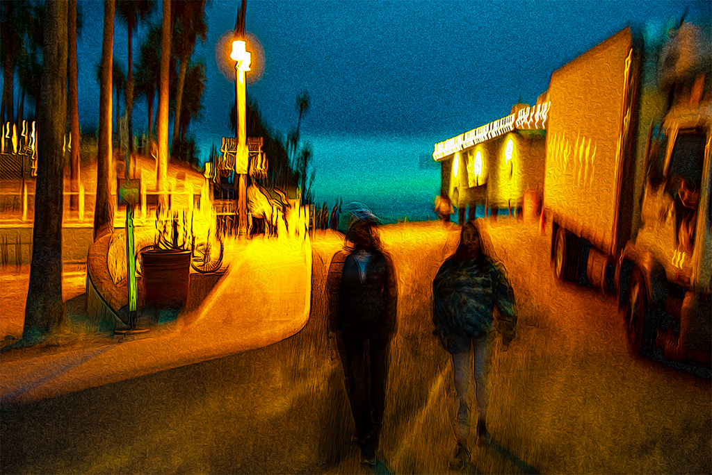
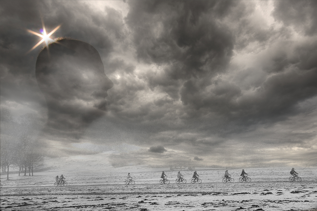
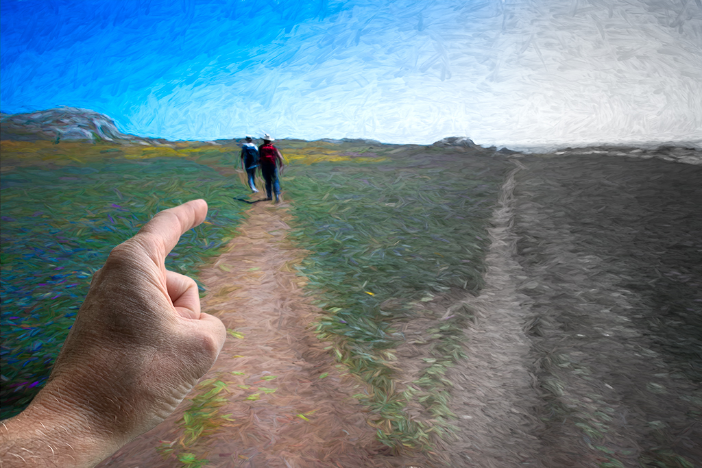
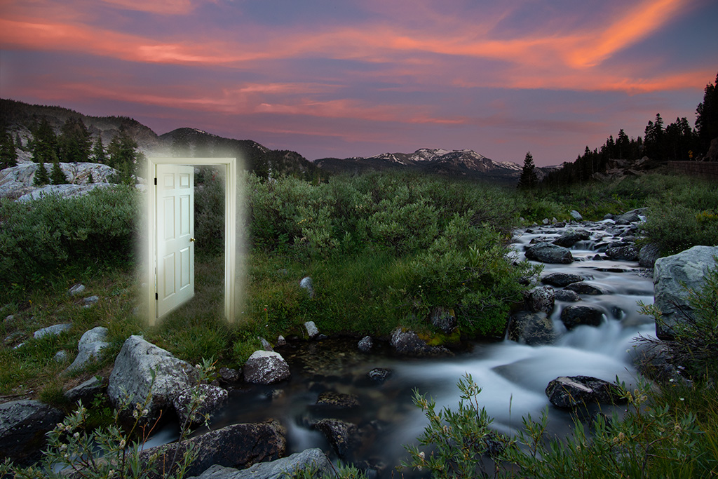
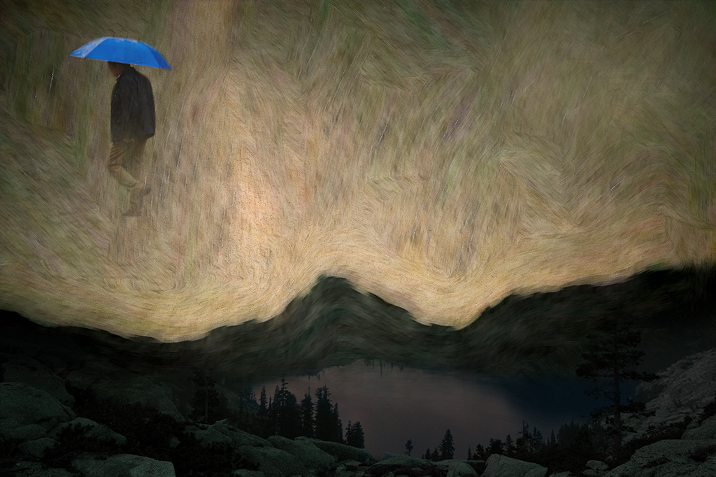
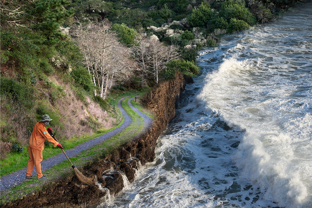
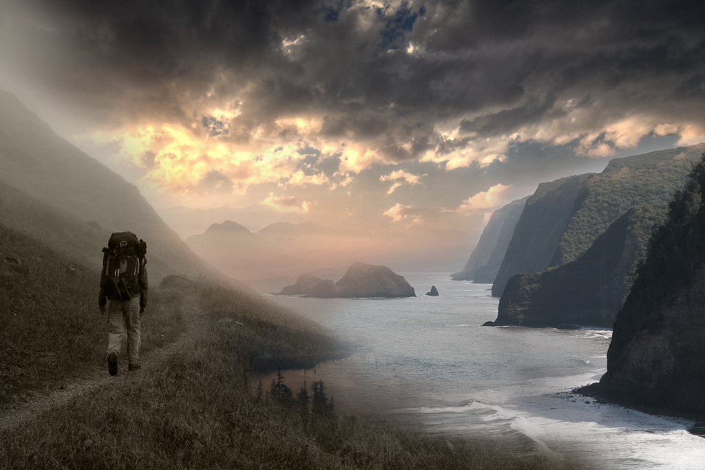
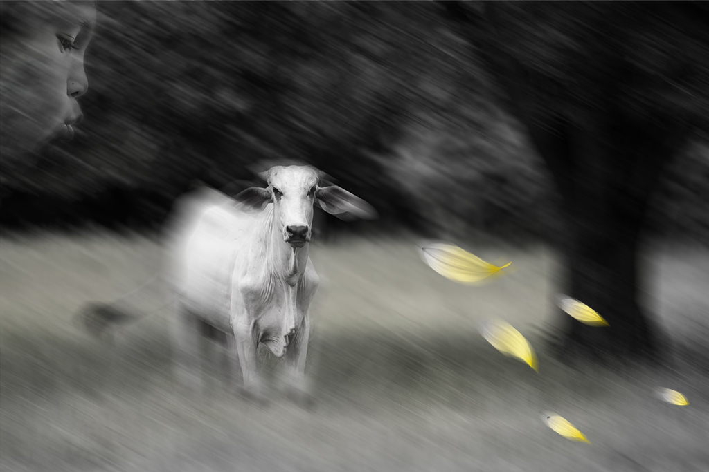
Stephen, Thanks for your input. I do try to have this type of tie in in many of my pictures. In this one the man looking off into the distance and the bikers riding off into the distance was my unconscious tie in but I realize the photo isn't "done" so I appreciate your feedback. Sometimes it is really hard to make things work perfectly with the images I choose. I can easily get attached to what I started with and have trouble letting go. Thanks again. |
Nov 10th |
5 comments - 6 replies for Group 41
|
| 54 |
Nov 19 |
Comment |
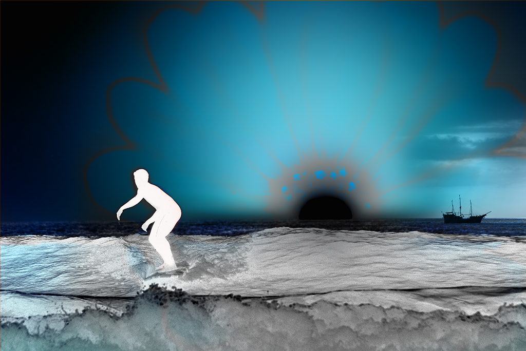
Peggy, It's interesting seeing how things look after responding to people's suggestions. I've made changes after everyone weighs in and often I go back to the original with some adjustments. I think each version has its merit. It's painful trying to take an excellent picture and make it "perfect". You have an excellent picture. |
Nov 29th |
| 54 |
Nov 19 |
Reply |
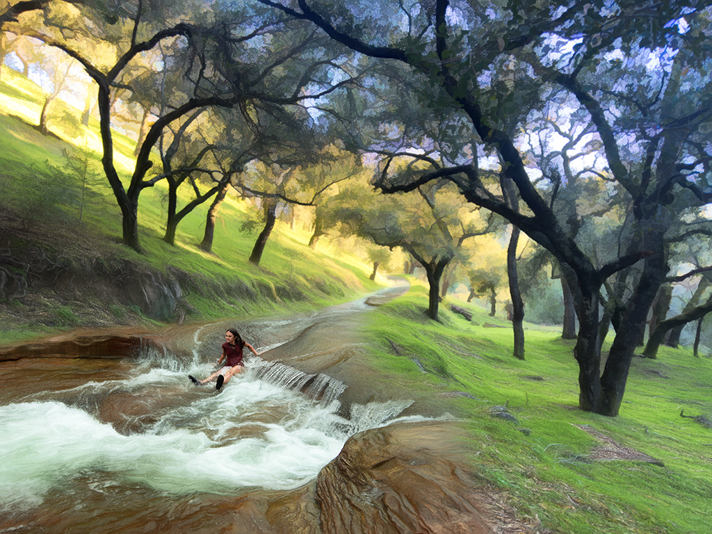
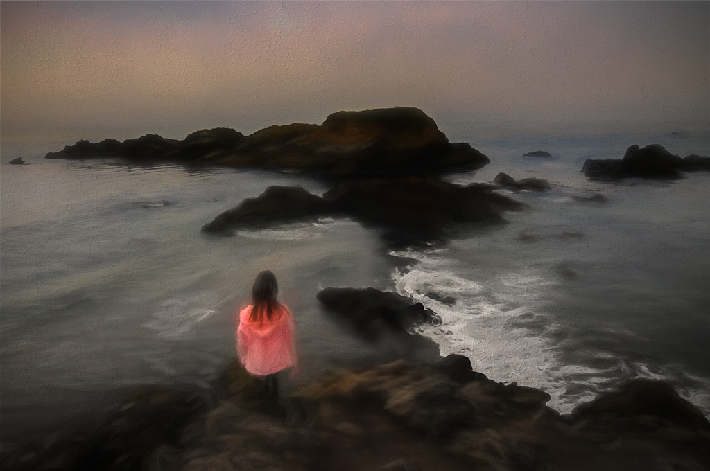
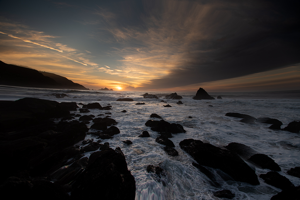
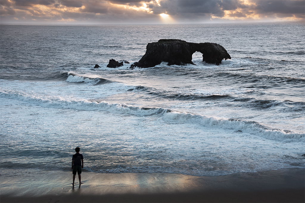
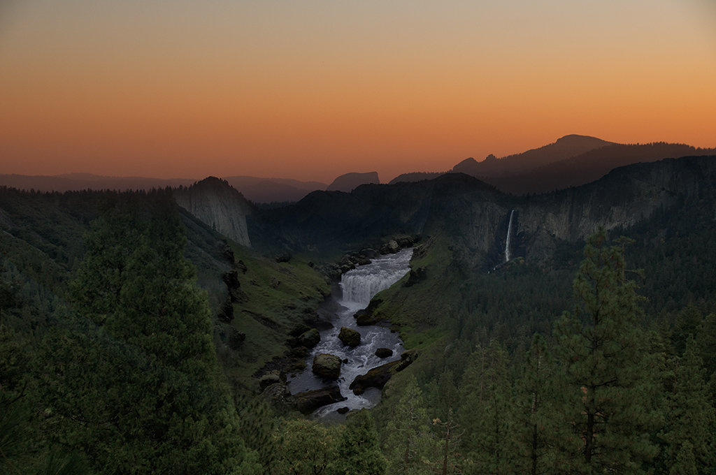
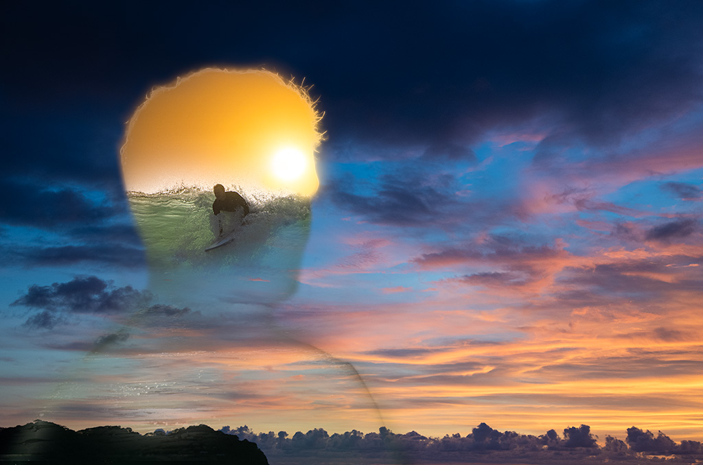
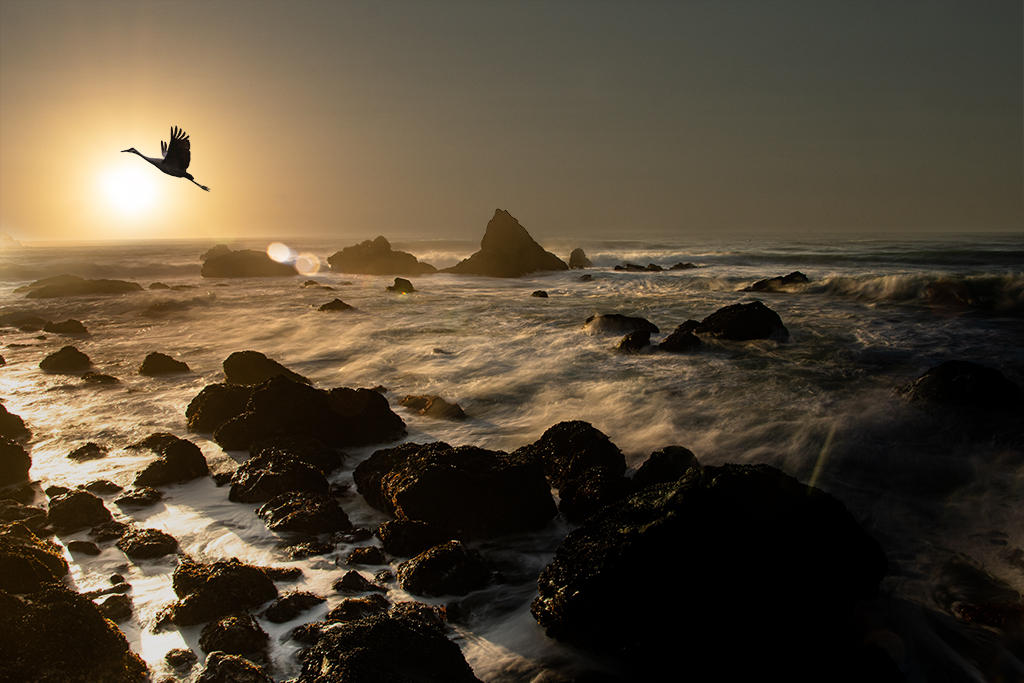
Peggy, As always I value your constructive feedback. I like what you've done with increasing the amount of wave at the bottom. It is always so hard for me to let go of the part of the image that inspired me, i.e. the bold sunset. In this case it is about balancing the image. I am going to rework it as I believe you've hit on something that can take it from a very soothing image to a more impactful image, thank you! |
Nov 18th |
| 54 |
Nov 19 |
Reply |
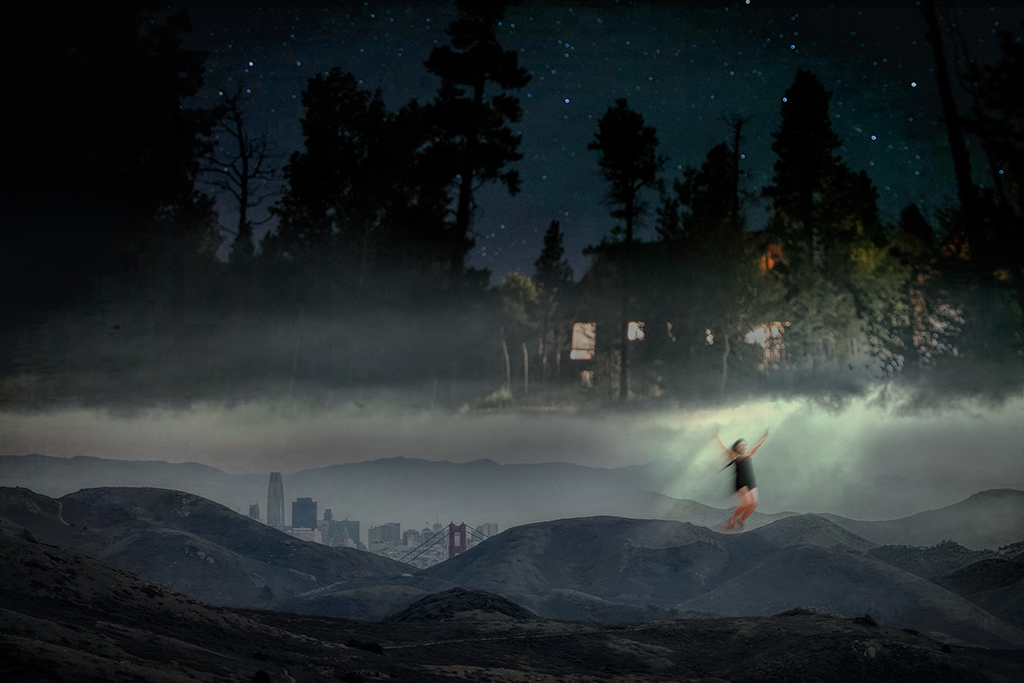
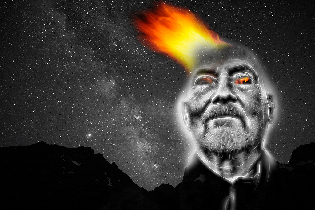
Alan, Thanks for your comments. I am trying to learn to add soloing to my guitar playing. It requires adding notes over the basic background. Juxtaposing harmonic and slightly off notes creates a complex mix. Sometimes it works and sometimes it doesn't. This image feels a little like that to me. I blended disparate images with the attempt to capture a feeling. I departed from my earlier surrealistic explorations into a realm of feeling with less story telling. I appreciate your feedback. |
Nov 18th |
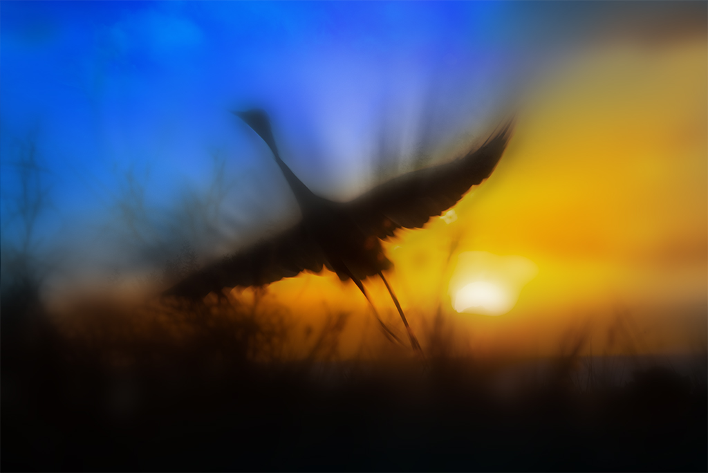
| 54 |
Nov 19 |
Reply |
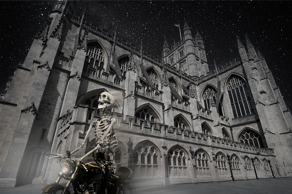
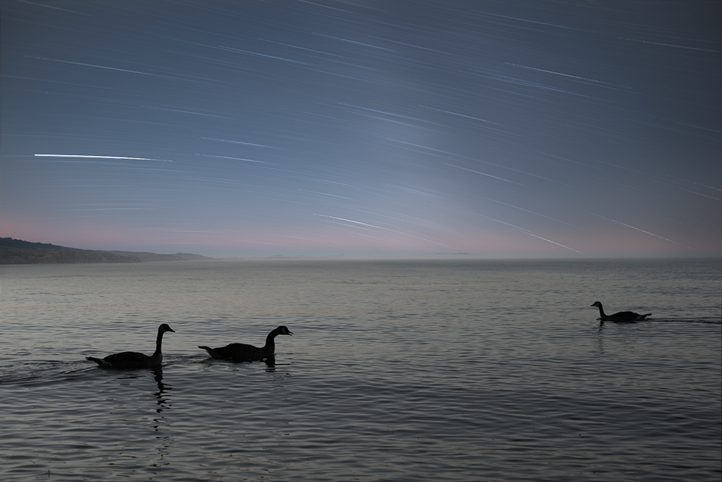
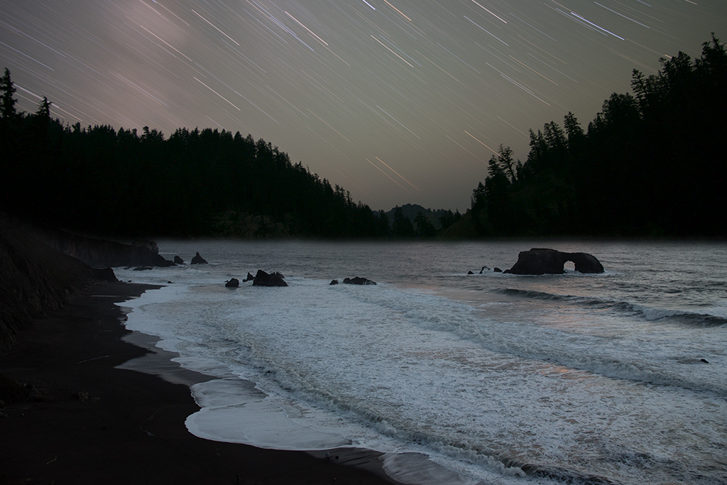
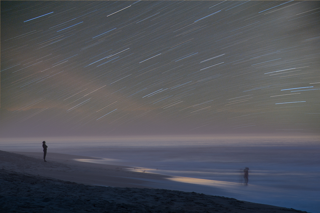
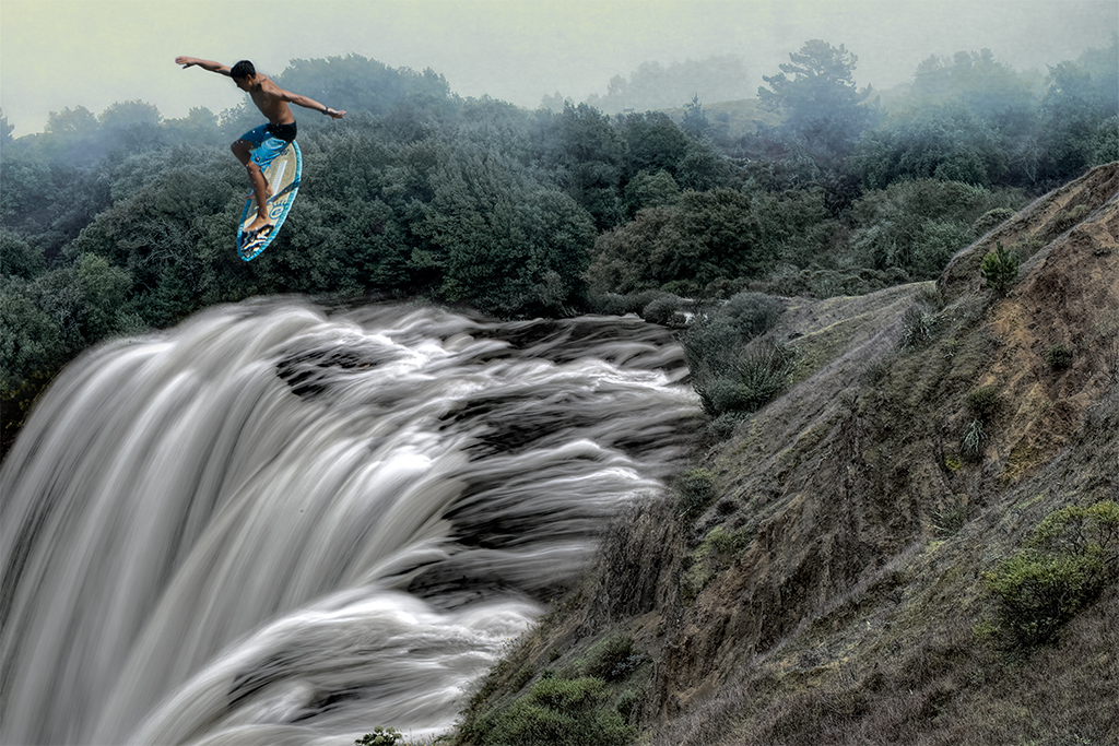
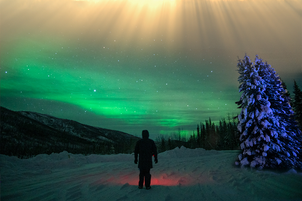
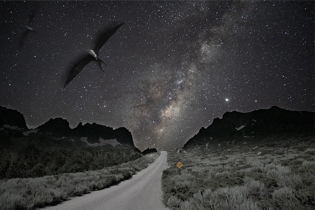
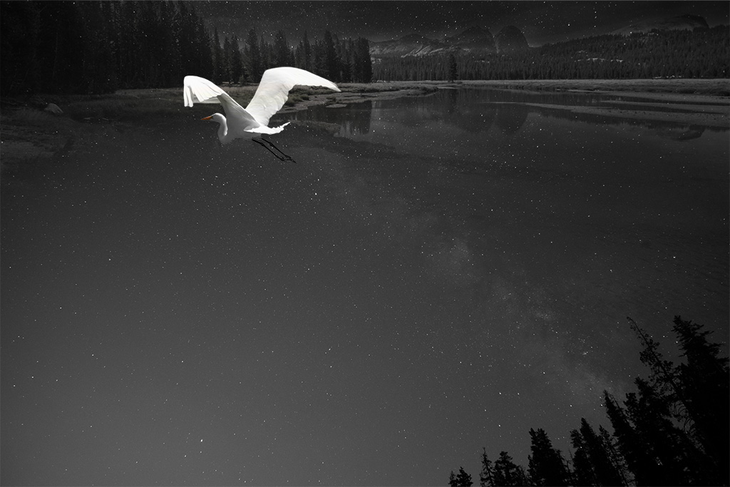
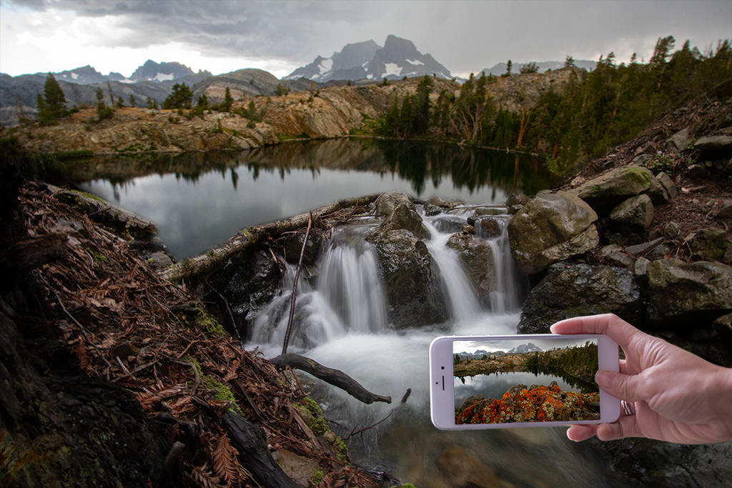
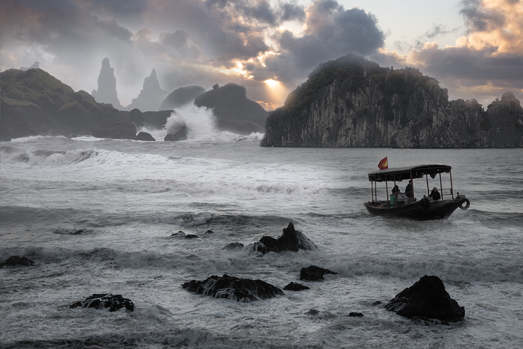
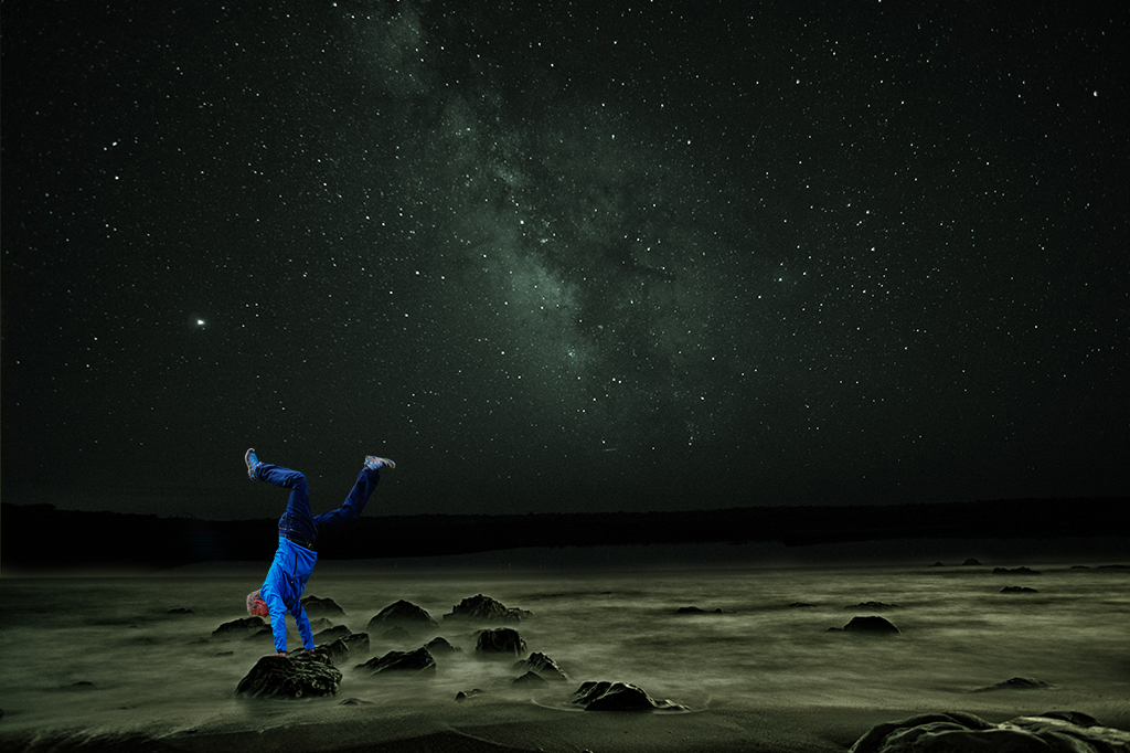
A good reason to get out there and do some night photography! |
Nov 16th |
| 54 |
Nov 19 |
Comment |
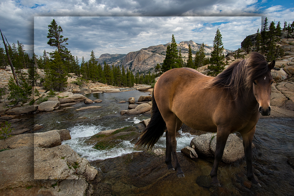
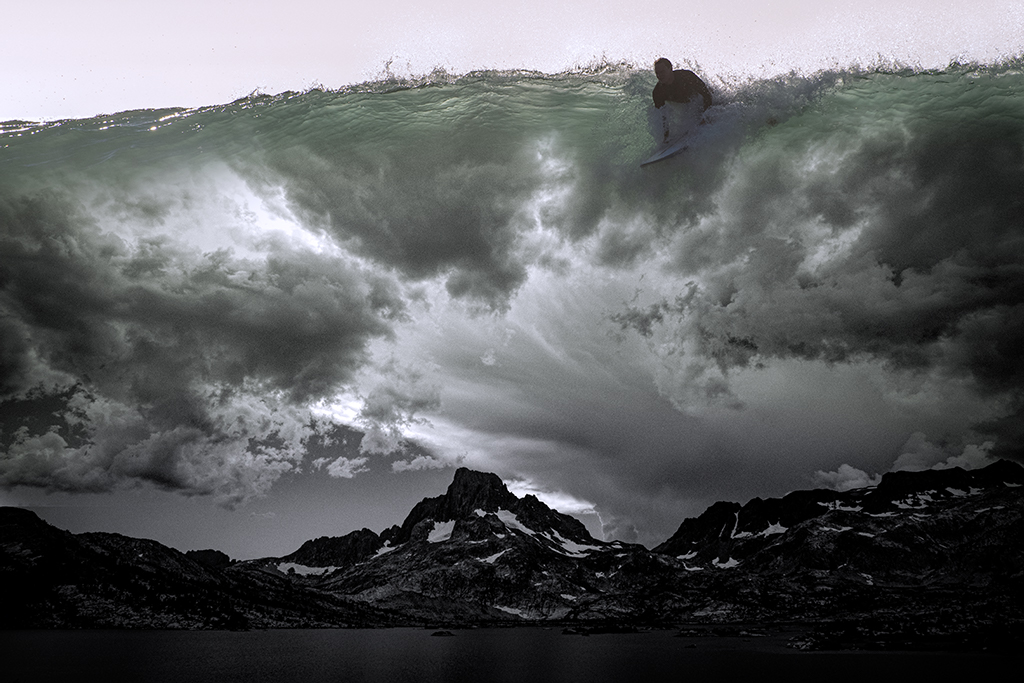
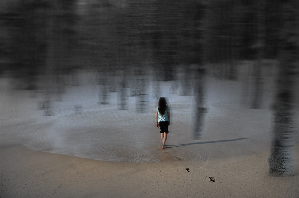
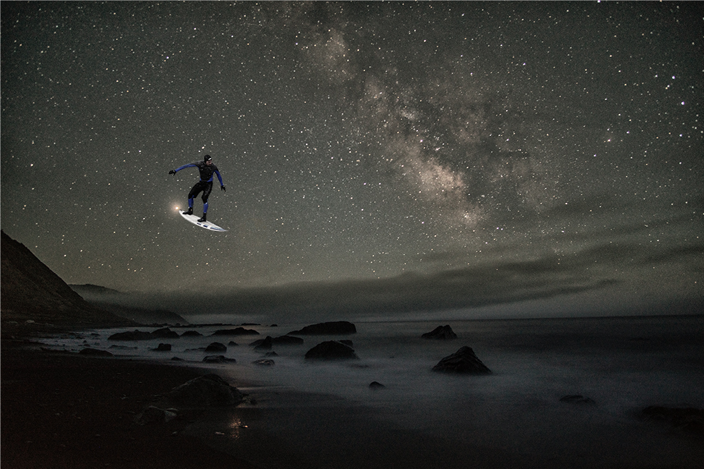
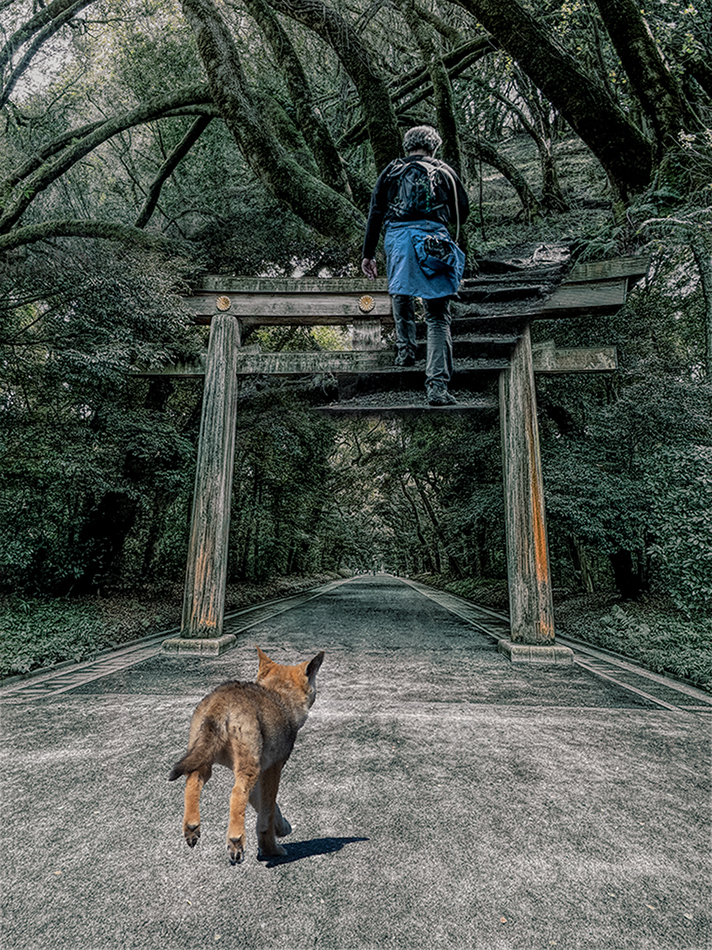
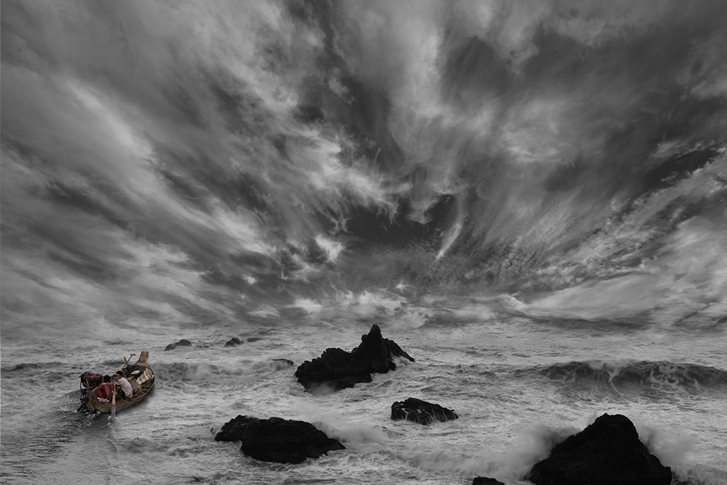
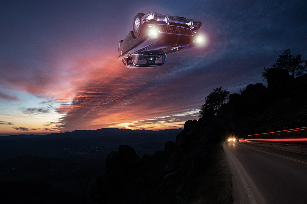
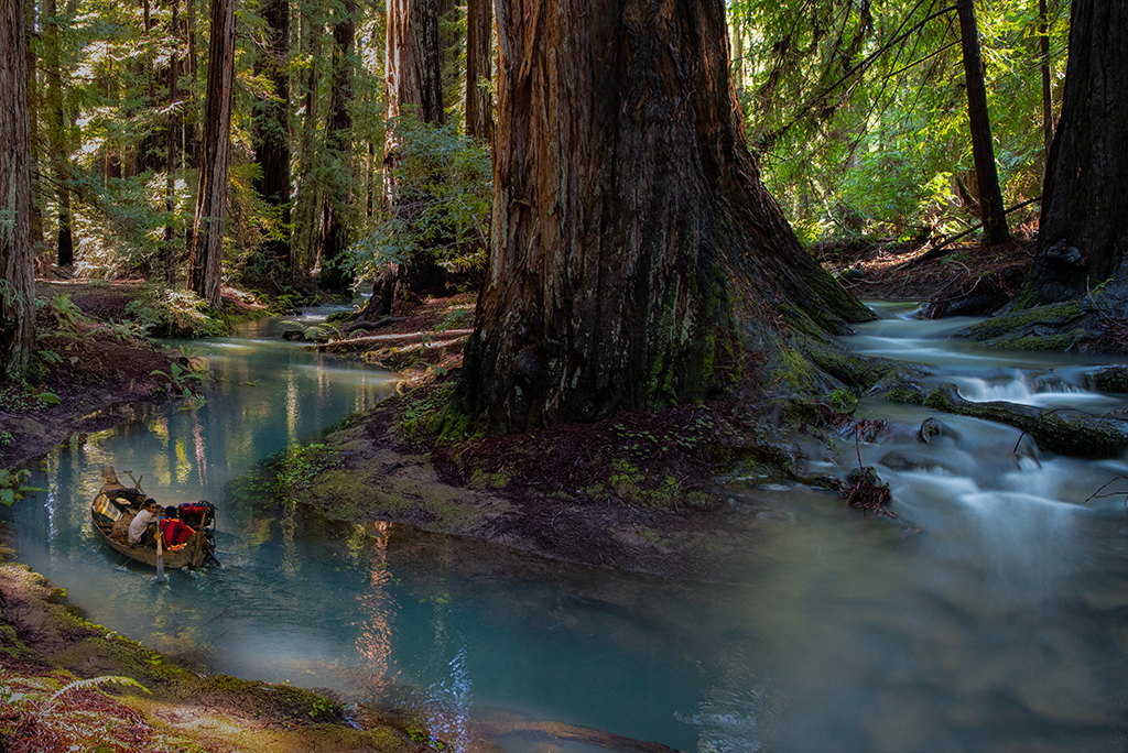
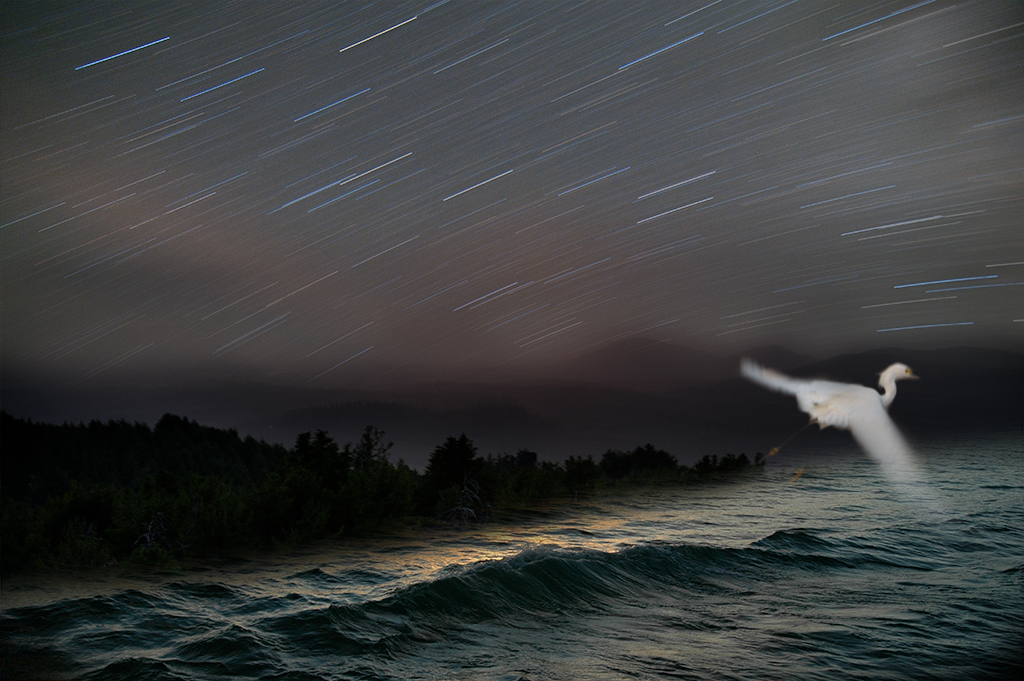
Alan, These kind of images often can go so many different ways. I too have done multiple versions of the same image and it can be hard to know when I am done. Usually I'll put it aside and open different versions on a different day and it is easier to see which one is more powerful. I think the line was the most distracting element in your posted version. I understand your struggle with this simpler version but I do like it. I also like the version with the water and more impressive mountain range. Maybe you can take out the line and have the fish a little smaller poking its head out almost mocking the child as if to say "here I am". Anyway, this is your picture to play around with. Ultimately you should feel proud as it is very well done. |
Nov 13th |
| 54 |
Nov 19 |
Comment |
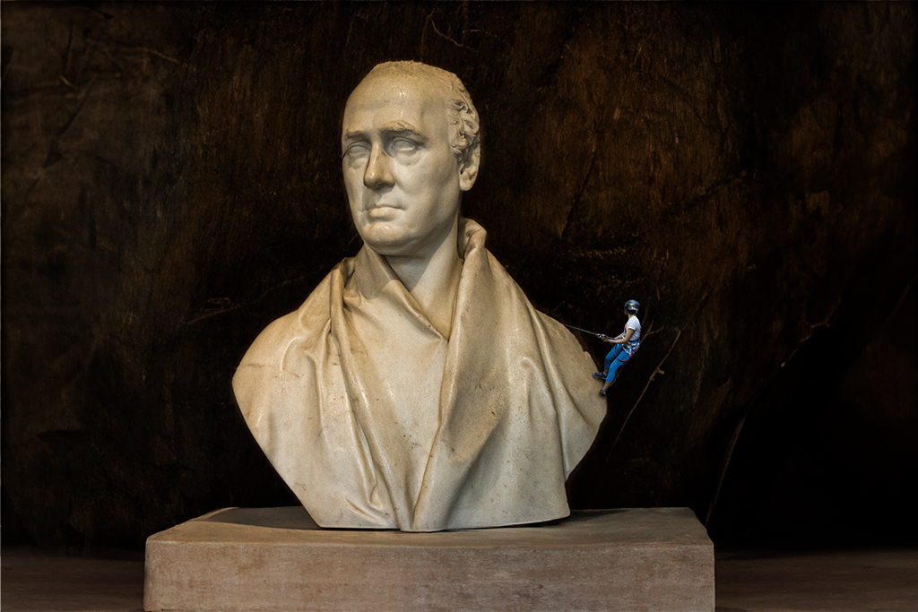
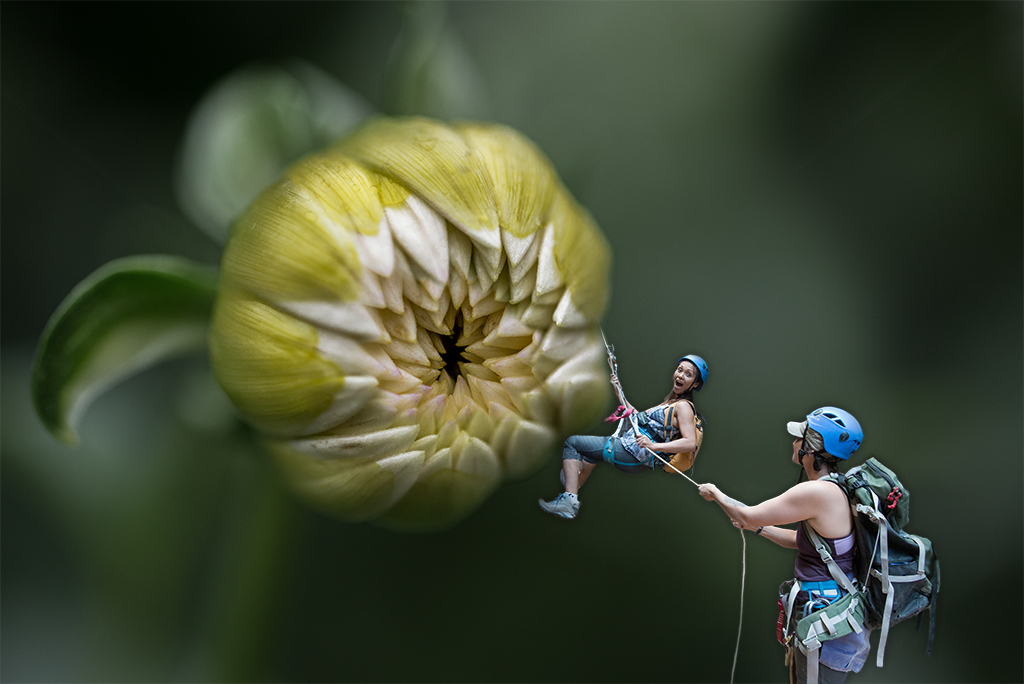
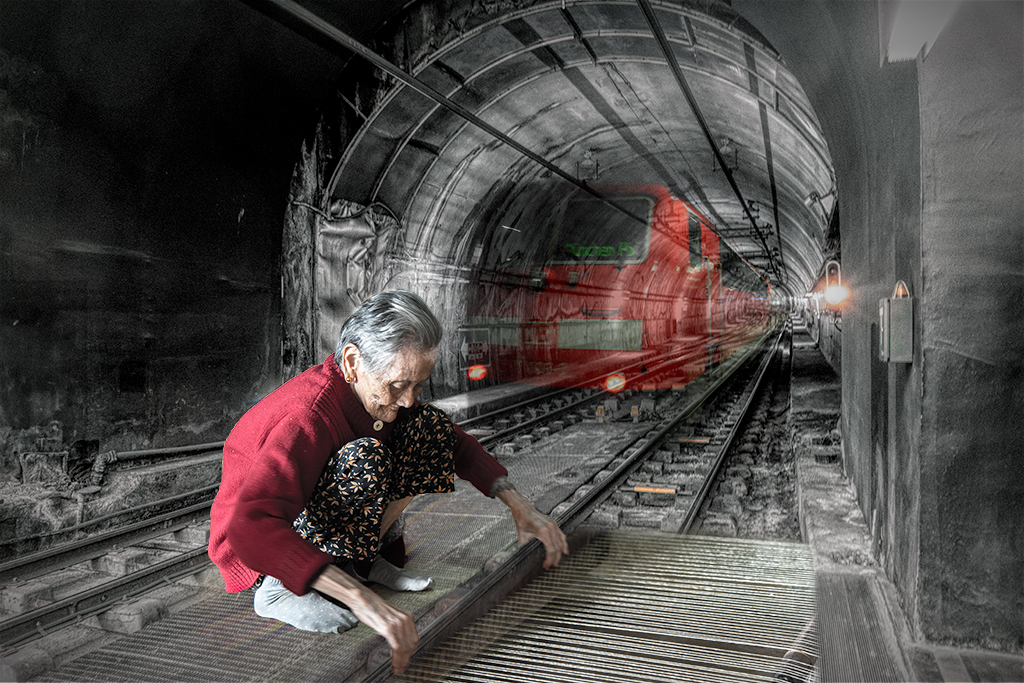
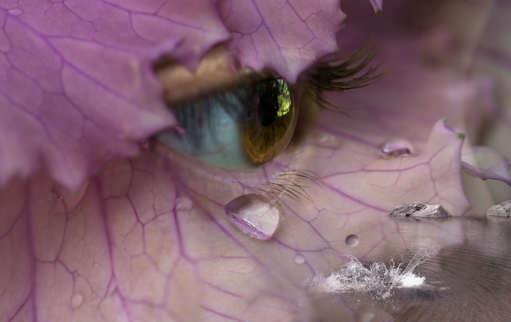
Alan, You've created another beautifully executed intriguing image. I love your surrealist sensibilities. I find the line coming out of the fish's mouth a significant distraction. I would consider removing that entirely and might even consider taking the fish out entirely as the boy looking into the missing square is so visually strong, the fish distracts for me. The train and the dress are enough additional elements to draw the eye around again and again. One other nitpicking element, I might tone down the contrast just a touch on the front of the train, just a touch. |
Nov 12th |
| 54 |
Nov 19 |
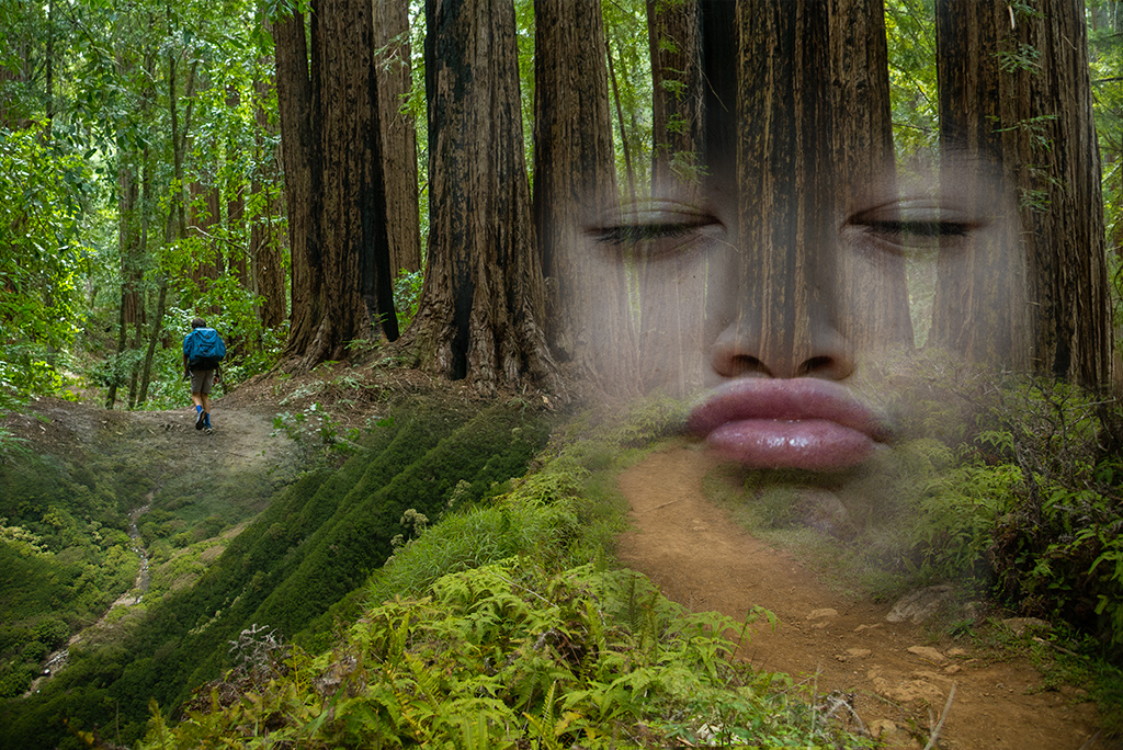
Comment |
Betty, You've done a wonderful job handling this subject. I like the various filters you've used as they create a visual impact. I wonder if a little more attention to the blending of the edges of the cat at the edges of the pot might make it a little stronger visually, otherwise I think it is a keeper. |
Nov 12th |
| 54 |
Nov 19 |
Comment |
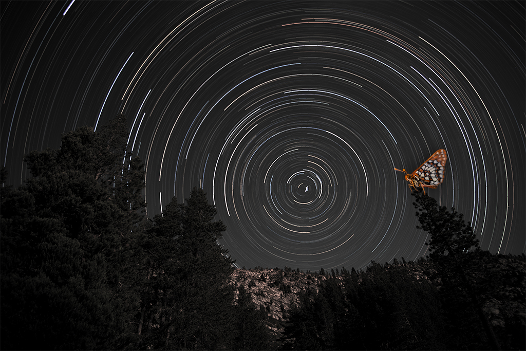
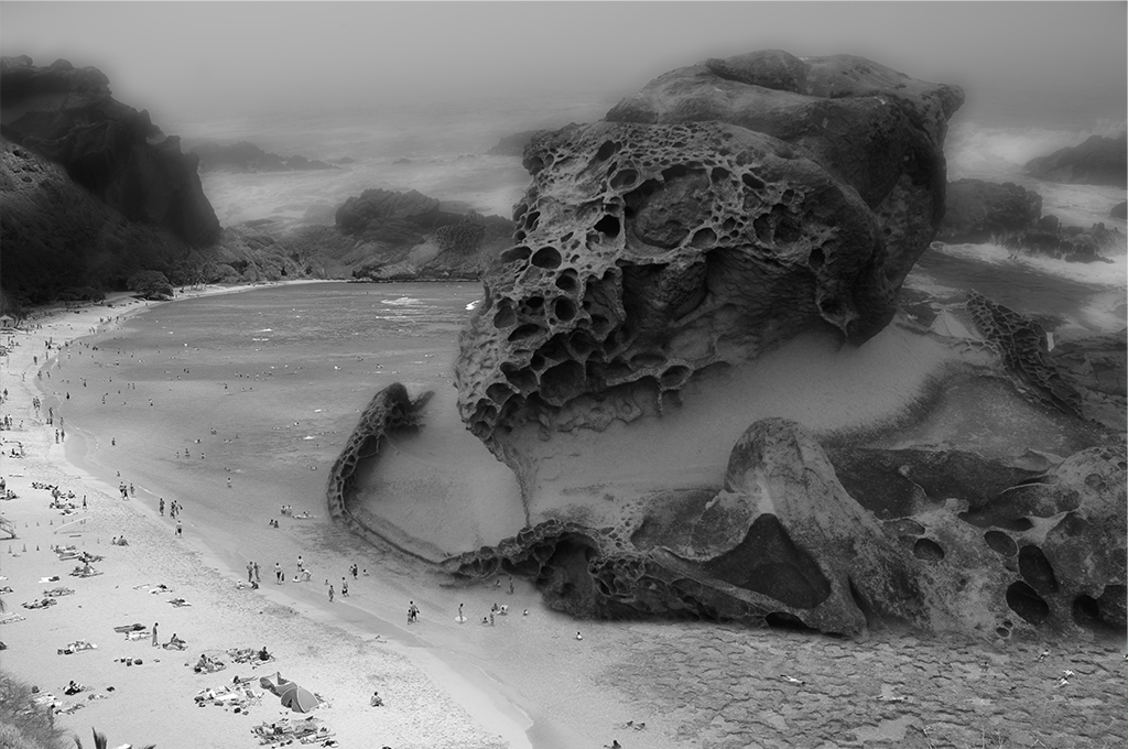
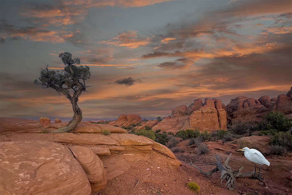
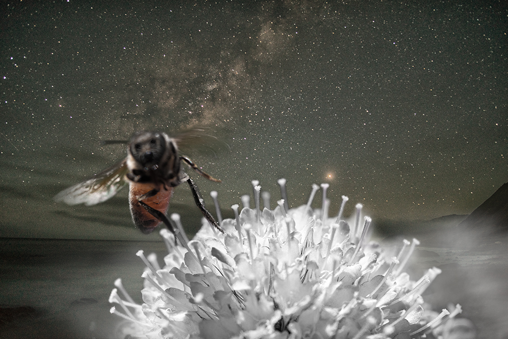
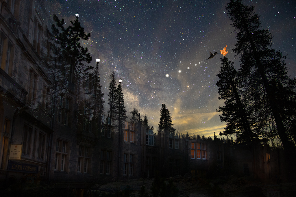
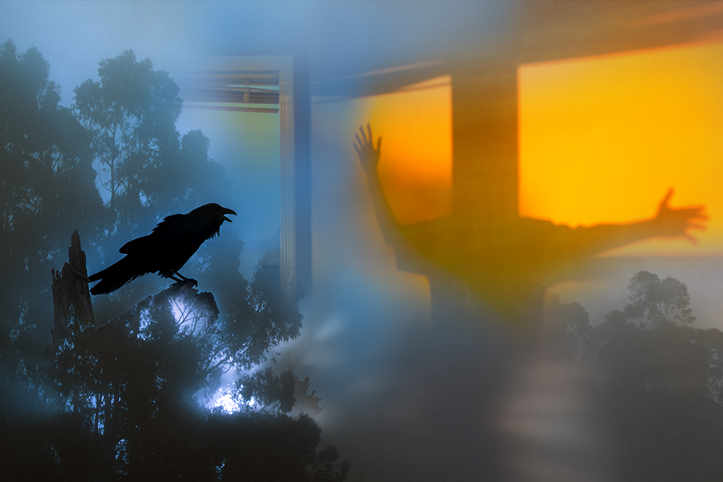
Aavo, I love Mono Lake. You've done a nice job creating a magical image here. My personal preference would be to handle this image in a more realistic way. You have a beautiful image of the lake and the tufas here. If you were to use real stars and add more of the original 1 lake image with a natural handling the of the tufas, I think that would be visually stronger. Nice job. |
Nov 12th |
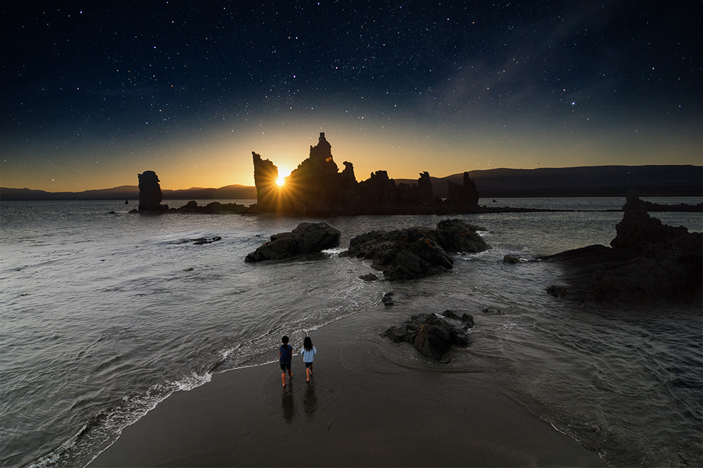
| 54 |
Nov 19 |
Comment |
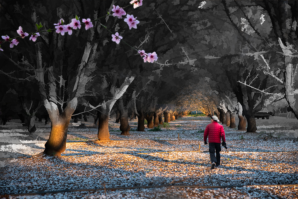
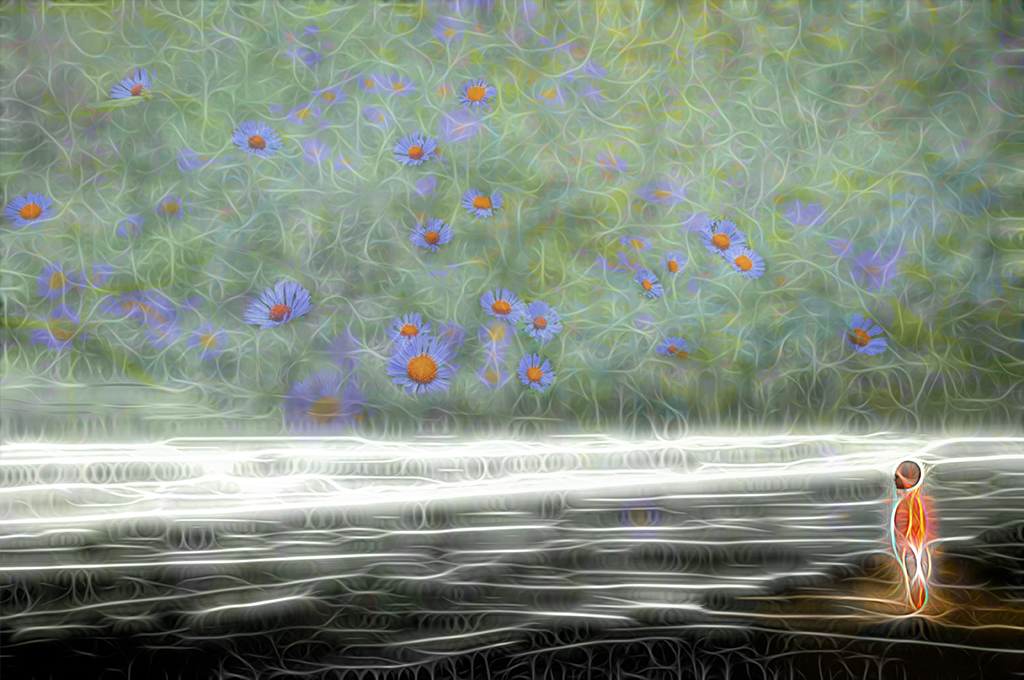
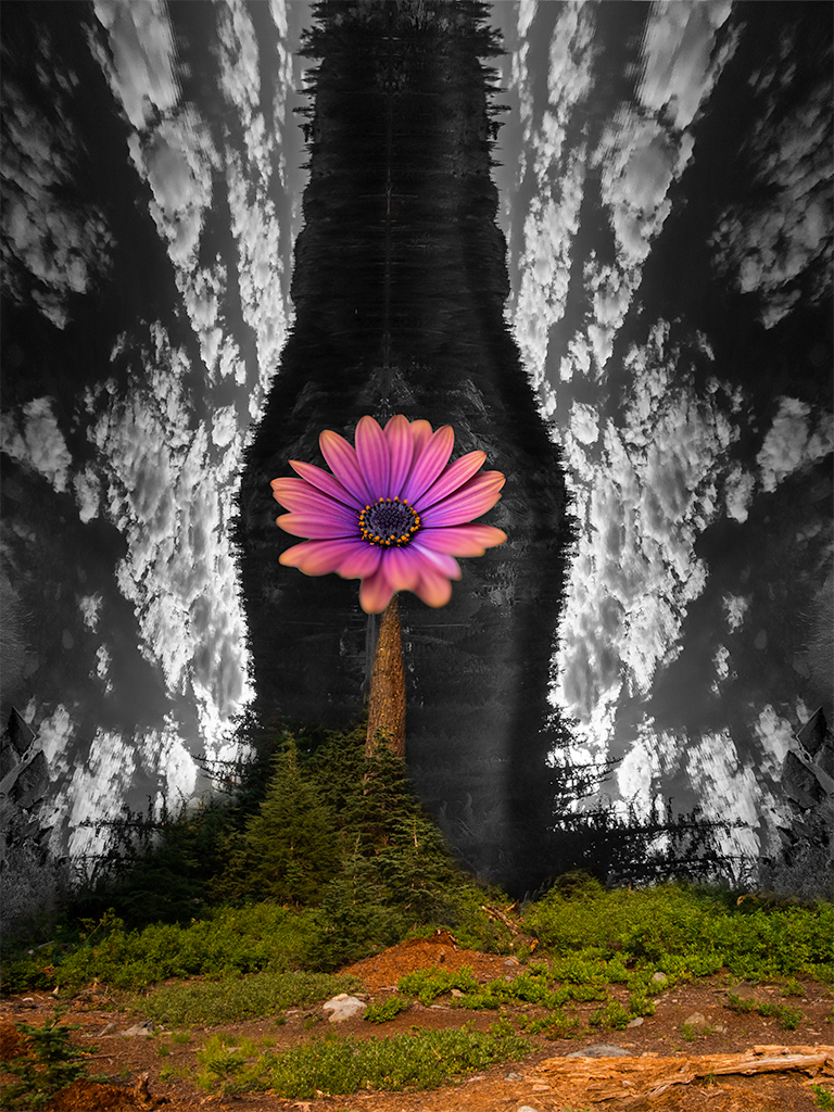
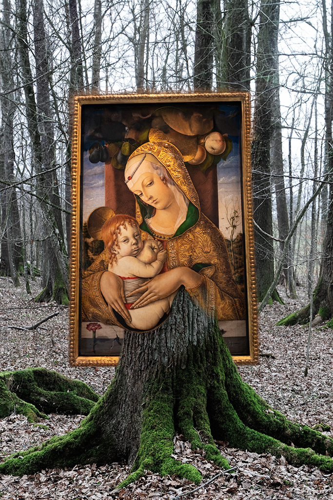
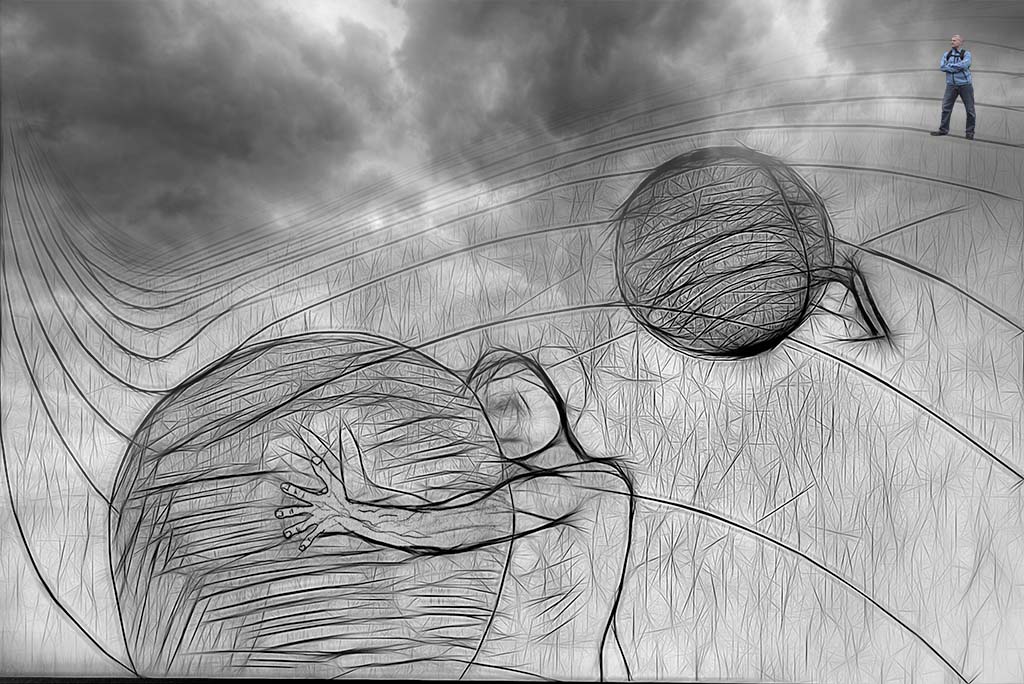
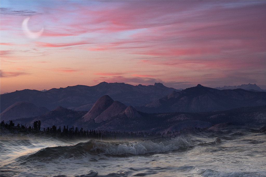
Peggy, This is wonderful. You've created a beautiful impressionistic image that is truly magical. Something about the size of the column does bother me a little as it competes with the beautifully handled subject of the mother in the image. I wonder if there were no column at all if the image would be even more pleasing. |
Nov 12th |
| 54 |
Nov 19 |
Reply |
Aavo, I have no intention with most of my images to be realistic anymore. I try for a certain level of believable. thanks for you comments. |
Nov 11th |
6 comments - 4 replies for Group 54
|
11 comments - 10 replies Total
|