|
| Group |
Round |
C/R |
Comment |
Date |
Image |
| 41 |
Sep 19 |
Reply |
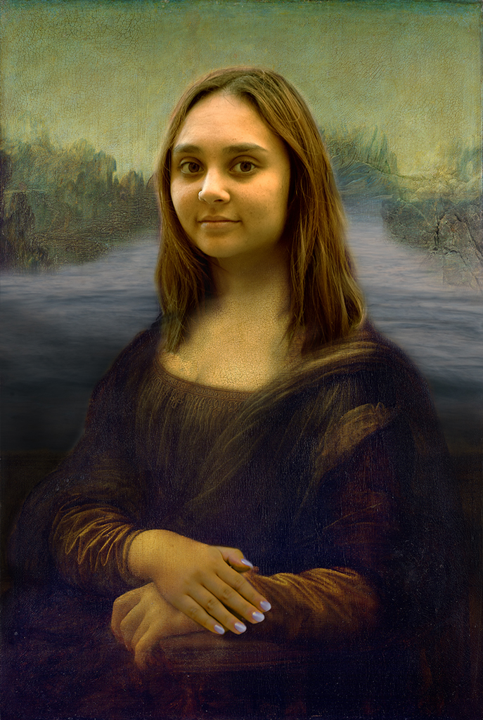
Nicely done. I like how it feels |
Sep 29th |
| 41 |
Sep 19 |
Comment |
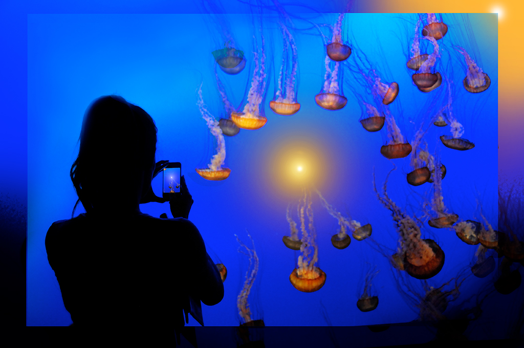
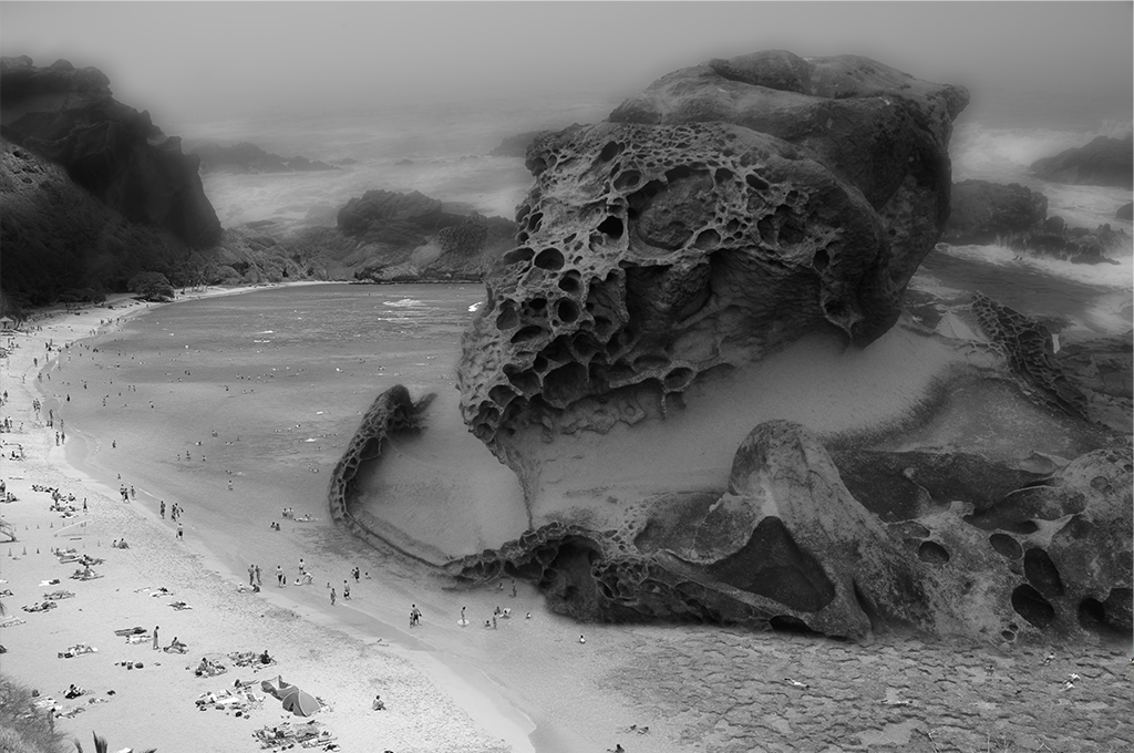
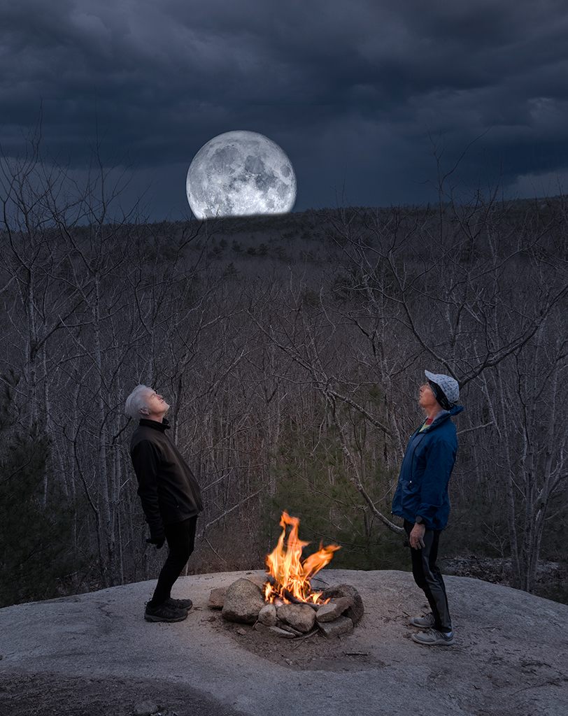
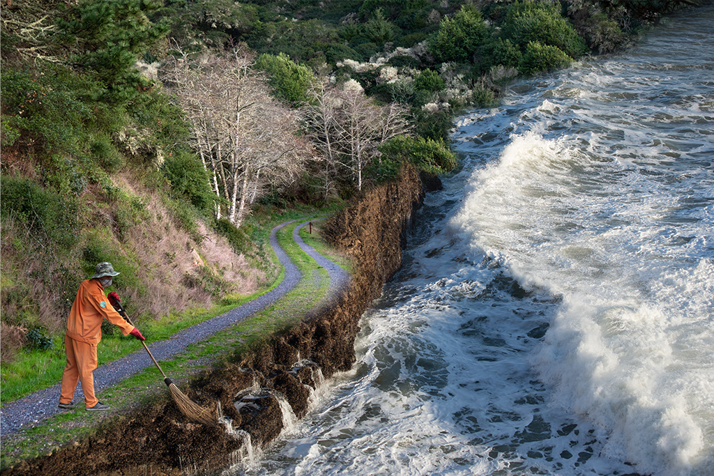
Thanks Jan. There seems to be a consensus on cropping and darkening the background. |
Sep 29th |
| 41 |
Sep 19 |
Comment |
Lisa, Thanks for your excellent suggestions. |
Sep 18th |
| 41 |
Sep 19 |
Reply |
Thanks Henry. Not sure if I missed your image this month. I don't recall receiving it from you. |
Sep 16th |
| 41 |
Sep 19 |
Reply |
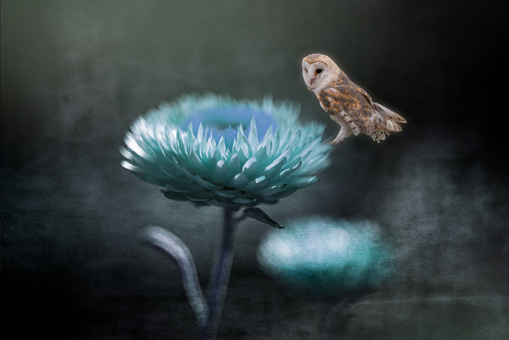
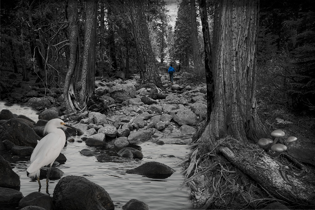
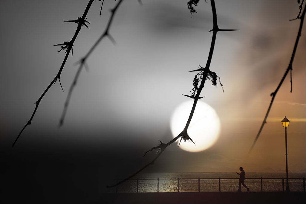
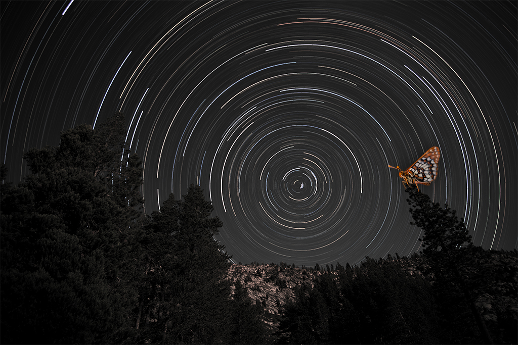
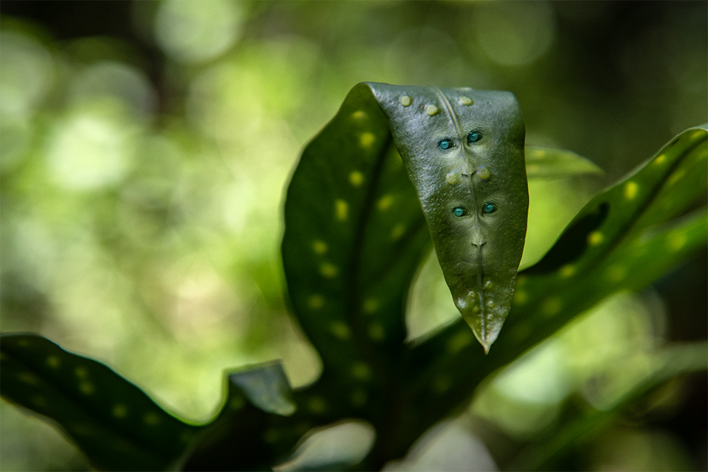
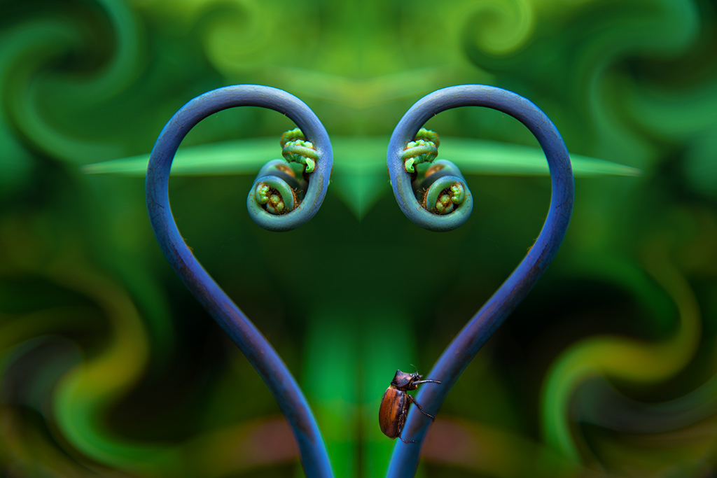
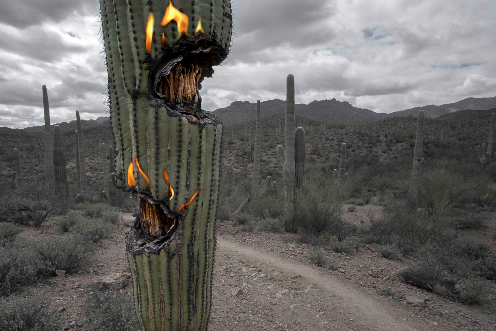
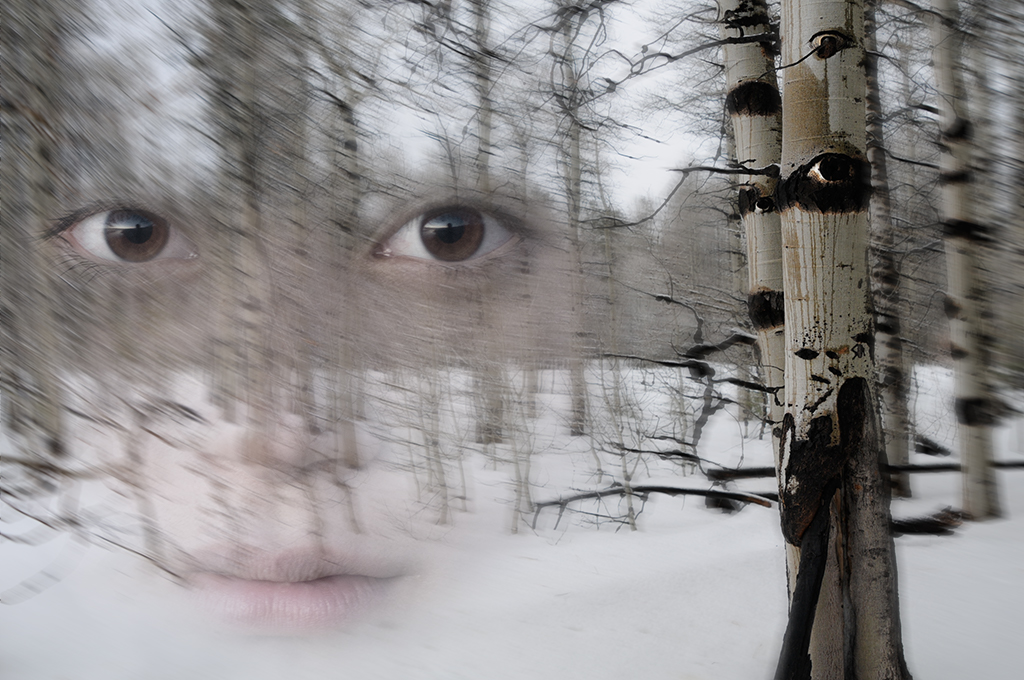
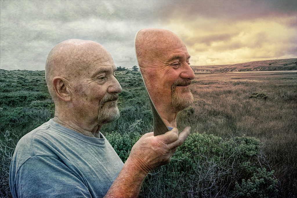
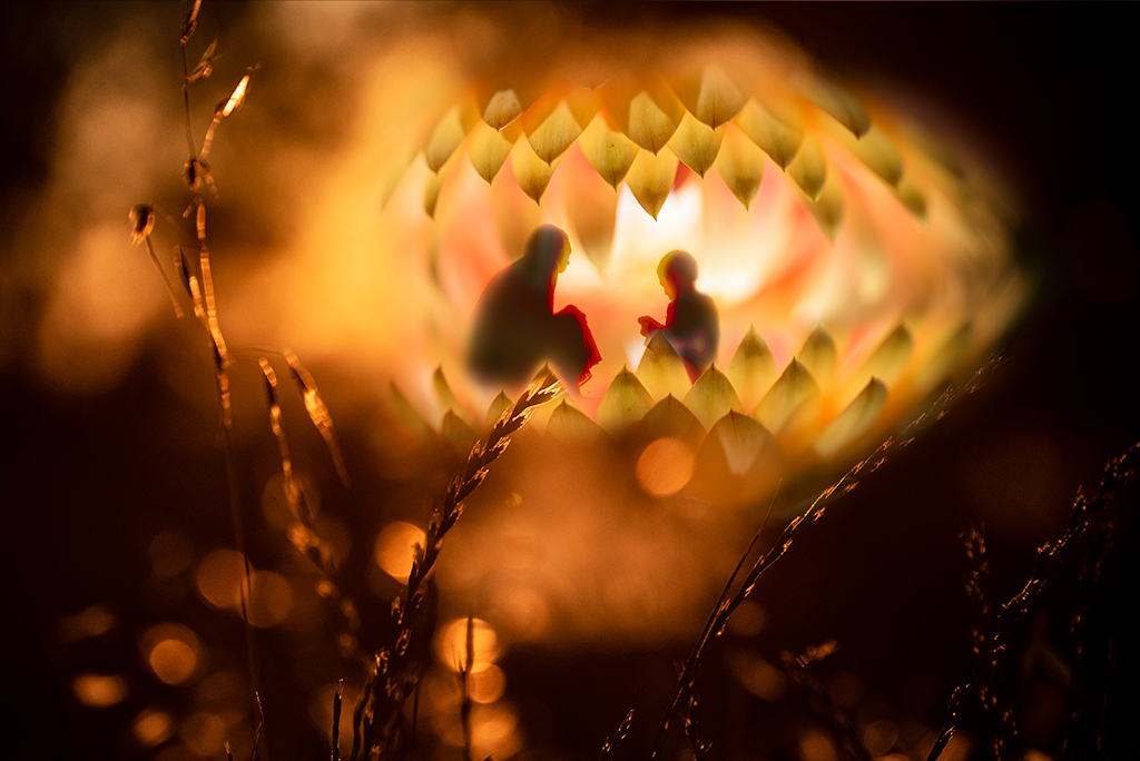
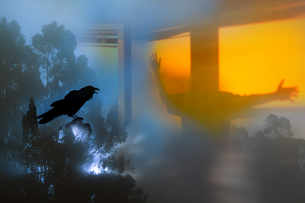
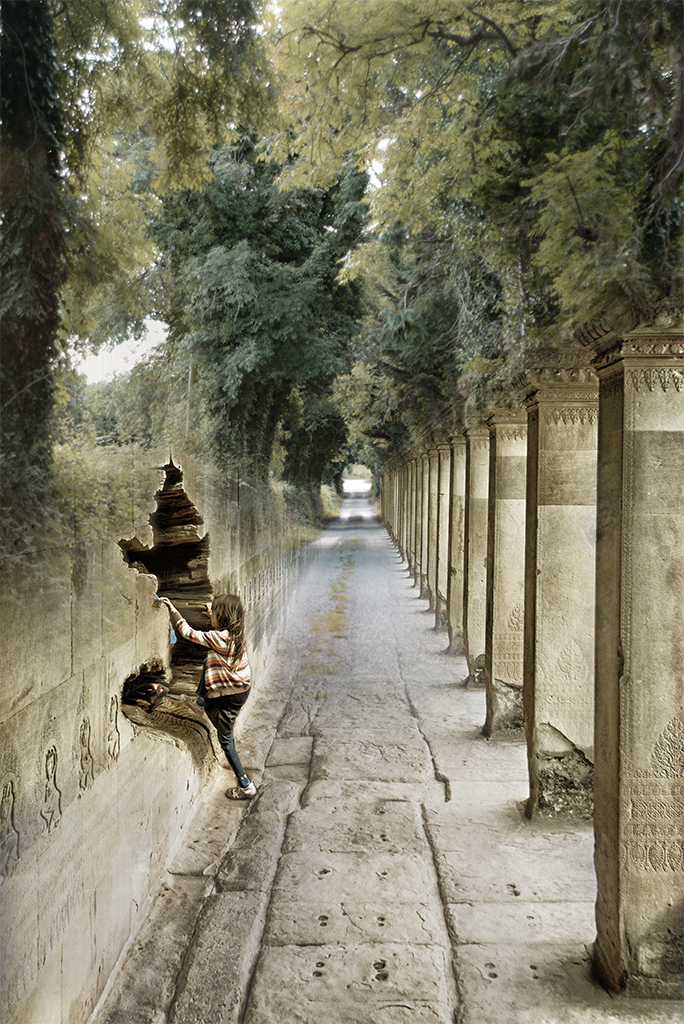
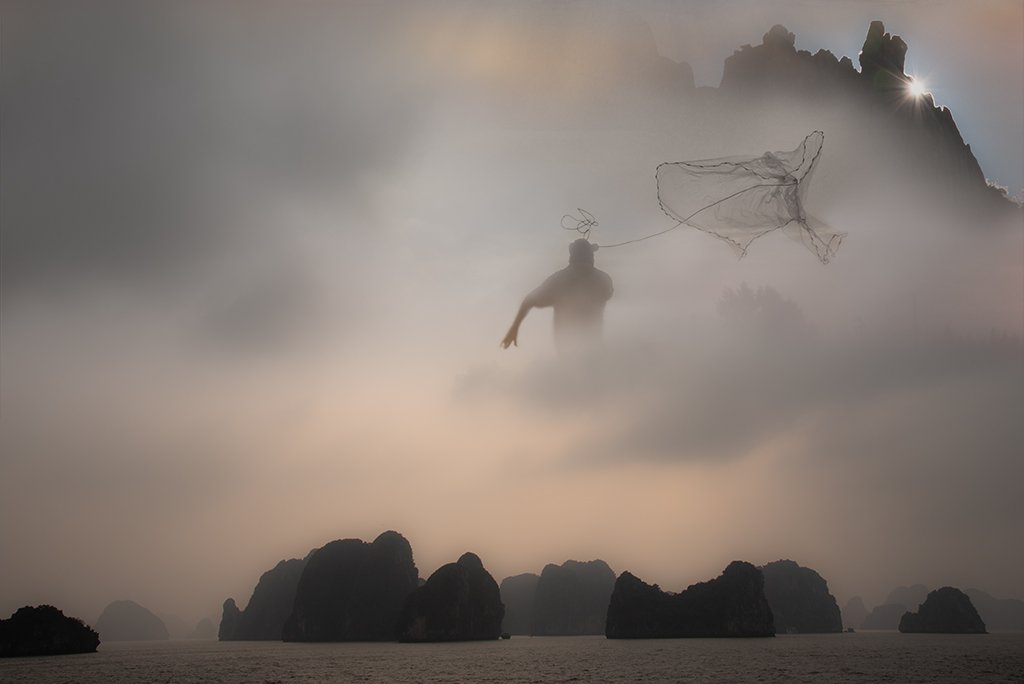
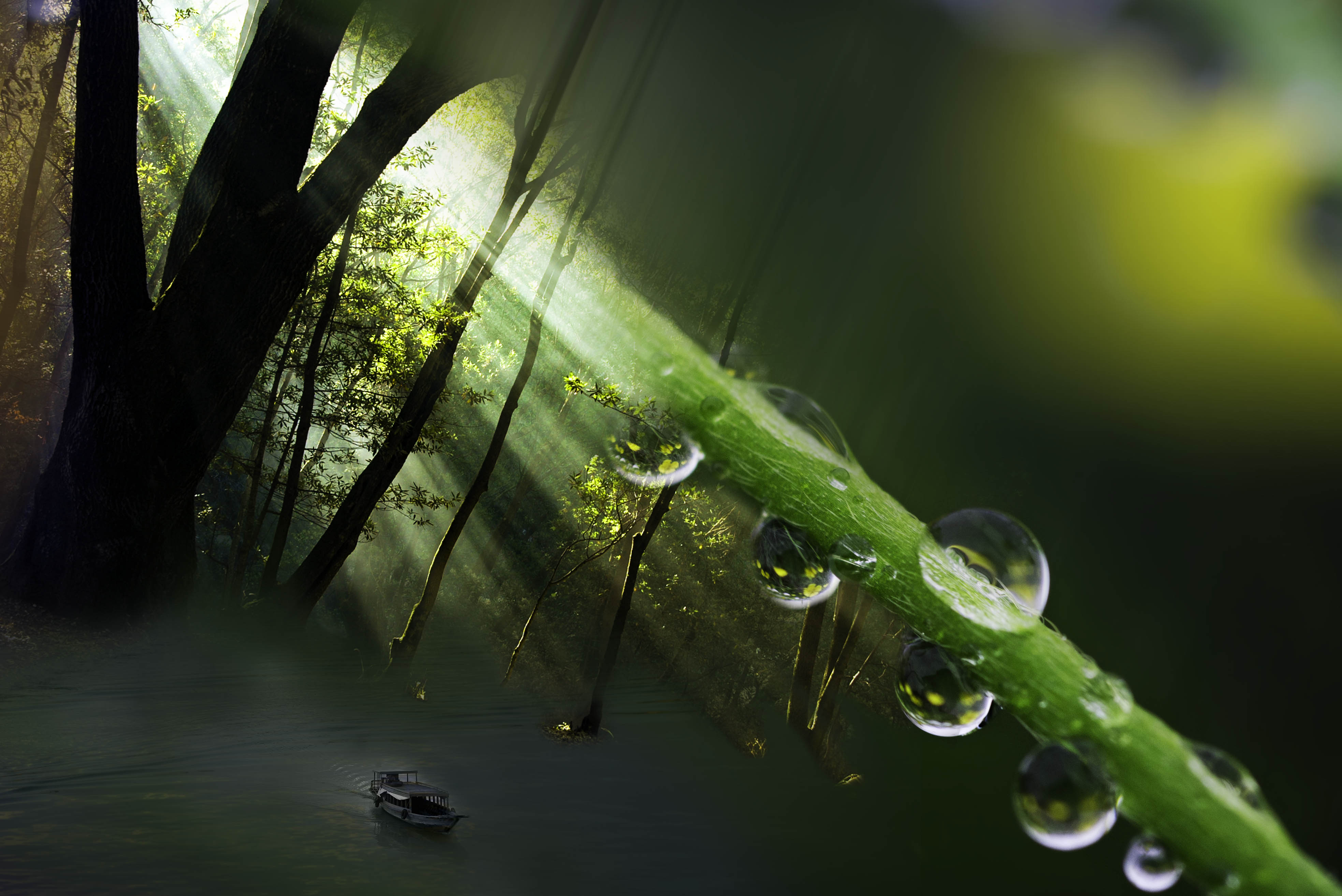
Ian, Thanks for your comments and visiting our site. Yes, I had thought about zooming in on the leave/eyes to emphasize and decided, at least in this iteration, to keep it smaller. I liked having the eyes/face less noticeable at first as there is a little more impact in discovering it later after wandering around the image. After reading your comments I agree I may want to go deeper into the darker more haunting quality that is implied in the faces on the leaf. Thanks for challenging me to go deeper. |
Sep 15th |
| 41 |
Sep 19 |
Comment |
I don't always make pretty pictures but I'm glad it affected you |
Sep 14th |
| 41 |
Sep 19 |
Reply |
Thanks Sue, I appreciate your comments |
Sep 13th |
| 41 |
Sep 19 |
Reply |
Both are good and have a different feel. |
Sep 11th |
| 41 |
Sep 19 |
Reply |
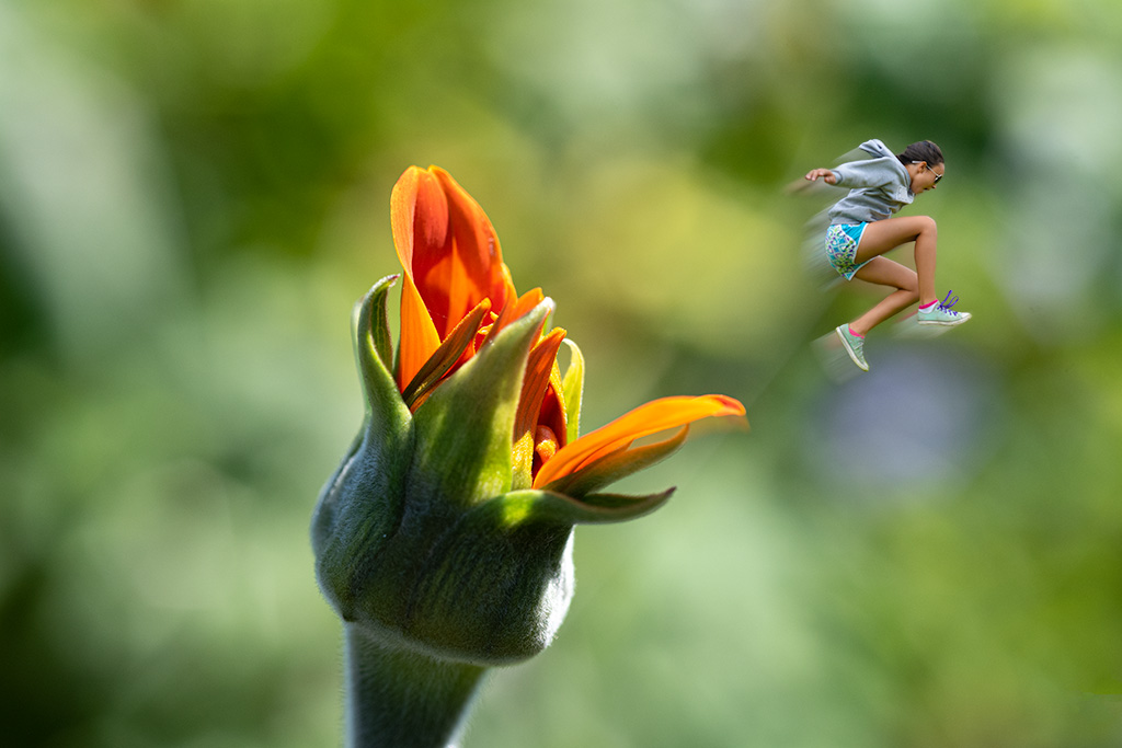
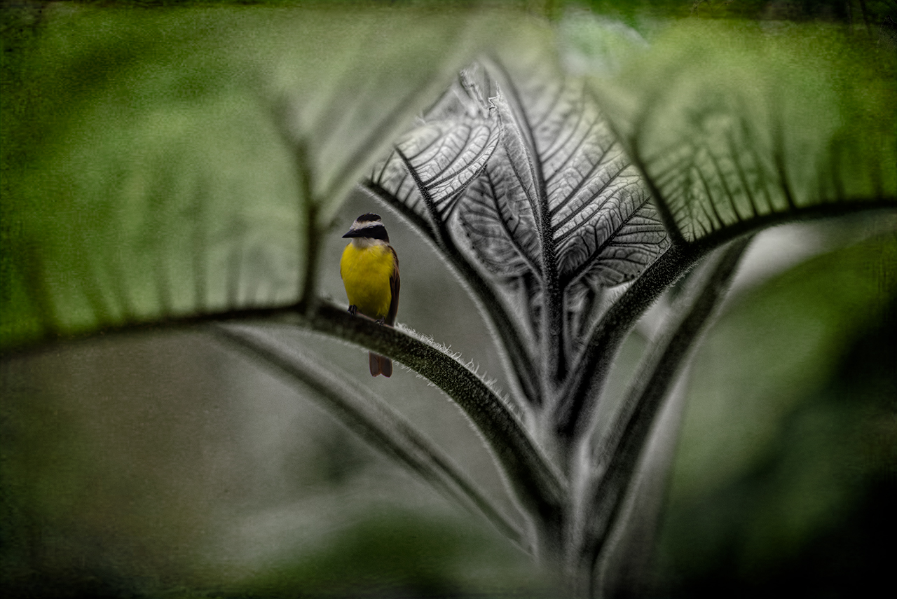
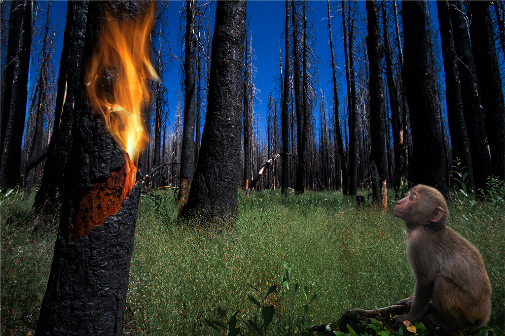
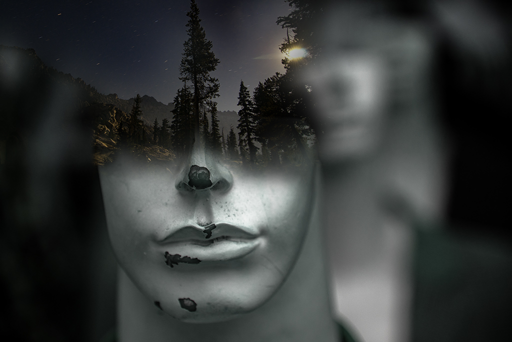
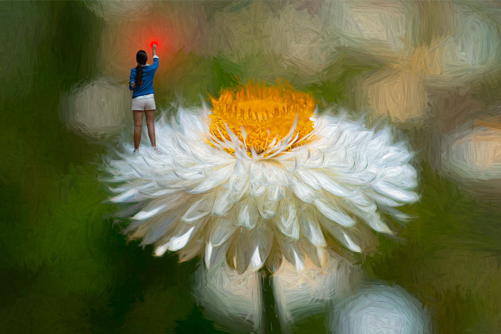
Angela, Thanks for your comments and visiting our group. I try not to think too much. I used to have everything figured out before I sat down at the computer. I now will bring up a picture that grabs me. I can take weeks staring at it and then thru juxtaposing it with other images I start to get a feeling. The spores on the plant looked eyes to me and the drape of the leaf felt animal like so that inspired me to dig into my archive of animals to play with that idea. About a year ago I spent a few months organizing all of my photos into all sorts of categories (flowers, animals, waterfalls, etc). That has allowed me to have a visual catalogue that I can now quickly access when an idea pops into my mind. Most ideas go nowhere but once in awhile something sticks. |
Sep 8th |
| 41 |
Sep 19 |
Reply |
Thanks Kathy. |
Sep 8th |
| 41 |
Sep 19 |
Comment |
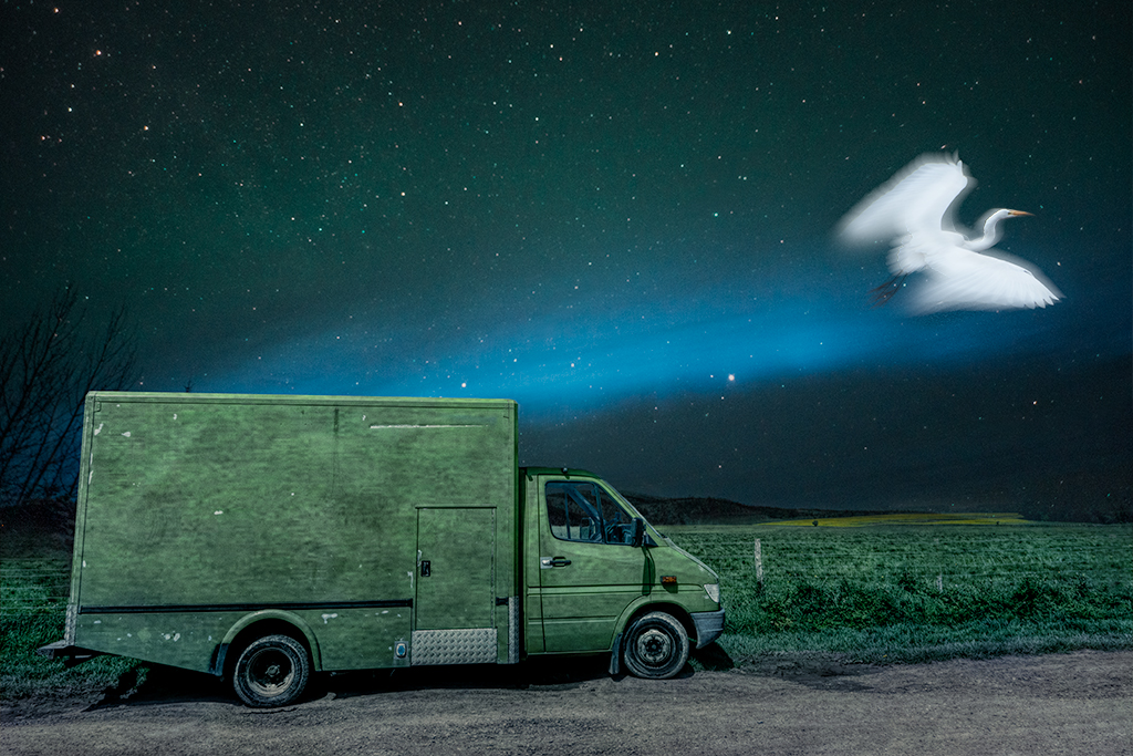
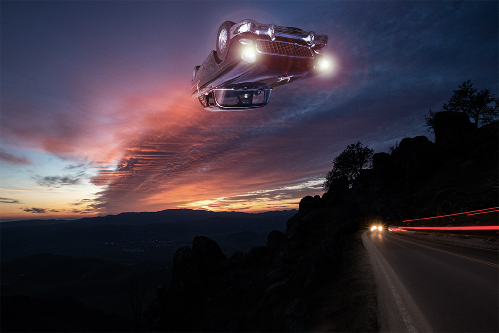
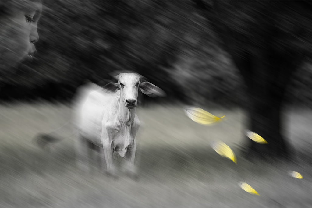
Lisa, This is a very interesting departure from your usual images. You've created a very provocative image. I love how you've handled the colors on the background and car. The placement of the birds on a wire and the poop create a very artfully balanced image. I thought about this image quite a bit as I realized it is the opposite of what we usually do with photoshop. Putting bird poop on the car instead of removing it is very clever. |
Sep 7th |
| 41 |
Sep 19 |
Comment |
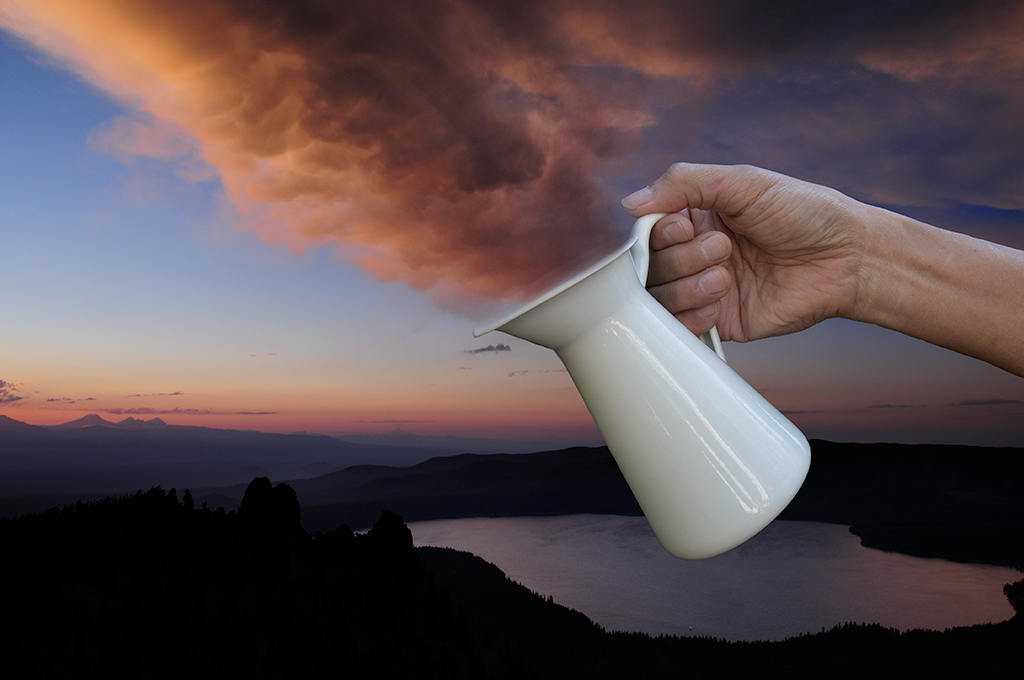
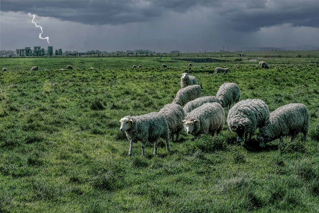
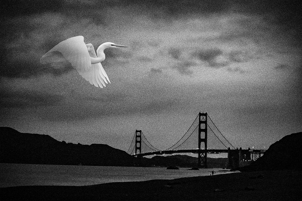
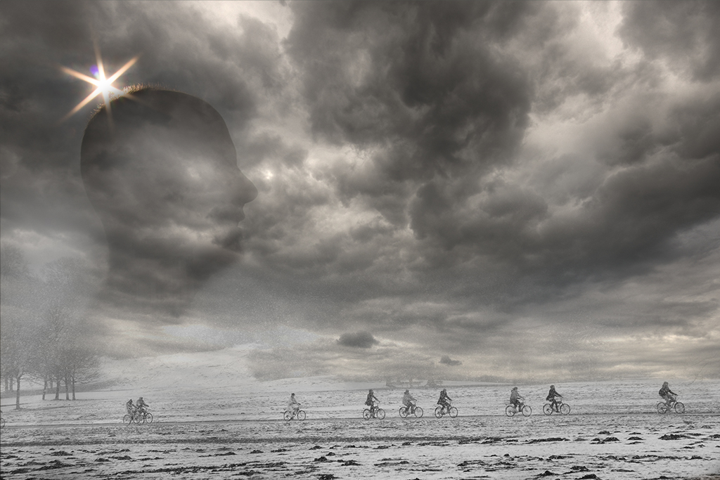
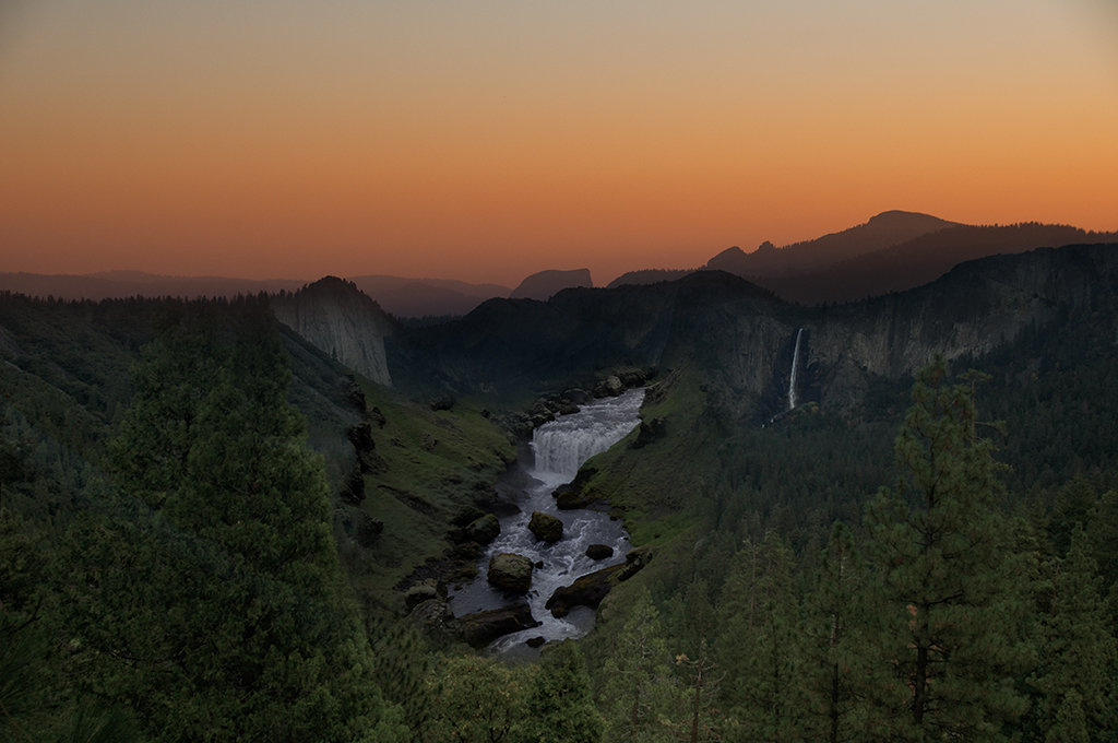
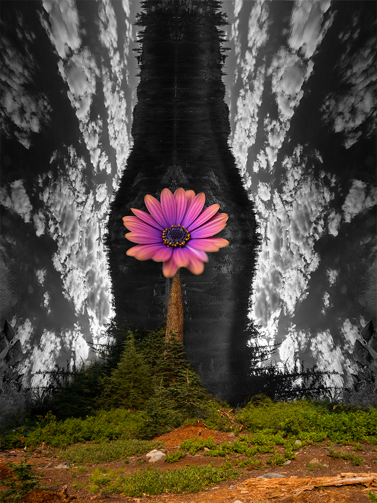
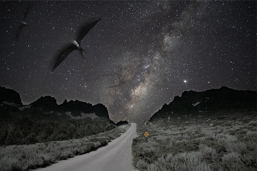
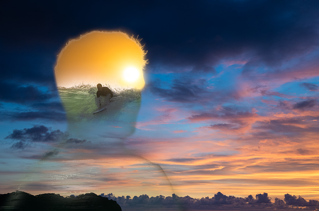
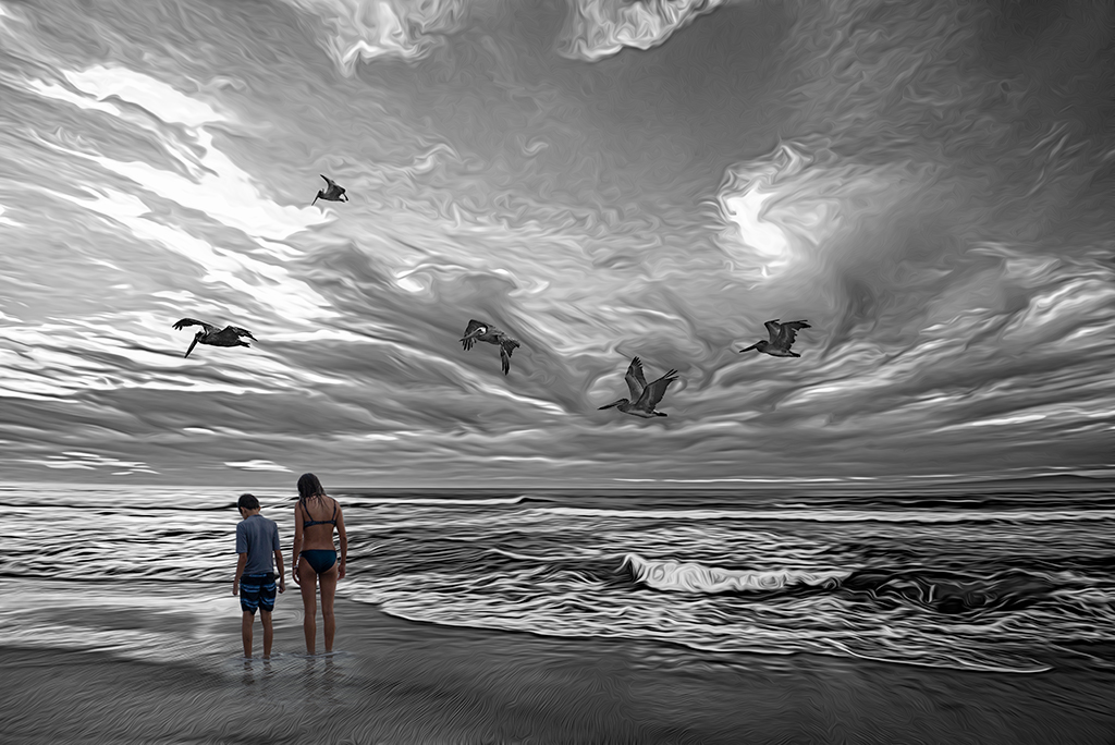
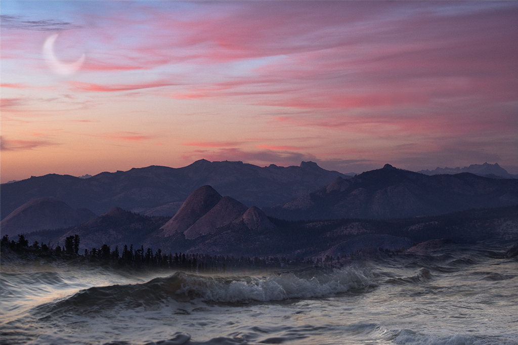
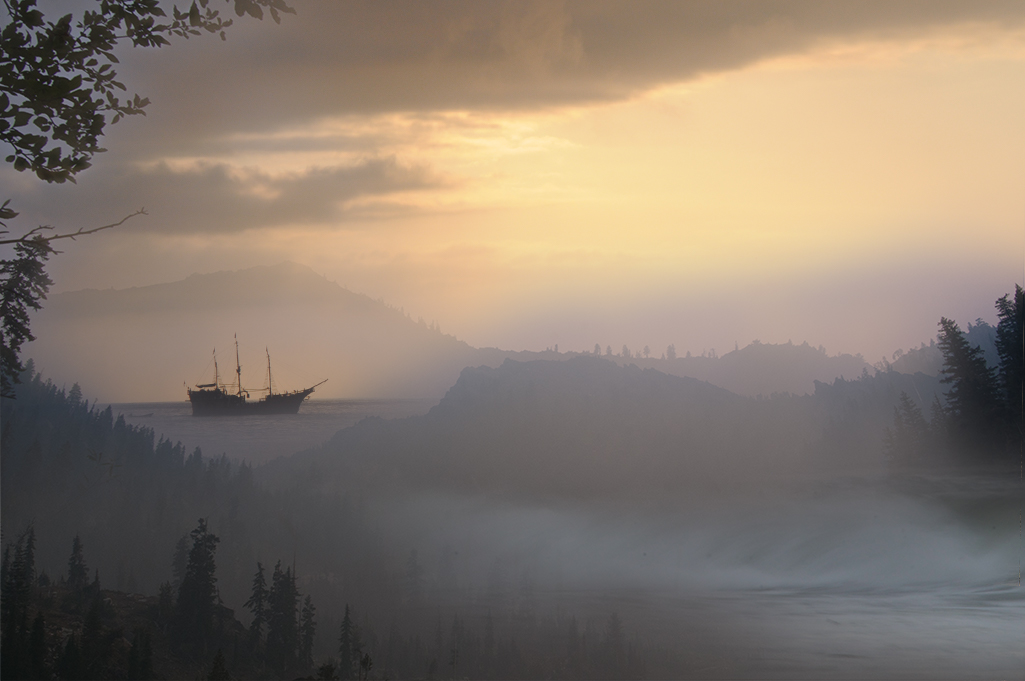
Jan, This is really well done. How did you create the texture on the clouds? |
Sep 7th |
| 41 |
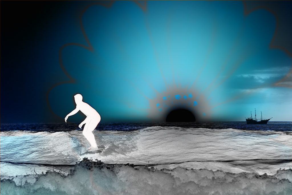
Sep 19 |
Comment |
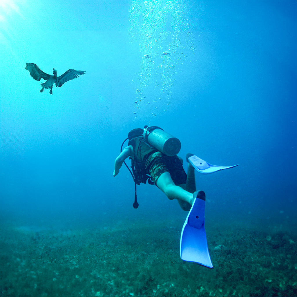
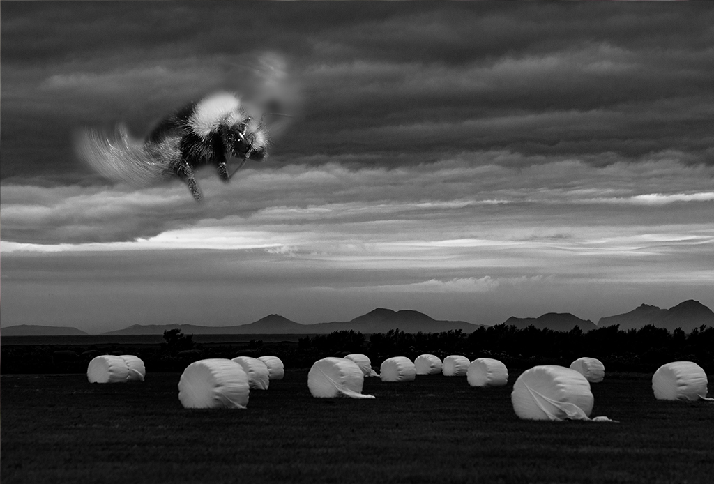
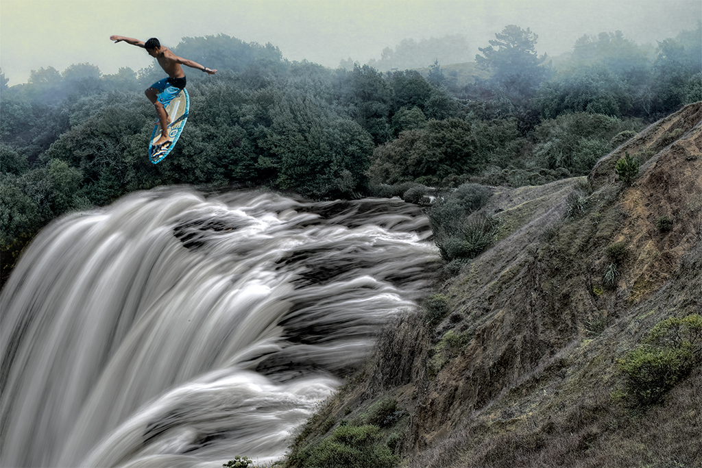
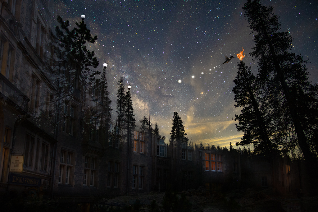
Sue, You've created another very fun composite. If it were possible it would be fun to tie in the theme from his swimsuit in the photo although a flying shark might be a little odd. |
Sep 7th |
| 41 |
Sep 19 |
Comment |
Maryellen, All I can say is every kid should have a grandmother like you. This card will likely be a keeper for him for life. |
Sep 7th |
| 41 |
Sep 19 |
Comment |
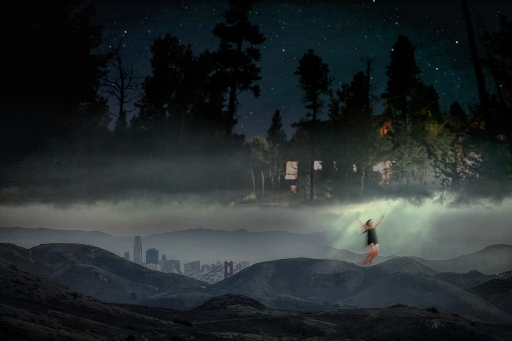
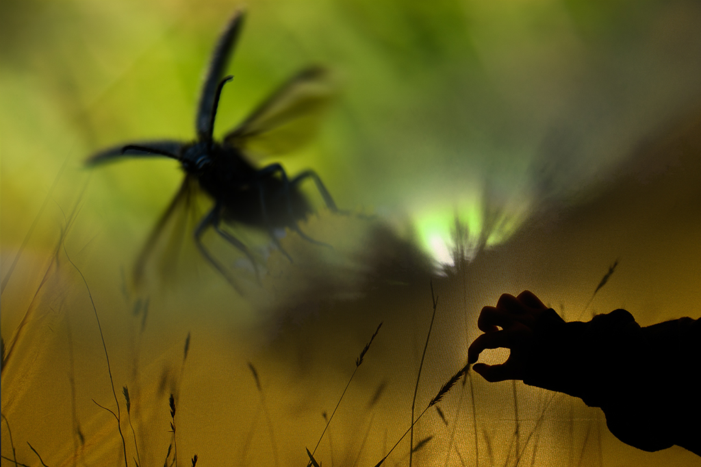
Kathy, I like the energy, light and movement in this image. The idea and your execution are excellent. I like how you have the light glowing above the fairy. It may be a personal taste thing but having her hand cut off is distracting for me. Nice job! |
Sep 7th |
| 41 |
Sep 19 |
Reply |
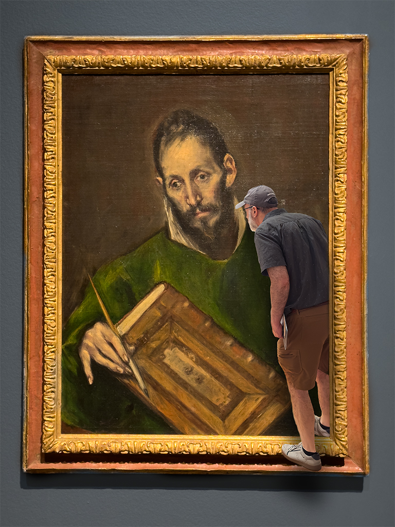
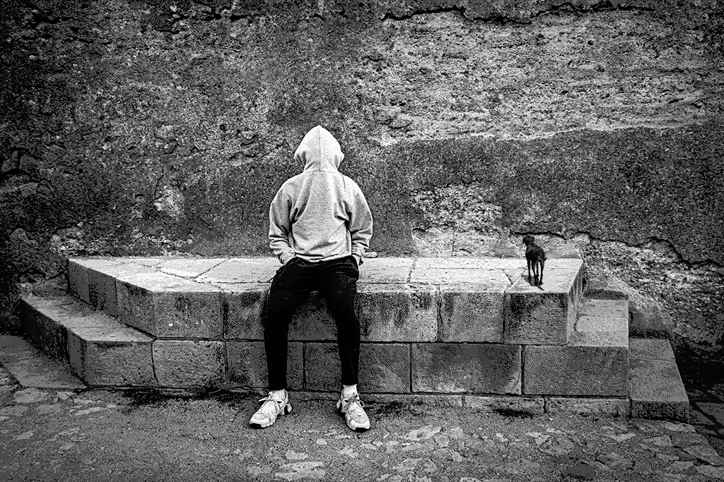
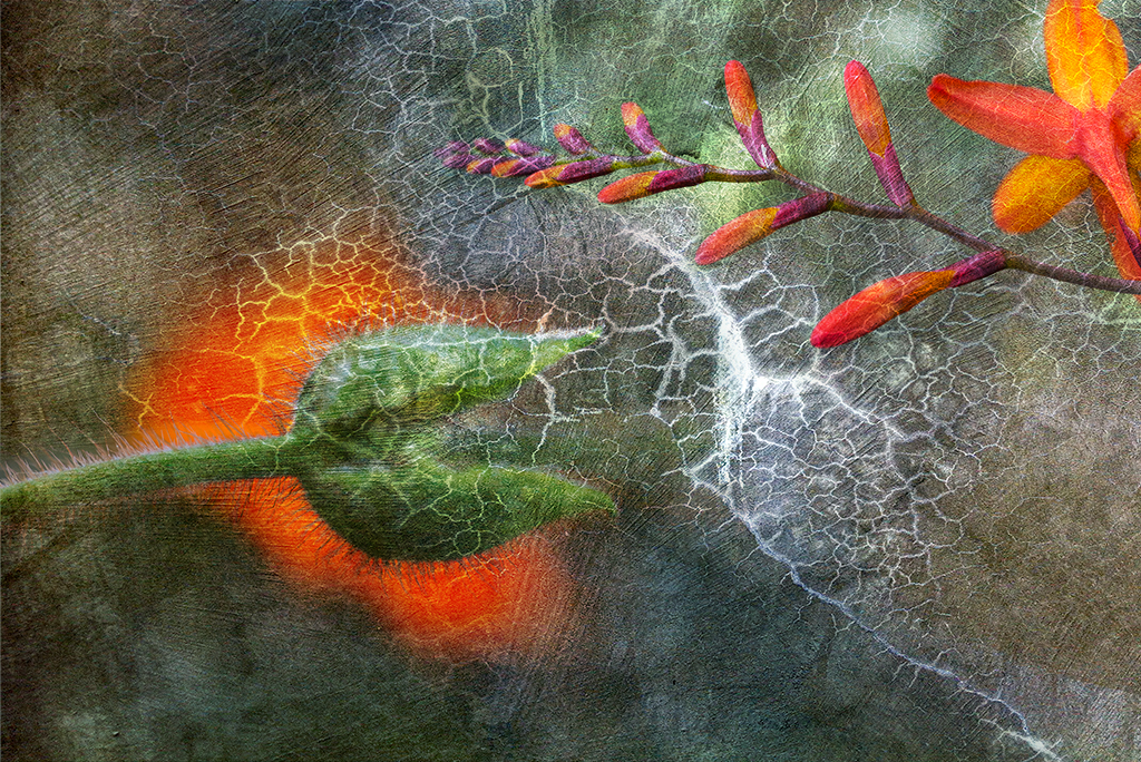
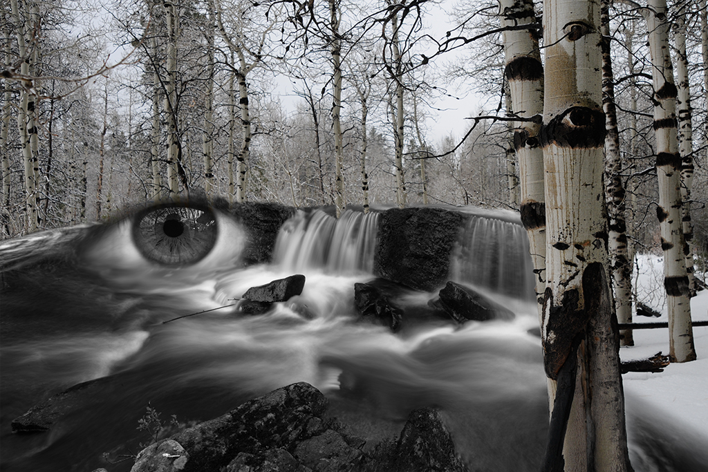
Mark, Thanks for visiting our page and for your comments. I played around quite a bit with one face, both the upper and lower. Even though I thought it would look better with one it looked better with two to me. The repetitive sori on the ferns reinforced the idea that a repetitive face may work. I did struggle with that a lot. You should definitely play with photoshop if you get a chance, it opens up the possibilities infinitely |
Sep 3rd |
8 comments - 8 replies for Group 41
|
| 54 |
Sep 19 |
Reply |
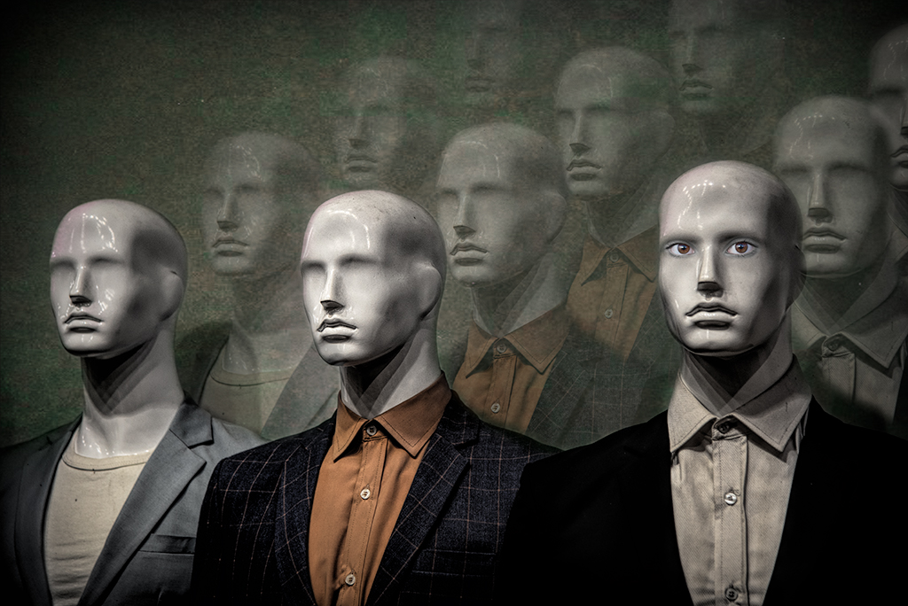
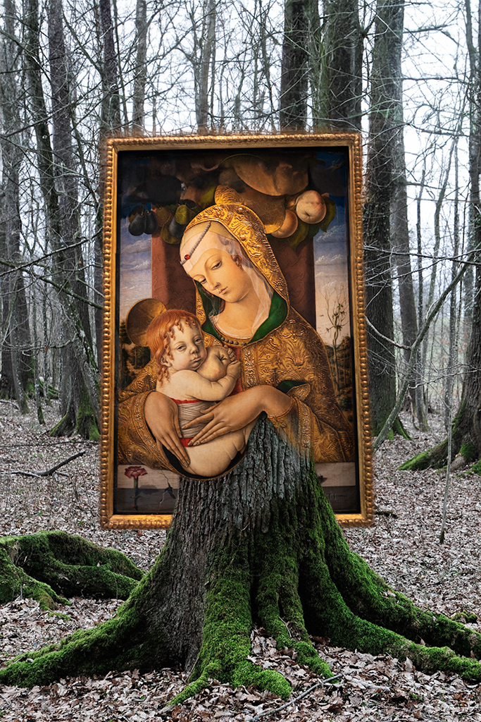
Aavo, Sorry I didn't see your response. It you want to have someone get a message that you've replied you should hit the reply tab under their message and it will then go directly to them. It doesn't look like anything happens as you still have to type in the box below. Anyway, it looks like you've gotten some good feedback. I like Peggy's background as it creates a Leonardo DeVince type effect. The models hand stretching up to the apply is so striking. I would try to focus attention on that section of the image by downplaying the background |
Sep 25th |
| 54 |
Sep 19 |
Reply |
Peggy this is a wonderful suggestion. It has a whole different feel. I will play with it and share my final product |
Sep 25th |
| 54 |
Sep 19 |
Comment |
Peggy, You've succeeded in your composition but I have to say the original image of the frog has more impact than this composition to me. I have often tried to improve on an original only to look back and realize it was complete as it was. My entry this month is a good example of that. |
Sep 24th |
| 54 |
Sep 19 |
Comment |
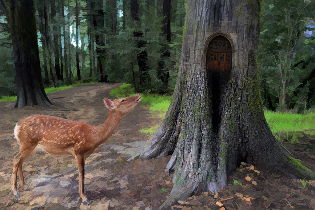
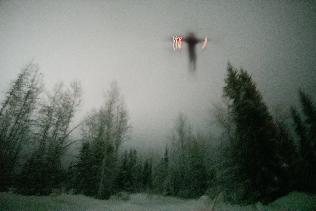
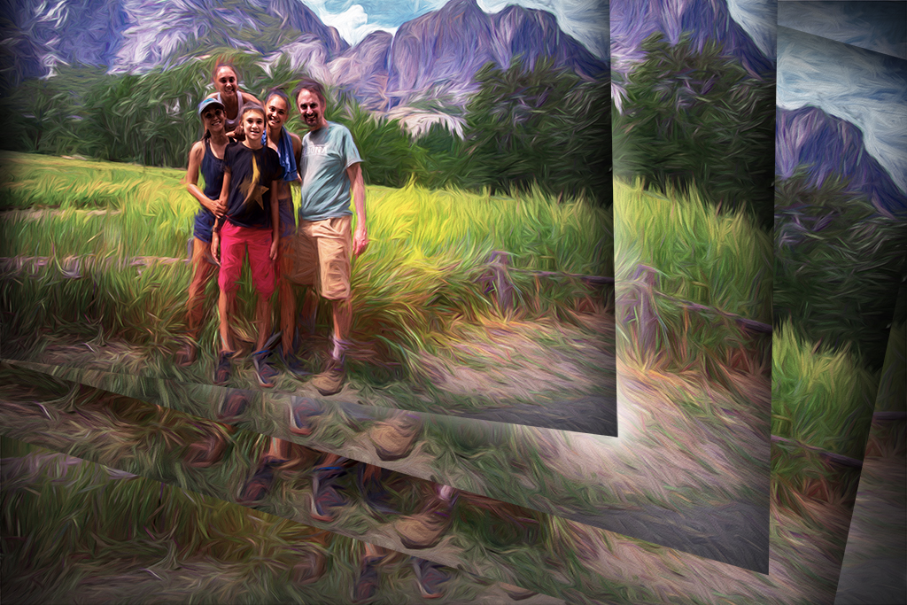
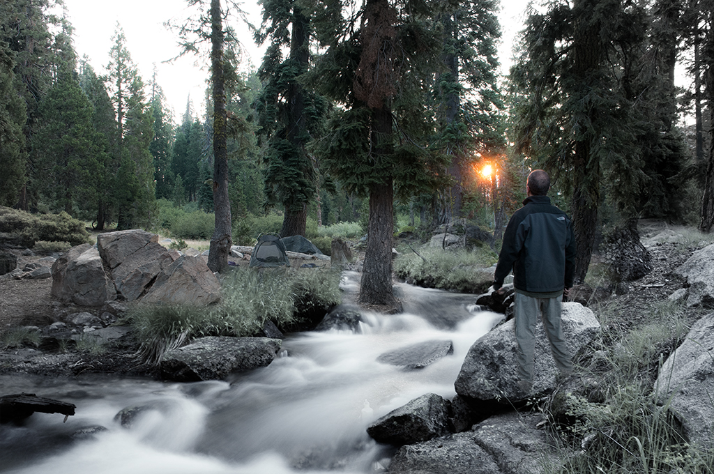
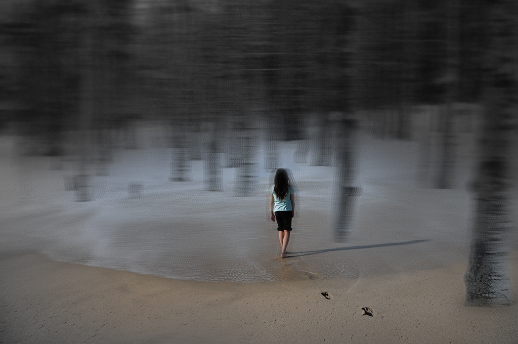
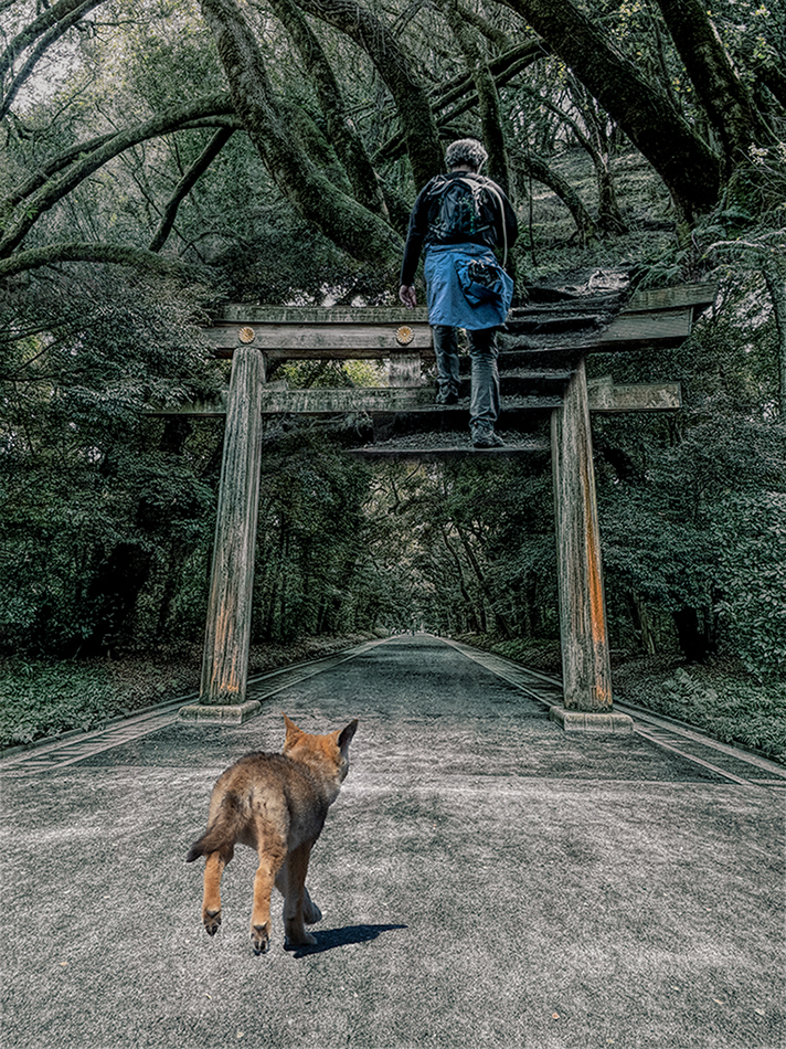
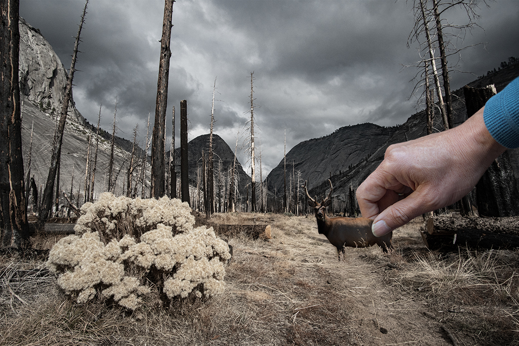
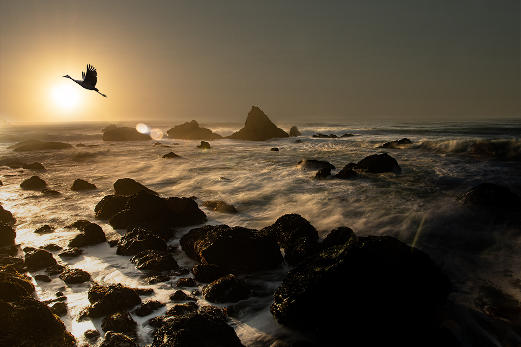
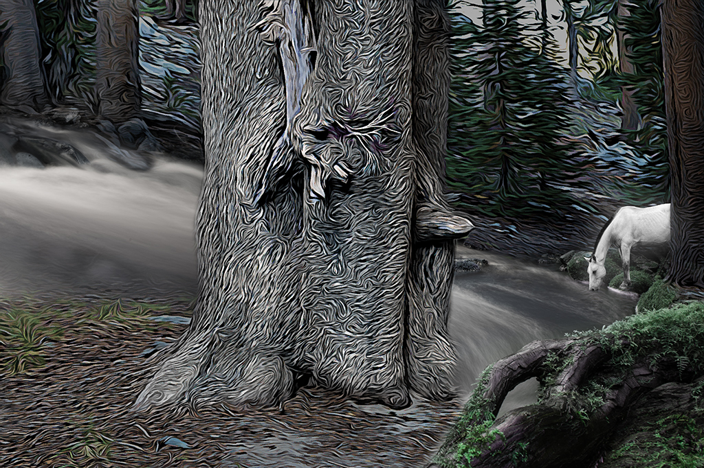
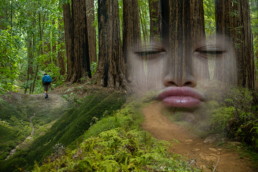
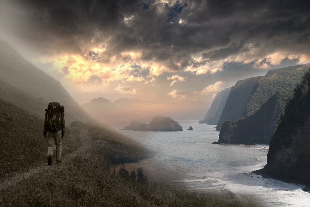
Alan, Thanks for your thoughts. It seems the consensus is the overlay of my son's face detracts from the image. I'm sure you've had images you tried to do something and eventually realized it just didn't work. I agree we need to respect the woods and accept it is hard to capture sometimes. My initial idea was to have a foreground element and I may try placing an image of my son in the right lower corner capturing the beginning of the adventure. |
Sep 24th |
| 54 |
Sep 19 |
Reply |
Betty, Thank you for your feedback. I was considering scrapping the face on the left entirely. I may try adding a foreground element on the front right to create a different message. I agree with you, the original image of my son with the big trees next to him has a beauty all by itself. |
Sep 16th |
| 54 |
Sep 19 |
Reply |
Thanks Aavo. I appreciate the feedback. |
Sep 16th |
| 54 |
Sep 19 |
Comment |
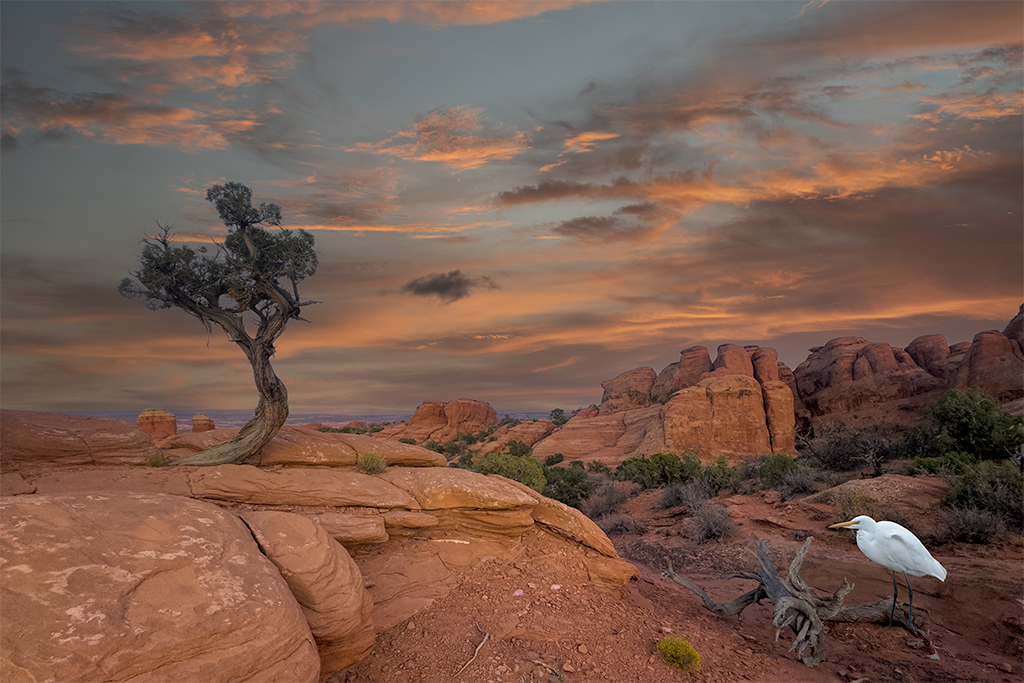
Alan, I like what you've done with the desert. The grey tones draw our attention more to the figures in the foreground. The triangulation of the three main figures creates tension and suggests a story without insisting on the meaning. Nicely done. |
Sep 8th |
| 54 |
Sep 19 |
Comment |
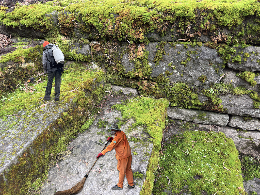
Betty, I like the texture you've created for the rocks. The fall color on the leaves do add a nice splash of color. The spider doesn't add a lot of impact for me as its size, contrast and positioning make it hard to spot. I think the image might be stronger if you got rid of the leaf and made the spider the main focus of the image, and made it larger. |
Sep 8th |
| 54 |
Sep 19 |
Comment |
Aavo, The message is very clear here. I wonder if you added a little mystery to the story as it doesn't challenge the viewer to go deeper into the message. The tree woman and apple all appear unreal. If you are trying for realism it would take more work to blend. If you are trying to capture something more magical you may want to take it a bit further. |
Sep 8th |
5 comments - 4 replies for Group 54
|
13 comments - 12 replies Total
|