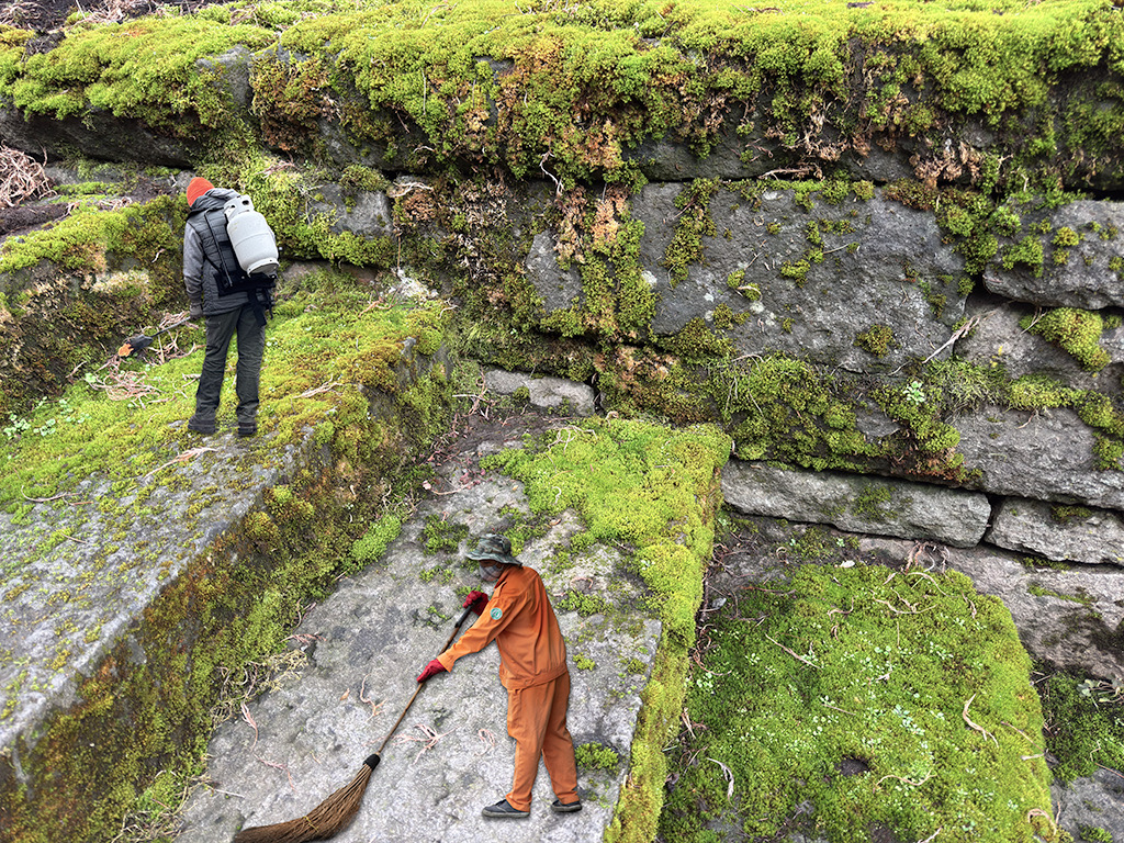
|
| Group |
Round |
C/R |
Comment |
Date |
Image |
| 3 |
Jun 19 |
Comment |
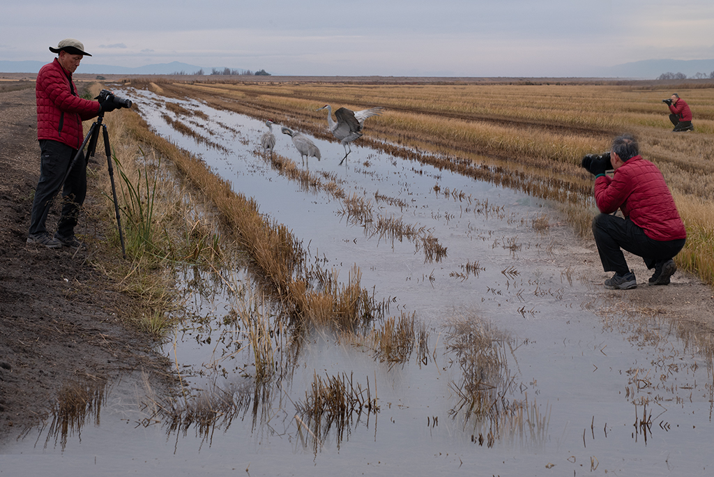
Wonderful portrait. You've really captured the personality of this frog. |
Jun 16th |
1 comment - 0 replies for Group 3
|
| 41 |
Jun 19 |
Reply |
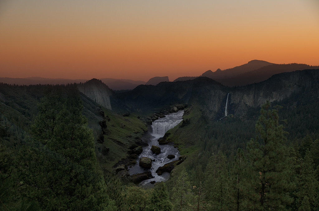
Lisa, Thanks for your feedback. I believe I fixed the brightness problem at the horizon in my revised image that I shared with Sue and I did the best I could with the horizon issue. I like your idea for another image blending 2 and 3. |
Jun 26th |
| 41 |
Jun 19 |
Reply |
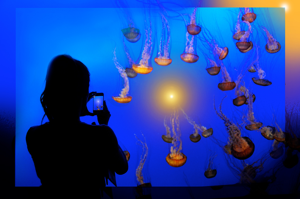
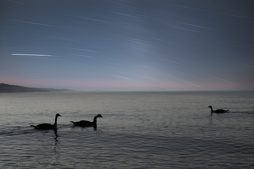
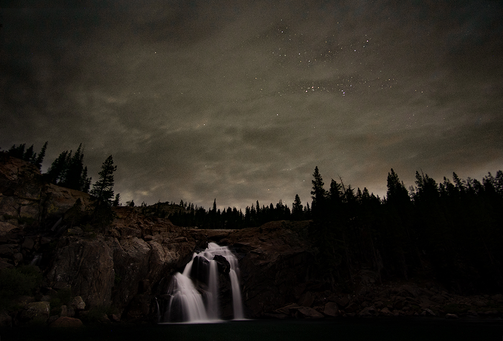
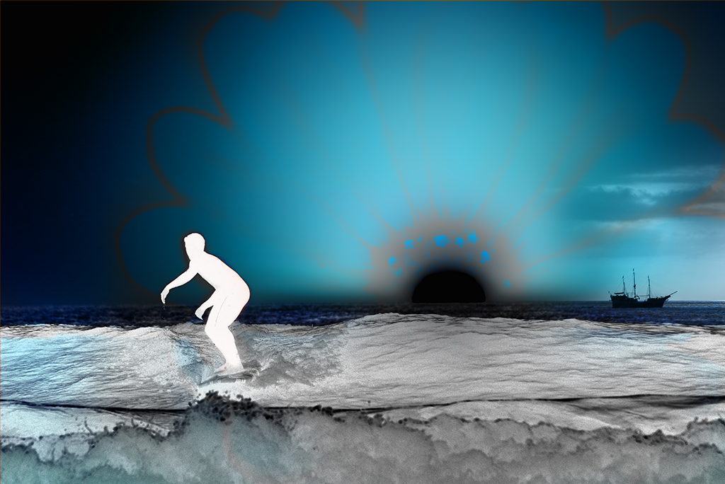
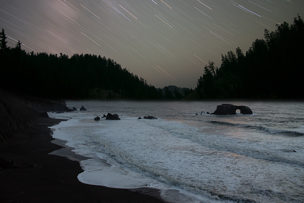
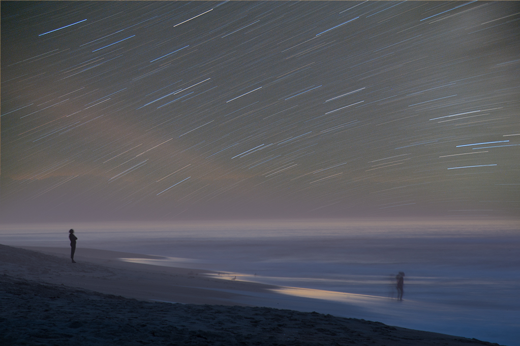
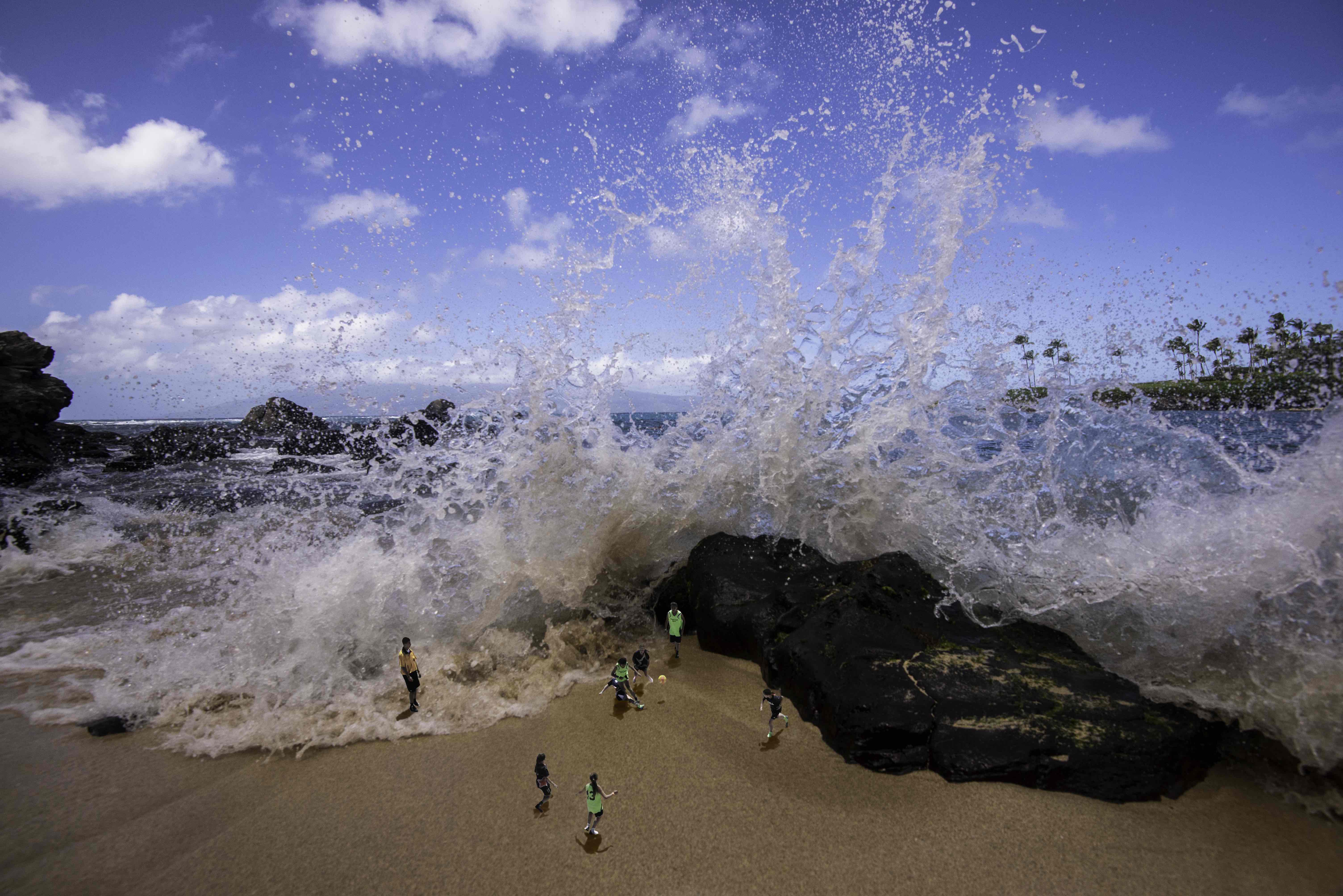
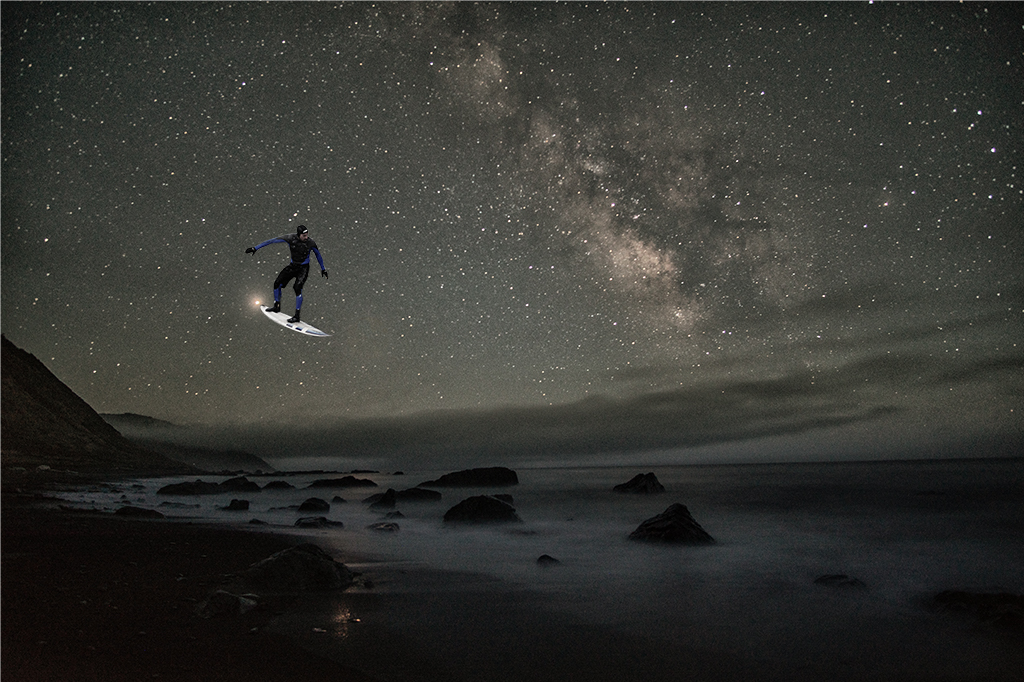
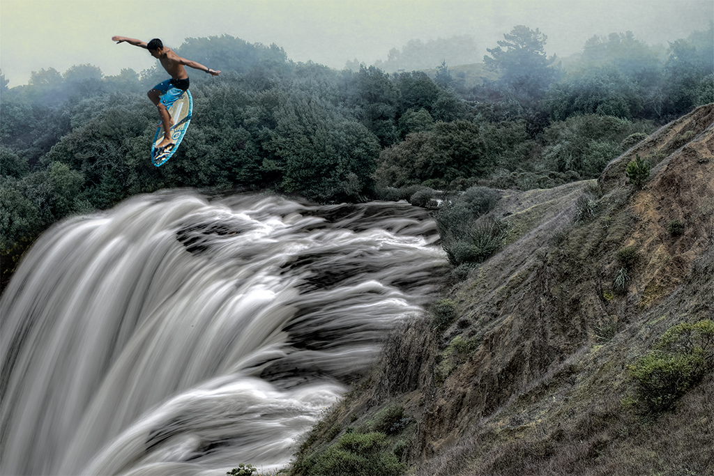
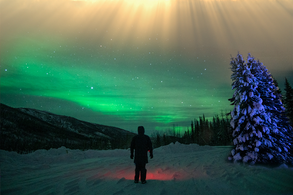
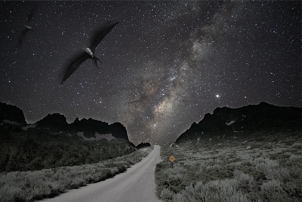
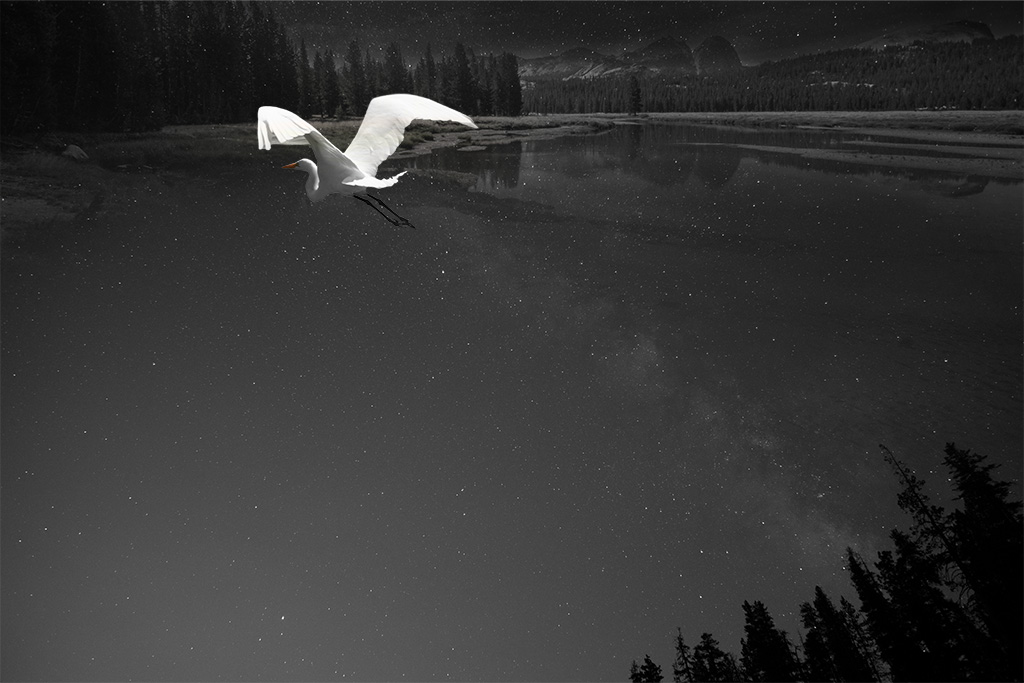
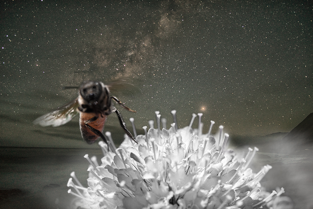
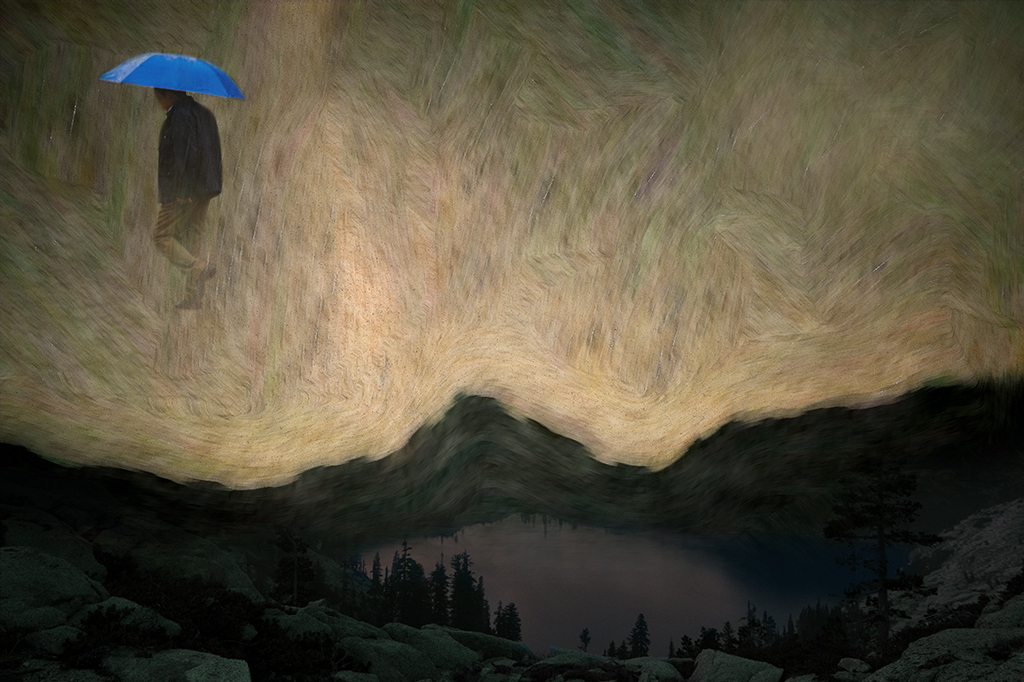
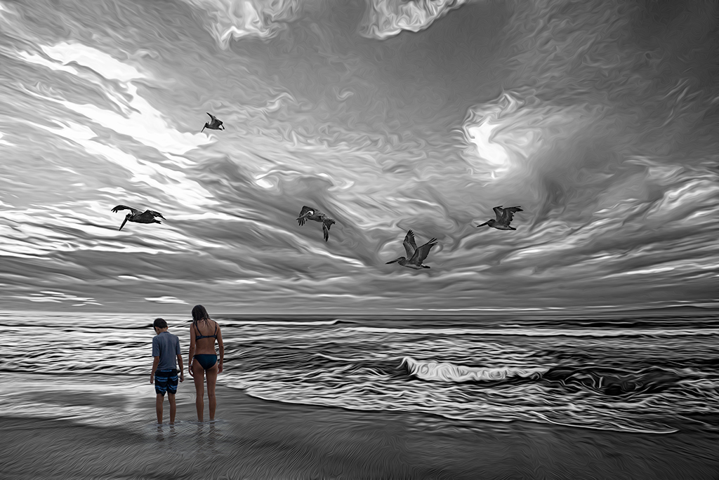
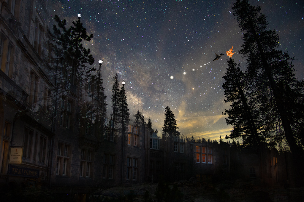
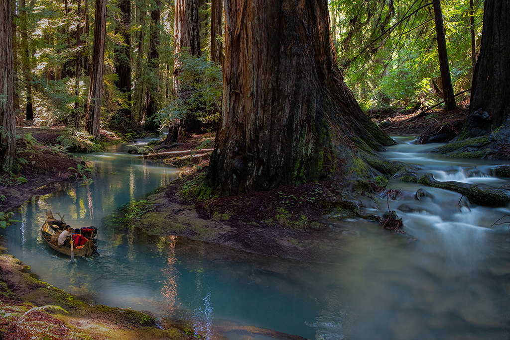
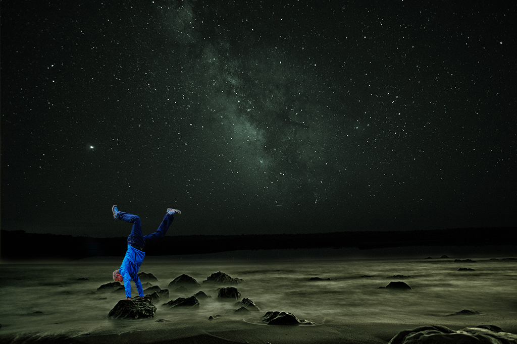
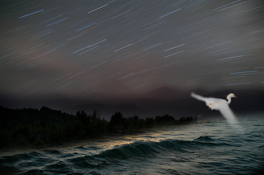
Henry, Thanks for the feedback. It's funny how different images affect people differently. I thought last months image was more interesting as it isn't every day people see start trails as they look into the ocean. Maybe it is the simplicity of this image that works. |
Jun 18th |
| 41 |
Jun 19 |
Reply |
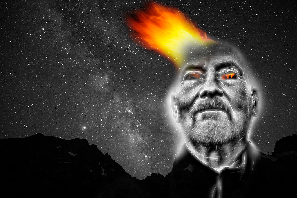
Maryellen, I didn't see your reply as you didn't add it as a "reply". If you want someone to be notified of your response click on the reply button next to their comments in the future.
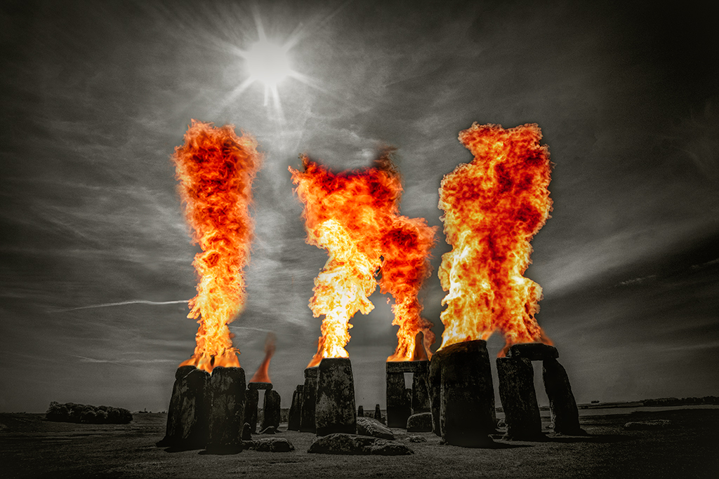
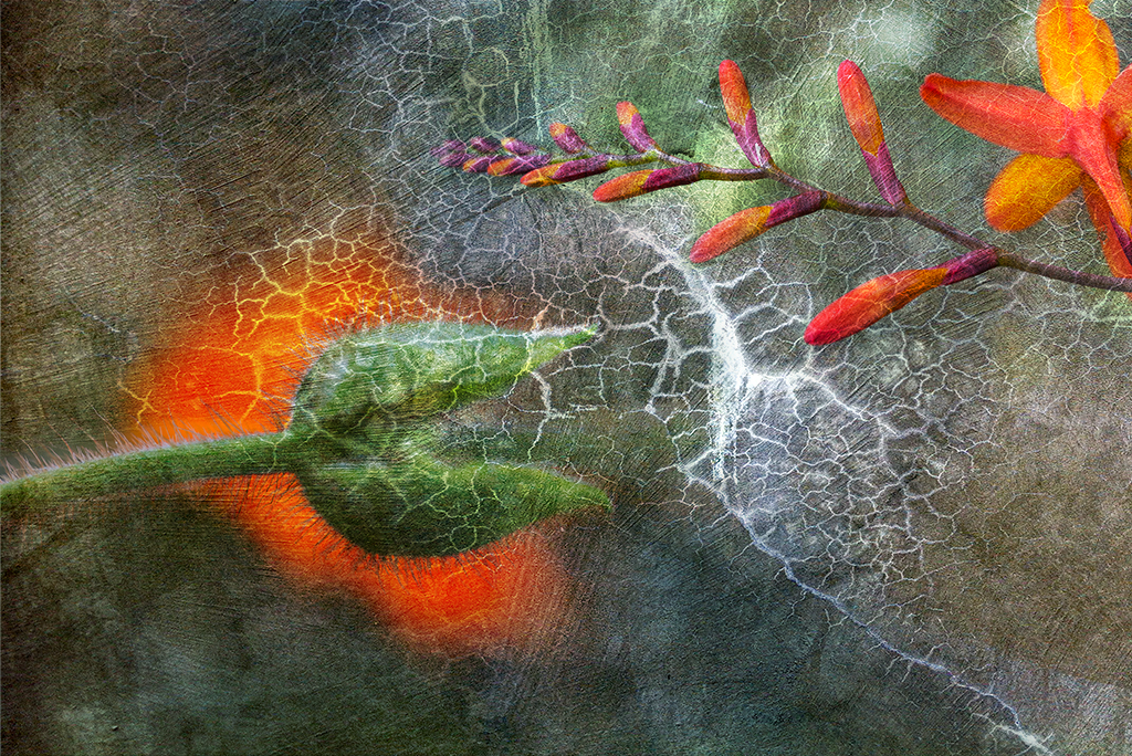
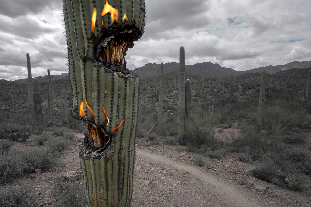
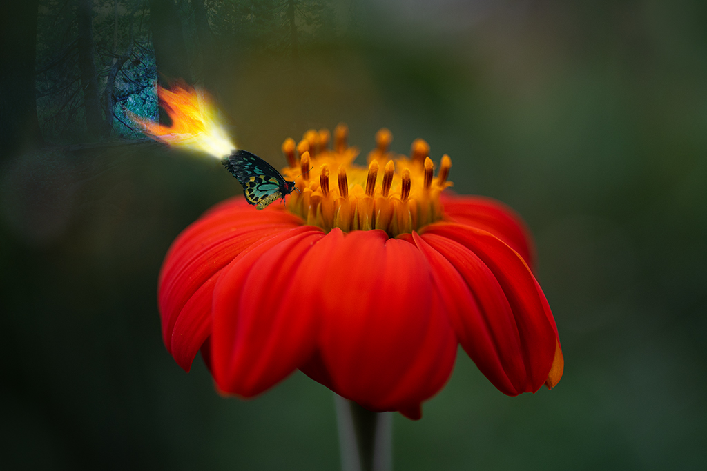
I took a fire photo I had and I believe I used a blend mode that took the orange flame to white. It wasn't my intention but I liked the look. That is how I work in photoshop. I cycle thru various filters and often have an "accident" that is better than what I intended. This often then leads me in a new direction. I darkened your image some with a darken filter and painted some black to cover over distracting elements. I only played with it for a couple minutes just to give you a feel of how your image inspired me. |
Jun 9th |
| 41 |
Jun 19 |
Reply |
Thanks Jan! |
Jun 9th |
| 41 |
Jun 19 |
Reply |
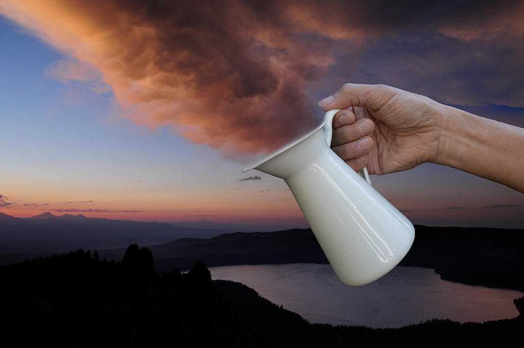
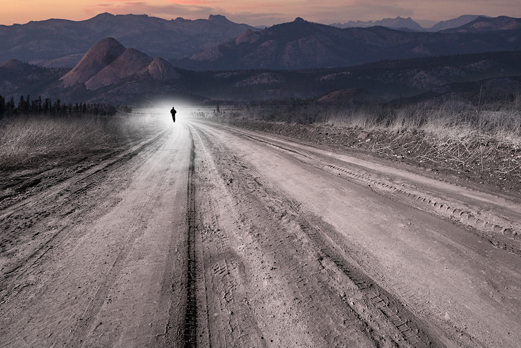
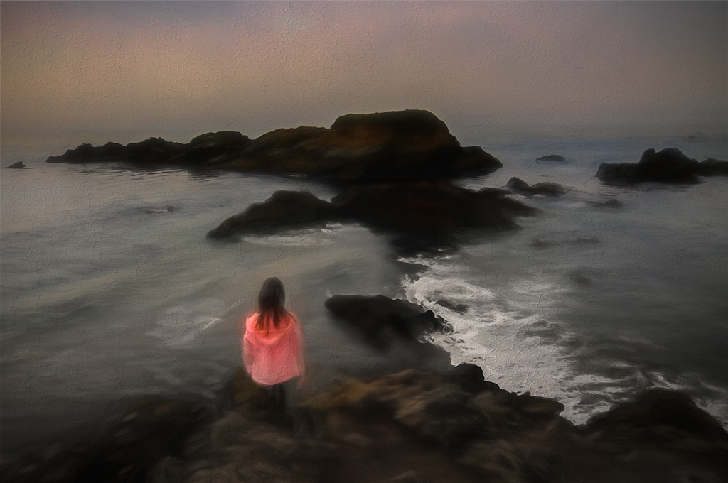
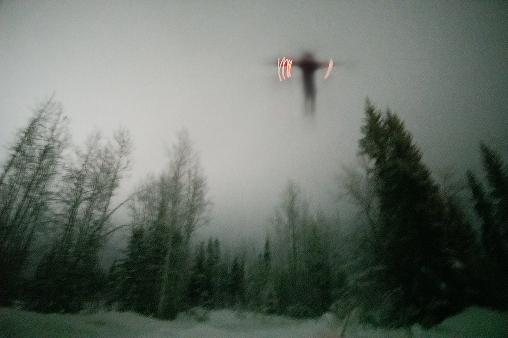
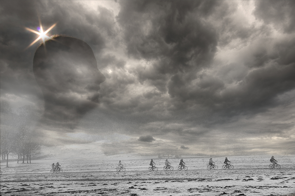
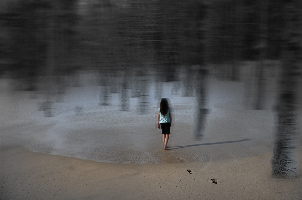
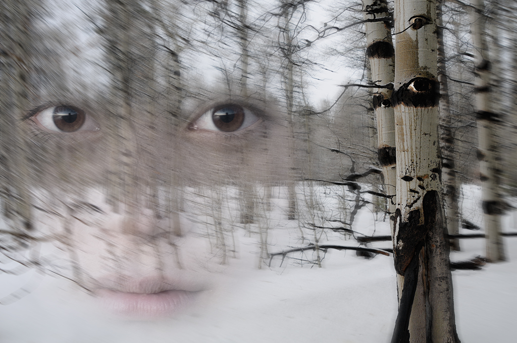
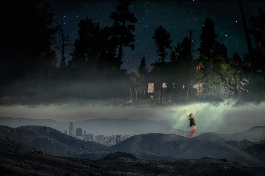
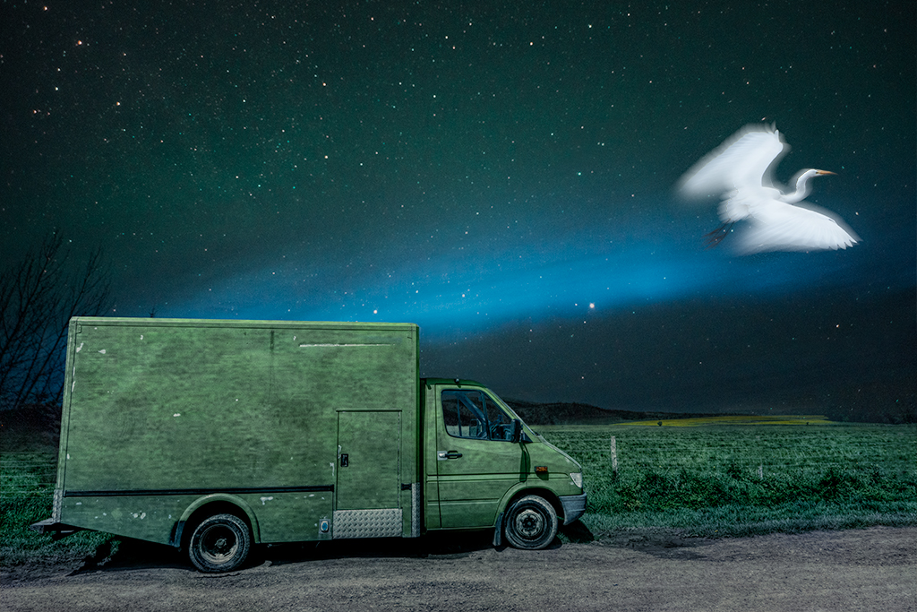
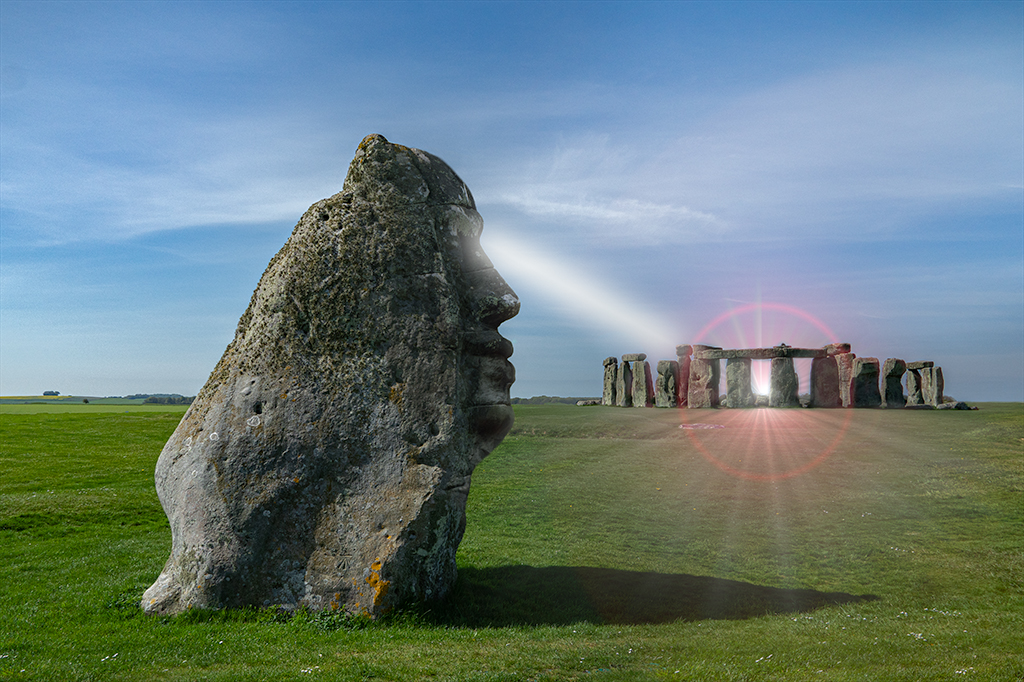
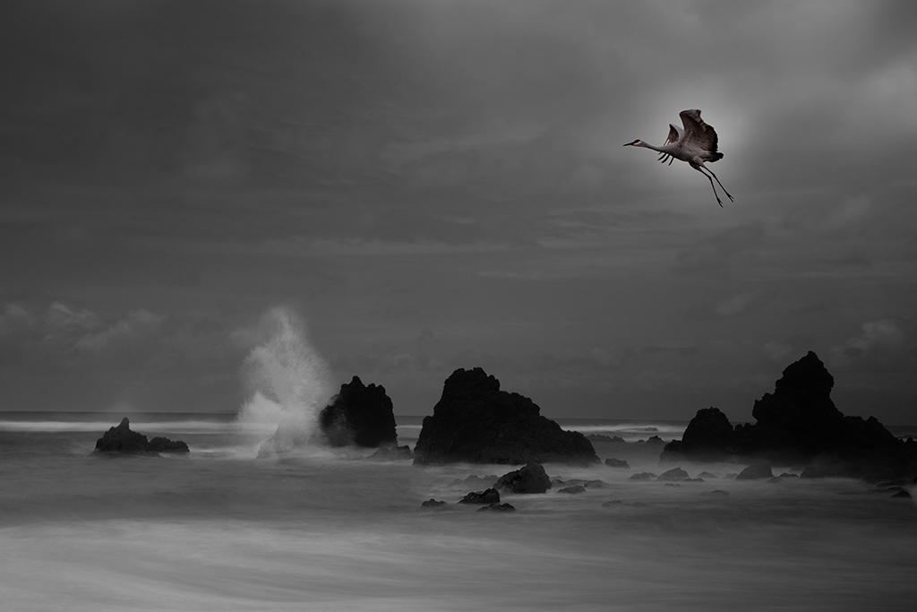
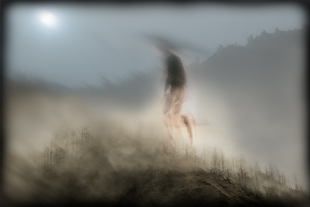
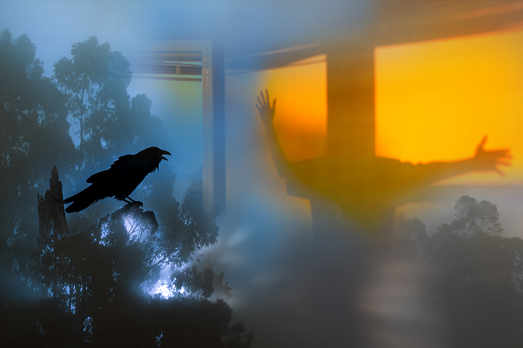
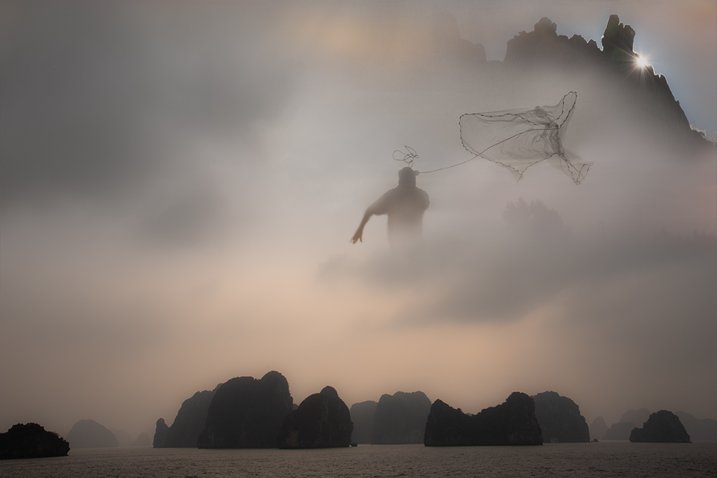
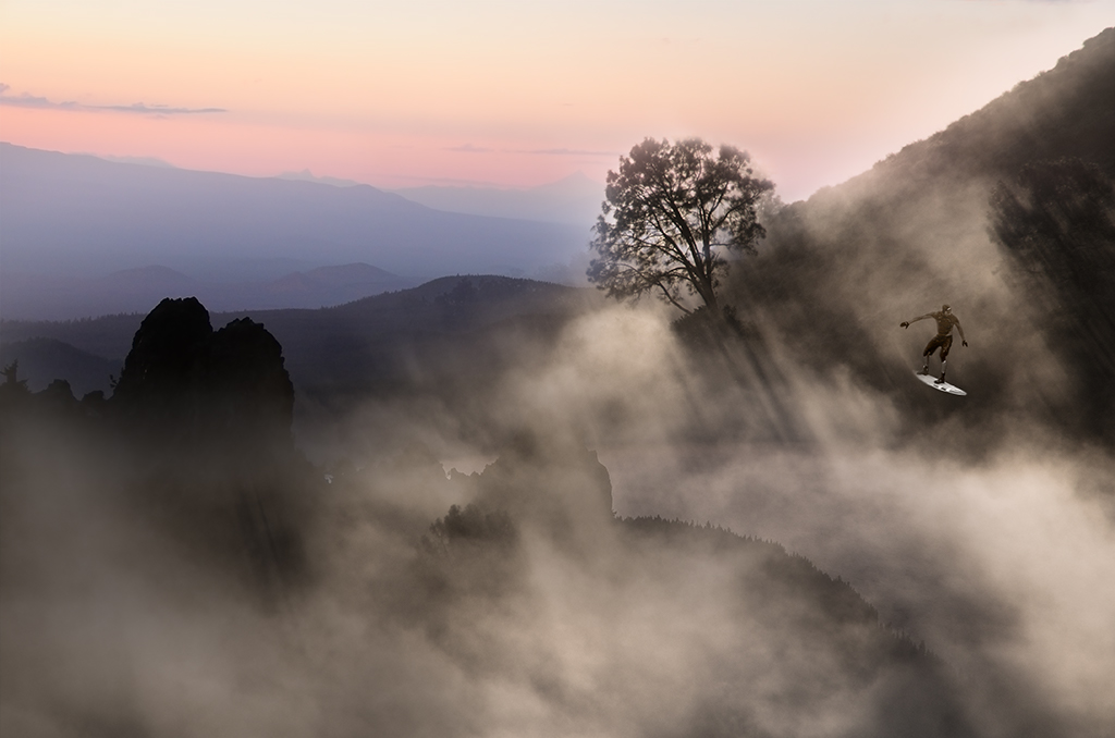
Kathy, It still seems a little stuck on to my eye. This reminds me of when I've taken a great picture in the past and stuck a bird or some other object on it to try to make it "better" only to realize the original image was much more powerful. If you have your heart set on this magical realism image I might try making the fog extend over a larger area as it looks a little too discrete |
Jun 8th |
| 41 |
Jun 19 |
Reply |
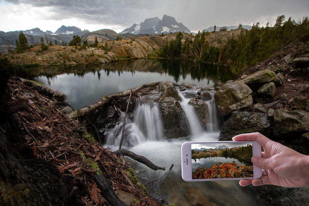
Sue, What do you think of this version based on your suggestion? |
Jun 8th |
 |
| 41 |
Jun 19 |
Reply |
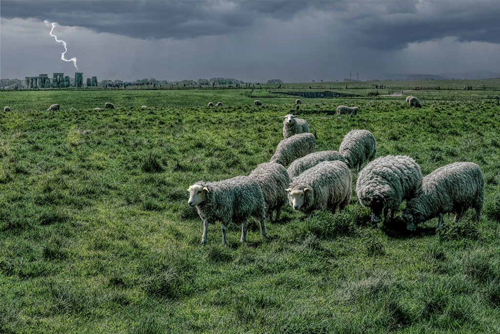
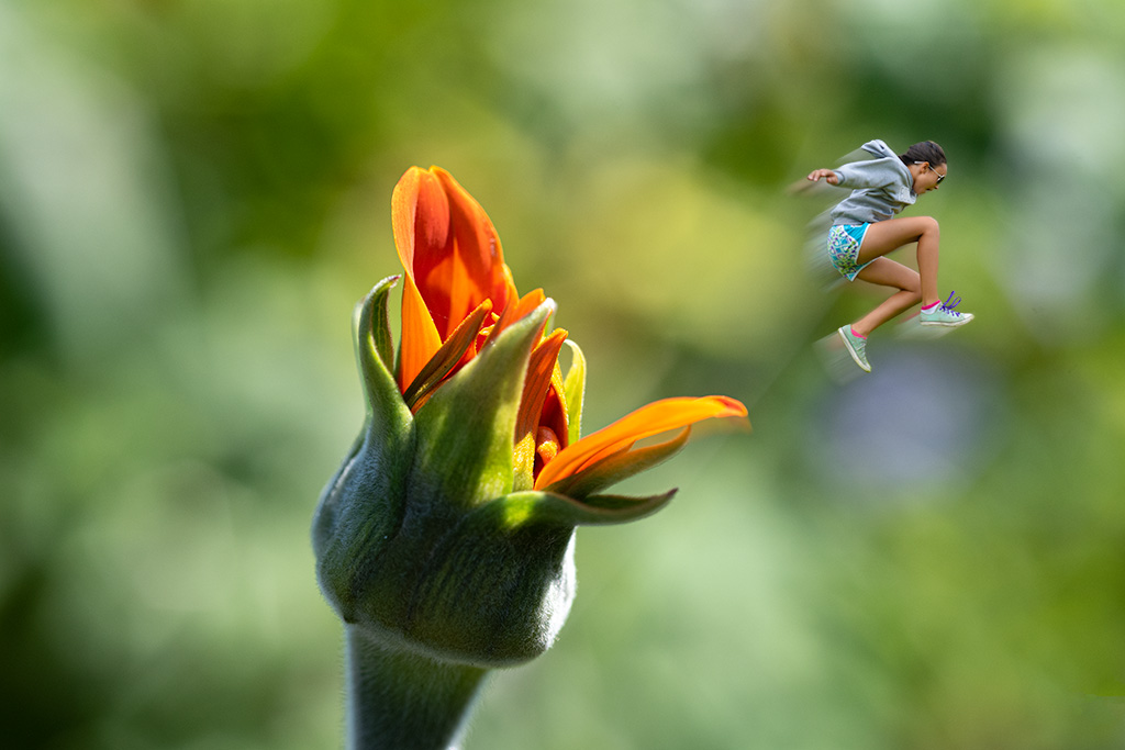
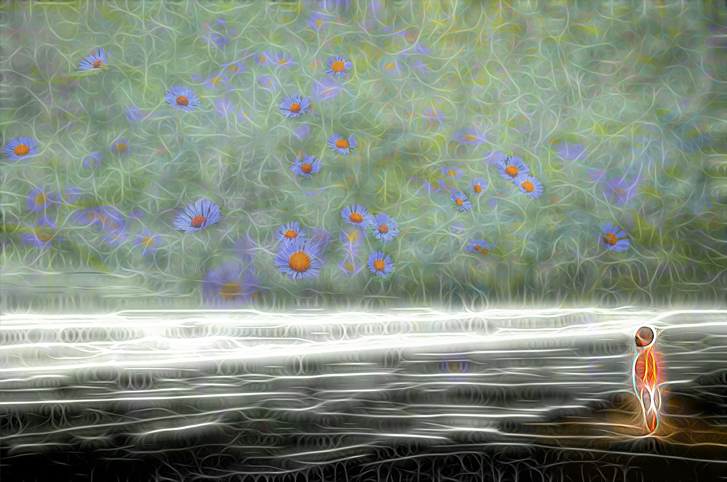
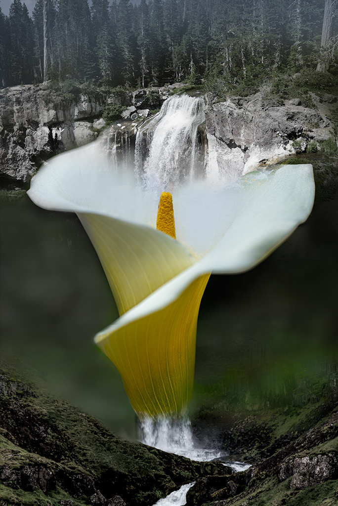
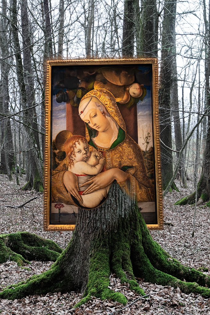
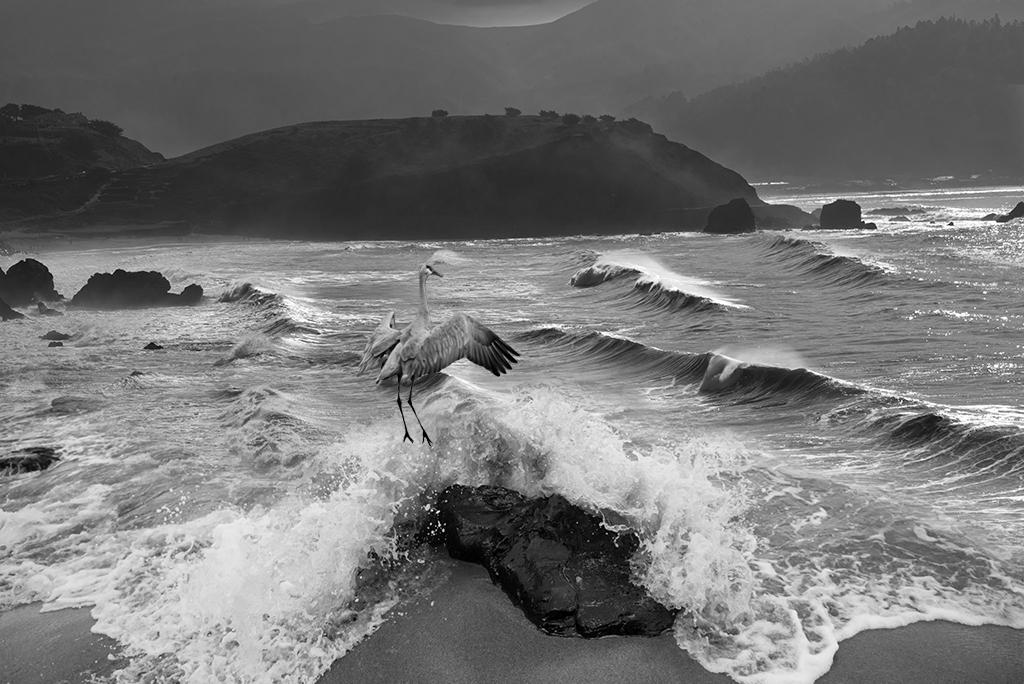
Kathy, I guess the answer to your last question is ALL. If I am tweaking the colors in lightroom or adding a better sky, as in the image above, I am always trying to give the photos a little something more. A good example of how I often work with nature images can be seen in my June image. I combined three images to create something that clearly isn't believable but "almost real". I find people who aren't as detail focused often will like the images and feel they are "real". |
Jun 7th |
| 41 |
Jun 19 |
Reply |
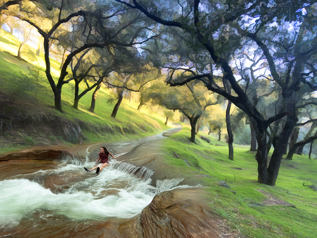
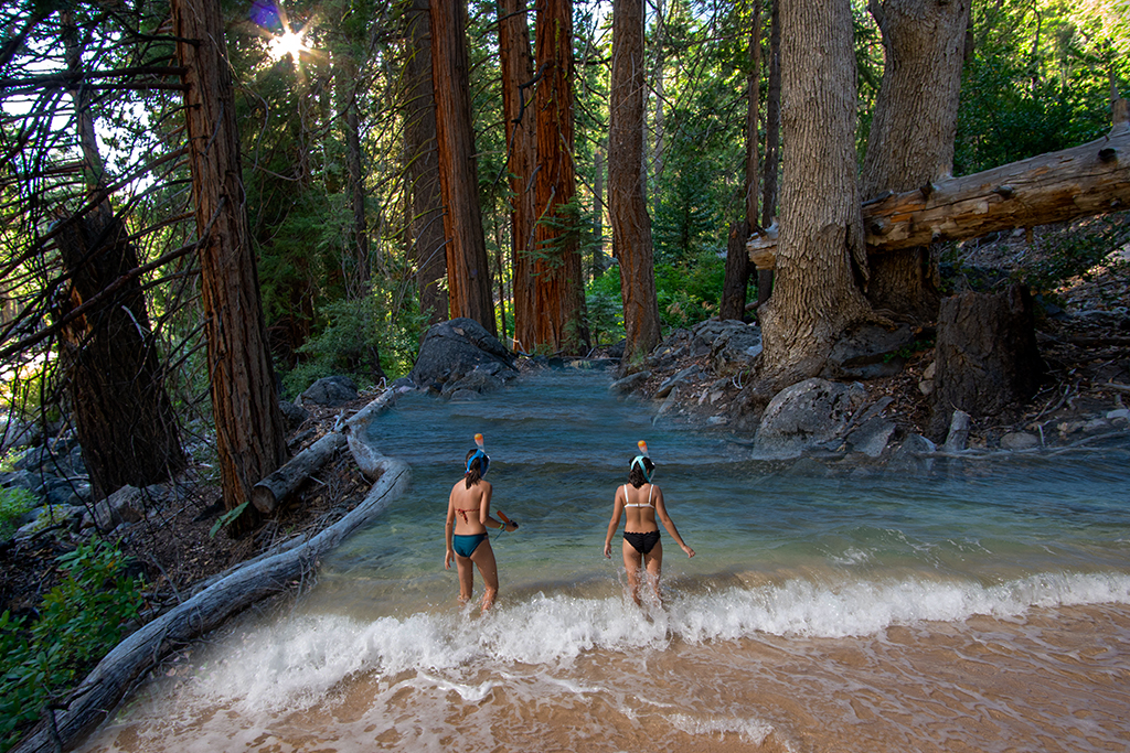
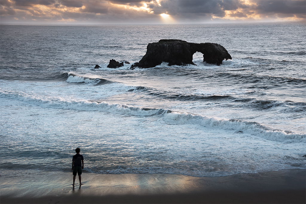
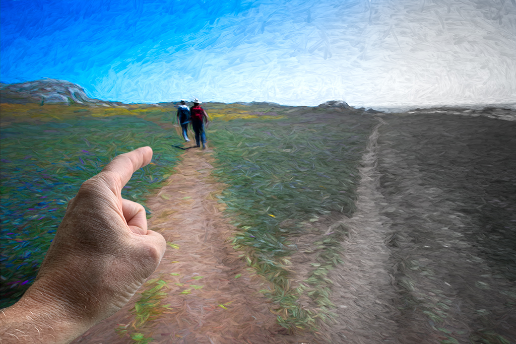
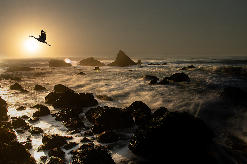
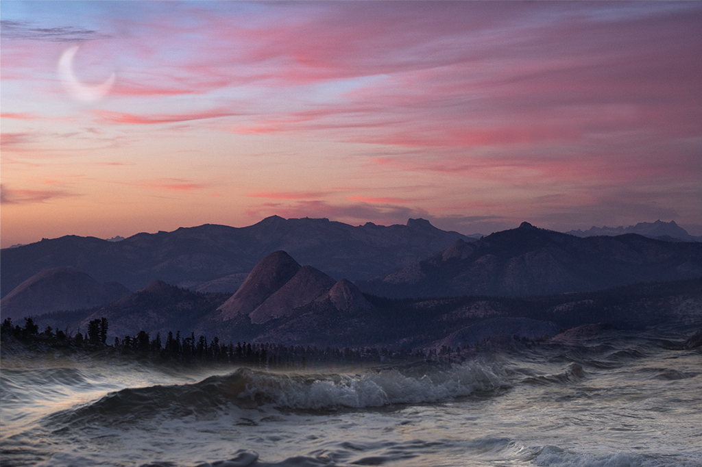
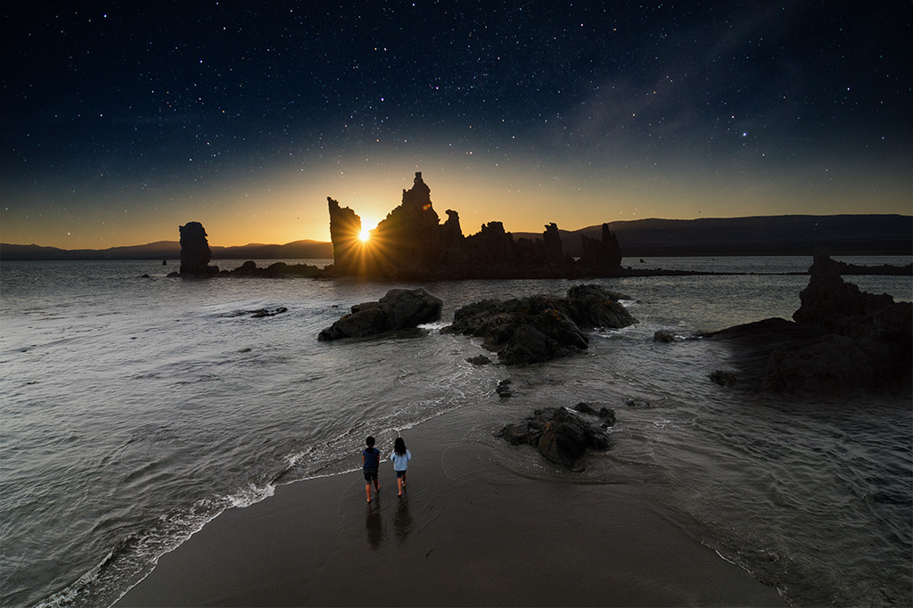
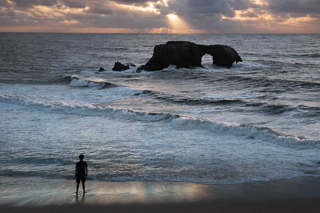
Kathy, The perspective and lighting are off because the photos were taken years apart at different beaches and from different vantage points. I wasn't trying to make it real just tried to add some punch to the photo. Do you find the "off" part to distracting? I often combine images that don't fit and my goal is to make it believable enough so that the viewer enjoys the construct. |
Jun 7th |
| 41 |
Jun 19 |
Comment |
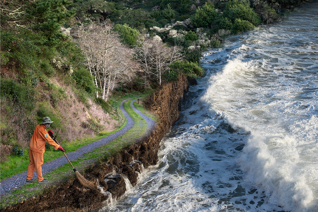
Sue, Thanks. I may try to add a little more sky, I don't think anyone will miss the distant water. |
Jun 5th |
| 41 |
Jun 19 |
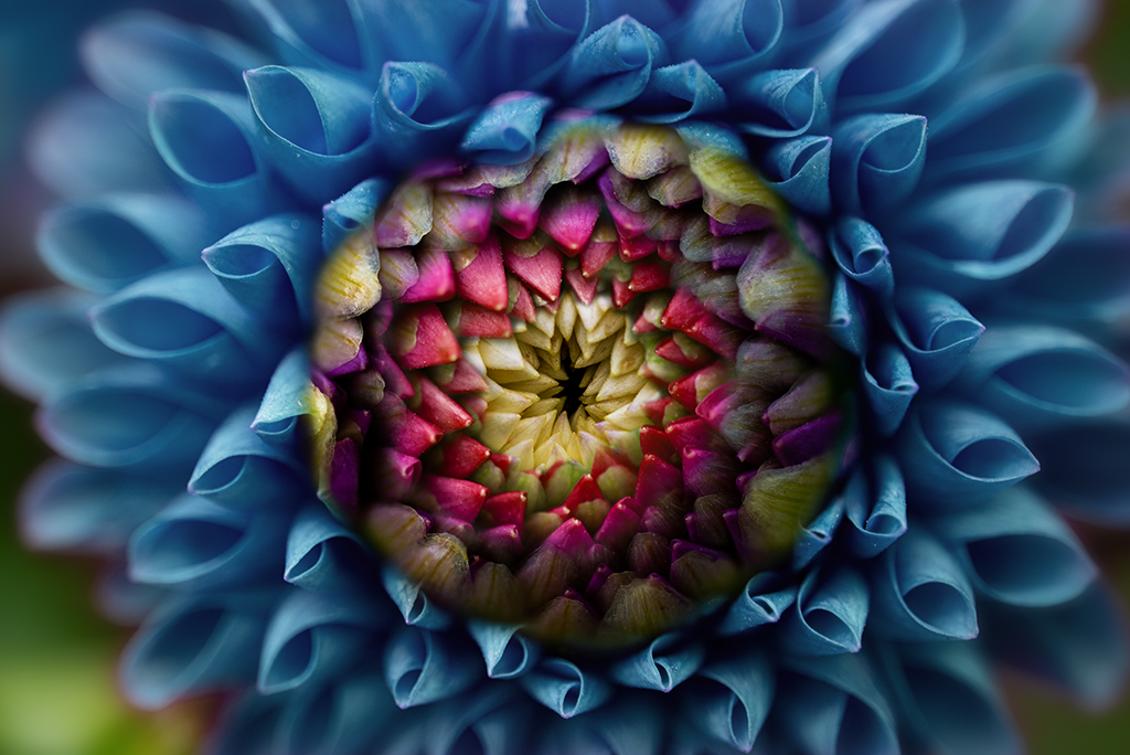
Comment |
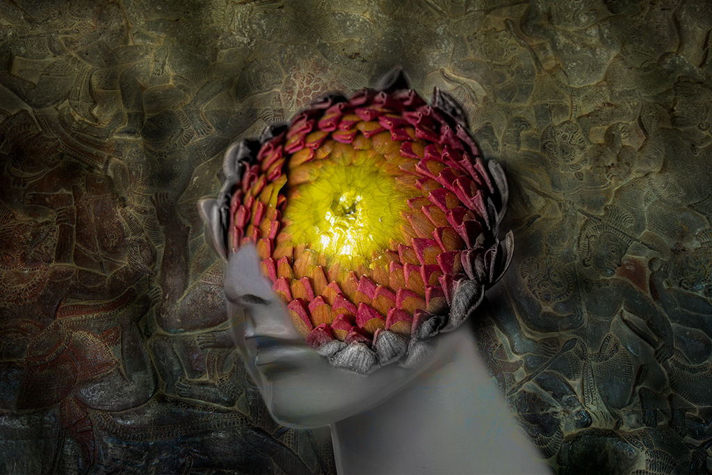
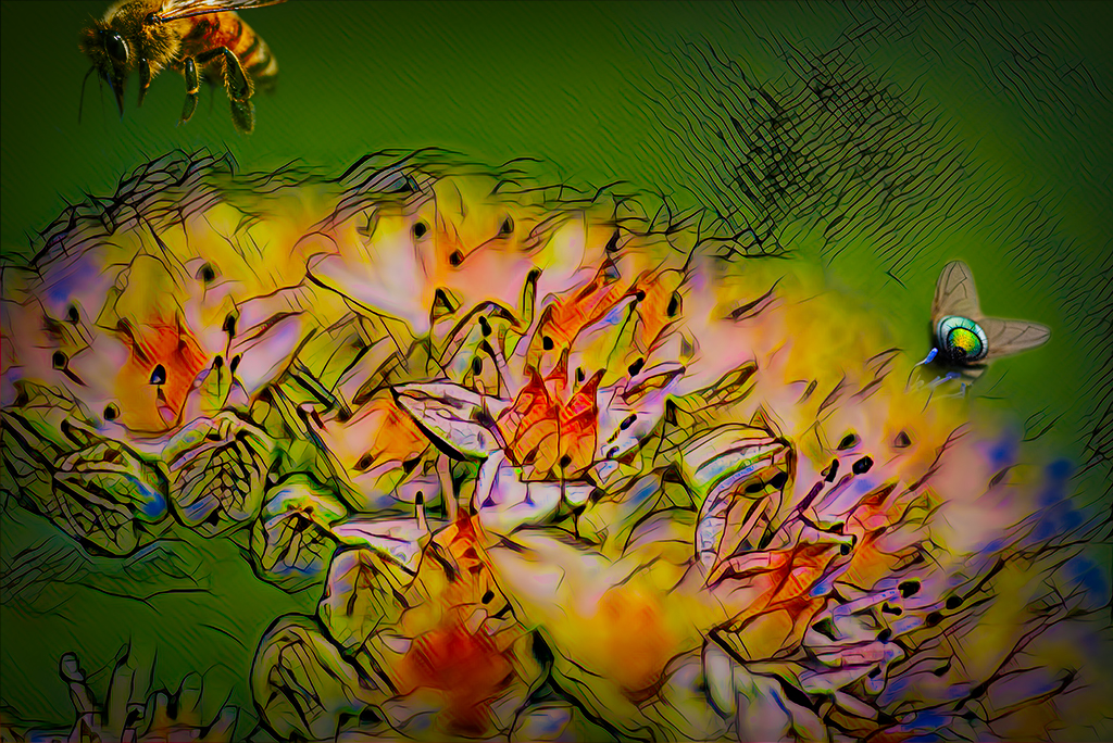
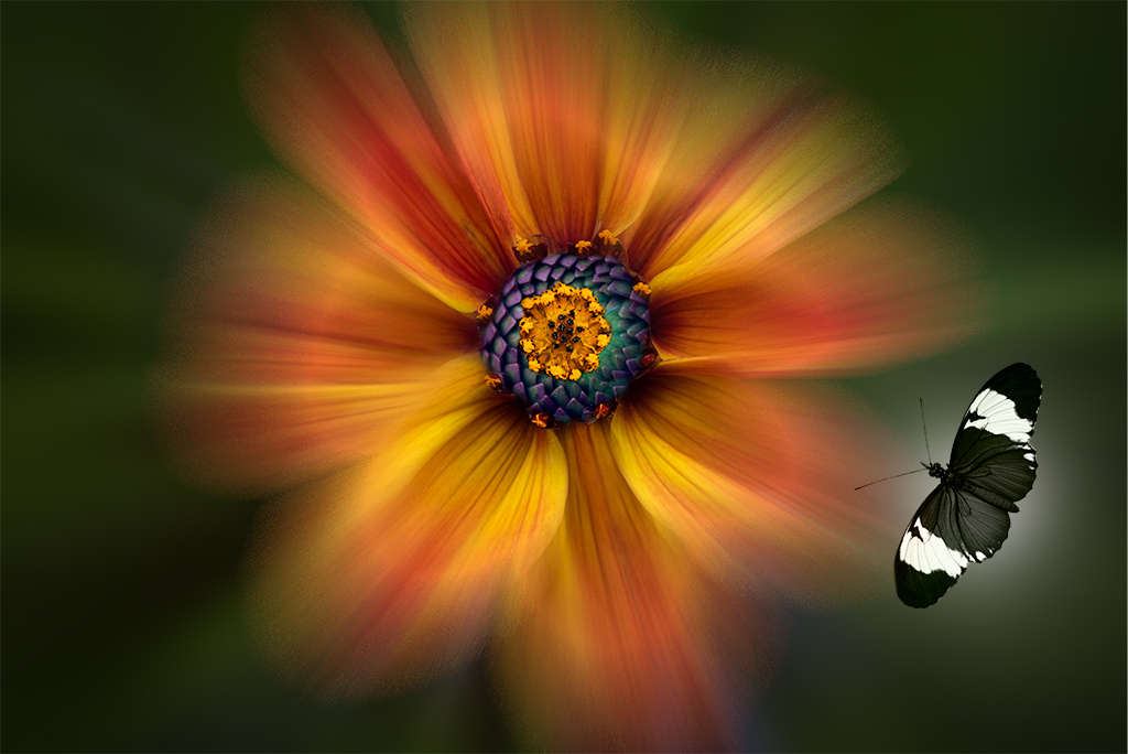
Lisa, Another great one. You've elevated this technique to a true art form. Your choice of colors and background are perfect for this "specimen". |
Jun 5th |
| 41 |
Jun 19 |
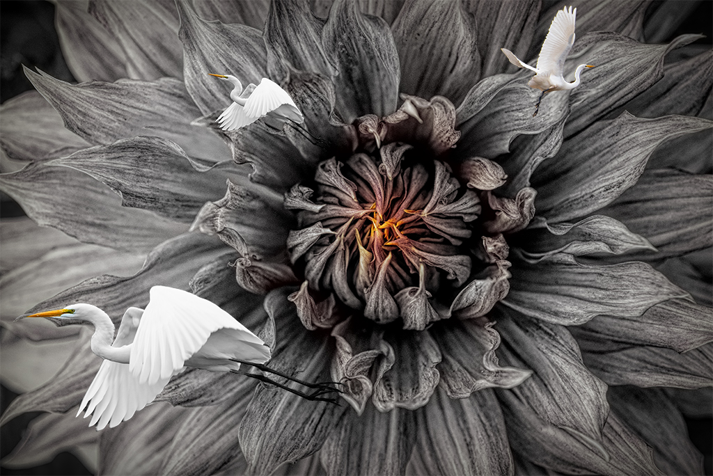
Comment |
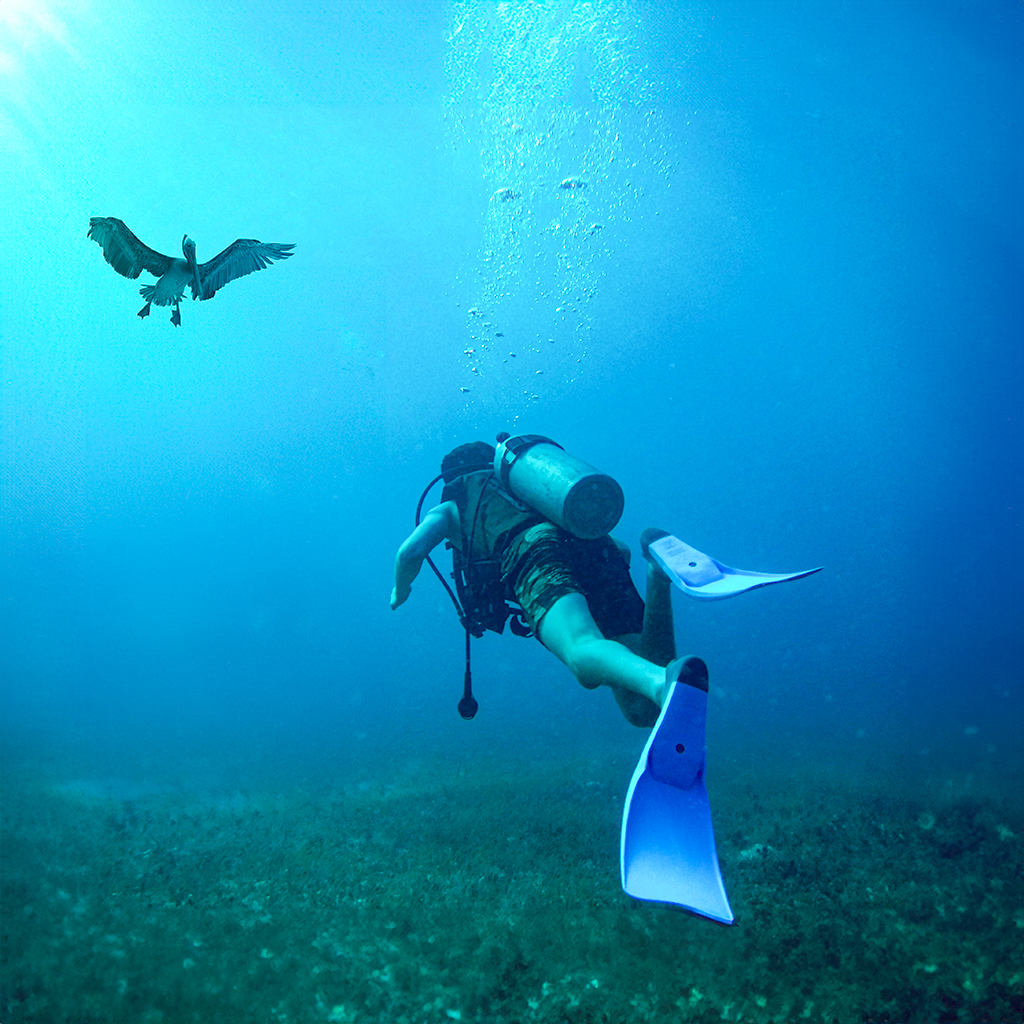
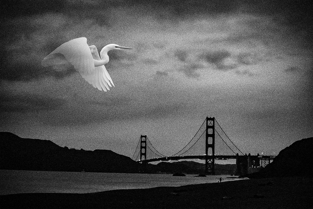
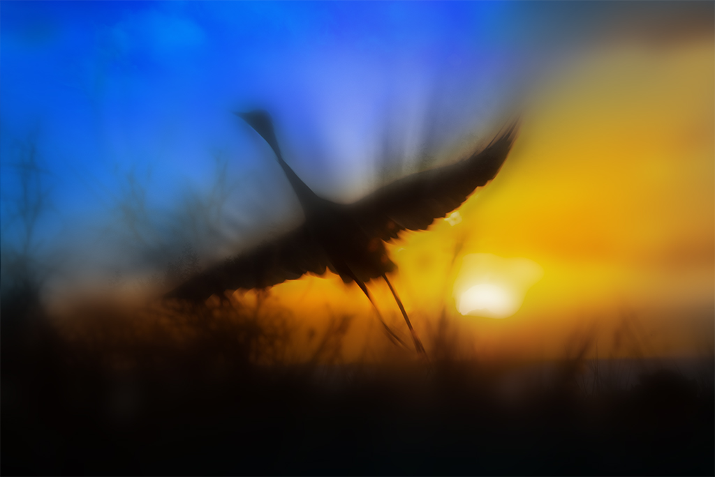
Jan, I really like this image. Your handling of the foreground contrast with the background muted tone is very powerful. The choice of an eagle creates strong impact and tells an interesting story. Nicely done! |
Jun 5th |
| 41 |
Jun 19 |
Comment |
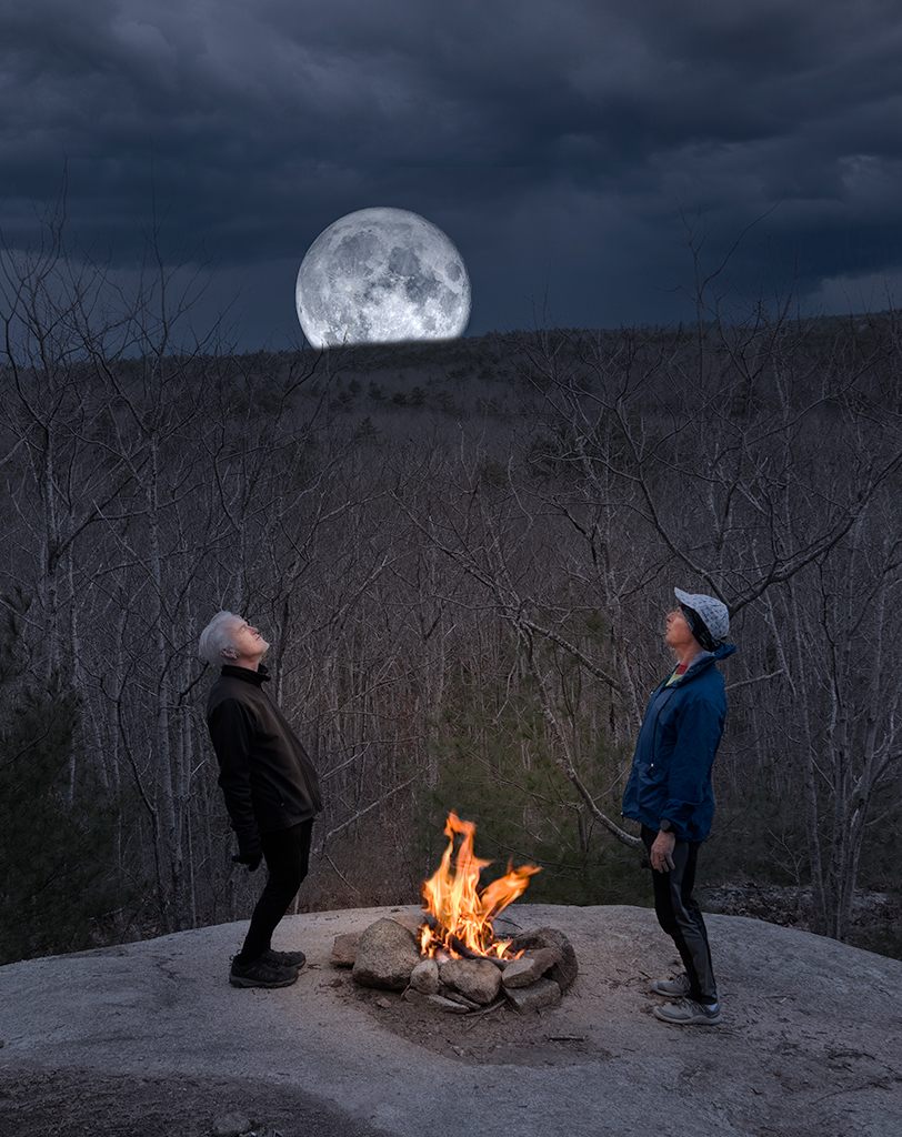
Sue, Nicely done. I think it is a wonderful tribute. I have nothing to add this time. |
Jun 5th |
| 41 |
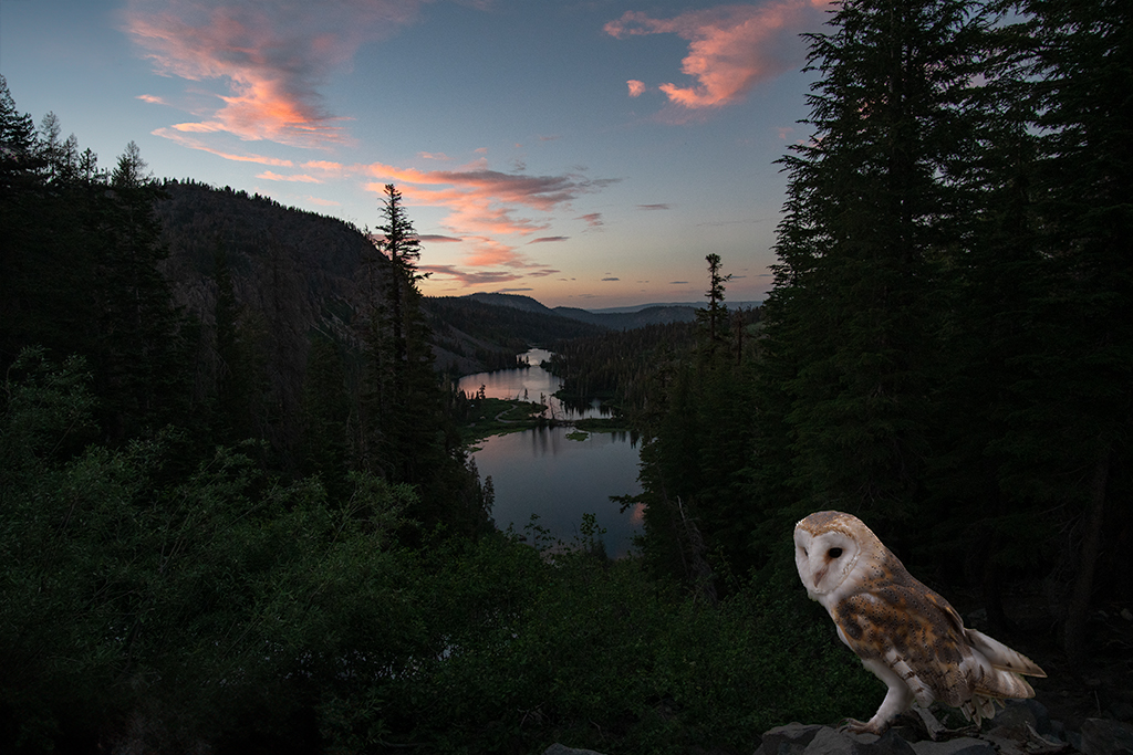
Jun 19 |
Comment |
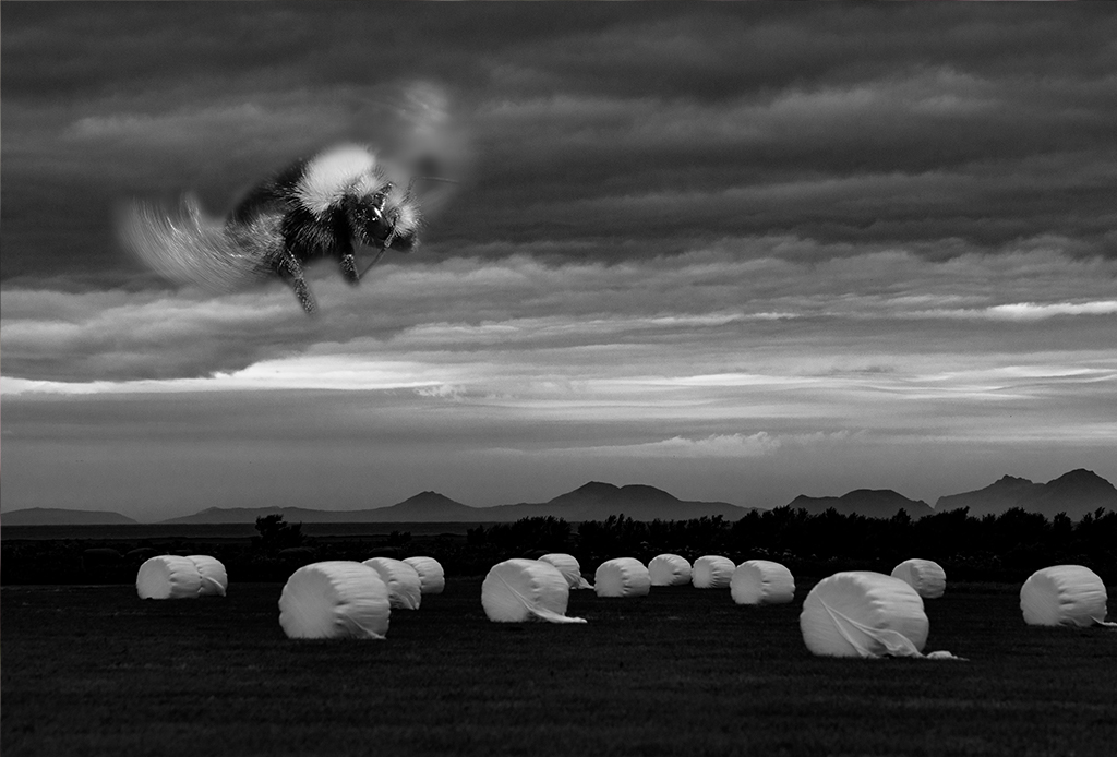
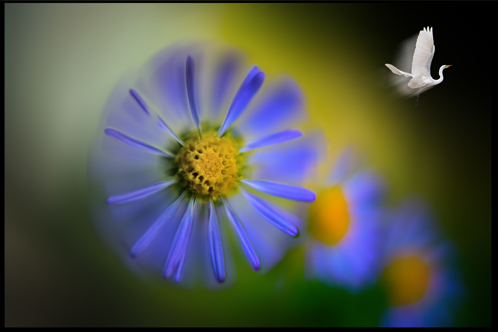
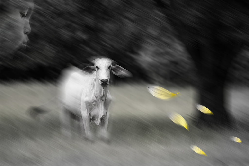
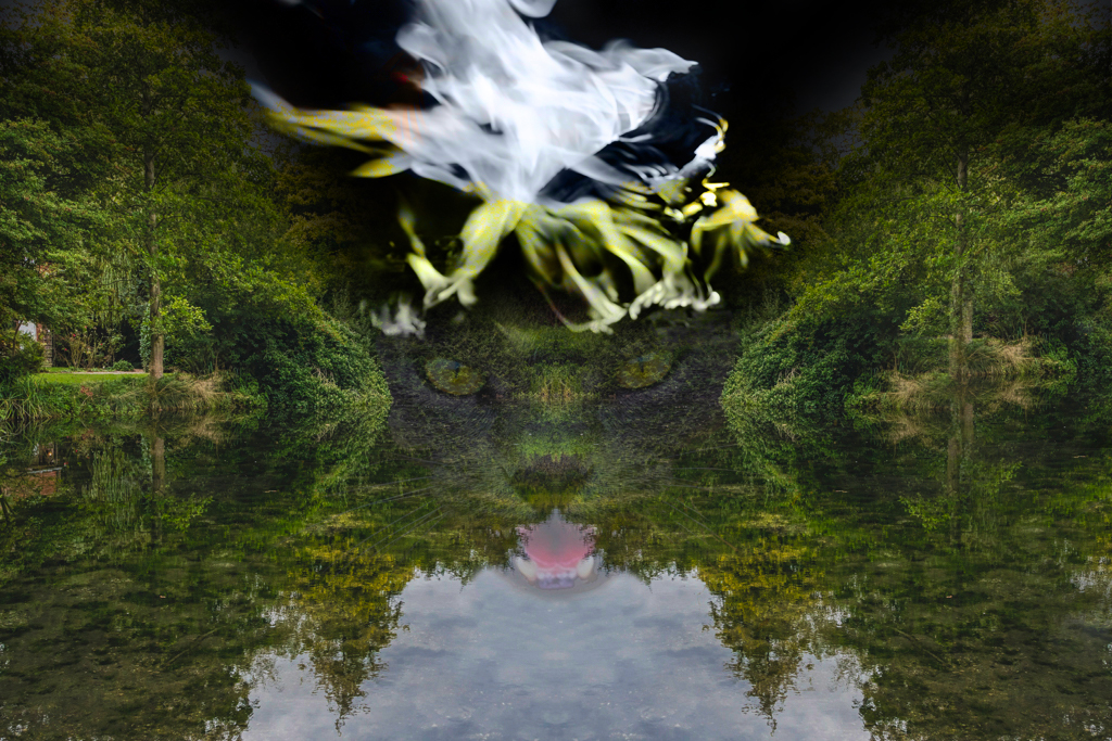
Maryellen, I like where you are going with this one. The placement of the cat centrally feels really powerful to me. I personally find the birds a little distracting.
I took a quick attempt at taking your image in a more ominous direction just to show you how it inspired me. |
Jun 5th |
 |
| 41 |
Jun 19 |
Comment |
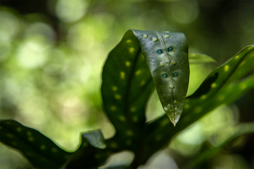
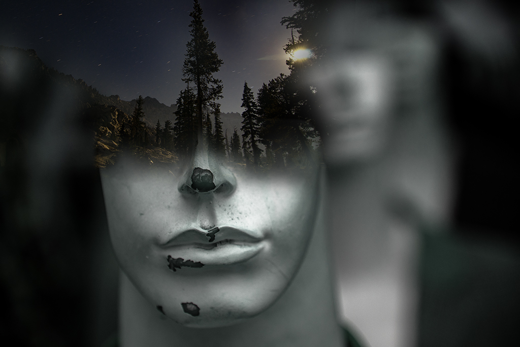
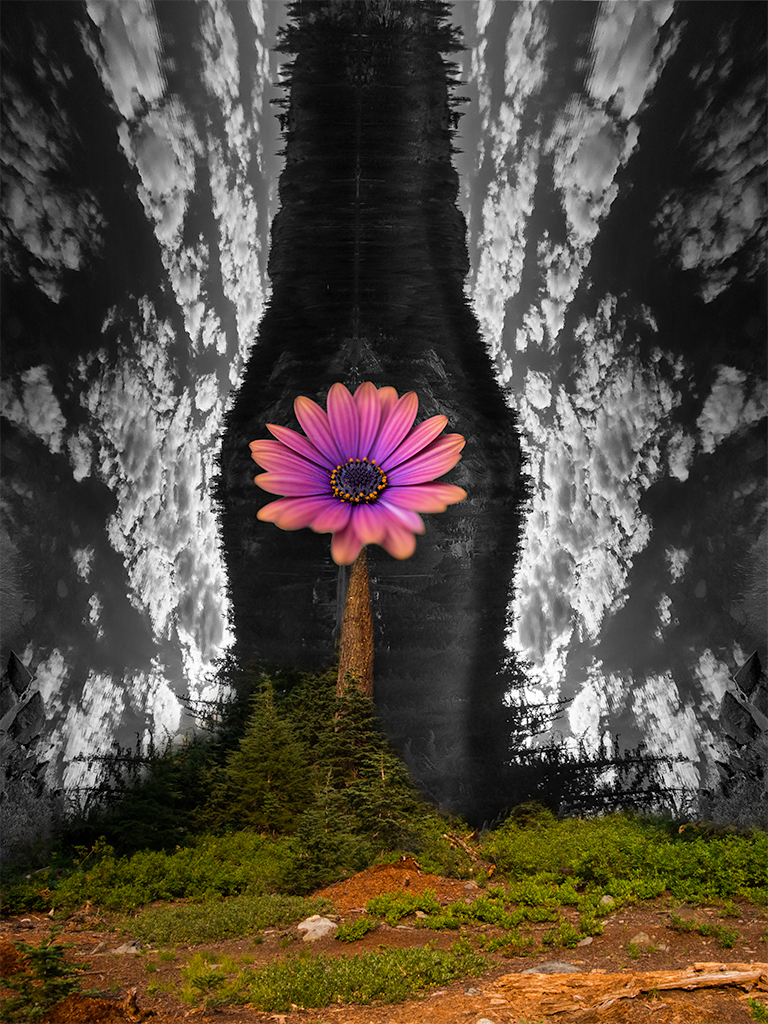
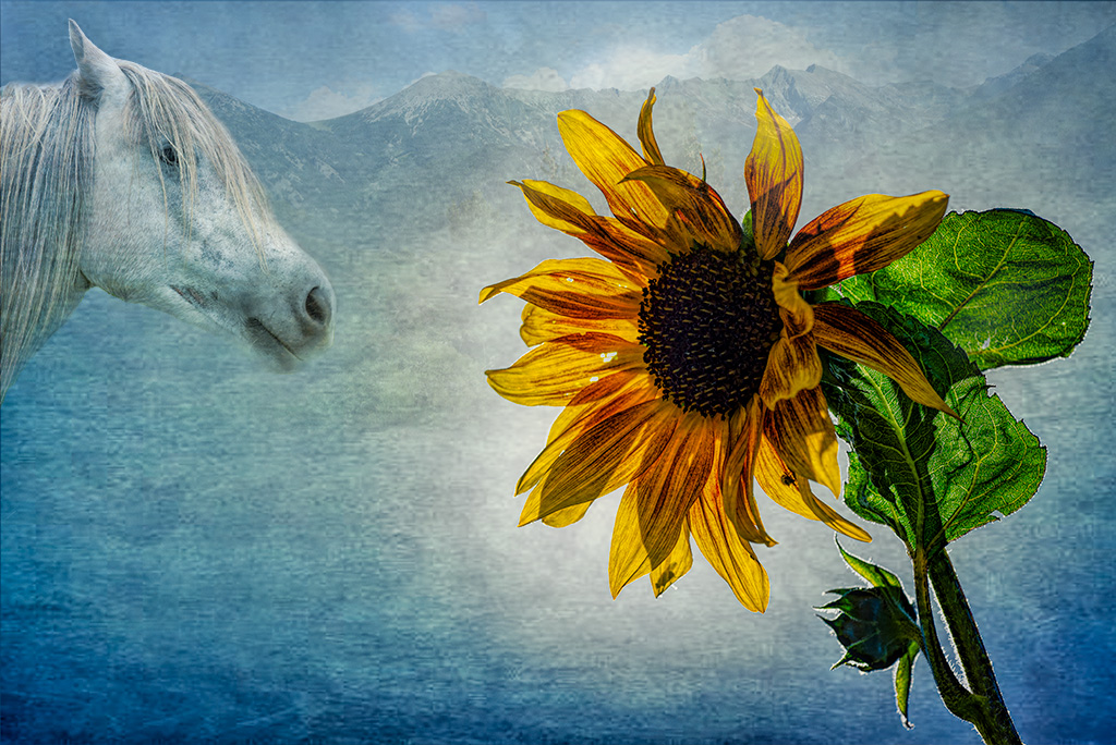
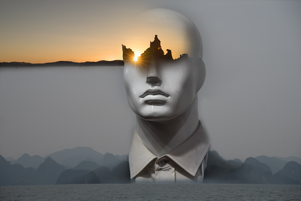
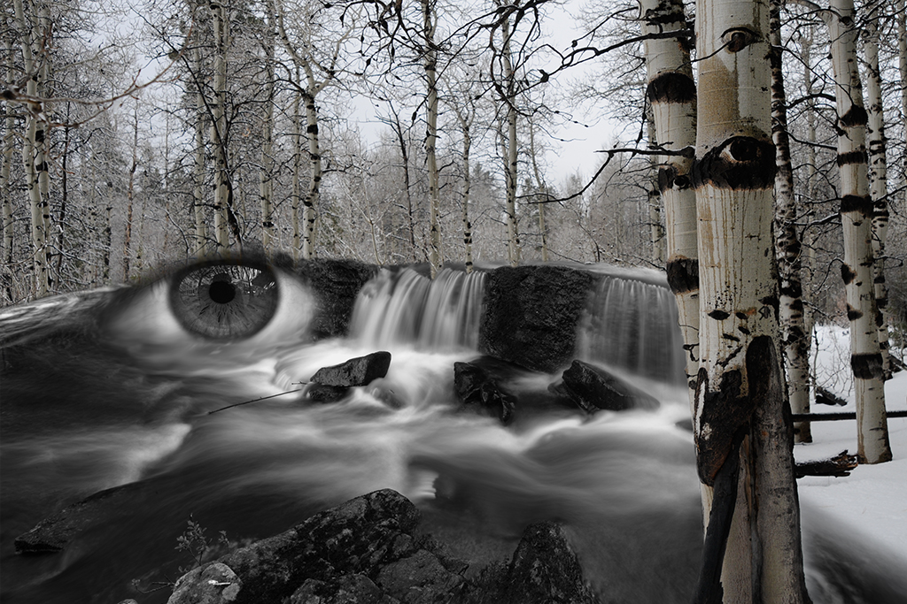
Henry, A very nice first attempt. I like how the nose works. The "eyes" are a little too sharply demarcated compared with the softer quality of the "face" flower. Consider blurring the edges some or adding a drop shadow to tone down slightly.
Looking at the original again it has the suggestion of a mouth and nose/moustache already. I might skip the hair and focus on a more subtle dark flower for the eyes as there is almost a hint of an eye in the dark area on the left. Or skip flowers and add dog eyes as this looks like a dog face to me. |
Jun 5th |
| 41 |
Jun 19 |
Comment |
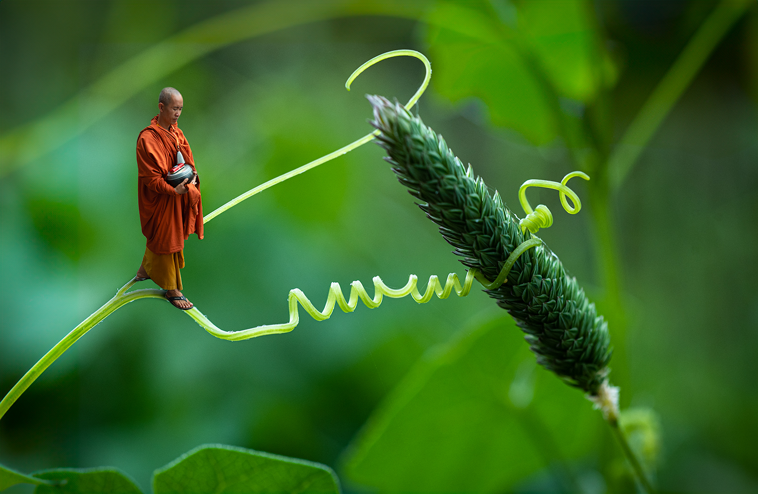
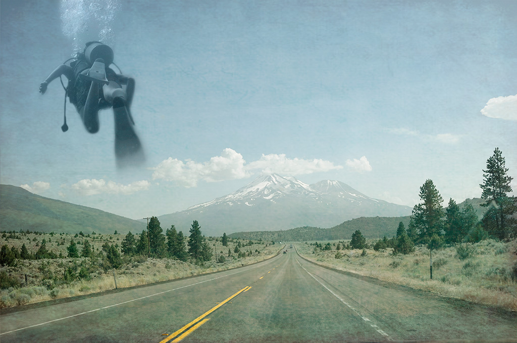
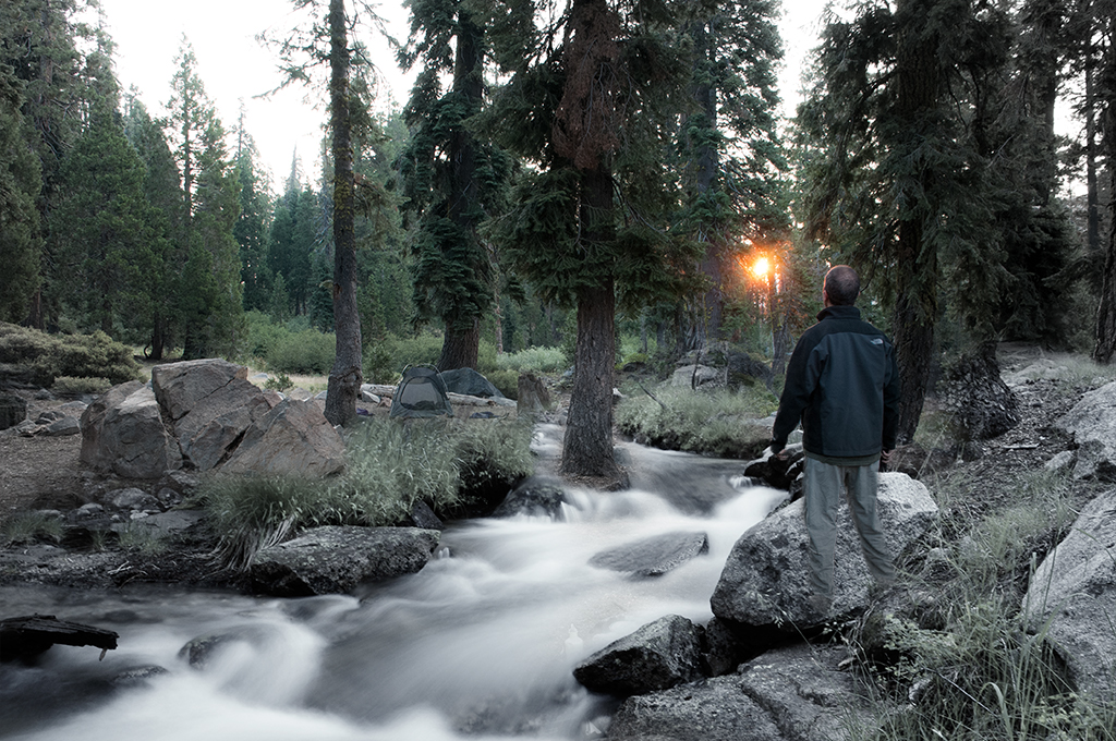
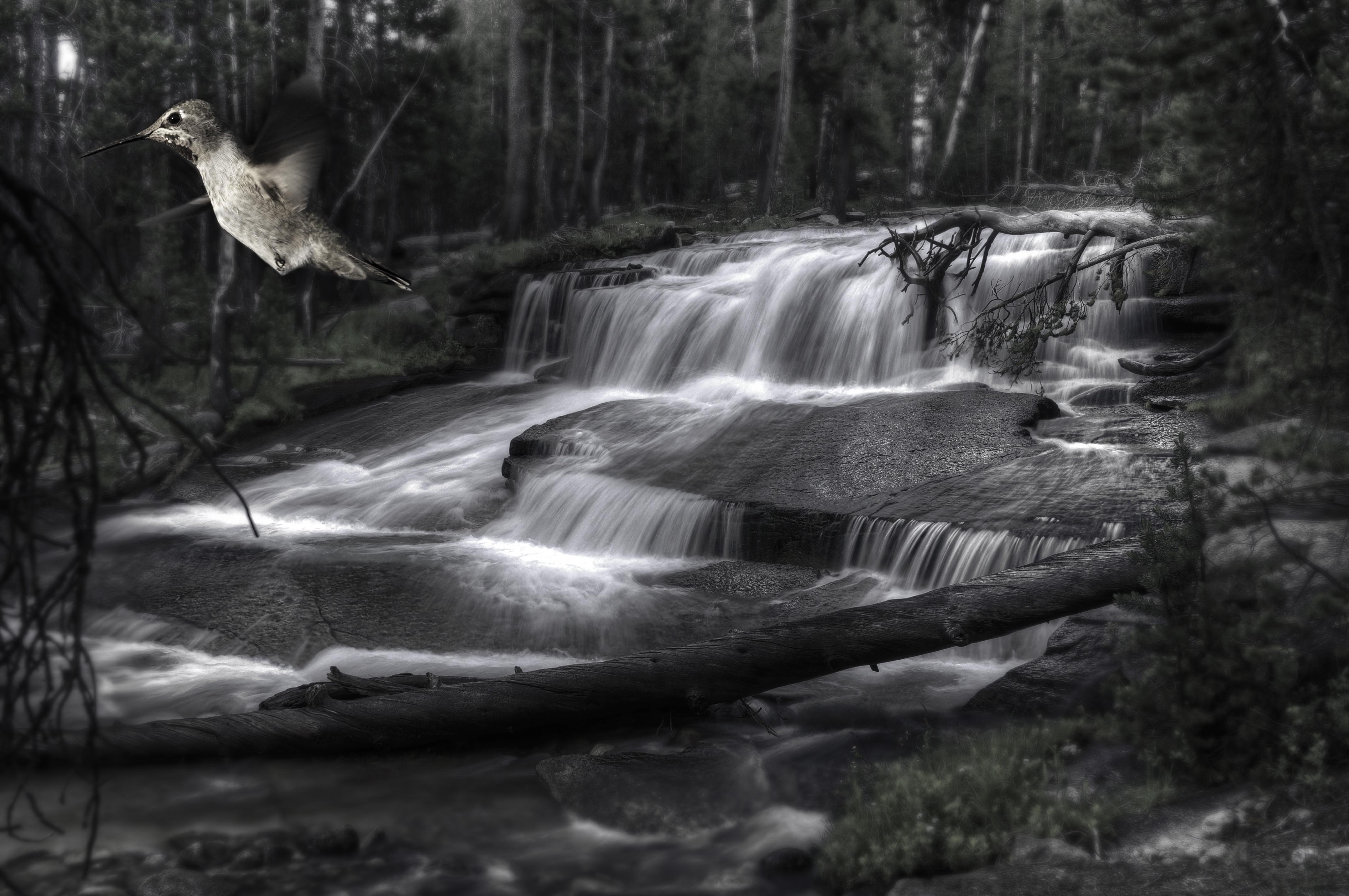
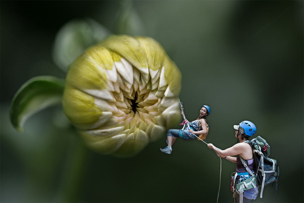
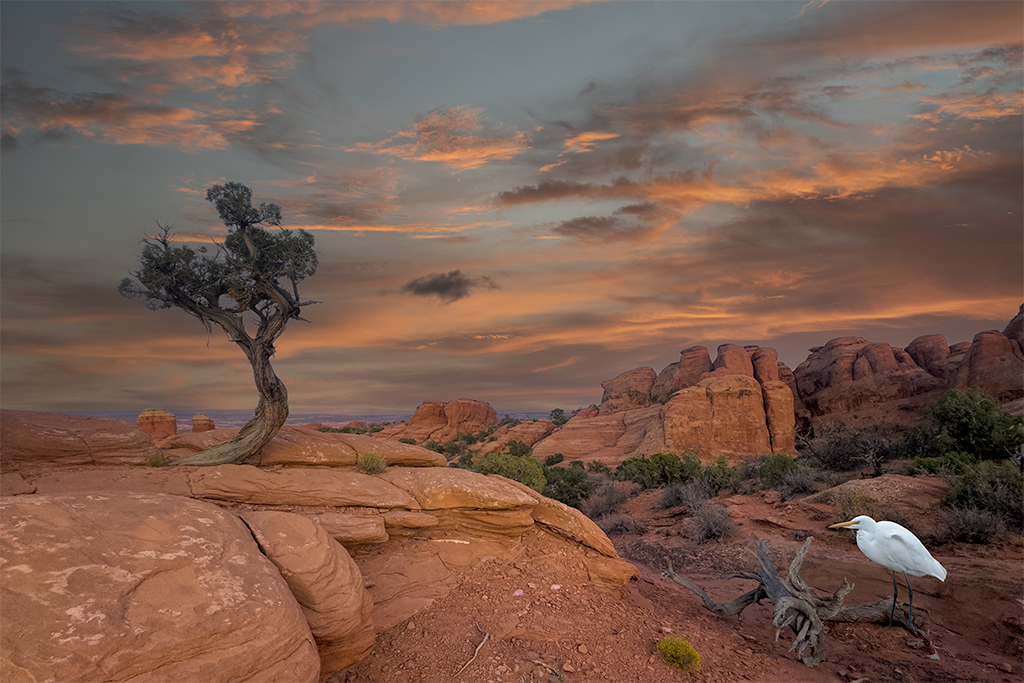
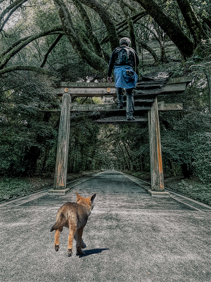
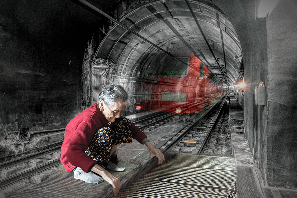
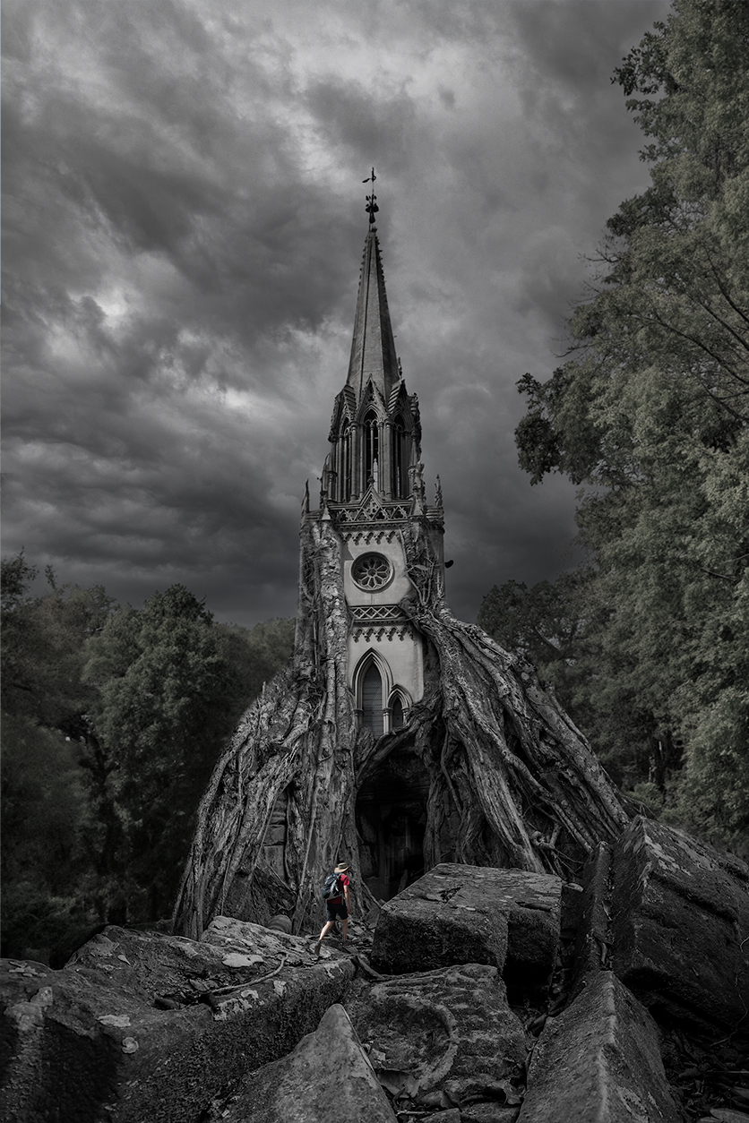
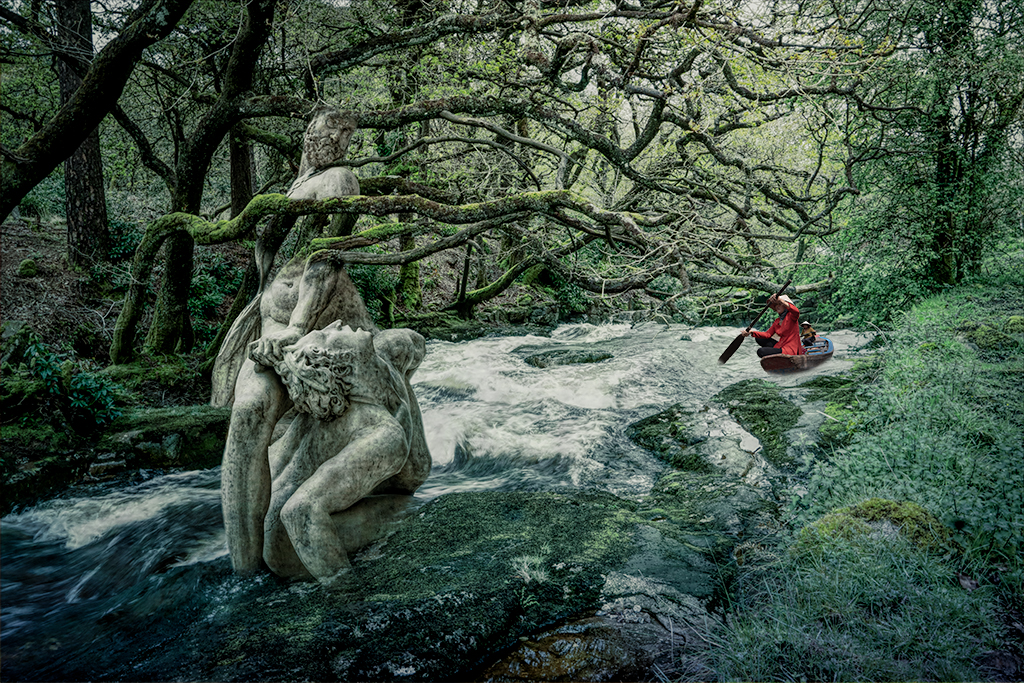
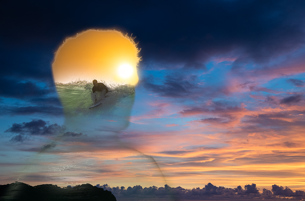
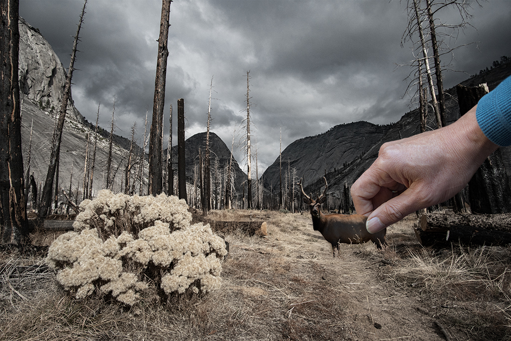
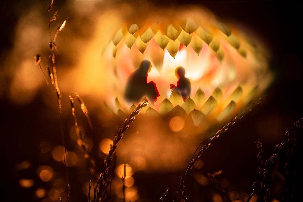
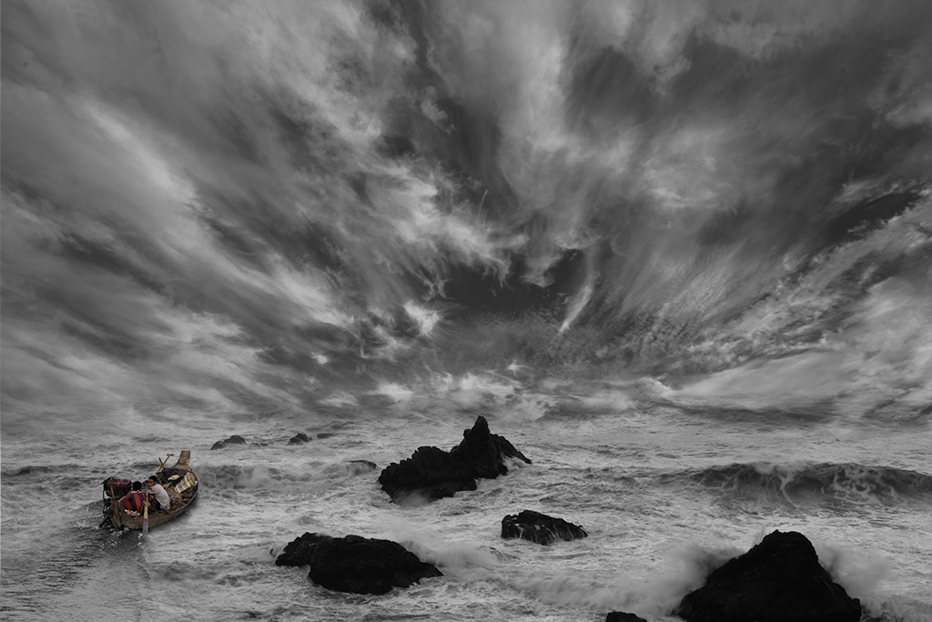
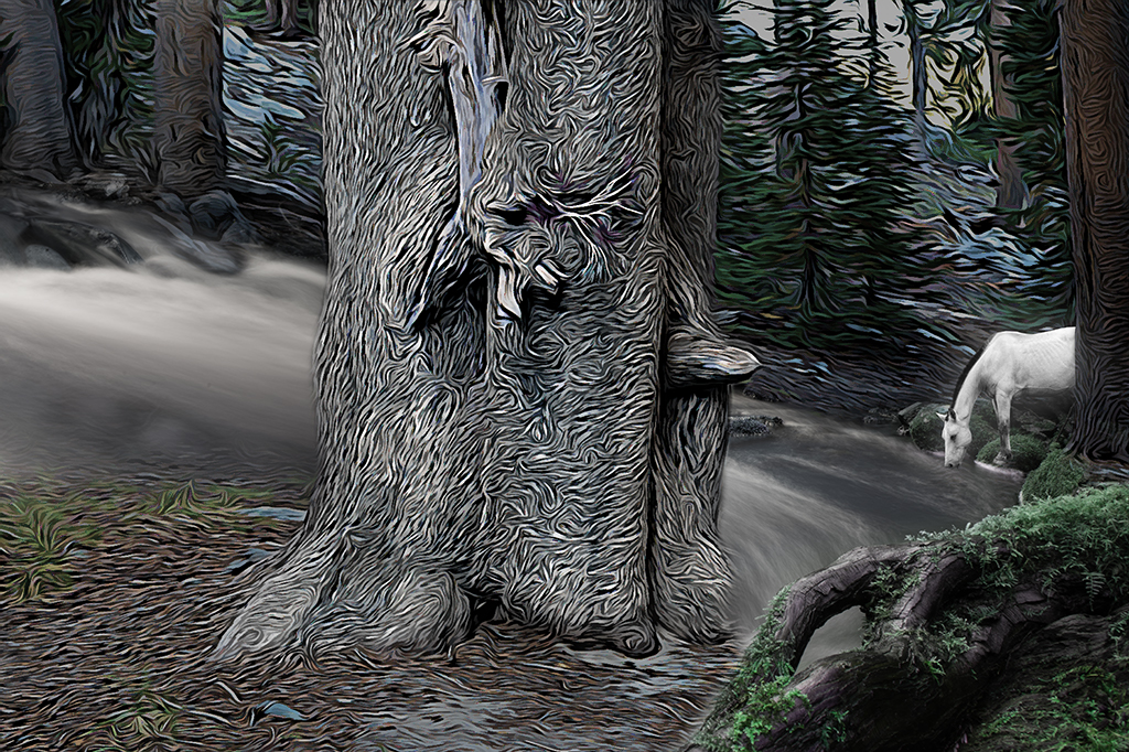
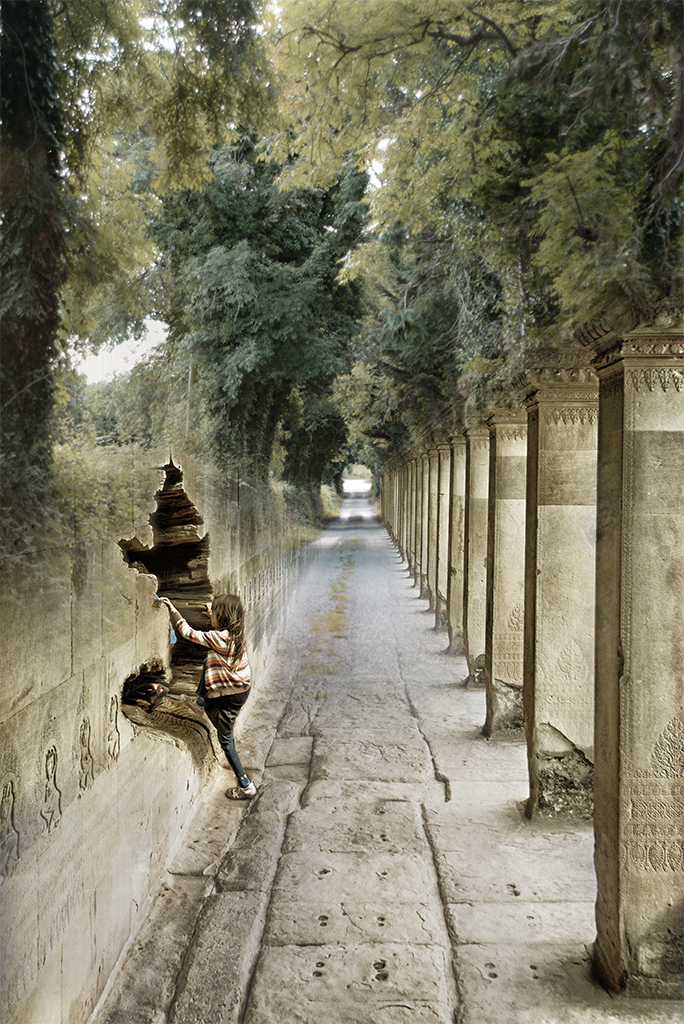
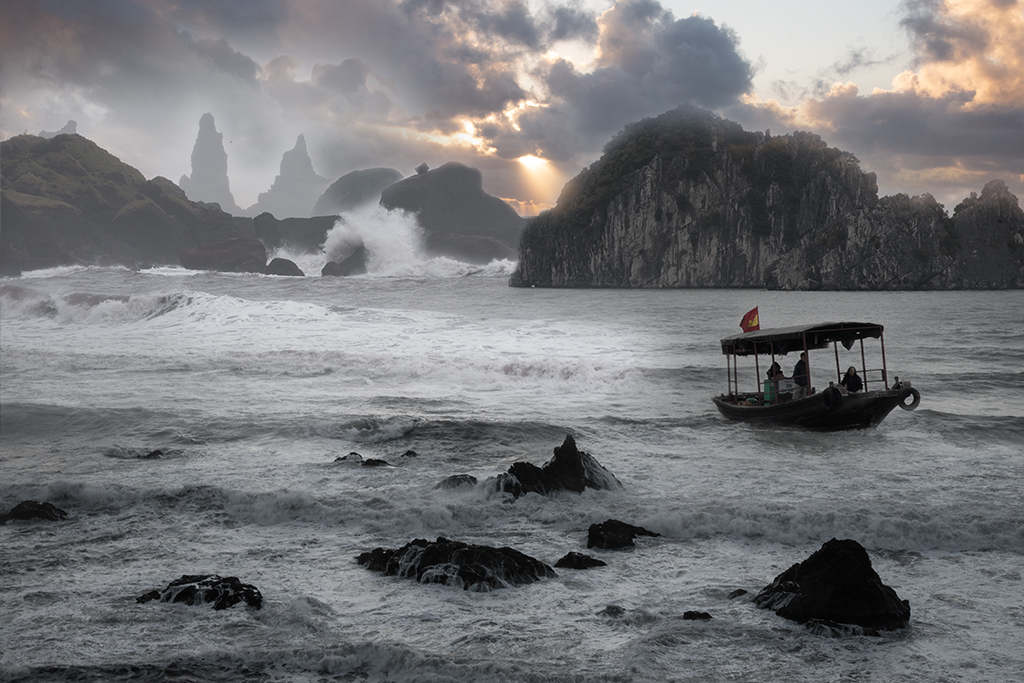
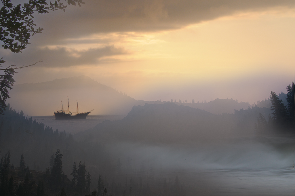
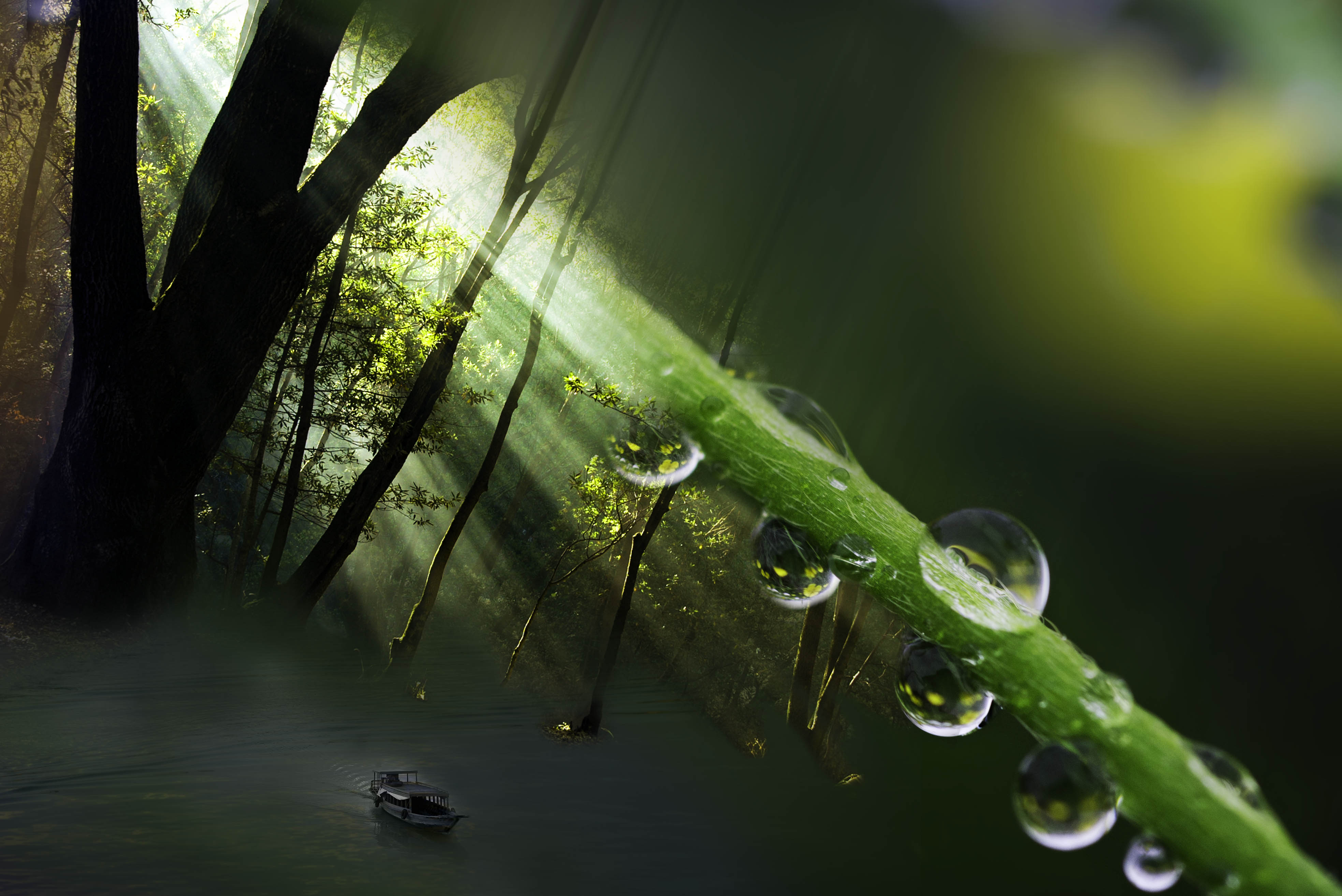
Kathy, First of all, your original photo is outstanding as it is. I personally would print and hang that one. The boat seems a little too soft relative to the sharp contrast of the rest of the image. If the fog was denser it may sell the boats lack of contrast but it would likely require a lot more fog. Peter Pan and friends feel a little too small making it hard to know what they are on first viewing. |
Jun 5th |
7 comments - 8 replies for Group 41
|
| 54 |
Jun 19 |
Reply |
Betty, Thanks for the suggestions. I think the blue is a great idea. |
Jun 16th |
| 54 |
Jun 19 |
Reply |
Peggy, I always appreciate how deeply you experience my photos, noticing everything. This is the visual equivalent of being "heard". Thank you. |
Jun 11th |
| 54 |
Jun 19 |
Reply |
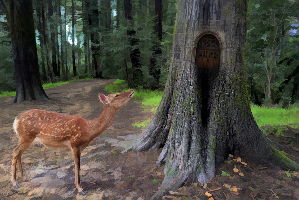
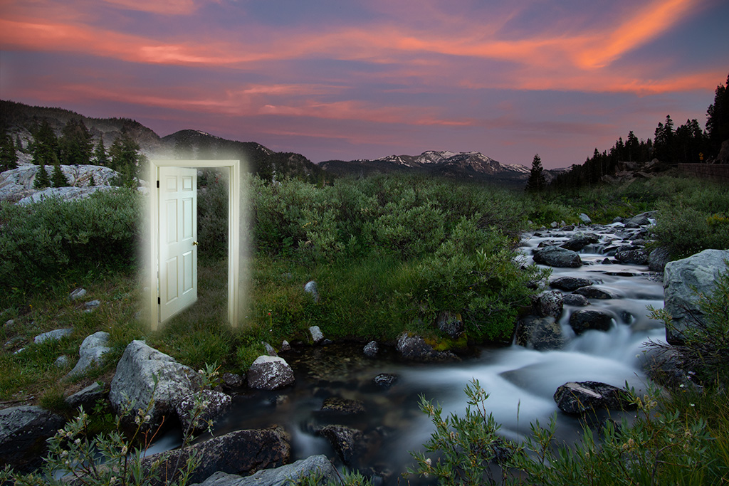
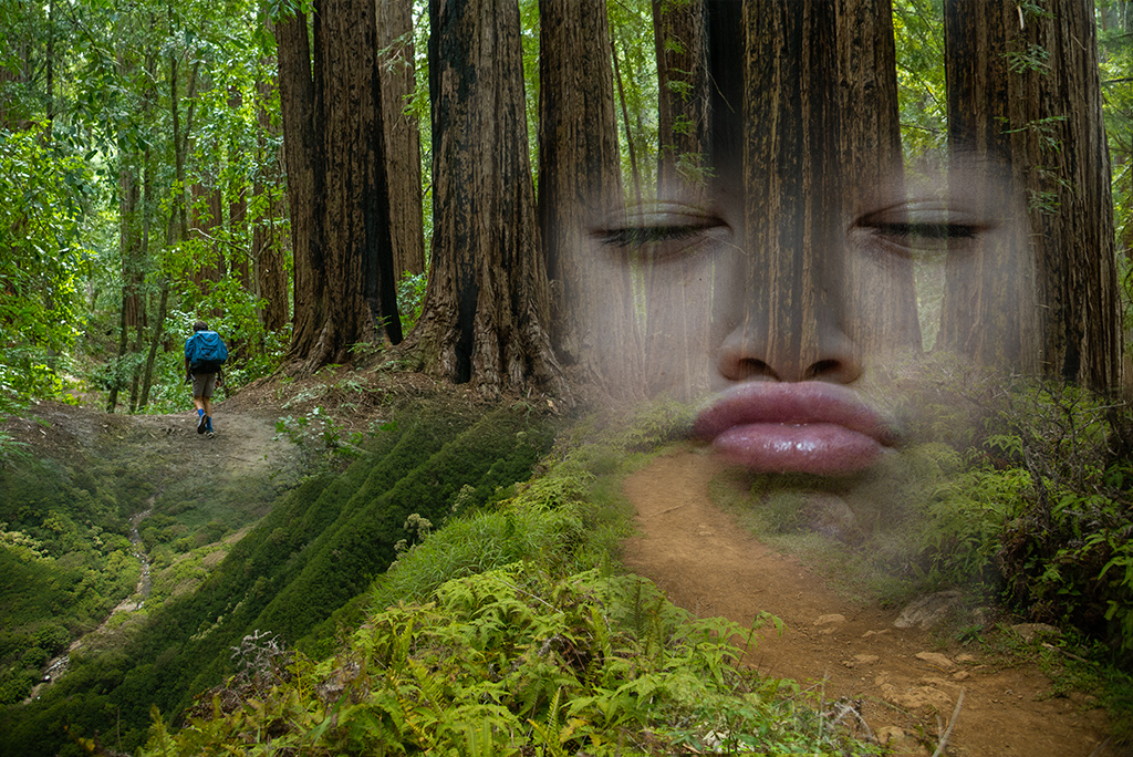
Gus, Thanks for your feedback. I wanted my daughter's journey into another realm to be the focal point of the image. I chose to make her, and particularly the opening in the tree/portal, a little sharper compared with the gentle soft pastorale tones of the wall. I think this is a personal preference thing. I will play around with a blur to this layer to see how it feels. |
Jun 11th |
| 54 |
Jun 19 |
Comment |
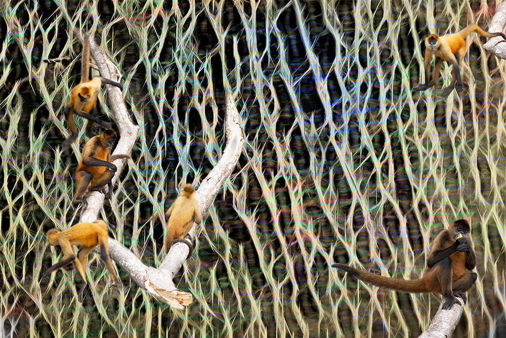
Gus, This is a superb image. I love the mood you've created. The colors are very relaxing/pleasing. The use of repetitive images here really have created a magical landscape for your subjects Well done! How did you generate the rain like vertical pattern? |
Jun 9th |
| 54 |
Jun 19 |
Reply |
Alan, It is a strong image as is. I only share my thoughts of hand I might handle the image. Take everything I say with a grain of salt. |
Jun 5th |
| 54 |
Jun 19 |
Comment |
Betty, I like the themes you are working with here. Time is a theme I always enjoy exploring. I'm not sure the story is clear in this image though. |
Jun 5th |
| 54 |
Jun 19 |
Comment |
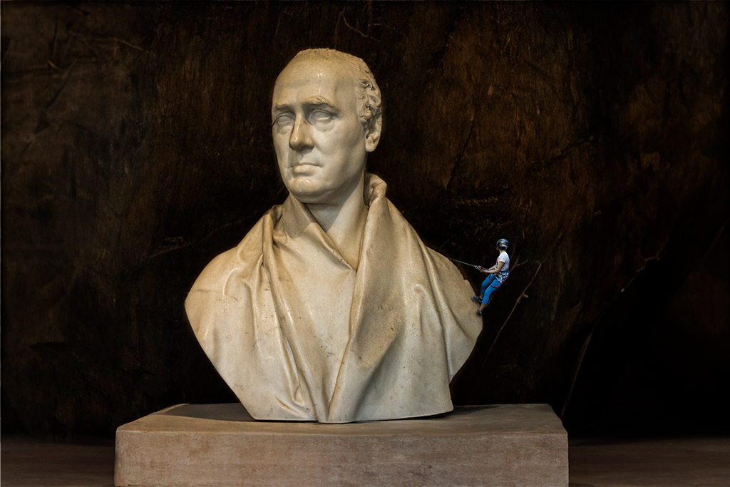
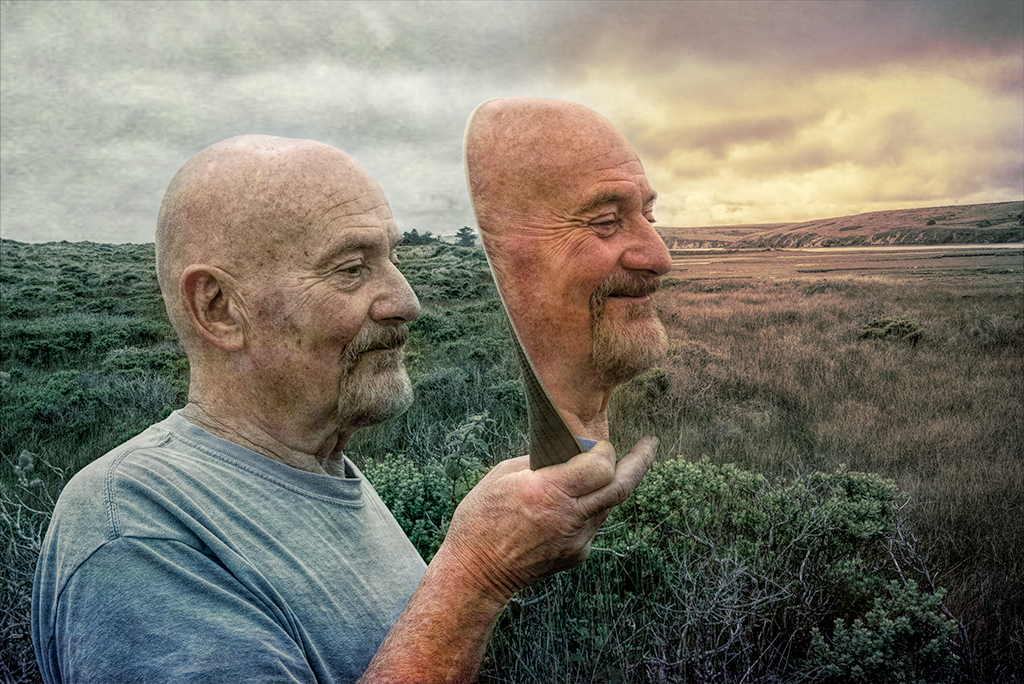
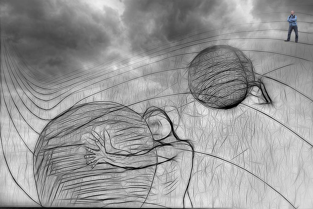
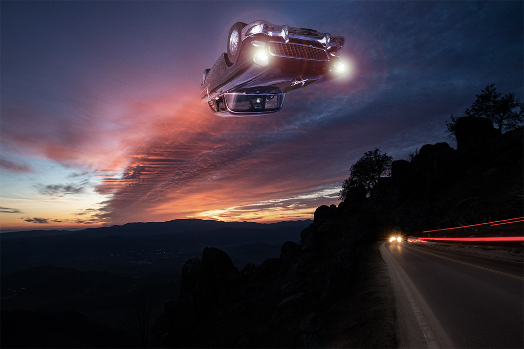
Alan, You've done an outstanding job on the original image, capturing the man on the ropes must not have been easy.
The elements you've chosen don't draw me in as much as in some of your other images. I could envision a stronger image if you were to have a single object floating in the upper right corner where the acrobat is looking. |
Jun 5th |
| 54 |
Jun 19 |
Comment |
Aavo, A fun image. There's a theme this month (look at Peggy's image). The cat's face feels a little bright on my screen otherwise it looks like you achieved your goal. It's nice your granddaughter is enjoying your work. |
Jun 5th |
| 54 |
Jun 19 |
Comment |
Peggy, What a wonderful image you've created here. I love the retro feel and the whimsical nature of the image. I really like the angle of the child's face and fish face as if they are regarding each other. There's something almost archetypal about this image with a surrealist twist. |
Jun 5th |
5 comments - 4 replies for Group 54
|
| 57 |
Jun 19 |
Comment |
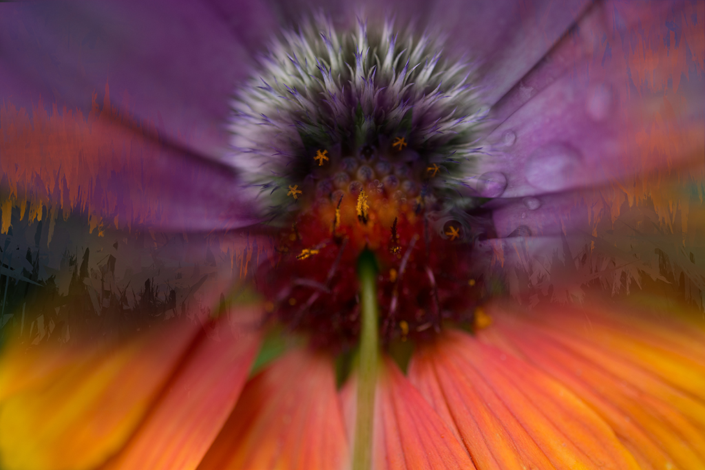
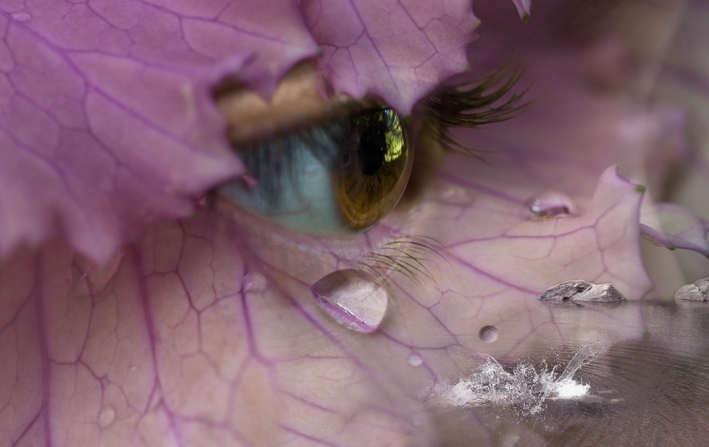
Stunning image, has a deeply spiritual feel to me by how you've handled the light and colors. I'd be interested in trying water drop photography after viewing your image |
Jun 16th |
1 comment - 0 replies for Group 57
|
14 comments - 12 replies Total
|