|
| Group |
Round |
C/R |
Comment |
Date |
Image |
| 41 |
May 19 |
Reply |
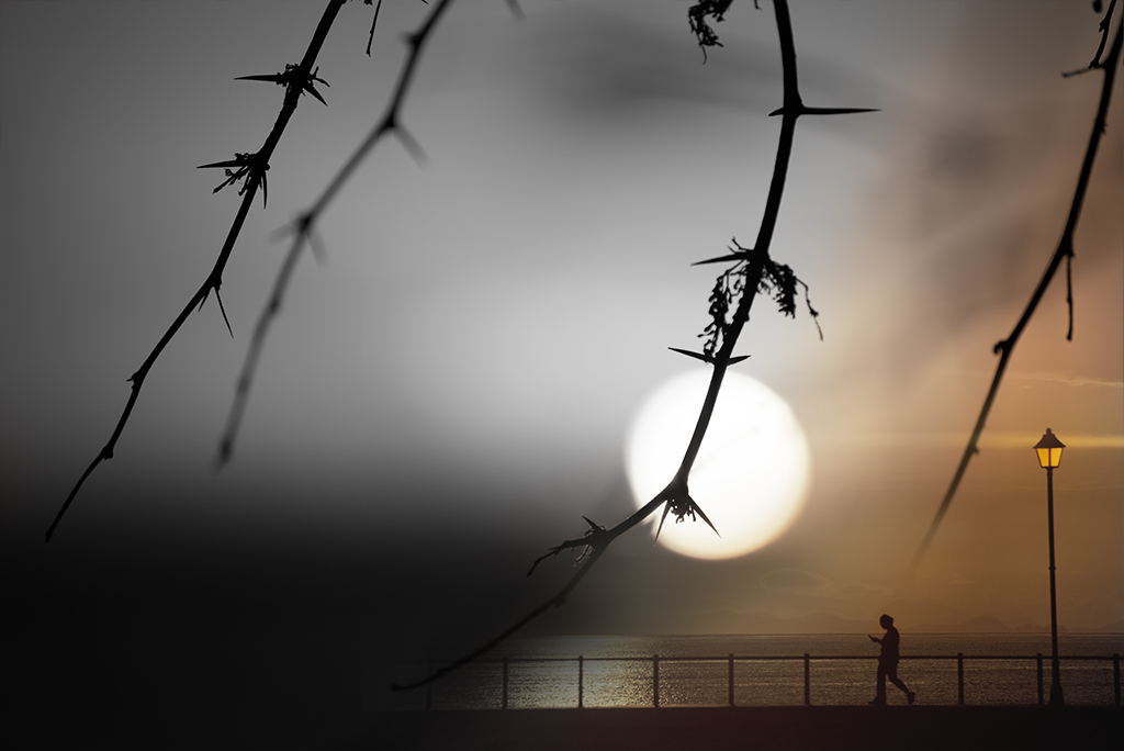
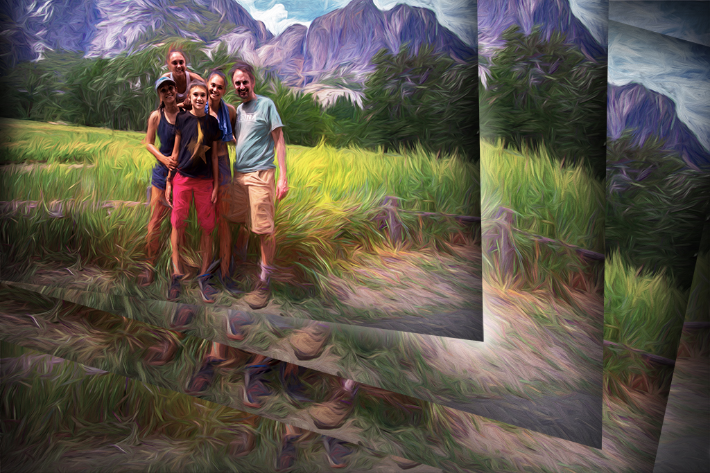
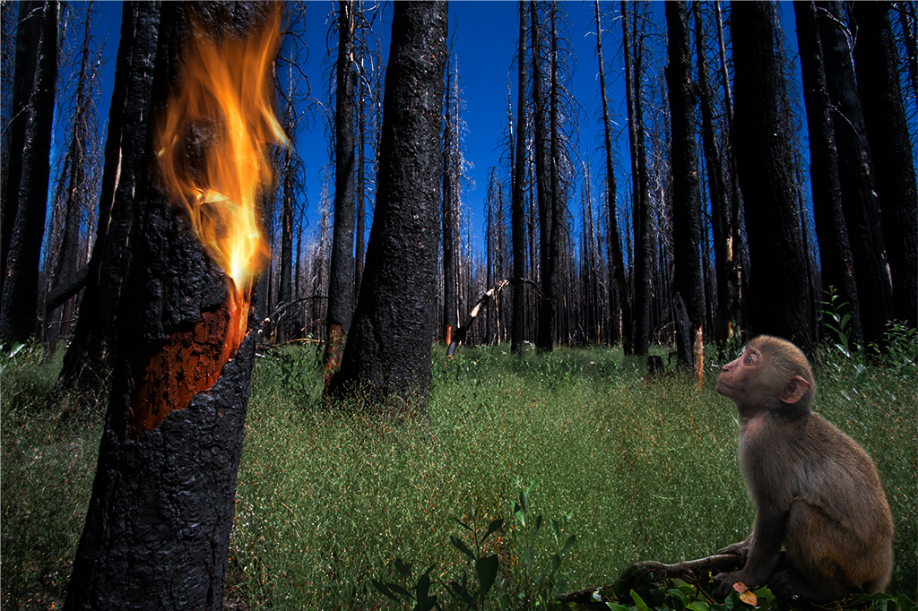
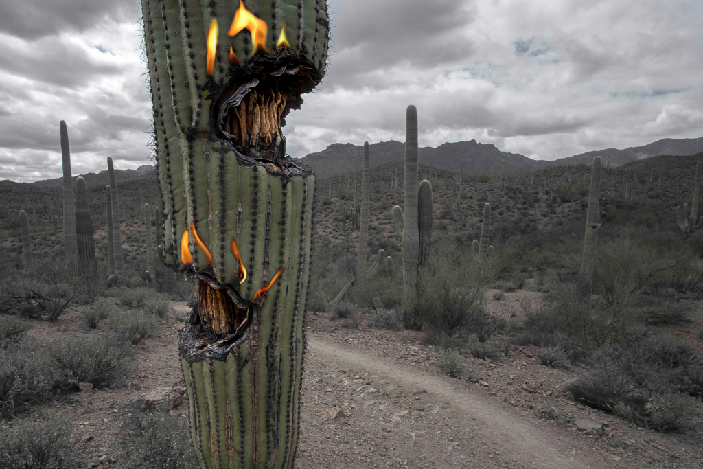
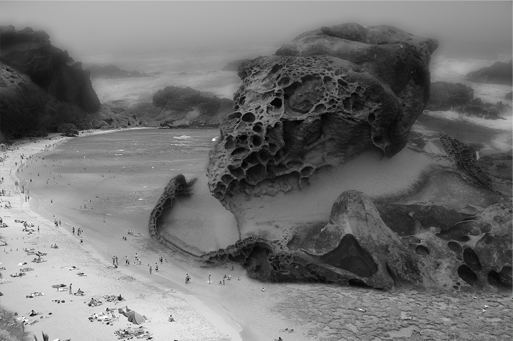
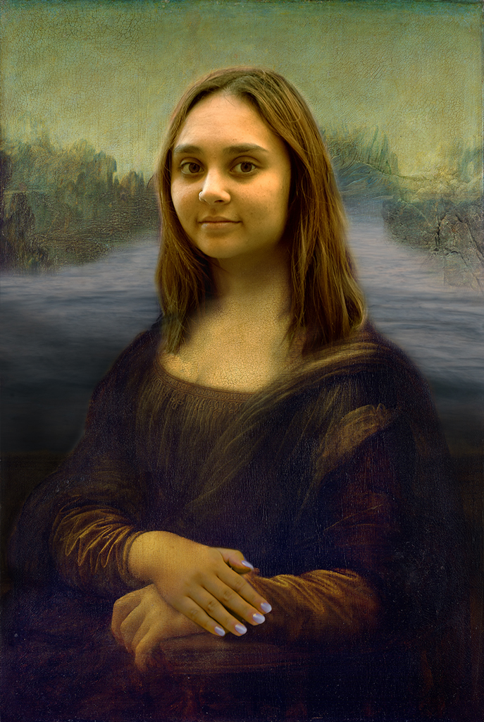
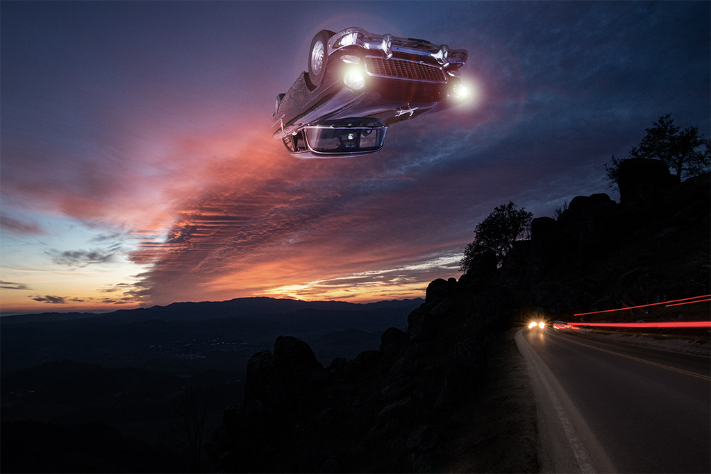
Jan, My version is certainly much more subdued. I like your version too. I am definitely going to brighten the left side and will play around with the contrast and lighting some. I'm sure you've found yourself playing with images and end up with so many different versions it can be difficult sometimes to settle on the final image. I'm glad I shared this image with the group as I have a lot of ideas to work on now. |
May 18th |
| 41 |
May 19 |
Reply |
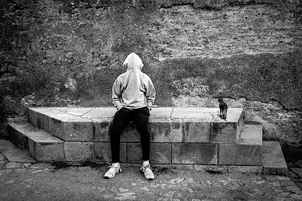
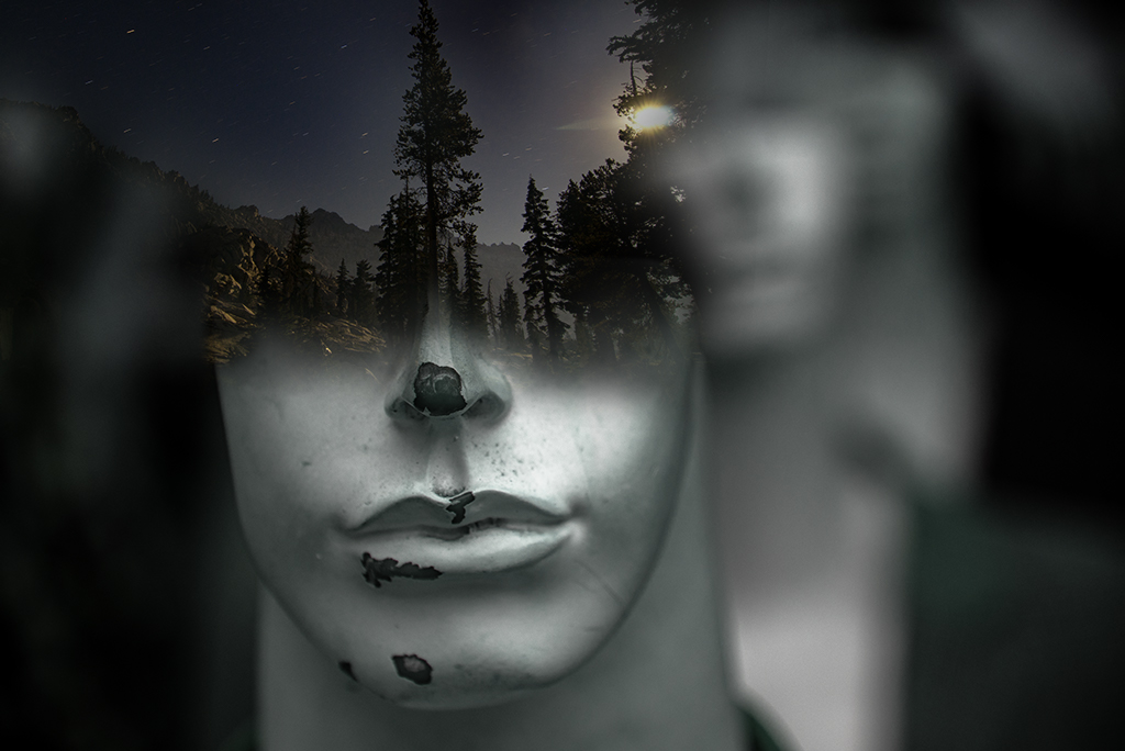
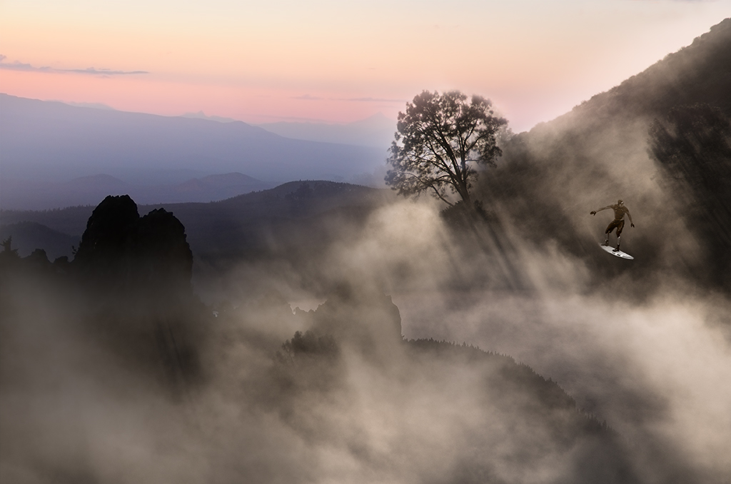
Kathy, Thanks I do see how the dominance of the black is a bit overpowering and relieved by your cropping. I am going to try listening up some of the dark areas to see if I can salvage them, but the crop may be the way to go. |
May 18th |
| 41 |
May 19 |
Reply |
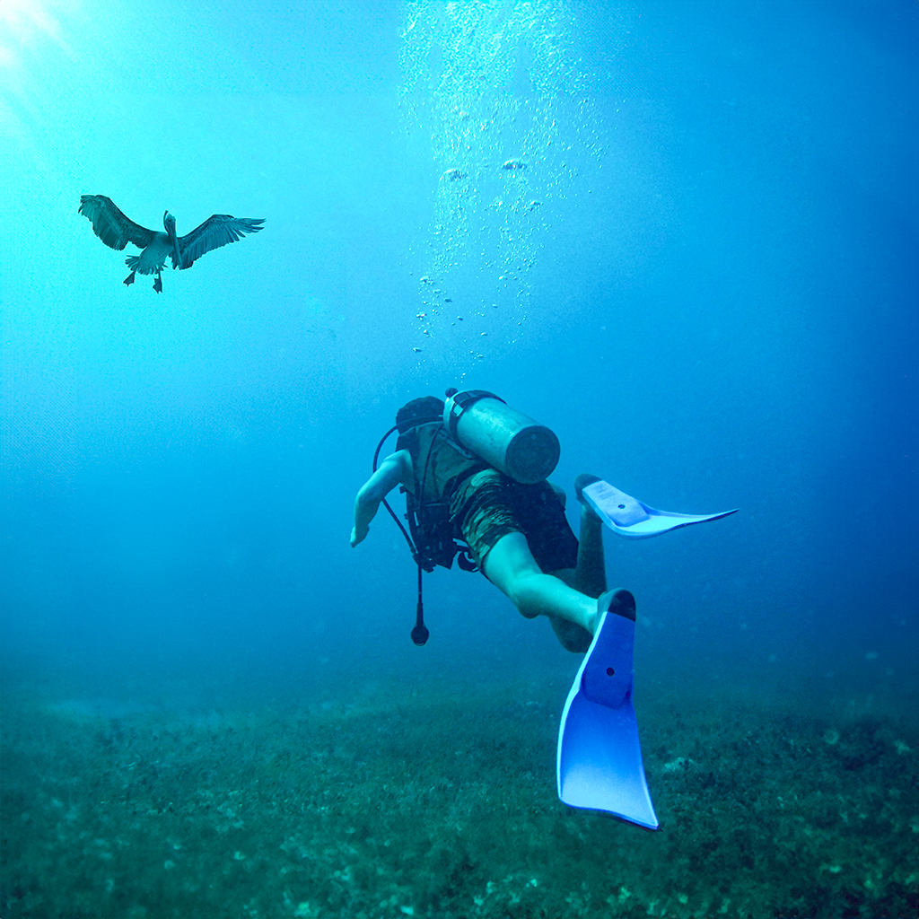
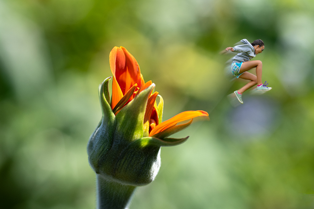
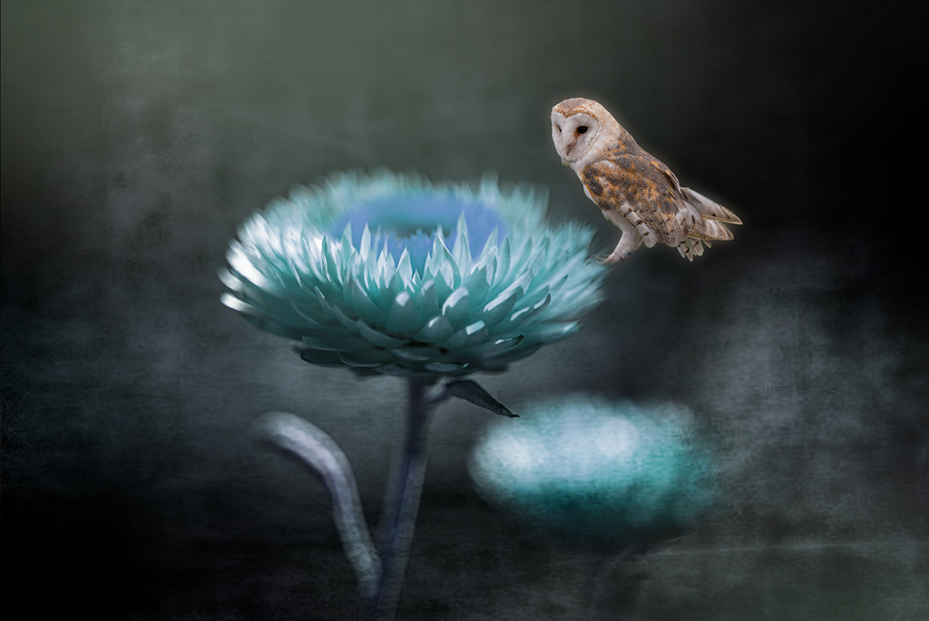
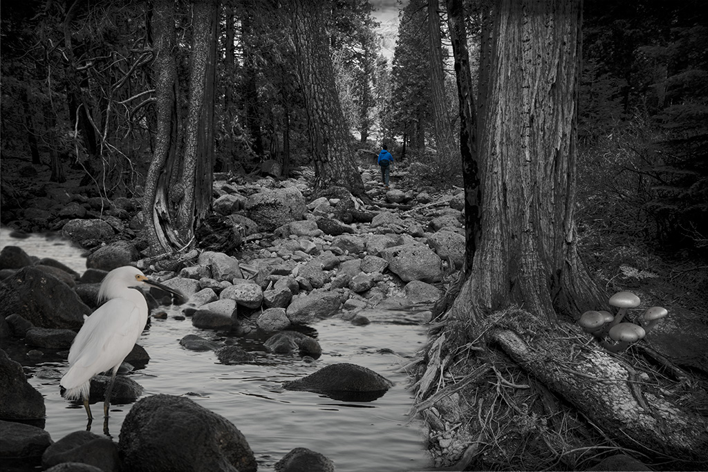
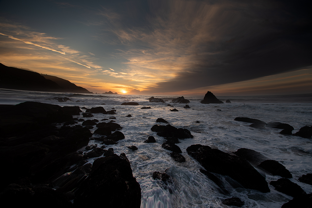
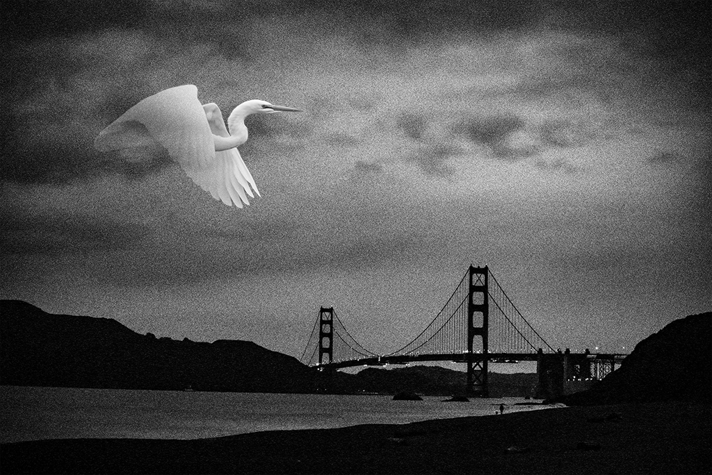
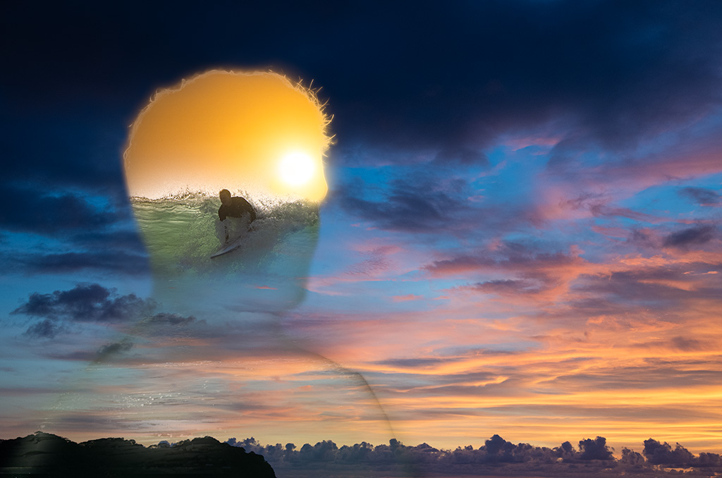
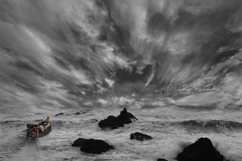
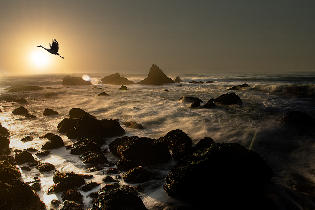
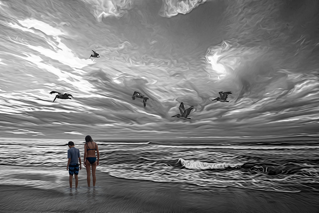
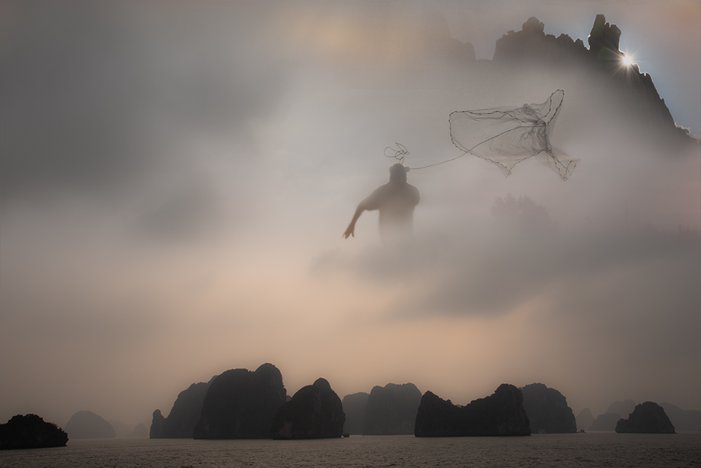
Kathy, You raise an interesting question. I had thought about putting a bird in the image to tie in the two elements and relieve the perfect balance of skin and waves but all the birds I've added seem too stuck on and didn't add to the image. I'm curious what you are imagining, i.e. how would you want to change the balance? |
May 18th |
| 41 |
May 19 |
Reply |
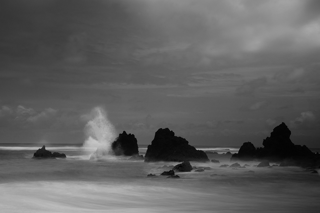
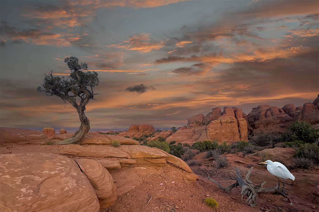
Henry, I appreciate the feedback. I feel like a rock in the bottom right might create an imbalance to the image and take away from the arch rock and the waves. Do you envision a specific size or color, I've tried adding rocks but find them distracting? |
May 18th |
| 41 |
May 19 |
Reply |
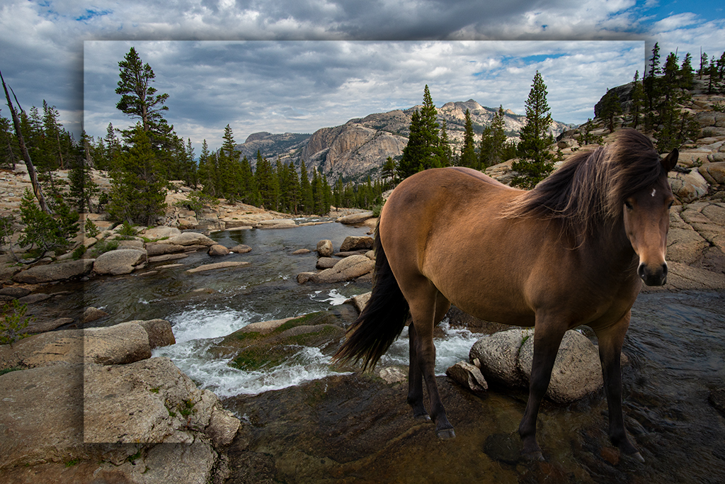
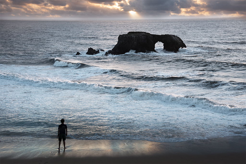
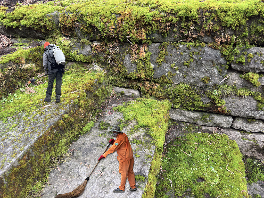
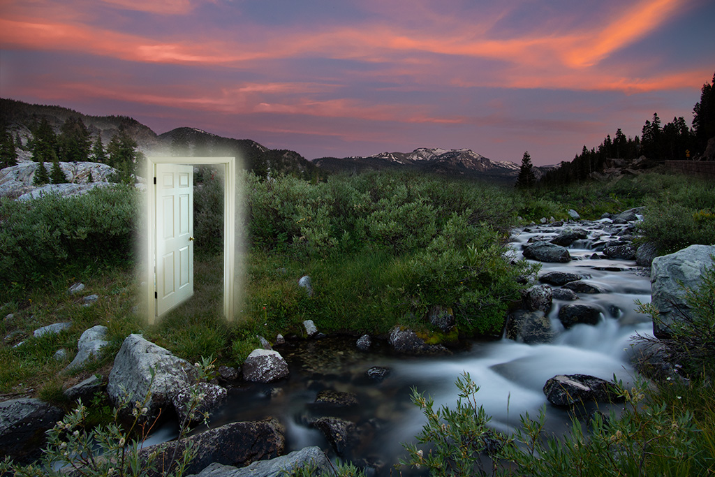
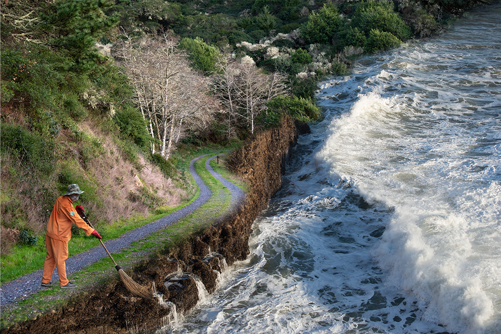
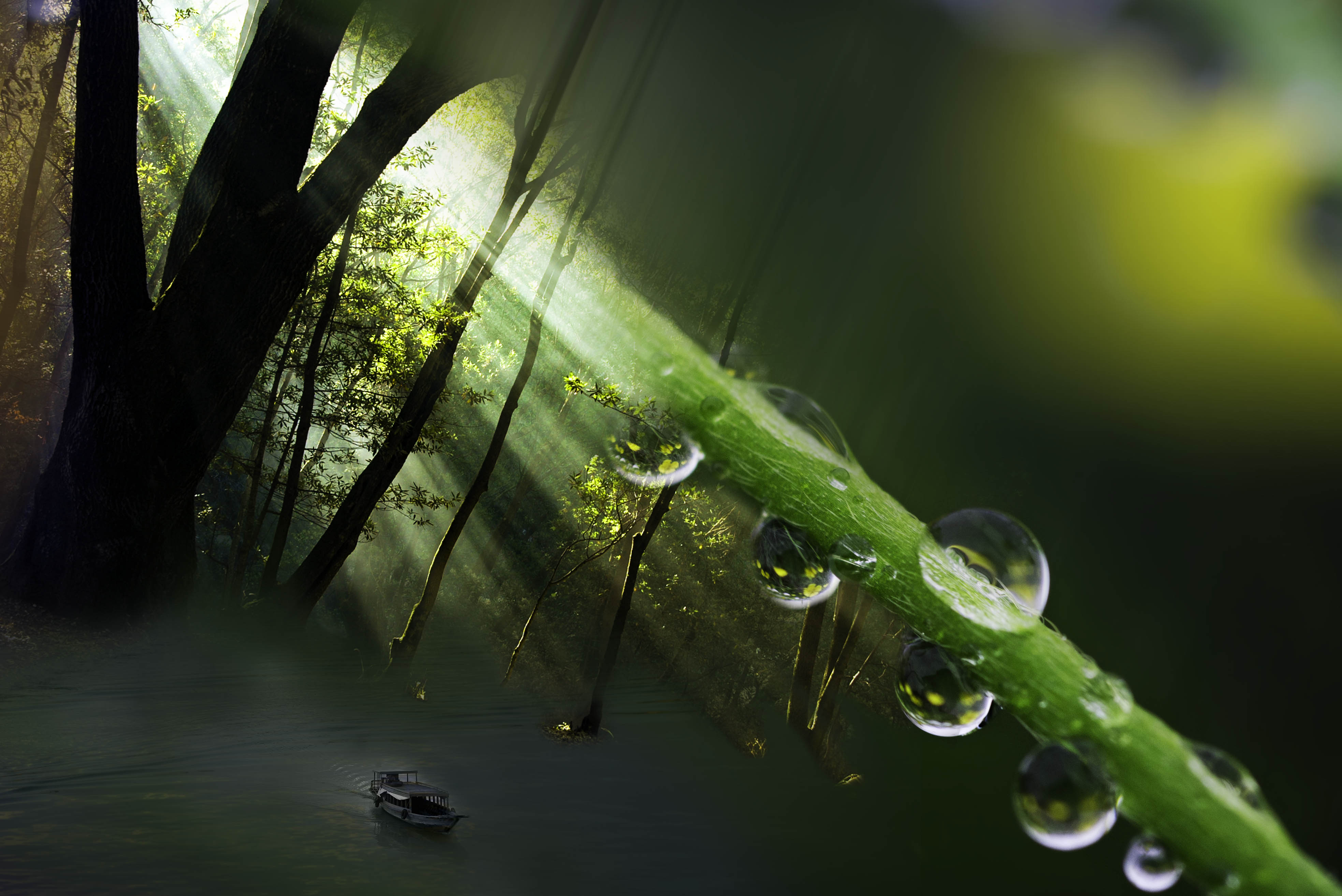
Lisa, I will play around some with the shadow on the left to see if lightening it up may draw the eye as I agree there is a lot of dead space |
May 14th |
| 41 |
May 19 |
Comment |
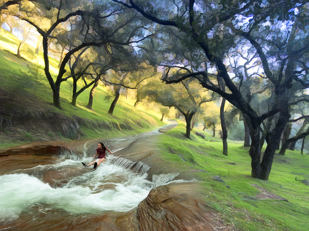
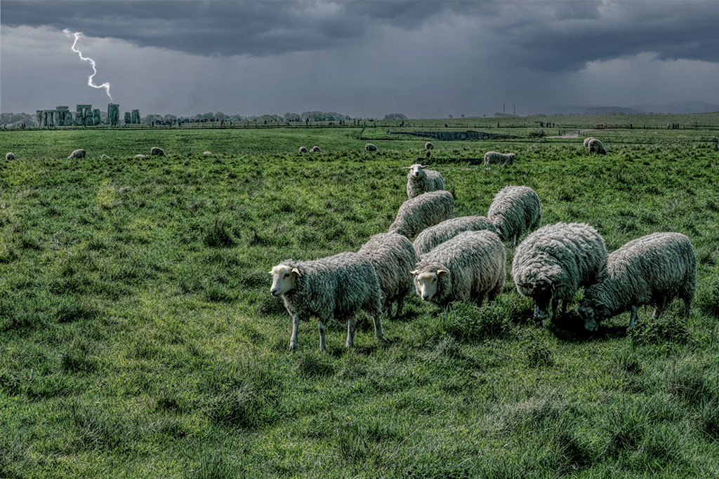
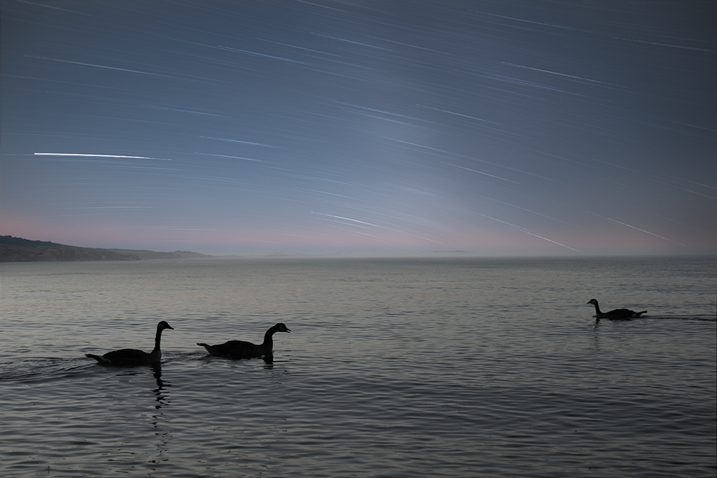
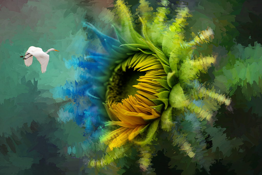
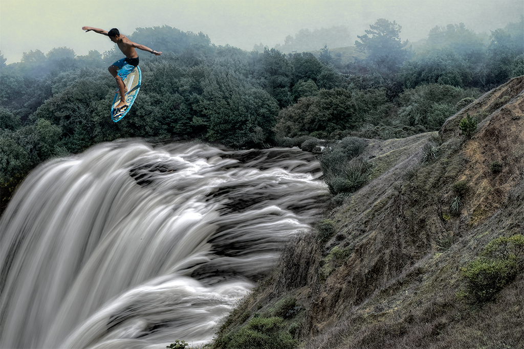
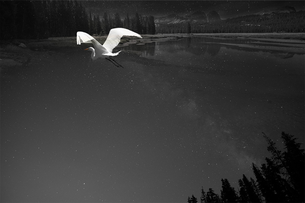
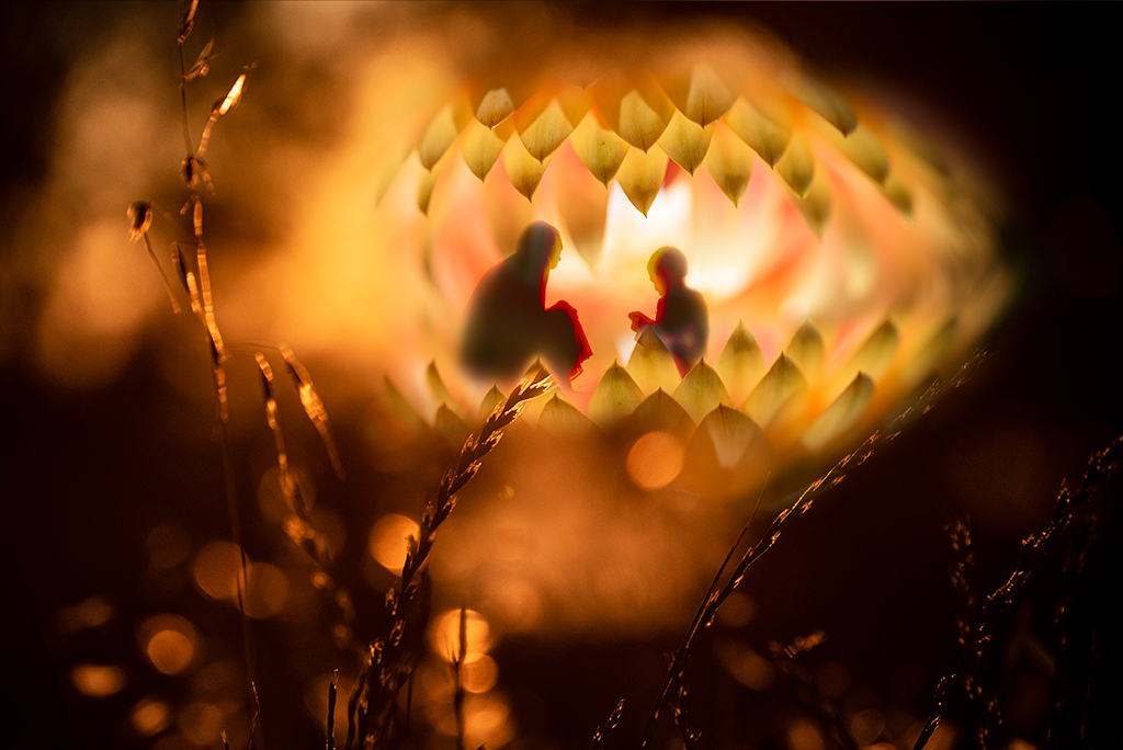
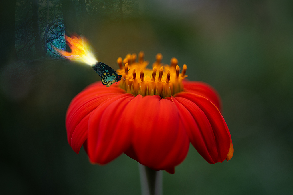
Henry, You've handled the filter and coloring nicely. I like how the splash of red color is vertical to counterbalance the horizontal lines in the pond.
I would like to see element to draw my attention like a bird or flower. It's a pretty image but doesn't draw me in. |
May 10th |
| 41 |
May 19 |
Comment |
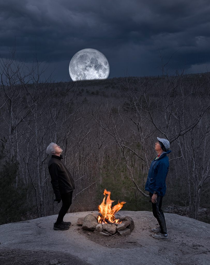
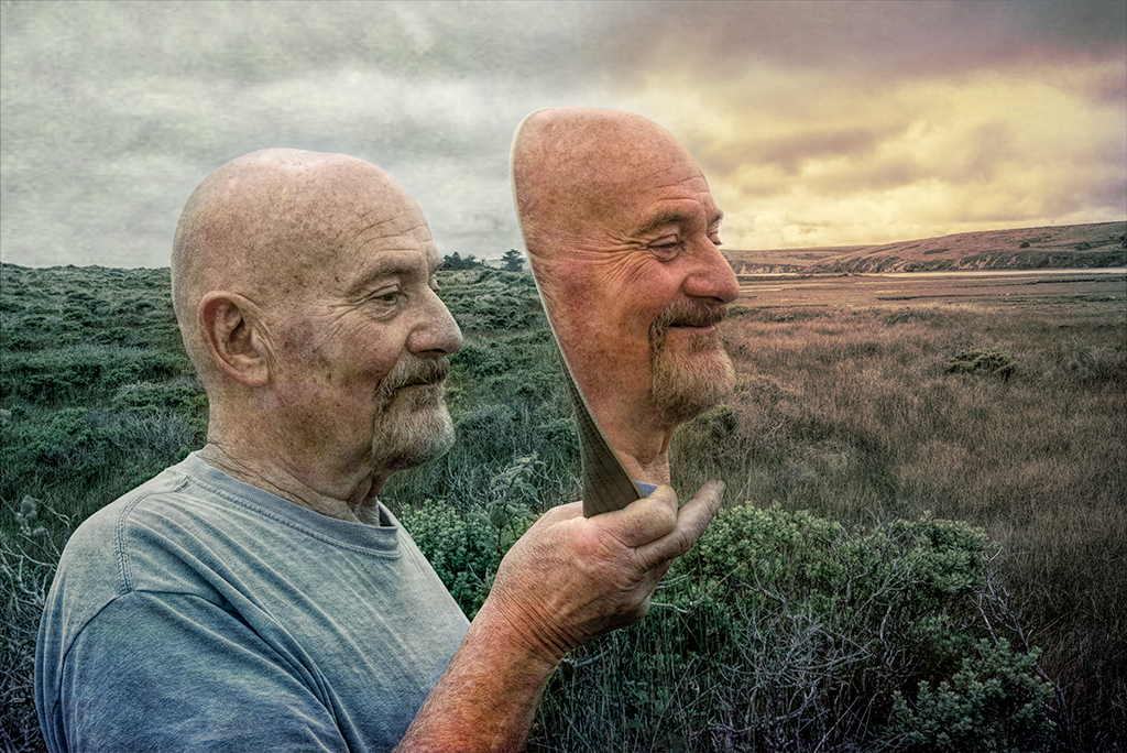
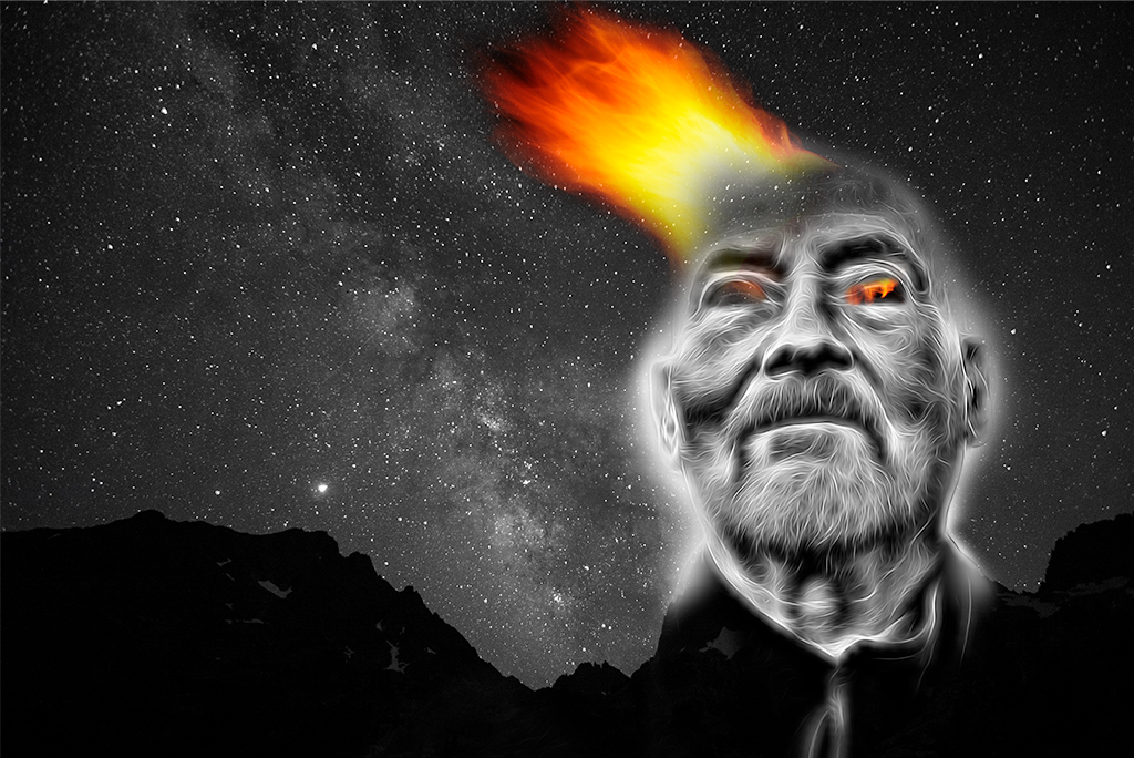
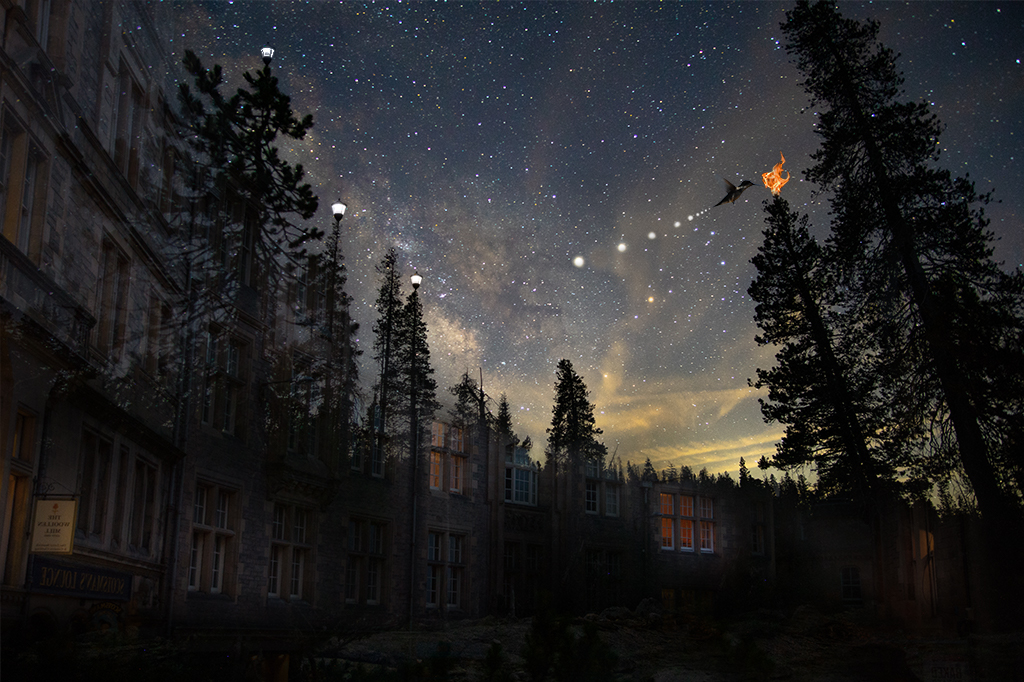
Jan, You've handled the cutting/pasting and blending very nicely. The moon does feel a little content heavy to me as it draws my eye away from the bear. I often struggle with how much to leave out of my images too. Photoshop is an amazing tool, but it can create visual indigestion. I think it is a very powerful image without the moon and birds. I might consider moving the boat a hair down and to the left, personal preference. I like to ask myself "what is the story I am telling". The bear on a boat in the middle of a lake, floating on a cloud staring at an owl has plenty to think about. Nice job! What is fotoclave? |
May 4th |
| 41 |
May 19 |
Comment |
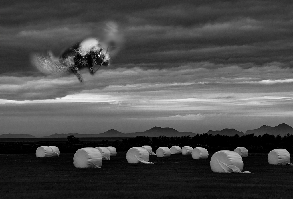
Shattered dreams is really edgy. Theresa sells the image very well, both of them. I expect we will be seeing some baby shots in future months. |
May 2nd |
| 41 |
May 19 |
Comment |
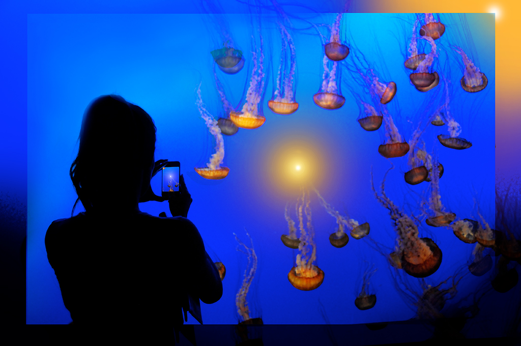
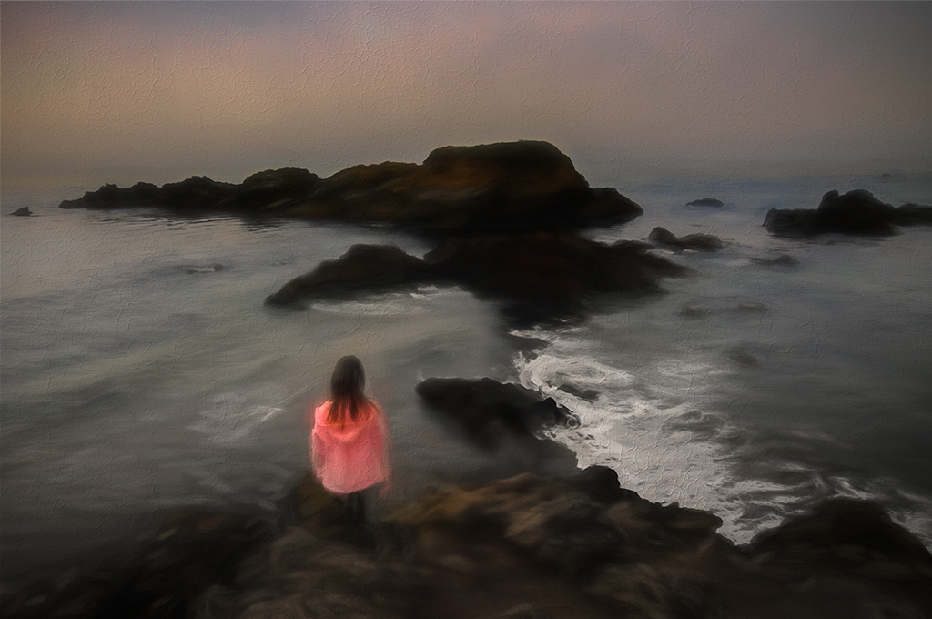
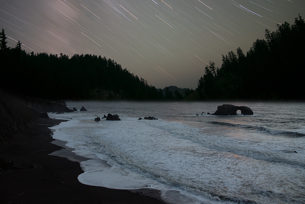
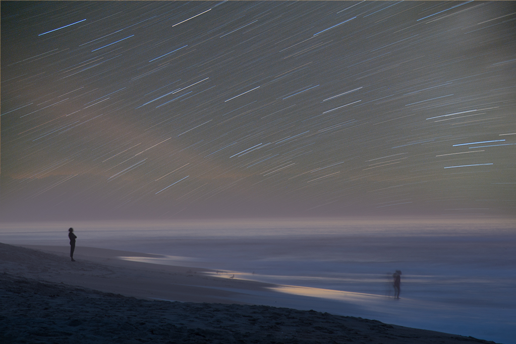
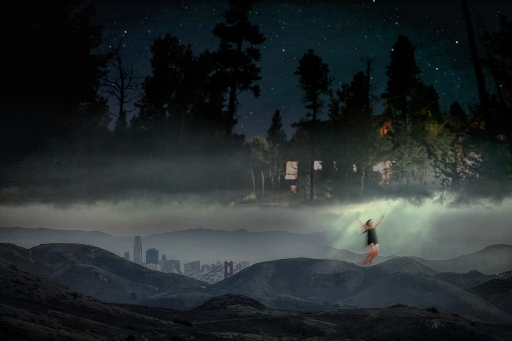
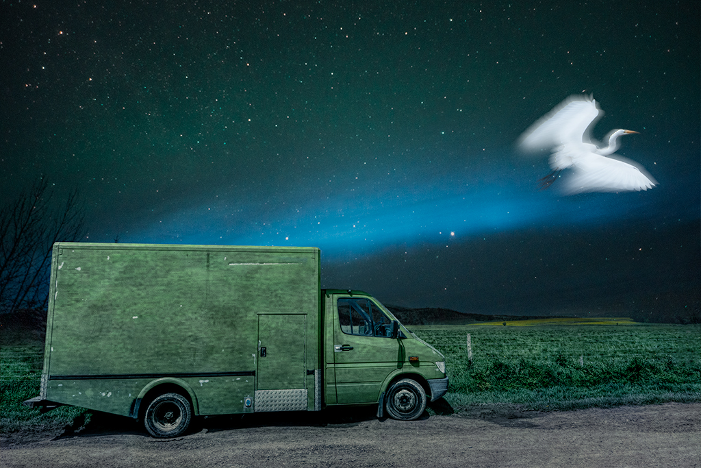
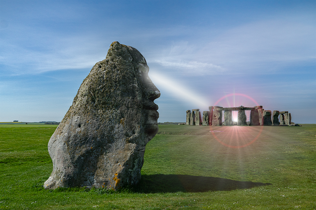
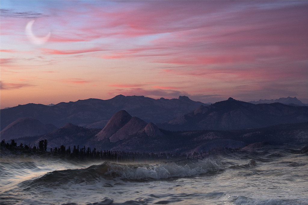
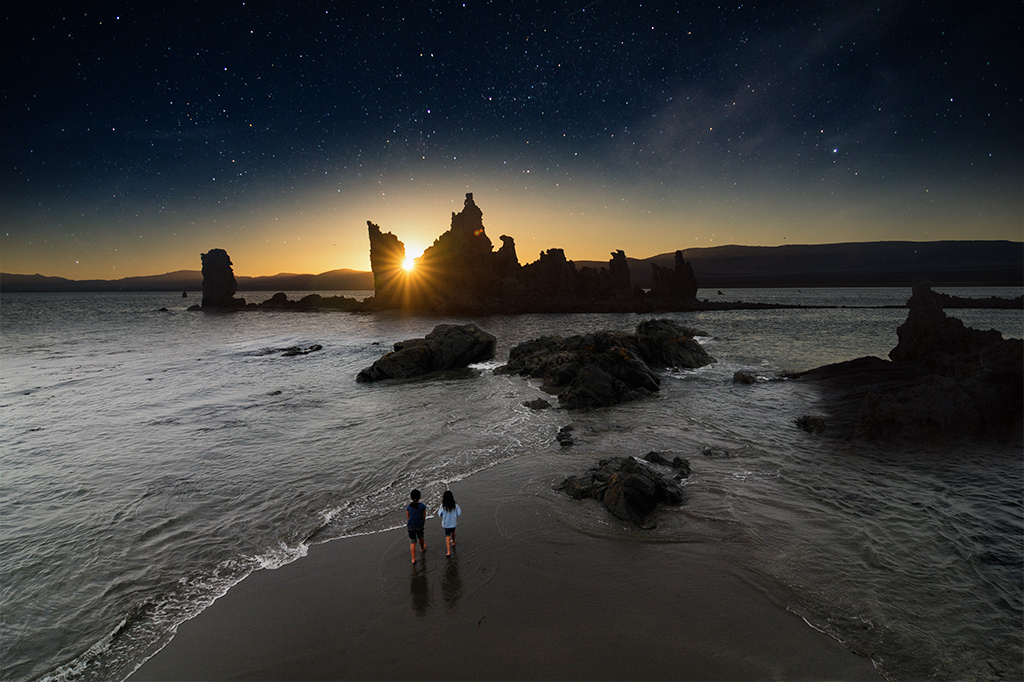
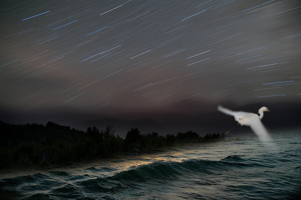
Kathe, What a magical beach image. I love the foreground and background elements. You've done a wonderful job telling a story here. The addition of stars and color pallet choices are wonderful and help to sell this mysterious image.
Although it may not be possible, given the original image, it would be nice to have her not so centered in the frame. She also appears a little dark. Since you are already bending reality maybe try adding some glowing light to her form to make her stand out a little more.
I just saw the whale. It is a wonderful element but not easy to see either given how muted the tones are |
May 1st |
| 41 |
May 19 |
Comment |
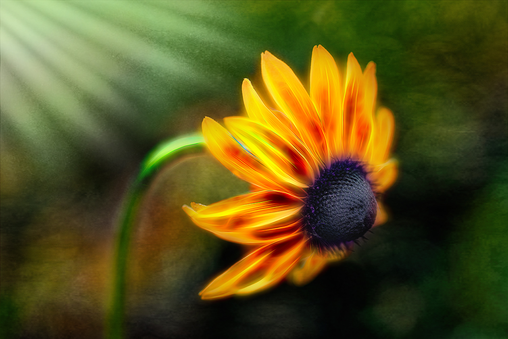
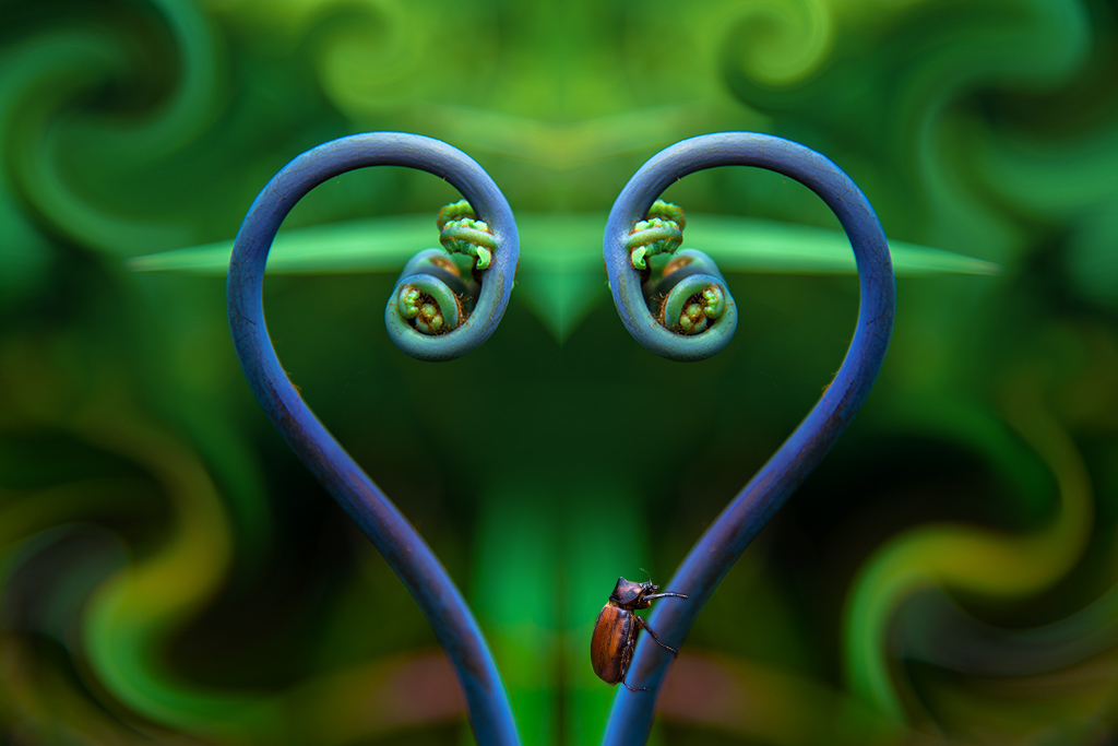
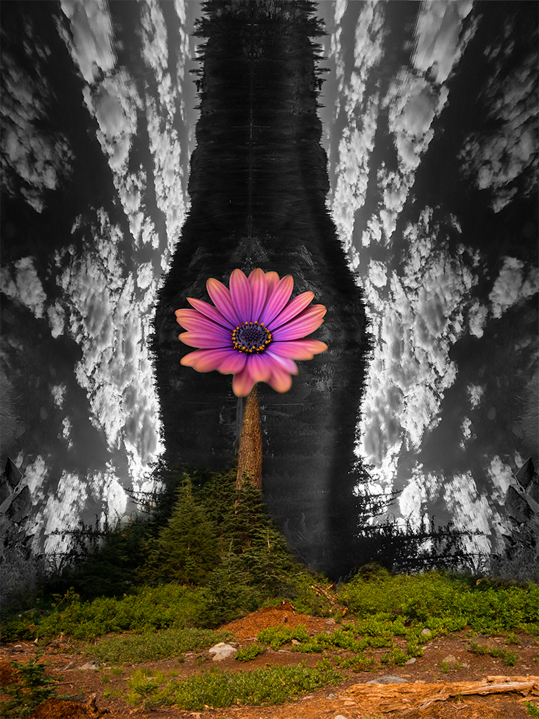
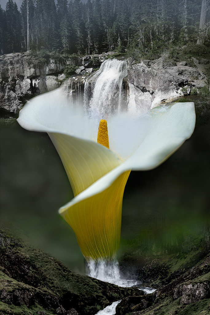
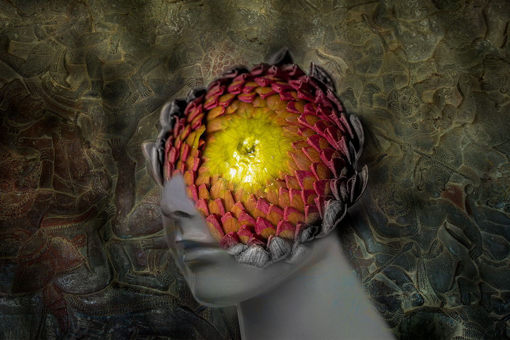
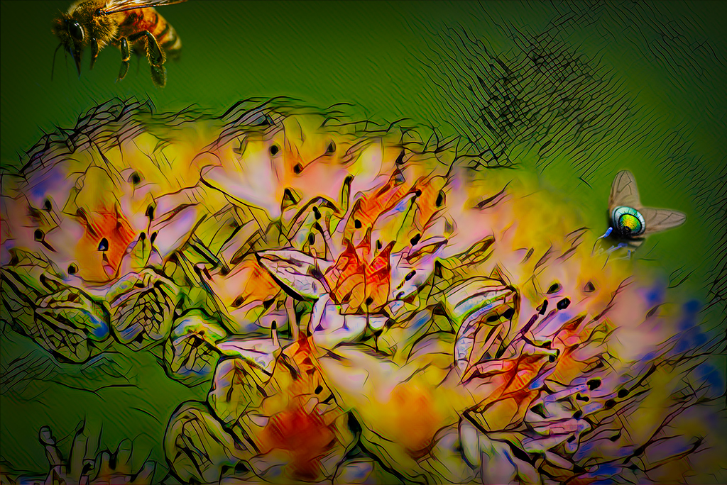
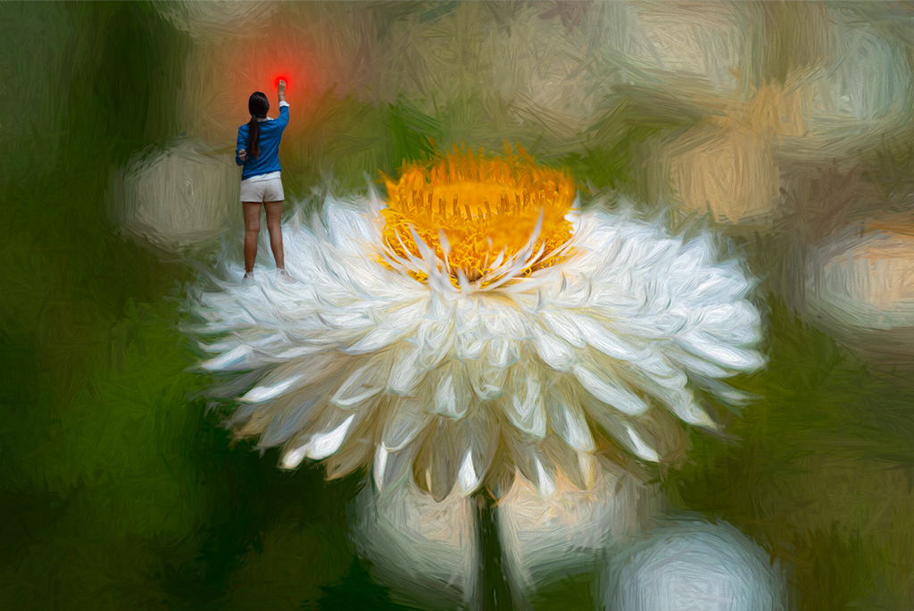
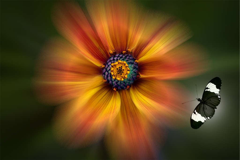
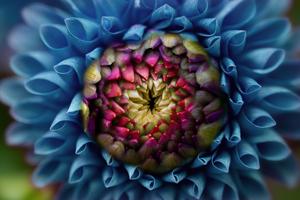
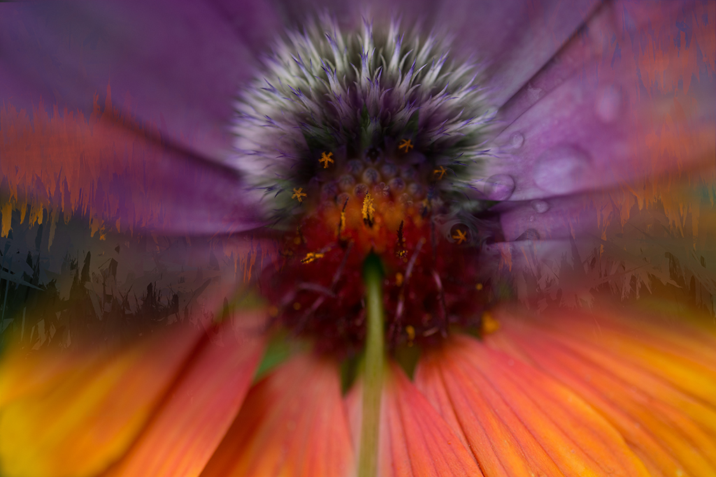
Lisa, Another amazing image. You are the master of repetitive forms. What a truly incredible flower. This reminds me of some of the photos of exotic invertebrates seen in the deep ocean. I have nothing to add. |
May 1st |
| 41 |
May 19 |
Comment |
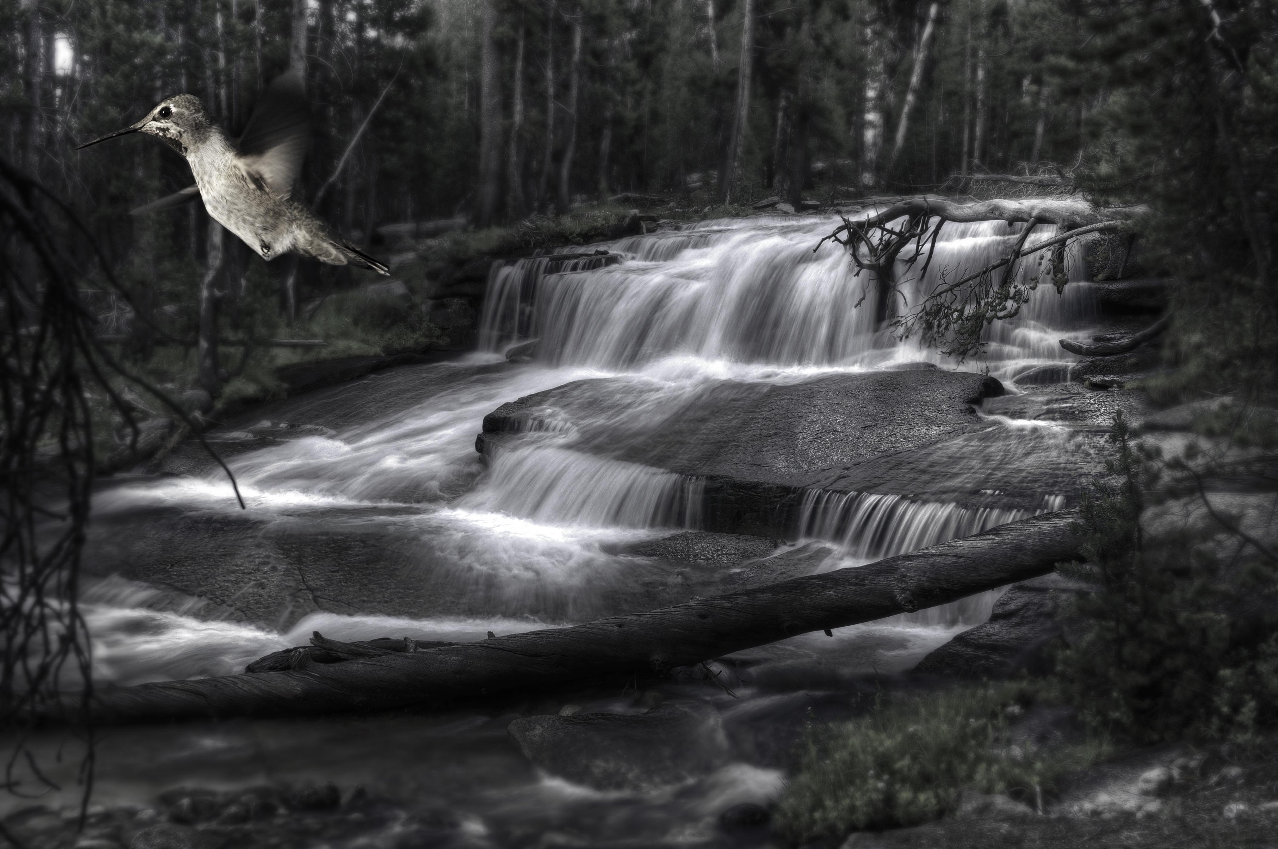
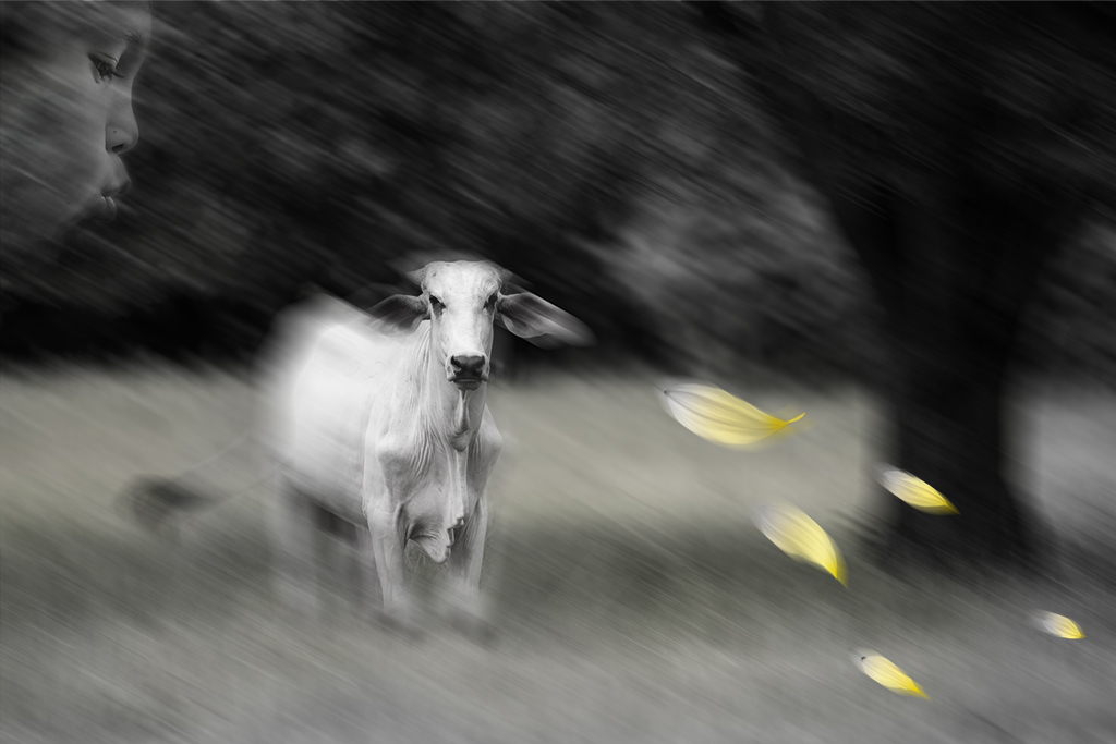
Sue, You've handled this playful image nicely. It feels nicely balanced and cropped. I have nothing to add. Impressive you got Theresa to cooperate with your image 2 weeks before giving birth. |
May 1st |
| 41 |
May 19 |
Comment |
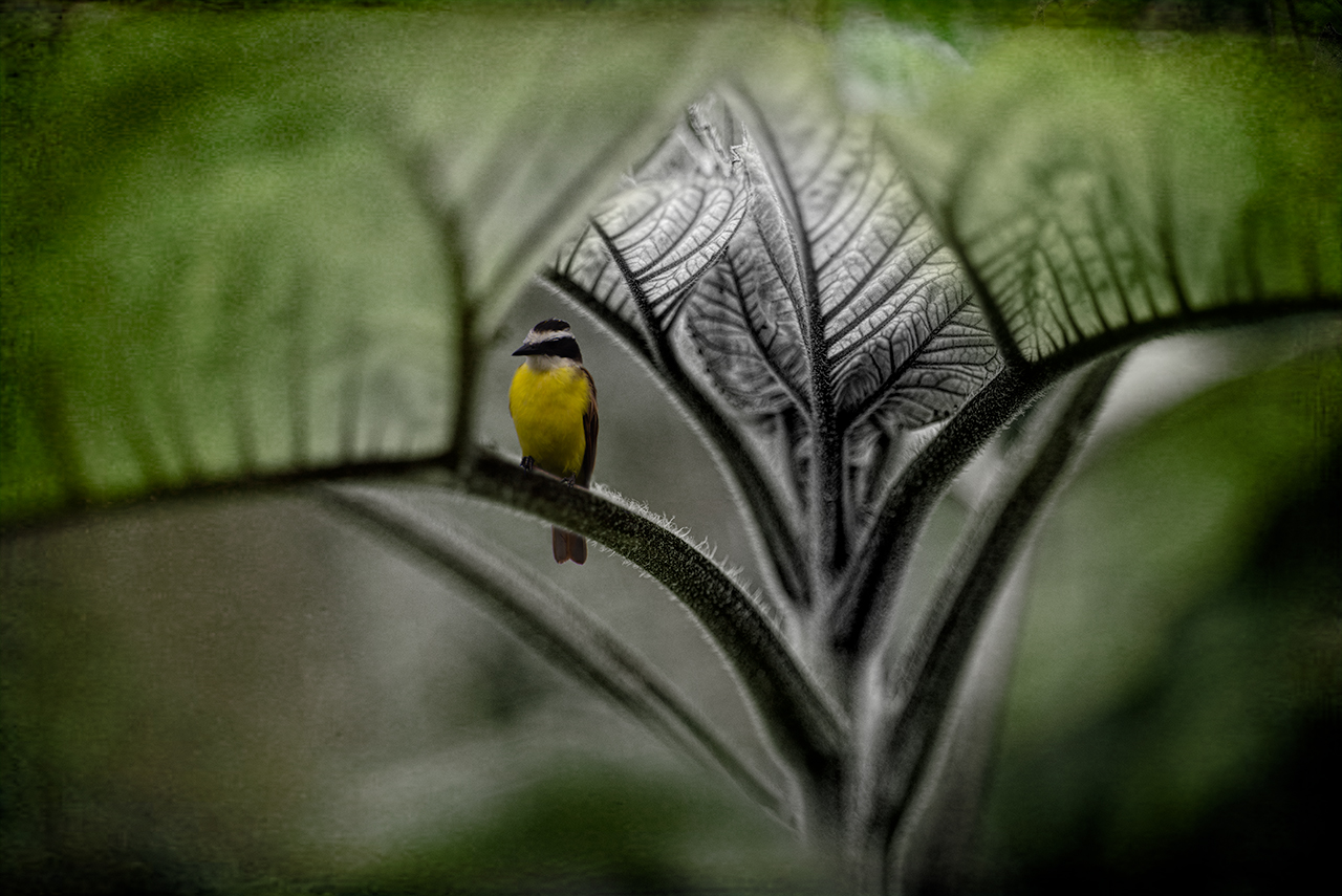
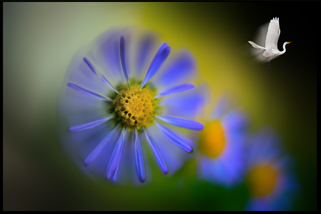
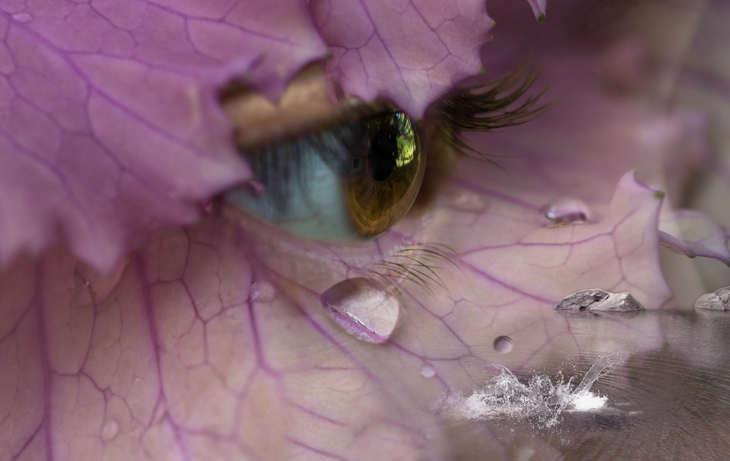
Maryellen, Welcome to our group. What a wonderful image. I love how you've found a type of flower that recapitulates the colors of the bird's eyes. I really like how you handle the framing in this image and especially like how you've selectively desaturated the flowers making the flowers that are in full color pop. Having a few flowers extend beyond the frame is artistically pleasing. The muted tones of the background nicely enhance the bird and flowers.
I wonder if the image would be stronger if you had a different hand position, maybe one hand or have the bird resting on something else. |
May 1st |
7 comments - 5 replies for Group 41
|
| 54 |
May 19 |
Reply |
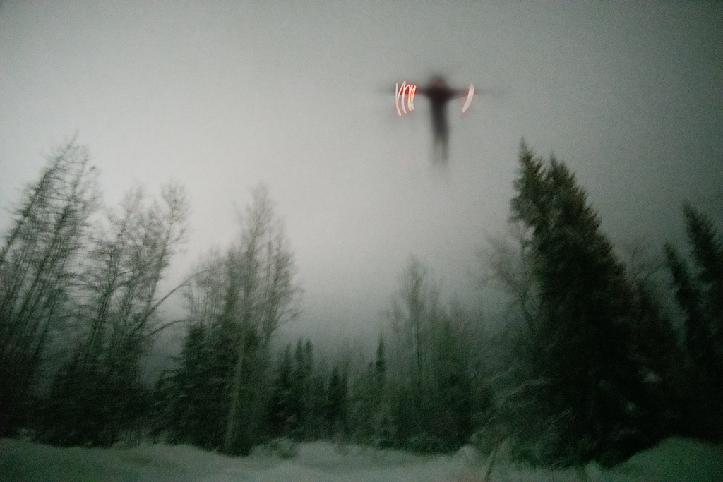
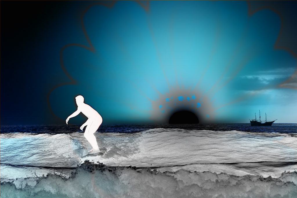
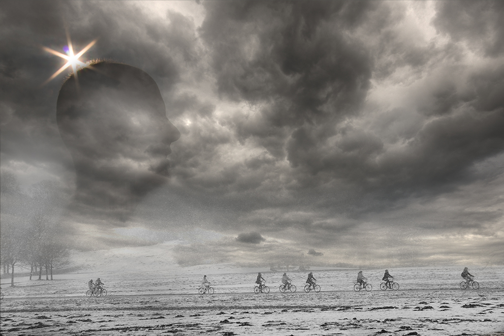
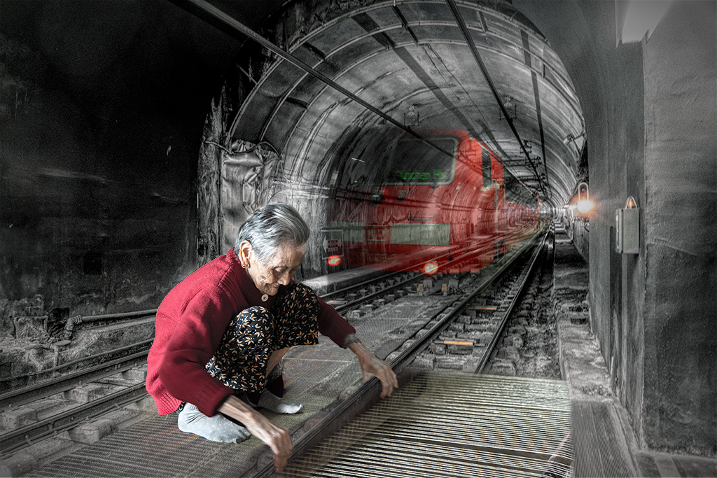
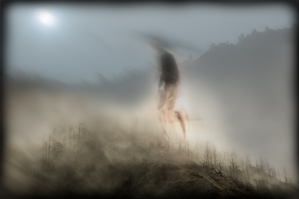
This explanation helps to tie it together for me more, but as you know, the image ultimately needs to speak for itself. Your images always leave enough room for the observer to create the story. This image is a bit more challenging for me as it seems to have a stronger implied message than some. One other thought might be to stretch the woman in the window to emphasize her desire to fly or possess the wings. |
May 14th |
| 54 |
May 19 |
Reply |
Wonderful portfolio Gus. Don't worry about your english, your images speak for you. Looking forward to seeing more of your images in the months to come. |
May 14th |
| 54 |
May 19 |
Reply |
Peggy, Thanks, very helpful. |
May 14th |
| 54 |
May 19 |
Comment |
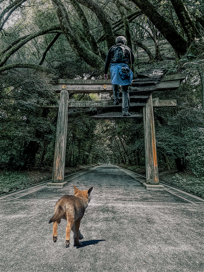
Gus, Welcome to group 54. This is a wonderful image. I can think of nothing to suggest other than entering this image in a contest as it has so many wonderful elements. |
May 14th |
| 54 |
May 19 |
Reply |
Thanks Alan. Send me a picture of you and your dog and I will put you in there :) |
May 14th |
| 54 |
May 19 |
Reply |
Peggy, Thanks. There definitely was a little mismatch with the colors. Can you give me a little more information on how you paint with a sampled brush? |
May 14th |
| 54 |
May 19 |
Reply |
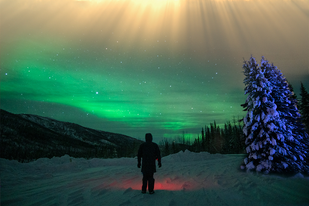
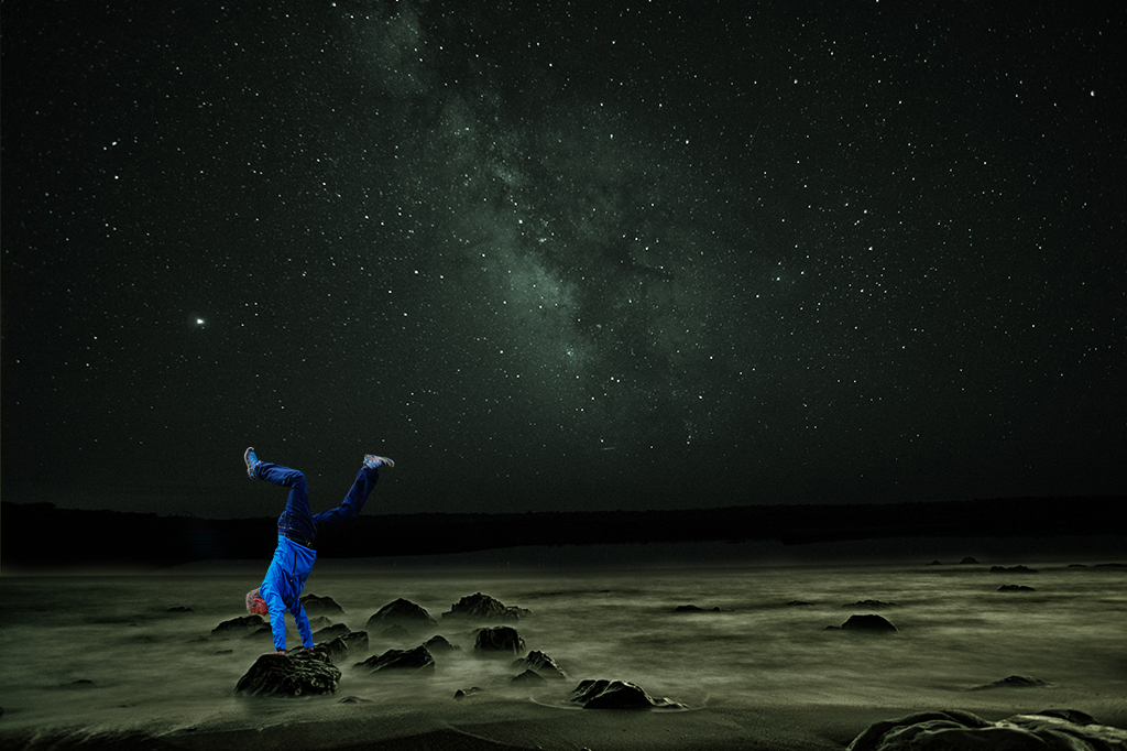
Peggy, I wouldn't stress too much about it. Since you are crafting some amazing images I am nitpicking. I have a few night shots I've done and the ones that are sharp are much more pleasing to me. I suspect most people won't even notice the stars and will be focused on the subject matter (which is what they should) |
May 7th |
| 54 |
May 19 |
Comment |
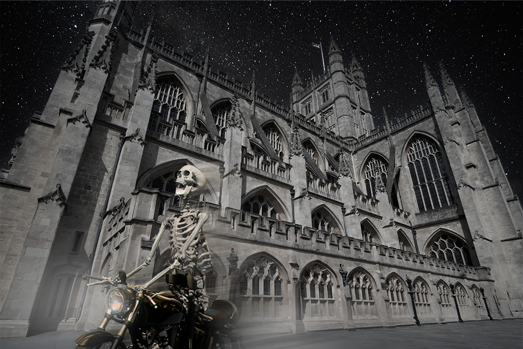
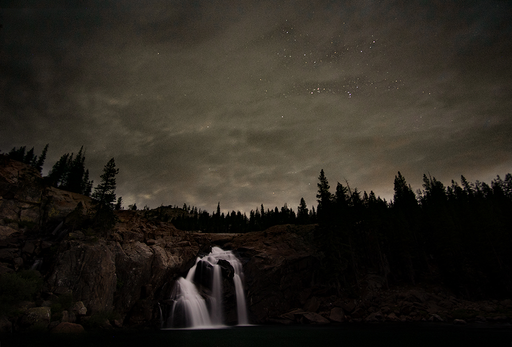
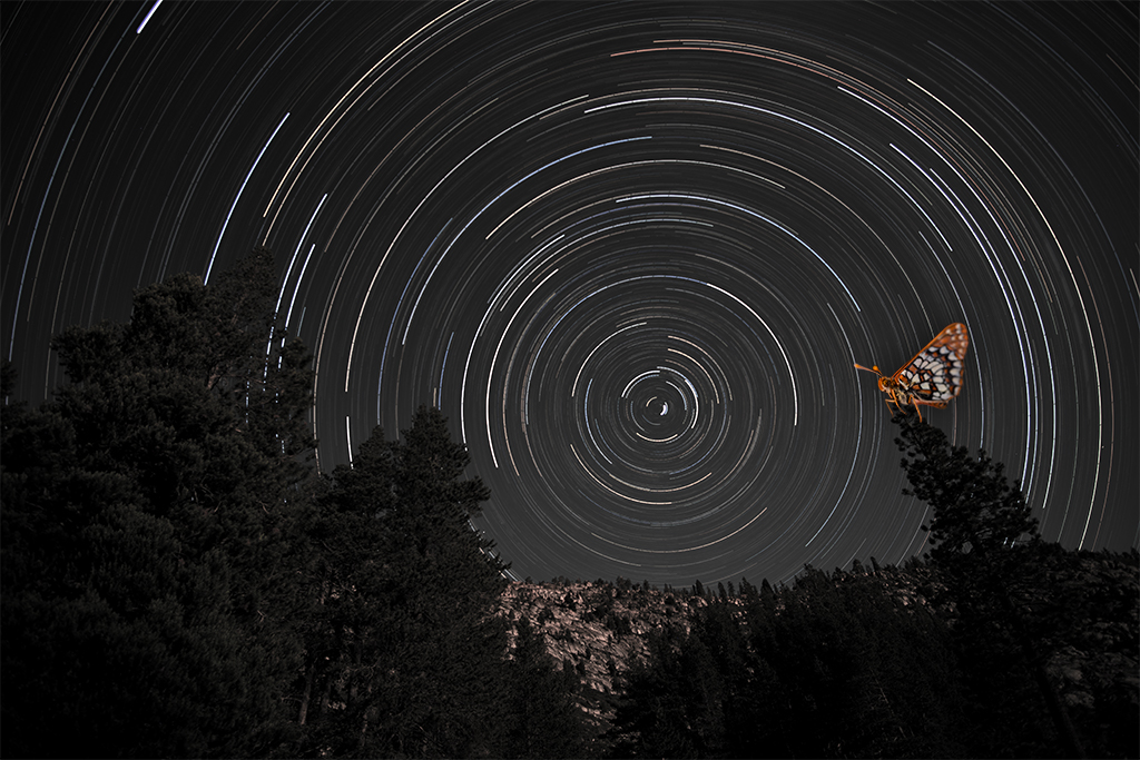
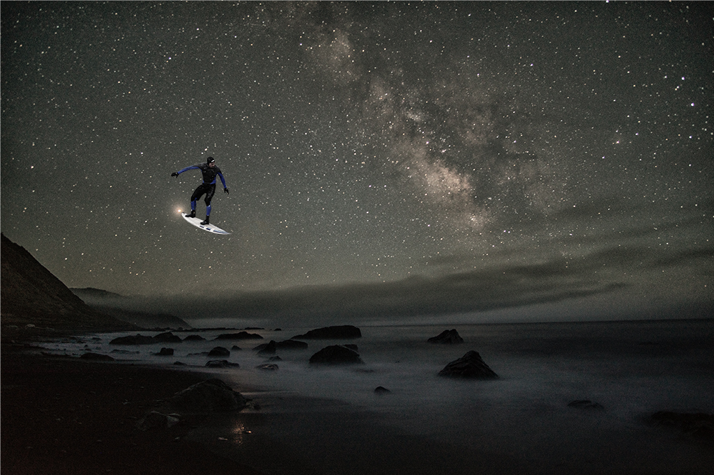
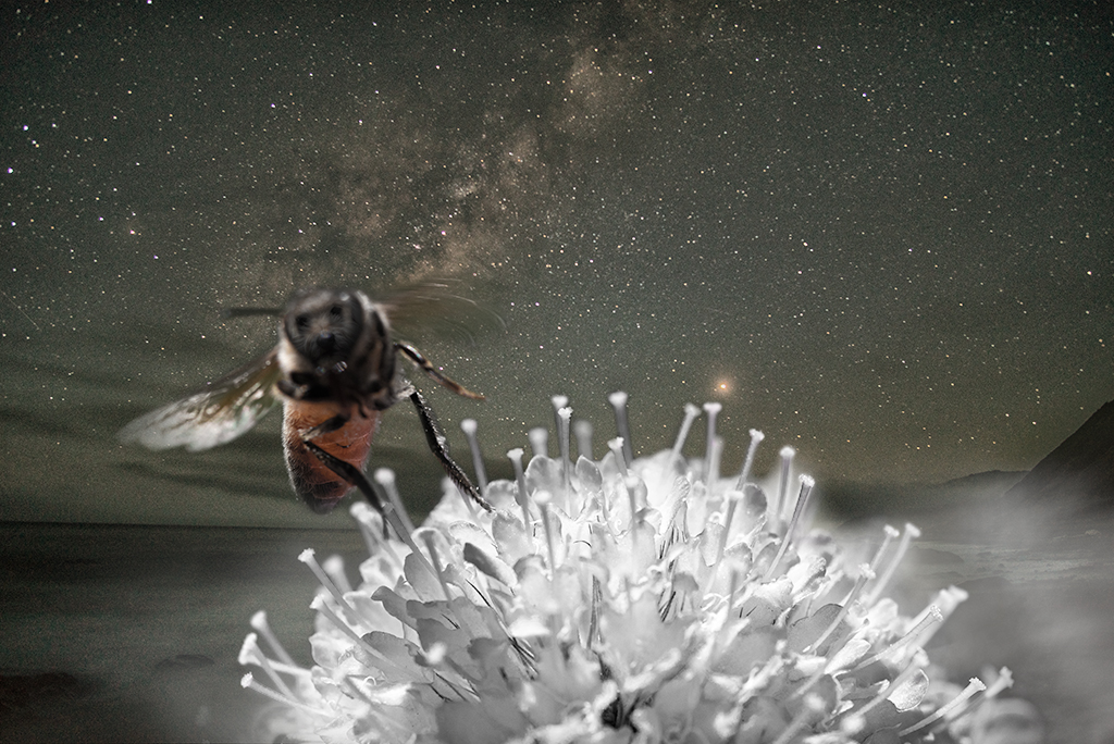
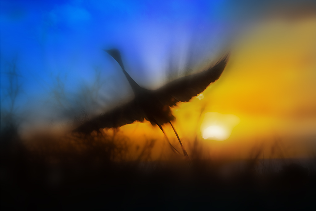
Peggy, You've done a wonderful job constructing this image. I really like the way you've handled the framing and find the color balance and lighting very pleasingly done. The choice of the blue background with the stars is great.
Your stars are a little blurry. I know you are experimenting with night photography. I often will try to keep the image under 30 seconds to avoid any movement in the stars or commit to a very long exposure to get star streaks. Many lenses aren't in focus at infinity so it requires some manually playing with that setting. A much crisper star background would have made this an even stronger image. |
May 7th |
| 54 |
May 19 |
Reply |
Betty, I generally try to understate my message and haven't often added magical elements to my images as I don't want to be too heavy handed but your point is well taken. |
May 7th |
| 54 |
May 19 |
Comment |
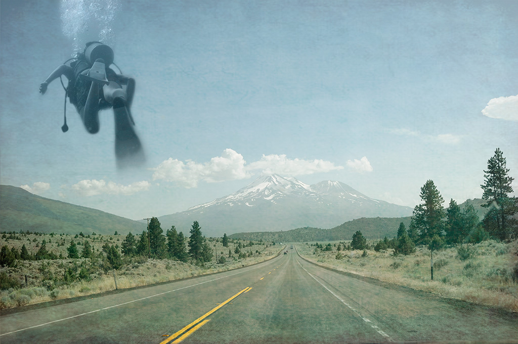
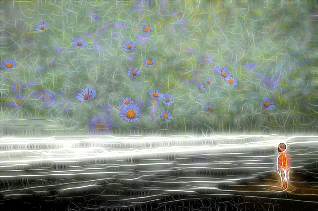
Aavo, You've done a wonderful job with this composition. The placement of the bird makes it look like it is staring at the woman. Since she is staring up, this creates a wonderful tension.
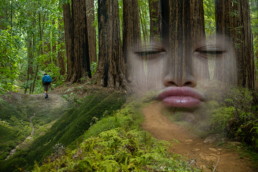
On my screen the sunset in the final image is grainier and more pixelated than in the original. I'm not sure all the hard work to move the skyline up is necessary as your original sunset has a beautiful balance to it. I like some of the qualities of how you've handled the woman but find the towel a little distracting and her legs look so unnatural which I'm not sure adds to the image. There is something about how you've simplified her that I find very appealing, it reminds me of some French paintings I can't name at the moment. |
May 1st |
| 54 |
May 19 |
Comment |
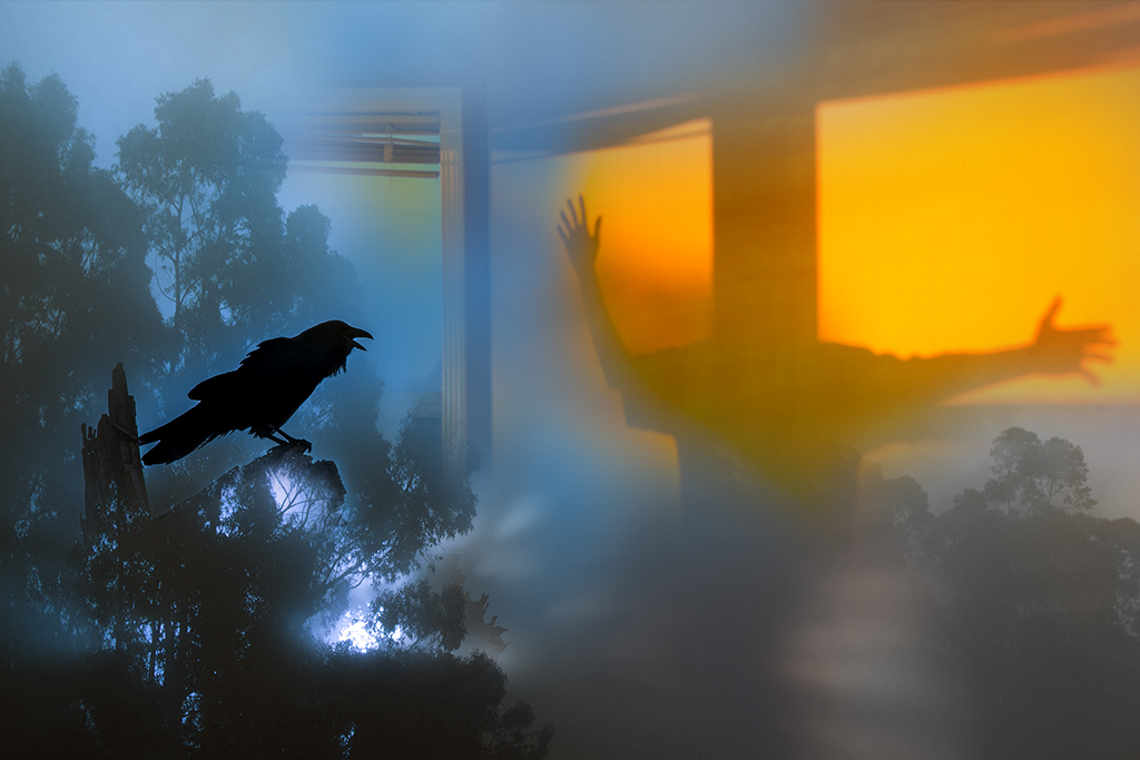
Alan, As always I enjoy the stories you craft. I too have discarded many elements before settling on a final image. I've always thought it would be fun to do a time lapse video showing how the image evolves. I like how you've repeated the wing element in the woman on the left. There are two elements that create tension for me. The cut off bird and the jumping/floating woman don't feel Kaplan Komplete, that is I wonder if you might fuss some more with placement. Tilting the woman some may create a more dream like quality. If you are set on having the bird cut off at the edge of the frame, I wonder if you handled the edge differently, such as dissolving, stretching or blurring its wing to emphasize the dream like nature of the image |
May 1st |
| 54 |
May 19 |
Comment |
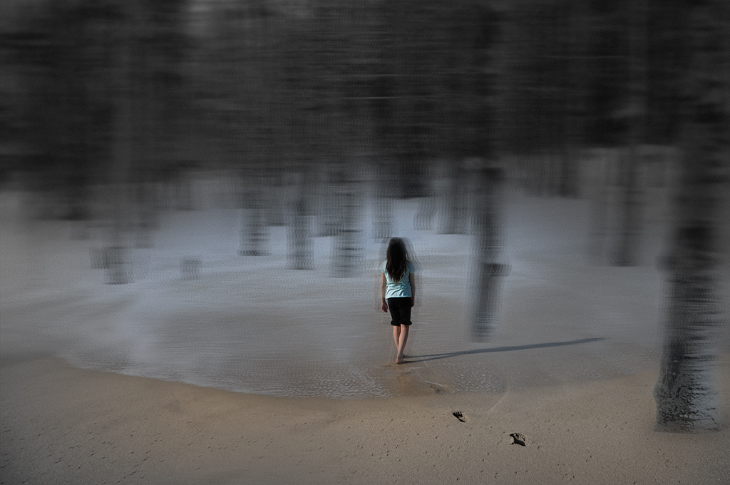
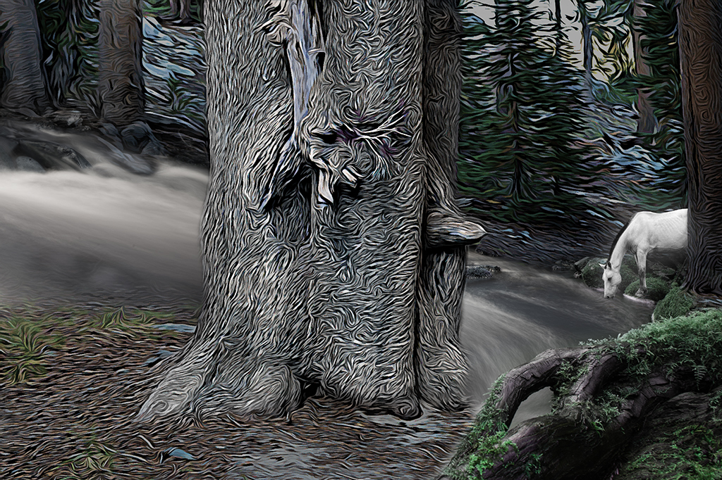
Betty, I like this image very much. Your handling of the forrest is very pleasing and creates a magical feel. The bunny rabbits add a wonderful splash of white to your image as well as hint at an Alice in Wonderland sensibility. I love how the bunny behind the tree pops with the bright white tones. The other bunny feels a little flat in comparison. Not sure if you were able to increase the brightness some for the second bunny to balance them more. I also wonder if placing the foreground bunny slightly further over to the left or increasing its size some might balance the image some. All in all a very enjoyable image. Well done. |
May 1st |
5 comments - 7 replies for Group 54
|
12 comments - 12 replies Total
|