|
| Group |
Round |
C/R |
Comment |
Date |
Image |
| 41 |
Apr 19 |
Reply |
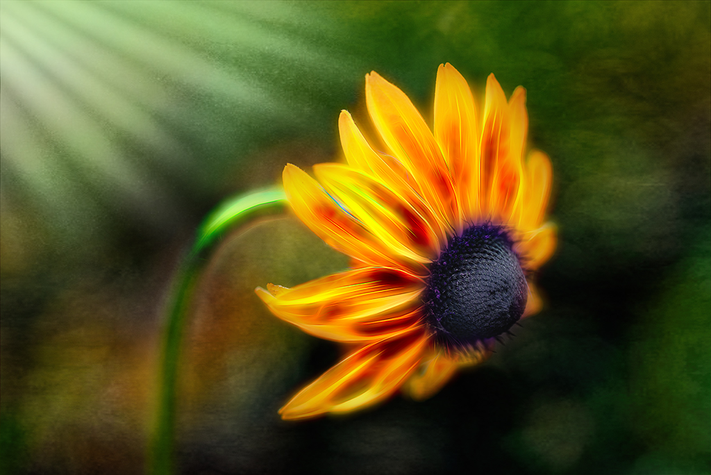
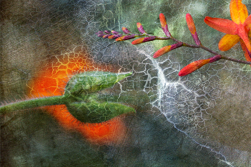
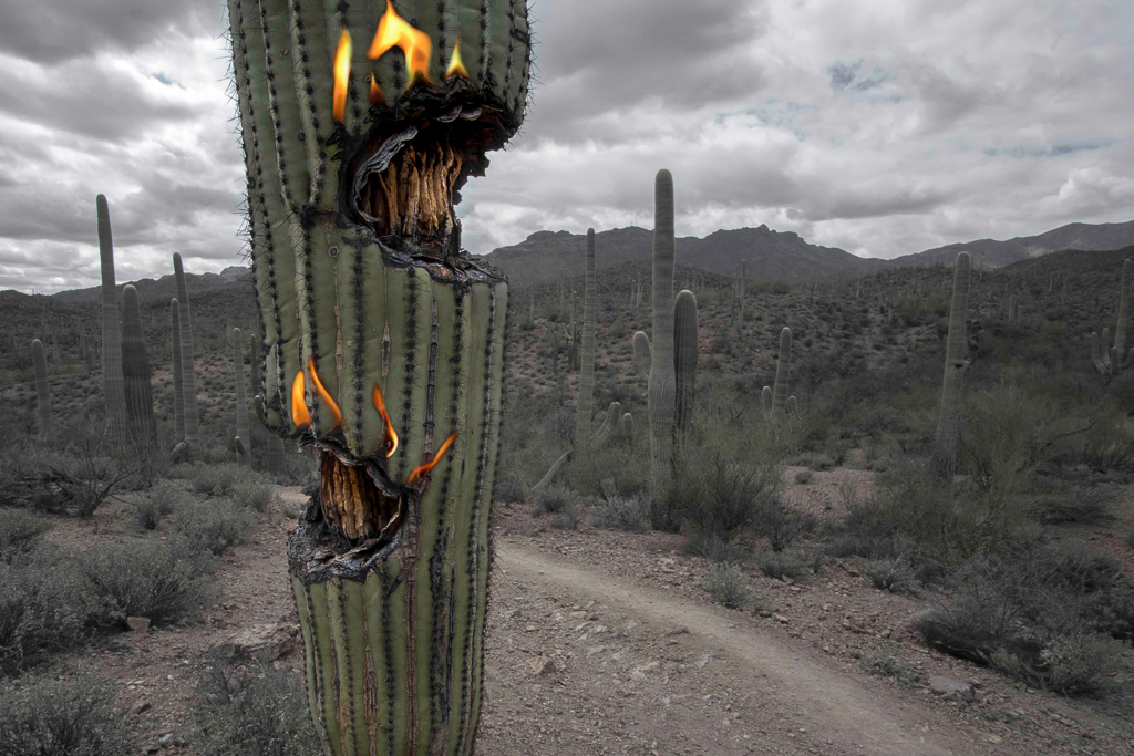
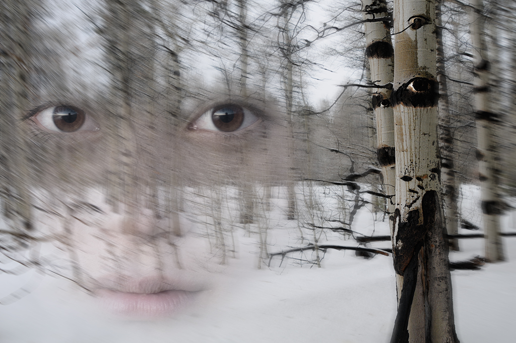
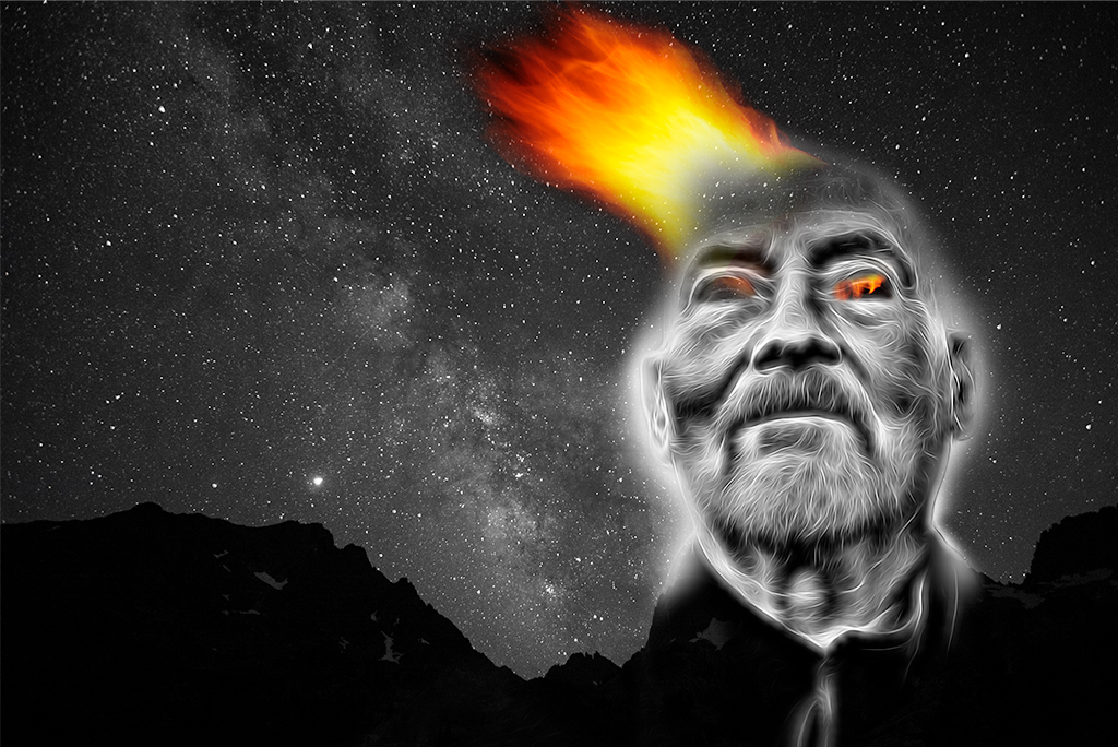
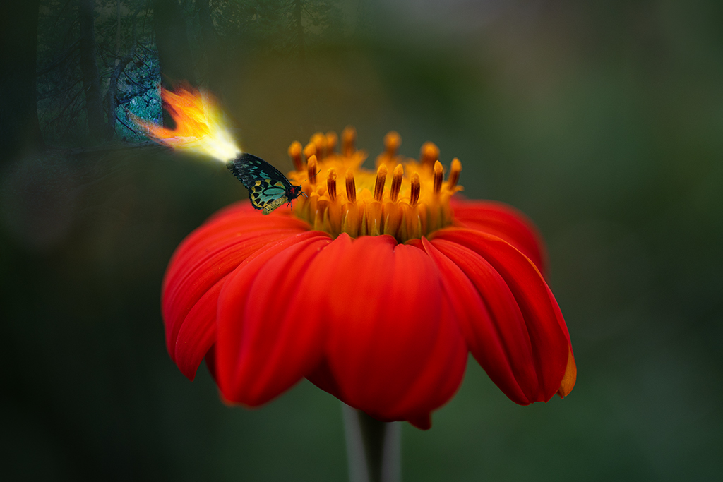
Kathy, I think "cactus hell" is more accurate as a title. Something about the burned out part of the cactus did take on some anthropomorphic creepy features of mouths and eyes for me that were a bit demonic feeling and that is what I was trying to render. |
Apr 11th |
| 41 |
Apr 19 |
Comment |
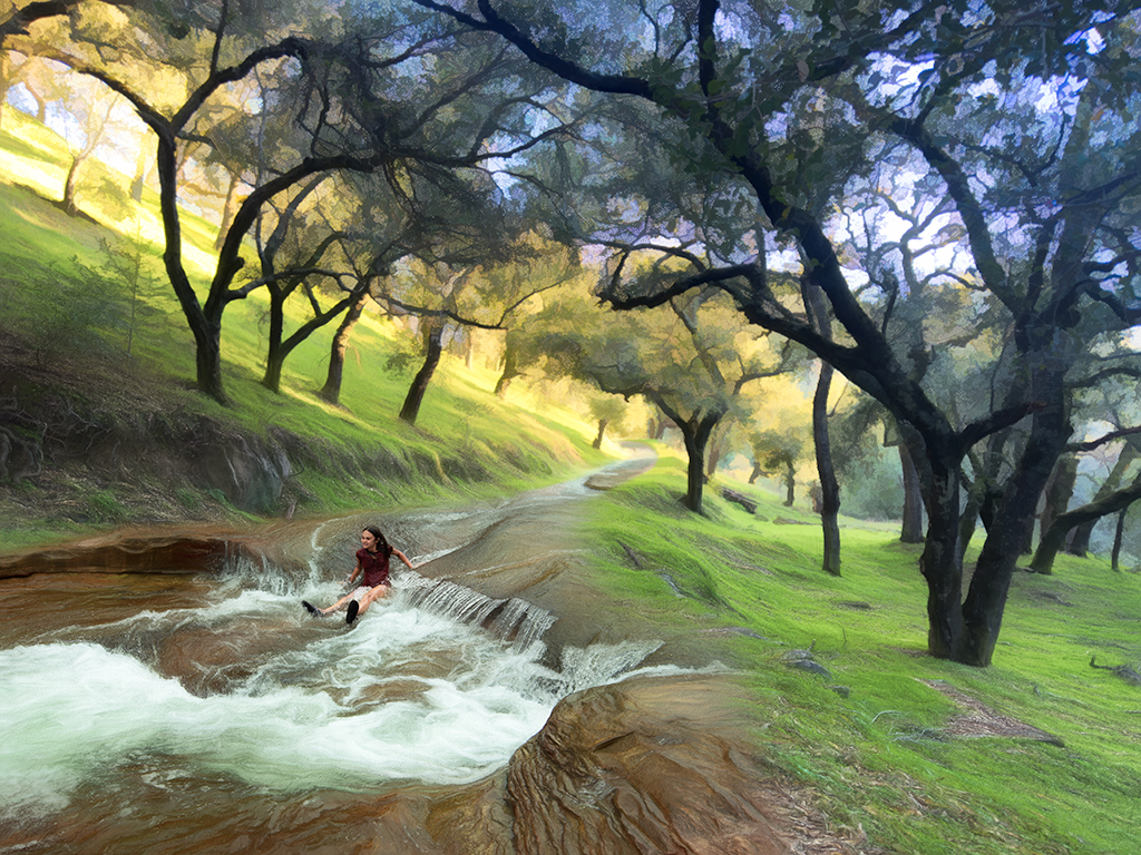
Lisa, I like your departure into new territory. I think the vertical and horizontal lines work differently depending on whether you are emphasizing the horizontal lines of the shoe or the vertical lines of the trees. Personally I like the horizontal line one a touch more. I have done a lot of work with blending disparate images like this and I will warn you up front I have my personal bias on this stuff. Having said that, I find the tree elements that have been left in partially distracting. If you look at my January image in group 54 you will see one where I've blended a number of backgrounds together. If you were able to find a tree image in which you could more cleanly combine them it would take on a cleaner Magritte like resonance. The other option is to abandon the brown background and attempt to integrate the shoe into the tree world. Overall I like this image and hope you continue working on it as I really like the concept you are communicating. |
Apr 11th |
| 41 |
Apr 19 |
Reply |
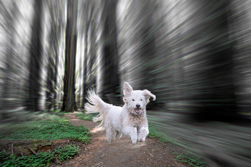
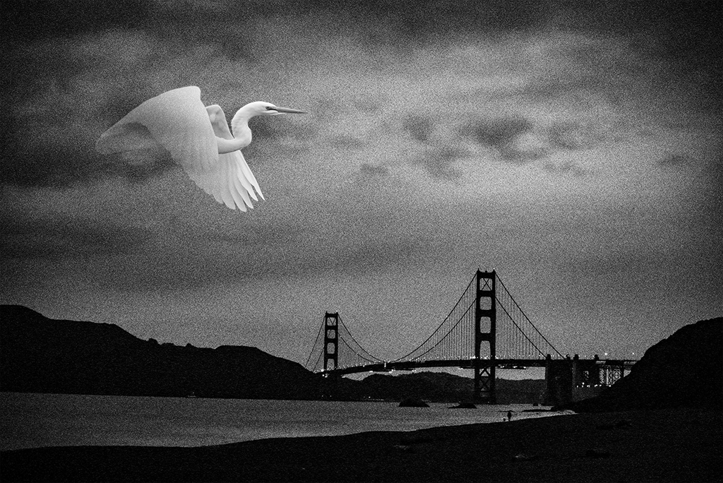
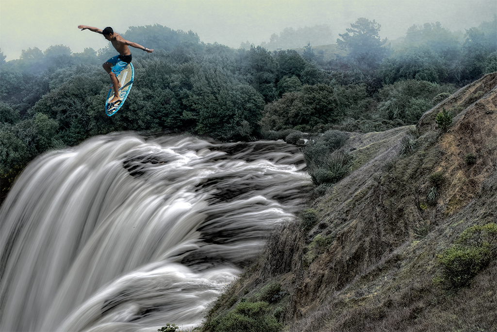
Yes, I think you've done a wonderful tribute. The Elliot Erwitt image has the leash hanging down emphasizing the leap even more. There's something about how tight the leash looks on your dog that doesn't resonate for me as much. |
Apr 11th |
| 41 |
Apr 19 |
Comment |
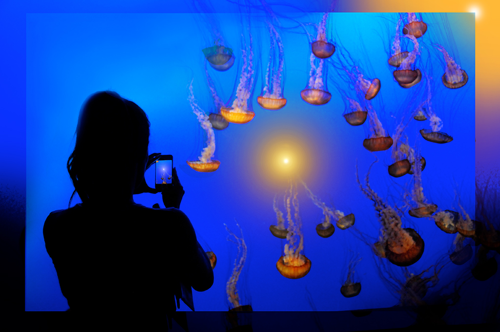
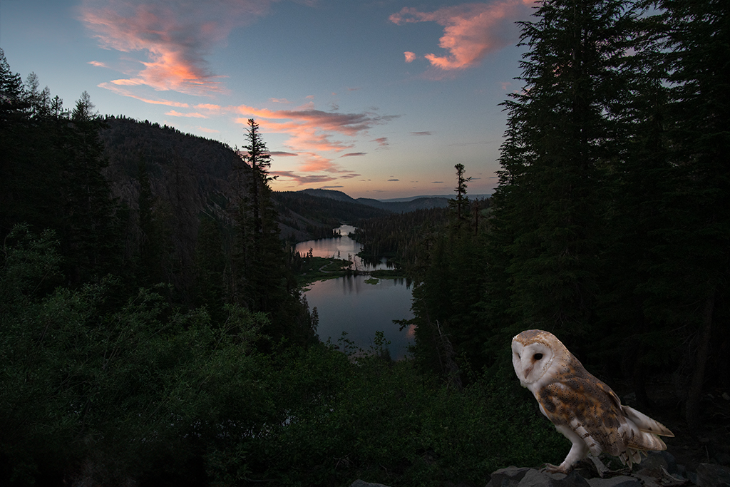
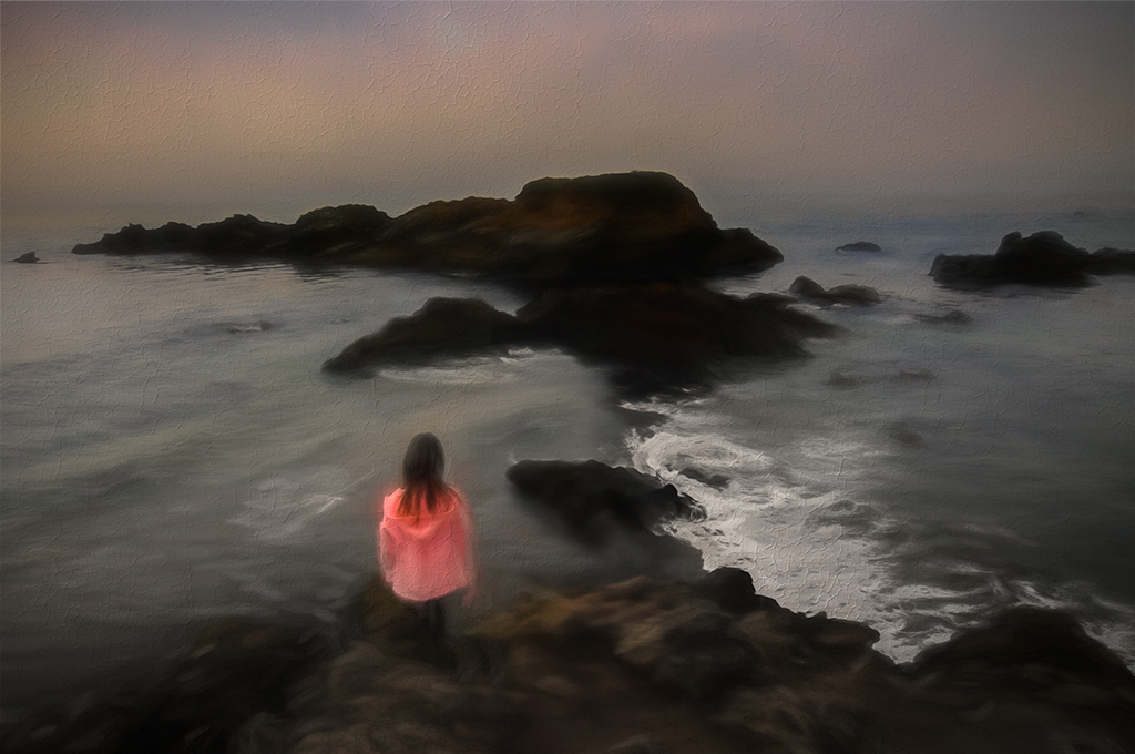
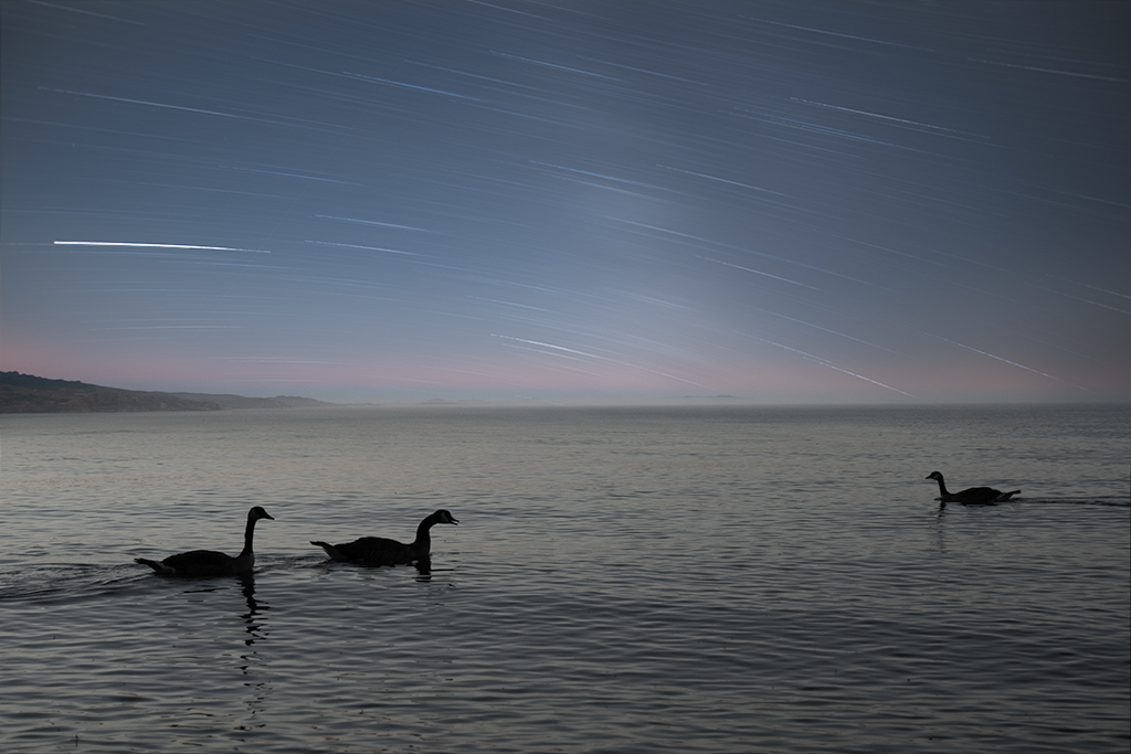
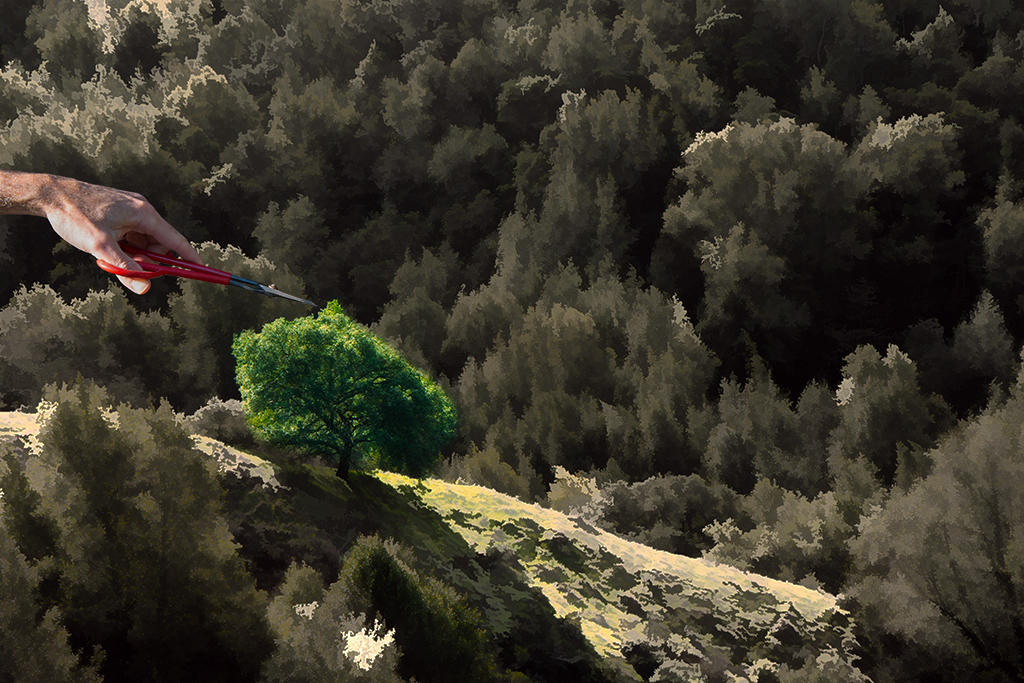
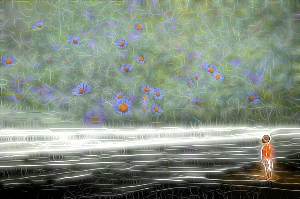
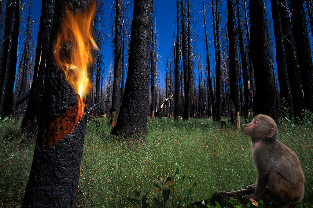
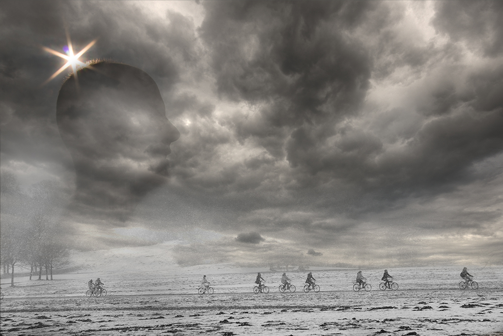
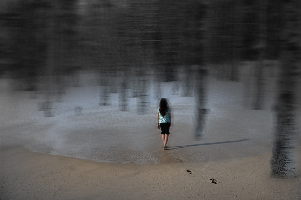
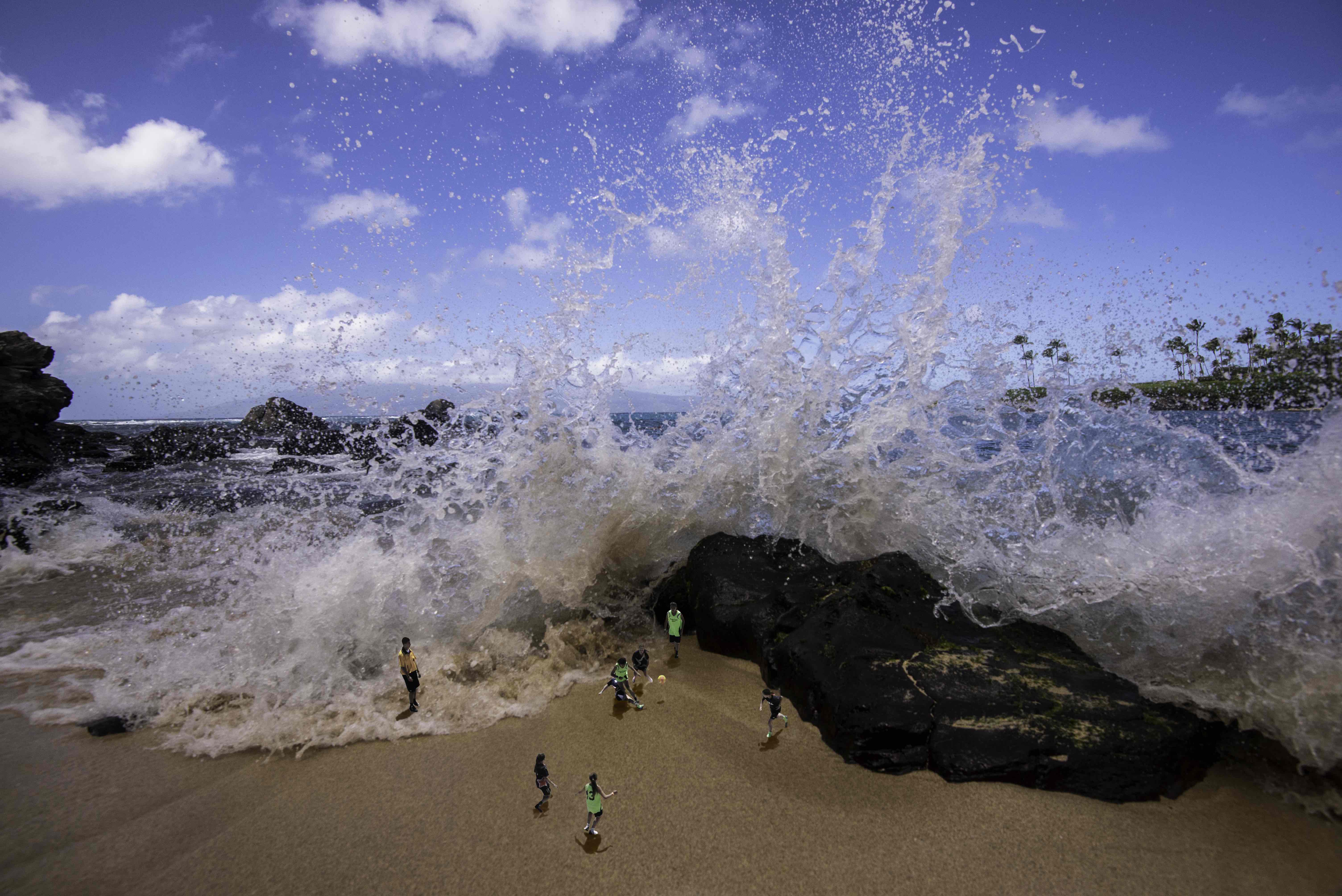
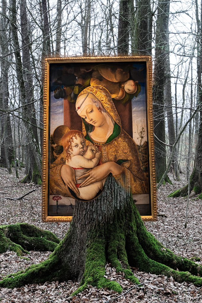
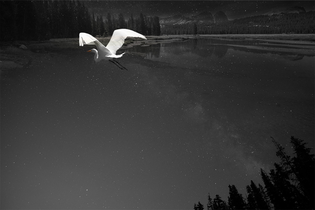
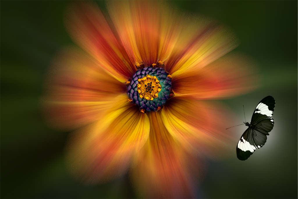
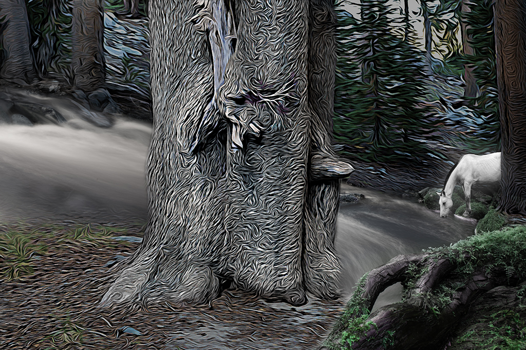
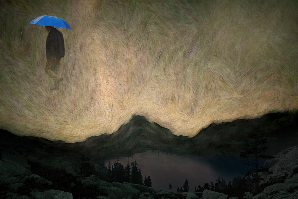
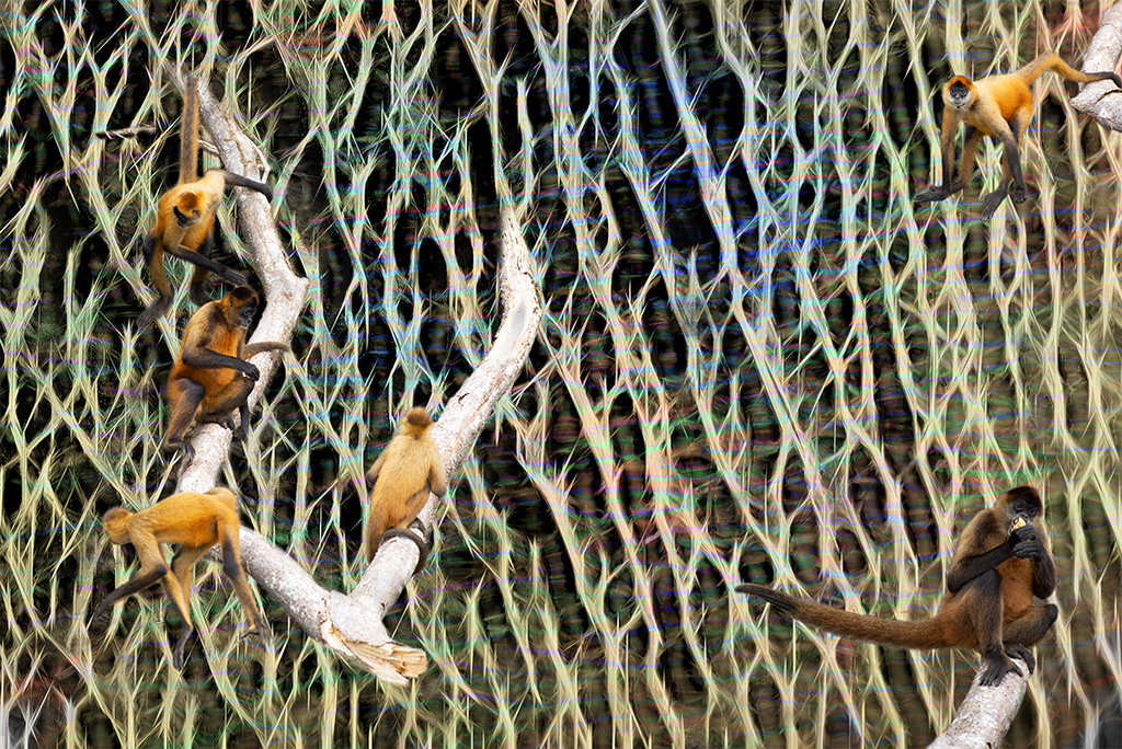
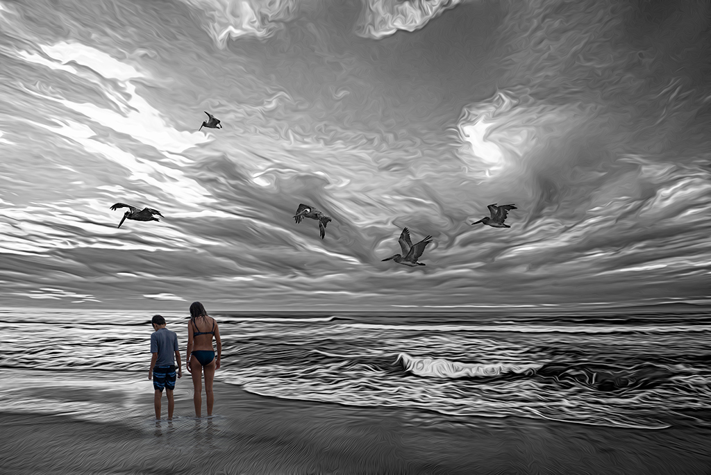
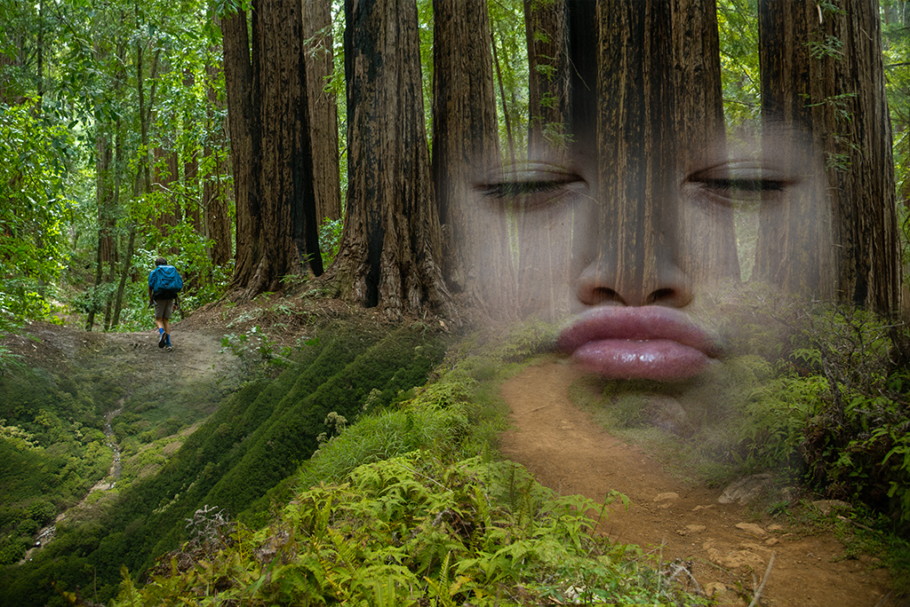
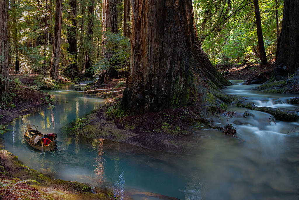
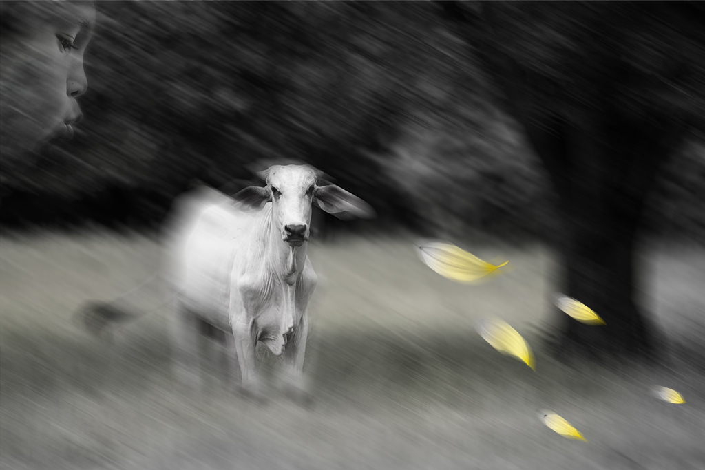
Jan, I like what you are doing with this image. The purple color cast in the sky is uneven making it look somewhat unnatural. I like how you've handled the purple tones on the water's edge. The animals appear unnatural in this image to me. I wonder if you created a drop shadow or increased contrast that might help. Also they are hard to spot, making it feel a bit like a "where's waldo image" I'm not sure exactly how you can remedy this. I sometimes decrease vibrance in the background and punch it up in the subjects to enhance the area I want to draw attention to (like how I handled the cactus in this months image) but that might not work as well here since I do like the magical feel of this forrest. |
Apr 11th |
| 41 |
Apr 19 |
Comment |
Henry, You've created a very pleasing image here. I think you've done an outstanding job with lighting, composition, color and all the technical handling. I could see this style being used in wedding albums. Nice work. |
Apr 11th |
| 41 |
Apr 19 |
Reply |
Sue, So true. I often reinterpret my images when describing them for the PSA. I should just be quiet as my thoughts/feelings while working on an image are often different than what I say. Thanks for the feedback |
Apr 3rd |
| 41 |
Apr 19 |
Comment |
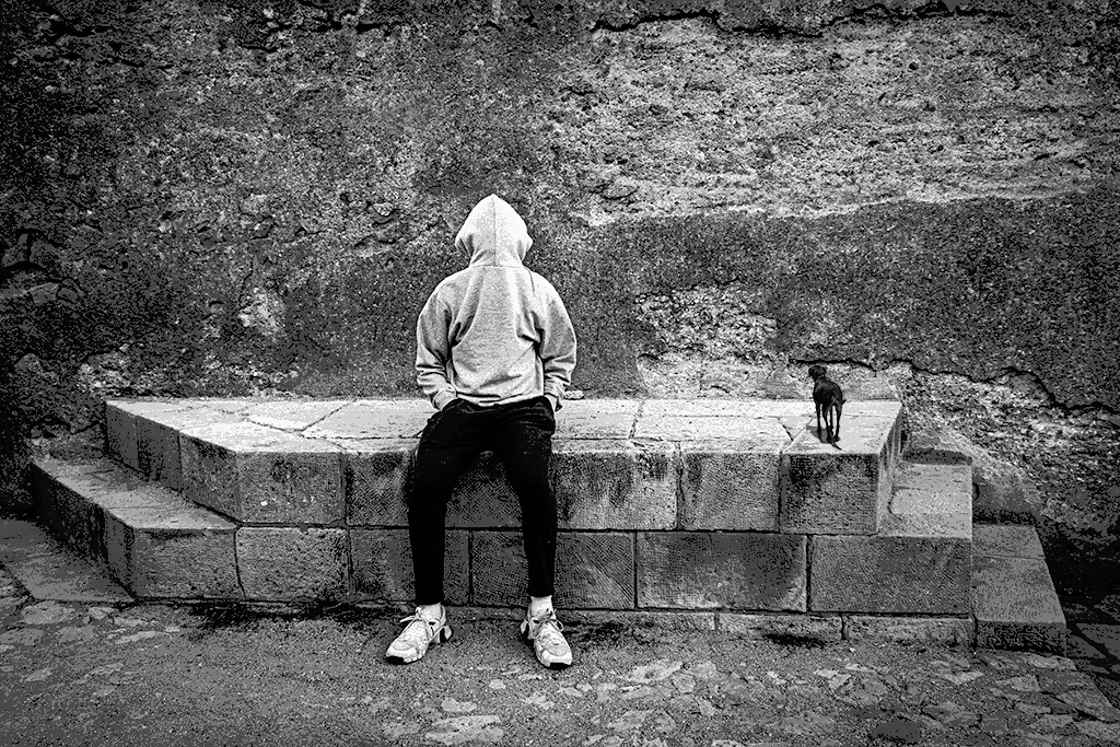
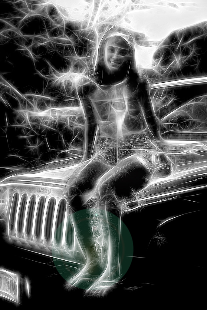
Sue, I really like the choice of black and white in this image. Your handling of all the technical elements is flawless. I love your choice of cropping showing only the lower half of your husbands body as it emphasizes how little Bub is.
My only suggestion would be to consider eliminating the leash entirely. I wonder if you were to have Bub floating next to your husband with his hands down, as in original 3, if that might create a more magical feel. |
Apr 2nd |
| 41 |
Apr 19 |
Comment |
Kathy, This is a very pleasing and fun image. I like your handling of the textures, colors and matting.
My only suggestion is to consider playing with the size and shape of the opening thru which the dog peeks out (and the placement of the wand) as the dogs head feels cramped to my eye. |
Apr 2nd |
5 comments - 3 replies for Group 41
|
| 54 |
Apr 19 |
Reply |
Peggy, I will try the metal prints next time. Thanks. |
Apr 12th |
| 54 |
Apr 19 |
Reply |
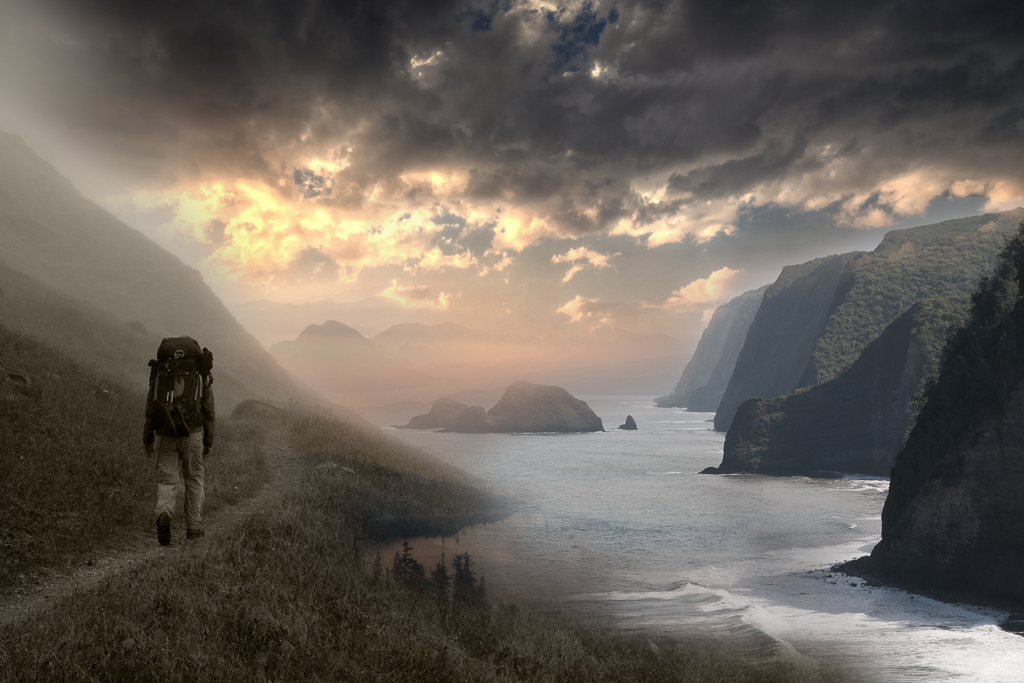
Betty, Thanks. It's hard sometimes to know which photos people will like. I'm curious if you've found a place to print your digital photos that you are happy with. I have tried Mpix and bayphoto and they always seem to come out lackluster even if I download their drivers and color correct my screen with a spider device. |
Apr 9th |
| 54 |
Apr 19 |
Reply |
Thanks for the suggestions Peggy |
Apr 8th |
| 54 |
Apr 19 |
Reply |
Aavo, They bothered me too. Hard to completely sell it but thanks for the feedback |
Apr 7th |
| 54 |
Apr 19 |
Reply |
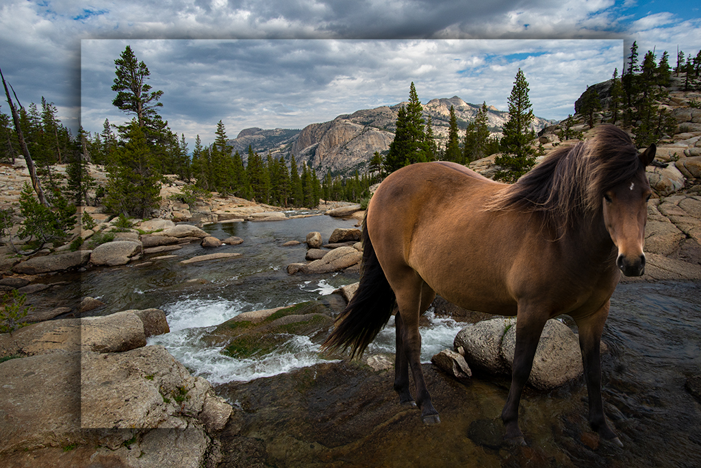
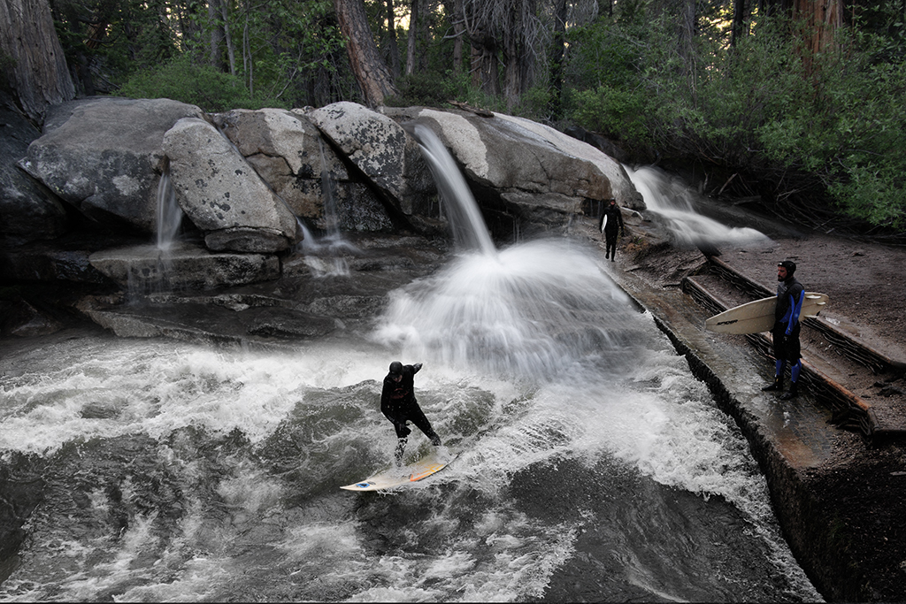
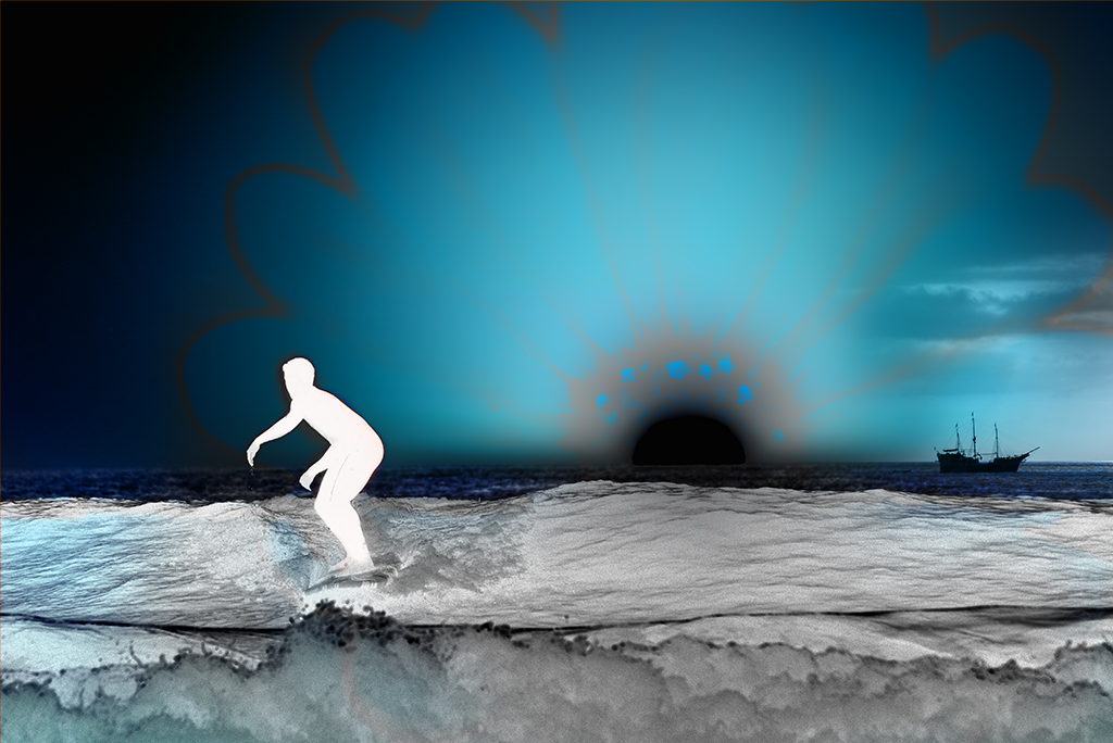
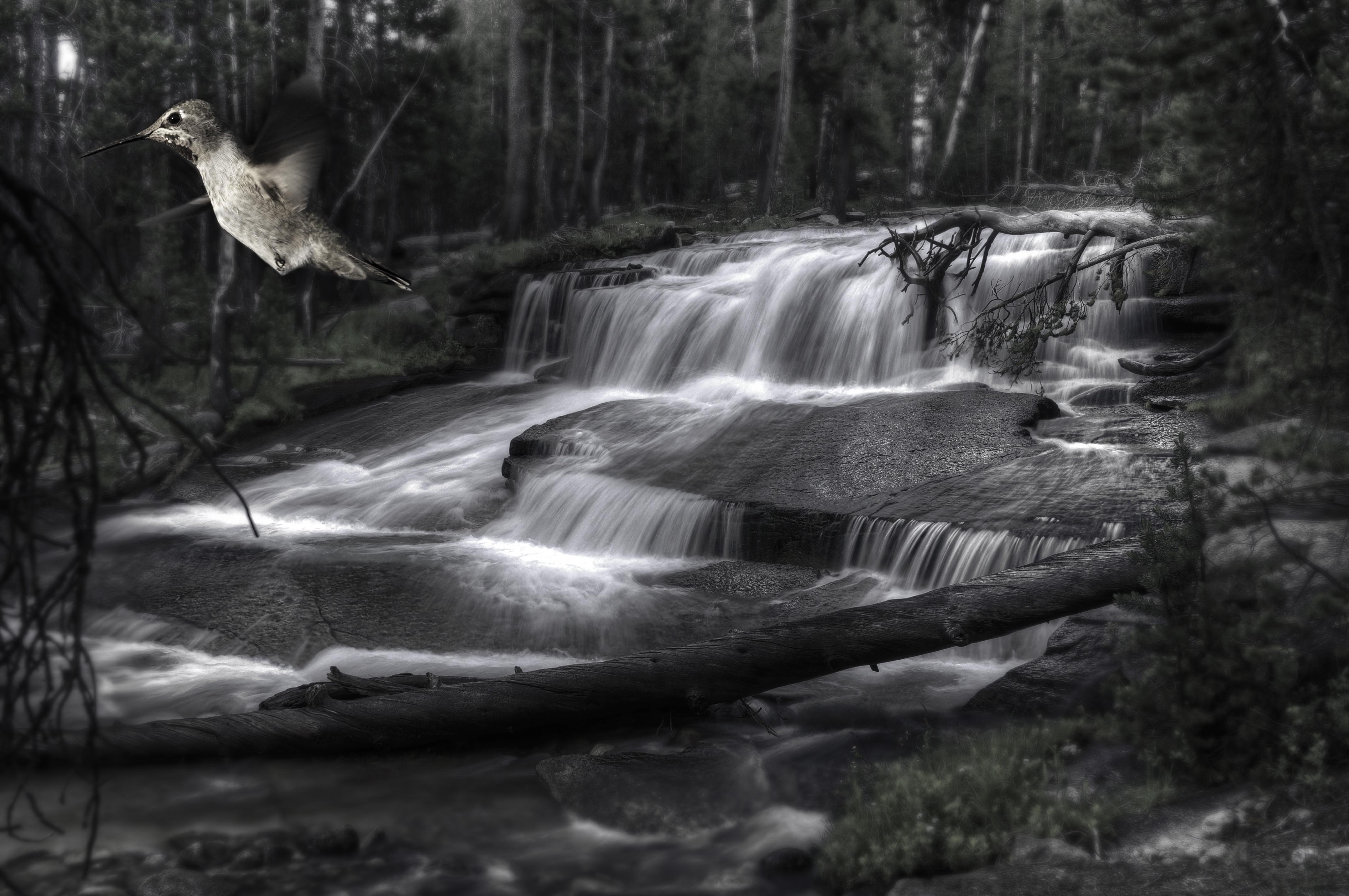
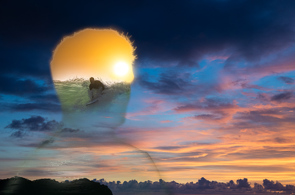
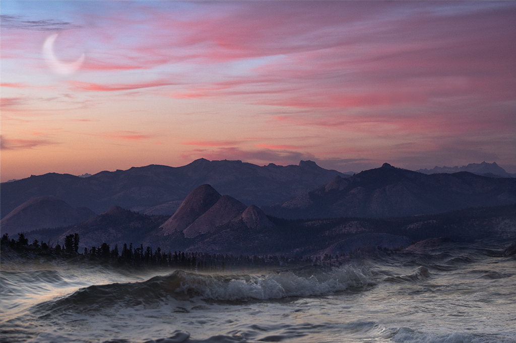
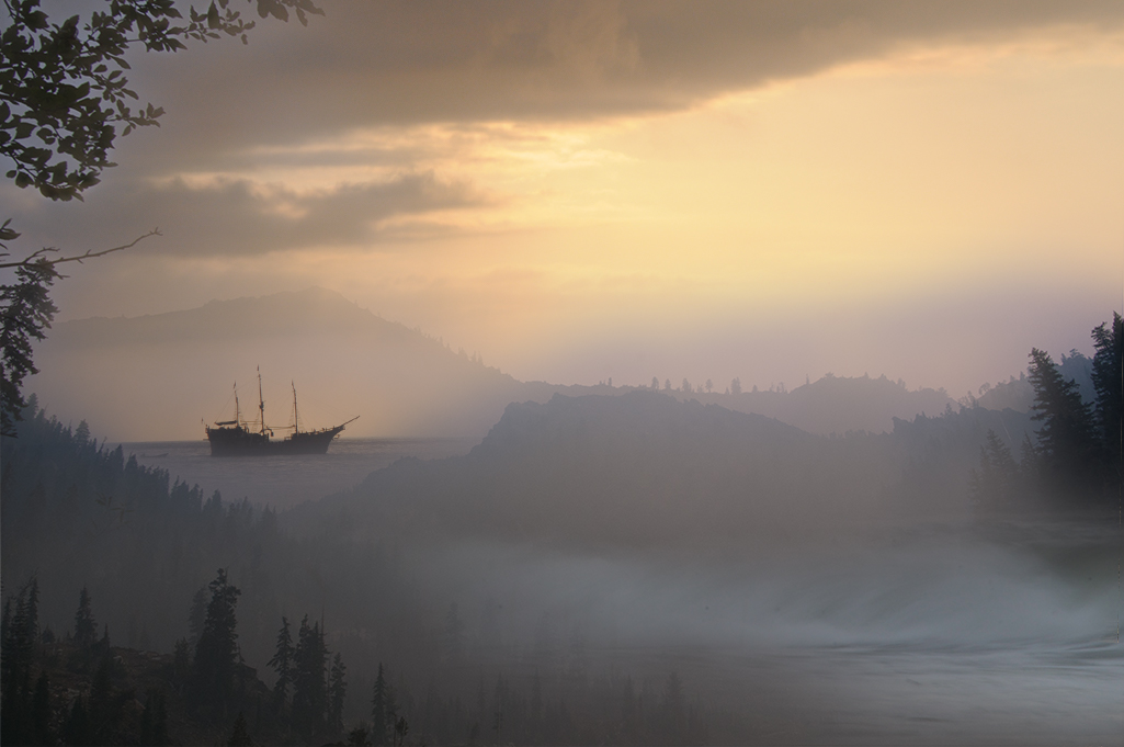
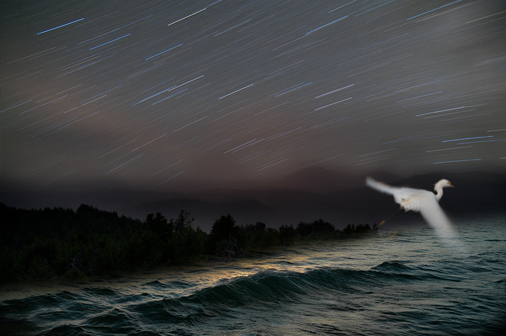
Alan, Thanks. When I pick images to blend they often have a similar hue/tone/color cast. If they don't I often adjust them with hue/saturation or one of the color adjusting filters.When I position the image I'll move it with 50% opacity so I can line up elements such as waves, so as to help sell the continuity. I then use a layer mask with a brush set on ~10-20 and brush away one layer. If I go to far I use the erase tool and go back and forth till I find a pleasing blend. Hope that helps. |
Apr 6th |
| 54 |
Apr 19 |
Reply |
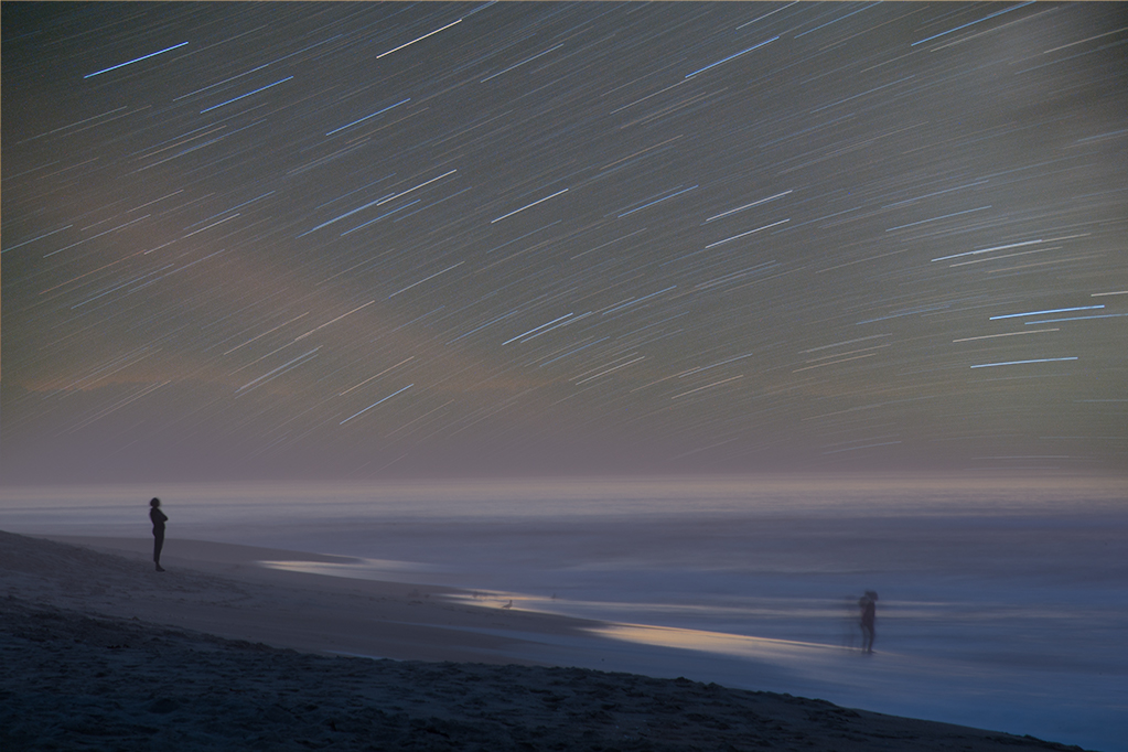
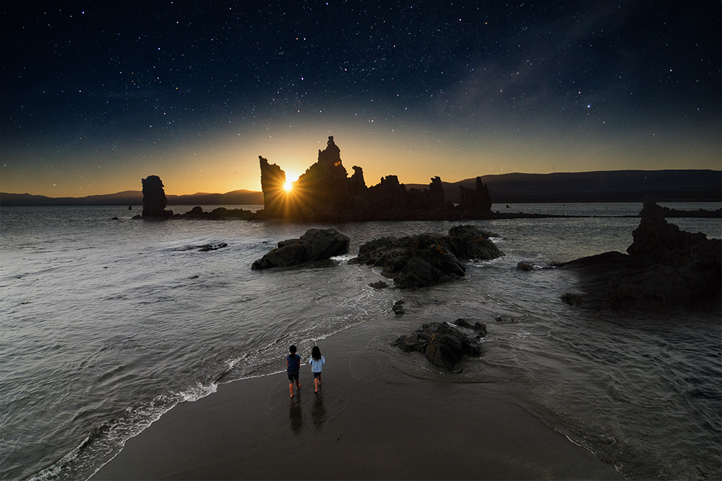
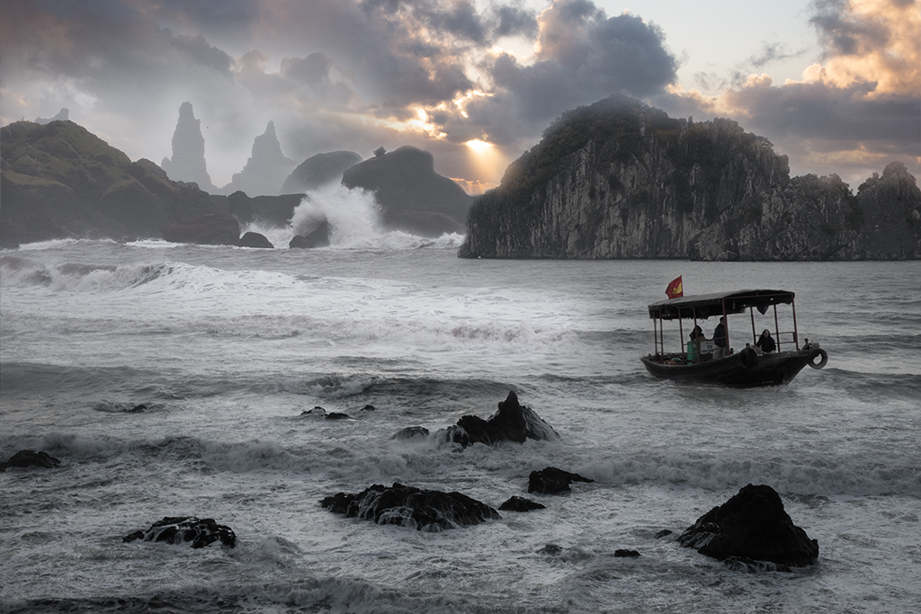
Stephen, We went in the winter and it was rainy and gray. I think the summer is the time to go there but it would have been very hot. Nice shot! |
Apr 6th |
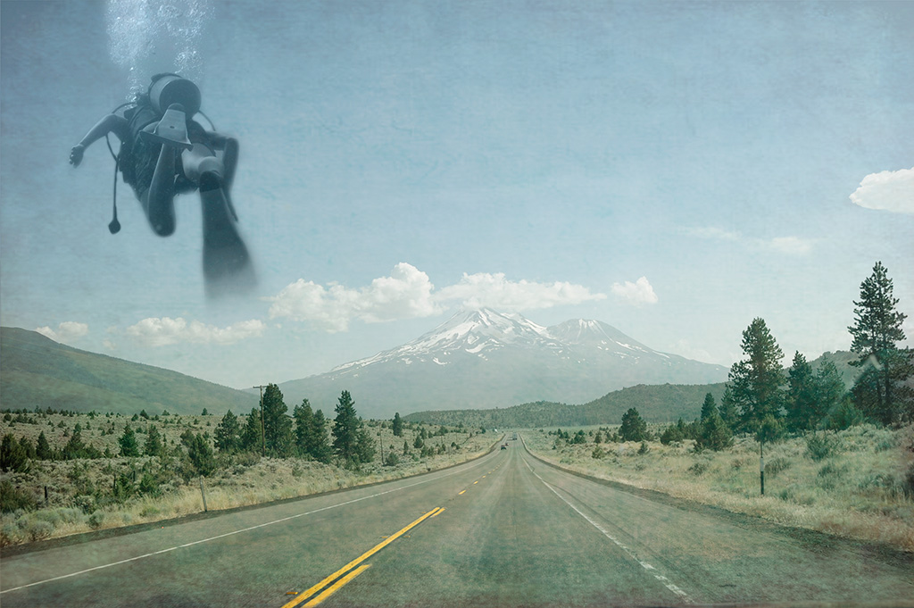
| 54 |
Apr 19 |
Reply |
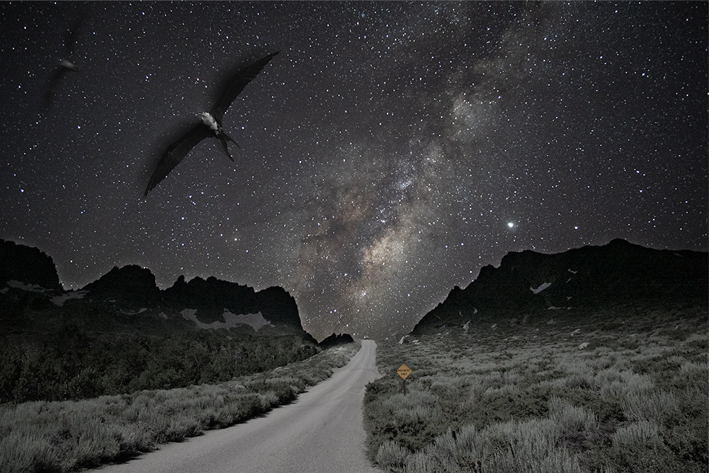
Stephen, I had actually considered adding a dragon given the myth we heard while in Halong Bay but I am much better at blending layers than creating dragons. |
Apr 5th |
| 54 |
Apr 19 |
Reply |
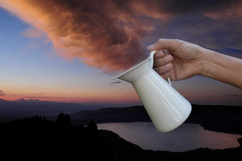
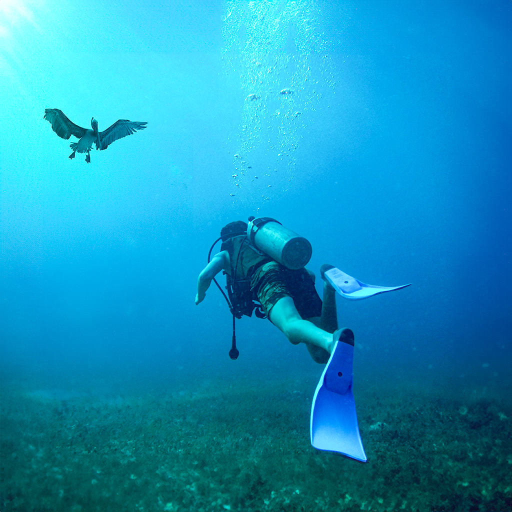
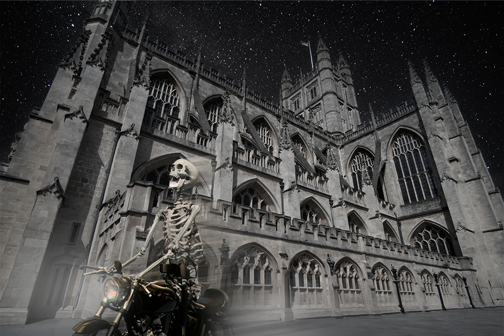
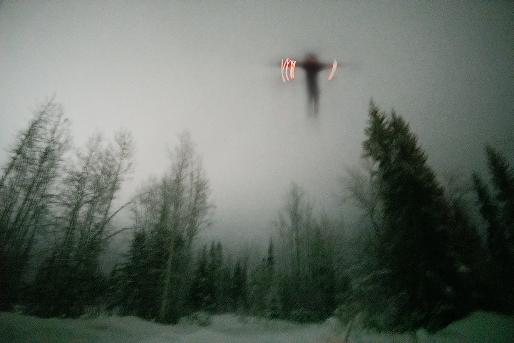
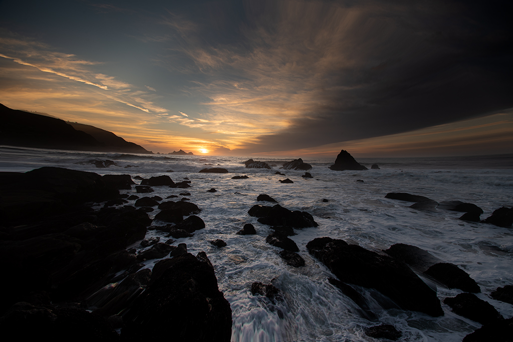
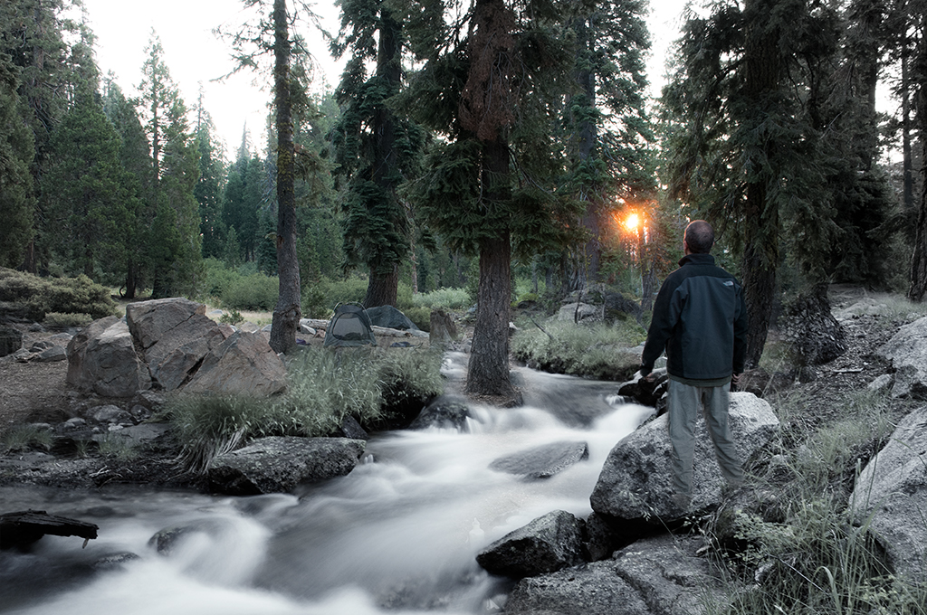
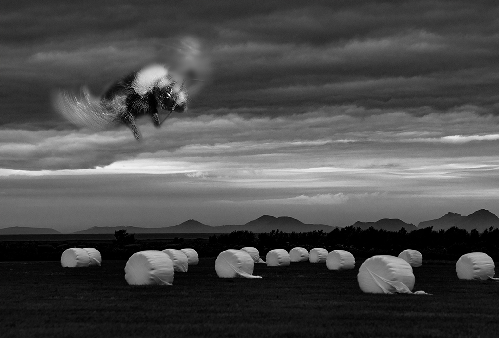
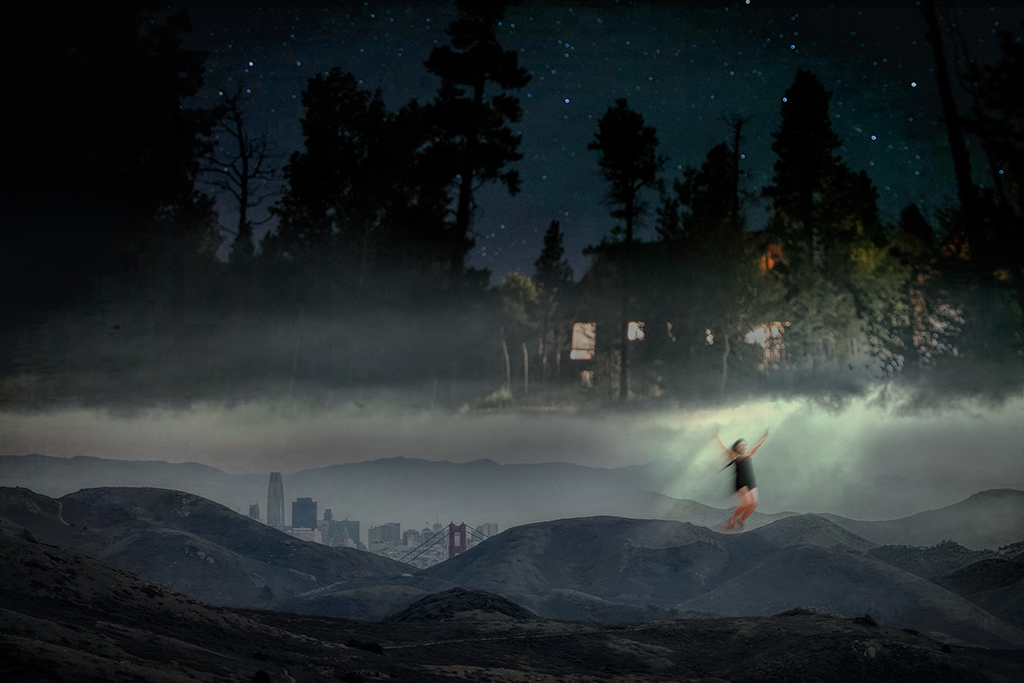
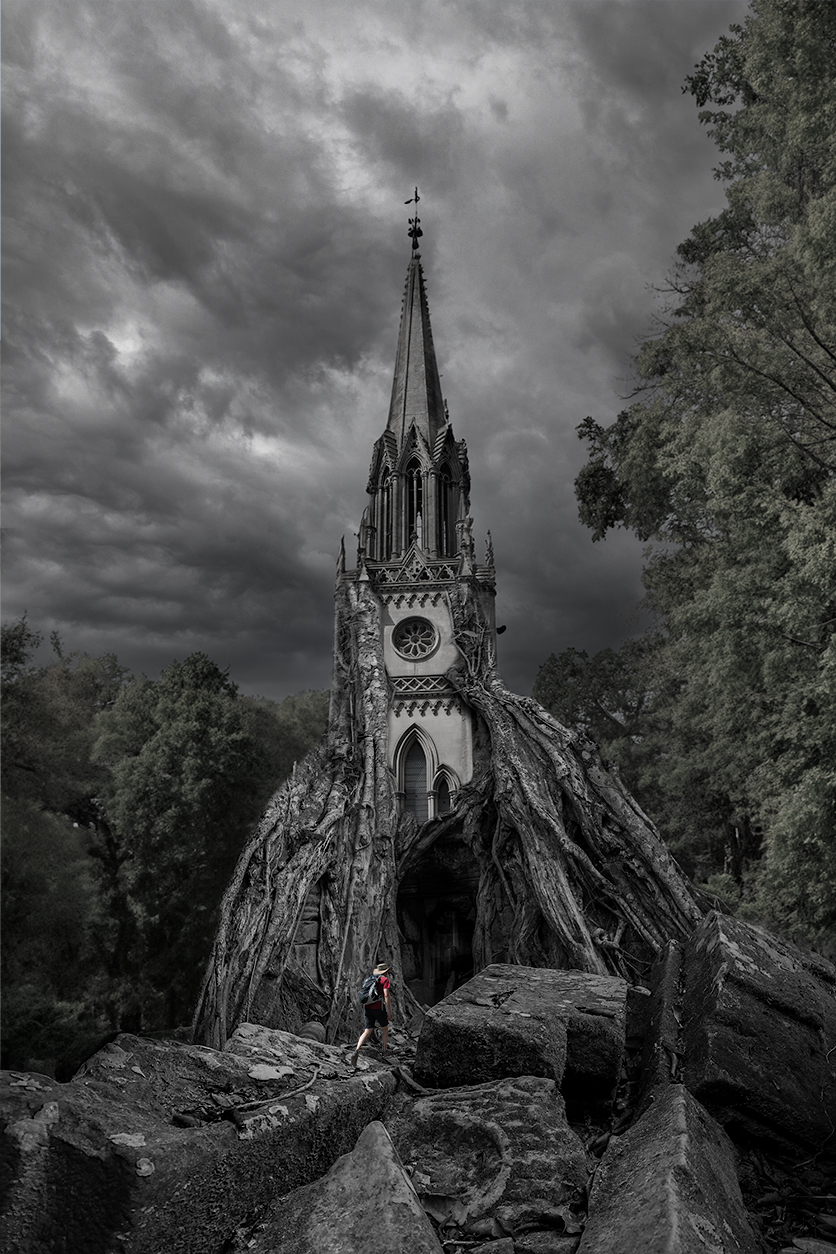
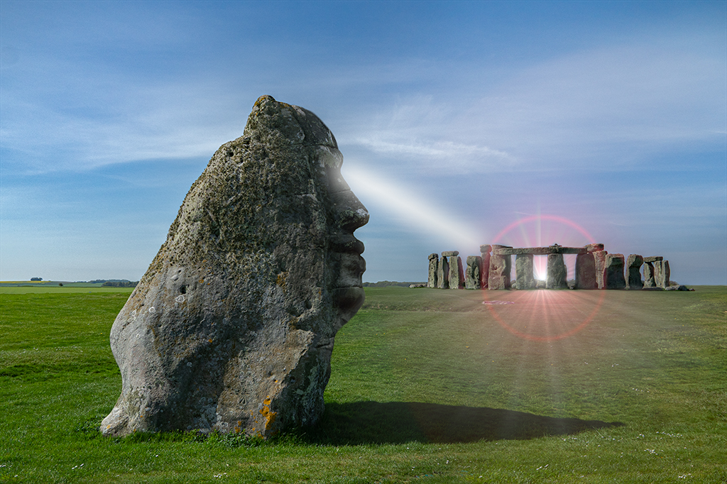
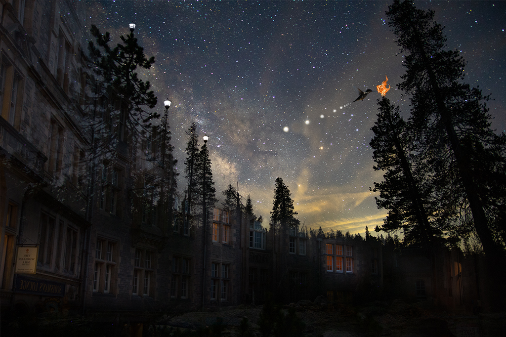
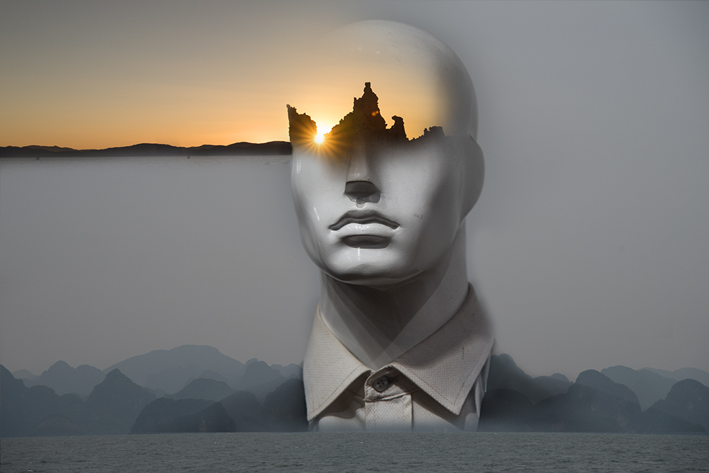
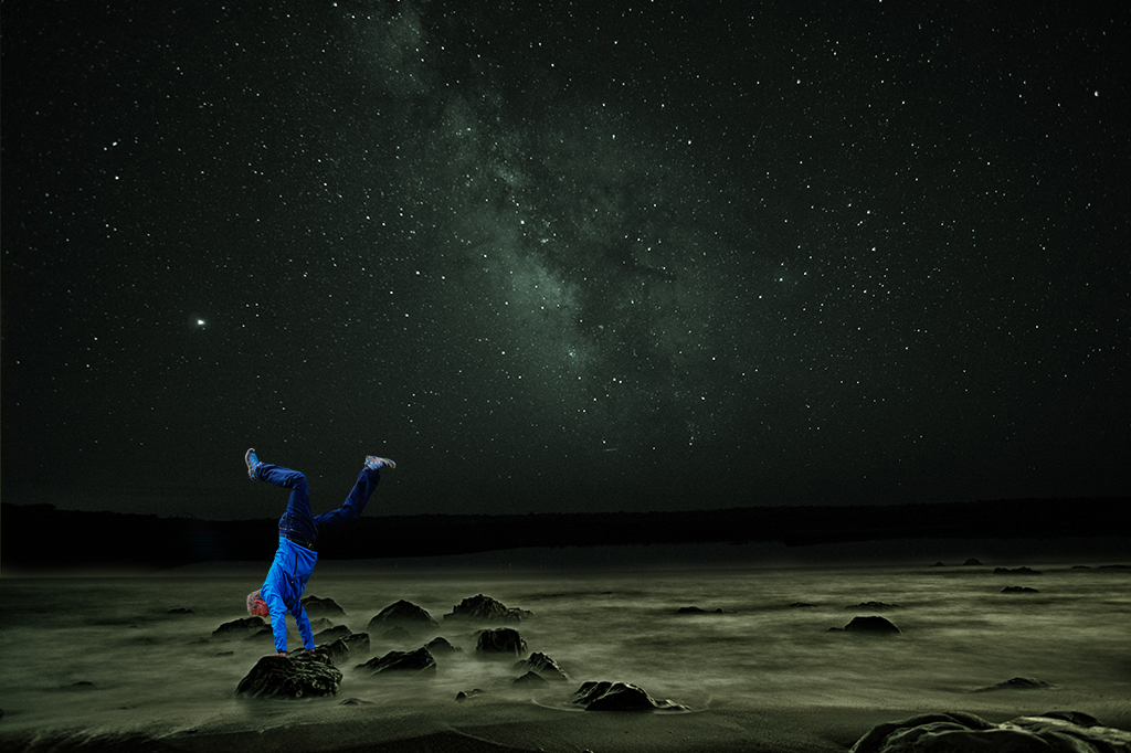
Alan, This image definitely got under my skin so I that ground you got an emotional reaction. This image asks for an explanation, at least for me. |
Apr 4th |
| 54 |
Apr 19 |
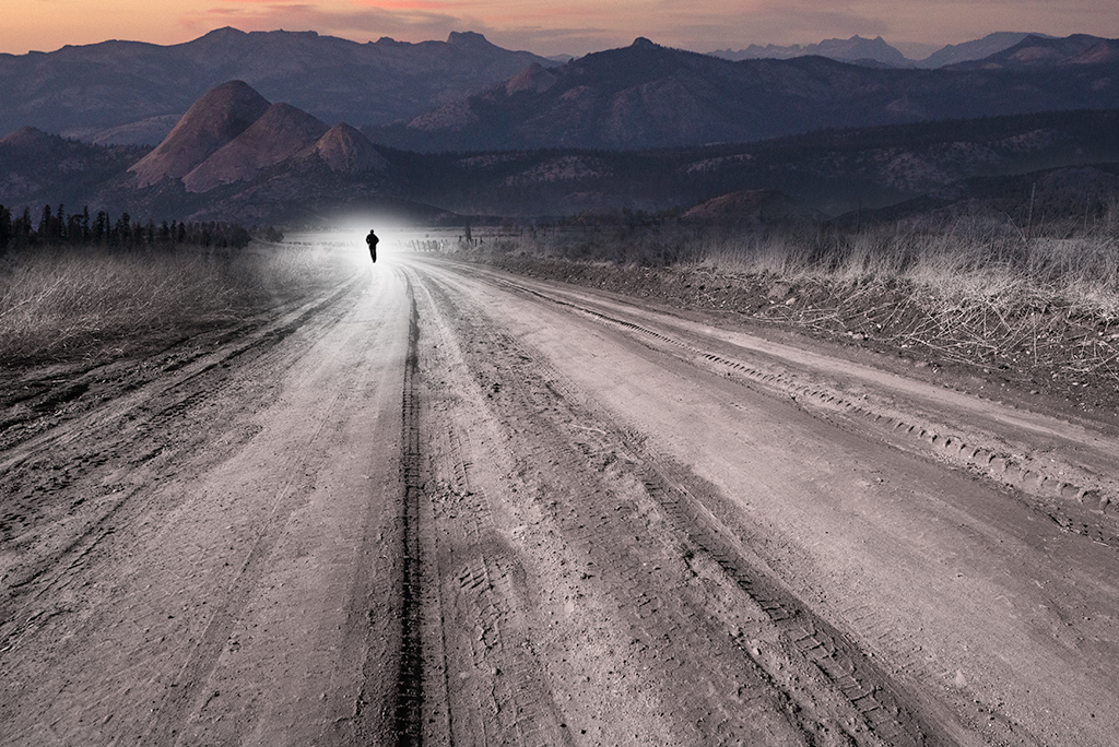
Comment |
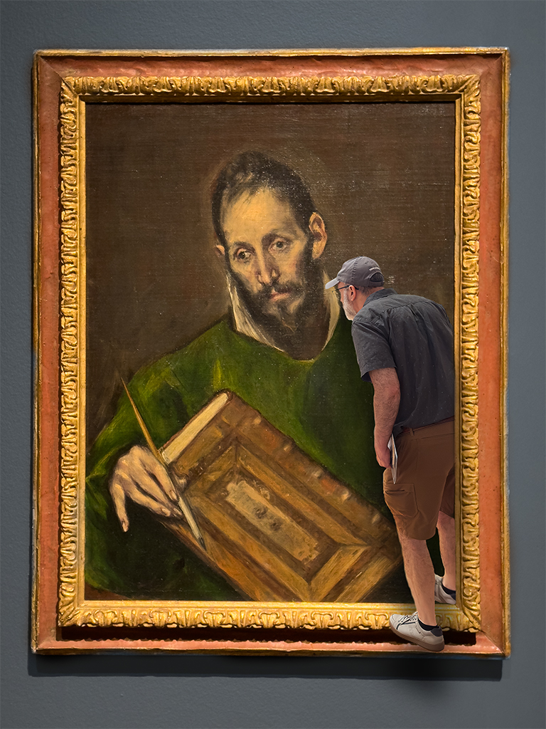
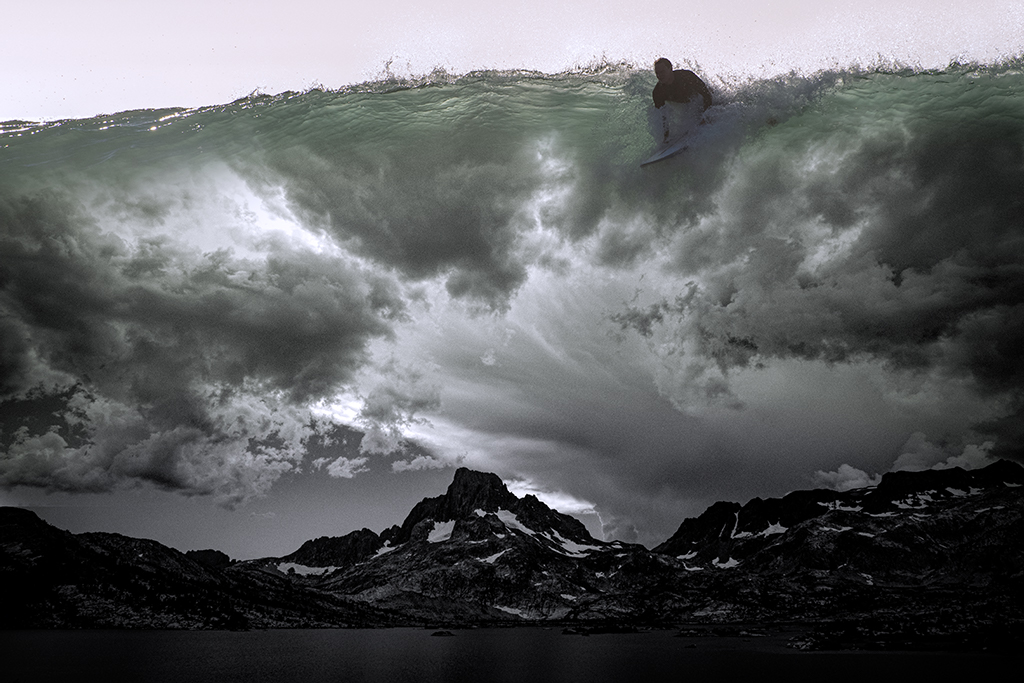
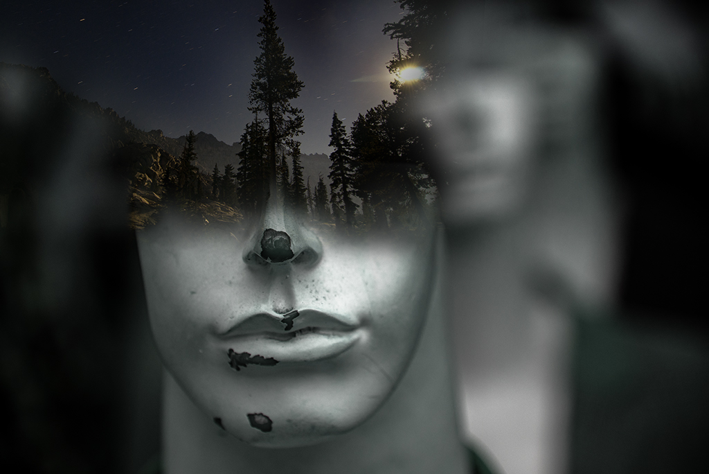
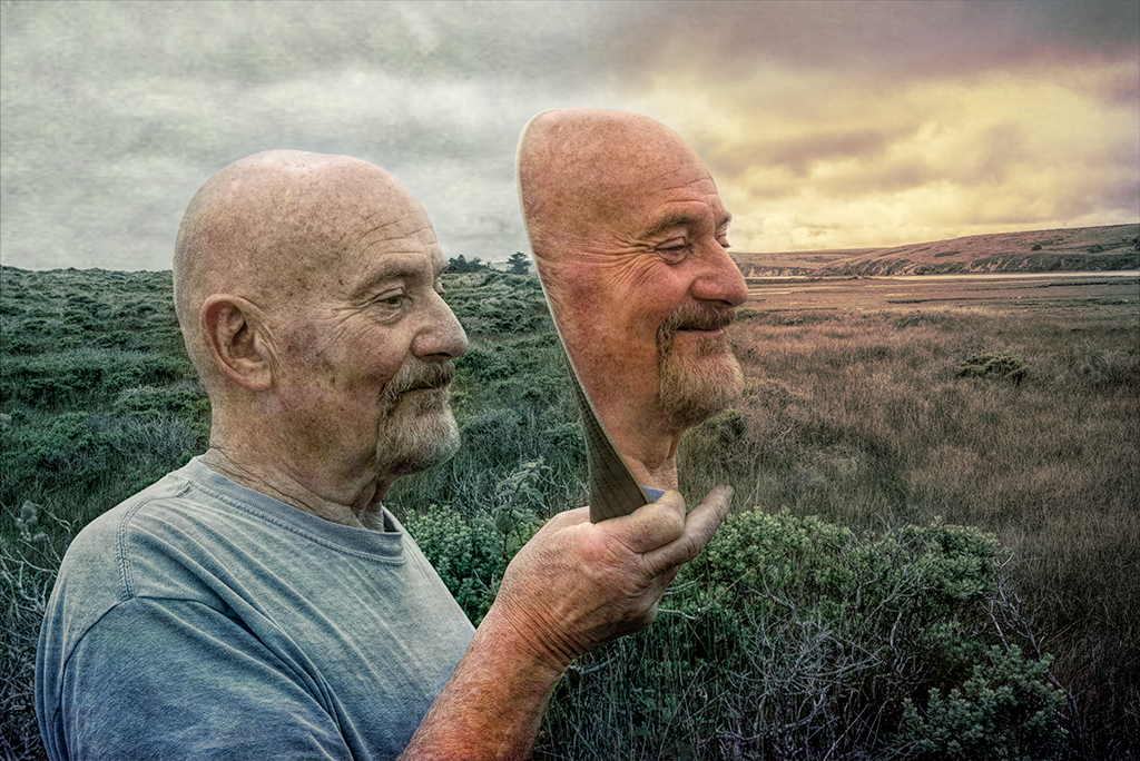
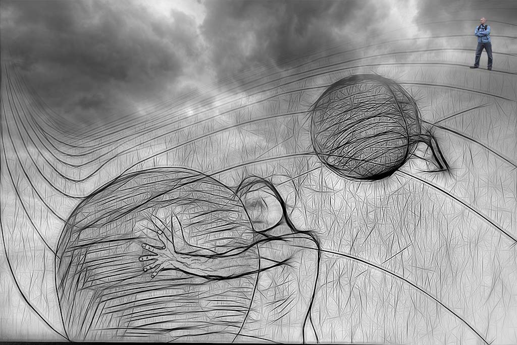
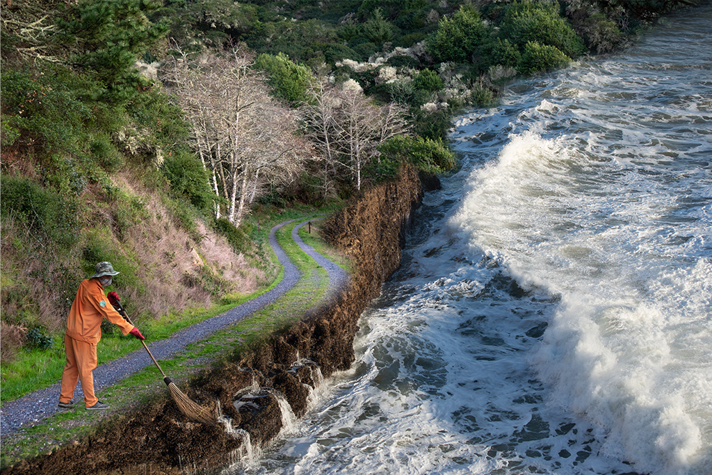
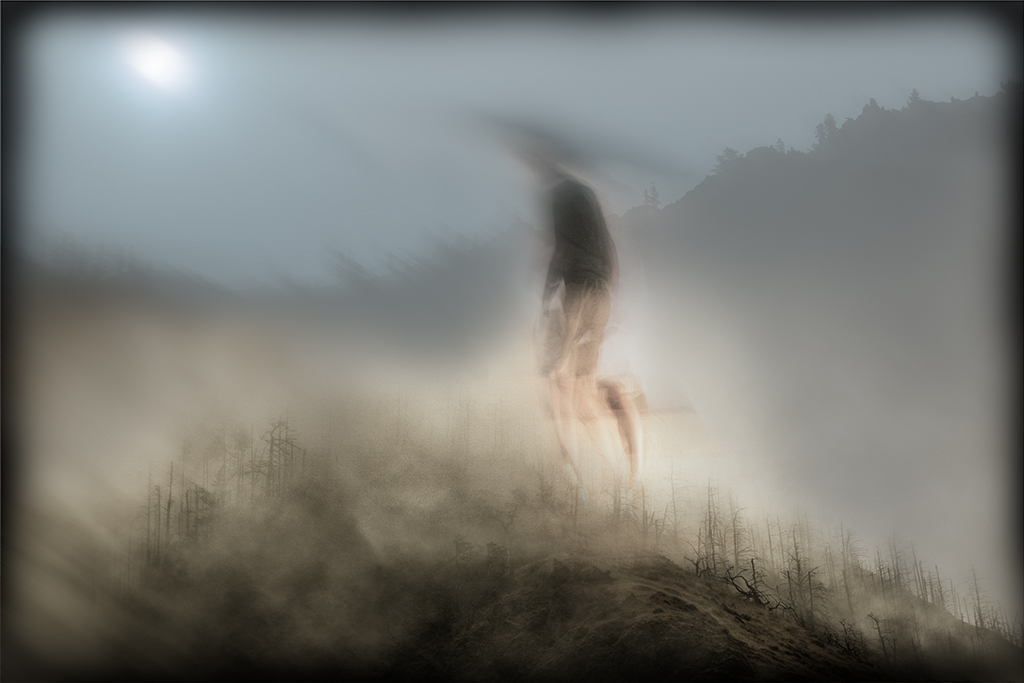
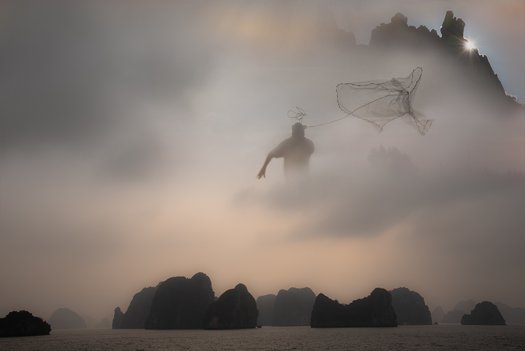
Alan, A nice departure from your other surrealist images. This one, although less complex than some of your other images in terms of the number of elements, feels much more complicated on a psychological level. The choices you've made on placement of the man, cutting his head off, and the handling of his feet could all be challenged if I were one of the critics you often mention from your camera club, yet, I like what you've done. This is the type of image I will likely come back to again and again to try and construct a story that works for me. Your "witch's brew" is very successful as a stylistic statement. Great job. |
Apr 2nd |
| 54 |
Apr 19 |
Comment |
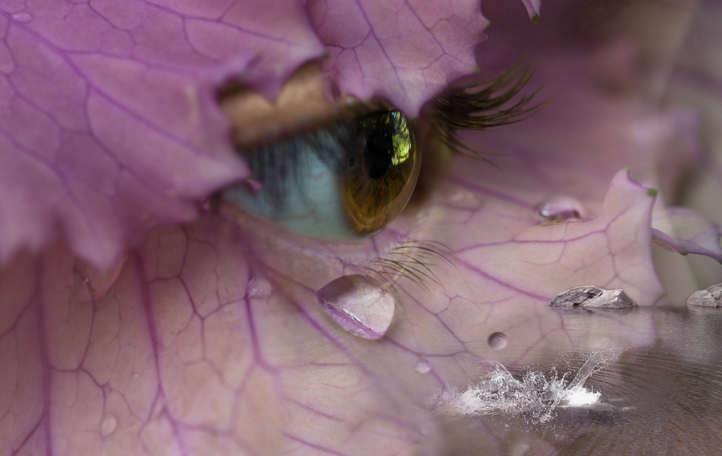
Betty, I really like this image. The colors are beautiful. The filter adds nicely to the feel of the image. The way you handle depth of field in this image feels very modern with an old world charm.
The vase seems a little soft/blurry given the other crisp features in the image. Given it is a final product of the work I wonder if you could give it a little more contrast/sharpness or darkening to help integrate it with this otherwise very strong image. |
Apr 2nd |
| 54 |
Apr 19 |
Comment |
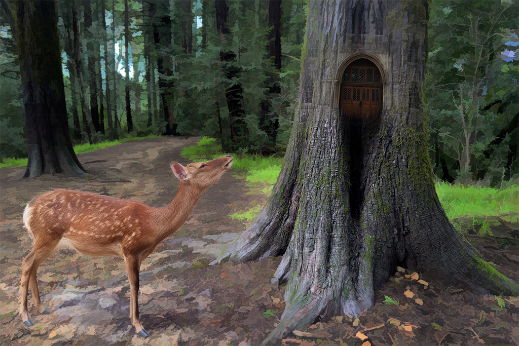
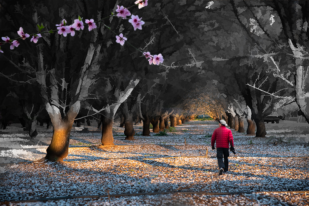
Aavo, I really like the esthetic of this image. The colors and placement of your granddaughters along with the old classroom objects create a very pleasing painterly experience. The addition of a cloud in the classroom creates a whimsical surreal feel to the image which I like very much.
The cloud feels a little low in the image to me and doesn't feel completely convincing. I wonder if a subtle drop shadow may help it to "float" better in the image. |
Apr 2nd |
| 54 |
Apr 19 |
Comment |
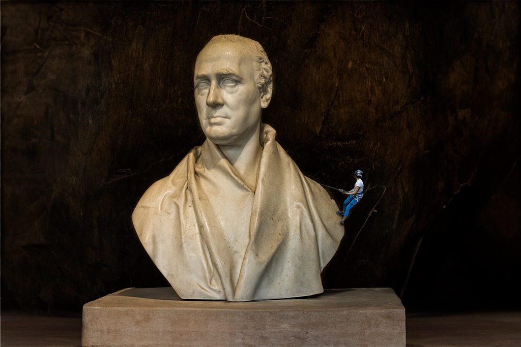
Peggy, That is quite an involved process. My first impression was, wow! I think this is a great image. I like how you've handled the shadows and highlights, it creates an image that is worthy of this great ape.
I feel like the green tones at the bottom of the gorilla are a little distracting and don't add anything for me but it may be a personal taste thing. I want to see more in this series if you continue doing these images. |
Apr 2nd |
4 comments - 8 replies for Group 54
|
9 comments - 11 replies Total
|