|
| Group |
Round |
C/R |
Comment |
Date |
Image |
| 40 |
Jul 19 |
Reply |
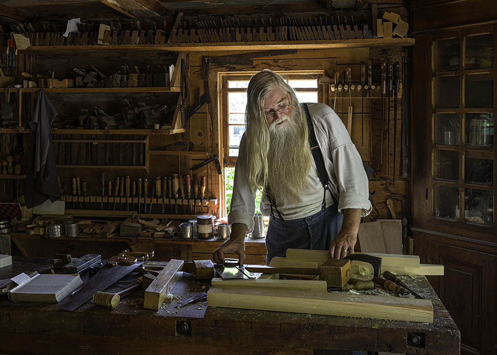
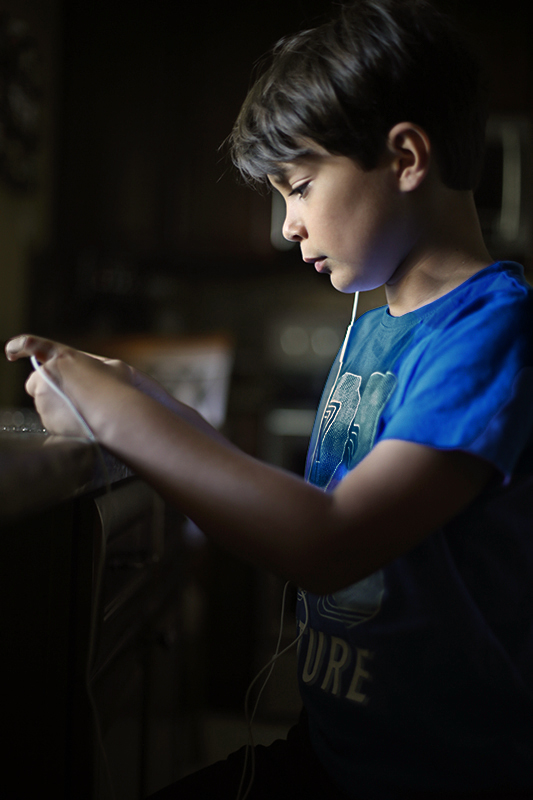
The lighting is more along the lines of what I am used to shooting under, but I do find that Jack looks a touch underexposed (regardless of his skin tone) and could probably use a bit of lightening to draw more attention to him. I may have gone just a touch too far, but it makes him stand out a bit more.
I don't love the sliver of road along the bottom of the frame as it draws the viewer's attention away from Jack. In my view shooting at an angle where you miss that part of the background would help with the overall composition. I would be tempted to crop out a lot of the background for the same reason; the shot is all about the boy not the background. I'm not sure that I love what the baseball bat is doing and I tend to pose my subjects so that they are a bit more compact.
I've done a fair bit of shooting in areas that are further south so I understand what you mean about the light behaving differently further north; the golden hour and blue hour last a lot longer in the summer and it is easier to shoot in that type of light for this reason.
Keep on practicing and come visit Group 61 which is where the portrait photographers seem to hand out. :) |
Jul 29th |
| 40 |
Jul 19 |
Comment |
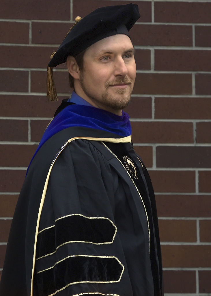
Nicely done portrait Alison. Your film background is serving you well here.
Let me start by trying to explain why the background is so dark. By pattern metering, I assume you are referring to what Canon refers to as Evaluative Metering". Here the camera tries to calculate the best exposure, give what is in the scene. The bright light hitting Jack is the main limitation and the metering is trying to ensure that he is not being "blown out". Had you taking your original scouting shot from the same position as where Jack is standing, your exposure would have been different for that shot as well.
In terms of the image itself, it is well thought out and well crafted. You are shooting up at him, which is usually a good approach with children. It's not the usual "snapshot" perspective with an adult shooting down, so is very effective. You've filled the frame nicely and with the possible exception of Jack's finger being a touch too close to the edge of the image, it works very effectively. The light is hitting his face and that is where we generally want the viewer's attention to go. The human visual system is cued to areas of brightness or high contrast.
Where might you improve? I don't know the compass direction of the window you were using, but in general north facing windows often give a more gentle and pleasing light. You might want to have another look at the house to see if you can find an area like that and shoot there to see the result. I find that the shirt and the hand are just a touch "hot" and just like in the wet darkroom, I would burn down those areas. Even his face and neck could use a bit of burning. The back of the chair that is reflecting could use a touch too.
In my work, I tend to prefer portraits a bit on the warmer side, so I would play around in post and would warm the scene up just a touch. I would go in this direction with your image. |
Jul 9th |
 |
1 comment - 1 reply for Group 40
|
| 61 |
Jul 19 |
Reply |
Donna - I generally shoot in a way that I don't need to crop the image I have taken. As I am a printer and do a lot of 17" x 20" prints, so I want as much data as possible.
I will shoot in such a way as to enable me to crop parts of the image so that it will fit on standard paper and frame sizes (this generally means leaving extra space at the top or bottom of the image). |
Jul 14th |
| 61 |
Jul 19 |
Reply |
Sorry Dave; Jim runs this group. I just run along with it. |
Jul 14th |
| 61 |
Jul 19 |
Comment |
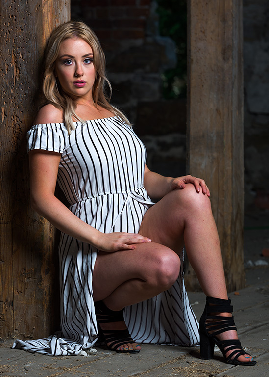
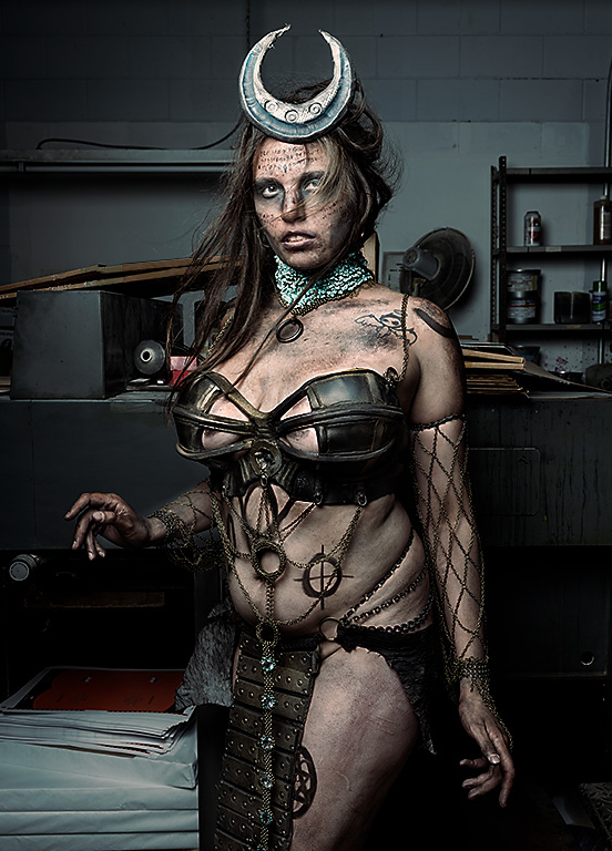
I would definitely work on the eye and bit of knee showing as both seem to be significant distractions on this fine image. |
Jul 12th |
 |
| 61 |
Jul 19 |
Reply |
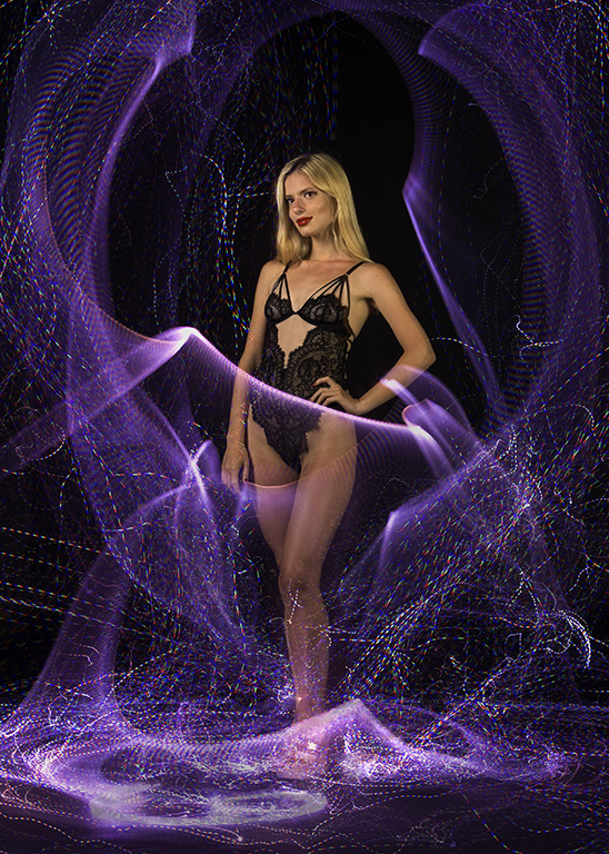
Donna - I think the setting is very important to this image as you are really somewhere between a street photo and an environmental portrait.
My main issue with your original treatment was that the background was overpowering your subject. In the re-do you've taken the environment right out of the image and I feel it needs something. |
Jul 11th |
| 61 |
Jul 19 |
Reply |
Here is the SOOC image. A lot of the work was to get the mood set. |
Jul 11th |
 |
| 61 |
Jul 19 |
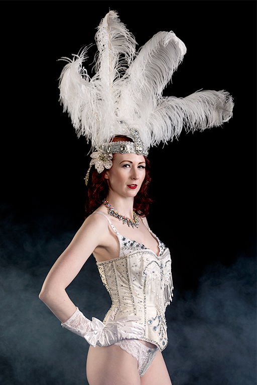
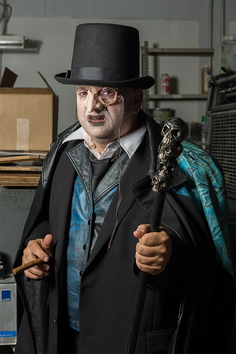
Comment |
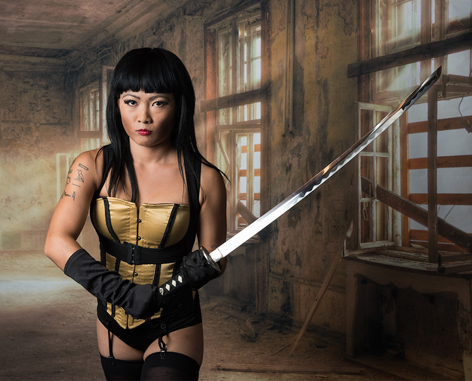
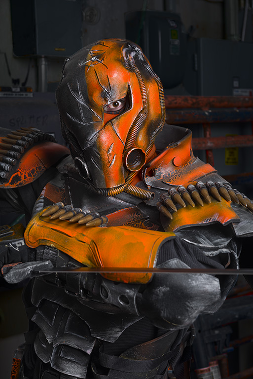
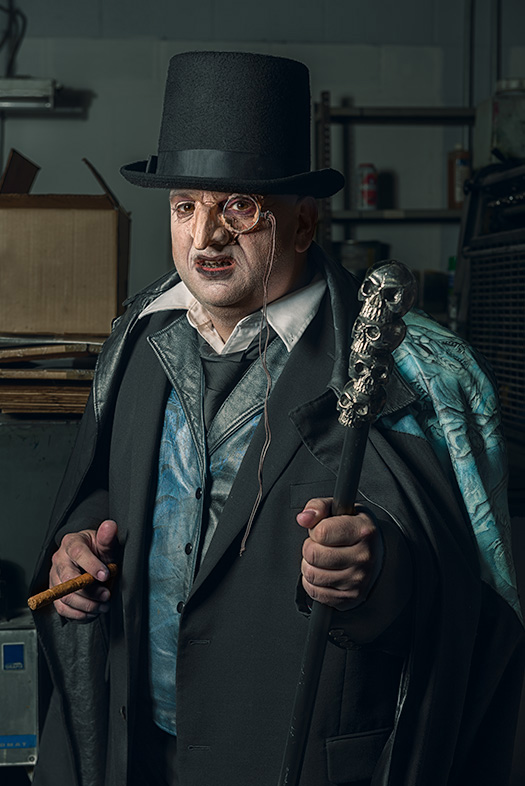
It looks like you had a great shoot. Carl, his costume and sword all come together nicely in your image.
A couple of things strike me though. The camera left sleeve is the brightest part of the image and is a bit distracting. I find my eyes go there instead of the face. I wonder if that might need a bit of burning down?
I also wonder about the lack of separation between the subject and background on the camera right side. Your subject just fades into the background there. |
Jul 10th |
| 61 |
Jul 19 |
Reply |
Very good point about the saturation Jim. Unfortunately, saturation and colour are linked when using an RGB colour space and when we adjust the brightness of part of an image, then the saturation comes along for the ride and we see this issue.
Rather than just desaturating, I have found in Photoshop there are two ways to avoiding / fixing this issue. The first is to do the dodging and burning using the Luminosity blending mode as this pretty well controls changes in saturation. The other way is to selectively desaturate certain colours. Again, in Photoshop the Hue / Saturation adjustment or Hue / Saturation adjustment layer allows adjustments to individual colour channels, rather than making a global change. For people, reducing the saturation in the red and to a lesser extent the yellow channels desaturates skin nicely without affecting some of the other colours in the image.
Of course, working in the Lab colour space also works... |
Jul 9th |
 |
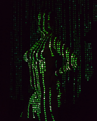
| 61 |
Jul 19 |
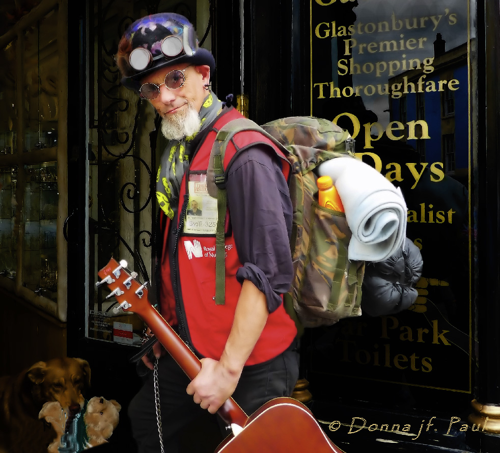
Comment |
Another interesting image Donna. I find that street entertainers and buskers always make for very interesting subjects, but they are very hard do well just because of the shooting environment. It's so busy back there that it detracts from your subject. This is very much almost an environmental portrait, so showing his environment is very important to the composition. I would be tempted to really burn it down so that it becomes less intrusive. I had to think long and hard about what to do about the dog carrying the stuffed toy, but in the end concluded that it too was a distracting element that had to be downplayed.
It's too bad that he is wearing his licence in such an obvious place as it is so bright that it draws our eyes to it as well. |
Jul 4th |
 |
| 61 |
Jul 19 |
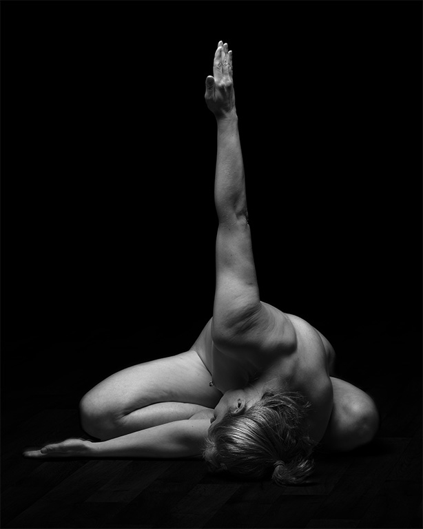
Comment |
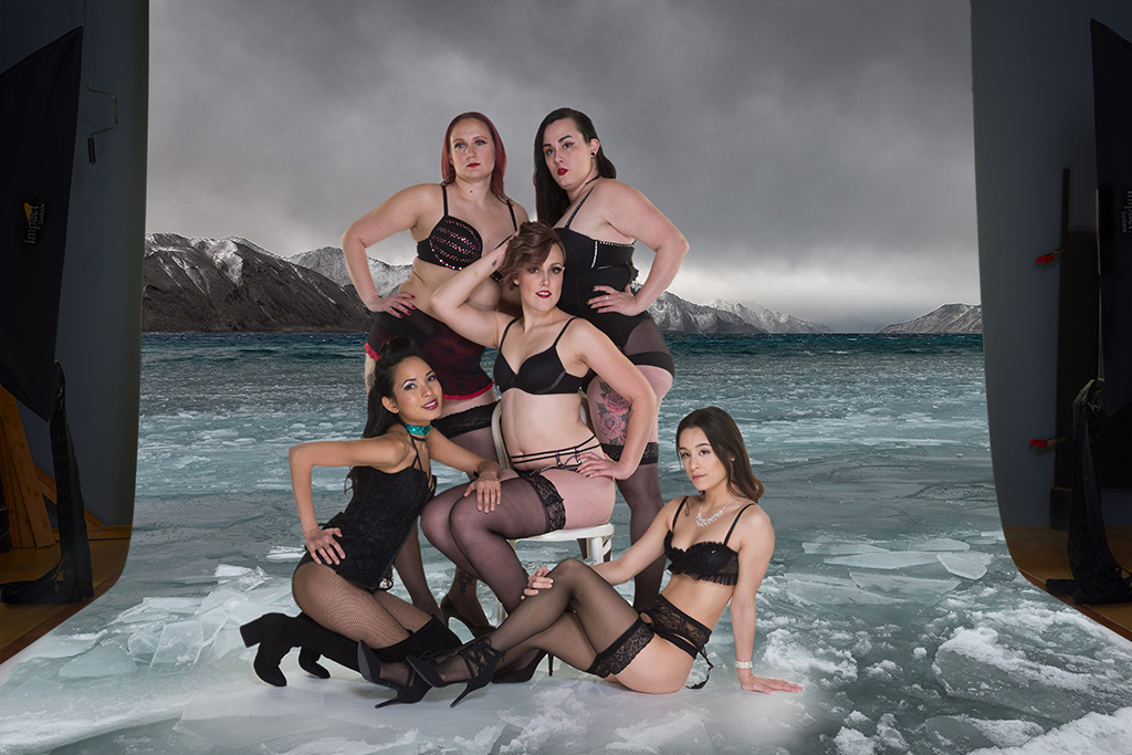
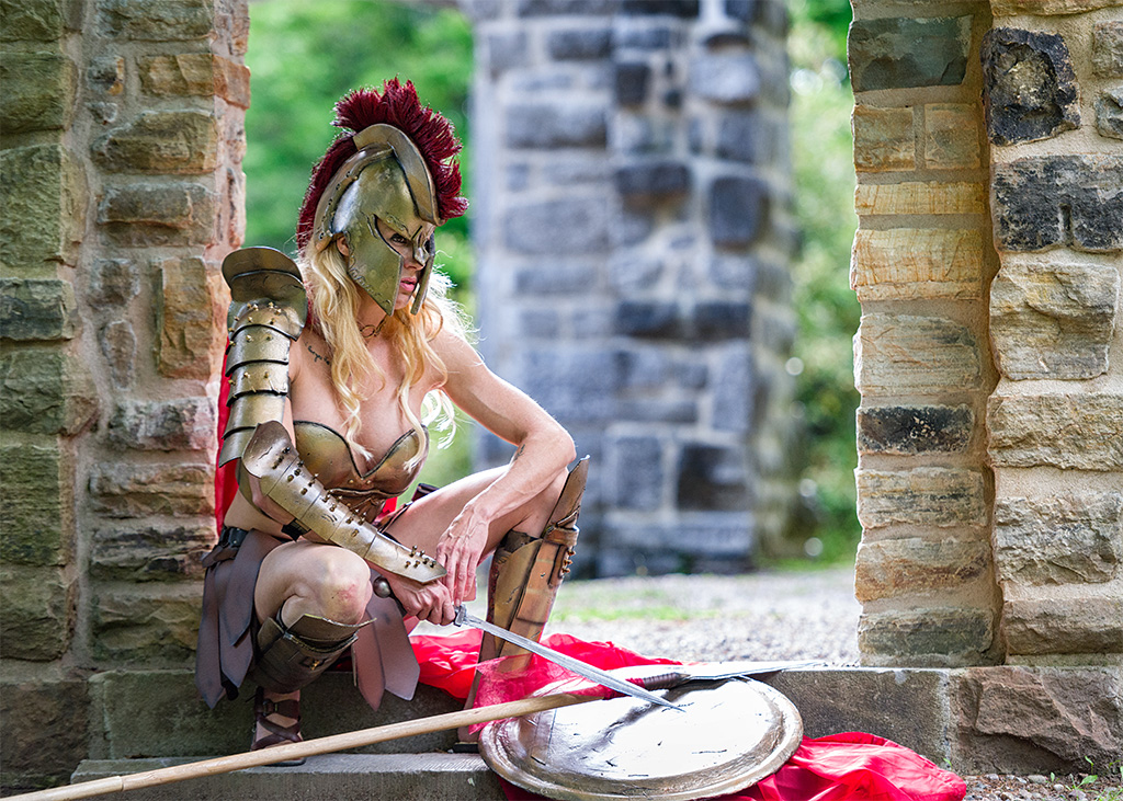
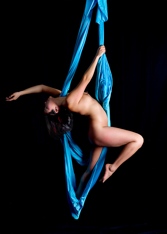
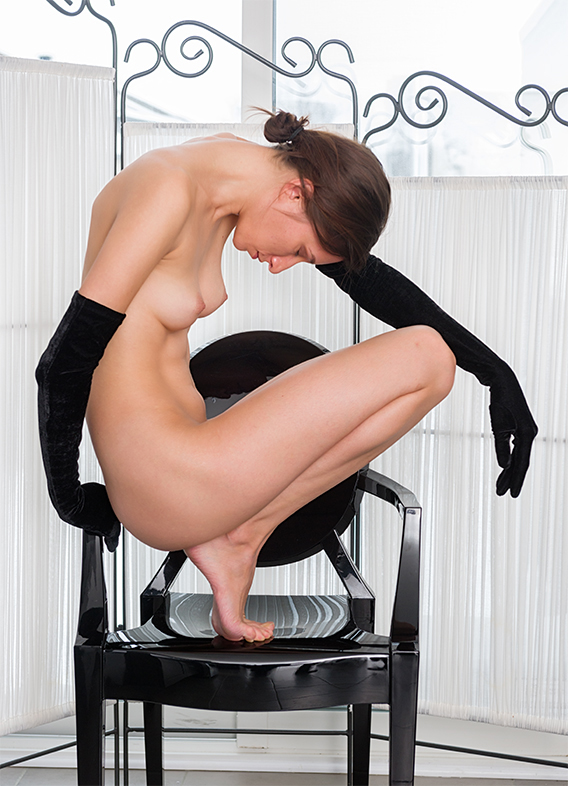
While this is an excellent image, I feel just a touch sorry for your poor model; making her repeatedly jump while holding weights (and still managing to smile) must have been some really hard work. How many tries did it take to get this shot?
That being said; I like the positioning of her arms and legs; a very dynamic looking pose. I can only assume that you were trying to get a 100% freeze here and wonder if just a touch of blur in her extremities might not have added something to the image and made it stand out even more.
Great post-processing work; the clouds and model interact very well. You did a very technically clean extraction here and the blend with the new background is excellent!
Another great image Jim! |
Jul 4th |
| 61 |
Jul 19 |
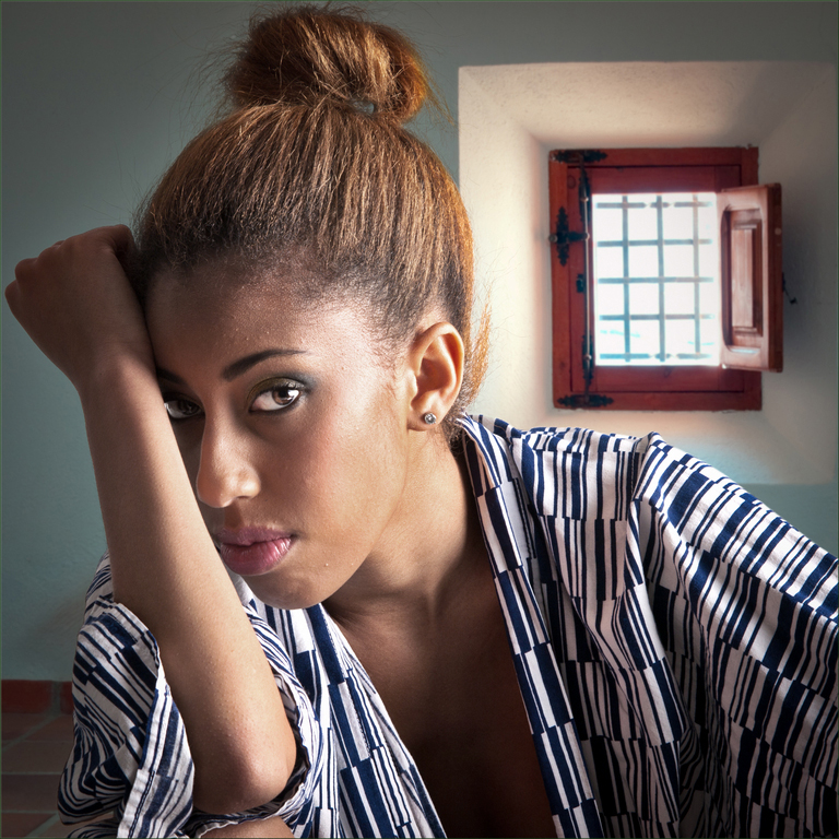
Comment |
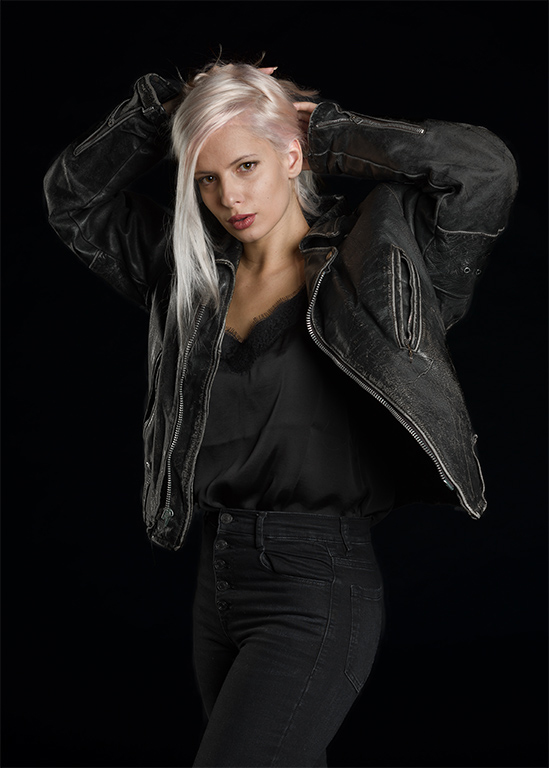
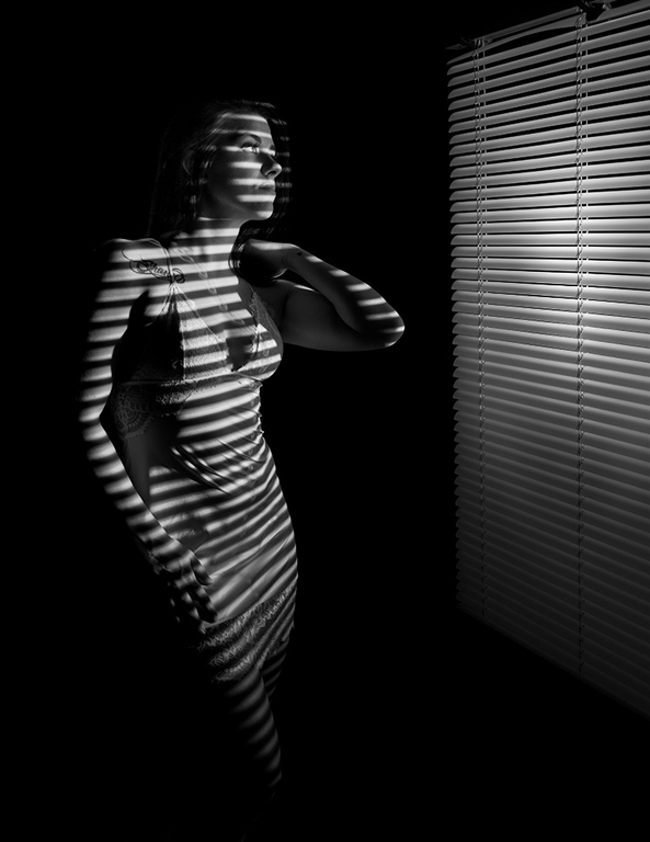
Another beautifully crafted image Salvador. I like the way you have balanced the image by placing the window in the scene as a way of balancing the position of the model's head. The effect is two fold; the model is a bit of an unusual position and is almost heading out of the frame but the window pulls everything right back. I wonder if burning down the window and window frame would help or hurt the overall image.
There are two little quirks that I find that draws my attention. The first is along the bottom of the frame where the elbow is showing, but the material of the yukata appears to have another elbow just below it. I also find that the reflection of the window in the model's camera right eye a bit strange. It is so bright that it almost makes the model look like she is looking to the camera left side, but her pupil tells us something else. Again, I wonder if toning that down might not do something for the character of the image? |
Jul 4th |
5 comments - 5 replies for Group 61
|
6 comments - 6 replies Total
|