|
| Group |
Round |
C/R |
Comment |
Date |
Image |
| 12 |
Feb 21 |
Comment |
What a great subject and capture and good you perserved despite the fishy smell! I think Barbara and Carole and done a great crop and that is what i would have suggested too giving more emphasis to the lovely textures in the starfish. |
Feb 15th |
| 12 |
Feb 21 |
Reply |
Thanks Carole...agree think it looks a nicer image brighter.. |
Feb 14th |
| 12 |
Feb 21 |
Comment |
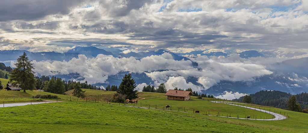
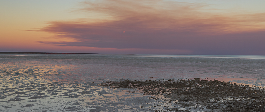
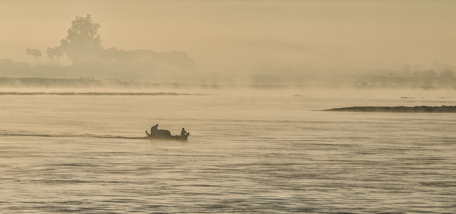
Skies are a wonderful addition to any photo and you have captured this one with the rays shining through beautifully! The landscape offers a nice backdrop to the clouds detailing a nice tranquil scene. |
Feb 14th |
| 12 |
Feb 21 |
Comment |
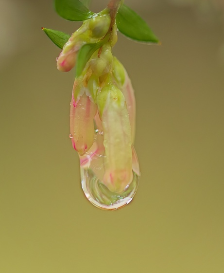
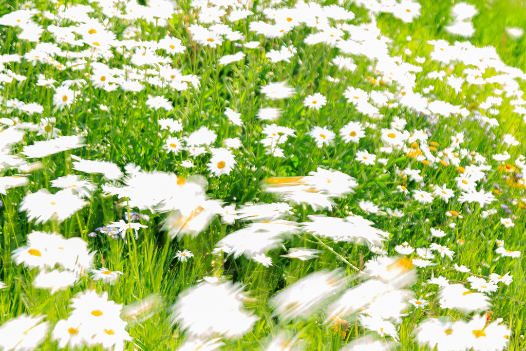
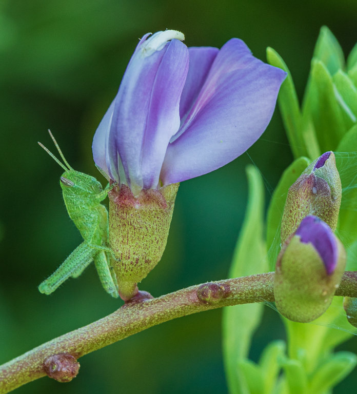
Yes always good to think of Spring when we are in the middle of winter! I really like the shape of this flower and how you have captured the light diffusing though the petals. My eye goes directly to the centre of the flower then to the green. I think i agree with Carole's edit to take out the white area of the greenery. |
Feb 14th |
| 12 |
Feb 21 |
Comment |
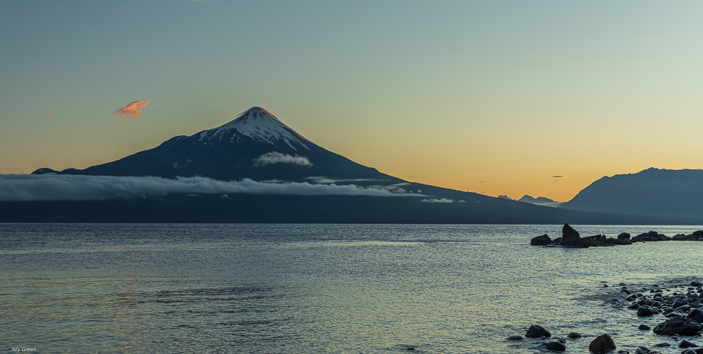
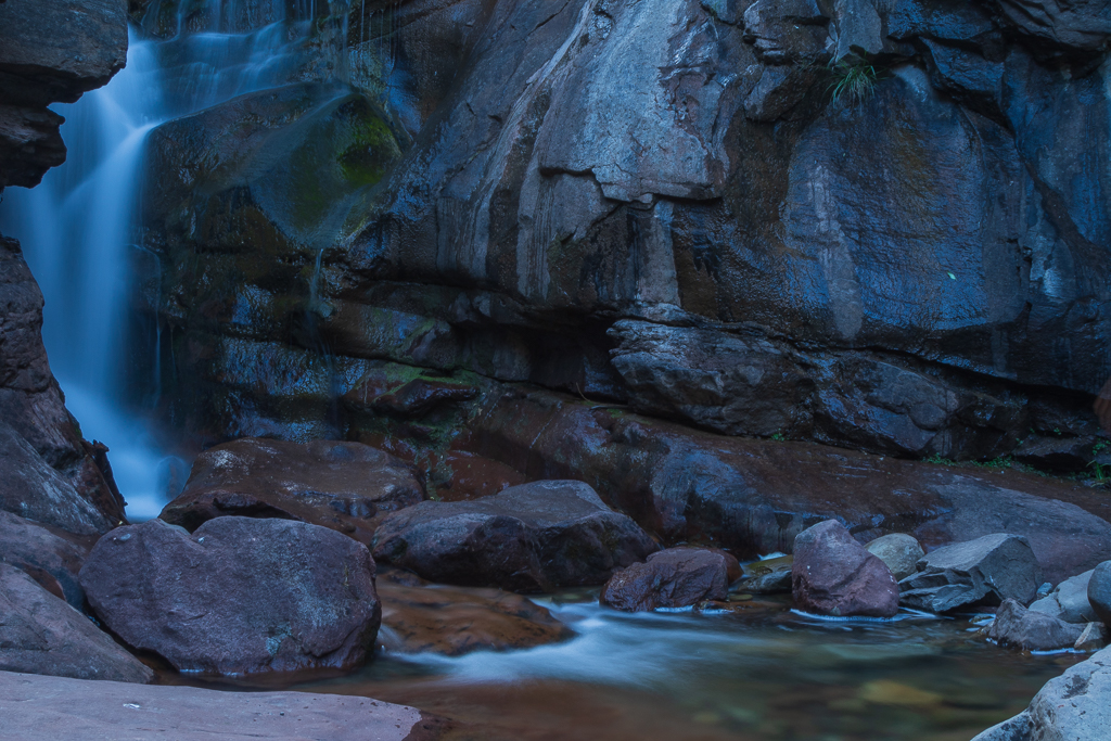
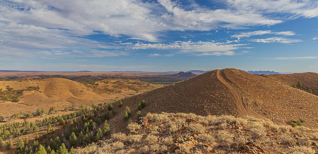
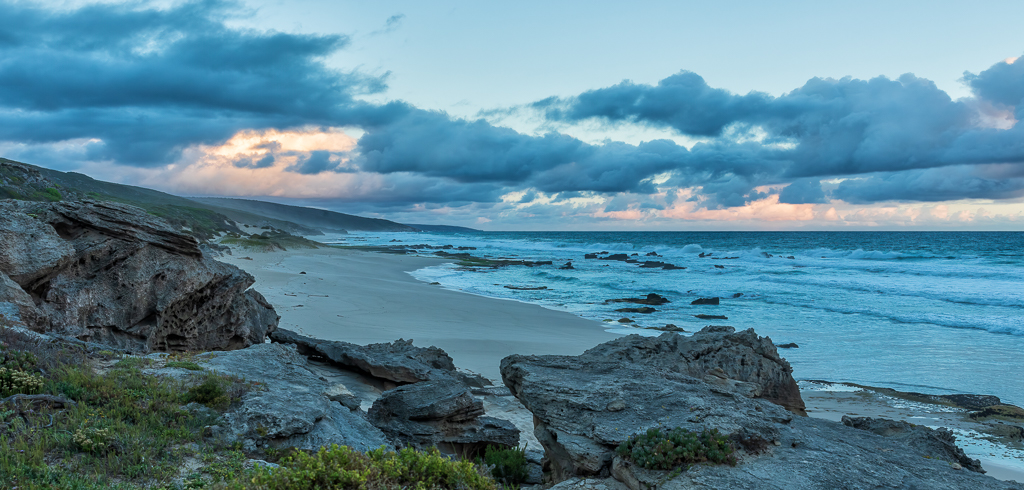
Yes Carole nice to be wise and to stand out and do something different. You have a great eye! The golden light on the bridge and on the rocks compliment each other and you have a nice depth of field in the rocks too. Nice to have the rocks in the foreground leading my eye to the bridge. Not sure if its my computer but there seems to be a few dustspots in the sky but could be that my computer screen needs a clean! I wonder if you cropped out the people and the pylons so just to focus on the bridge and the rocks? |
Feb 13th |
| 12 |
Feb 21 |
Comment |
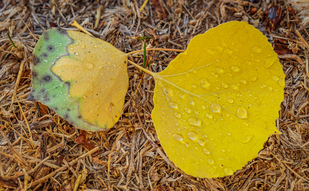
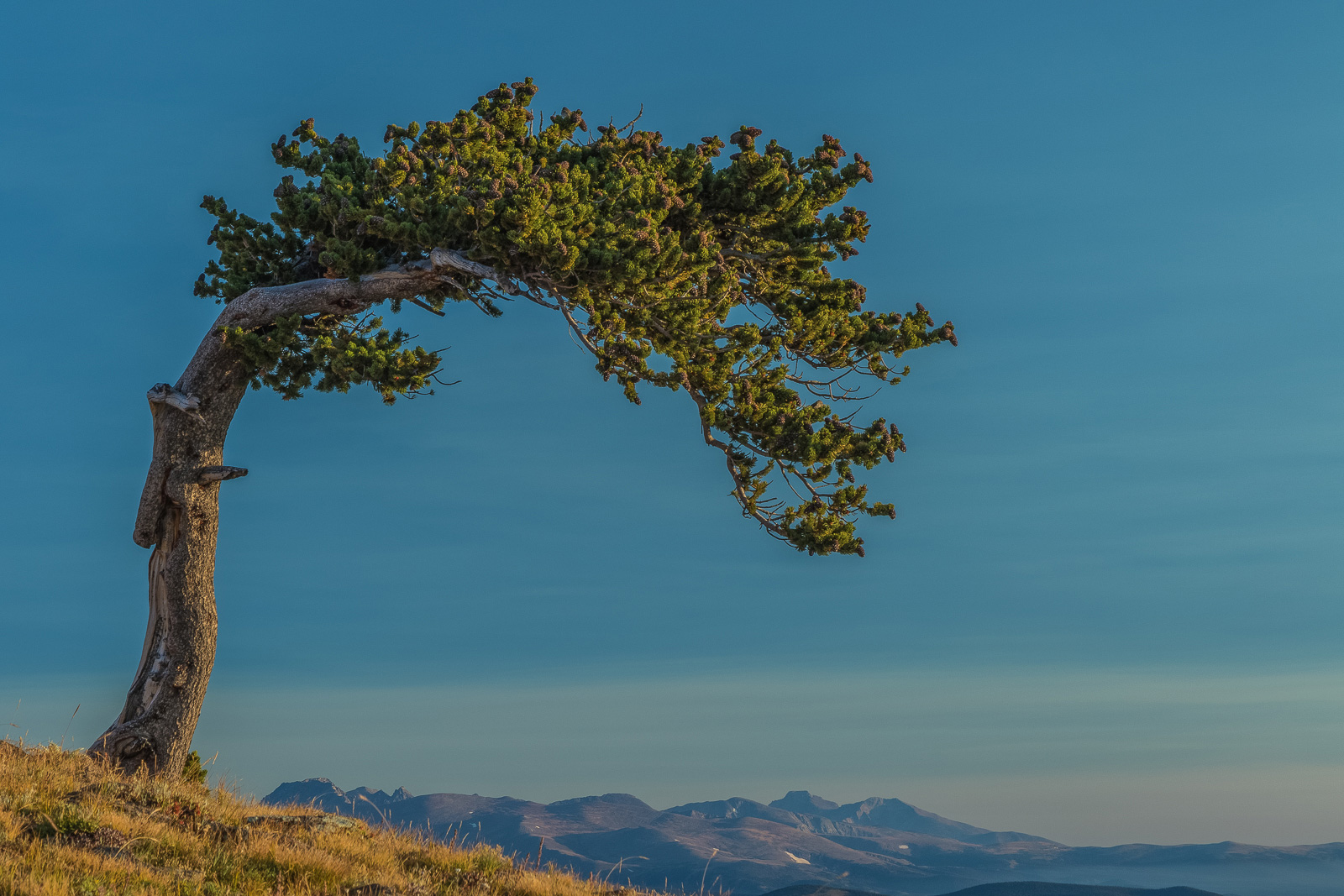
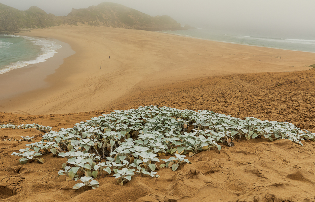
Interesting composition and i like the diagnal positiion of the branch. Great colours in the leaves at the top but my eye is distracted by the brown leaves at the bottom. I think if it were me i would have focused just on the golden leaves and cropped out a bit of the grass too making it a tighter image. Good detailing in the leaves. |
Feb 12th |
5 comments - 1 reply for Group 12
|
| 52 |
Feb 21 |
Reply |
Thanks Judith and agree with your sentiments! |
Feb 19th |
| 52 |
Feb 21 |
Comment |
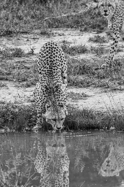
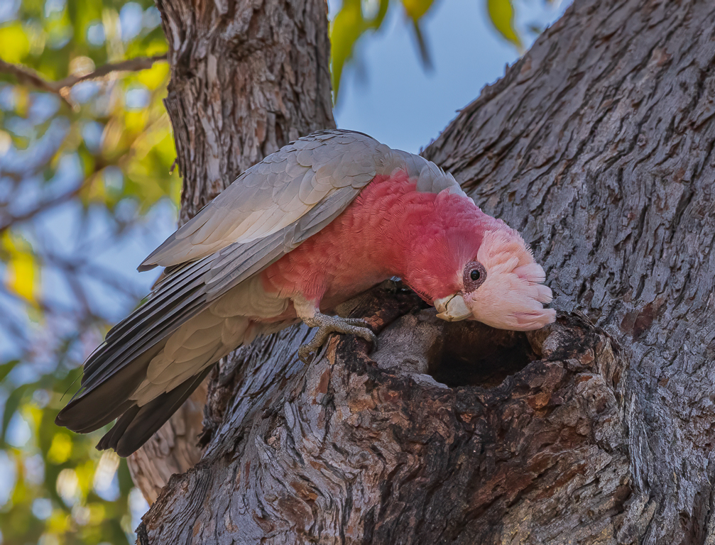
Kudos for you for restoring your ranchland and must be amazing to see so many different species of birds. With this Phoebe i like how you have captured it on the spiral ironwork and with its beak open. Nice focus on the eye but to me the rest of the bird needs a bit of sharpening as slightly soft to me. Cropping the empty space as Mike has suggested enhances the image. |
Feb 18th |
| 52 |
Feb 21 |
Comment |
Mike - I have just seen the photo 'The Leap' which Sharon mentioned was a runner up in the 'Wildlife Photographer of the year'....It is an amazing photo and deserves huge recognition! Being an africa specialist...i would love to know how you shot that image...my email is allyg@eaglelaw.com |
Feb 16th |
| 52 |
Feb 21 |
Comment |
An interesting photo with many different textures to look at and converting to black & white is perfect to show these off. To me it is a tad bright so would adjust perhaps the contrast slider. I like where you have positioned the mushroom within the frame. Nicely done. |
Feb 15th |
| 52 |
Feb 21 |
Comment |
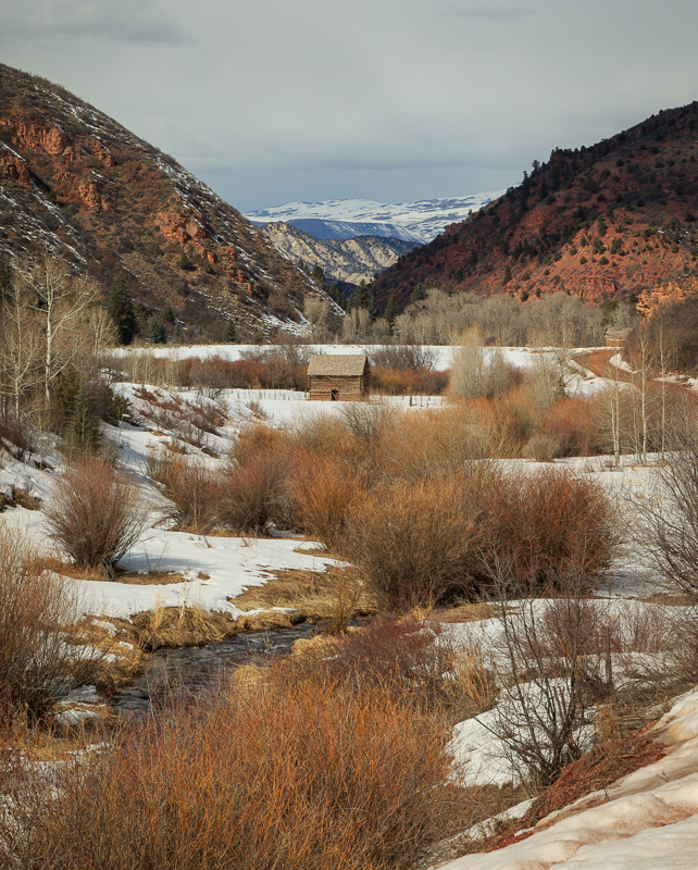
A pleasing composition and nice reflections of the trees in the water and i like the way you have bought out the colours. In my opinion i would have cropped in from the left to take out those structures as Pam as suggested. I might also have cropped in from the bottom to show less snow so as to focus on the lovely tree relections. |
Feb 14th |
| 52 |
Feb 21 |
Reply |
Thanks Sharon and yes i did crop it to your suggestion and it looks a much stronger image. A good improvement and not quite sure why i didn't consider the vertical in the first place...guess i was thinking about the clouds being atmospheric. |
Feb 13th |
| 52 |
Feb 21 |
Comment |
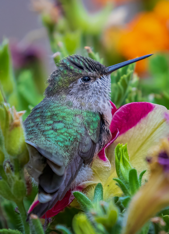
A beautiful capture of this bird and you have done a great job 'cleaning' up his feathers. His eye is so vivid it i can't imagine it closed! I love the square crop (something i do often) and it works well here. Prefer the revised version. Really nice image. |
Feb 13th |
| 52 |
Feb 21 |
Comment |
What a great capture and the colouring of the hawk is wonderful with tact sharp detail. Good job in your post processing of removing the distracting details. I like the vertical crop that Mike suggested although to me i would like to see a little bit more room above the head. I may have darkened the green post a bit but doesn't detract from the main subject too much. |
Feb 12th |
| 52 |
Feb 21 |
Comment |
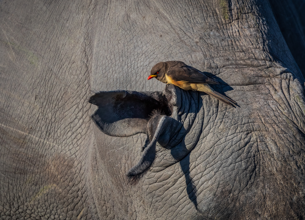
You have done a lovely of highlighting the wings of this Ibis. I too was a bit perplexed like Pamela when i looked at the original and saw the ruffled feathers but i understand now your explanation! To me the eye looks a bit lost in the colouring of its head but the detailing in the wings attract more of my attention. I like how you have positioned the bird as a diagnol and the background is nice and blurred. Good job. |
Feb 12th |
| 52 |
Feb 21 |
Reply |
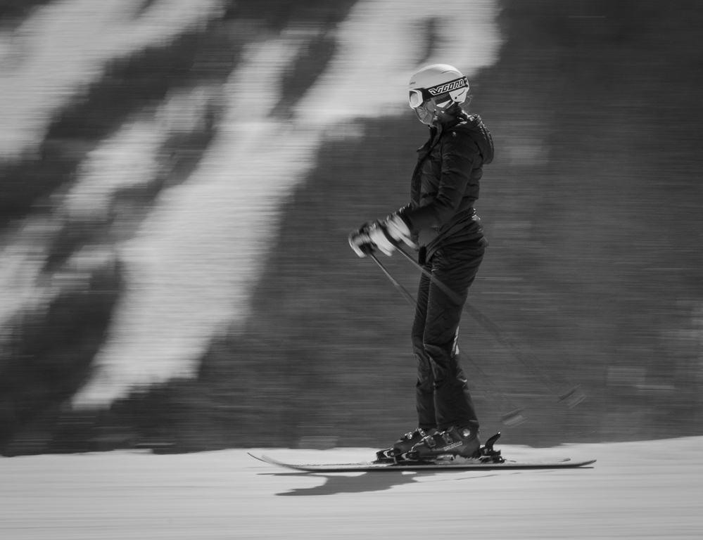
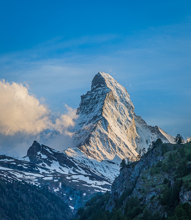
Thanks Pamela and think the foreground does add a bit of depth. I first learnt to ski in Zermatt 35 years ago so the town has changed a bit! |
Feb 12th |
| 52 |
Feb 21 |
Reply |
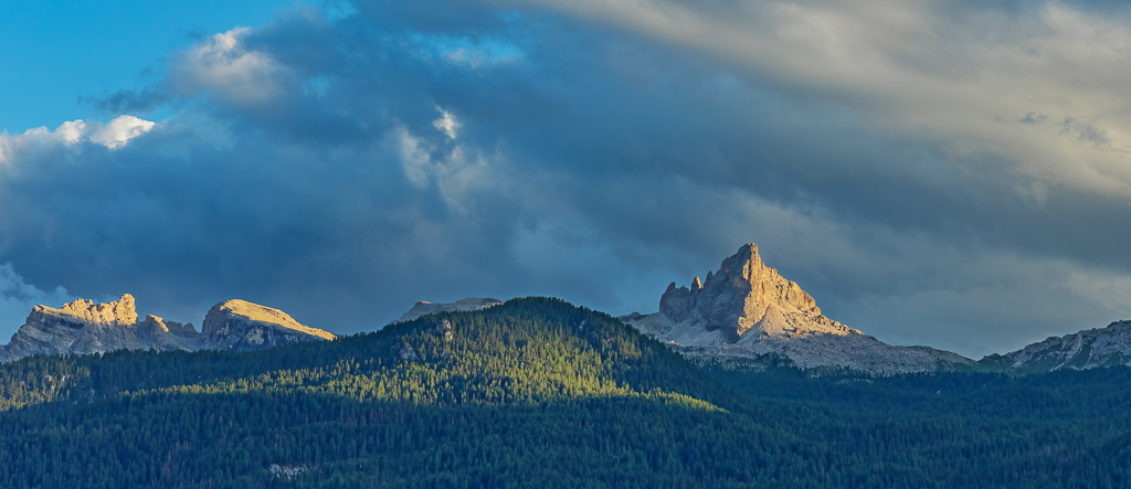
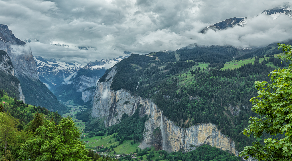
Thanks Mike..i really like the warmth you have created on the side of the Matterhorn..definitely an improvement. |
Feb 12th |
7 comments - 4 replies for Group 52
|
12 comments - 5 replies Total
|