|
| Group |
Round |
C/R |
Comment |
Date |
Image |
| 35 |
Mar 19 |
Comment |
Joshua tree needs its own space to show off its majestic line and foam, the rocks and the clouds clashed with the tree, made it hard to show off the nice texture of the tree. |
Mar 13th |
| 35 |
Mar 19 |
Comment |
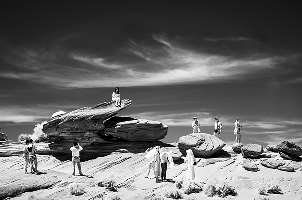
You have a great image of the cemetery, great textures and light, and the ghostly images add a story to it. The only thing I'd maybe try is not to position the mum so close to the edge. It's a beautiful image! |
Mar 13th |
| 35 |
Mar 19 |
Comment |
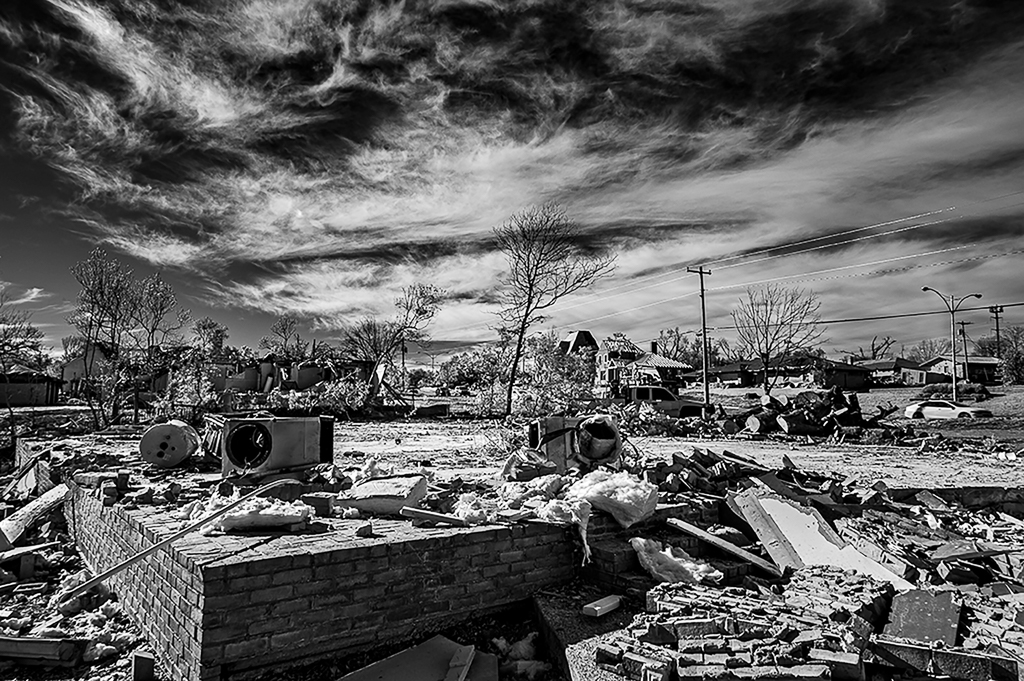
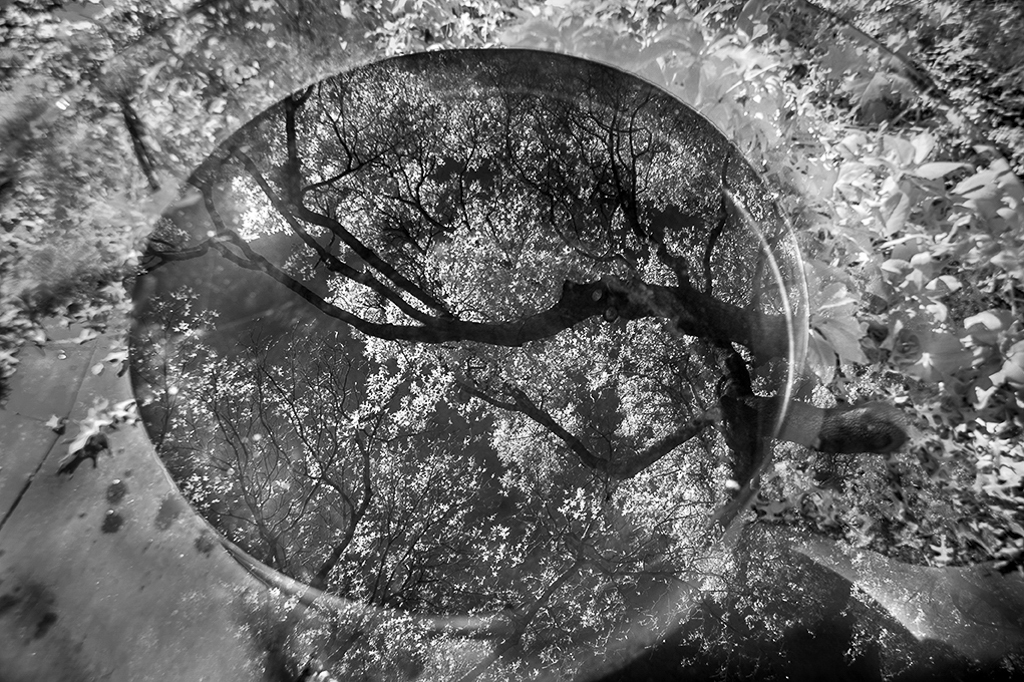
WOW! You did a great job converting the original to the final image! I agree with Stuart that some areas need to be darken especially around the globes. |
Mar 13th |
| 35 |
Mar 19 |
Comment |
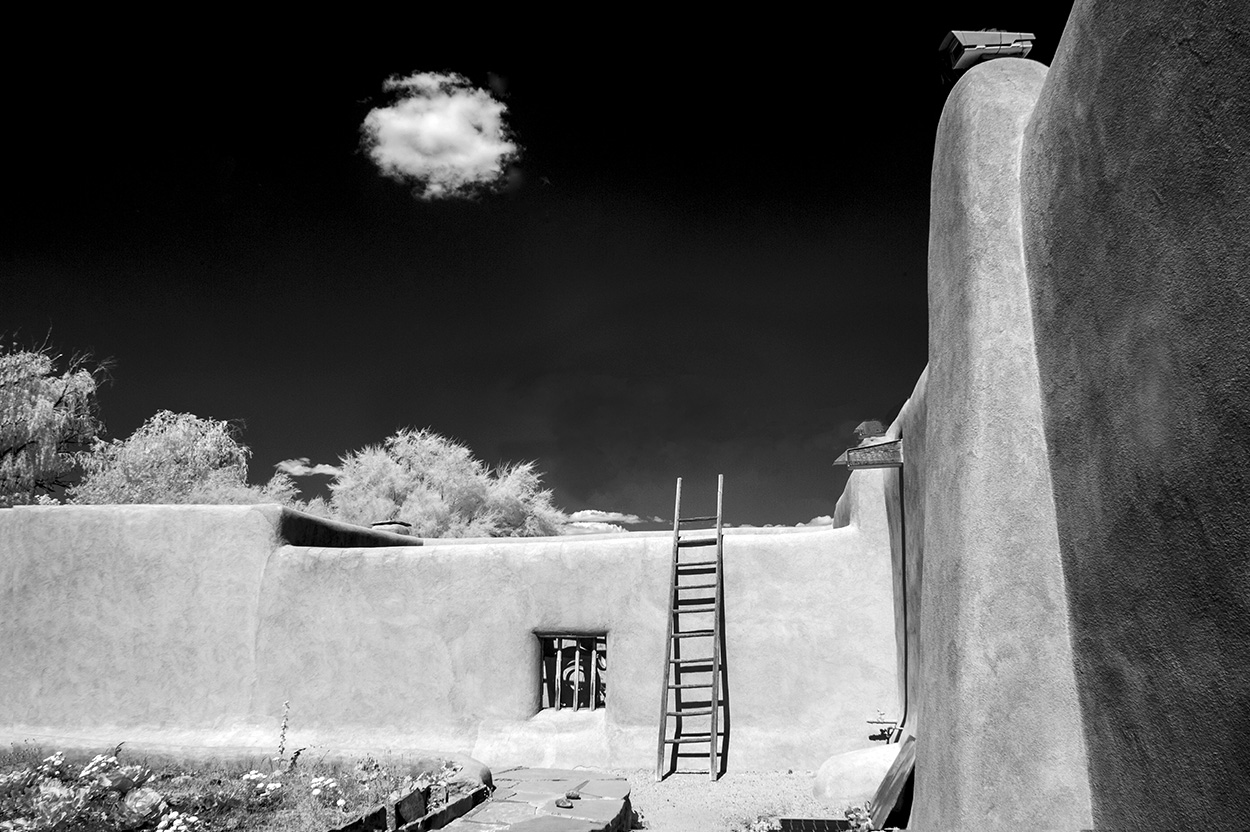
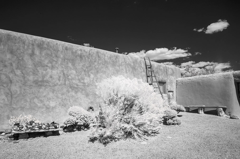
I like the composition and textures of the building and the birch trees, but it seems a little soft on the contrast, maybe a darker sky will show those delicate birches even better |
Mar 13th |
| 35 |
Mar 19 |
Reply |
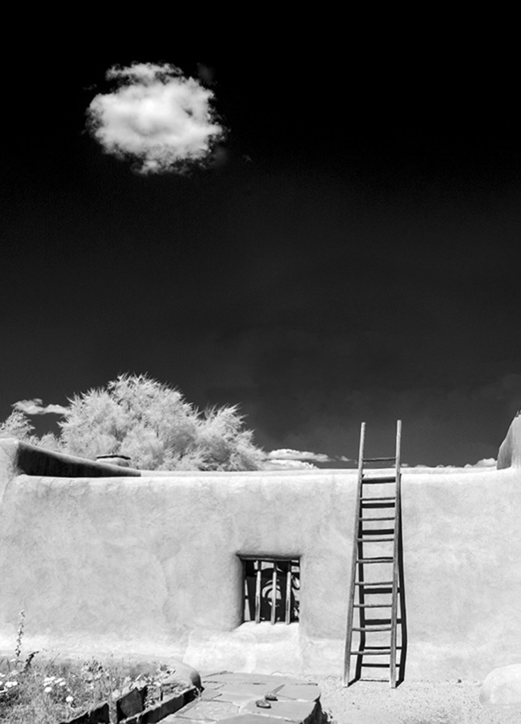
Thank you Stuart! I agree with you, it'd be a much stronger, simpler image and tell the story better, I did tried cropping it before I submitted the image, but some how I decided to show her Adobe home then making a better image. Cropping large pixels off an image has always been my biggest problem,
and my lack off time working on images is another. |
Mar 13th |
 |
4 comments - 1 reply for Group 35
|
4 comments - 1 reply Total
|