|
| Group |
Round |
C/R |
Comment |
Date |
Image |
| 35 |
Oct 18 |
Comment |
Nice scenery. I love the look, the details and exposure of the building and the trees in the original #3. The dark sky and the over exposed trees seem competing with the main subject.
|
Oct 20th |
| 35 |
Oct 18 |
Comment |
I agree with you all about the sky needing some clouds. I would move up the image to have less sky, there's plenty of room on the foreground in the original image, crop or move up the image to emphasize the loch, lots of nice textures and the reflection there, the cottage will seem even more intriguing in its isolated location. I would try sepia tone the image, take the original tone to -75% in Saturation layer, the brown tone gives the cottage a sense of timeless. |
Oct 18th |
| 35 |
Oct 18 |
Comment |
Beautiful light and tone, lot of details, textures and nice contrasts. The viewer's eyes are meandering all the way into a garden and want to see more. The only thing if I wanted to be picky would be the white line on the right side of the urn, it's not easy to get rid of, but other than that, it's a very lovely image. Good job Debbie!
|
Oct 17th |
| 35 |
Oct 18 |
Comment |
Very powerful image! The leaning and tilting head stones and the amazing clouds made this image so unsettling, agree with Sharon to eliminate the little shadow on the right and two branches on the upper left. Love it!
|
Oct 17th |
| 35 |
Oct 18 |
Reply |
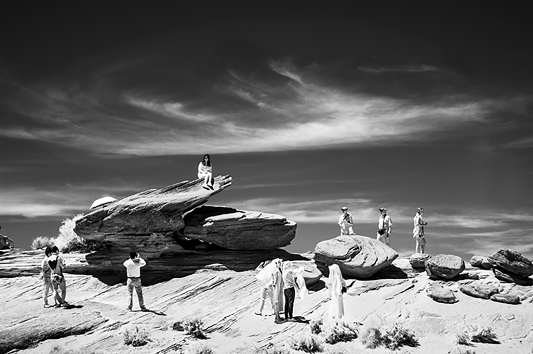
Thank you all! I'll try all of your suggestions. The grouping of the tourists was pure lucky shot.
Debbie, it was that woman who caught my eye for making the shot. |
Oct 17th |
4 comments - 1 reply for Group 35
|
4 comments - 1 reply Total
|