|
| Group |
Round |
C/R |
Comment |
Date |
Image |
| 75 |
Jun 21 |
Reply |
I like the changes you made and moving the hippo closer was a very good choice. |
Jun 17th |
| 75 |
Jun 21 |
Reply |
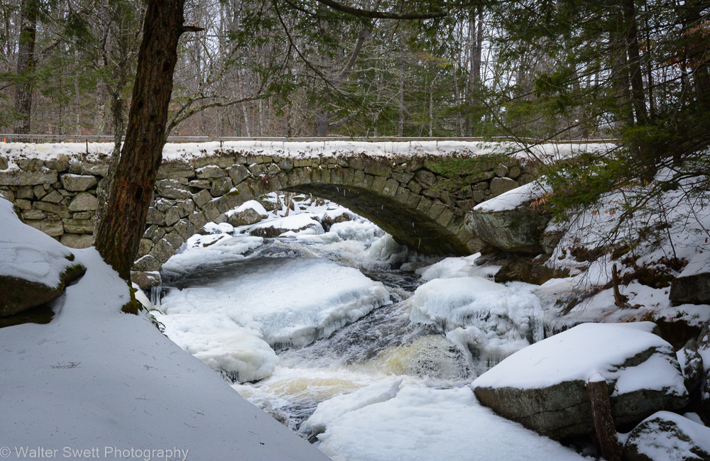
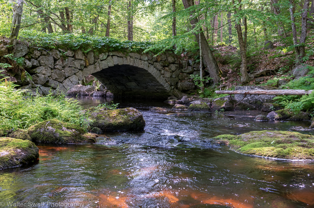
Thanks Frank. This bridge was built circa 1840 and is still in daily use, granted not a high volume of traffic, but still pretty amazing. |
Jun 17th |
| 75 |
Jun 21 |
Reply |
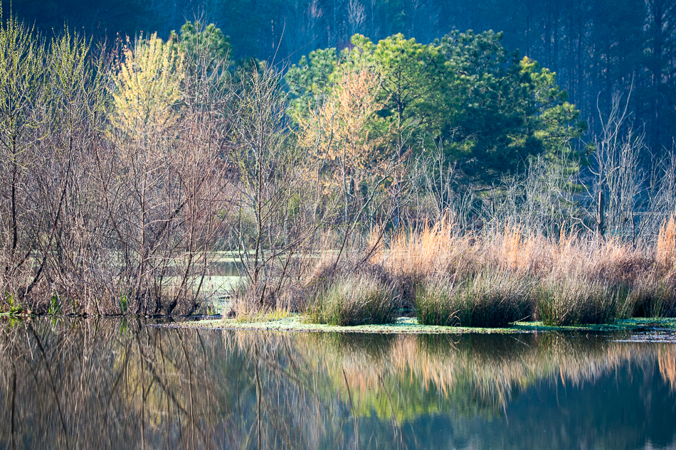
Thanks. Sometimes it is difficult to see the obvious. A new set of eyes can be very helpful! |
Jun 16th |
| 75 |
Jun 21 |
Reply |
The great part of photography is it is your image and you choose what you like. If you get a chance, I'd like to see any changes you settle on. |
Jun 13th |
| 75 |
Jun 21 |
Reply |
I think the color image works well also. |
Jun 13th |
| 75 |
Jun 21 |
Reply |
Thanks for the comments. |
Jun 13th |
| 75 |
Jun 21 |
Reply |
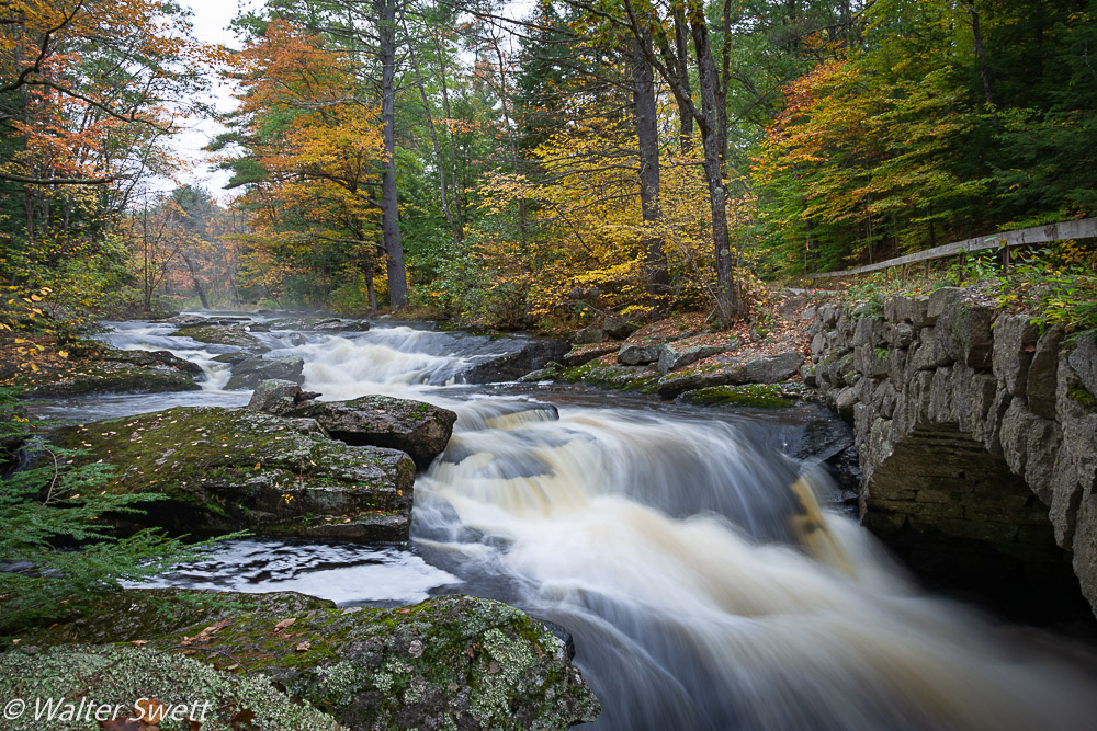
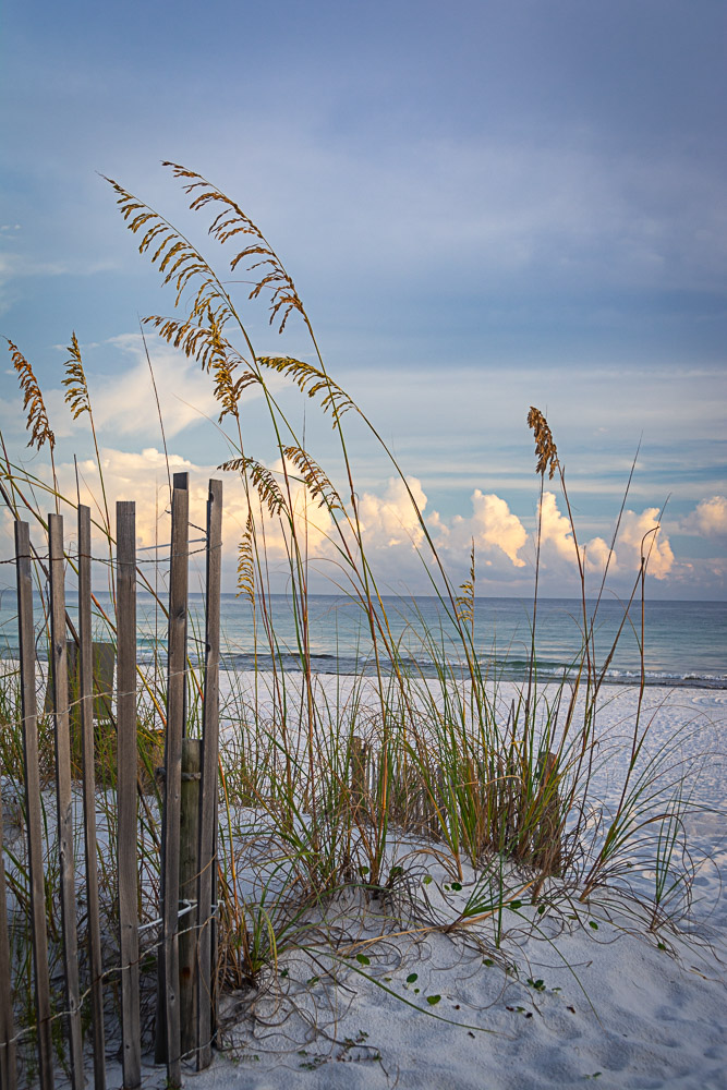
Thanks for the feedback Kerry. There was so much foliage around, there was a lot of green tint cast. I had not noticed how much green there was on the stones until you commented on it. I went back and checked the white balance and I think I've fixed it. How does this version look? |
Jun 13th |
 |
| 75 |
Jun 21 |
Comment |
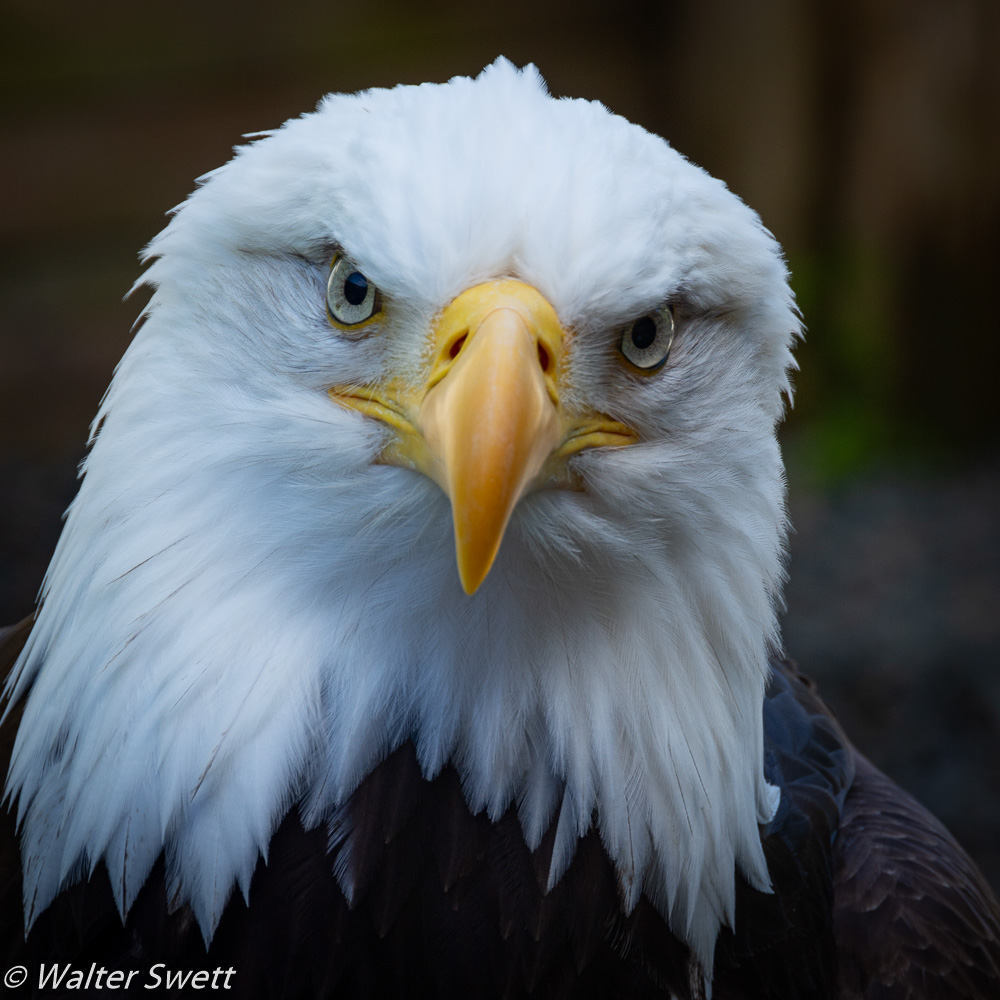
Interesting treatment of the image. I think it works with this shot, but I think it would have also worked in its original form. I would have liked to have seen a little more of the headlamp on the boatman. |
Jun 12th |
| 75 |
Jun 21 |
Comment |
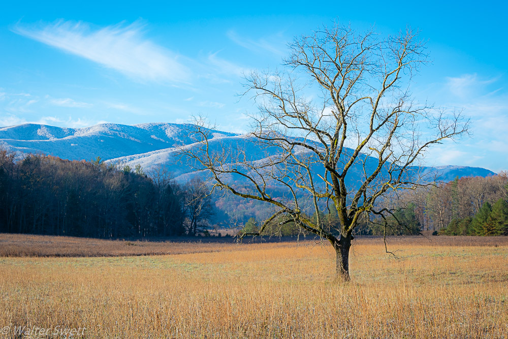
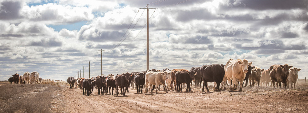
I like the angle you used to shoot the image and how the string of cattle, telephone poles, road and clouds create a great sense of depth. To me, the final image feels a little flat and could use some additional contrast. Have you given any consideration to a panoramic style crop? I think it might emphasize the strengths of the the stars of the show. I've attached a copy to show what I mean. What do you think? |
Jun 12th |
 |
| 75 |
Jun 21 |
Reply |
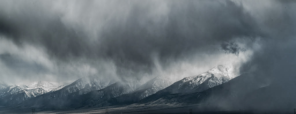
I agree with Nicole that the drama can be found mostly around the tops of the mountains. Did you consider trying black and white? I've made an edit into more of a panorama and converted to B&W. What do you think? |
Jun 12th |
 |
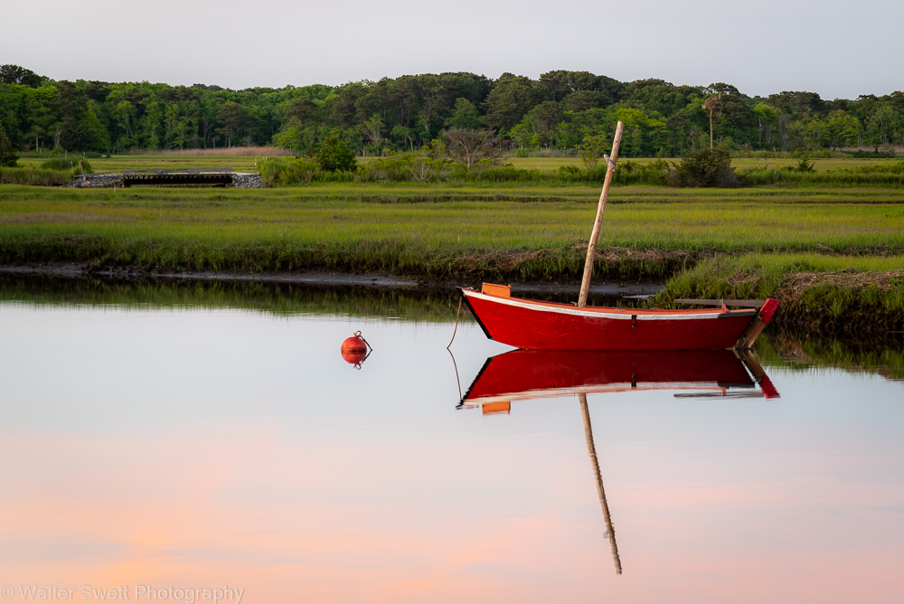
| 75 |
Jun 21 |
Comment |
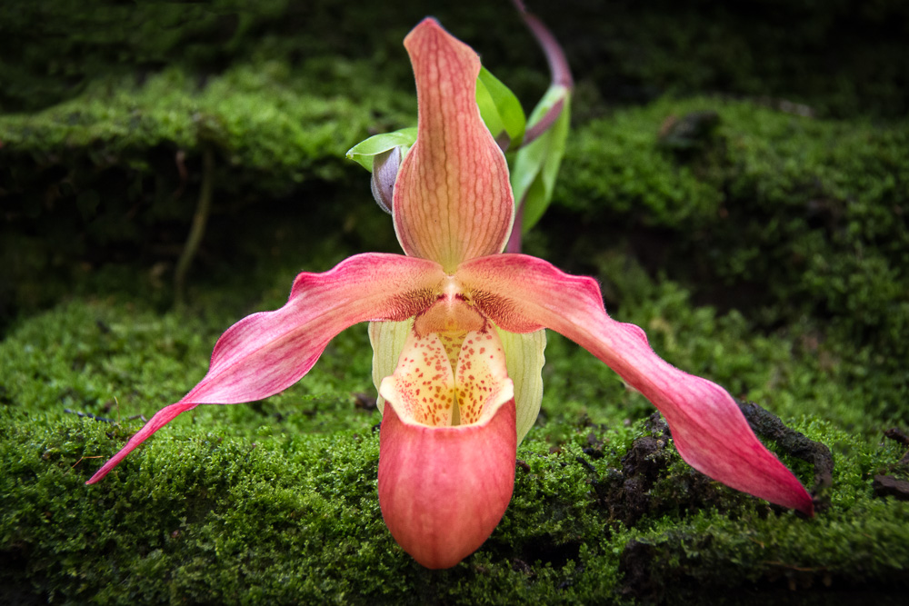
Interesting concept. I agree a tighter crop would emphasize the NDE. With the current crop, I would recommend straightenting the horizontal line. |
Jun 12th |
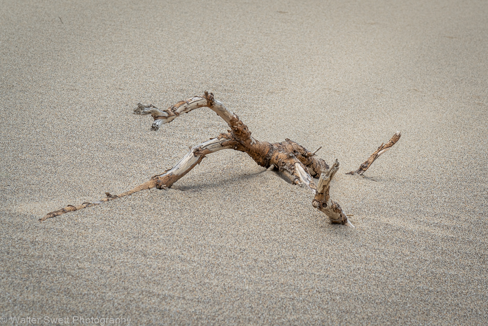
| 75 |
Jun 21 |
Comment |
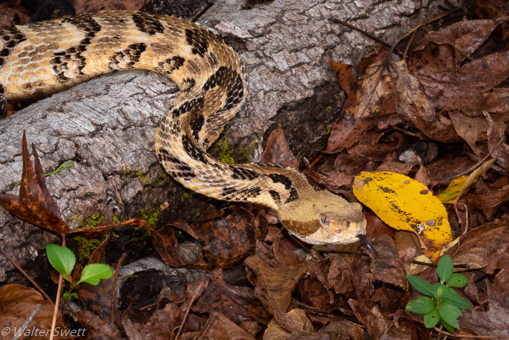
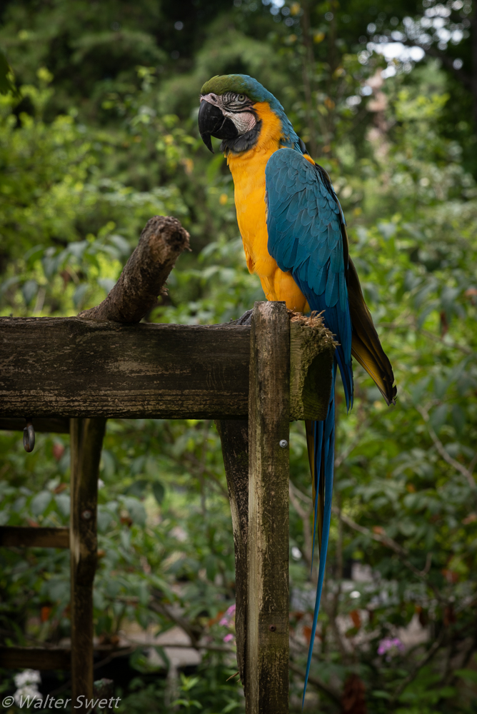
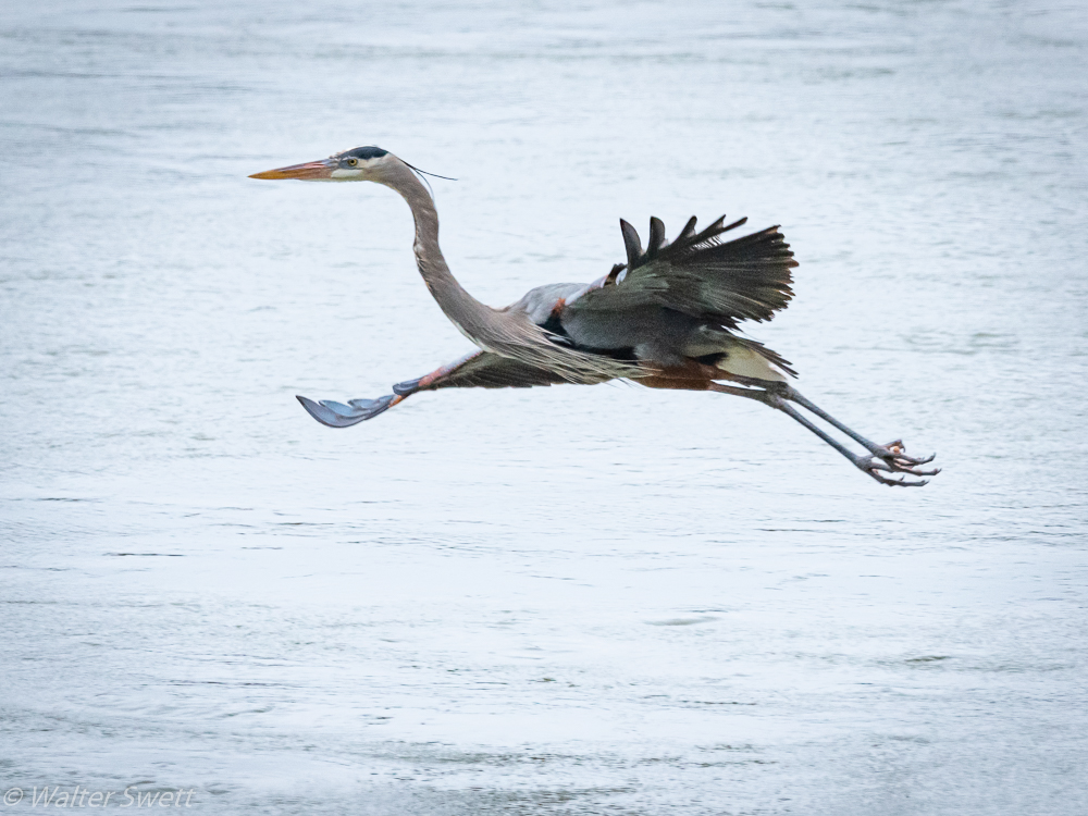
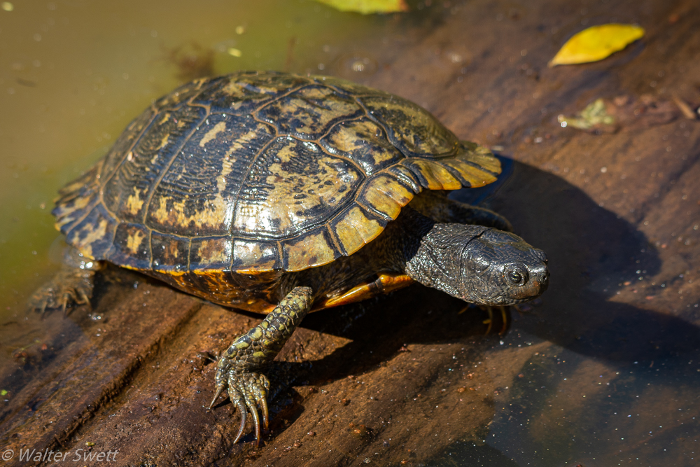
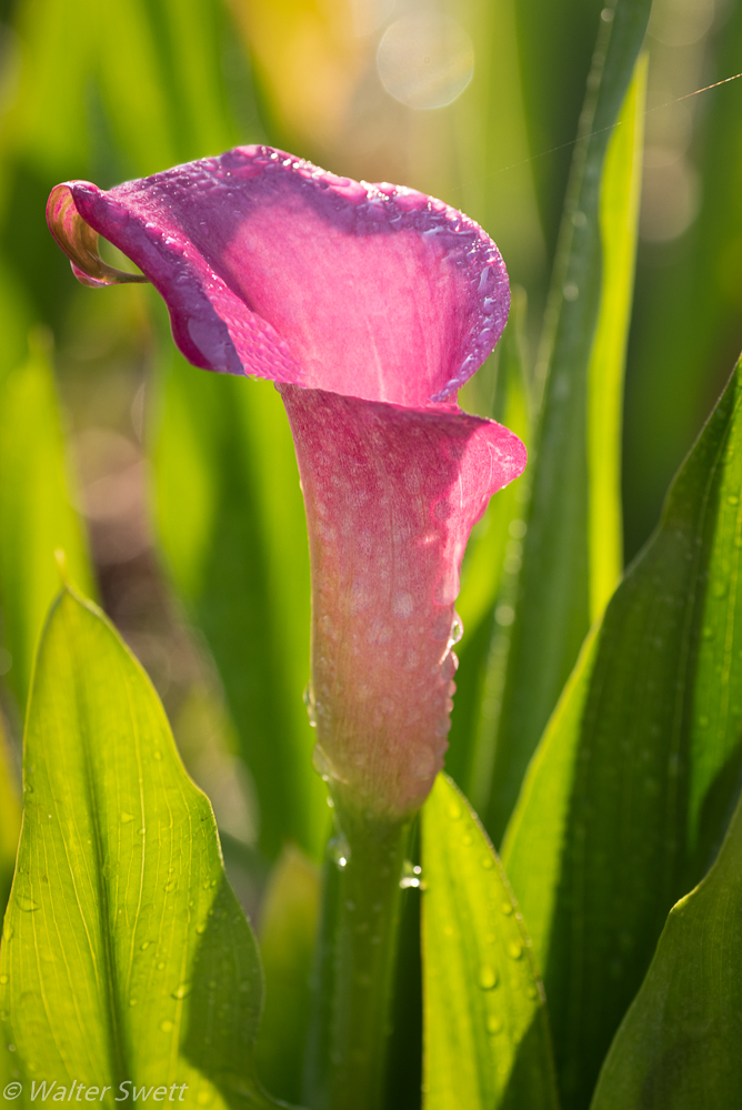
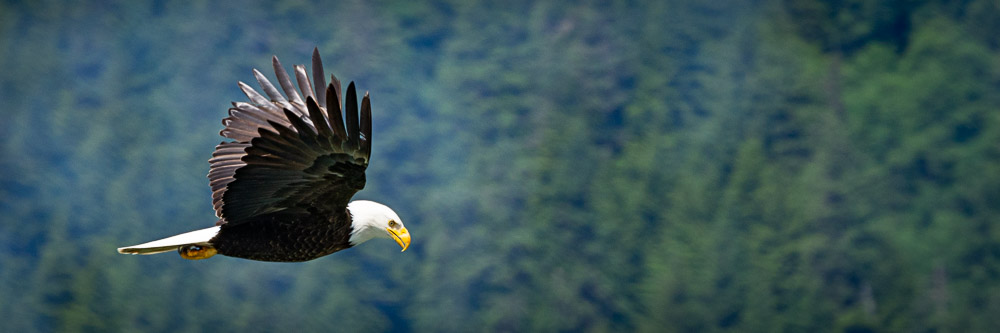
I think this is a great subject with all the colors and textures. I like how you have placed the subject at an angle in the frame. In my opinion, the point of focus should be the eye, but to me, it seems the POF is the shoulder leaving the eye a little soft. Have you considered trying to burn down the highlight in the center on the background and limb? |
Jun 12th |
| 75 |
Jun 21 |
Reply |
Thanks for the feedback. |
Jun 12th |
| 75 |
Jun 21 |
Reply |
Thanks for your comments and feedback. |
Jun 12th |
4 comments - 10 replies for Group 75
|
4 comments - 10 replies Total
|