|
| Group |
Round |
C/R |
Comment |
Date |
Image |
| 75 |
Dec 19 |
Reply |
Thanks for the feedback Kerry. Good point with the background, I should have shot at f5.6 to blur the background more. I have not tried it as B&W. |
Dec 20th |
| 75 |
Dec 19 |
Comment |
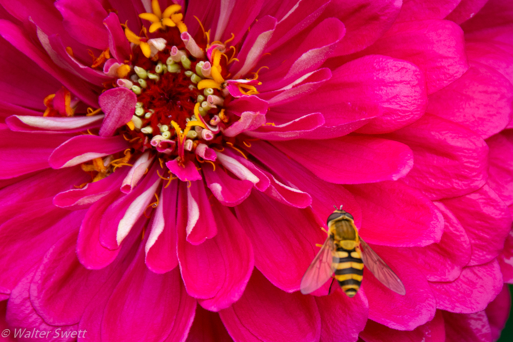
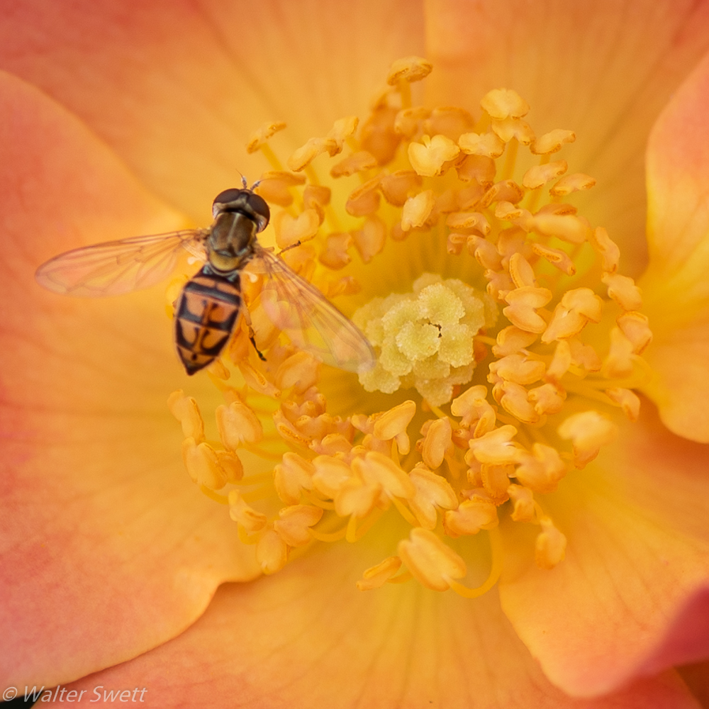
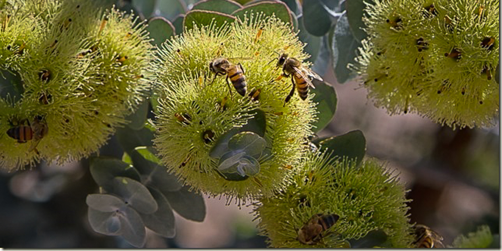
Interesting subject. I like the colors and the activity of the bees. At first I didn't realize there were so many bees hidden in the flowers. I could see this image as a banner shot for an article if it had more of a panorama crop.
In my opinion, a panorama crop would strengthen the composition and highlight the main subjects by eliminating a lot of the stem. I have attached an edited version to show what I mean. I cropped the image into a 2x1 format to eliminate much of the stalk and to highlight the bees in the flowers. I made the following adjustments in Lightroom: highlights +7, shadows +12; whites+10; dehaze+10; vibrance+5; saturation +5; orange sat. +2; yellow sat +4; aqua sat +2; sharpening 21; post-crop vignette -12. |
Dec 13th |
 |
| 75 |
Dec 19 |
Comment |
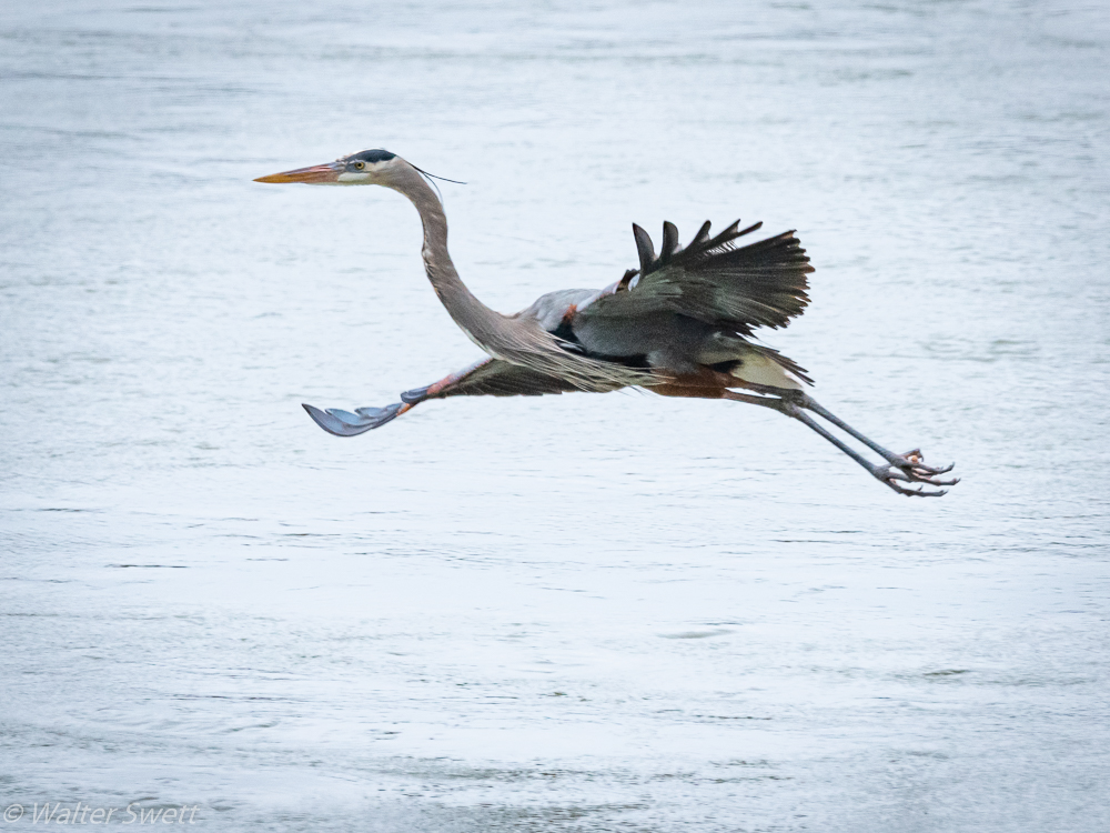
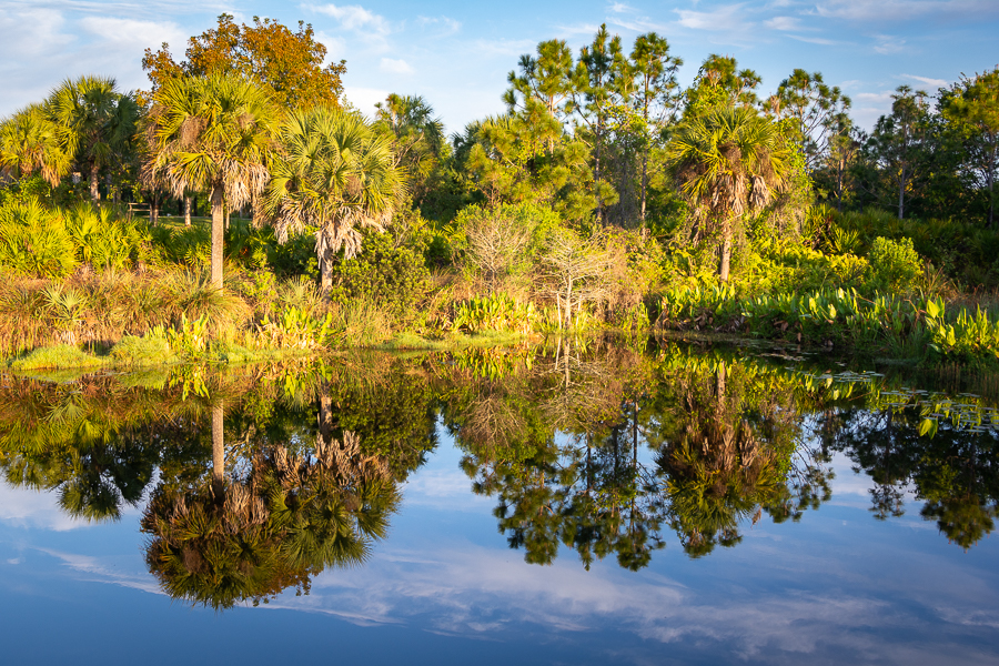
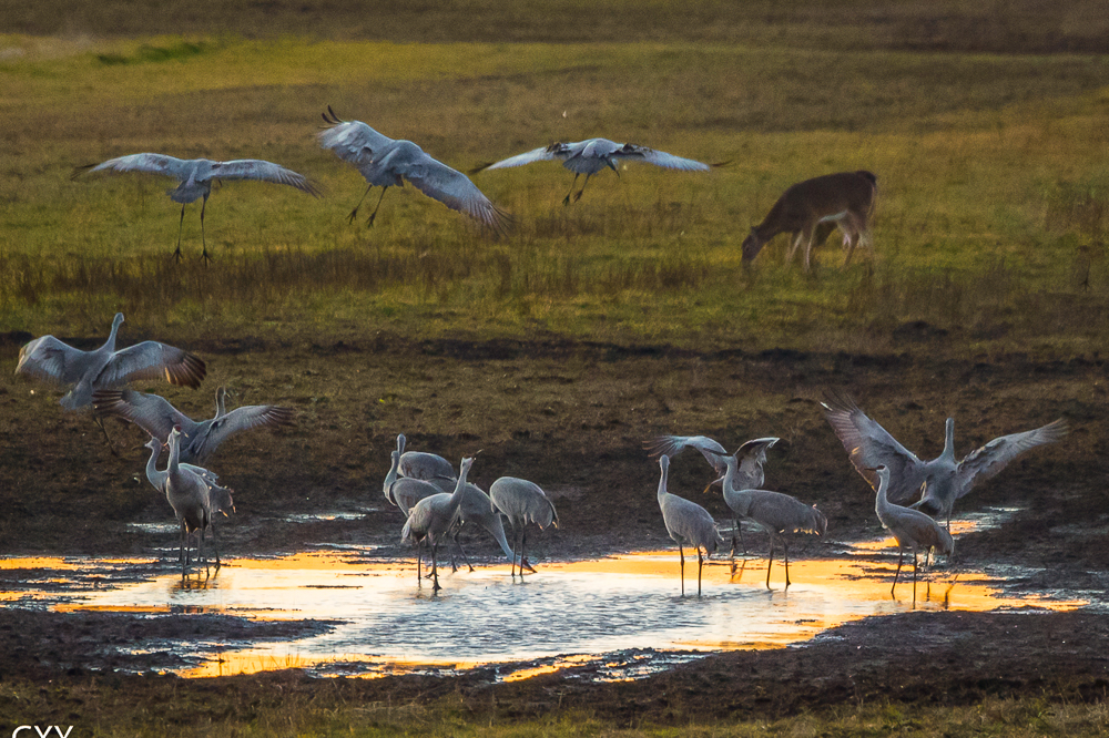
Interesting shot with a lot of activity. I like the "gathering at the water hole" and interaction between the birds and how the birds and deer peacefully co-exist.
For my taste, the image feels too cool and could use additional contrast. I have attached an edited version I did in Lightroom for consideration. I cropped it slightly to eliminate a little of the foreground, adjusted the temperature to warm it up and used the radial filter to make some localized adjustments to the water in an effort to bring out the colors. The following adjustments were made:temperature +10; shadows +19; texture +10; dehaze +12; sharpening 29; luminance 21; post-crop-vignette -10. Localized adjustments in the water area with the radial filter were: highlights -14; vibrance +10; saturation +14; red saturation +9; orange saturation +9; yellow saturation +11 |
Dec 13th |
 |
| 75 |
Dec 19 |
Comment |
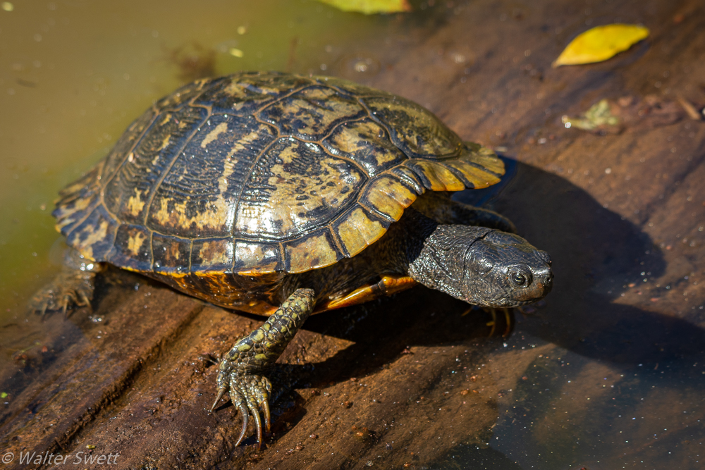
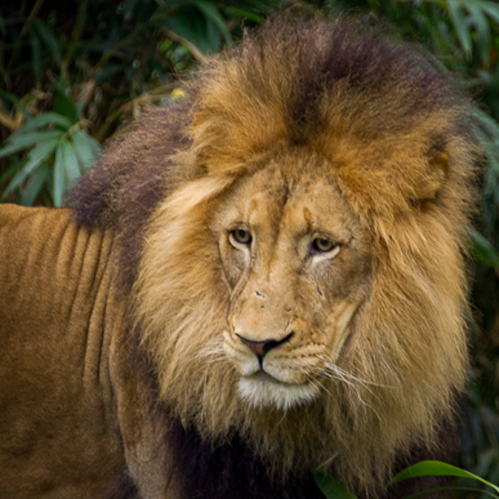
I like the subject matter of this image and the expression on his face, the texture of his fur and the scars on his face.
In my opinion, the final image feels too cool. I also find the highlights in the upper and lower right corners, the dark area beneath his chin and the stick in the lion's mane to be distracting.
I have added my version of an edited image that was done in Lightroom. The crop was changed slightly to provide some additional space on the left side moving the subject out of the center of the image. I removed the stick from his mane, darkened the right corners and opened the shadows under his chin some.
I made the following adjustments: contrast +19; highlights -26; shadows +45; blacks -10; texture +5; dehaze +7; post-crop vignette -31. |
Dec 13th |
 |
| 75 |
Dec 19 |
Reply |
I agree with Stephen.
I think this is an interesting scene and I like the composition and leading lines created by the rows of grain.
I like how Stephen was able to capture the colors of the sky in his version. |
Dec 13th |
3 comments - 2 replies for Group 75
|
3 comments - 2 replies Total
|