|
| Group |
Round |
C/R |
Comment |
Date |
Image |
| 2 |
Oct 19 |
Reply |
Thank you for the edit. I really like the photo better with both your edits and Hung's. |
Oct 17th |
| 2 |
Oct 19 |
Reply |
Thanks! I like this crop much better than my edit. |
Oct 17th |
| 2 |
Oct 19 |
Comment |
I would love to get into bird photography. I don't see many around my house, so I don't get much practice. This is a great shot & I really like the edit that you did and the branches that you were able to remove. I would not crop any tighter on the bottom - I like the crop as is. |
Oct 17th |
| 2 |
Oct 19 |
Comment |
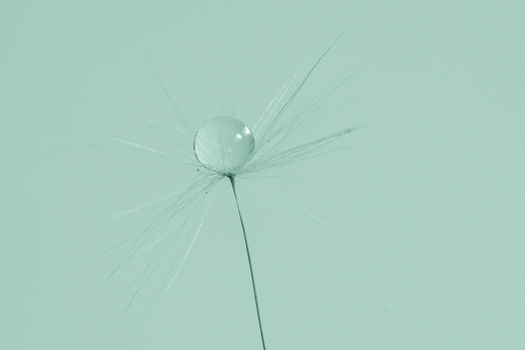
Such a sweet image of your daughter. Great timing to get that dandelion seed isolated. My only suggestion is to include more of her hand. |
Oct 5th |
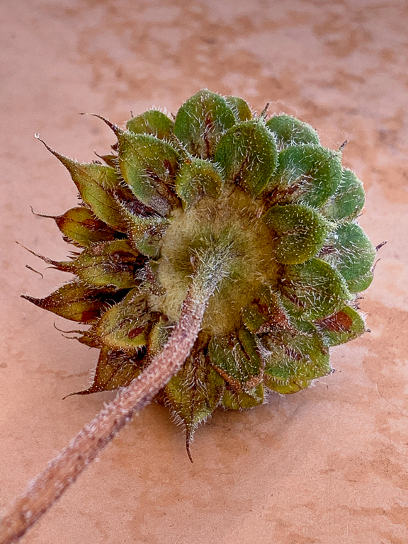
| 2 |
Oct 19 |
Comment |
Welcome to the group! I've never seen a mushroom that big. And it does look like a hand. I think your edits on this were really good. |
Oct 5th |
| 2 |
Oct 19 |
Comment |
I want to be there. I really like this image and feel like the edits are spot on. There's nothing I would change. |
Oct 5th |
| 2 |
Oct 19 |
Comment |
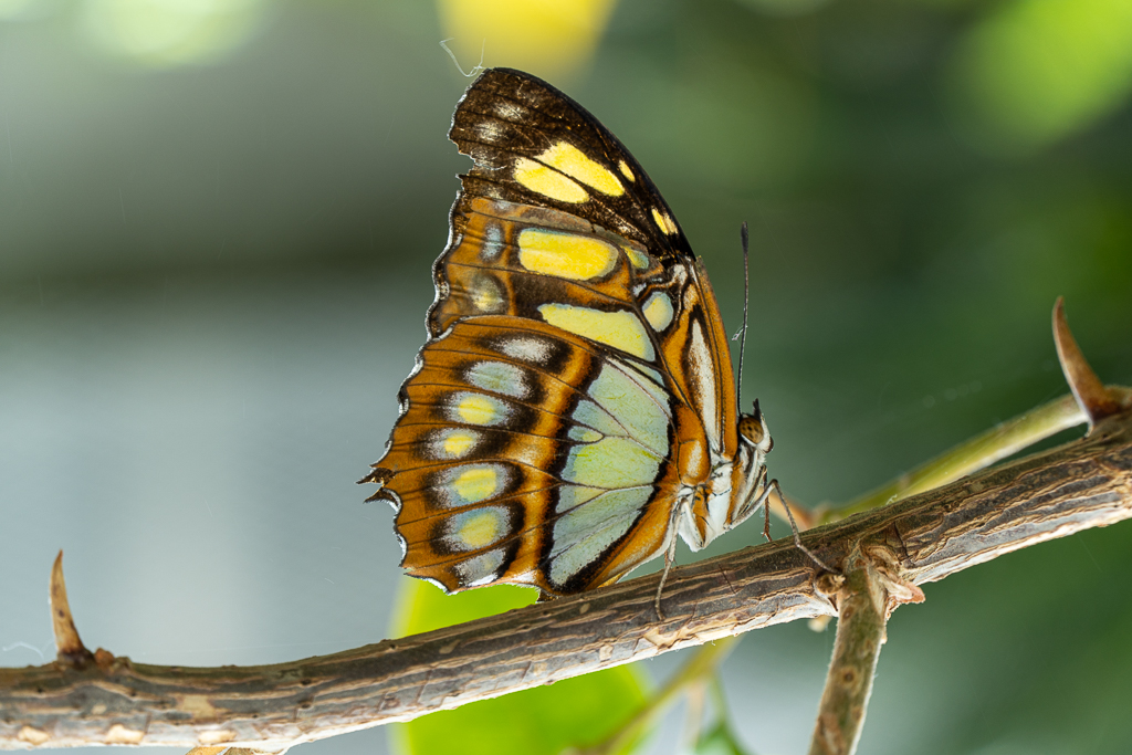
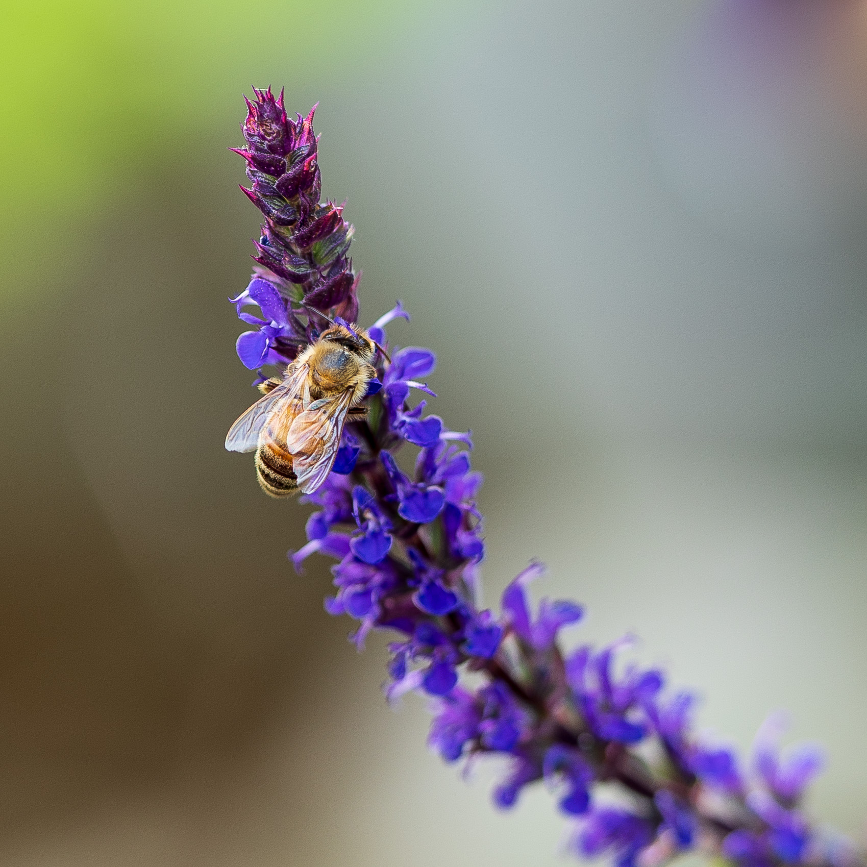
Beautiful! I like the lines that take you straight to the butterfly. Also - I really like how clean the background is. Very, very nice. |
Oct 5th |
| 2 |
Oct 19 |
Comment |
I really like the B&W edit on this and the crop. For me the very light Taj works because it feels really ethereal. I wouldn't change anything. |
Oct 5th |
6 comments - 2 replies for Group 2
|
| 57 |
Oct 19 |
Reply |
I like it! |
Oct 19th |
| 57 |
Oct 19 |
Reply |
Thank you. I like the darkened background! And I did not notice the water drop until you mentioned it. |
Oct 17th |
| 57 |
Oct 19 |
Reply |
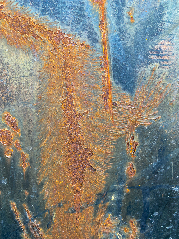
Thank you. It was sitting on an outside metal table that use to be red. Now it is faded to the color shown. I love the texture on that table. |
Oct 17th |
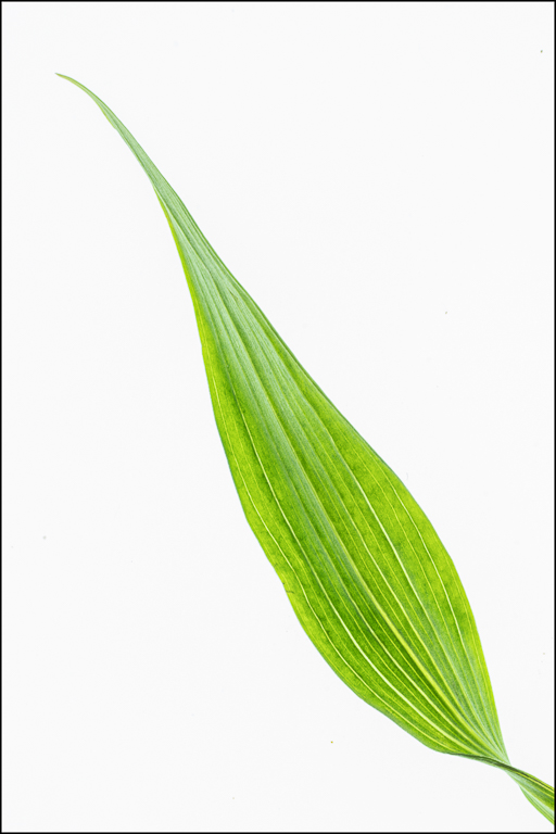
| 57 |
Oct 19 |
Comment |
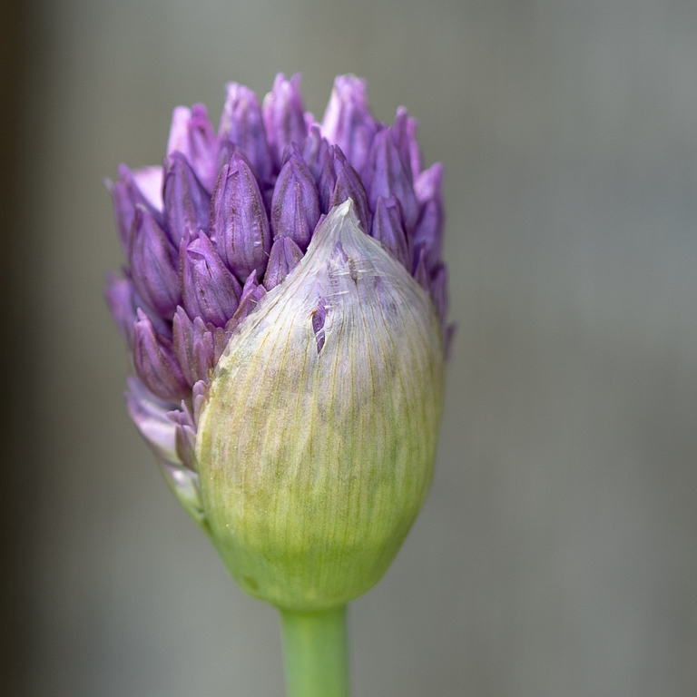
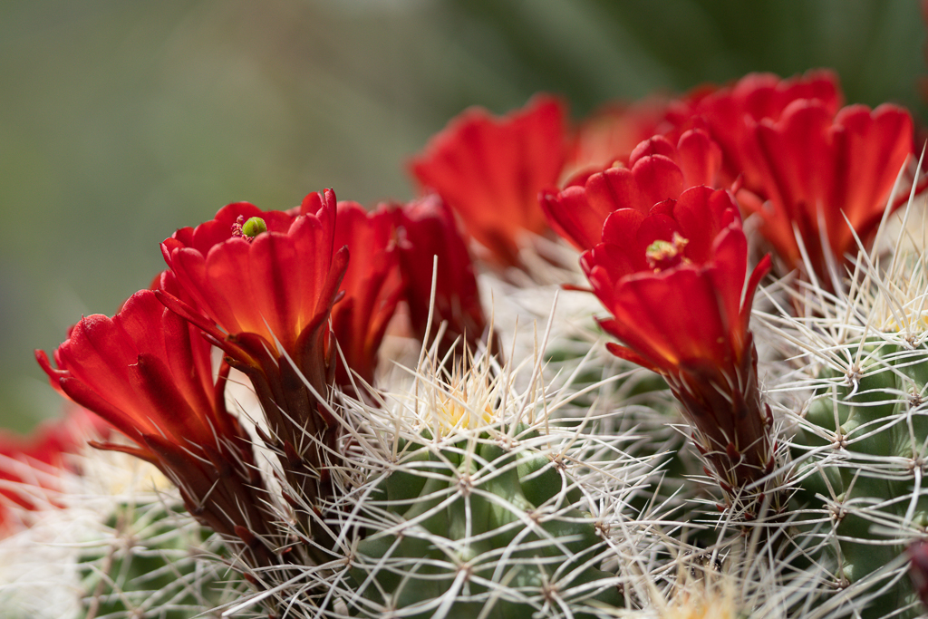
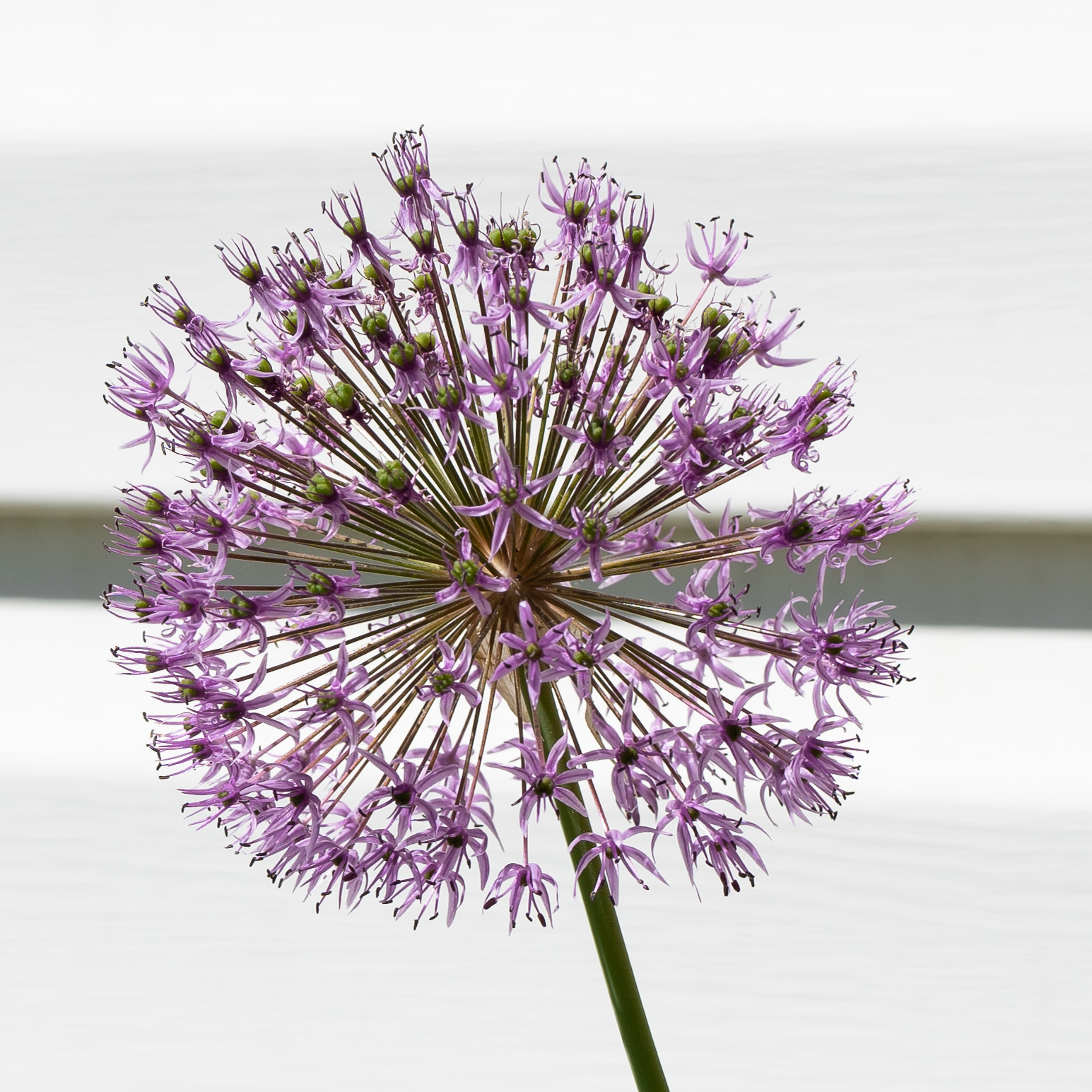
Very interesting plant. I like this a lot but wish that the dark blob on the left side wasn't so dominant. Could you try desaturating just that area? I like the touches of pink on the bulbs. |
Oct 17th |
| 57 |
Oct 19 |
Comment |
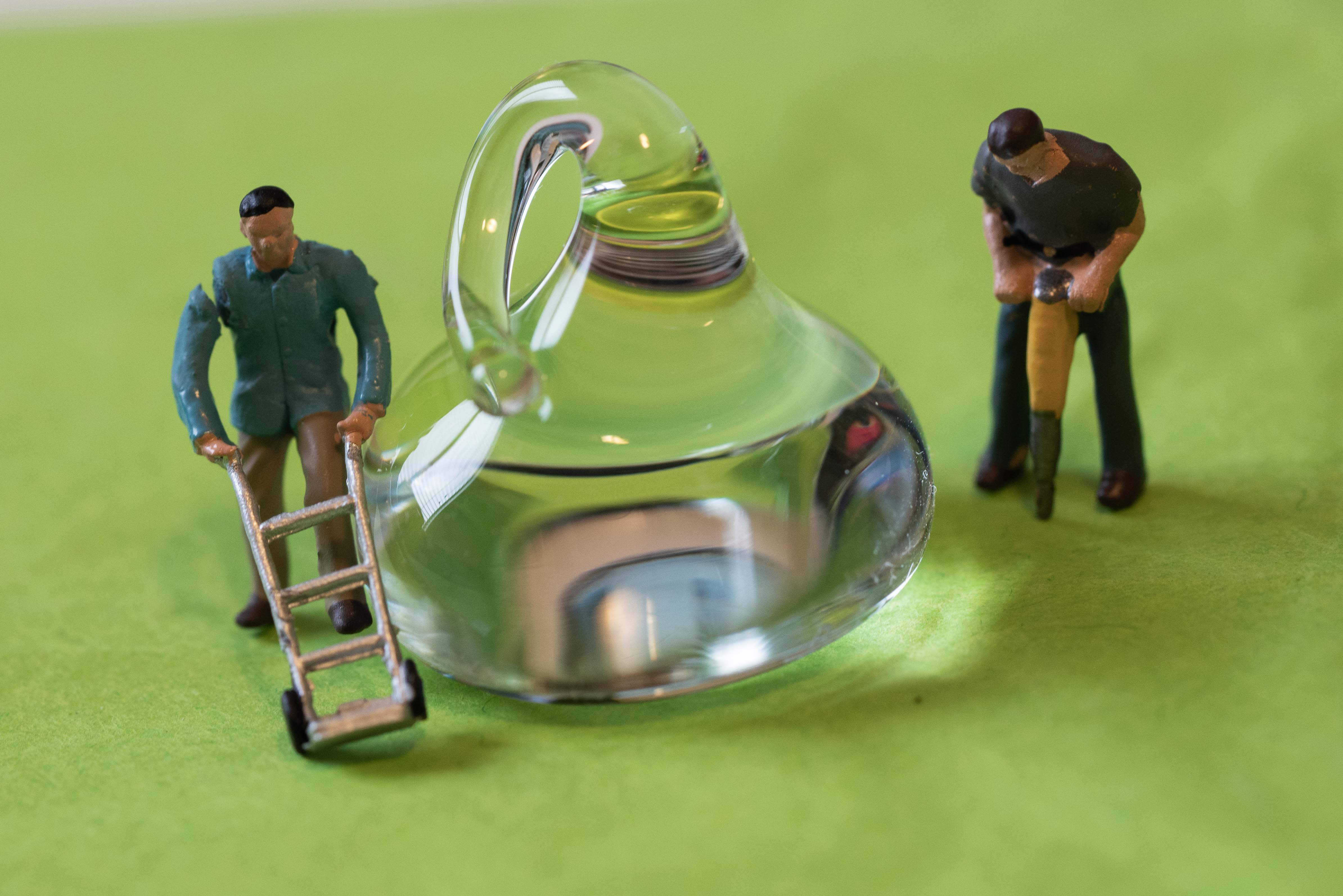
I like the colors and the grain of this a lot. I think it would be better with just the 2 identifiable glasses in the front. I spent a minute looking at this before realizing I was looking at glasses. Maybe that works for this though. |
Oct 17th |
| 57 |
Oct 19 |
Comment |
I have an old typewriter of my grandmother's. I don't think it's as old as this one though. Maybe I'll get it out and play with it this month. You have great focus, I just wish the entire keyboard was in frame. |
Oct 17th |
| 57 |
Oct 19 |
Comment |
One of my treasured possessions is my Grandmother's button box. I have spent many hours photographing them. You obtained much better focus than I have been able to get. The blue button was a brilliant idea. It really makes the photo much more interesting. |
Oct 5th |
| 57 |
Oct 19 |
Comment |
The vibrant colors are just beautiful. Your focus looks good. Did you try a bit tighter crop removing the blurred leaf at the bottom right? That might also eliminate the upper right corner that is not important to the image. But then you lose a little definition of the pink leaf shape. Editing is tough! |
Oct 5th |
5 comments - 3 replies for Group 57
|
| 86 |
Oct 19 |
Comment |
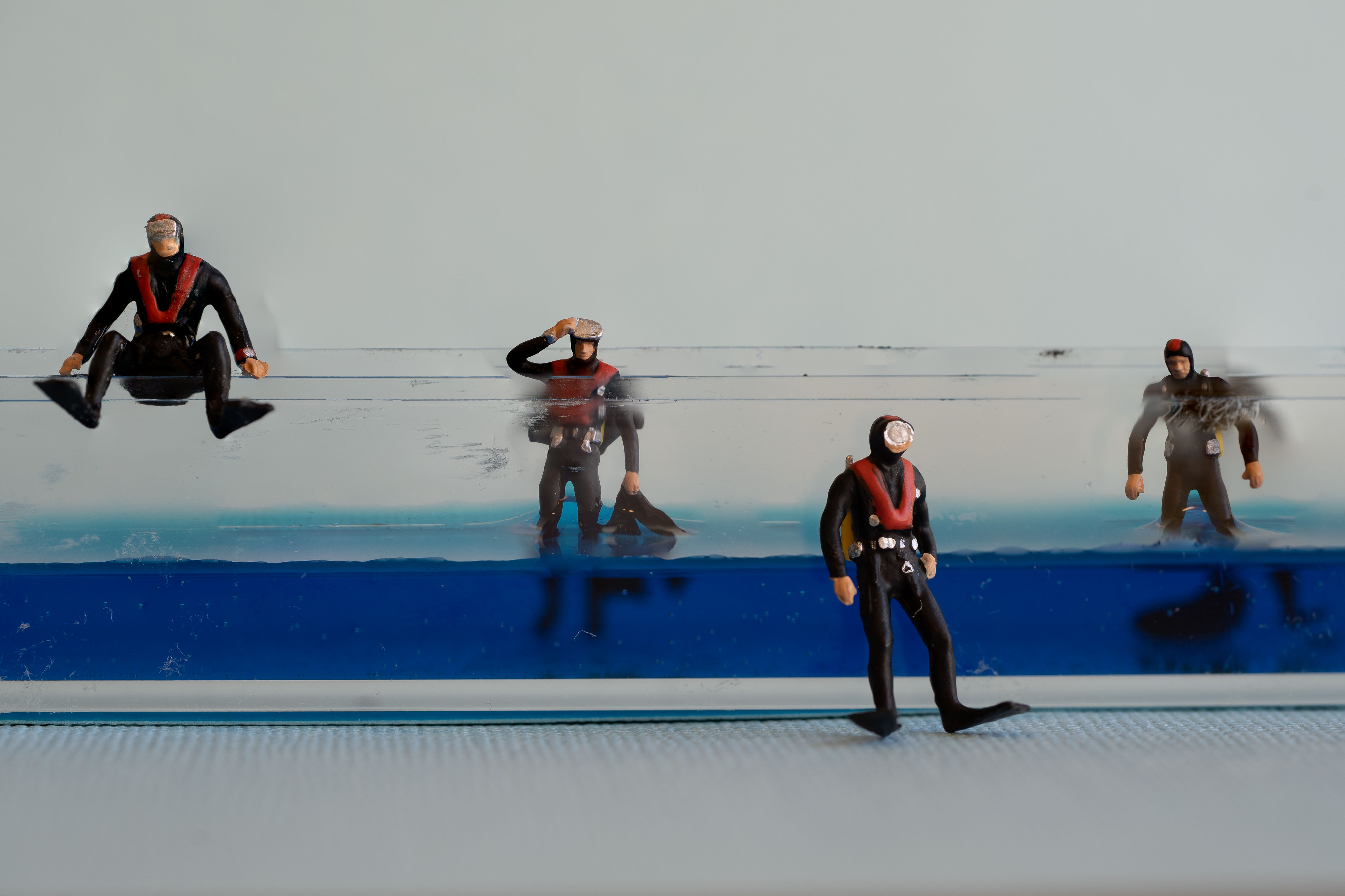
This shot definitely tells a story. With the white stipe above the heads I feel like it needs to be straightened. One interesting thing about this shot is that they are all contained in separate spaces. They all have fencing of some type around them. I really like that. |
Oct 17th |
| 86 |
Oct 19 |
Comment |
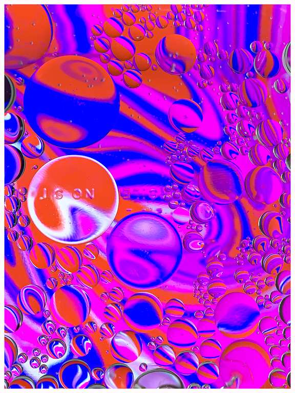
I like this a lot. The label doesn't distract because it is in the same color shades. I think it adds to the image. The blue streak on the left is distracting to me though. If you could edit the color of that I think it might help. |
Oct 17th |
| 86 |
Oct 19 |
Comment |
Great shot! I love the curve of the lizard with the head tilted. I wish we could see the end of his tail, but you were lucky to get this much of it! |
Oct 17th |
| 86 |
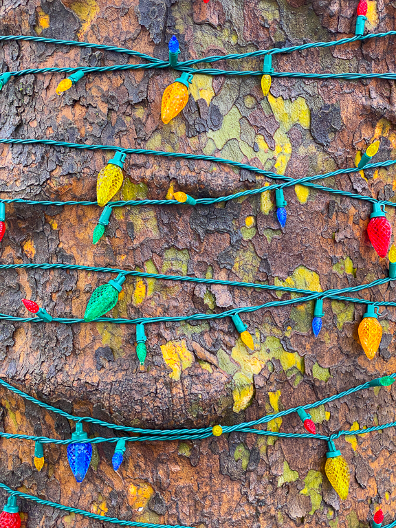
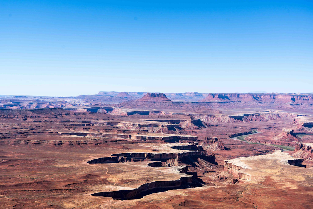
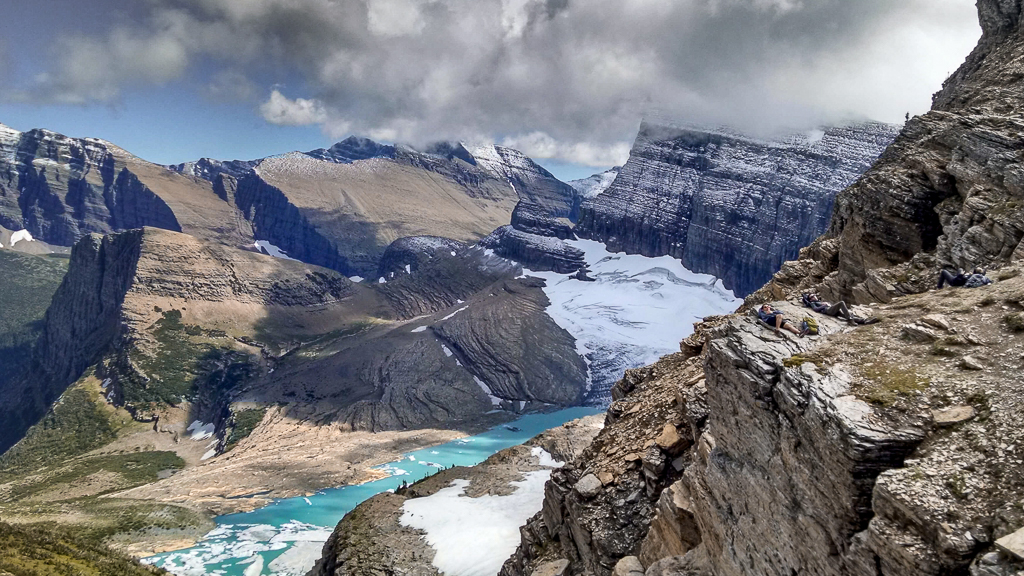
Oct 19 |
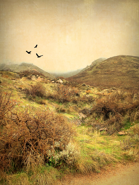
Comment |
What a beautiful place. I do like your b&w edit & crop. In the original I really like the color of the water, but feel like the sky and water are competing with each other. I tried to desaturate the sky a little and not sure I accomplished anything. But - here's my quick edit on the original. |
Oct 17th |
 |
| 86 |
Oct 19 |
Comment |
This is simply delightful! The colors and the curves make me keep looking. Great job. |
Oct 5th |
5 comments - 0 replies for Group 86
|
16 comments - 5 replies Total
|