|
| Group |
Round |
C/R |
Comment |
Date |
Image |
| 2 |
Aug 19 |
Reply |
Thanks for taking the time to edit this. I do like the image flipped. |
Aug 21st |
| 2 |
Aug 19 |
Comment |
I like the monotone shades in your edit better than the original. I also like the crop. I like the couple framed by the fence and other objects. The top of the fence hides the shoreline though & I wish it was just a bit lower. |
Aug 6th |
| 2 |
Aug 19 |
Reply |
Piers - here's the sky toned down just a bit. I think it's better, thanks! |
Aug 4th |
 |
| 2 |
Aug 19 |
Comment |
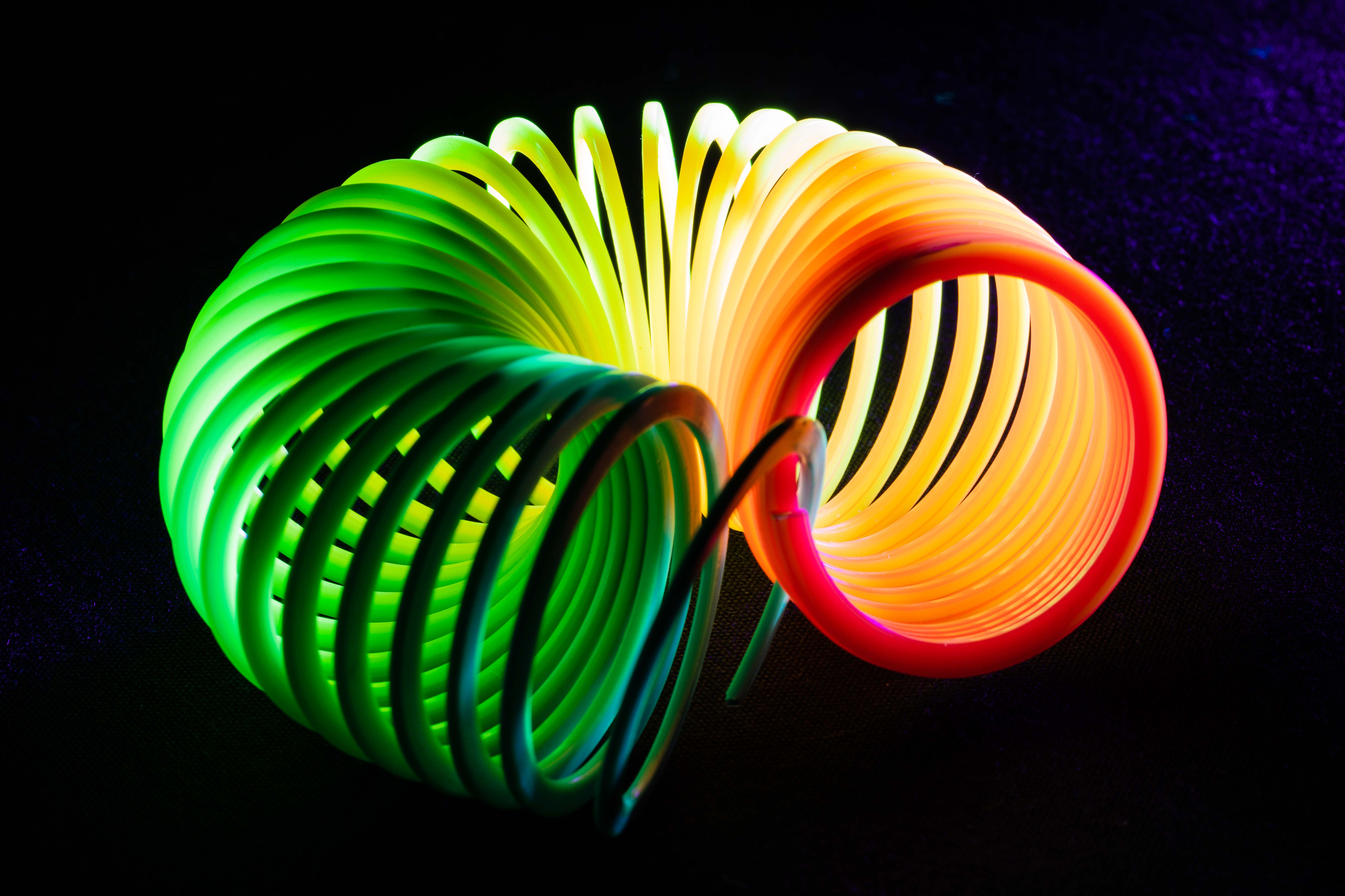
Very creative. You can make memes all day long with this image. I like it and need to venture out and play more with my photos. |
Aug 4th |
| 2 |
Aug 19 |
Comment |
Nice shot Brenda. I agree that you could crop it at the bottom a bit more. I also think that the saturated colors are more pleasing in the original. I'm trying to increase my f stop a little when shooting macro on a tripod. |
Aug 4th |
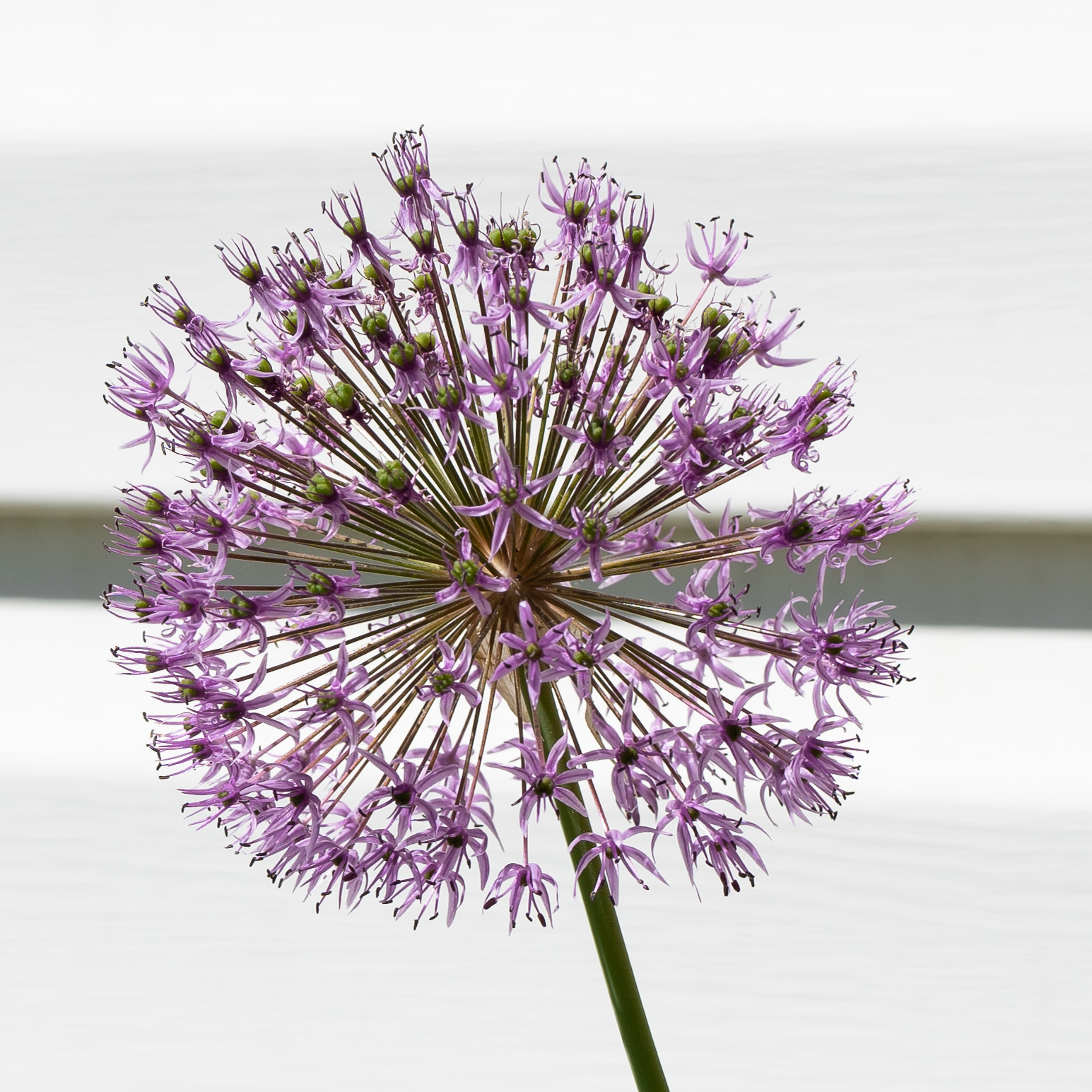
| 2 |
Aug 19 |
Comment |
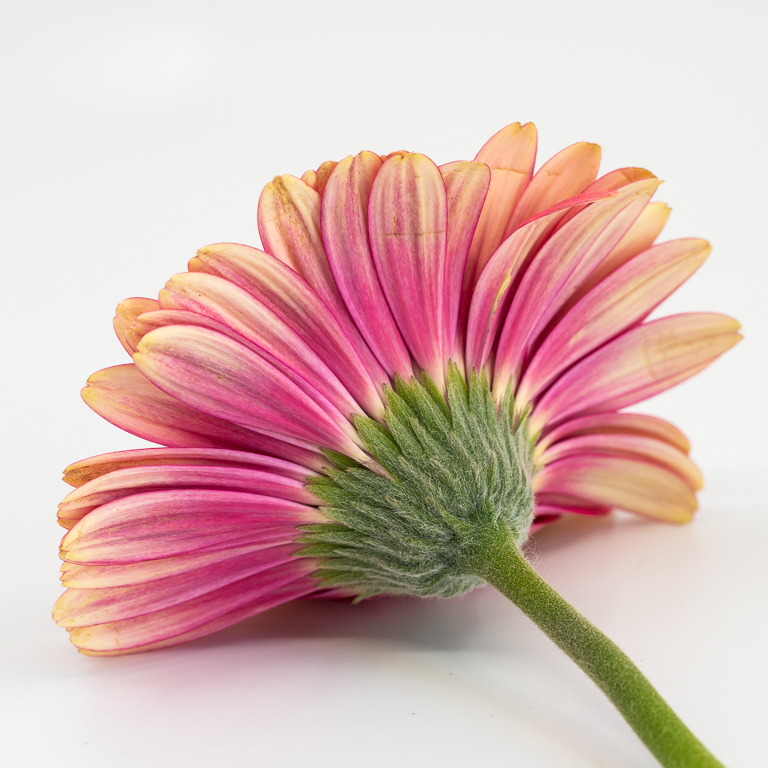
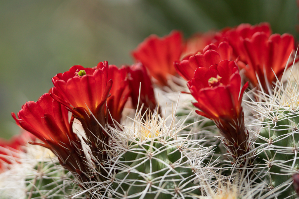
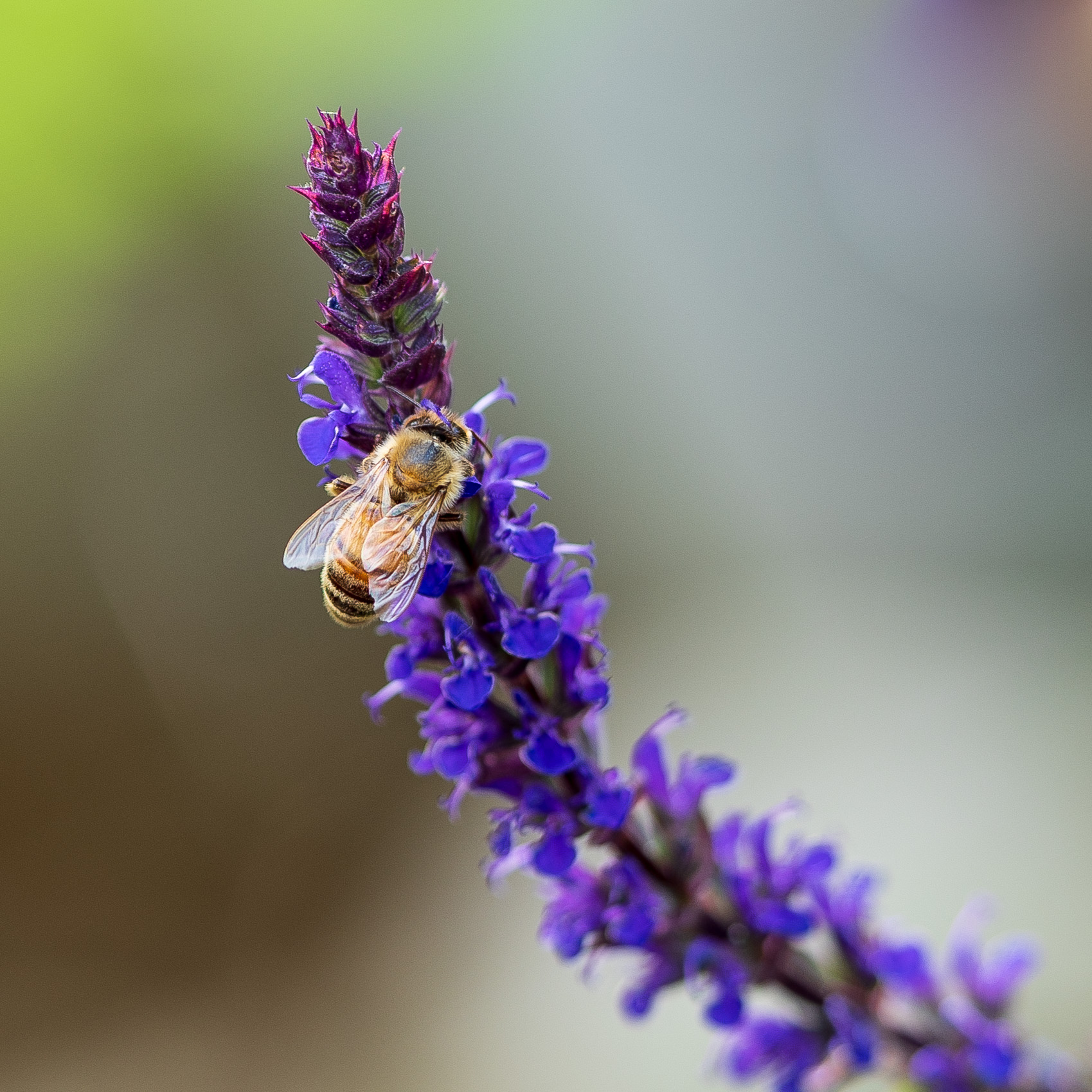
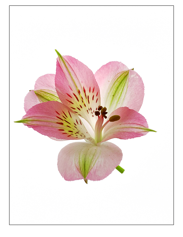
The light is really pretty on these flowers. I also love the colors. I would try to remove the brown on the left hand side. |
Aug 4th |
| 2 |
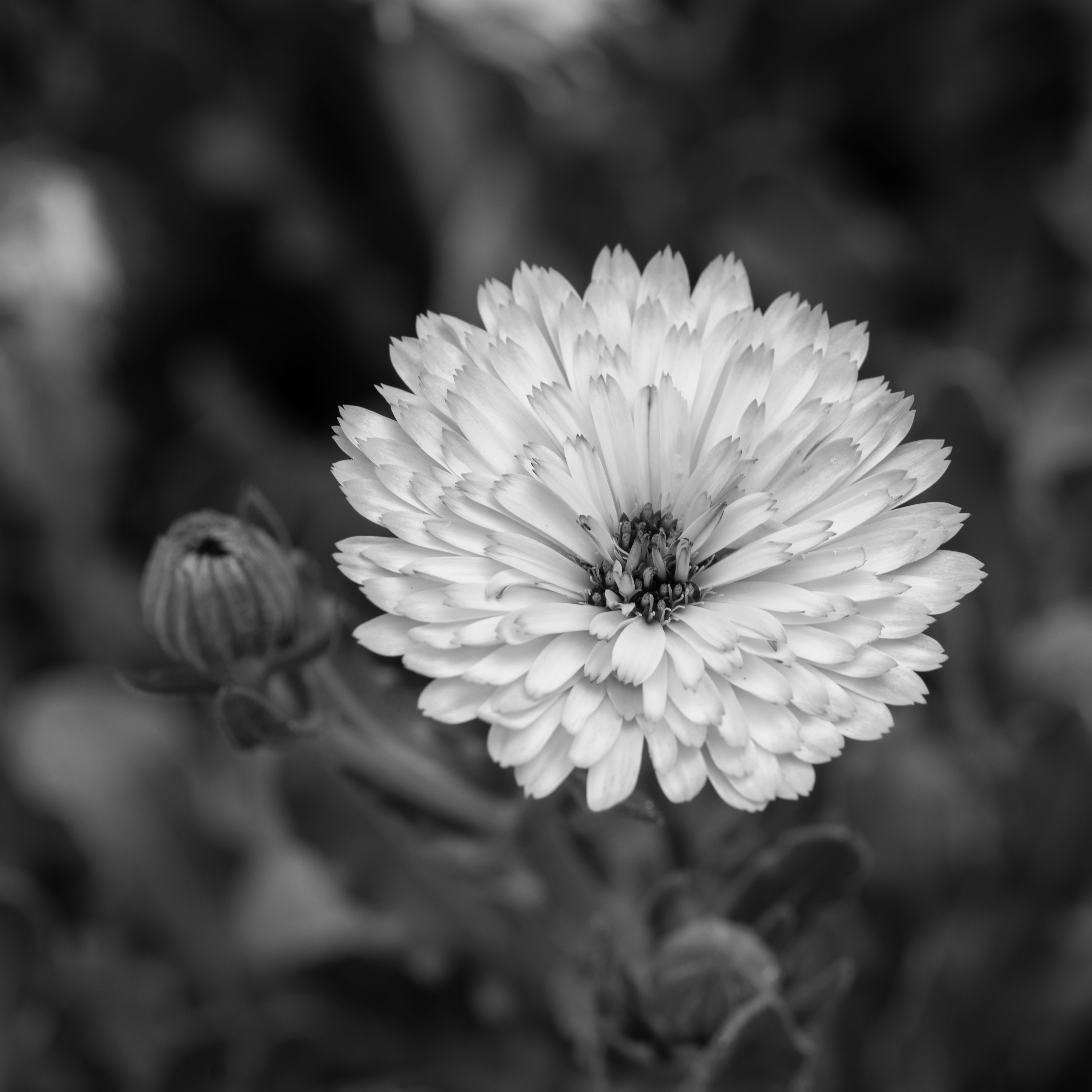
Aug 19 |
Comment |
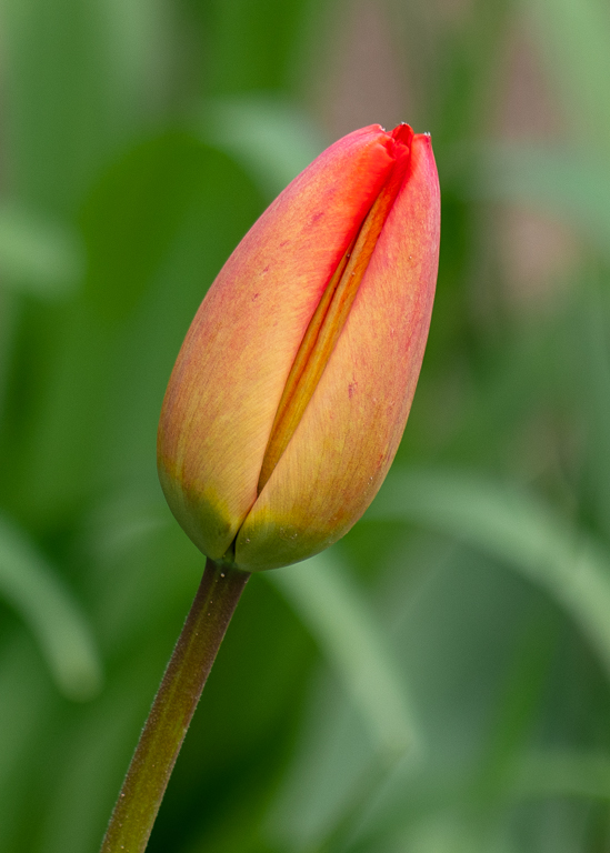
I take a lot of shots of dead or wilted photos. They are really interesting to me. If you removed the bright green behind the flower I think it would improve the composition. |
Aug 4th |
| 2 |
Aug 19 |
Comment |
Beautiful image Shirley. I'm amazed at how much it improves with your edits. I do prefer your edit with the deep black for the foreground. I wouldn't change a thing. |
Aug 4th |
6 comments - 2 replies for Group 2
|
| 57 |
Aug 19 |
Reply |
Thanks for the recommendation to watch Charles Needle's webinar. It was really good. |
Aug 10th |
| 57 |
Aug 19 |
Comment |
Very pretty. I went to the butterfly biosphere a few months ago and found it very difficult to get sharp focus. I'll go back after school starts and try again. I like the processing a lot and can't offer any suggestions for improvement. |
Aug 8th |
| 57 |
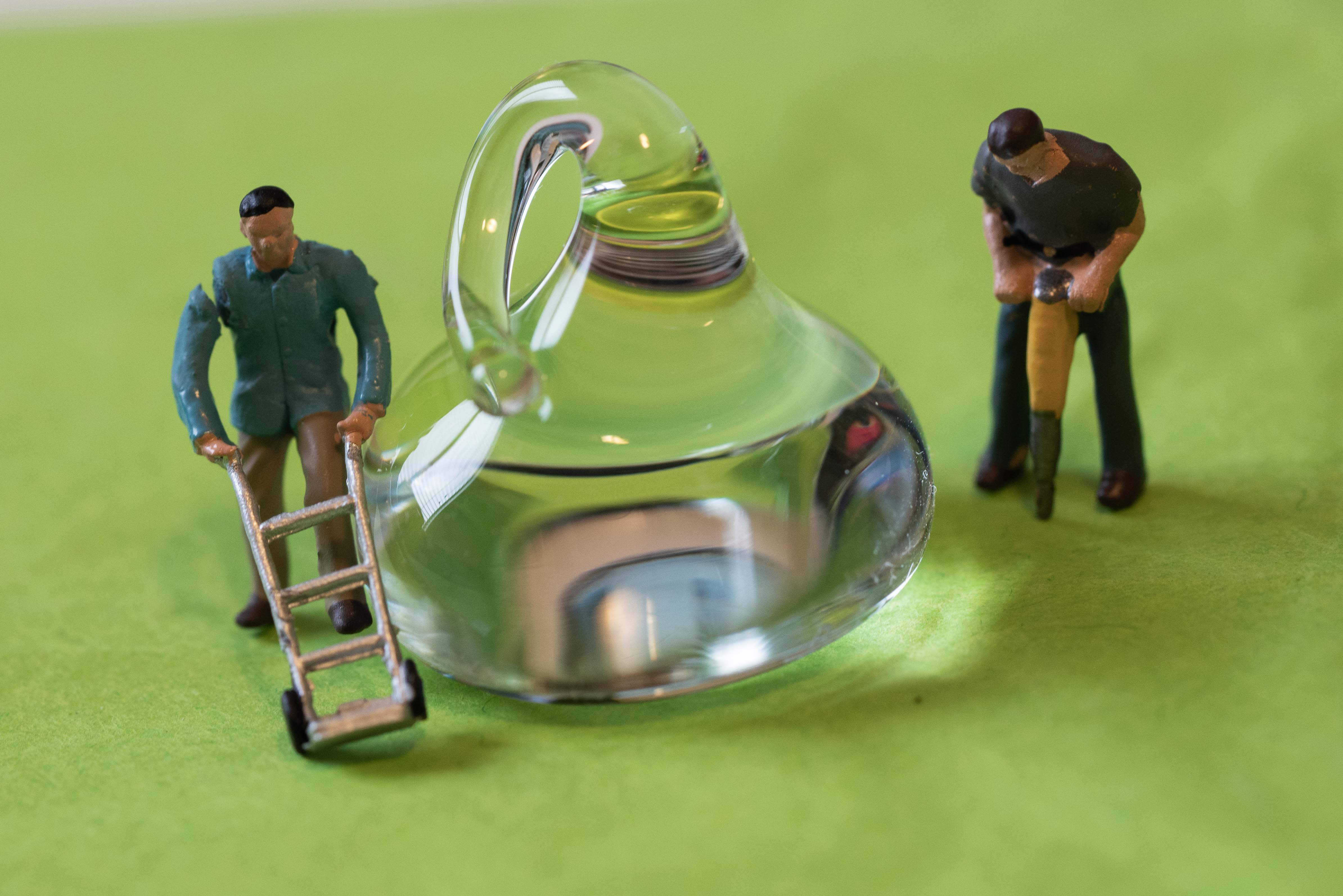
Aug 19 |
Comment |
I like the color and the blurry wine bottles. The reflection in the glass do not distract me, I find them interesting. The only critique I have is that to my eye it looks like it is tilted a little to the right. I also wish you had a bit more space to see the bottom of the glass.
|
Aug 7th |
| 57 |
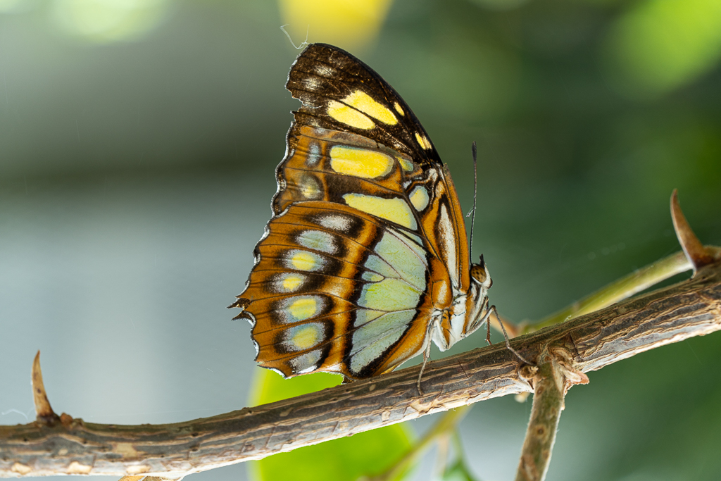
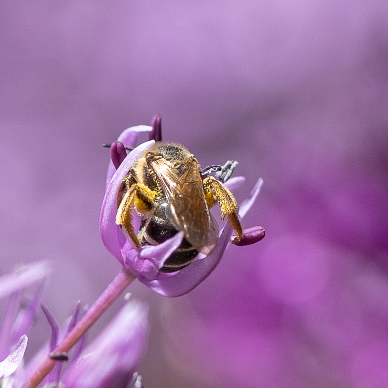
Aug 19 |
Comment |
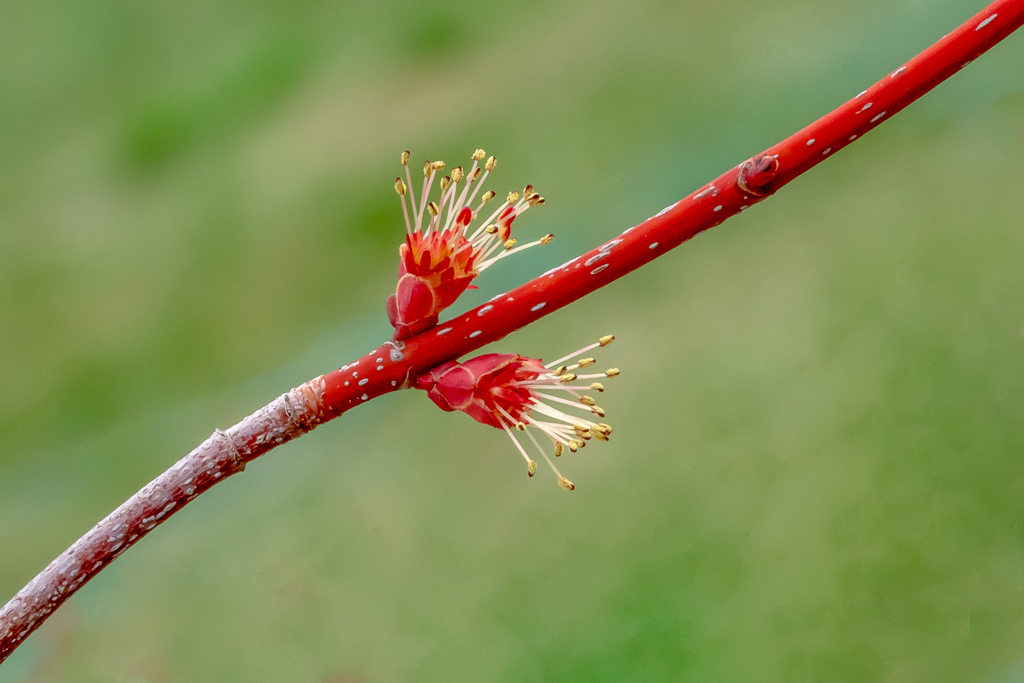
This is so interesting. Did you notice that there appears to be a double shadow? I don't think I've ever seen that before. I really like the color of the background. Can you try to brush an adjustment just on the insect's body to lower the whites/exposure? |
Aug 5th |
| 57 |
Aug 19 |
Comment |
Fun image, I love the color. It is nice & sharp.
The background looks like the bird is in front of a glass window to me.
Did you try cropping out the brown strip of dirt on the bottom? Not sure if you have room to do that without losing the space around the head. |
Aug 5th |
| 57 |
Aug 19 |
Comment |
Janis - this is beautiful. I love the creamy background and the sharp focus on the butterfly. The only suggestion I have (and it's minor) would be to blur the leaf in the lower left hand corner. One other thing is that when I click on your image it's so small that it's difficult to see details. You might want to check the settings when you export your photos. |
Aug 5th |
| 57 |
Aug 19 |
Comment |
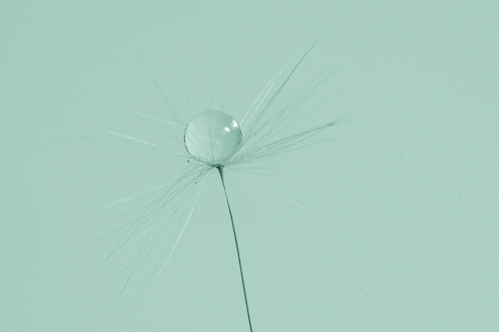
I like this a lot. The lines and colors really lead the eye into the photo. After looking at it for a minute I found the small water drops. Other than playing with the crop I can't think of any suggestions for the edits. This crop works for me. |
Aug 4th |
6 comments - 1 reply for Group 57
|
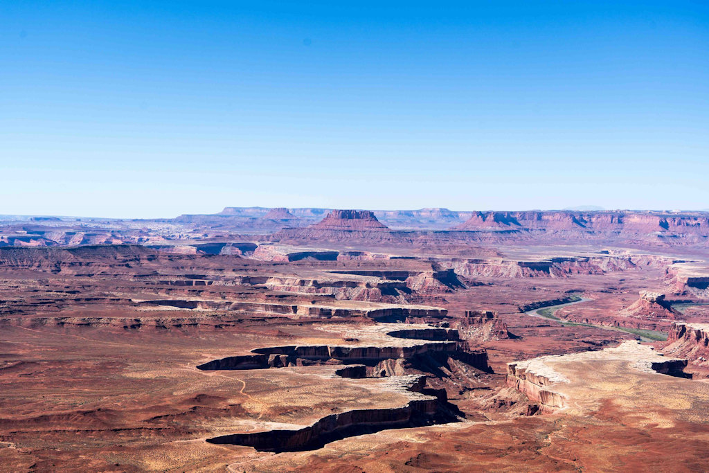
| 86 |
Aug 19 |
Reply |
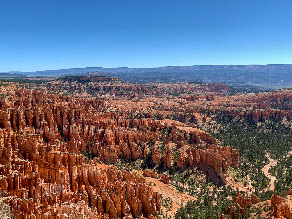
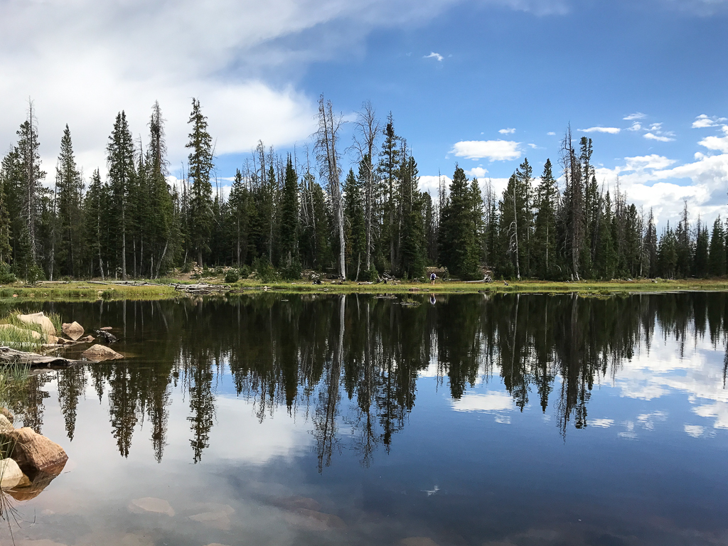
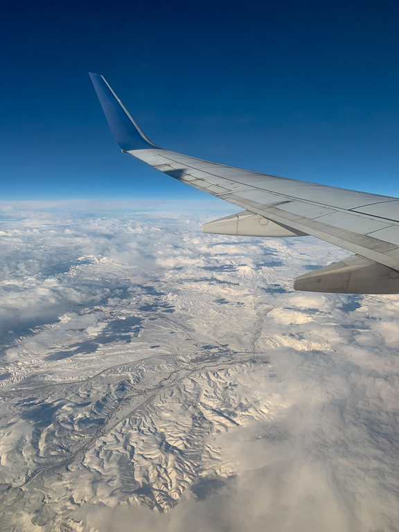
It's such a beautiful spot. Utah's National Parks are incredible. I am lucky to have such close access to them (SLC). |
Aug 21st |
| 86 |
Aug 19 |
Comment |
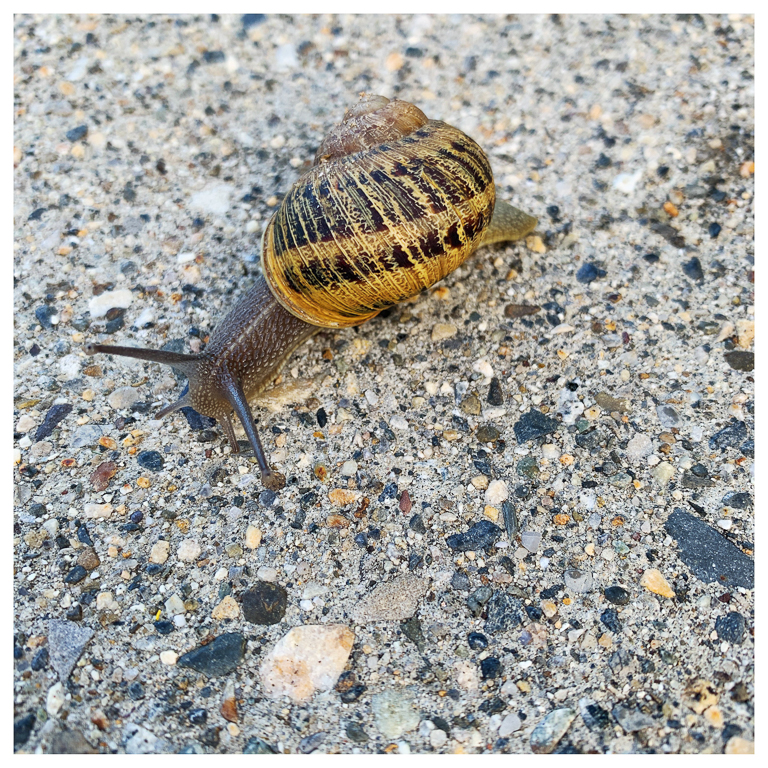
Great idea for a series. I really like the colors and lines in this. That is a lot of snails. There are a few snails at the top that are out of focus and you could crop them out if it bothers you. I don't mind it. |
Aug 10th |
| 86 |
Aug 19 |
Comment |
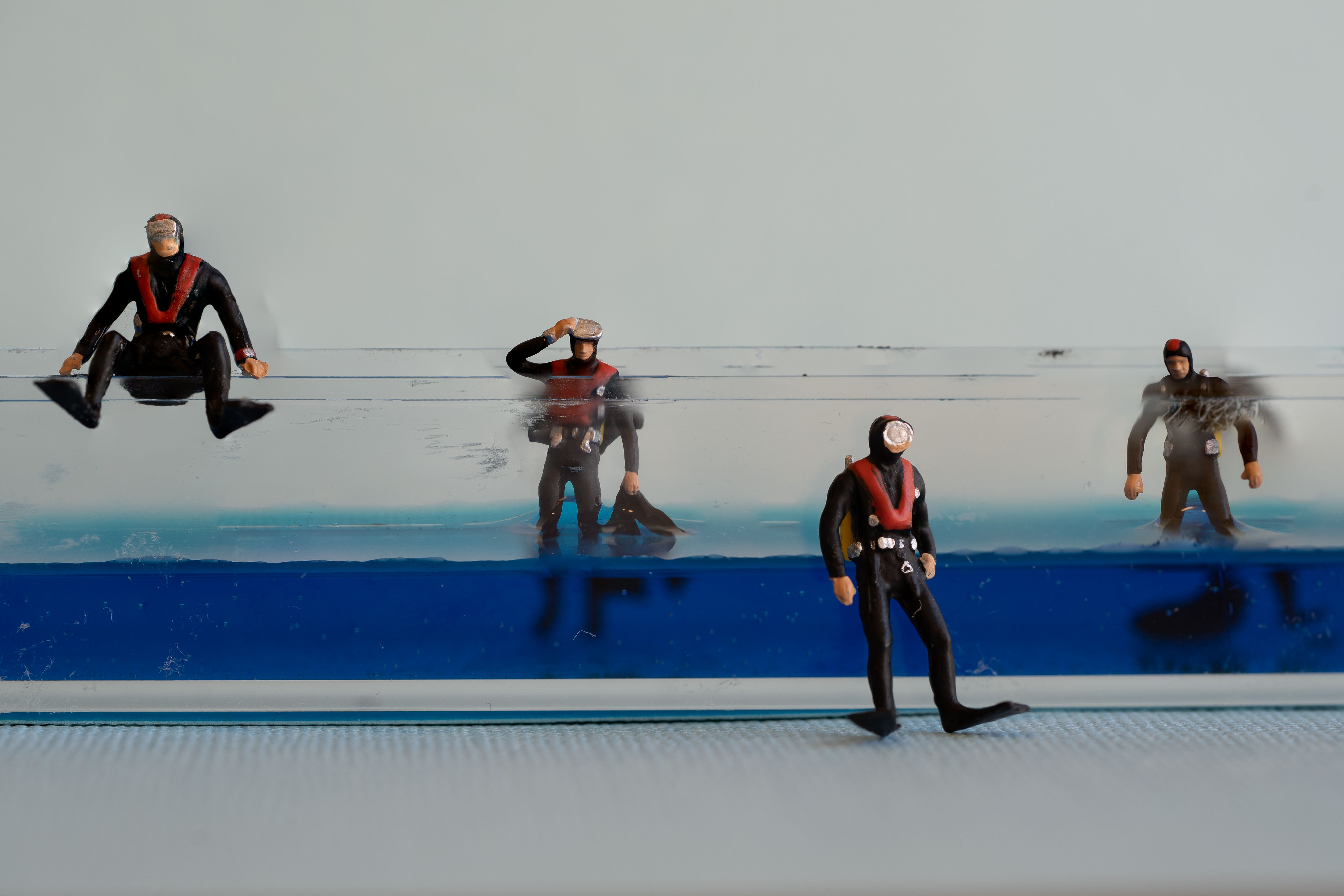
This image captures a fun moment and I appreciate that. There are several things that really distract for me though. First the arm that disappears on the left and the hand that is really distorted. Then the boy on the right has part of his body chopped. It would be better for me if all 3 subjects were totally in the frame. Changing the crop can fix the one on the right. |
Aug 8th |
| 86 |
Aug 19 |
Comment |
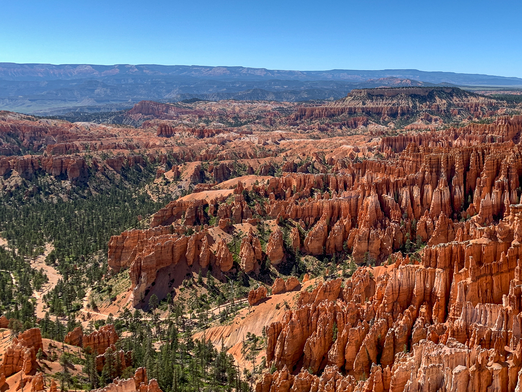
I live about an hour from here and have only been a couple times. I need to get out there. I like the image with the light hitting the rocks in the foreground. I think you just need to raise the shadows a bit. The foreground is a little too dark. I also like Janet's edits, it feels totally different. |
Aug 8th |
| 86 |
Aug 19 |
Comment |
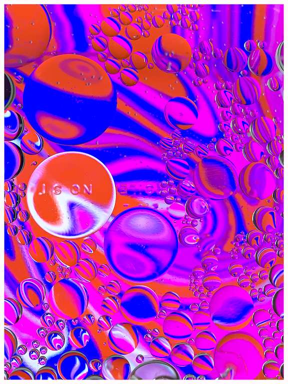
I like your edits on this, especially the crop you used. The lettering doesn't bother me but if it does bother you maybe try a blur tool on it. I'm just starting to edit on my phone a little so I can't offer any easy fixes. |
Aug 8th |
| 86 |
Aug 19 |
Comment |
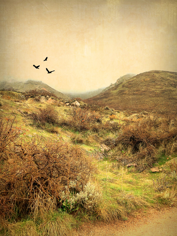
Here is an edit with some sky cropped and the horizon flipped. I'm not sure how I feel about it, I think I like the original orientation better but maybe it is just how my mind remembers it. |
Aug 7th |
 |
| 86 |
Aug 19 |
Comment |
I will try out this app - thanks. The colors are so pretty in this. I think I prefer Original #2 with no flower right beneath the sun. It might just be my imagination but it seems like there is a fair amount of noise in your final edit vs. Original #1. I am glad that you got rid of the flower in the lower left though. It almost looked like a finger got in the way.
|
Aug 5th |
| 86 |
Aug 19 |
Comment |
I can imagine fairies and elves here. I like your edit a lot - it really puts the focus on those bright poppies. |
Aug 5th |
7 comments - 1 reply for Group 86
|
19 comments - 4 replies Total
|