|
| Group |
Round |
C/R |
Comment |
Date |
Image |
| 2 |
Jun 19 |
Reply |
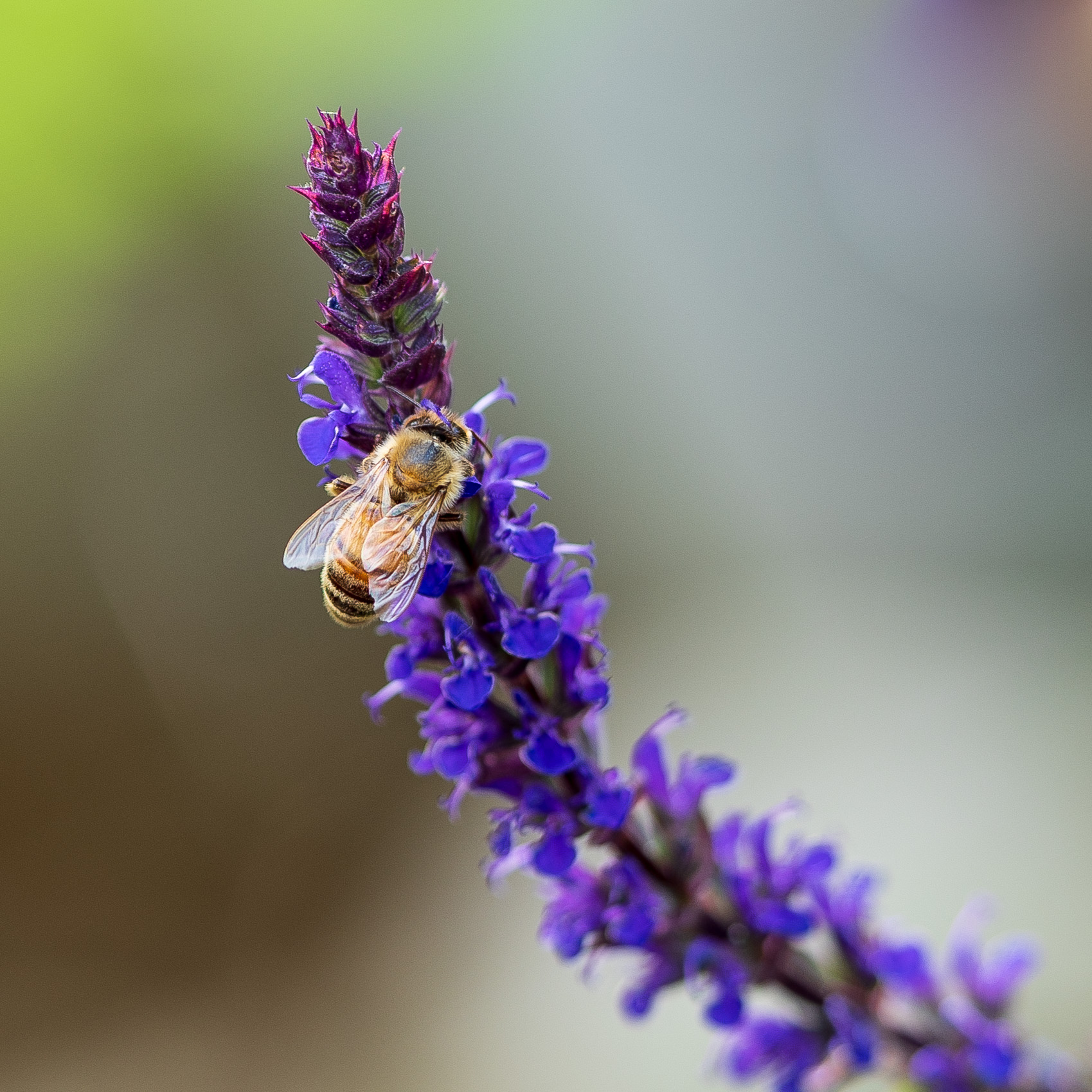
Thanks for the alternate edit Hung. I do like the closer crop. I think there's a green tint on the bee that I would tone down. |
Jun 17th |
| 2 |
Jun 19 |
Reply |
Thanks for the honest critique. I'm not sure why I submitted such strange images this month (I belong to a couple groups). But I did have a great time taking photos over the last several weeks. Tomorrow I'm going to a butterfly biosphere so hopefully I can get something for next month. |
Jun 13th |
| 2 |
Jun 19 |
Comment |
Nice image. It looks like such a nice garden spot. The only thing I might change is to remove or desaturate the little yellow blooms that are center left. My eye goes there and they take me out of frame. |
Jun 7th |
| 2 |
Jun 19 |
Comment |
I keep switching between the original and the edited version of this one. I can't believe how much your crop and edits enhanced this shot. I'm glad you got lucky with the runner because he adds so much. |
Jun 7th |
| 2 |
Jun 19 |
Reply |
If you can't eliminate it totally I would at least remove the lettering on it. If you do that it may not even be noticeable. |
Jun 5th |
| 2 |
Jun 19 |
Comment |
I like this shot, the players are all concentrating on the ball and the focus is good. I like the processing. If possible I think I would crop the left side just a tiny bit to remove the white pole that is still visible. Moving subjects are difficult for me. |
Jun 5th |
| 2 |
Jun 19 |
Comment |
Very nice image! It's beautiful, and you captured it at a perfect moment. The only suggestion I have would be to crop a little from the right side. |
Jun 3rd |
| 2 |
Jun 19 |
Comment |
Powerful image. She is looking straight at the camera. Your post processing did a great job bringing light to her eyes. I also like the black background. My only suggestion would be to desaturate the blue channel a tiny bit.
I have the same feelings about zoos, yet I'm glad that people are able to see these animals. |
Jun 3rd |
| 2 |
Jun 19 |
Comment |
This is beautiful. It really works with the black background. Was that achieved in post processing? I love the metallic looking lines in the feathers. |
Jun 3rd |
6 comments - 3 replies for Group 2
|
| 15 |
Jun 19 |
Comment |
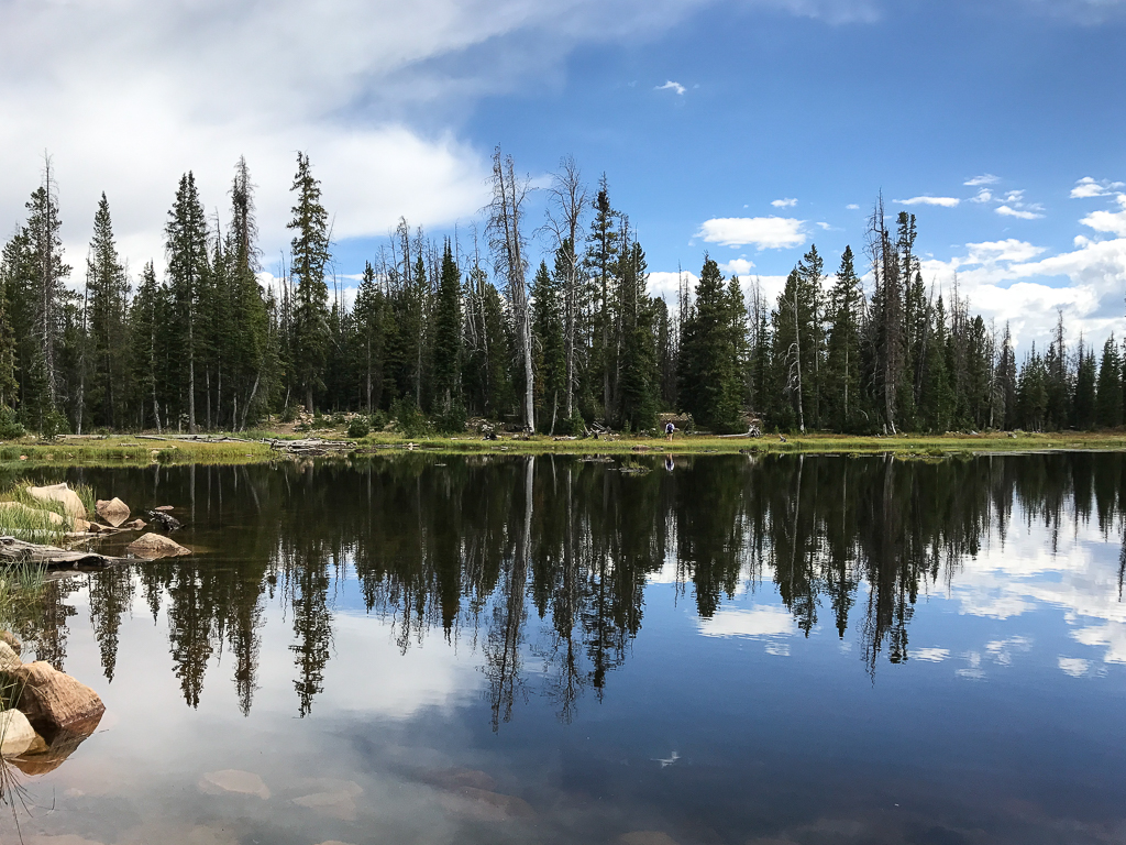
Just visiting from another group (02,57, and 86). This is beautiful, especially the color. Substituting the sky was an excellent choice.
|
Jun 11th |
1 comment - 0 replies for Group 15
|
| 57 |
Jun 19 |
Comment |
Welcome to the group Janis. I'd love to see one of these in the wild. If you could increase the exposure a little I think it might help. Find some way to make the edge of the caterpillar on the right pop a little more. Great shot. |
Jun 11th |
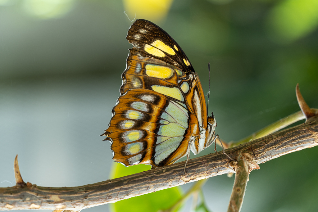
| 57 |
Jun 19 |
Comment |
What a beautiful bird! I'm really impressed that you could hand hold a 200mm lens that steady. I struggle with that a lot. I'm not very good at photoshop, but I think this image would be really straight forward for someone to add a different background. |
Jun 9th |
| 57 |
Jun 19 |
Comment |
I love the framing of the bird here. Great composition. I'm not sure what is going on with the board the bird is perched on - there's a blur on the board but not on the bird.
I think you could crop in from the bottom left and remove that first pane of light on the left. You wouldn't lose anything, and it would put the bird in a better spot I think.
I do really like the warm colors. |
Jun 9th |
| 57 |
Jun 19 |
Comment |
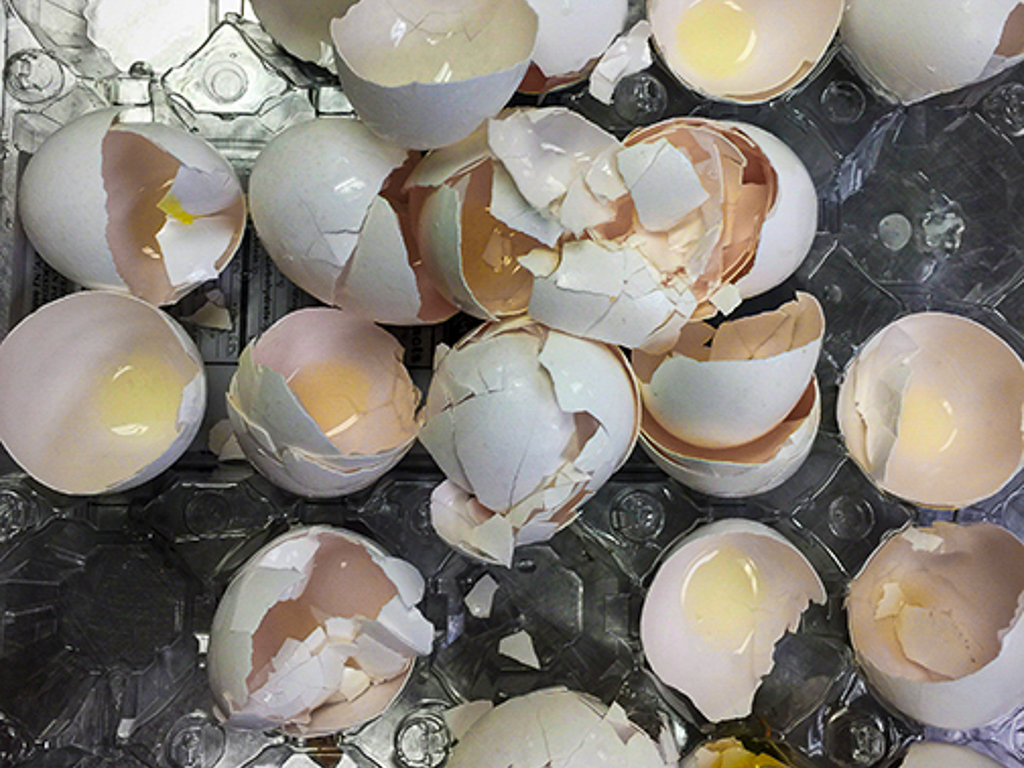
I'm not really sure what to suggest for edits. I played with it a little & tried to make it a BW, but I missed the yellow. Here's my take - I changed the orientation to remove the yolk (?) in the upper left that had a green tint. |
Jun 9th |
 |
| 57 |
Jun 19 |
Comment |
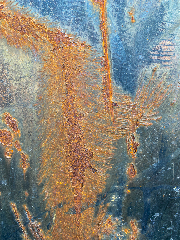
So many textures. I really like that turquoise color, for me it makes the shot. |
Jun 7th |
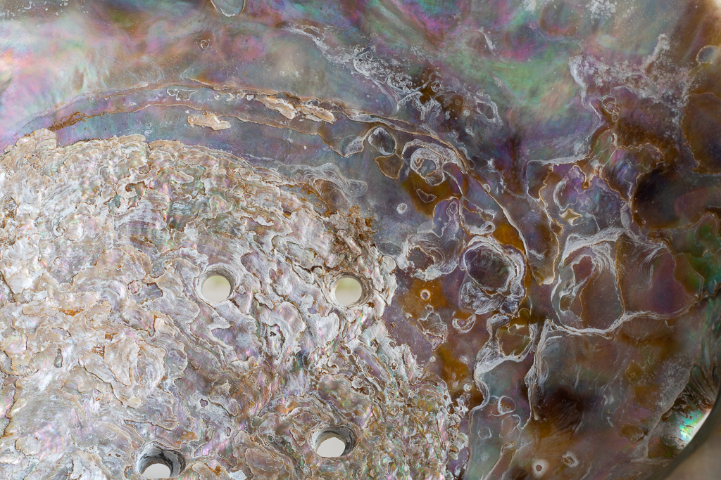
| 57 |
Jun 19 |
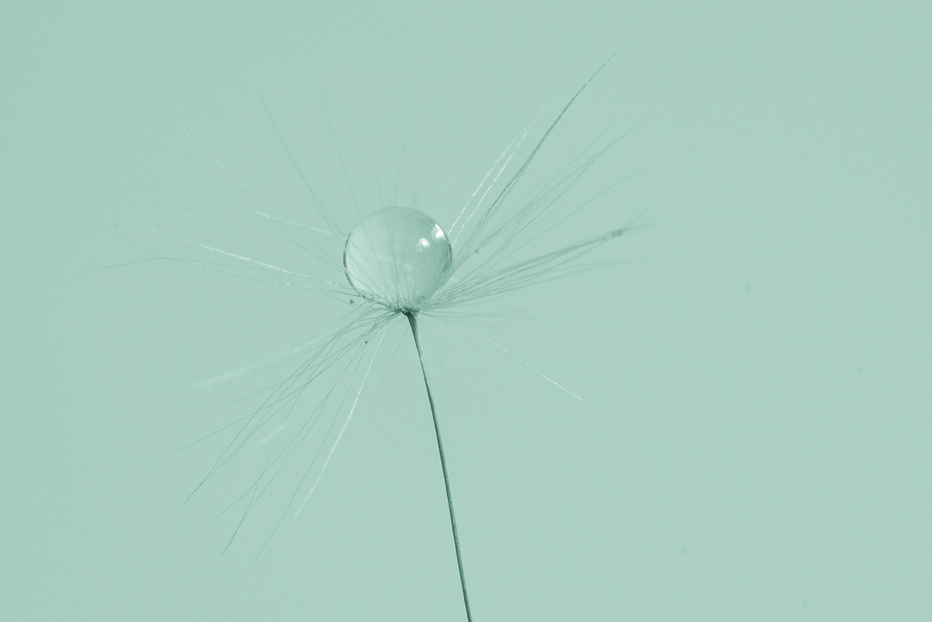
Comment |
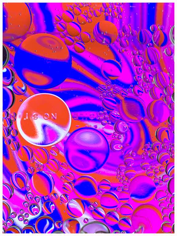
Wow - beautiful colors. You got such sharp focus on the drops. Very impressive. I also like the rays that go out from the top drop. I'd like to know a little more about your setup - specifically the lights you used and what you used for the color. |
Jun 7th |
6 comments - 0 replies for Group 57
|
| 86 |
Jun 19 |
Reply |
Some more thoughts - When you look at the original shot there is a clear path to the stairs and it leads the eye diagonally up the scene. When you put something in that bottom corner it blocks the stairs. It changes the feeling to have the path blocked. |
Jun 8th |
| 86 |
Jun 19 |
Comment |
What a story this one tells! I had a similar reaction to a meat market in China. I had to run around and leave, so I respect your ability to change your attitude.
I love the color edit, it makes so much difference. I also like the tighter crop but wish you had left all of the woman on the left instead of chopping her arm. |
Jun 7th |
| 86 |
Jun 19 |
Comment |
This is a great shot that really captured a wonderful smile. I bet he would like a copy of this. |
Jun 7th |
| 86 |
Jun 19 |
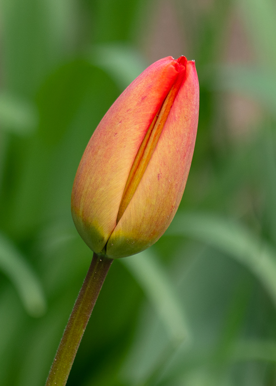
Comment |
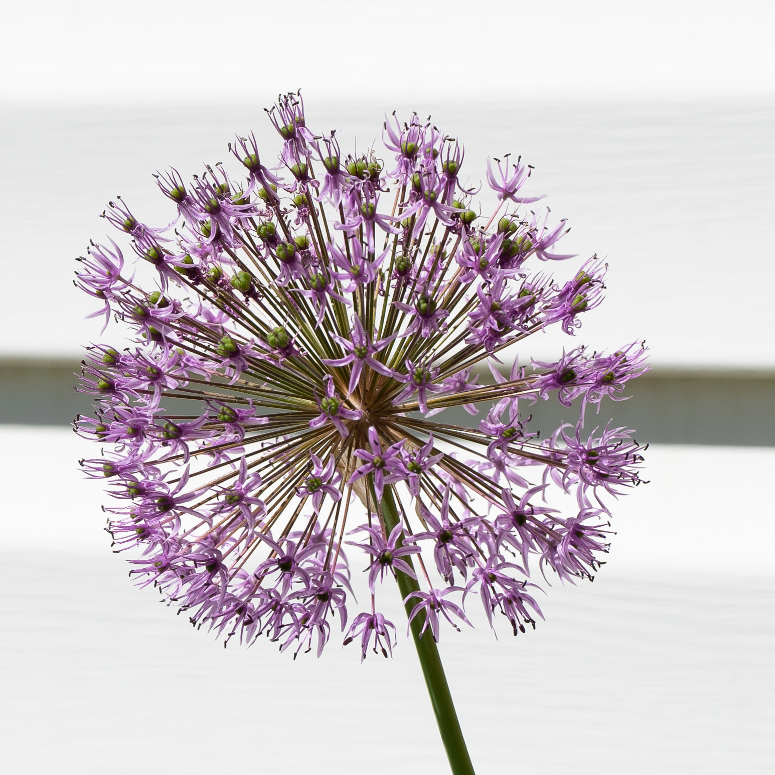
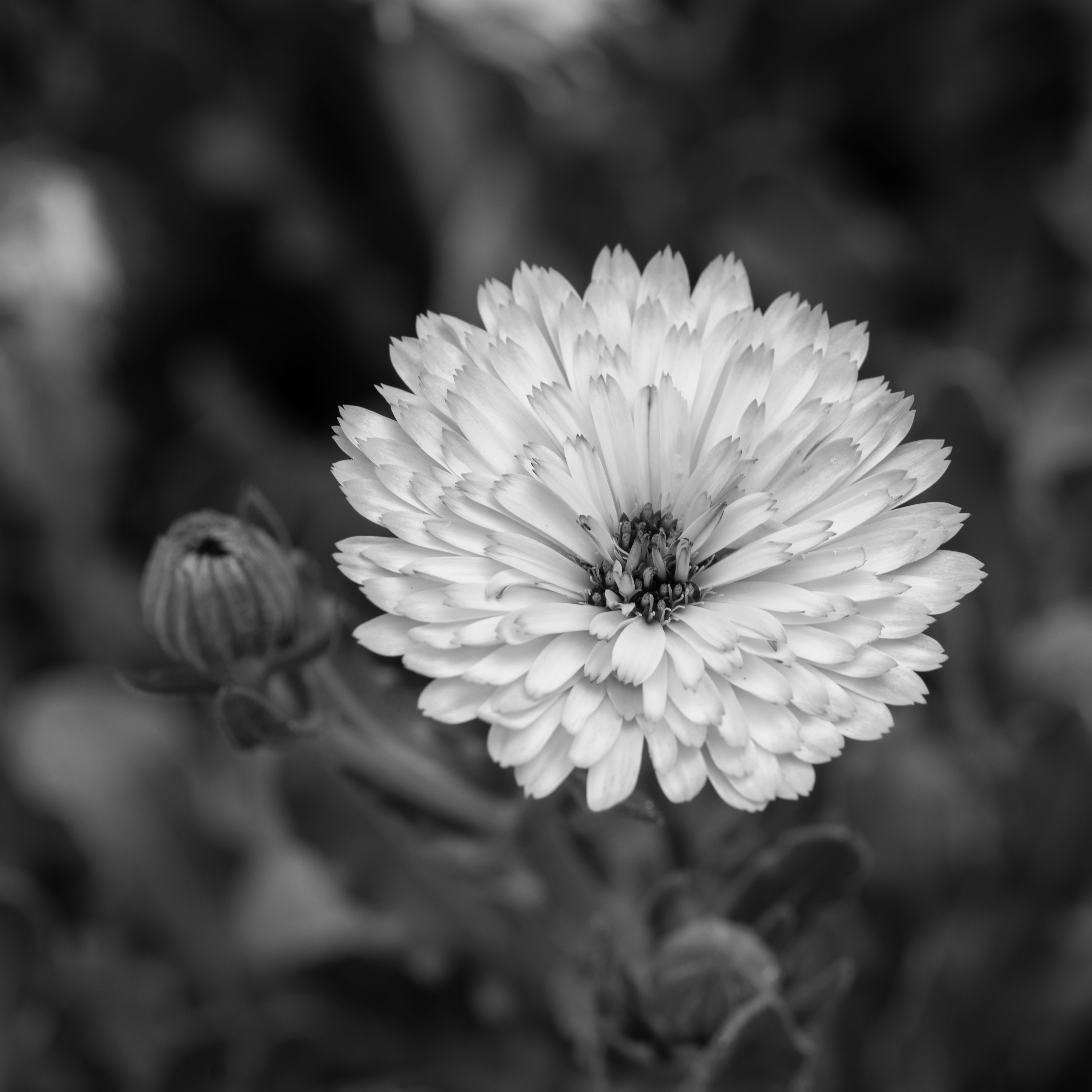
I've been looking for dandelions for a photo project that I'm working on and they are pretty scarce here after some really strong winds and rain. I think the green looks a little too yellow. If you could tone the greens down it might make the yellow flowers even more vibrant. |
Jun 7th |
| 86 |
Jun 19 |
Comment |
I really like the B/W edit on this. The colors in the original are absolutely beautiful though. It would be a difficult decision for me to pick one of them. I also like the crop, removing the green from the bottom edge. |
Jun 7th |
| 86 |
Jun 19 |
Reply |
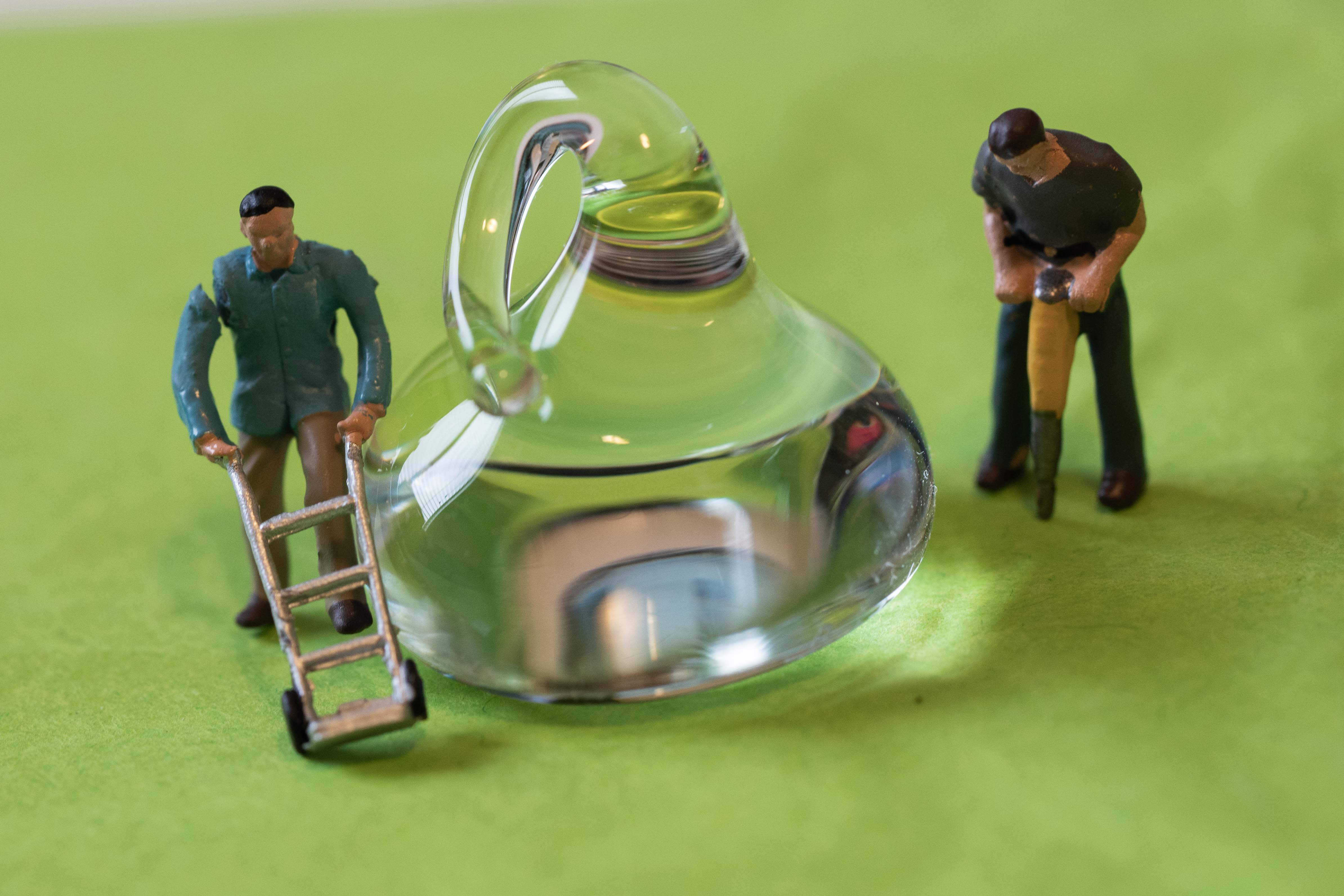
It's a fun project. This is a totally different type of result that I got by elevating the pan of water about 6 inches above the iPad (I used cans of soda). I didn't use my phone for this photo though. |
Jun 6th |
 |
| 86 |
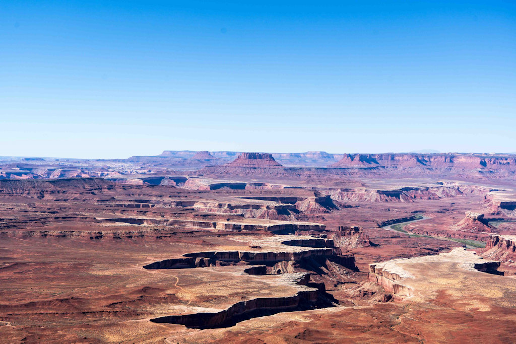
Jun 19 |
Comment |
Nice image. I really like the patterns in the sand. I feel like the crop needs to exclude the land at the top completely, or leave all of the sky in the original. I know you are trying to put the emphasis on the wonderful patterns on the bottom, but the cramped space above the people feels constrictive.
I downloaded the image and cropped it a bit differently. |
Jun 5th |
 |
| 86 |
Jun 19 |
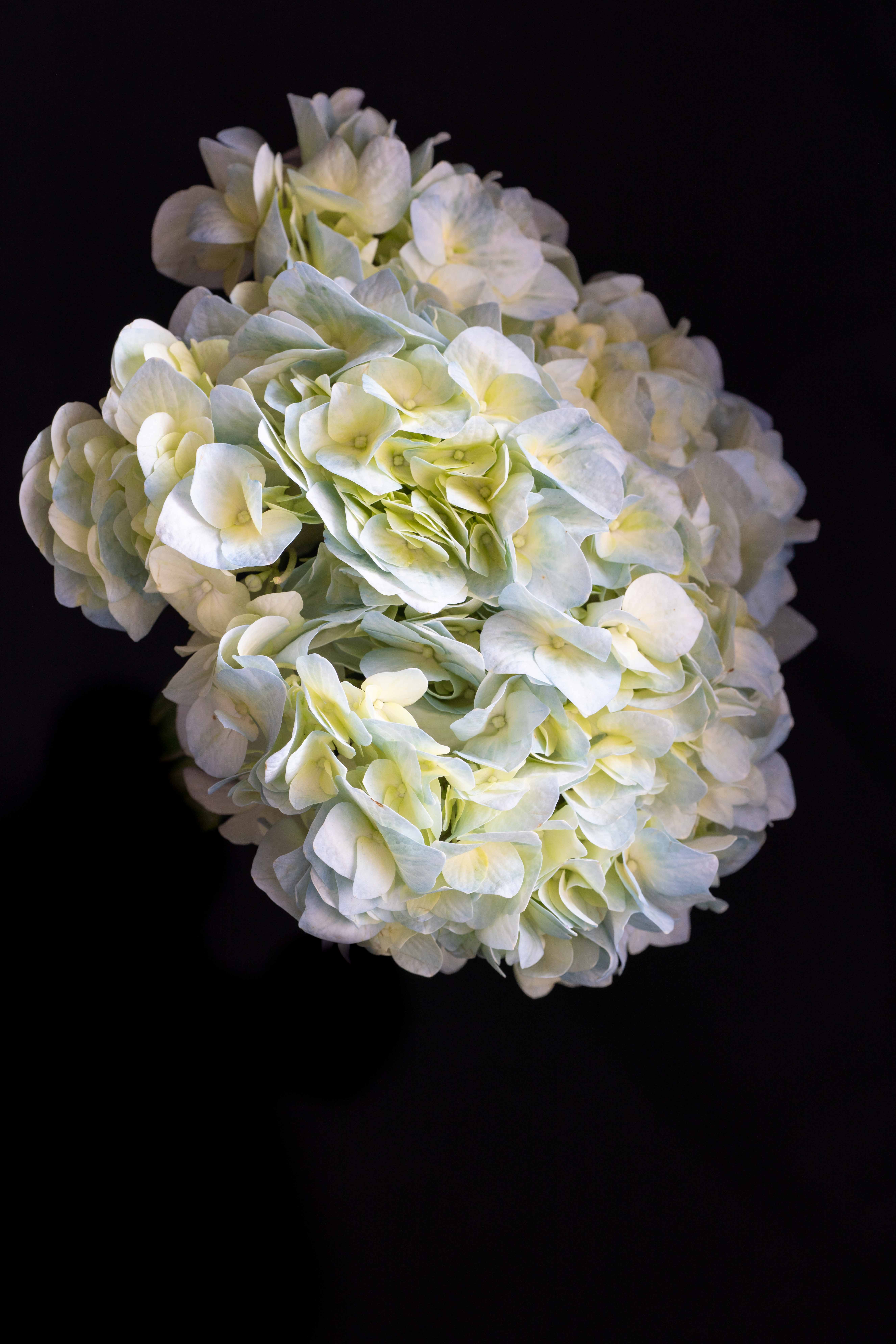
Comment |
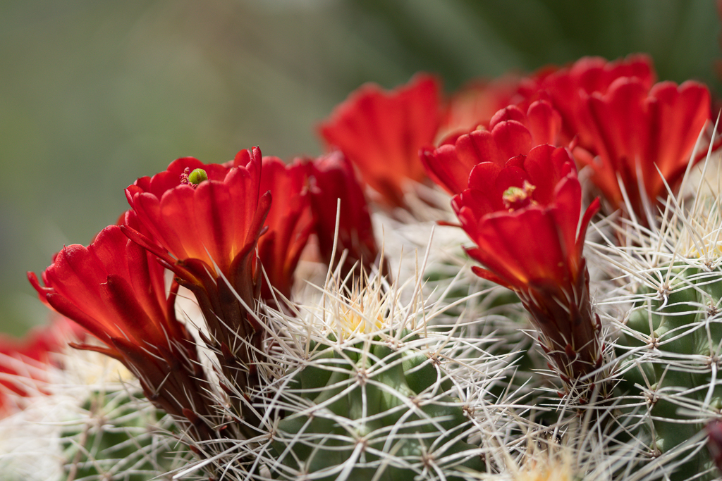
Creative edits! I like the darkened edge on the right behind the blossoms. I've looked at both the flipped version and the original and I'm fine with either one. For me the blossoms that were added with double exposure confuse my eye. They don't look solid to me - is the opacity of the top layer at 100%? I didn't know Snapseed lists edits. Thanks - that will be helpful. |
Jun 5th |
6 comments - 2 replies for Group 86
|
19 comments - 5 replies Total
|