|
| Group |
Round |
C/R |
Comment |
Date |
Image |
| 2 |
Apr 19 |
Comment |
Nice pumpkins! I agree with Shirley that it would help to lower the highlights on the left a little. You've got some tough lighting with the shadows on the right and the bright light on the left. I do like the rows of pumpkins - it's an interesting shot. |
Apr 13th |
| 2 |
Apr 19 |
Comment |
Here's another try at the edits on this. Thanks for the suggestions! |
Apr 13th |
 |
| 2 |
Apr 19 |
Reply |
Thanks for the suggestion - I've made another go at the edit.
|
Apr 13th |
| 2 |
Apr 19 |
Reply |
Thanks for the suggestion - I've made another go at the edit. |
Apr 13th |
| 2 |
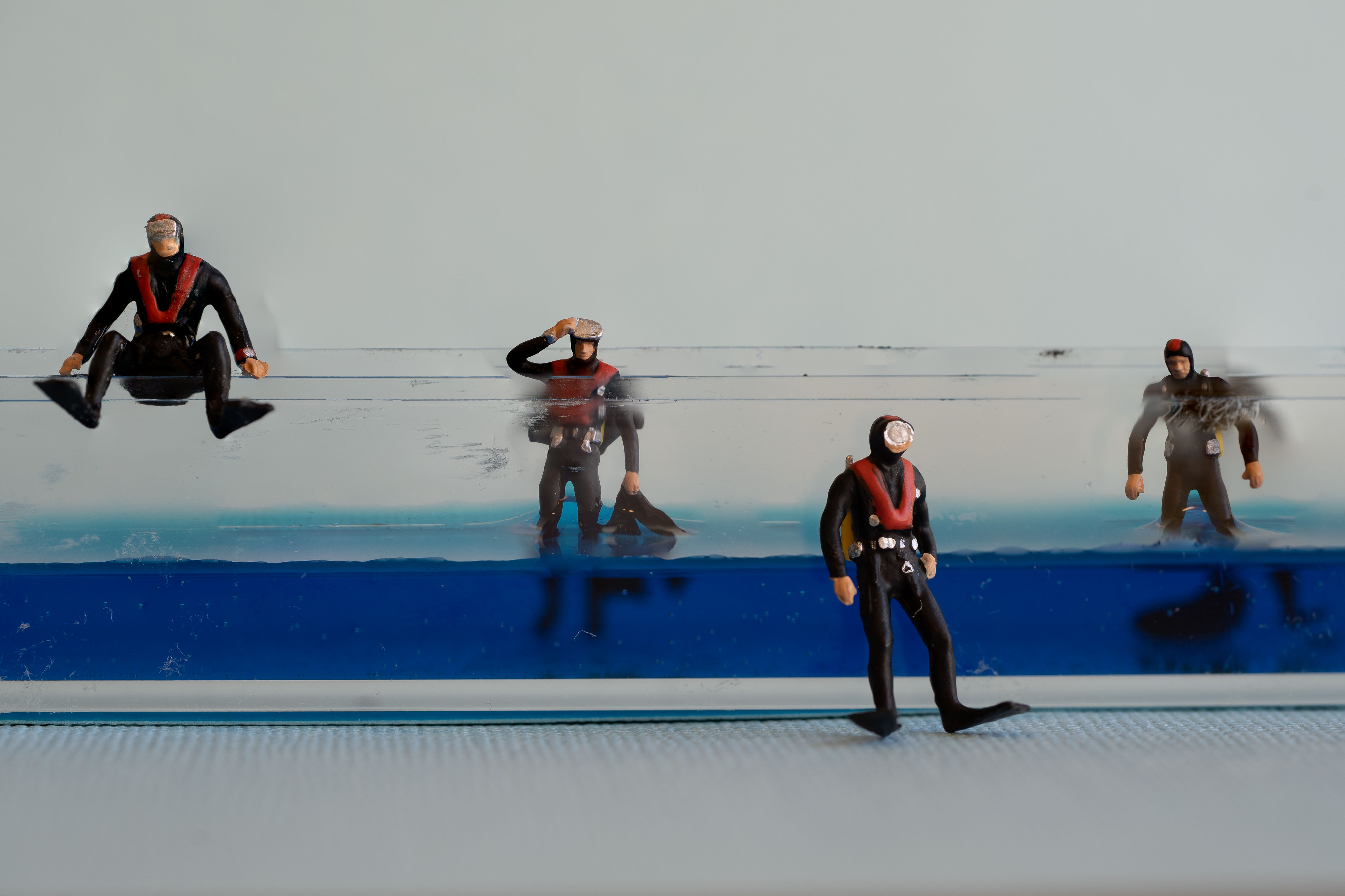
Apr 19 |
Comment |
This is an interesting image. I do like it. I wish you had a little more space on the right. It feels like the people are squeezed in a tiny little space. |
Apr 10th |
| 2 |
Apr 19 |
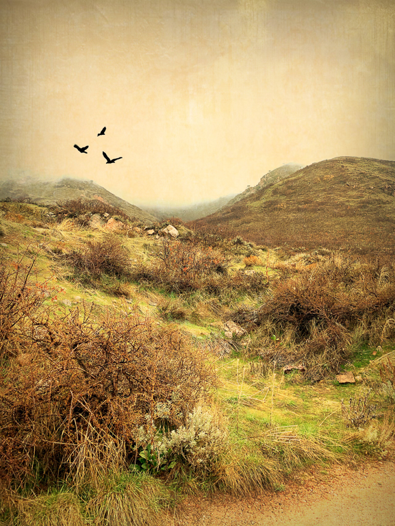
Comment |
The crop really improved the composition - although the original was already beautiful. The muted tones really work and I think if the rainbow or sky was any more saturated it would actually lose a little of the feeling.
I like that the steeple is the beginning of the rainbow (or the end if you look at it that way).
Very nice! |
Apr 6th |
| 2 |
Apr 19 |
Reply |
I wondered about that - but I like the water ripples. |
Apr 5th |
| 2 |
Apr 19 |
Comment |
Welcome to the group Brenda. This is absolutely beautiful. I agree with Shirley that you could crop out some sky, but it's beautiful either way. |
Apr 5th |
| 2 |
Apr 19 |
Comment |
Beautiful capture - the light is so wonderful. It looks to me like you didn't need to make many changes at all - the original file is also beautiful. I like the crop and the blurred background doesn't distract me. |
Apr 5th |
| 2 |
Apr 19 |
Comment |
I like your crop very much. If you could lighten the lower left corner I think it would help a little. Right now I look at the monkey's face and then my eyes fall into the black corner.
I really do like this though! |
Apr 5th |
7 comments - 3 replies for Group 2
|
| 57 |
Apr 19 |
Reply |
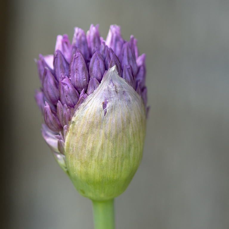
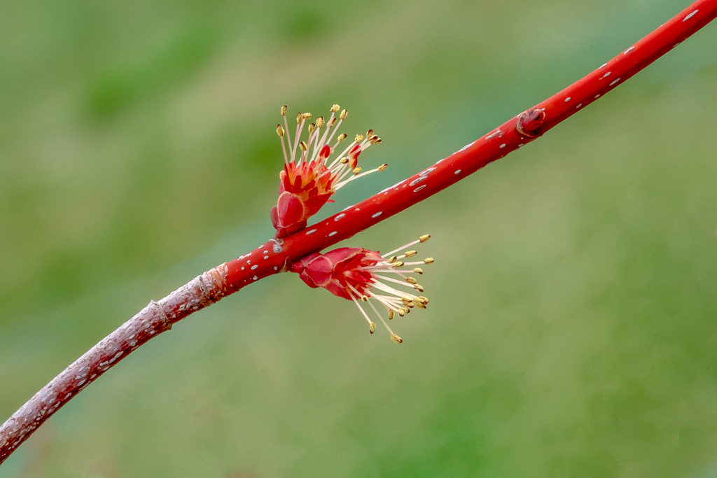
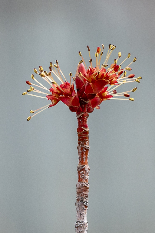
I couldn't decide between 2 images. The other choice was more about the bud vs. the branch. It's tough to decide - I like the color in the branch shot which is why I eventually decided to use it. |
Apr 12th |
 |
| 57 |
Apr 19 |
Comment |
I love the colors of this. All of them - the purple, green, blue and the burgundy color of the wine. The color is what draws me to this image. I'm glad you didn't change it.
Did you get to sample any of the food or just photograph it?
I'm interested in knowing more about filters too. I never use them & realize that I should know when to use them. |
Apr 10th |
| 57 |
Apr 19 |
Comment |
Very sharp detail on the blossom. I'm so glad that we're seeing growth in my part of the world. Just when all of our trees are full of blossoms we are getting more snow! If you cropped out the bluish/green on the right hand side I think it would be a stronger composition. |
Apr 10th |
| 57 |
Apr 19 |
Comment |
Beautiful colors! The purple and green background is a perfect backdrop for the bright yellow flowers. I like this a lot. |
Apr 5th |
| 57 |
Apr 19 |
Comment |
I love this photo. I have a thing for button collections though. When my grandmother died I said that the only thing I really wanted was to have her 'button box'. I use to play with it for hours as a child. I especially like the clear buttons contrasted with the metals. The light is just right also. |
Apr 5th |
| 57 |
Apr 19 |
Comment |
I really like the contrast between the wood and the colors also. Everything is in focus and the eggs really draw all of my attention. Very nice! |
Apr 5th |
5 comments - 1 reply for Group 57
|
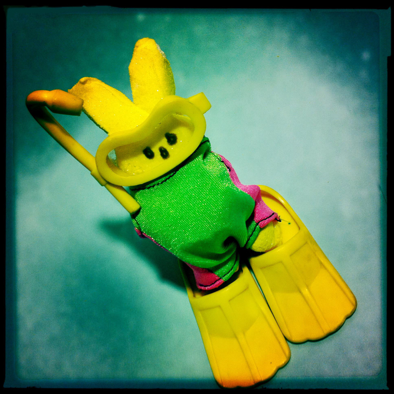
| 86 |
Apr 19 |
Reply |
Thanks. Yes I did dress the peep. I went through a 'peep phase'. Wish I still had some inspiration mojo to come up with something original for my peeps.
Here's some of my other peep photos: https://www.flickr.com/photos/laurie777/albums/72157626375913460 |
Apr 13th |
| 86 |
Apr 19 |
Comment |
Your edits give this image such a warm feeling. You did a good job removing the power lines. I wouldn't change anything else. |
Apr 10th |
| 86 |
Apr 19 |
Comment |
Wow - what a difference between the original and the edited version. You have made the image much more interesting. I like this a lot. |
Apr 10th |
| 86 |
Apr 19 |
Reply |
Hipstamatic has flashes & you can apply gel overlays to them. That's what I used I'm pretty sure. |
Apr 6th |
| 86 |
Apr 19 |
Comment |
I love it! I wouldn't have thought to combine those 2 images, but the result is very, very nice. I like that the 2nd window from the left has beams of light coming from it. Was that a happy accident or did you intentionally do that? |
Apr 5th |
| 86 |
Apr 19 |
Comment |
This is beautiful. Your edits seem perfect, but I'm curious why you thought to flip the image? It just wouldn't have occurred to me to do that & maybe it should. |
Apr 5th |
4 comments - 2 replies for Group 86
|
16 comments - 6 replies Total
|