|
| Group |
Round |
C/R |
Comment |
Date |
Image |
| 58 |
Aug 18 |
Comment |
For me, it's a perfect image for the Me too movement! Two men trying to look down the blouse of a beautiful lady, with her finger poised saying, No, no, no!! And in this sense, I probably would crop out the lady on the left. The photo itself is well exposed and I like the complimentary colors as well. |
Aug 16th |
| 58 |
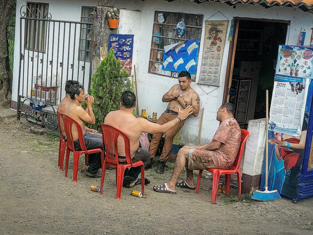
Aug 18 |
Comment |
I do agree with Isaac in cropping closer as the tattoo and gentleman's face are the focal points. The man's tattoo and face are sharp and well exposed and I like the feeling of the photograph in black and white. Nice portrait! |
Aug 16th |
| 58 |
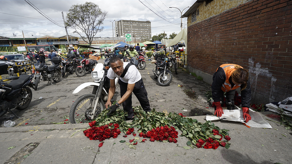
Aug 18 |
Comment |
This is a very interesting photograph and title to read. The vendor's pose, eye contact, body language is striking. I like the colors, especially the reds in the gentleman's clothing and jewelry. As the title emphasizes his wares, stepping back or positioning at a different angle could have shown his entire display as well as more of the environment. I usually think of titles as benign but ambiguity in a title leaves it open for interpretation in a way that the photographer may or may not have intended. |
Aug 16th |
| 58 |
Aug 18 |
Comment |
This is a very nice composition that I feel transcends just two boys having fun on the beach! The recurrence of triangles in the scene , the boys, the rock, the painting on the rock, the shape of the bushes, the angles of the wet sand, to me, all combine to make a dynamic composition. The primary colors of the boys swimsuits fit in nicely with the geometric composition of the photograph. Nice job! |
Aug 16th |
| 58 |
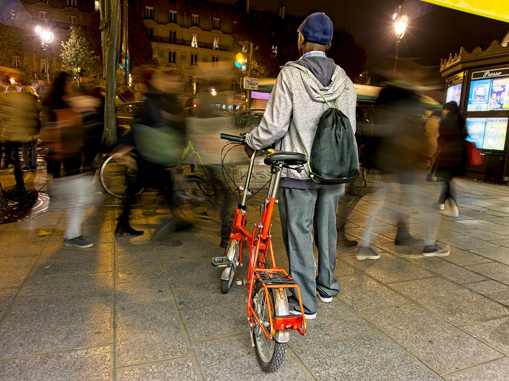
Aug 18 |
Comment |
I agree that the reflections in the door of the street and the photographer bring an added dimension to this street scene with the gentleman walking into the image. I also agree with cropping out the hardware but agree with Gloria about retaining the graffiti. I have had the desire to "clean up" graffiti both in the real world and in a photo, but here I believe the dripping, red painted letters help balance the photograph. Nice scene! |
Aug 16th |
| 58 |
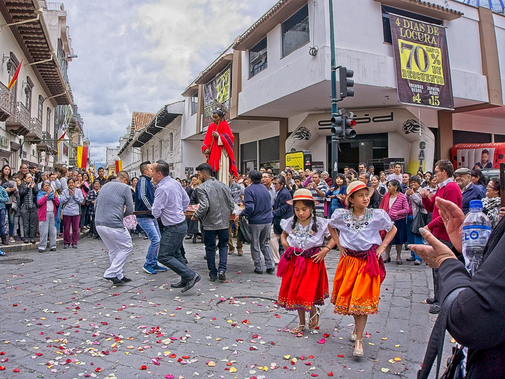
Aug 18 |
Comment |
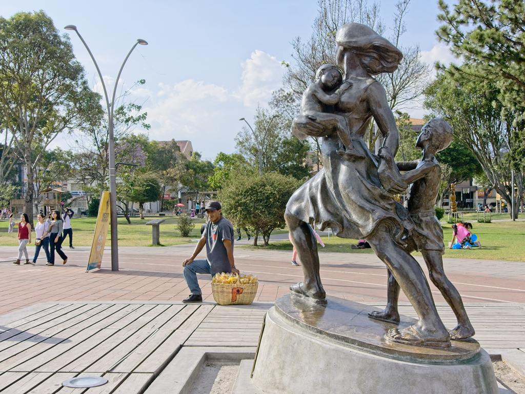
Very nice photograph of this environment and installation! I especially like the leading lines created by the trees and the umbrellas. The families in the foreground add a personal touch to the scene and help in creating additional layer of depth. Good depth of field and the bright colors (with absence of definite shadows) give it an almost surreal look! |
Aug 16th |
6 comments - 0 replies for Group 58
|
6 comments - 0 replies Total
|