|
| Group |
Round |
C/R |
Comment |
Date |
Image |
| 58 |
May 18 |
Reply |
I had a hard time, too, adjusting the whites without blowing them out; so instead I lowered the saturation of the blues in the chair. |
May 13th |
 |
| 58 |
May 18 |
Comment |
Yes, I agree, that's even better! I will get in and try it myself!! Thanks, Gloria |
May 13th |
| 58 |
May 18 |
Reply |
Thank you for your comments! There was a magazine stand on the right that got cropped out in this version which left only the distracting yellow awning. It does look better without it! |
May 8th |
| 58 |
May 18 |
Comment |
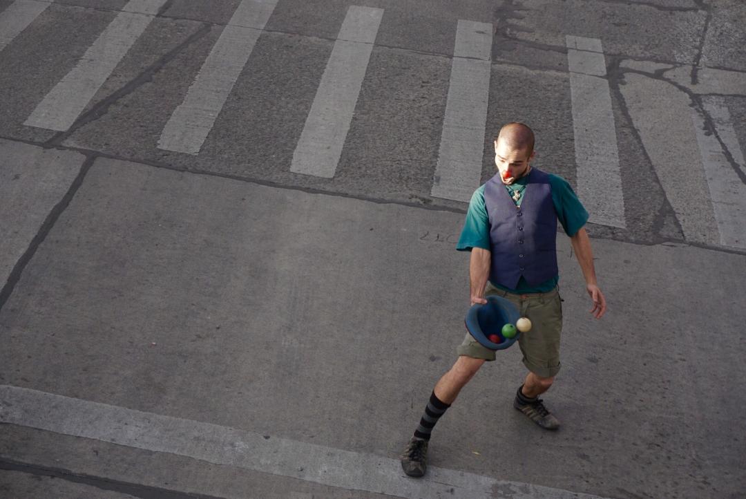
Yes, I also agree that this is an impactful image, capturing the intensity and concentration of the street artist and showing a lot of detail in his face. The treatment of black and white and color is somewhat ironic to me, as he's intent on becoming a dark character yet uses a brightly colored mirror that is the center of attention for both the viewer and the subject! Nice composition! |
May 8th |
| 58 |
May 18 |
Comment |
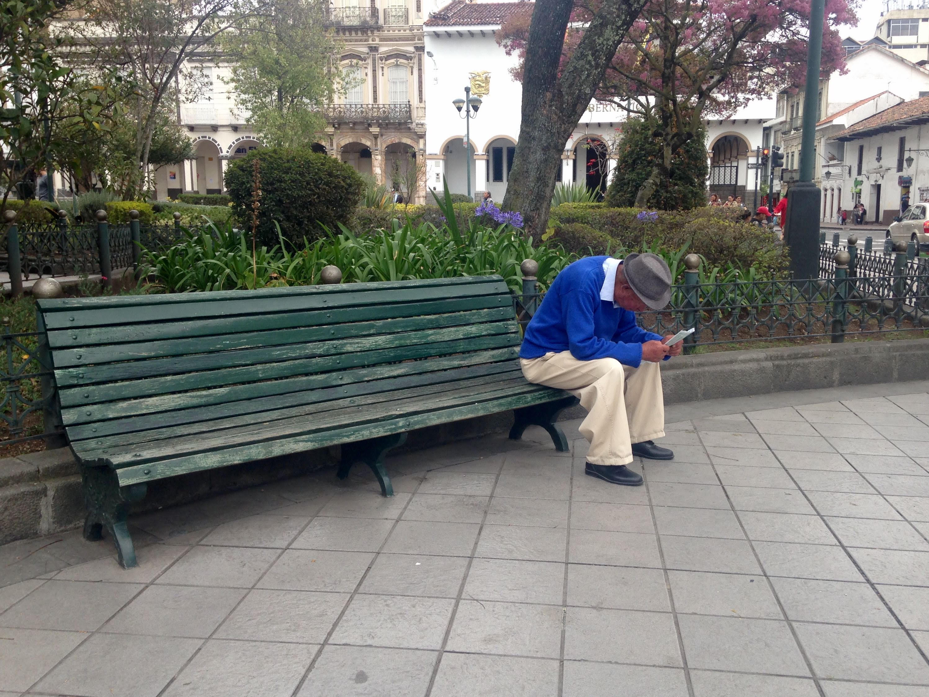
I really feel that this photo has impact and captures this pleasant moment between the adult and child. The image is well exposed and I especially like the well detailed highlights on the hands and face. I believe you gave a lot of attention to the details, such as the reflections in the adults' sunglasses-of both the photographer and his peace sign- as well as the catch-lights in the boys eyes! Great photo! |
May 8th |
| 58 |
May 18 |
Comment |
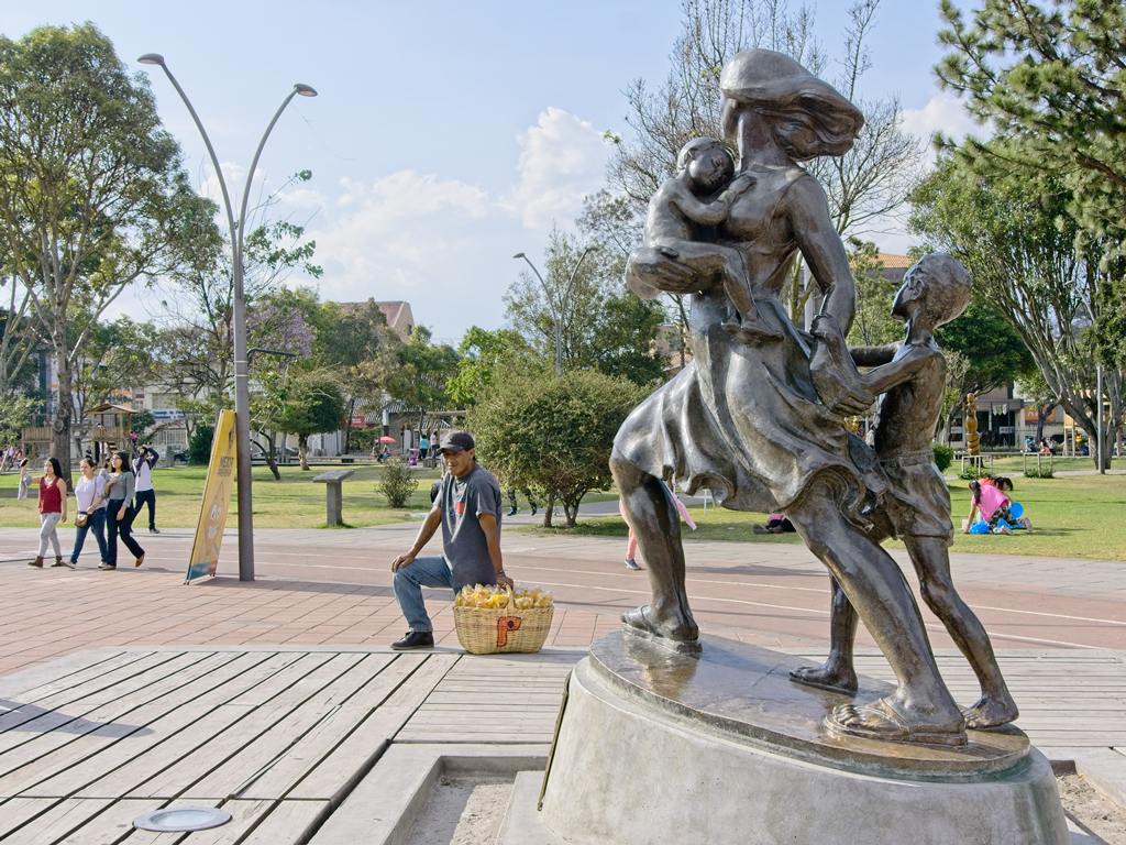
Very cute boy and I love his pose! Looks like he's trying to model the figures on the carving and they both work well together! To me, the stone and gravel appear a little mushy. I like how the boy is nicely focused and exposed and especially highlighting the glimmer in his blue eyes! Nice composition! |
May 8th |
| 58 |
May 18 |
Comment |
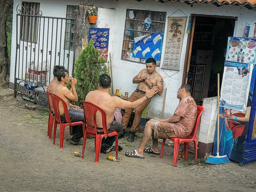
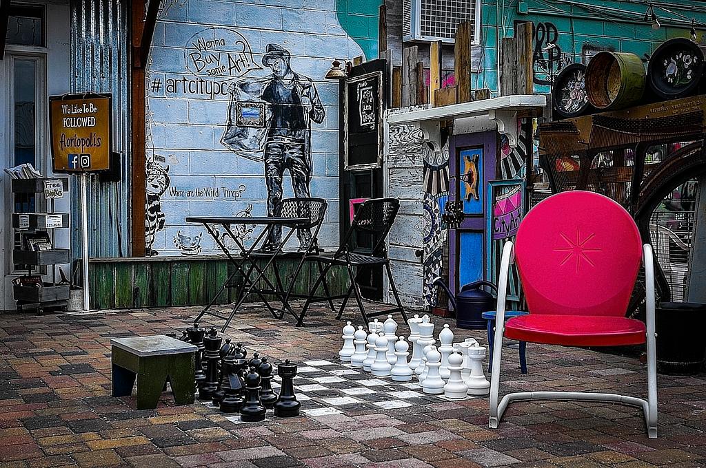
Very nice street scene that I feel works very well in color. There is a lot of detail in the photo and I find it is well exposed. My eyes definitely move around and ultimately end up on the chair, which I see as the focal point of the photo. As it does have a very "clean" look to it, I feel that the armrest or leg on the right could be lightened to match the left leg which has a brighter look. |
May 8th |
| 58 |
May 18 |
Comment |
Realizing that I'm looking down on not just the cafe, but the city below and it's coastline, gives it impact and gives me the feeling that I'm at an extremely high and unique vantage point! I feel the tree in the middle adds an additional dimension to the scene and separates the viewer even more from the cafe and the city below. I like the quality of the light and the haziness of the city and sea. To me, I would bring the shadows up in the cafe area just a little while still maintaining the nice contrast. Nice view of the Black Sea! |
May 8th |
| 58 |
May 18 |
Comment |
Nice countryside photo in Colombia! (I'll be traveling there soon!) I love the colors, the brown car contrasts with the green grass and the white horse stands out in the background, too. I also like the placement of the car and the horse, with just the right amount of space in between. The detail and rustiness of the car certainly give it character! The pattern of the grill, to me, goes well with the fence and the house in the background. I'd love to see more of Colombia! |
May 8th |
7 comments - 2 replies for Group 58
|
7 comments - 2 replies Total
|