|
| Group |
Round |
C/R |
Comment |
Date |
Image |
| 5 |
Jun 18 |
Reply |
He is beautiful and you did an amazing job enhancing his beauty. Thank you for sharing. |
Jun 14th |
| 5 |
Jun 18 |
Comment |
The same peacock posed for me. Well maybe not the same one, but I have a similar shot as your original. You said that your image was not from the original. It is beautiful. How did you create it in novice terms please. |
Jun 14th |
1 comment - 1 reply for Group 5
|
| 27 |
Jun 18 |
Reply |
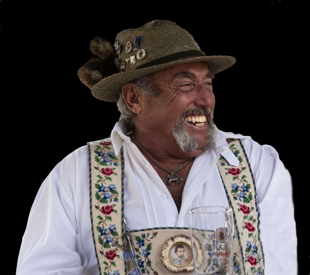
Thanks for your comment, Danny. You are right about taking the image without distractions rather than trying to fix them up later, but this was a grab shot. Too often when you ask to take the photo, people pose and the image ends up looking unnatural.
Beer in the image would have been nice, but... |
Jun 27th |
| 27 |
Jun 18 |
Reply |
Thank you. I just learned to how darken the background without saturating it completely. I will try it in another photo perhaps next month.
All help is greatly appreciated. |
Jun 19th |
| 27 |
Jun 18 |
Reply |
Thank you for your suggestion, Barbara. As a novice photographer, I really appreciate not only your comment, but the simple instruction on how to get it done. I also like that you lightened his face. In real life, he face was very red, probably from too many beers, but the color you selected was a big improvement. How were you able to do that? Any help is greatly appreciated. I am very eager to learn. |
Jun 14th |
| 27 |
Jun 18 |
Comment |
I think I would still try to darken the very light areas. That is where my eyes wander. Your subject is much sharper in this one and that is great. |
Jun 12th |
| 27 |
Jun 18 |
Reply |
Thank you, Becca. I noticed the same thing as you did about the sleeve. I had to delete the man with the green shirt that was in the original photo and I thought I could just use the clone brush to extend the shirt. I didn't notice that it didn't work so well until I saw it on the site. A tighter crop might have worked. I just didn't think about that.
Thank you.
|
Jun 12th |
| 27 |
Jun 18 |
Reply |
Thank you Oliver and thanks for the suggestion of the frame. I love that idea and will try it in the future. I am still learning so all suggestions are greatly appreciated. |
Jun 10th |
| 27 |
Jun 18 |
Comment |
Great image. The sky is so interesting and full of detail. Great job. |
Jun 9th |
| 27 |
Jun 18 |
Comment |
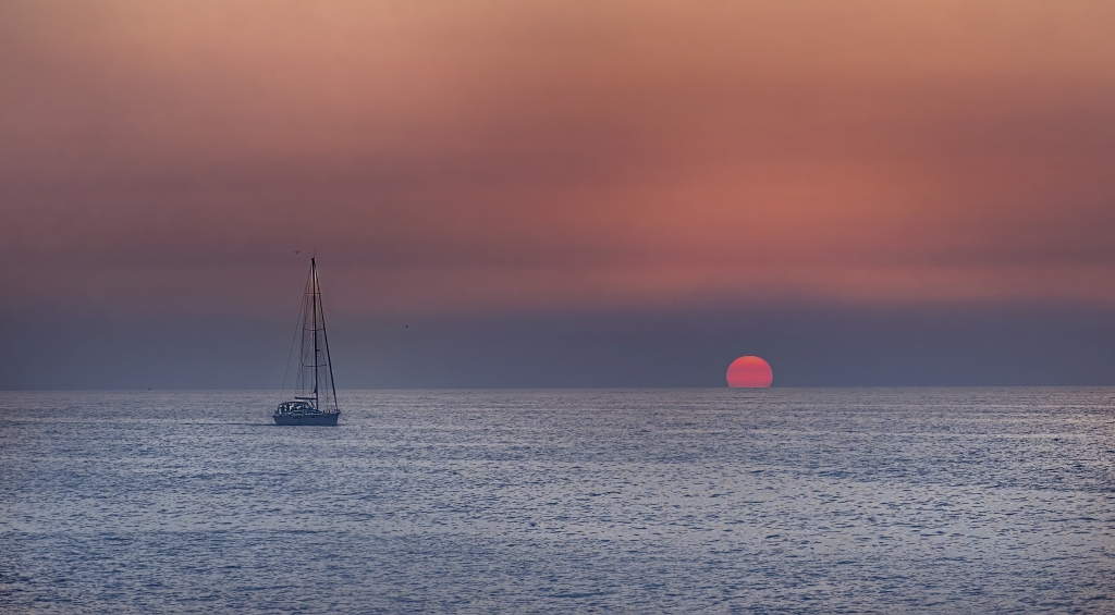
My eyes to the Samsung sign. Perhaps that could have been removed or the white in the sign darkened a bit. I love the red sails on the boat and the color reflections in the water. |
Jun 9th |
| 27 |
Jun 18 |
Comment |
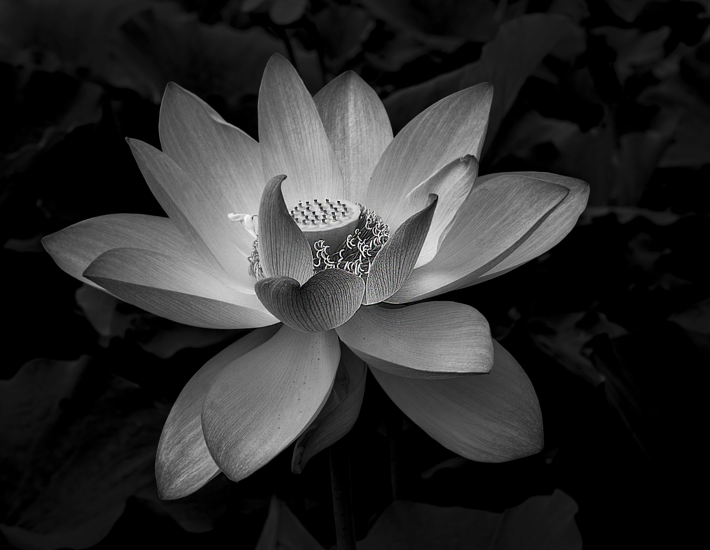
In the B&W image some of the petals of the lily look like they are way past their prime. I like the background in transition, but it almost looks like a shot of dead flowers. |
Jun 9th |
| 27 |
Jun 18 |
Comment |
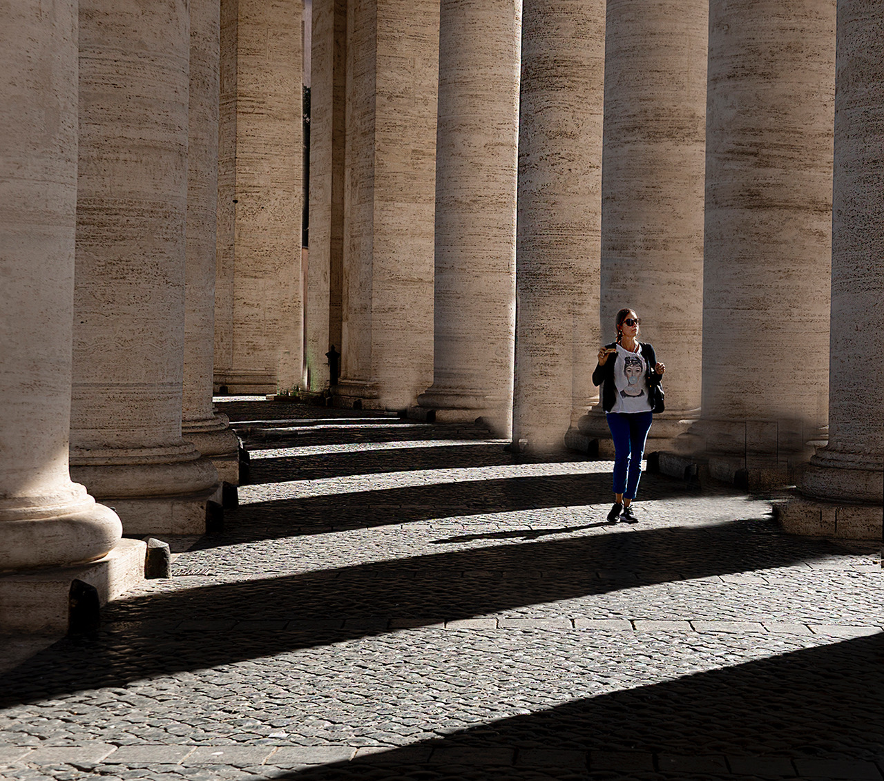
I like this image better in B&W than the color version, but I think it is too soft. The subject was sharper in original 2. Although the people in the background have been blurred, the background is still too distracting to me. |
Jun 9th |
| 27 |
Jun 18 |
Comment |
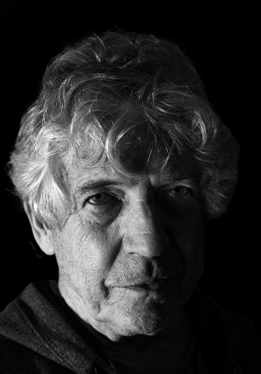
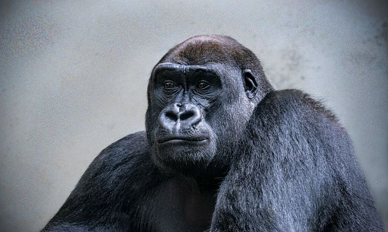
Fabulous image. It has so much impact. It is probably better in B&W than if it were in color. His eyes make the image. I also love how you can see each hair in his mustache. The background is great too. All around...fantastic. |
Jun 9th |
6 comments - 5 replies for Group 27
|
7 comments - 6 replies Total
|