|
| Group |
Round |
C/R |
Comment |
Date |
Image |
| 36 |
Jan 23 |
Reply |
That is a great idea. I am not sure which I like the best but will try it with the full image on my screen. |
Jan 23rd |
| 36 |
Jan 23 |
Comment |
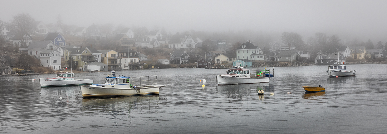
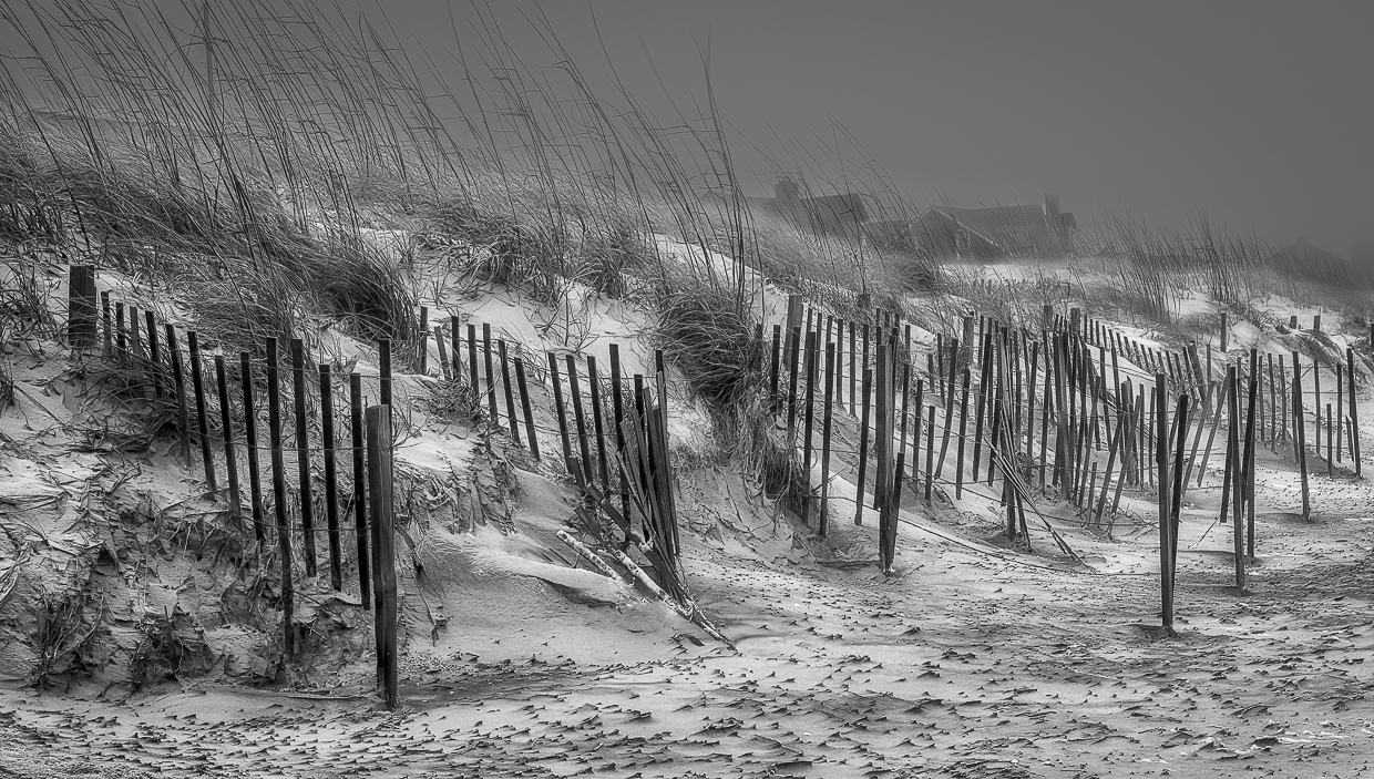
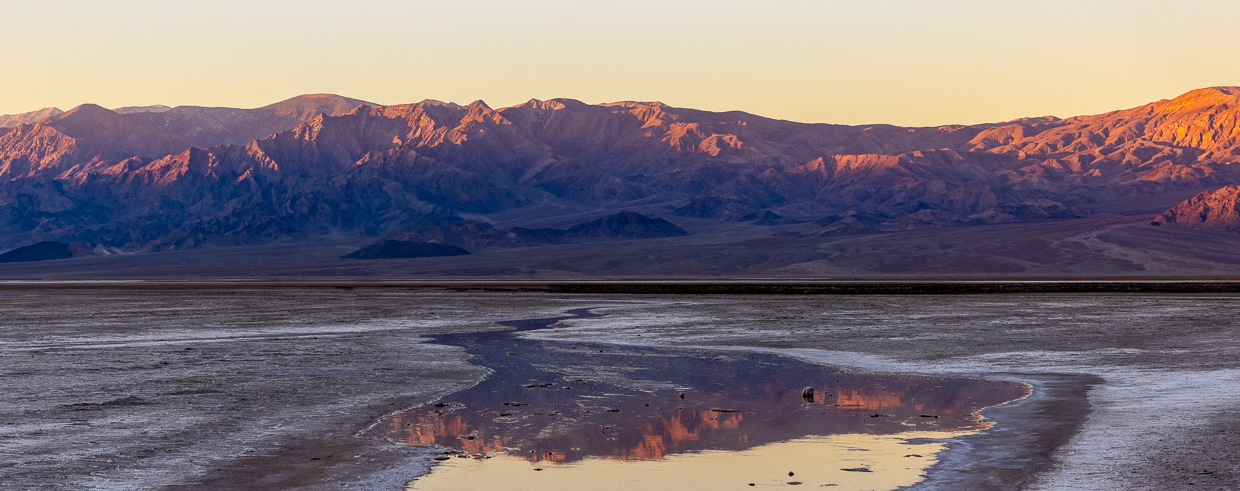
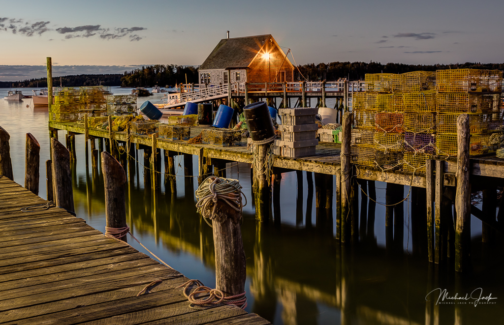
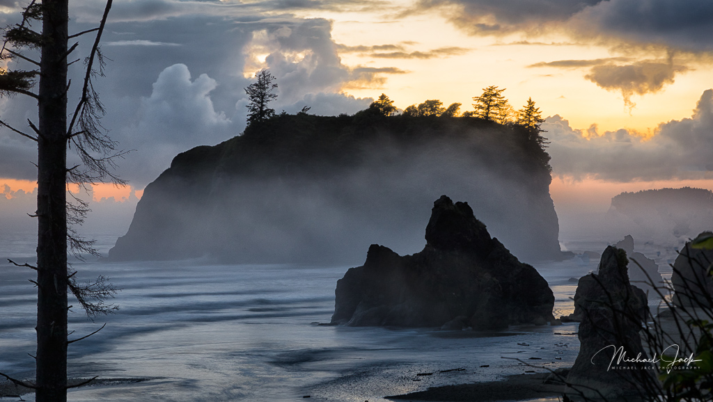
My first reaction was the same as the others - where is the traffic. I also agree with cropping in substantially from the right and up a bit from the bottom would focus the image on the story of the 405. The haze in the distance adds a real sense of distance. I like you choose a diagonal for the freeway which adds energy to the image. I am ok with the sky as you have it. |
Jan 14th |
| 36 |
Jan 23 |
Comment |
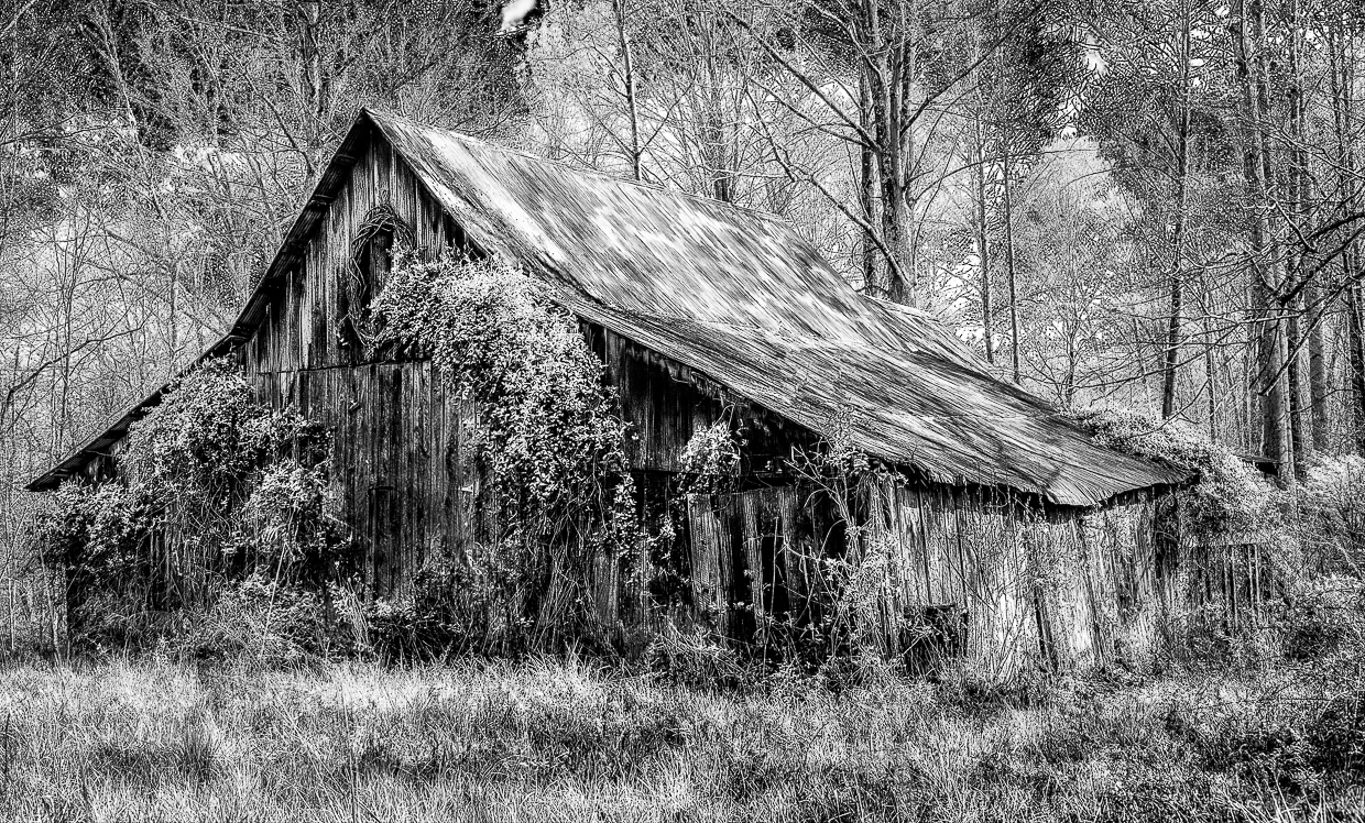
I really like the composition of this image. You have included a lot of eye candy for the eye to roam around on. The midtones are well managed. I like how your dodging and burning adds a lot of interest to this image. I agree with Larry's suggestion to crop in a bit from the left. Initially, I thought maybe cropping down the top a bit would work but that made the image feel crowded so I think you made the best choice. |
Jan 14th |
| 36 |
Jan 23 |
Reply |
Thanks for your comments. The sky was totally gray - no detail whatsoever even with max clarity and dehaze. |
Jan 14th |
| 36 |
Jan 23 |
Reply |
I am a power LR user so familiar with all the sliders |
Jan 6th |
| 36 |
Jan 23 |
Reply |
Thank you for the observations. I will play with the crop. I am a bit confused by your comment to reduce clarity and add more black which seems contradictory. I did move the histogram to the point some of the black was out of gamut. |
Jan 6th |
| 36 |
Jan 23 |
Comment |
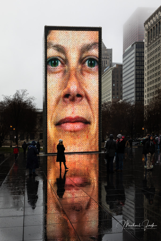
I think you captured an interesting street scene. Time of day and strong color enhance the image. I did not see the shutter speed. My guess is it was handheld and too slow to provide a sharp image. I agree with Larry that the softness of the whole image is a bit distracting. The blur of the walkers does work well, but there appears to be some strong artifacts at the man's face. For me, I think the image would have been more effective if a single person were walking into the frame; the overlapping woman and man are a bit distracting for me. I would trade a much higher ISO to get a faster shutter speed. ISO 800 would be low for a handheld scene like this. Also, artists choice - I would fix the perspective, but you may prefer it to give a sense of height. |
Jan 5th |
| 36 |
Jan 23 |
Comment |
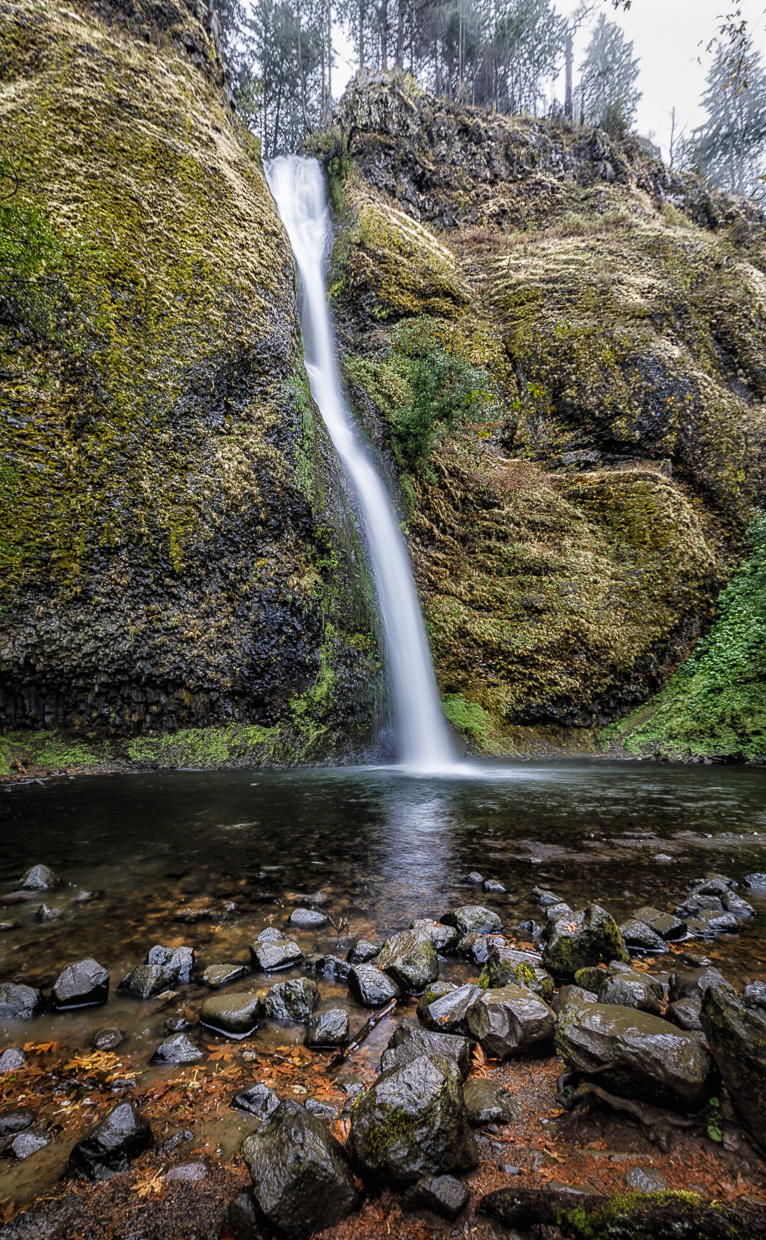
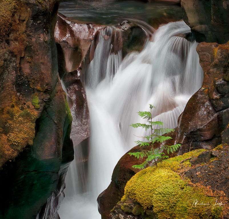
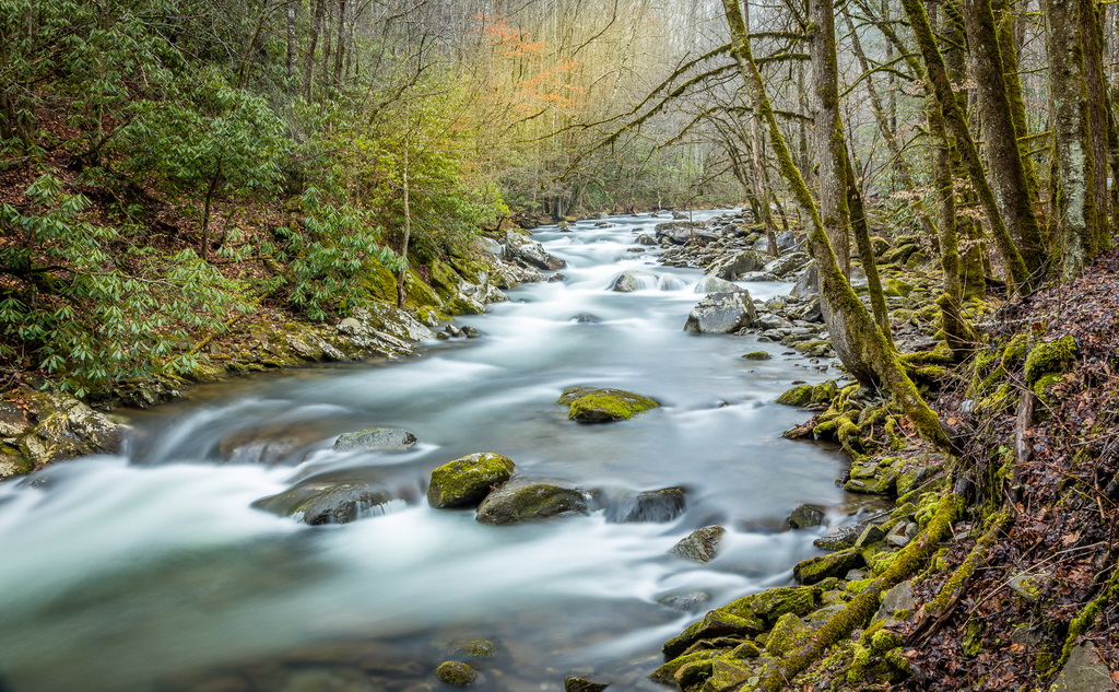
I like your choice of shutter speed which slows the water but still provides some detail in the flow. The trees and rocks frame the water and being able to see the stream ahead of the rapids work well for me. To my eye, the whole image is over saturated and does not look natural. I think you were trying to highlight the green color of the stream and the red in the rocks, but I would for sure tone down the green saturation of the trees. |
Jan 5th |
| 36 |
Jan 23 |
Reply |
Same for me. I use a variety of camera and lens covers depending on the severity of the conditions and always a UV filter any time I am near salt water, even on nice days. |
Jan 3rd |
| 36 |
Jan 23 |
Reply |
Here you go |
Jan 3rd |
 |
| 36 |
Jan 23 |
Comment |
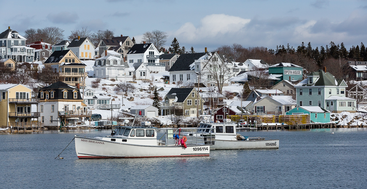
For me, the exposure and choice of shutter speed work very well with the lighting and water movement. I like the composition with the trees and fountains framing the sand sculpture. Being an anal finance guy, I would have preferred you move just to the right so the water fountains would be symmetrical. I always appreciate your explanations of the image |
Jan 2nd |
| 36 |
Jan 23 |
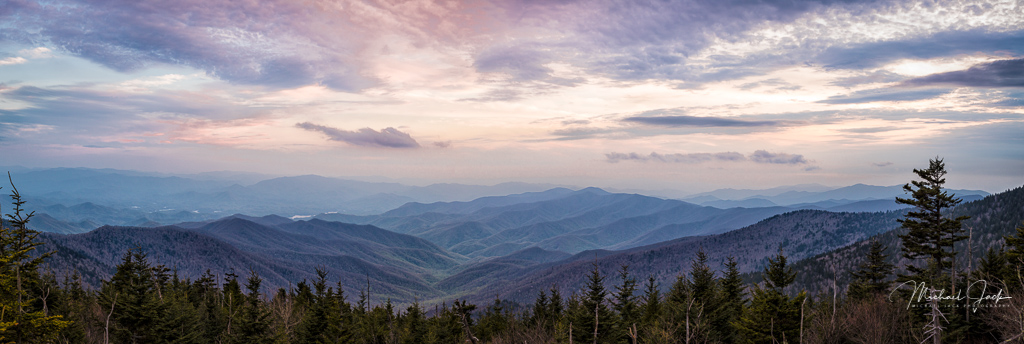
Comment |
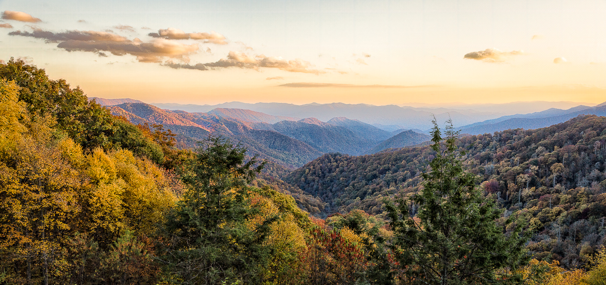
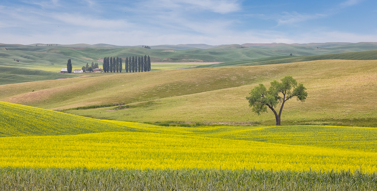
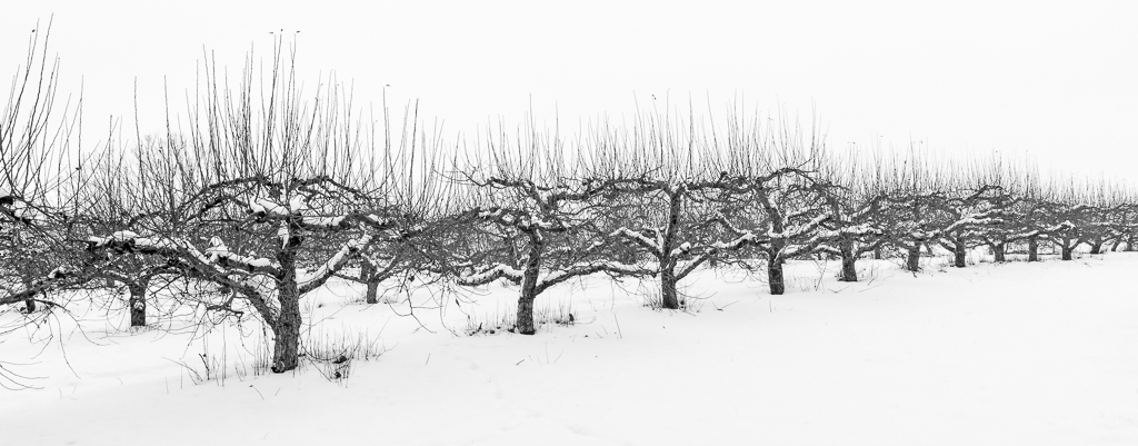
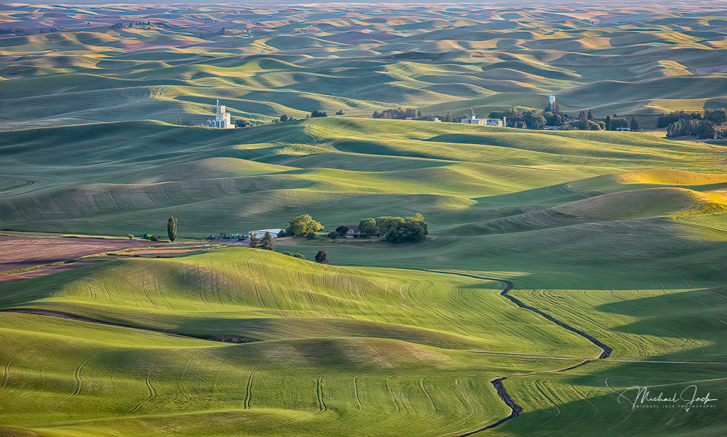
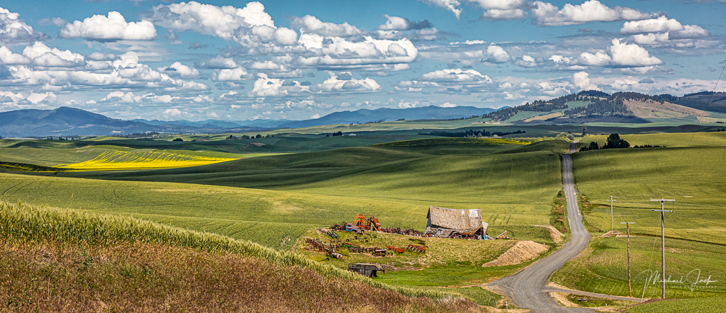
I like the composition and your choice of focal length which gives the road more presence. I also like the post processing. To my eye, many fall images are well over saturated so your choice to mute the greens,bring out the color and darken the end of the lane works very well in this image. |
Jan 2nd |
| 36 |
Jan 23 |
Comment |
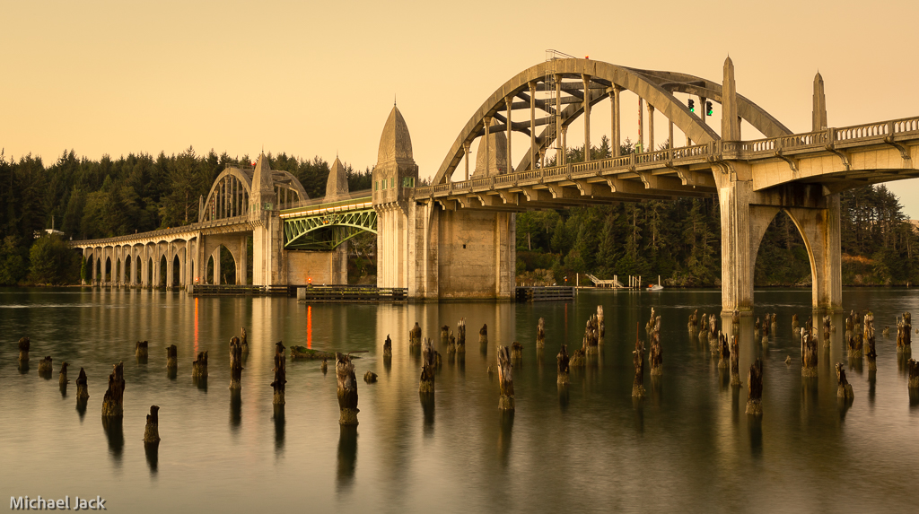
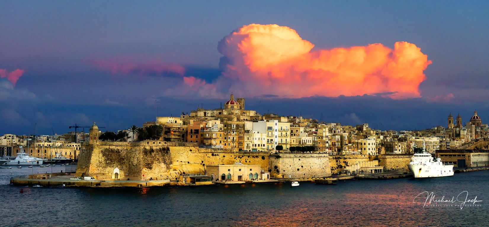
Actually, I found a sky I had taken that worked and substituted it. It is a much better image. |
Jan 2nd |
7 comments - 6 replies for Group 36
|
7 comments - 6 replies Total
|