|
| Group |
Round |
C/R |
Comment |
Date |
Image |
| 36 |
Sep 22 |
Comment |
I agree with Larry's comments about cropping and sharpening. Some of the letters almost look like they have a sharpening artifact. I like the variety of color in the buildings and where you cropped the bottom of the image. For me, I would consider straightening the vertical lines of the buildings. I agree with your intent to blur the mountain in the background, but to my eye the blur is too much so it appears artificial. I think the image tells a story about time that has passed. |
Sep 8th |
| 36 |
Sep 22 |
Comment |
I like the composition of the image with the upward slope of the hill, the background and the light on the ground in mid-scene but agree with Larry the houses on each side are a bit tight. I wonder if you could have tweaked the rainbow to draw out more of the colors - it looks overexposed to me. Great capture though. |
Sep 8th |
| 36 |
Sep 22 |
Reply |
This was my image. There is absolutely no detail in the sky, none. If I decided to do anything with this image, I would have to replace the sky. Compositionally, it does not compare to yours. |
Sep 5th |
 |
| 36 |
Sep 22 |
Reply |
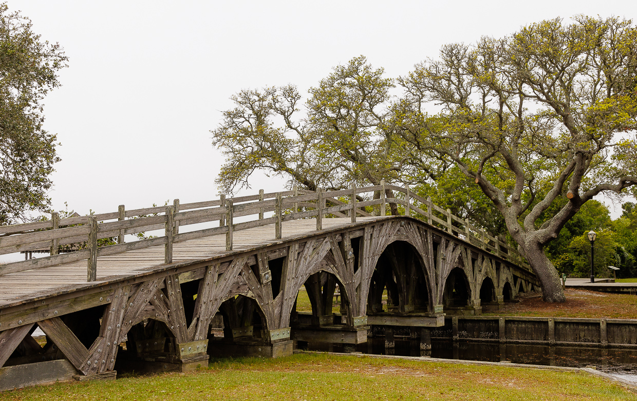
You made an artistic choice on the bridge so I would stay true to your own instincts. My thought was just an opinion based on my style. |
Sep 5th |
| 36 |
Sep 22 |
Reply |
I actually did not know you could open a thumbnail. Now that I see it large, what I thought was truncated was not. I now see what you mean by the house. I change my vote to the one you chose to share. I could not tell how close the camera was to the ground. It appears you realized the situation and did what you could. Cloning could be easy with a selection and content aware fill. I will look for my bridge image, but again it does not compare. |
Sep 5th |
| 36 |
Sep 22 |
Comment |
Great time of day and beautiful sky and reflection. I like the exposure and saturation. Regarding the larger image, I wonder if you could have included the whole Gazebo if you had lowered your camera. It appears the image was taken at almost eye level. The wood sides of the lake are good leading lines to the Gazebo. I would lean toward the thumbnail as taken, but the reflection of the bridge seems truncated as I can see it, but I think you had to include as much of the tree that you did. I was there in May, but your compositions of the bridge are far superior to mine. |
Sep 4th |
| 36 |
Sep 22 |
Comment |
I like the composition with the leading line of the road and the bridge on a thirds line. Contrary to Larry, the image looks almost oversharpened on my monitor. That must mean between me and Larry, you got it right.... I agree with Larry about the tight crop on the right. If possible, I might consider trying to tease out a bit of detail inside the bridge. Good choice about minimizing the sky. |
Sep 4th |
4 comments - 3 replies for Group 36
|
4 comments - 3 replies Total
|