|
| Group |
Round |
C/R |
Comment |
Date |
Image |
| 36 |
Jan 22 |
Reply |
The only thing I can think of immediately is to do some cloning if possible to block out part of the sky. Now that I look at the image again, another suggestion is to use the radial tool to bring out more detail in the area behind and next to the falls. The goal would be to more strongly draw the eye there. |
Jan 11th |
| 36 |
Jan 22 |
Comment |
Larry has made most of the points I would make including making the image a pano. The color palette does work well. My only other suggestion is slightly lightening the shadows of the wall and perhaps using the HSL red luminosity and saturation slider to highlight the structure at the point. |
Jan 10th |
| 36 |
Jan 22 |
Comment |
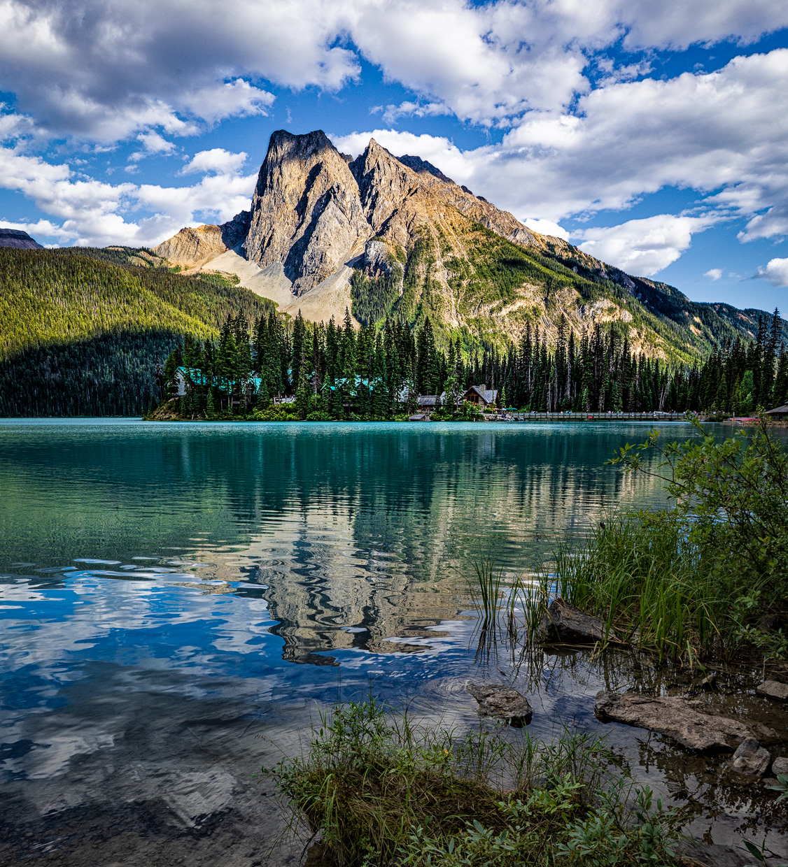
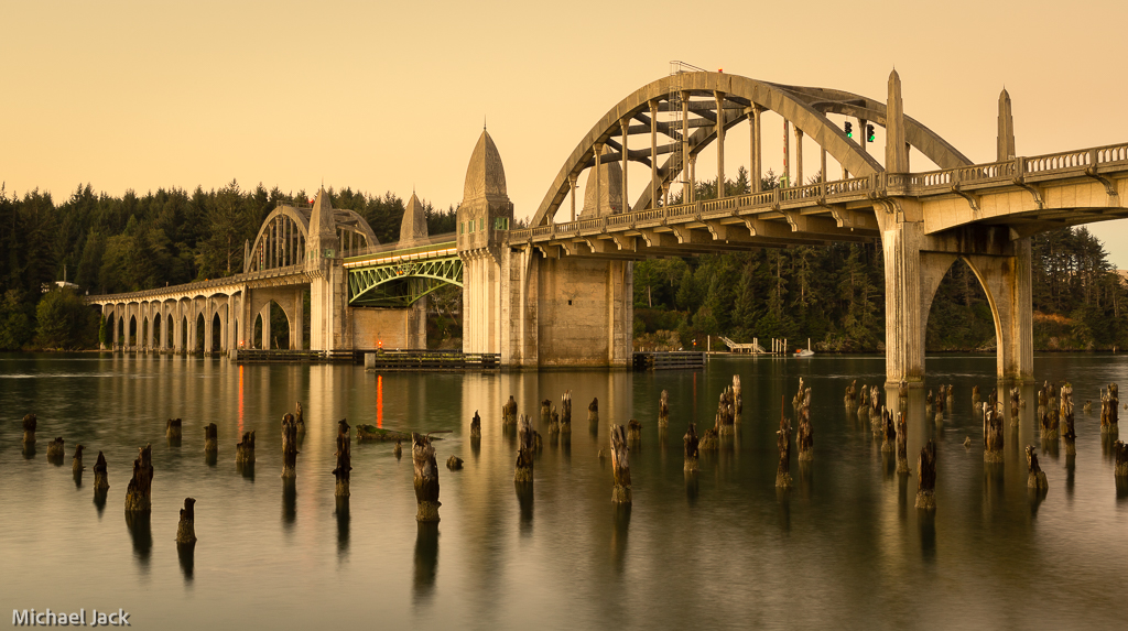
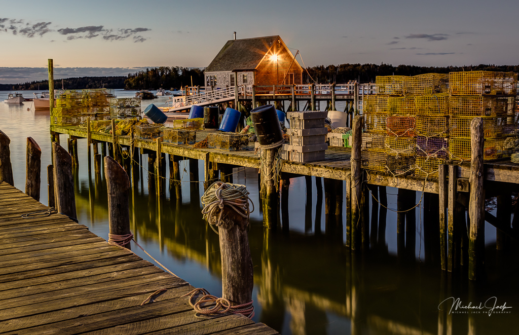
I like your composition with the positions of the schoolhouse and the boathouses, that the boathouses are straight and vertical, and the brightness of the schoolhouse. I agree with Larry that over all you could up the contrast. Have you used the whole tonal range from black to white? If not, that would help. To my eye it appears you have tried to lighten some of the buildings with a broad brush which makes the lighting uneven. I would consider cropping down the sky just a small amount. Again, great composition. |
Jan 10th |
| 36 |
Jan 22 |
Comment |
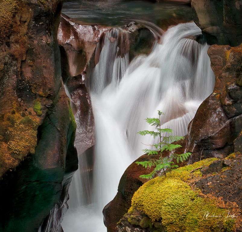
I think you described what your intention was, what works and what makes this shot excellent, so I have little to add. For me, I would like to see a little more breathing room at the top of the falls and maybe crop up some from the bottom to take the water line closer to the thirds line. |
Jan 10th |
| 36 |
Jan 22 |
Comment |
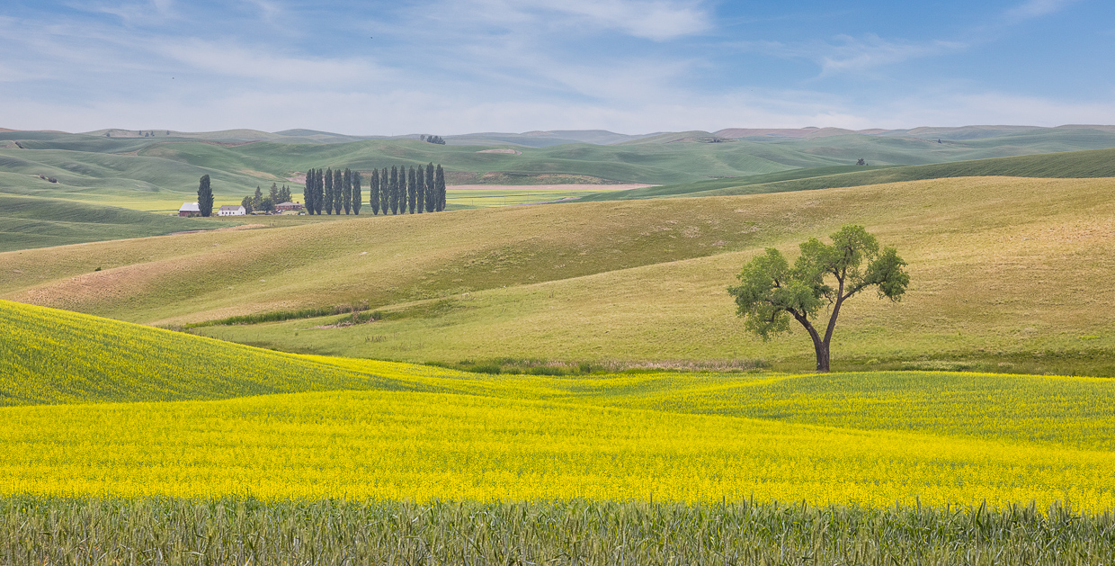
Well seen. The image almost has an ethereal effect. Adding an Orton effect may make it more so. I tend to agree with Larry and Arne - the brightness of the foreground grass is the first thing that draws my eye so taking some of the brightness away would draw attention to the tree. The eye likes contrast too so perhaps adding contrast just to the tree would also attract attention to it. Finally I would consider a subtle vignette to keep the eye within the image. |
Jan 10th |
| 36 |
Jan 22 |
Comment |
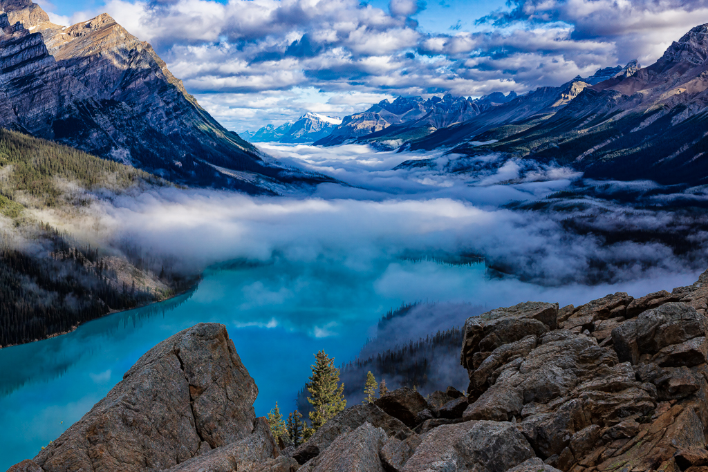
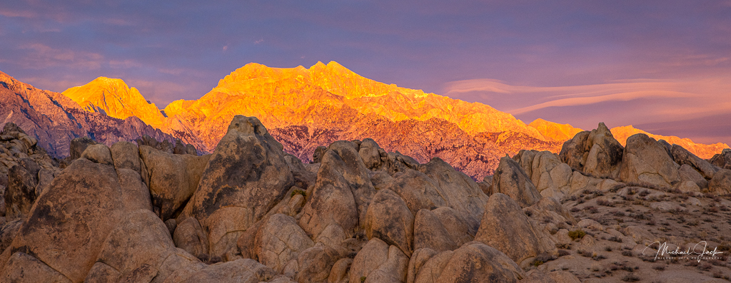
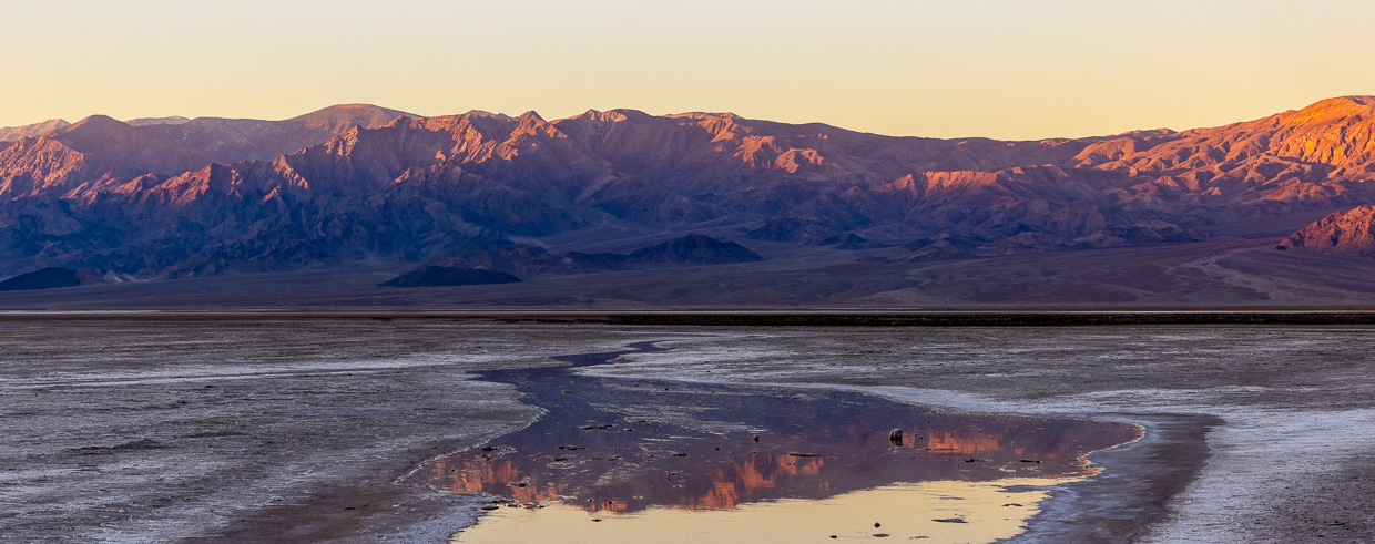
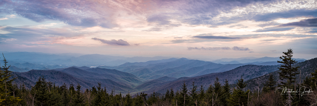
Sorry if I misled you all. The mountains are intended to be the main subject with the boulders as foreground. |
Jan 9th |
| 36 |
Jan 22 |
Comment |
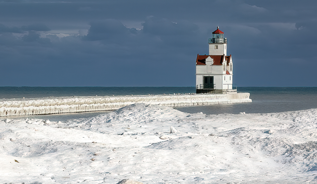
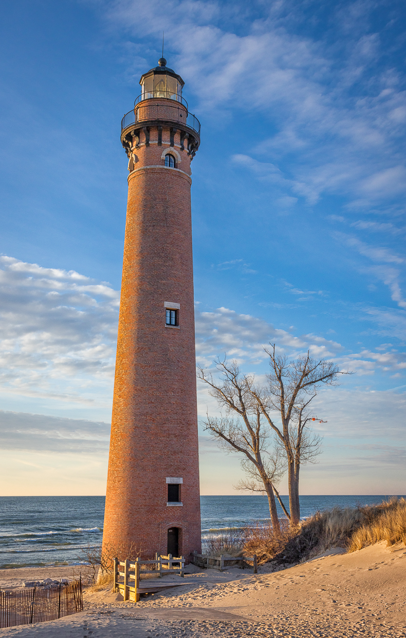
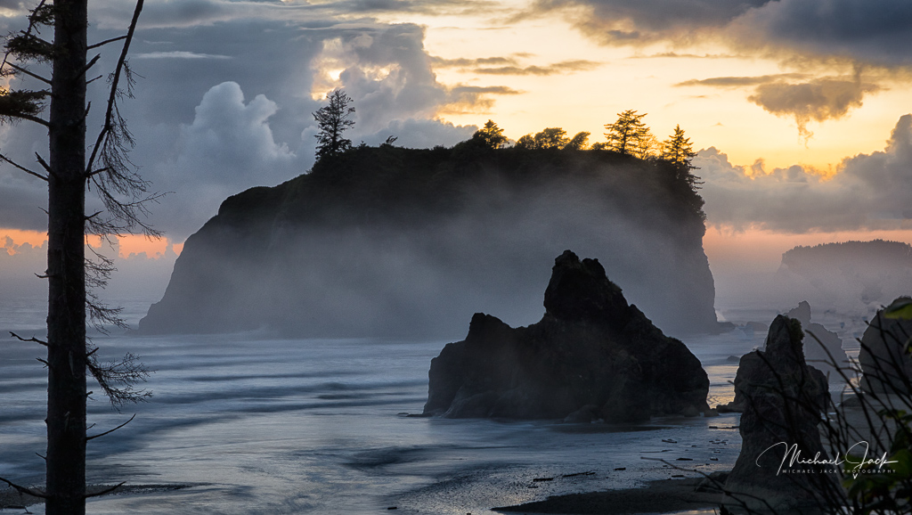
Love this image. Your patience really paid off to get the lighthouse framed between the exploding wave and the brightest cloud. Well done. Having the wave on the right is a good choice because the eye tracks the water moving from the right - almost like it is powering the exploding wave. To my eye there appears to be some artifacts at the edge of the cliffs like they were over sharpened, but it just could be my monitor. I would consider lifting the shadows of the lighthouse just a bit to make it jump out more. |
Jan 2nd |
| 36 |
Jan 22 |
Comment |
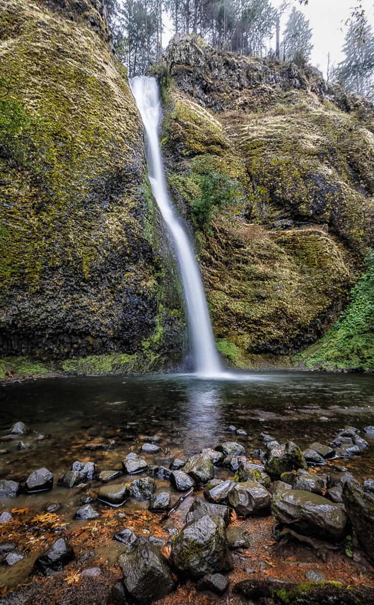
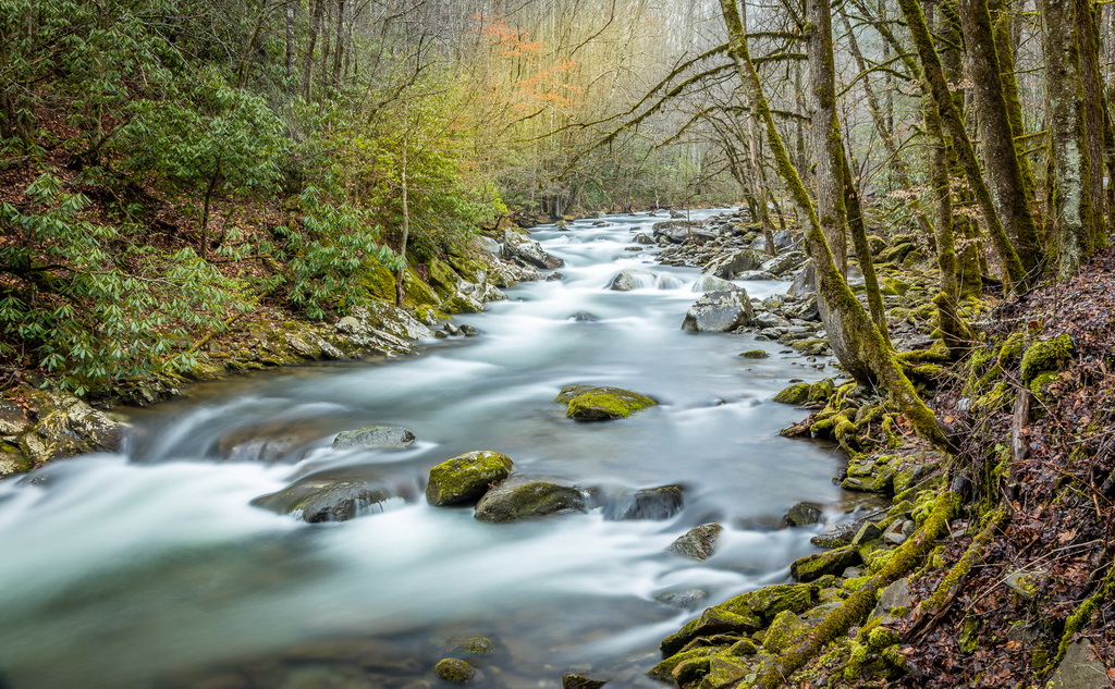
I like the composition with the diagonal view of the falls which adds energy to the image and the post processing choices you made to crop and add saturation. Including people adds perspective to the size of the falls. My initial reaction was that the image was a bit flat, but after seeing the original, I see you enhanced it. I would consider going slightly more in saturation and contrast. I have mixed feelings about shutter speed. You froze the dynamic action of the falls which tells the story of its power. To my eye, a shutter speed of say 1/4 second would still provide context but take the sharpness out of the water - just a personal preference. |
Jan 2nd |
7 comments - 1 reply for Group 36
|
7 comments - 1 reply Total
|