|
| Group |
Round |
C/R |
Comment |
Date |
Image |
| 36 |
Nov 21 |
Comment |
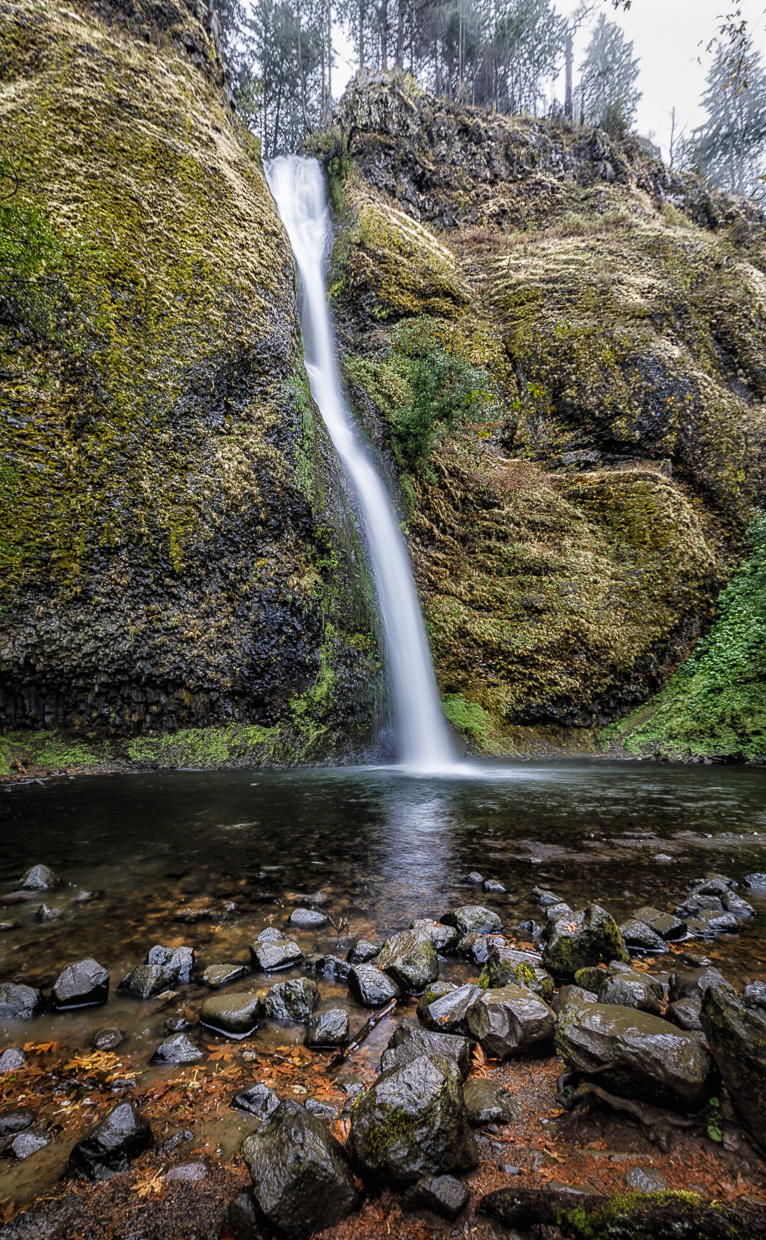
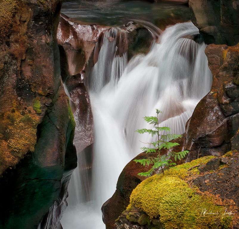
Nice work in getting sharpness throughout the image. I like your choice of shutter speed. I agree with Larry that overall, the waterfall feels a little crowded so slightly wider composition may have worked better. You may have been trying to avoid a bright area above the fall. You could change the blue of the water by using the hue sliders. The other colors in your image look good to my eye. |
Nov 7th |
| 36 |
Nov 21 |
Reply |
Clyde was honored by PSA in the Spokane festival (convention). His work is amazing. |
Nov 7th |
| 36 |
Nov 21 |
Reply |
If you have it, Topaz Sharpen AI works wonders as well. |
Nov 6th |
| 36 |
Nov 21 |
Comment |
Well framed.... For minimal processing, it is quite good. Some suggestions: Bring out a bit more shadow detail in the windows (unless there is noise there), In the HSL panel, see what increasing the orange luminosity and saturation to bring out the moss would look like (might be too distracting). Apply the dehaze filter to the image in the window. Sharpen a bit more overall. Again, suggestions of things to try. Nicely seen image. |
Nov 5th |
| 36 |
Nov 21 |
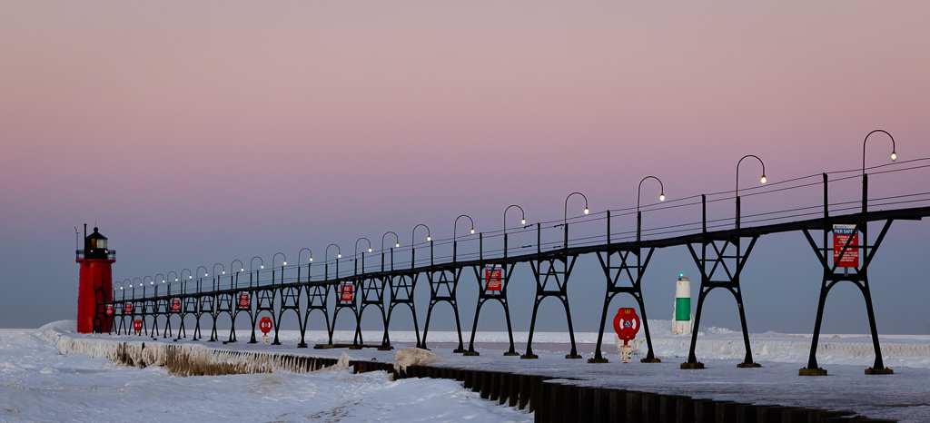
Comment |
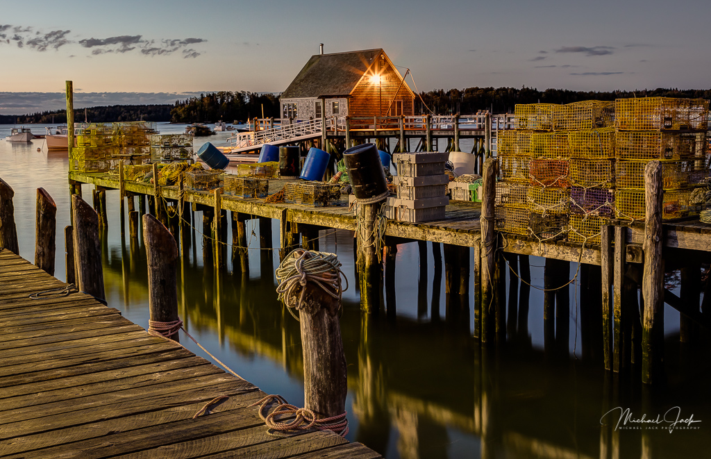
I agree your choice to place the image in the middle works in the image. It provides a sense of balance that would otherwise be awkward if you tried the rule of thirds for example. Some suggestions just for consideration: Add more contrast and ensure your histogram goes all the way to white and black points. Subtly dodge the pier (but not the bottom of the image) and add some texture/clarity. Crop the sky down from the top and add more drama to it (dehaze in LR). These should all be subtle. Again, some ideas. |
Nov 5th |
| 36 |
Nov 21 |
Comment |
This to me is a very well composed image, and the colors are eye-grabbing. Larry did pick up that the rose bud gets a bit soft beyond the area of focus so a smaller aperture or focus stacking would have helped. I would consider dodging the ice near the stem to lighten it and burning the bright part of the ice near the right edge of the image to keep the eye centered. |
Nov 2nd |
| 36 |
Nov 21 |
Comment |
This is well seen, and the swan adds interest to the image. I agree with Larry that I would consider dodging the building quite a bit since it is the main subject you want the viewer to focus on. I would also consider cropping in from the left, maybe between the two support structures, to move the building and swan out of the middle of the image to give it a little more energy. |
Nov 2nd |
| 36 |
Nov 21 |
Comment |
You are one brave soul.... I think your regret is a nit for this image. The dark area around the Madonna does separate her from the tree behind which to my eye works well. I also like the composition. A couple of suggestions - the tree on the left is a bit brighter than the Madonna so I would consider making the Madonna the brightest subject in the image. I would also consider subtly darkening the trees at the top to keep the eye from moving out of the image. You can bet on one else will be brave enough to get this shot. |
Nov 2nd |
| 36 |
Nov 21 |
Reply |
The full tonal range exists in this image but your point is well taken. It could be improved by changing the tone curve manually |
Nov 2nd |
6 comments - 3 replies for Group 36
|
6 comments - 3 replies Total
|