|
| Group |
Round |
C/R |
Comment |
Date |
Image |
| 36 |
Sep 21 |
Comment |
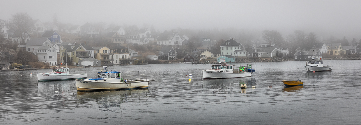
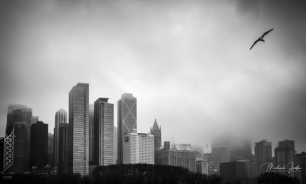
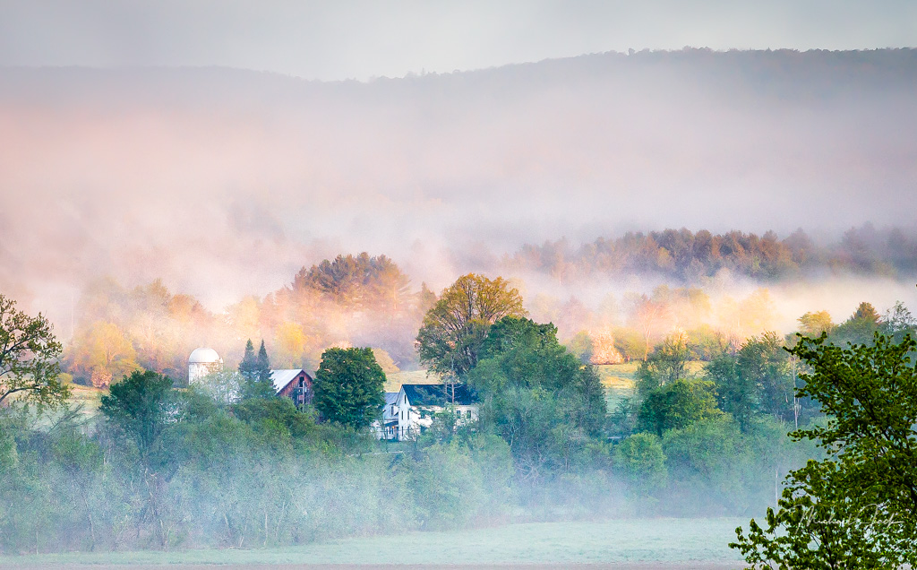
I think this is well composed with the interest of the birds coming into the image and the surroundings which add a sense of place. I like what you did with the color palette - the warm sky and cool fog and water. To my eye the birds look sharp which is good. My only suggestion is to crop up to eliminate the water detail at the bottom of the frame and just crop into the fog, maybe then darkening the bottom of the fog in the image. My eye gets attracted by the contrast in the water which is a distraction in the image for me. Really nice post processing work |
Sep 10th |
| 36 |
Sep 21 |
Comment |
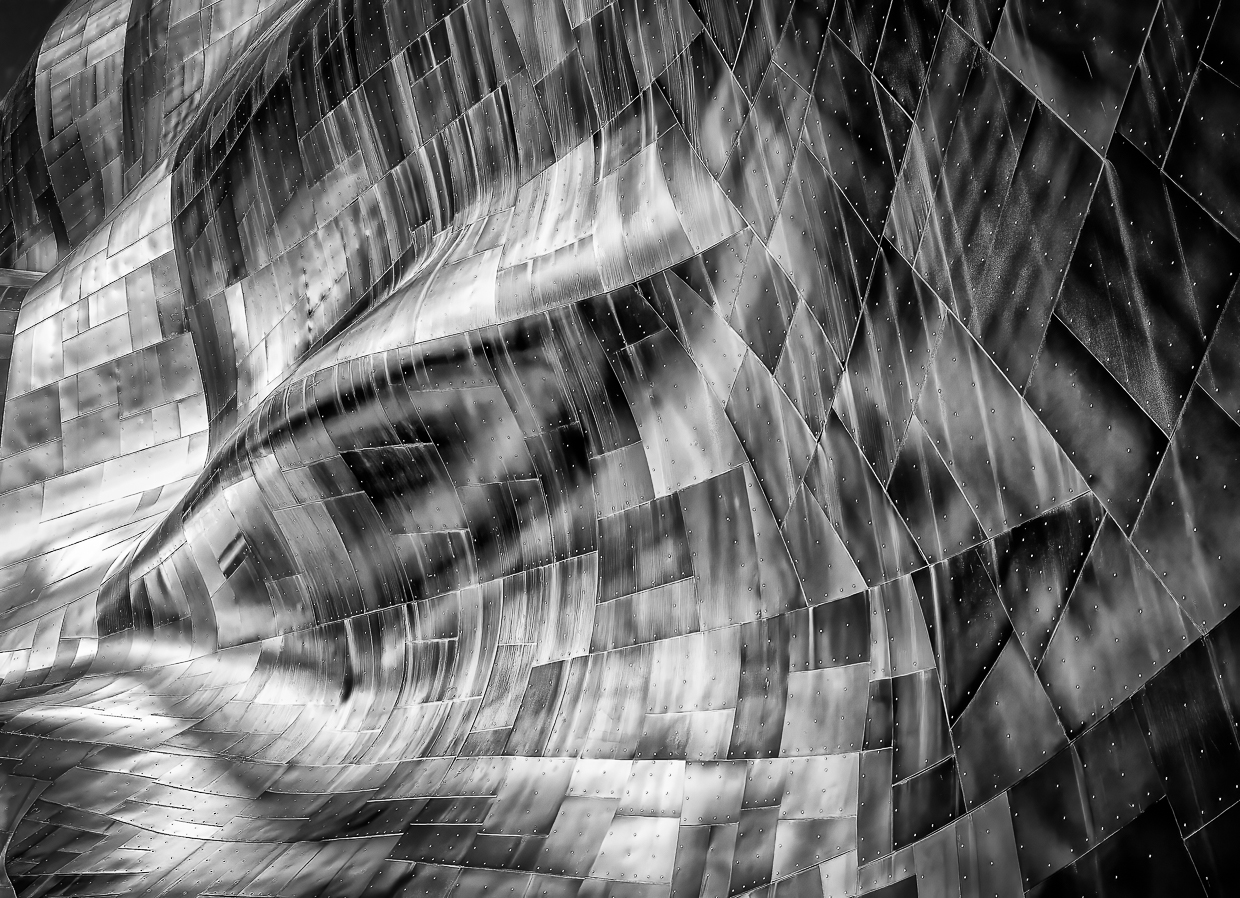
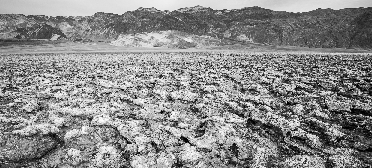
I like the composition of this image - the diagonal lines leading up the hill to the pyramid, the inclusion of the house on the lower left which to me is a start of a story for this location. However, I think it would have been better in color instead of B/W. There are too many tones of the same level which makes the image look very flat to me. I would consider upping the contrast and dodging and burning parts of the image - lightening the houses and pyramid and darkening other parts. A friend suggested an approach to determine B/W or color. Pretend color is a volume control - low volume means probably B/W but high volume means the color makes the image so stay with color. |
Sep 10th |
| 36 |
Sep 21 |
Comment |
I like the warm tones signifying morning and the exposure which is consistent with time of day. The foreground flowers are balanced by sections of the wall. The backlite flowers makes the flowers pop. If it were my image, I think I would have considered including more of the wall on the left in the image rather than cutting it off and just subtly adding some detail in the dark shadow area just under the tower. Nicely seen |
Sep 5th |
| 36 |
Sep 21 |
Comment |
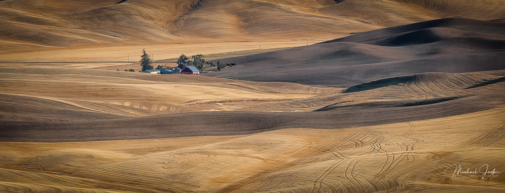
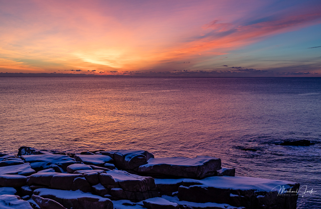
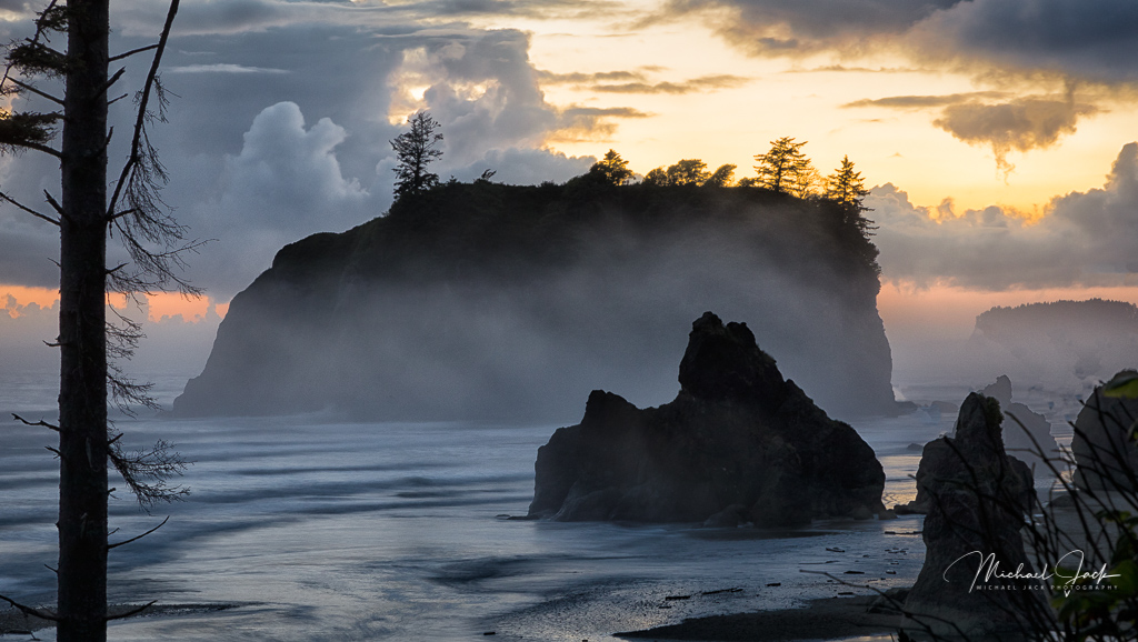
I like the composition with the curved line of the cliffs and the ridge of the cliff both pointing to the sea stack. The amount of sky left in the shot appears appropriate to me. Some suggestions to consider. I might try cropping in some from the right to see how that would look, reducing the highlights of the grasses in the lower right part of the image (which pulls my eye there), and just subtly increasing the exposure of the sea stack to more effectively pull my eye there. If you had a chance for a do over, you might consider reducing the shutter speed to 1/4 to 1 sec to capture more action in the waves as they receded. |
Sep 2nd |
| 36 |
Sep 21 |
Comment |
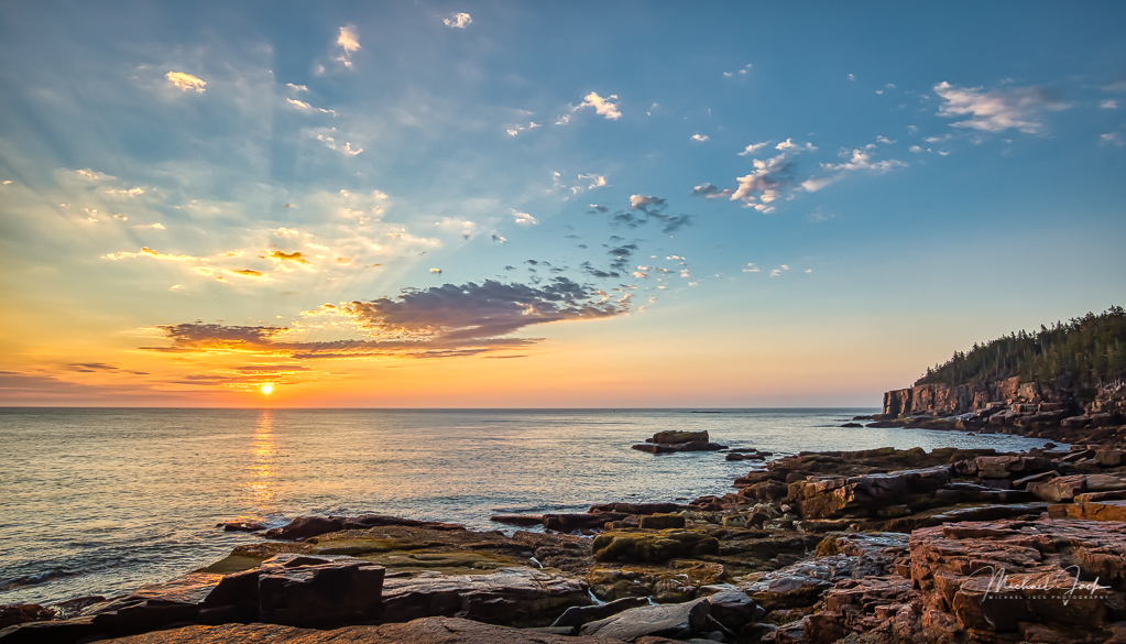
Incredible story as always. I think you achieved your objective. The complimentary warm and cool colors add interest to the image. Having said that, this image might look powerful in B/W as well. Capturing waves as they receded is effective. The only question I have is as I view the image it seems to be leaning left. It might just be an optical illusion |
Sep 2nd |
| 36 |
Sep 21 |
Comment |
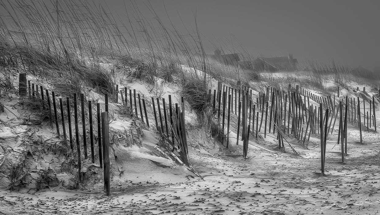
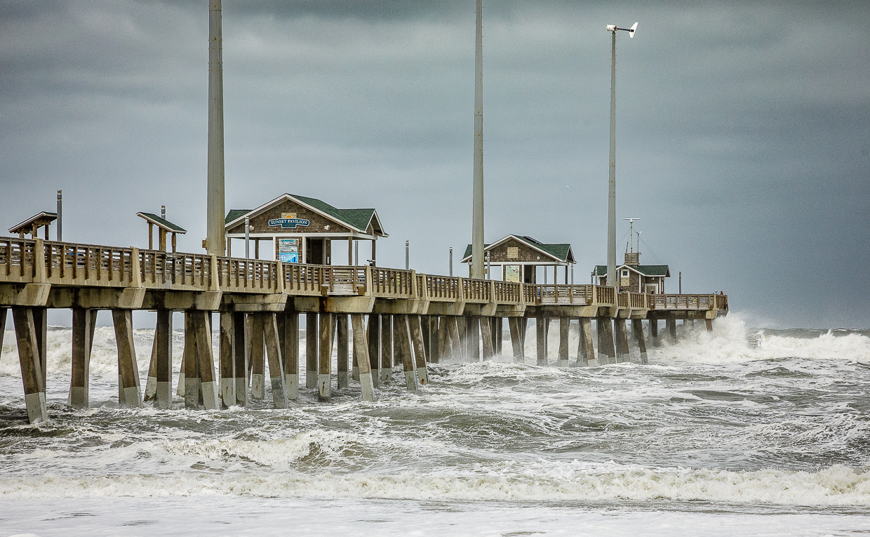
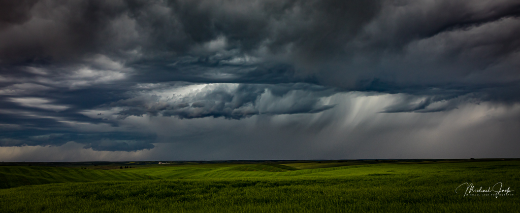
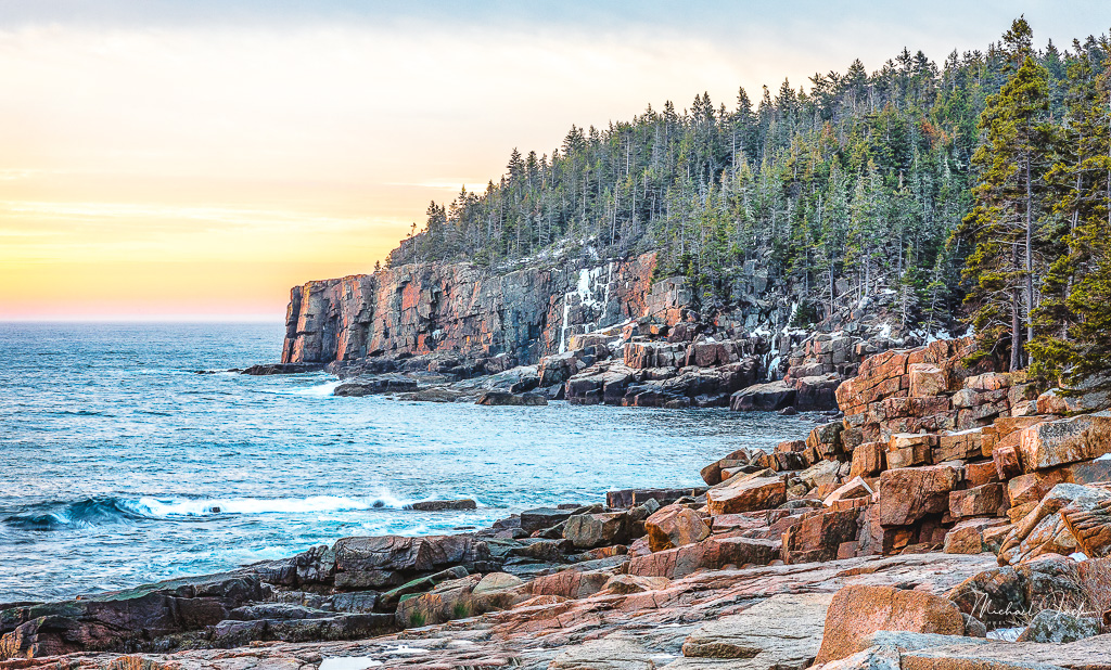
This gives a real sense of the incoming storm. Including the sea grass as you have shows the effect of the wind, and I can almost feel blowing sand - nicely composed. This image looks natural as is. A minor suggestion is to slightly darken the upper left and lower right lighter areas to keep the eye in the image. If this were my image, I might add a bit more drama to the sky by applying the dehaze filter, but that is just a personal choice. |
Sep 2nd |
6 comments - 0 replies for Group 36
|
6 comments - 0 replies Total
|