|
| Group |
Round |
C/R |
Comment |
Date |
Image |
| 36 |
Jun 21 |
Comment |
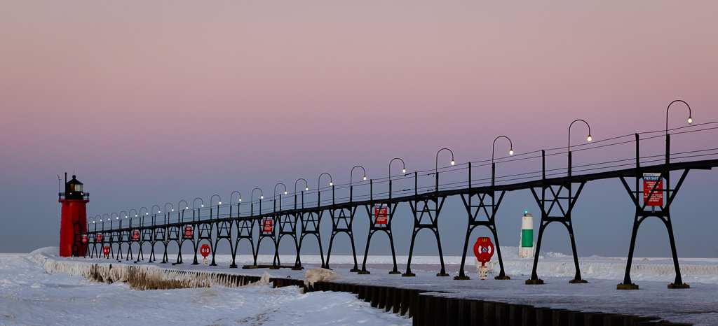
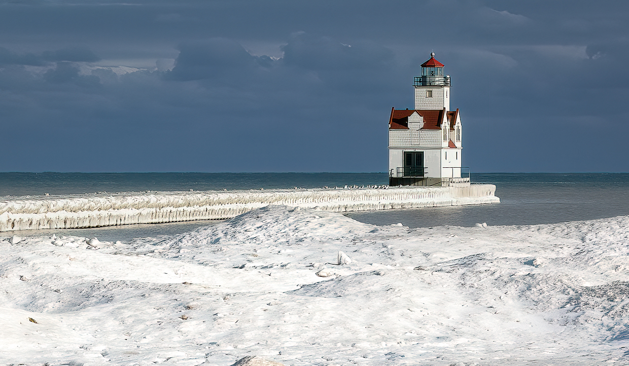
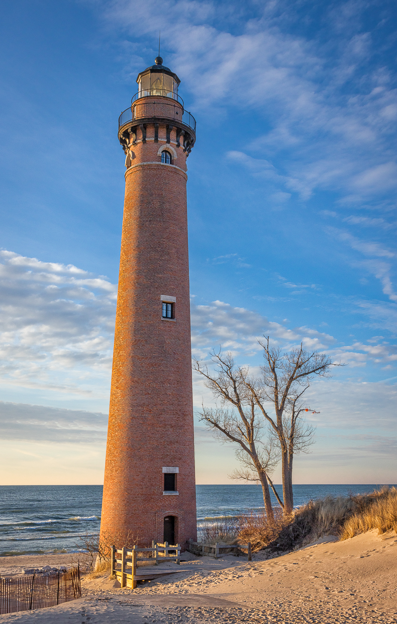
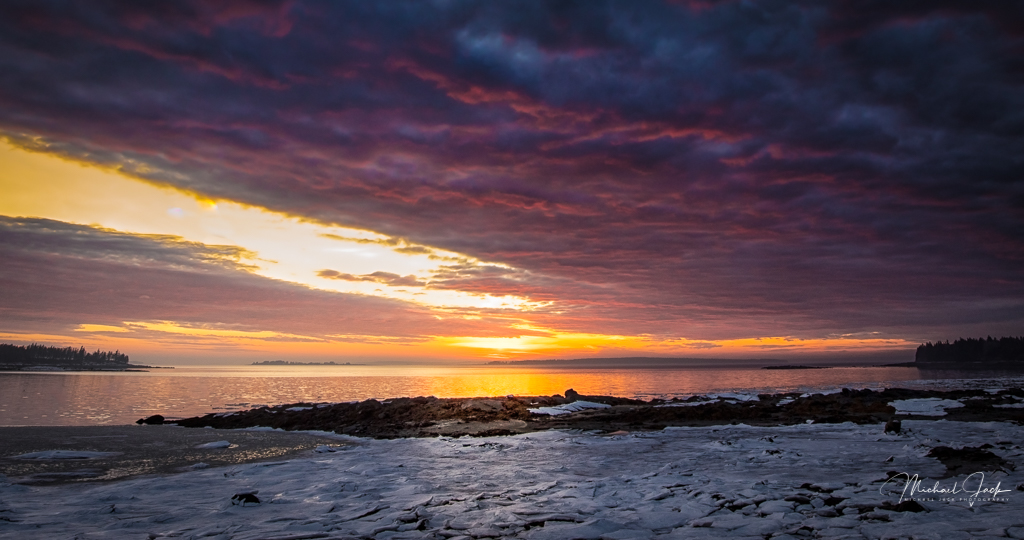
This is a tricky image to expose correctly. It appears you nailed it. I like the composition of the diagonal line of the cliffs leading up to the lighthouse. The small group of rocks balance the weight of the lighthouse to my eye. I would agree with Larry about eliminating the sky and darkening the bottom right corner, maybe with the linear gradient tool. If you do that, I would consider slightly darkening the top of the image also with a gradient to keep the eye in the middle of the image. Good use of DOF too to get the whole image sharp. |
Jun 13th |
| 36 |
Jun 21 |
Comment |
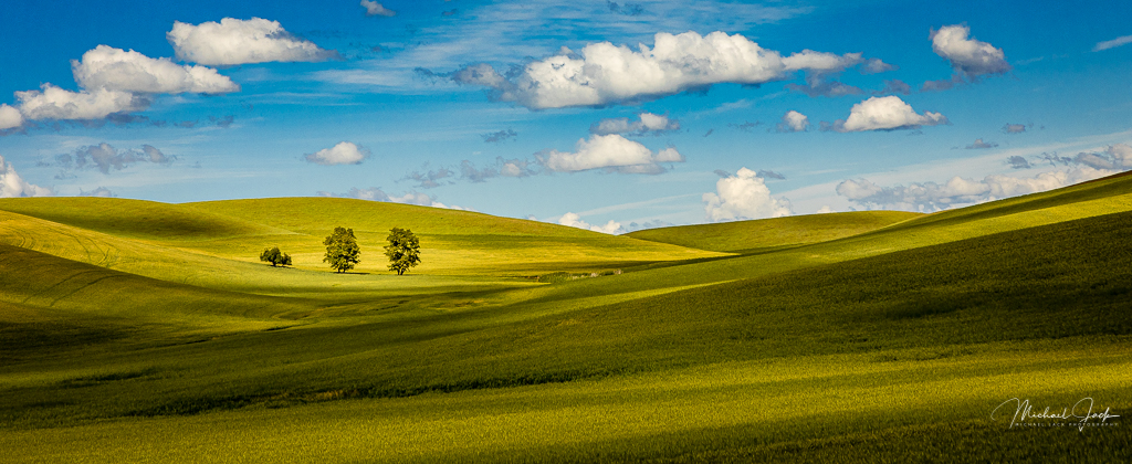
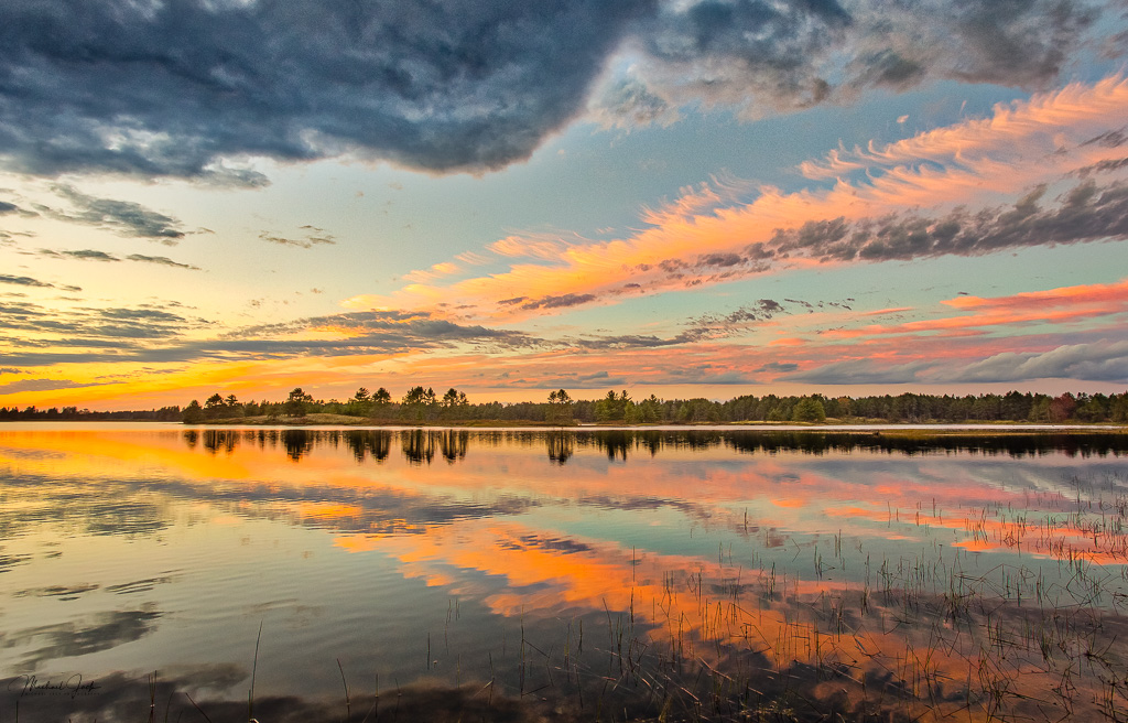
I agree with most of the previous comments. Great color, nicely processed. I like the sharpness of the trees and the distant mountains not being sharp to confirm the sense of distance. The foreground trees provide a sense of depth. The sun and large trees on the right provide balance in the composition. |
Jun 13th |
| 36 |
Jun 21 |
Reply |
We shoot there too. The spot you mentioned is the sunrise spot. If you go onto the Parkway from the Wears Valley entrance and go past the cantilevered part of the road to the parking area (maybe 5 miles), you can get to a sunset spot although the sun sets behind the mountain part of the year. |
Jun 3rd |
| 36 |
Jun 21 |
Comment |
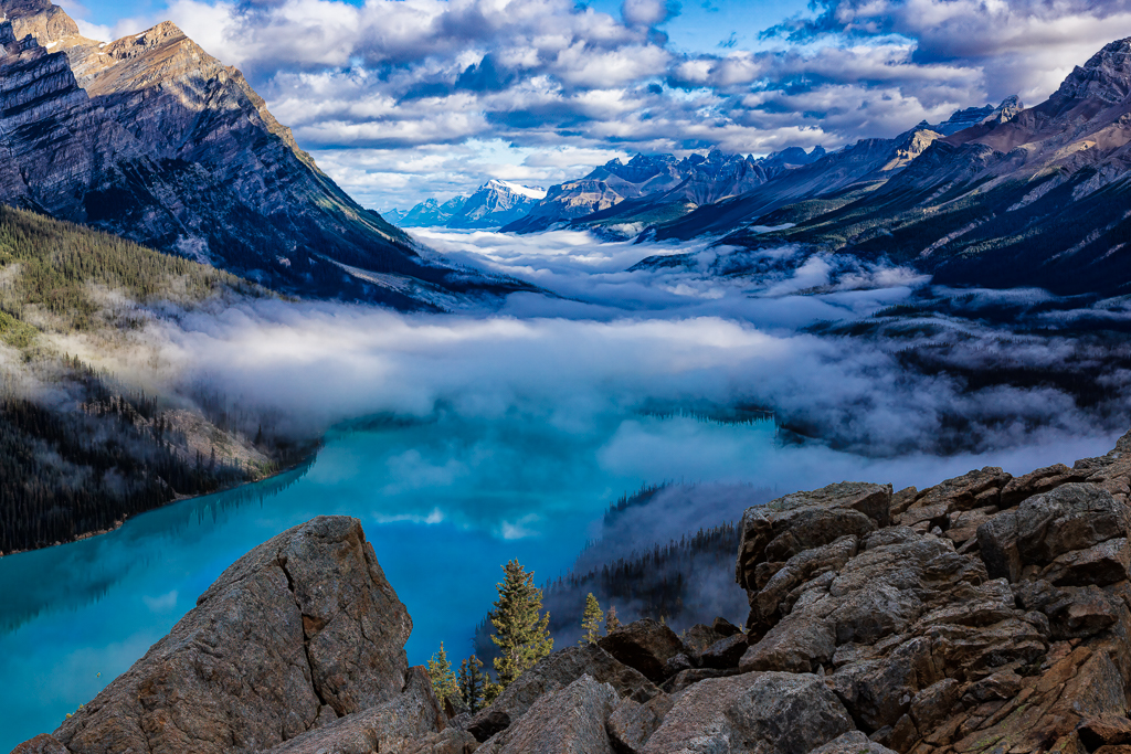
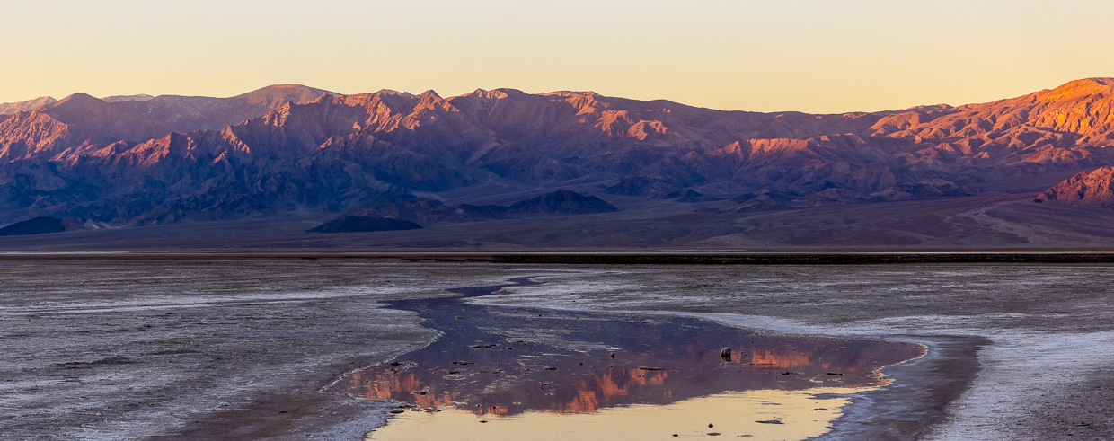
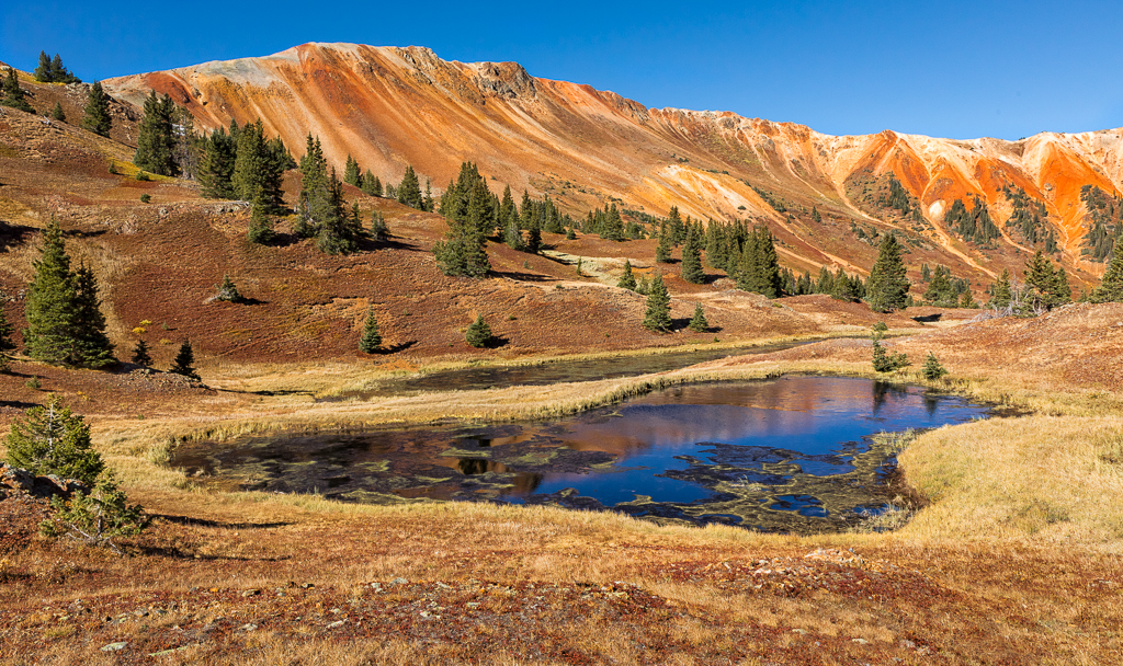
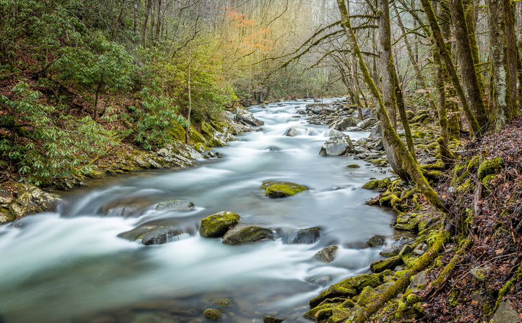
This has wonderful complementary colors. The s-curve of the riverbed leads the eye into the mountains and adds a lot of interest and energy to the image. I like that the bottom of the image is dark which forces my eye up to the mountains. It appears to me that the closest mountains are really soft (could be my how the image is displayed on my monitor) which may be the results of handholding for the lighter images. I would consider a crop up from the bottom, but that is just me. |
Jun 3rd |
| 36 |
Jun 21 |
Comment |
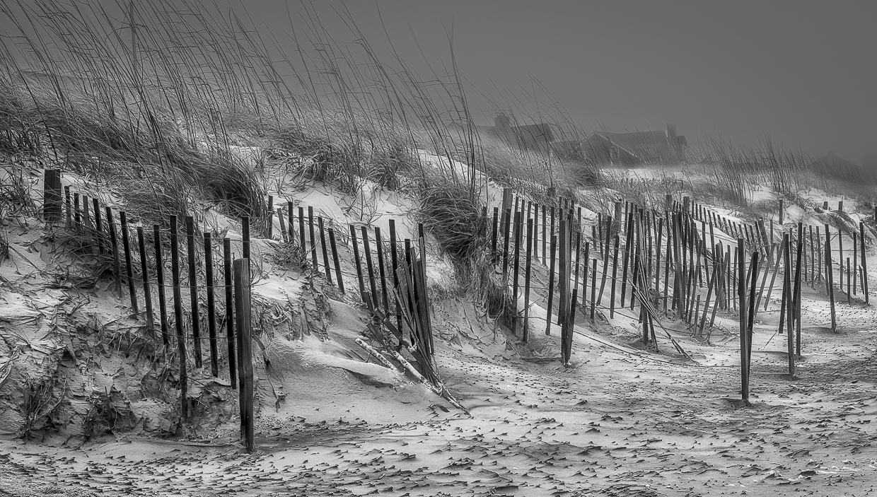
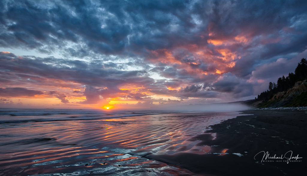
To me this is a well seen image. I like the curve of the black sand and the white of the ocean waves leading my eye through the scene. The image appears technically well done. A few suggestions - I would crop in just a bit more from the left to eliminate the grass - the green (most attractive to the human eye although some argue red) is a distraction for me. I would consider cropping down a bit from the top or adding some more impact to the clouds. Finally, I would consider bringing out just slightly more details from the shadows of the rocks. |
Jun 3rd |
| 36 |
Jun 21 |
Comment |
This is absolutely an incredible piece of work. Wonderful post processing. The image is fantastic. The color palate is well chosen. Lighting is very well done. If I had a suggestion it would be to reduce the number of visible stars but this is just a stellar image. |
Jun 3rd |
| 36 |
Jun 21 |
Reply |
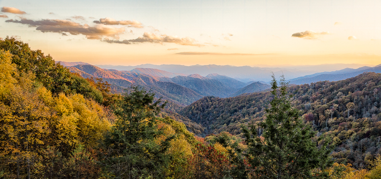
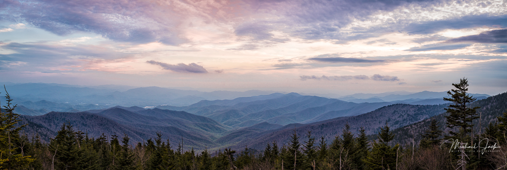
I think I have over 1000 images from Morton's overlook. So many we have stopped going there, but I agree it is one of the best places in the park for a sunset shot. This was sunrise. I think the comments about the trees are fair, but there is no place to exclude them from this location. If you have not been to the Smokies recently, there is a lot of growth that is getting in the way of a lot of shots. |
Jun 3rd |
5 comments - 2 replies for Group 36
|
5 comments - 2 replies Total
|