|
| Group |
Round |
C/R |
Comment |
Date |
Image |
| 36 |
May 21 |
Comment |
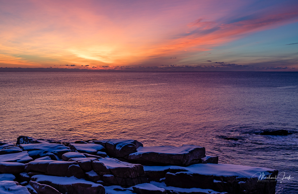
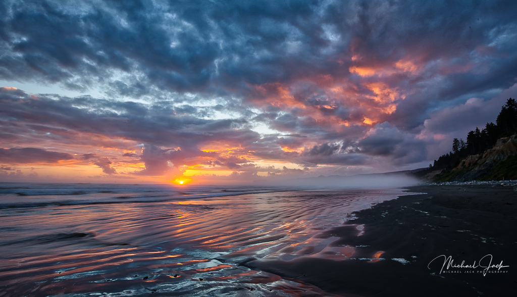
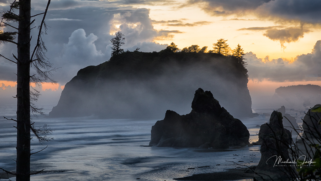
The exposure was probably a challenge and is nicely managed for the scene. I echo Larry's comments about the colors creating color impact in the image. The waves form an effective leading line to the sun. Sometimes, capturing water receding after a wave comes in has a lot more texture and interest, but that may have competed with the sunrise so photographer's choice. I think the way you captured the waves added a lot of energy to the image. If it were my image, I could consider brightening the whites of the waves slightly and cropping out some of the blue sky. Kudos to you for hanging in after a night shoot. |
May 8th |
| 36 |
May 21 |
Comment |
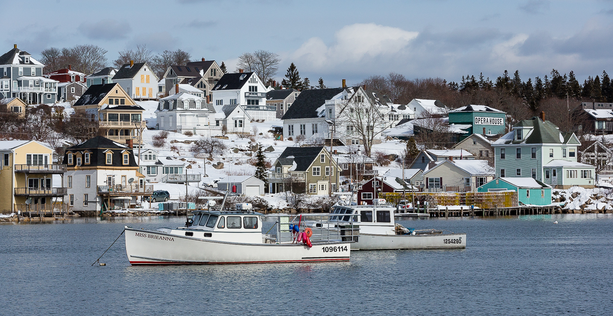
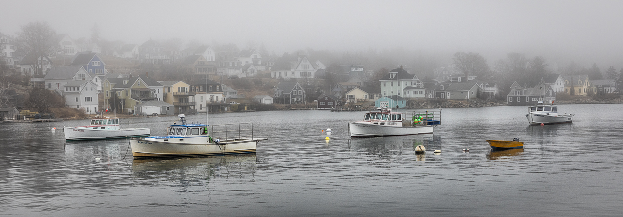
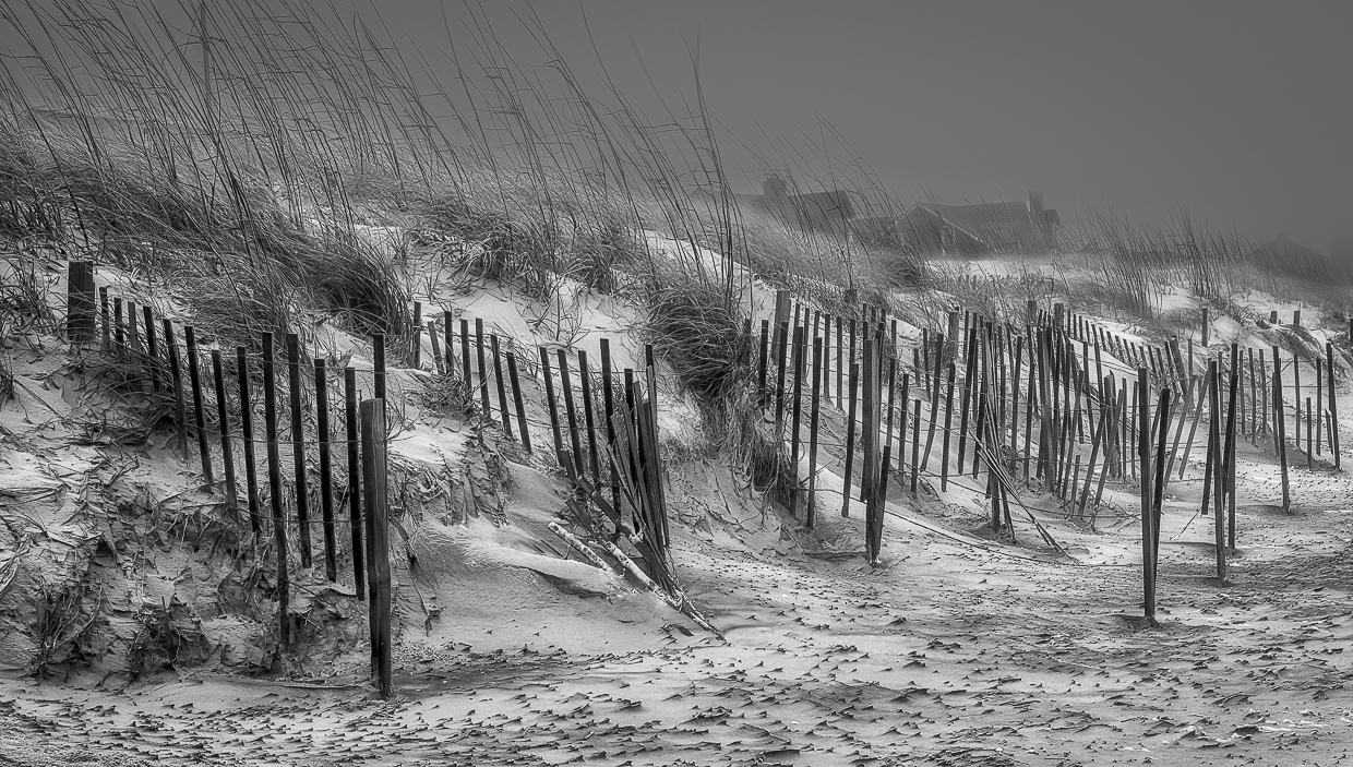
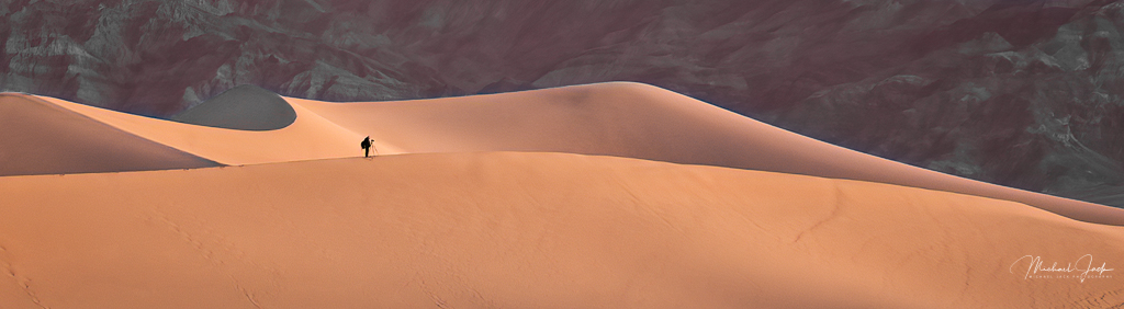
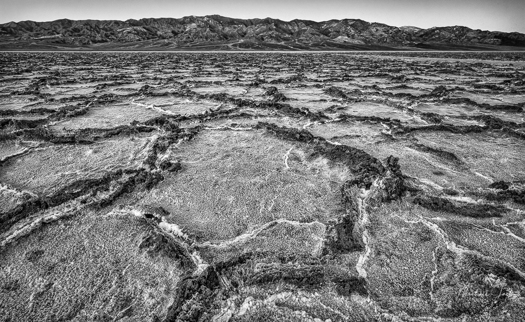
Your comments about the sand are interesting. I entered this image in a competition where one of the judges comments was there was too much texture in the sand.... Go figure. |
May 8th |
| 36 |
May 21 |
Comment |
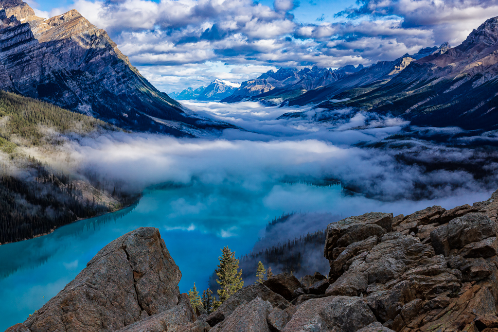
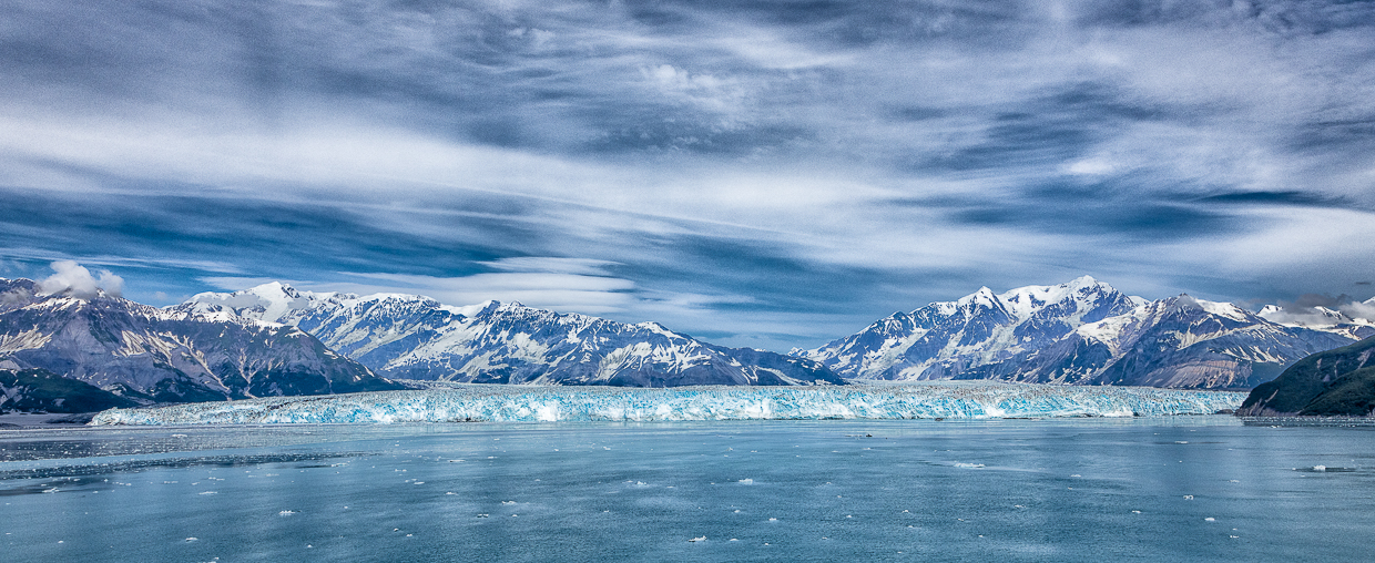
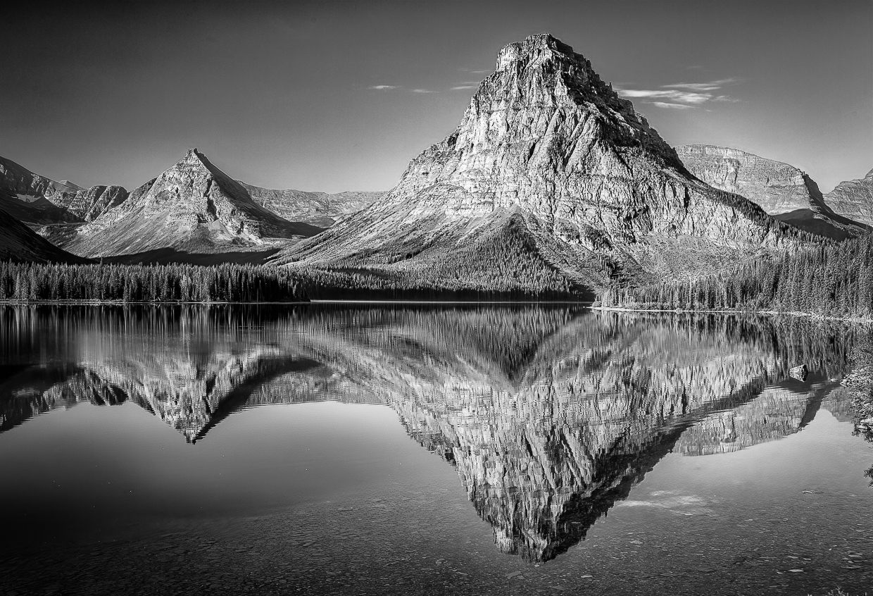
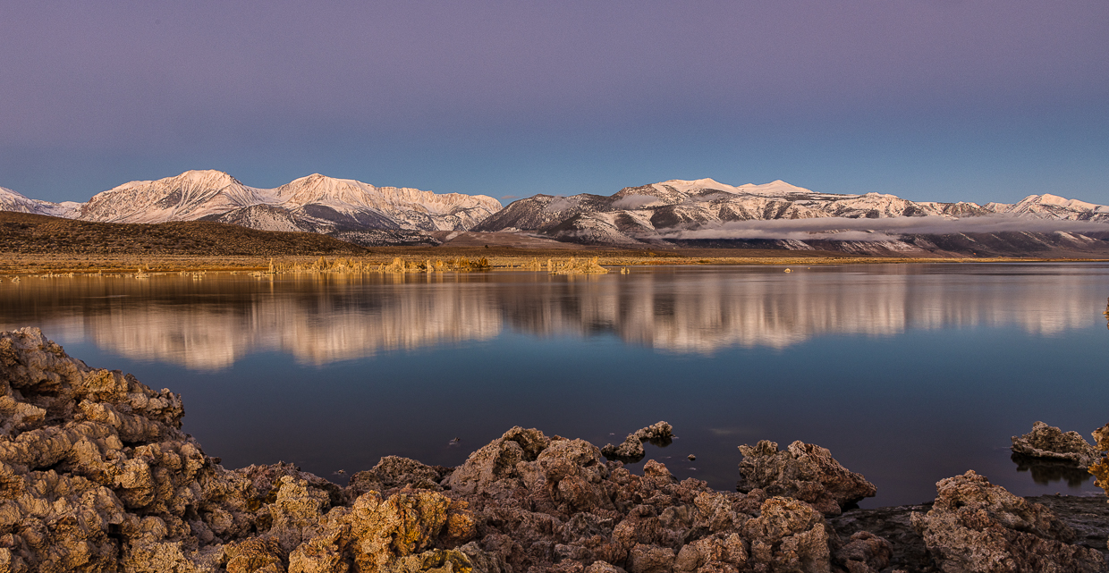
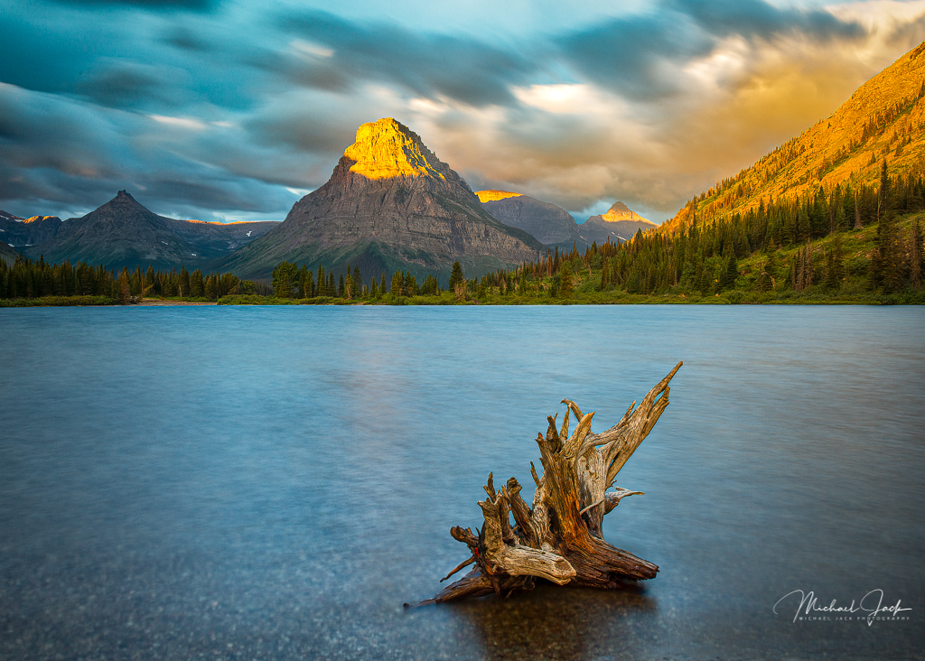
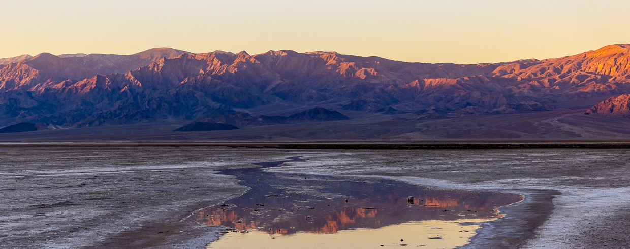
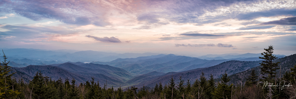
You have several triangular shapes in this image which really add interest - the V of the mountains and the reflection in the water. Now the Barbara mentioned the horizon line, the power of suggestion makes it seem a bit off to me too. It may not be - just the effect of the reflection. Good choice of aperture. I like the way the rocks in the foreground act as leading lines to the mountains. My only suggestion is if you had a chance to shoot something like this again is to add a polarizing filter to reduce the brightness of the reflection and bring out more contrast detail in the clouds. |
May 8th |
| 36 |
May 21 |
Comment |
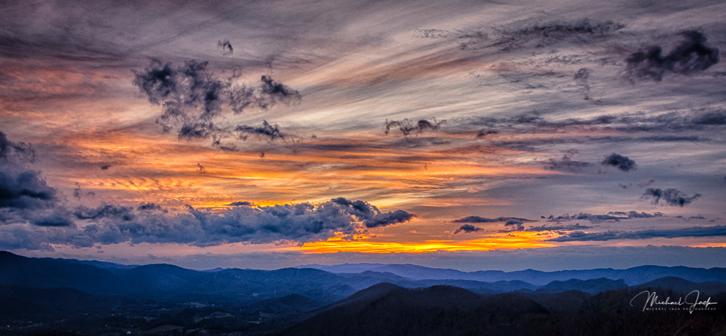
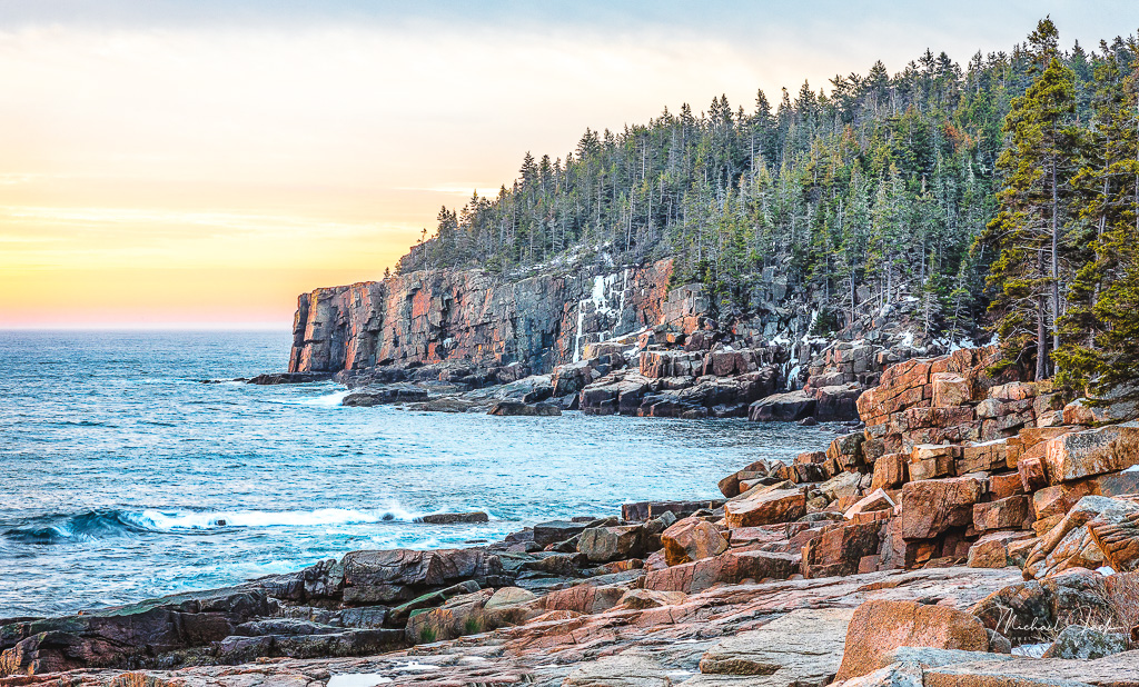
I like your composition with the diagonal line of the cliffs receding into the distance and the post processing you did to add the sky - but cropped down - and bring out more detail in the cliffs. To my eye it appears the wide aperture cost you sharpness in the distance beyond the effect of the haze. Also to me, it appears the top of the cliffs are unnaturally darker so I would consider bringing up the exposure to match the lower level (like the tonal range in the original image). I think your image is superior to the one I took when I was there. |
May 8th |
| 36 |
May 21 |
Comment |
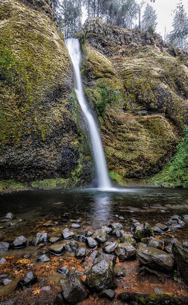
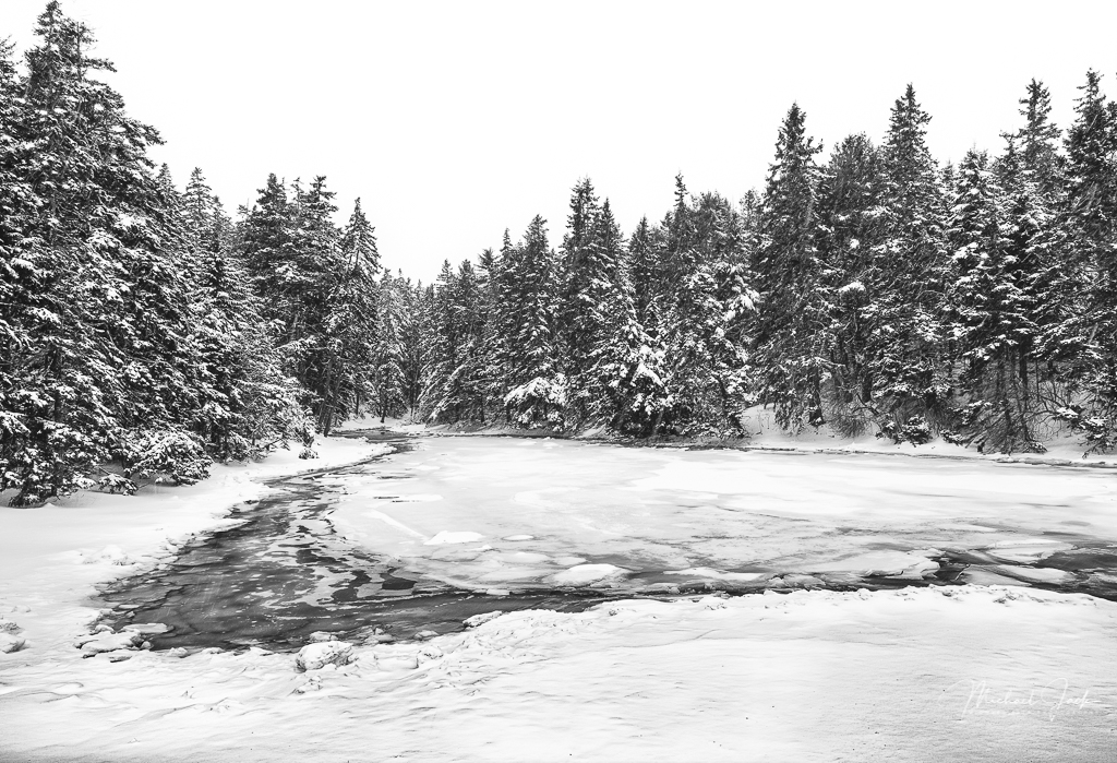
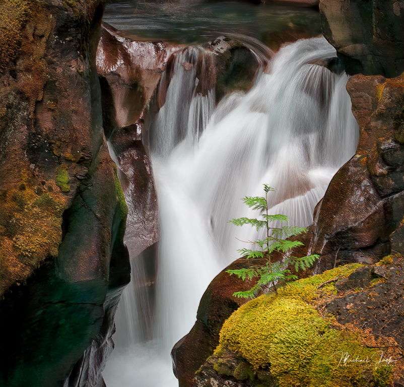
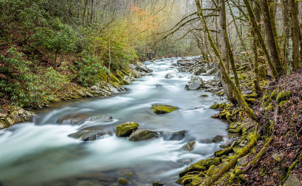
I like how you positioned the water to flow diagonally across the image and flow out the right side and also left enough room of the water flow on the left to let my eye complete the image. I agree with Larry that the darkening of the sky looks artificial. You might try going to the HSL sliders and reducing the luminance of blue instead. The human eye sees about 1/60 sec so your shutter speed is close to what we see. If you really wanted to capture details you might consider something closer to 1/500 sec. It appears to my eye that some detail is lost in the water and snow on the mountain. You might consider playing with an adjustment brush to go over these areas and add clarity (and dehaze if you have it) to see if that helps. Nicely seen composition though. I envy where you live. |
May 8th |
| 36 |
May 21 |
Comment |
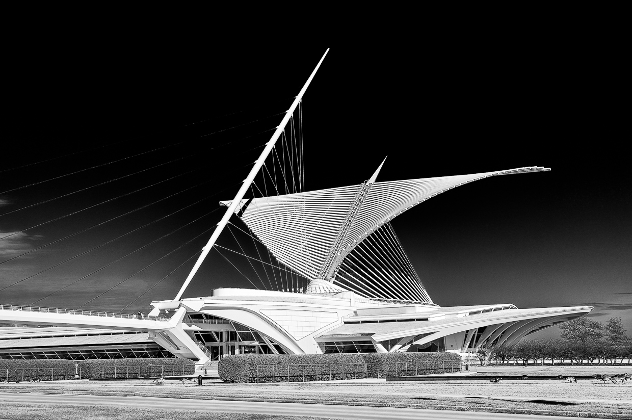
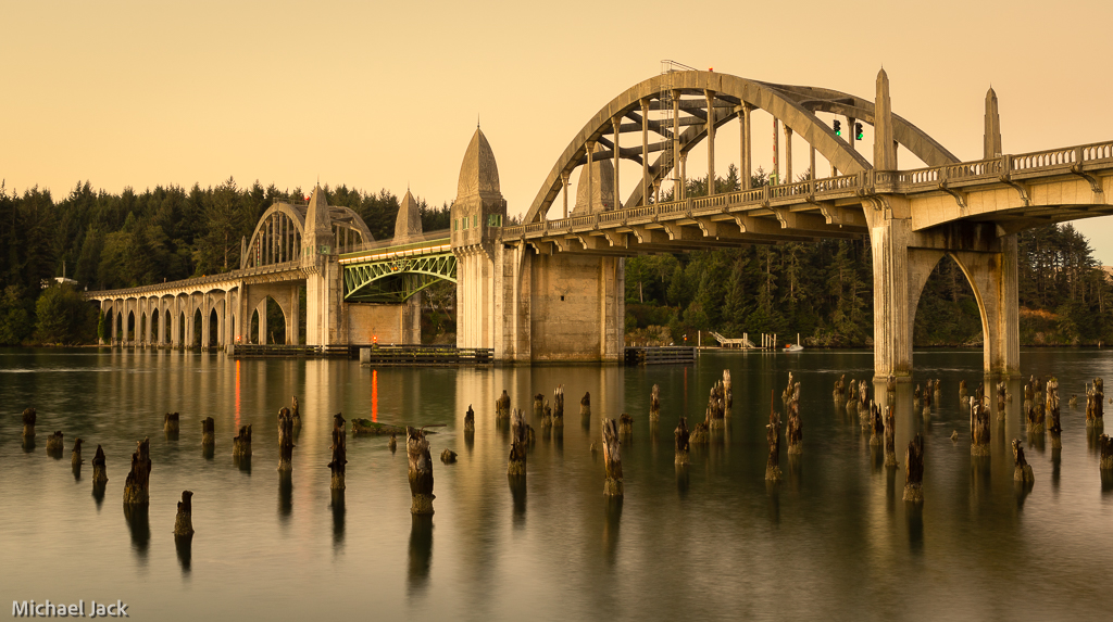
I like the composition of the bridge with the towers away from the center and the perspective effect of the bridge receding in the distance. The yellowish glow of the bridge makes a nice complementary contrast to the blue of the clouds and also helps with creating a greater sense of distance. Great exposure also. I think the wind may have cost you some sharpness - the image looks a little fuzzy to my eye. Regarding the crop, I agree with you about liking the reflections in the water, but I would consider cropping down from the top and also reduce the highlights of the clouds and maybe even drag a linear filter down from the top to darken it a bit. The light spot in the clouds draws my eye which is not an important part of the image. |
May 8th |
6 comments - 0 replies for Group 36
|
6 comments - 0 replies Total
|