|
| Group |
Round |
C/R |
Comment |
Date |
Image |
| 36 |
Feb 21 |
Comment |
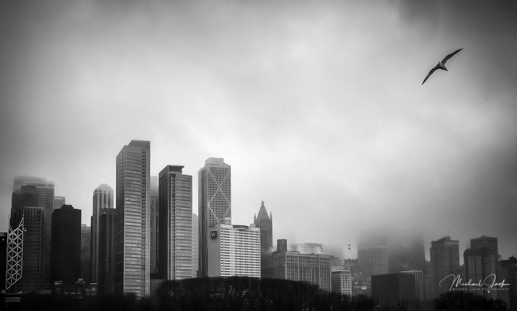
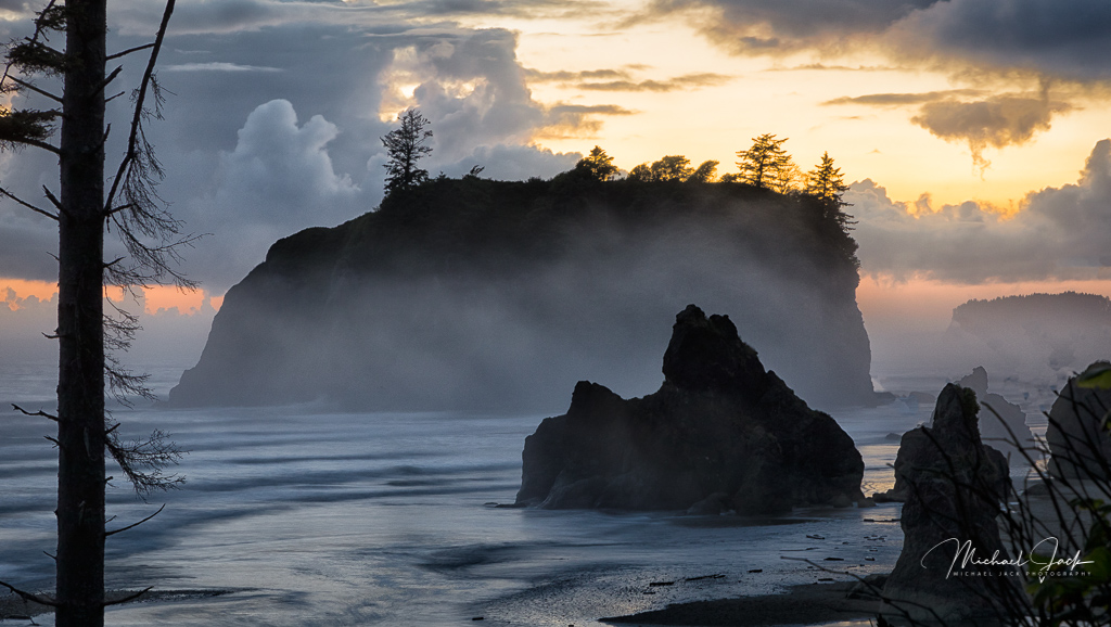
I think this is an outstanding use of leading lines. I like that most of the lines are at an angle adding more energy to the image. DOF, sharpness and exposure look great to me. I agree with the composition decisions to include the cliffs in the upper third and in the center, since that is the subject of the leading lines. Just a couple of thoughts - I would consider bringing up the shadows slightly in the cliff. Did you use a polarizer? The effect of the darker center of the sky looks like the effect of a polarizer on a wide angle lens (generally do not use for a sky shot with a wide angle lens). I would consider darkening the sky on both ends of the image, or conversely, use the circular filter in LR to brighten the darker part of the sky in the center of the image to get all the sky the same exposure and then vignetting the ends. |
Feb 19th |
| 36 |
Feb 21 |
Reply |
Interesting. Thanks Arne |
Feb 14th |
| 36 |
Feb 21 |
Comment |
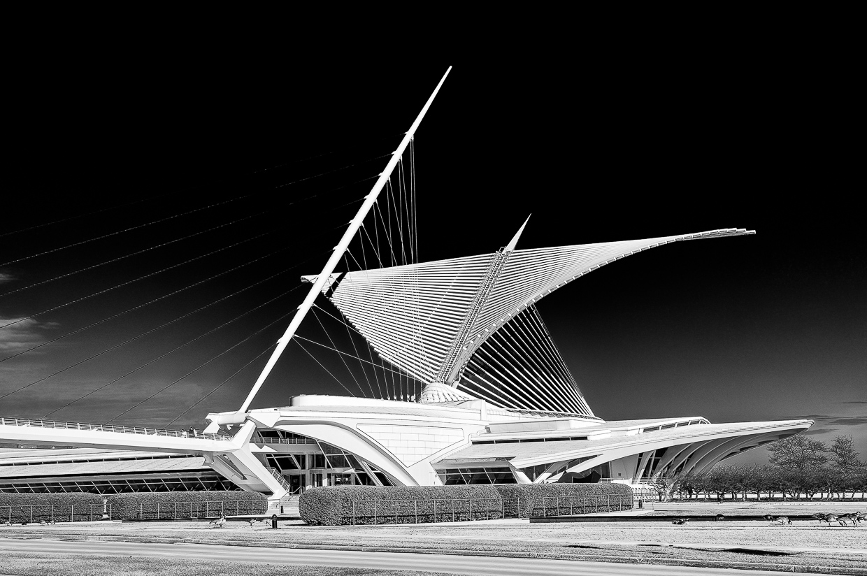
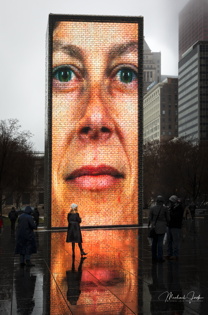
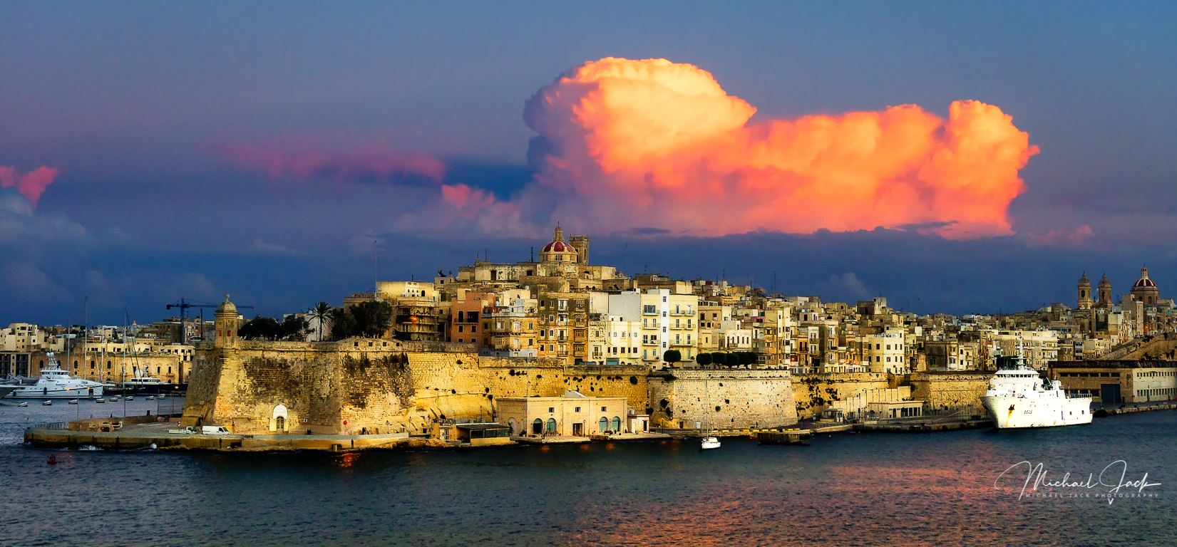
For me this is a really strong composition. I like the perspective of the tower which makes it more imposing. The bird adds a lot of interest to the image. Your post processing is excellent from my perspective, but I do agree with Larry about the halo on the right side of the castle and noise. Have you tried Topaz DeNoise AI? It is an incredible app. I would consider trying to pull out a bit more detail from the shadows of the walls unless that is really noisy. As I look at this, to me the light on the clouds comes from a different direction than the light on the castle so I would consider lining the lighting up a bit. Just me being anal. |
Feb 10th |
| 36 |
Feb 21 |
Reply |
I think you are right. Good observation |
Feb 10th |
| 36 |
Feb 21 |
Comment |
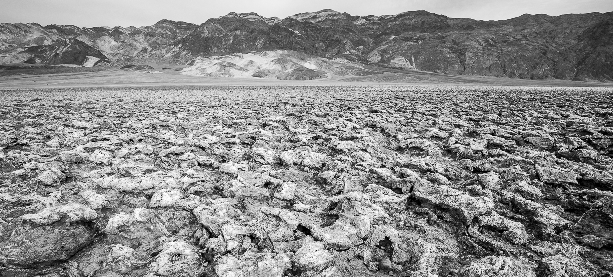
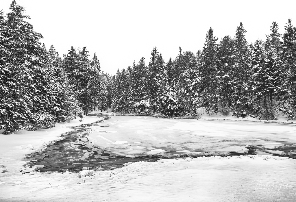
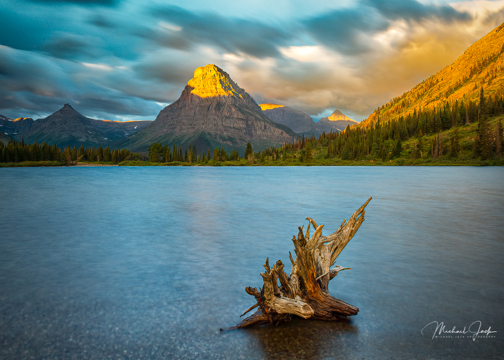
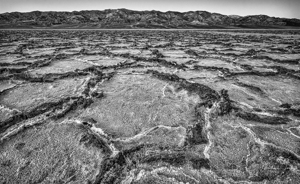
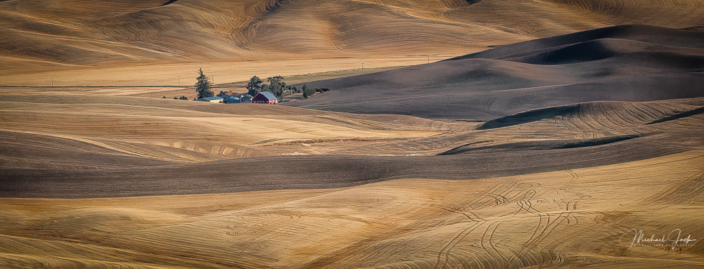
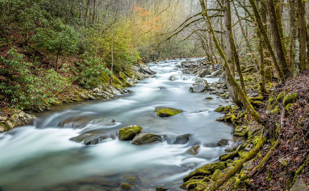
To me, it appears your choice of B/W was appropriate, the image appears sharp throughout, the tonal range is well done, and I like just the small amount of sky you included. For me, the composition works, but I wonder if it could have been made stronger if you positioned the near stump closer in the image and let the stumps, rather than the stream, be stronger subjects in the frame. To my eye, the darkened center of the image is a bit of a distraction (you may have been trying to highlight the stump) so I would consider bringing that back and trying to highlight (contrast or clarity, highlights) the individual visible stumps. |
Feb 6th |
| 36 |
Feb 21 |
Comment |
To me, this is a really effective composition. The choice of a vertical shot, the S curve of the stream, the interest factor of the bridge at a power point position in the image, the inclusion of only a small part of the skey, the stream exiting the image at the bottom right, the foreground boulder - well done. The camera settings are not available. To my eye the image looks a bit soft, but it could be how it is rendered. It appears you did darken the blue and vignette the sky. I would consider reducing the vignette in the sky so it still looks natural and sharpening the image with clarity.
|
Feb 6th |
| 36 |
Feb 21 |
Comment |
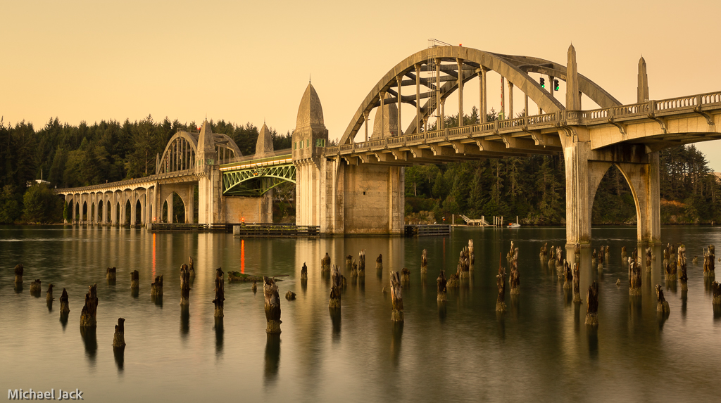
I enjoy your description as much as your images (both are great). I think this is a really well composed image and the side lighting affect on the piers works much better than if they were front lite. They add a lot of interest to the shot and are well placed in the frame. Your exposure choice to use ISO 1600 and only 13 sec reduces noise and over population of stars in the image. A suggestion you might try is to pull back the whites a bit to reduce the number of barely visible stars and compensate that with a brush to bring back the whites in the Milky Way. You are an extremely dedicated, and brave, photographer. |
Feb 6th |
5 comments - 2 replies for Group 36
|
5 comments - 2 replies Total
|