|
| Group |
Round |
C/R |
Comment |
Date |
Image |
| 36 |
Dec 20 |
Reply |
Got it. Thanks for the perspective. |
Dec 6th |
| 36 |
Dec 20 |
Comment |
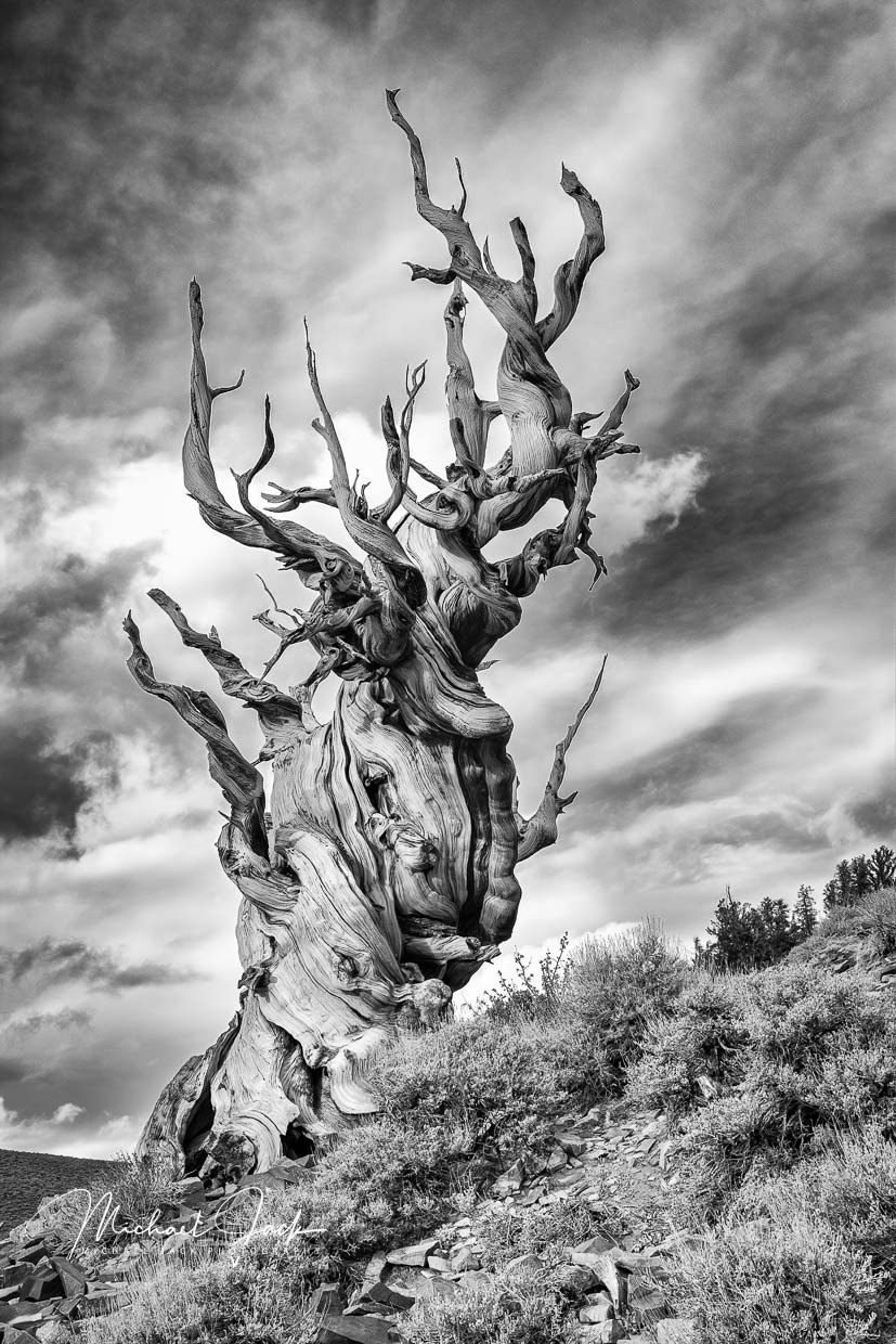
This is a beautiful image. Along the same lines as some of the other comments, to me the image is stronger with the tree being the central element with all of it being sharp, well exposed and with good contrast. The top branches of the tree look artificially dark to my eye so I would consider for sure brightening those. Also to my eye the sky competes with the tree so I would consider reducing the red saturation and adding a vignette. |
Dec 6th |
| 36 |
Dec 20 |
Comment |
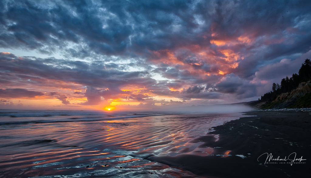
It appears there was great timing in getting the clouds and fog in this image. To my eye, I would consider: cropping down from the top as others have suggested (hate to lose the bird), continue to bring out a bit more detail from the shadows of the mountain, darkening the bright spots in the green foliage. I do agree with your crop up from the bottom. If you wanted to make the sky more dramatic in PS you could duplicate the layer and blend with overlay, masking out all but the clouds. An alternative would be to use the high pass layer and blend with overlay. |
Dec 6th |
| 36 |
Dec 20 |
Comment |
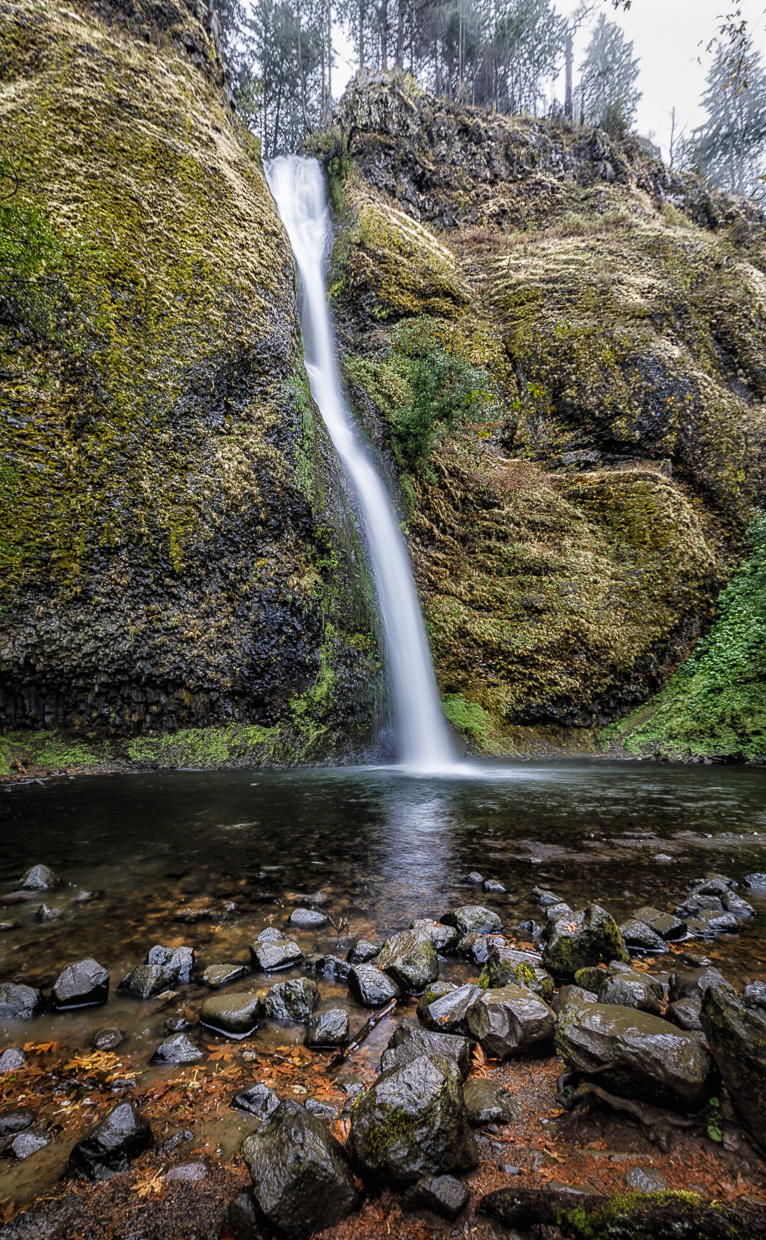
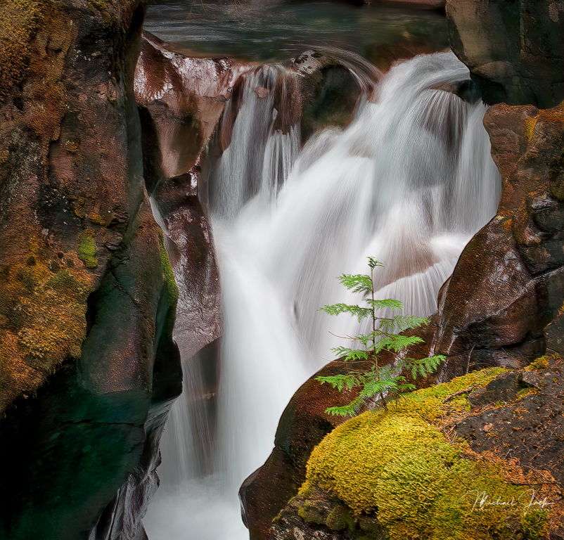
Another welcome to the group. This is a fascinating image. For me, I tend to agree to the comments. I like the choice of shutter speed to give a sense of flow to the falls. I would also think about cropping in from the left to eliminate the bright plant and the top down just a bit to reinforce the subject - the falls. I would consider bringing out slightly more detail in the dark cliffs - not enough to compete with the falls to enough to provide more detail about sense of place. |
Dec 6th |
| 36 |
Dec 20 |
Comment |
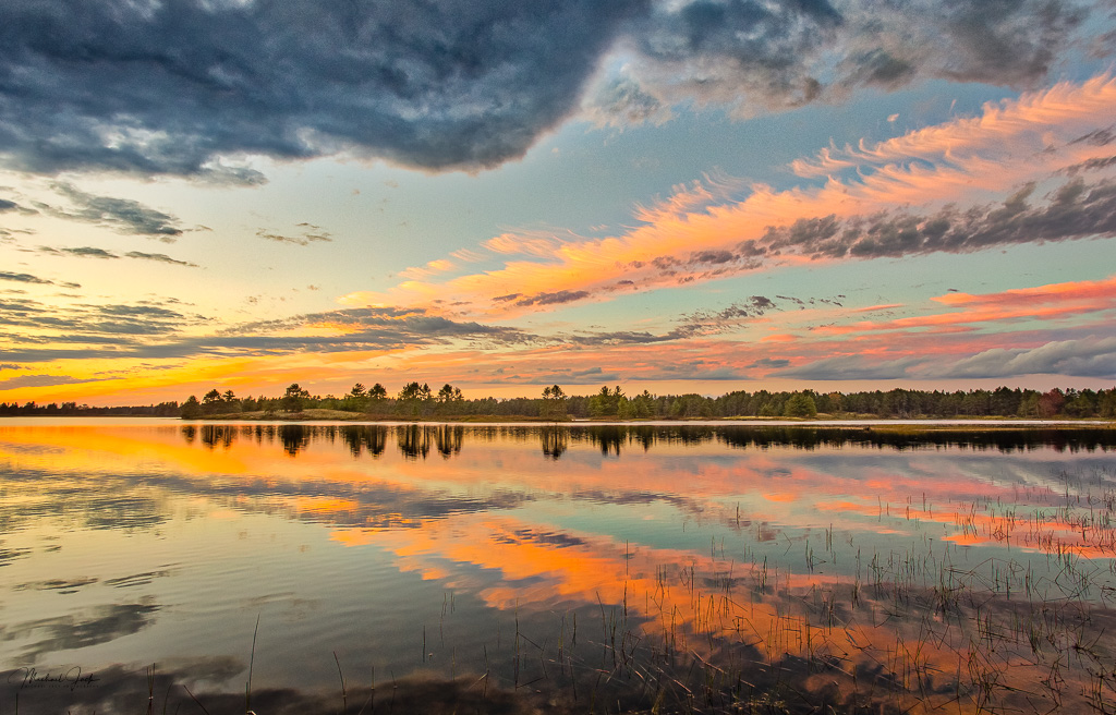
I think you did a great job with light painting; there is just enough light to bring out the details but not enough to create an overexposure. Making the crop a pano landscape works for me. It appears you tried to place the shoreline on the thirds line which works well, but to me since the reflection is strong enough, you could have a balanced image as well and show more of the reflection. I agree with Larry's comment about reducing the brightness of the shore line to make it blend more with the light level of the tress. To my eye, the bush on the left is more of a distraction than an addition to the image so I would clone that out; just me. |
Dec 6th |
| 36 |
Dec 20 |
Comment |
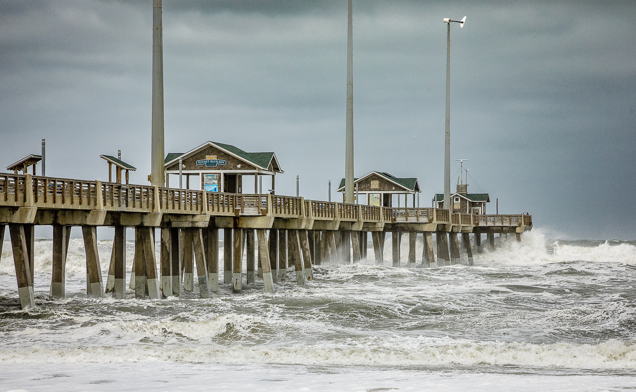
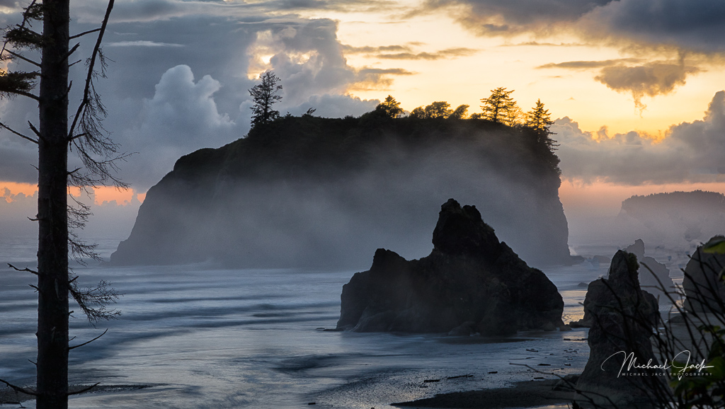
That is true dedication. You have an outstanding image as a result. I like your choice of shutter speed, the energy that comes from the composition and angle of the waves, the darkness but yet detail in the rocks. I agree with your post processing decisions and differ from Arne. I think the lack of contrast in the waves gives the image an ethereal look which to my eye is effective for the scene. My only suggestion would be to subtly darken the part of the wave exiting the top left of the image to keep the eye from following it out of the image. |
Dec 6th |
| 36 |
Dec 20 |
Reply |
Thanks for taking time on this. It is why we submit images for feedback. I would like to see your result. |
Dec 6th |
| 36 |
Dec 20 |
Reply |
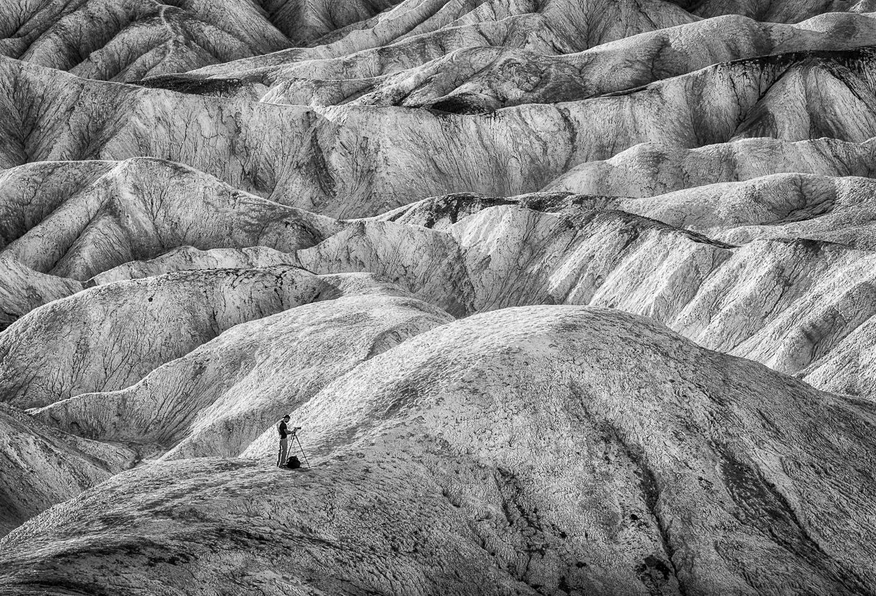
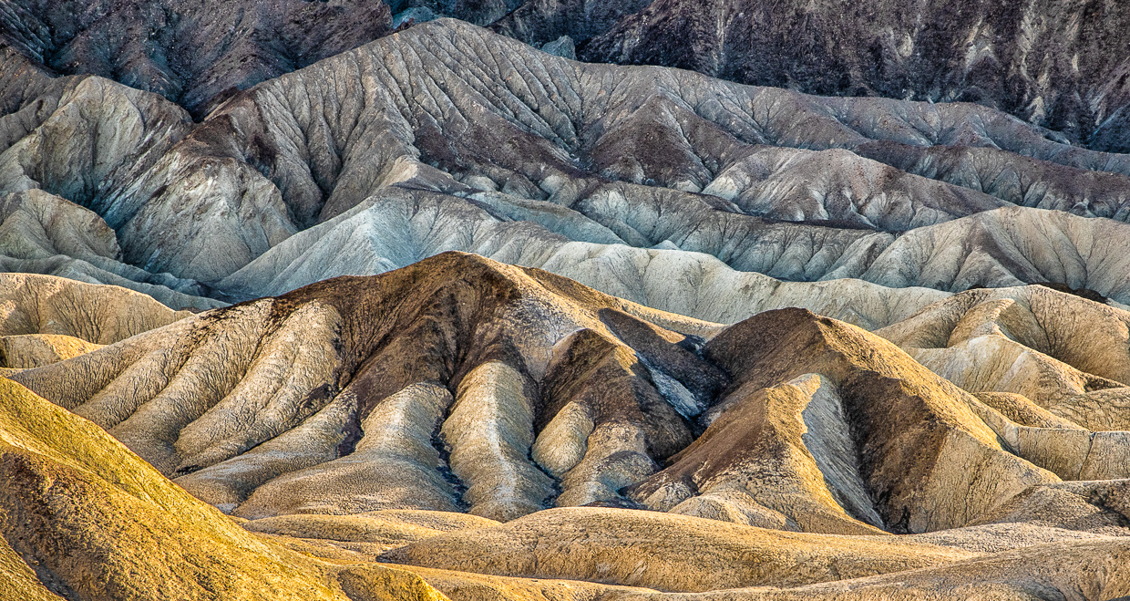
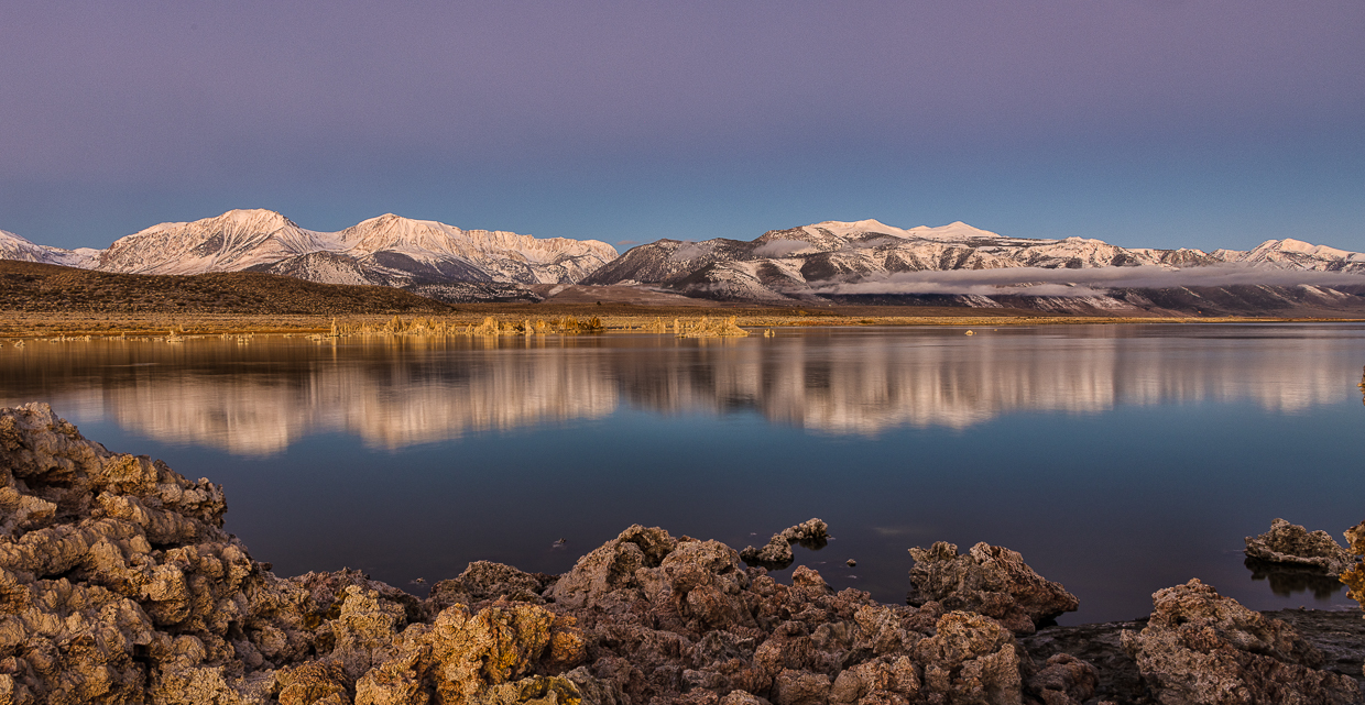
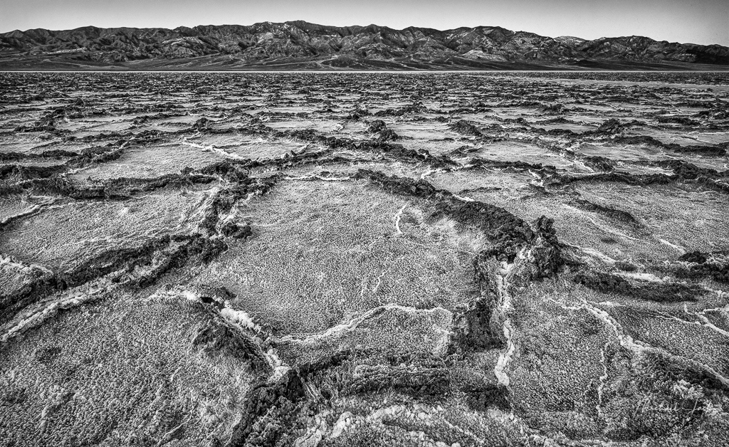
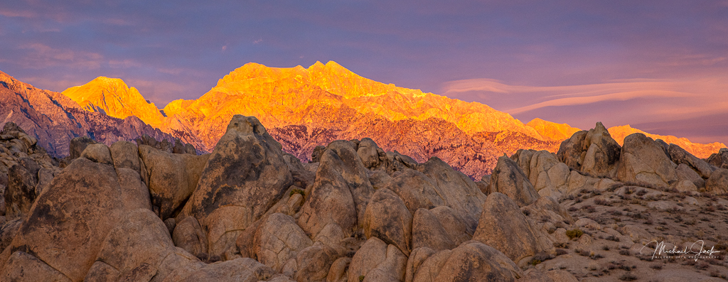
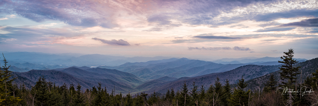
This is why it is helpful to get comments from others. The mountains were behind some smoke still coming in from CA fires so I applied some, I though heavy at the time, dehaze to bring out contrast. I was thinking maybe I overdid it, but obviously not. This was taken only a couple of weeks ago when a few of us went out and stayed masked and socially distanced in Stovepipe Wells. |
Dec 1st |
5 comments - 3 replies for Group 36
|
5 comments - 3 replies Total
|