|
| Group |
Round |
C/R |
Comment |
Date |
Image |
| 36 |
Oct 20 |
Reply |
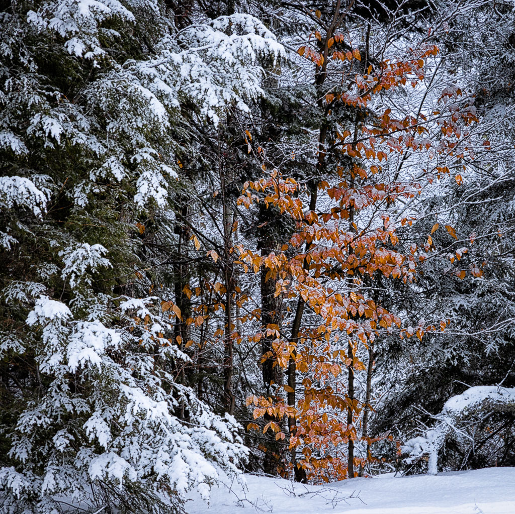
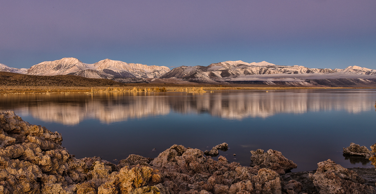
This looks like a good improvement to me. One more suggestion - in the color image I would darken the blue in the sky (HSL panel luminance and saturation in LR) In LR or Silver Effex for the B/W conversion go to the color adjustments and move the blue slider to darken the sky. That will give you a nice dark sky to contrast with the snow on the mountains. |
Oct 20th |
| 36 |
Oct 20 |
Comment |
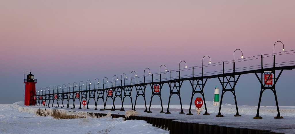
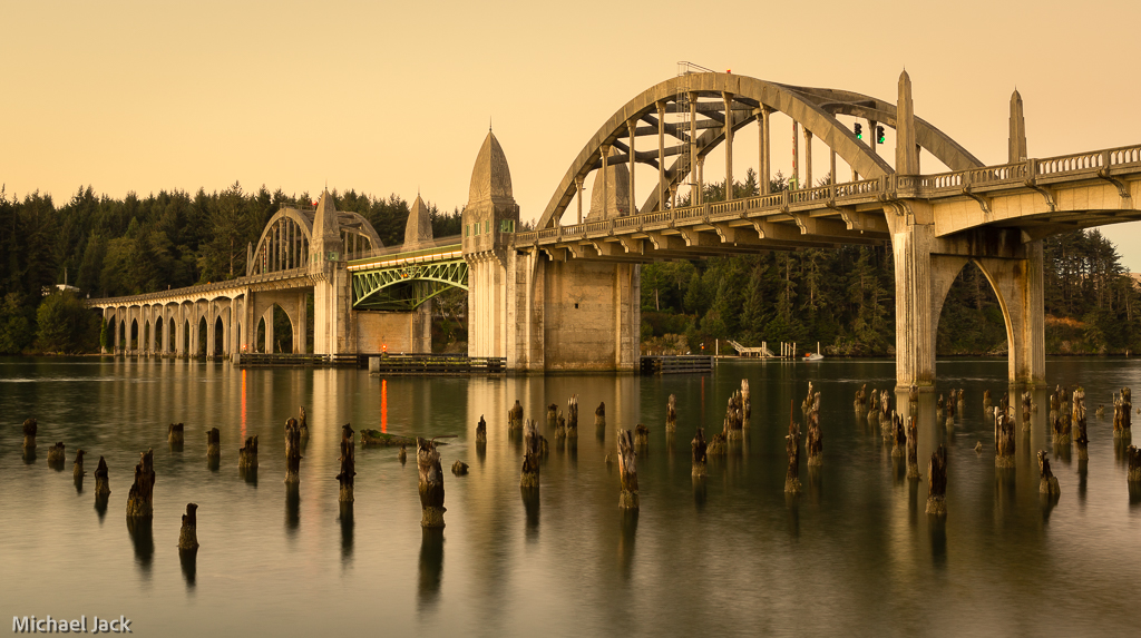
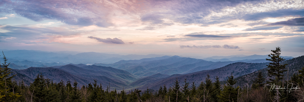
I really like the composition - the strong foreground structure and color leading to the long horizontal line of the bridge which keeps my eye in the image, the shutter speed, saturation, sharpness and exposure. I see you had a polarizer on, but it does not appear that it was turned correctly to eliminate the glare on the water (something I usually forget and mess up). To my eye, the wide angle distorted the bridge so I would consider using some of the PS tools to straighten it out a bit and maybe have checked to see if moving slightly would have allowed a full clump of grass in the bottom rather than cutting it in two - may not have been possible though. Love the view. Nicely seen |
Oct 12th |
| 36 |
Oct 20 |
Comment |
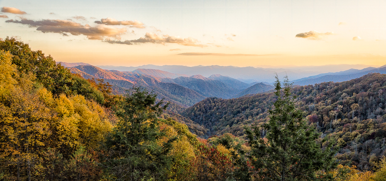
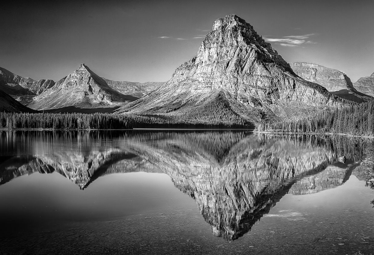
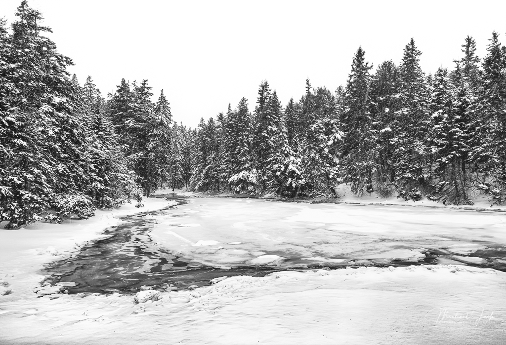
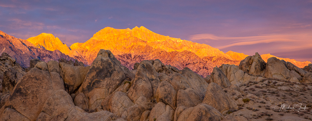
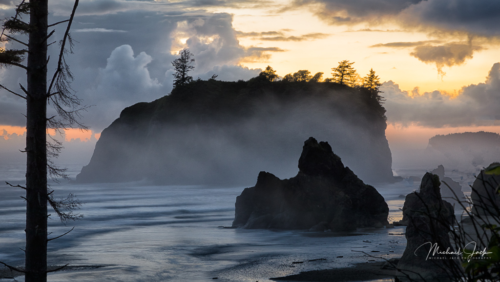
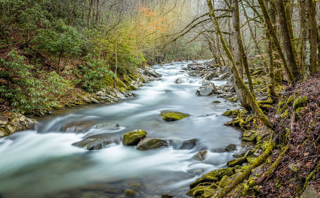
Very sorry to hear about your husband and the difficulties of travel and hope you are staying well. Image: I like the way you captured a foreground, middleground and background and the position of the mountain in the image. I agree with some of the comments above except I am not uncomfortable with the amount of sky above the mountain. Some suggestions to consider - if you have the NIK collection, definitely use SilverEffex to convert to B/W. If not and you did it in LR, go to the HSL sliders and darken the blue which will make the sky much darker. Add some clarity and sharpening to the mountains. Increase the tonal range (a la Adams) by making sure the histogram goes to total white and black - this would add a lot of contrast to your image. I would consider cropping up from the bottom just slightly but not cutting off any of the river. Finally, the bright leaves in the bottom right are a bit of a distraction so I would consider just darkening those. |
Oct 12th |
| 36 |
Oct 20 |
Reply |
Yes, that is the spot where we shoot sunrise. We still think the place I mentioned is best for sunset around Townsend.
You can also go to Tellico Plains and shoot sunrises and sunsets from the Cherohala Skyway. |
Oct 12th |
| 36 |
Oct 20 |
Comment |
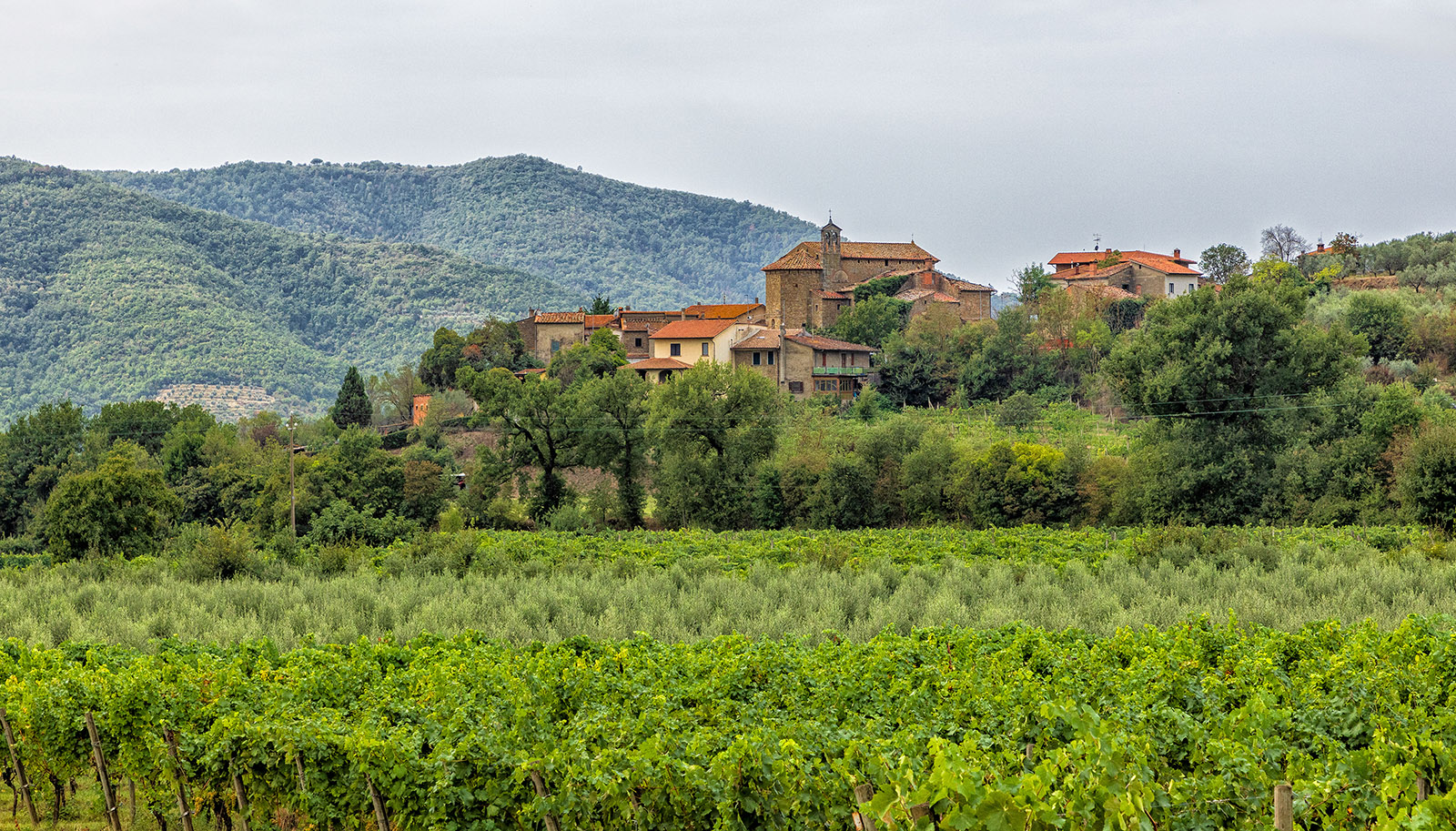
I agree with Larry about lightening the tower, through dodging or raising the shadow, in fact my suggestion would be to draw out a lot more lightness and detail in the castle since that is the subject. To me, I would consider cropping in significantly from the right all the way to the tree to the right of the castle. Again to me, all the parts of the image on the right do not add to the subject but in a way is a distraction. Overall, I think you mentioned the exposure and DOF well so hopefully this will do well in a travel photo. I realize the rules will not let you eliminate the people. You were fortunate to be in a place like this.
|
Oct 9th |
| 36 |
Oct 20 |
Reply |
LUTs are look up tables, and you find them with other adjustment layers (levels, hue/sat., etc). There are a number of potential layers that are in a drop down menu - some colors, some textures. I think most people who use them select a color and reduce the opacity to about 10% and maybe mask out part of the layer. |
Oct 6th |
| 36 |
Oct 20 |
Reply |
I was thinking just the vertical column should be perpendicular in the image. May be it is and my eye is just off. |
Oct 4th |
| 36 |
Oct 20 |
Comment |
I think the vanishing lines of the railroad and the perspective of the buildings make an effective composition, and the amount of sky you included is appropriate. You got a sharp image and good depth of field. Some suggestions: The tower in front looks like a perspective correction was slightly overdone so to my eye the building looks a bit wonky on top. If you go back, you might try a different time of day to get more shadows to add more contrast to the silos. I would consider cropping in from the left enough to eliminate the "D" sign. This may or may not work, but you might try some lower shots from the railroad itself but I am not if that would just highlight the railroad tracks rather than the buildings. I would either try to include or exclude the blue truck on the bottom right. Great idea to capture structures that one day will not be with us. Sounds like a project....
|
Oct 4th |
| 36 |
Oct 20 |
Comment |
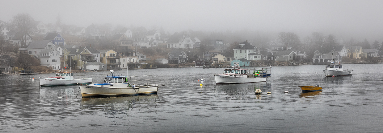
Well seen. I like the treatment of the fog which has both ends of the bridge in the image fading into it. The cropping looks effective to me compared to the original image although I would level the bridge and consider adding a bit more contrast to make the bridge stand out a bit more. It appears you have applied a vignette which keeps my eye in the image. Good thinking about stopping and getting this shot. |
Oct 4th |
| 36 |
Oct 20 |
Comment |
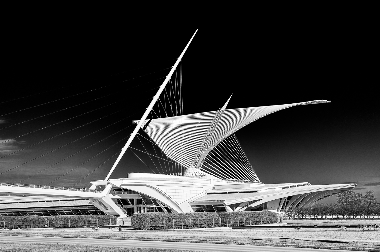
This image would do very well in competitions. I like your composition with the leading lines of the walkway leading to the structure and the position and lens choice to create a bit of a perspective to the building. To my eye the exposure and tonal range are right on. Contrary to Arne, I would not include any more detail in the shadow areas than you have - the blackness makes the image stand out and adding details would to me be a distraction. Very well done, and you avoided the gators. |
Oct 4th |
6 comments - 4 replies for Group 36
|
6 comments - 4 replies Total
|