|
| Group |
Round |
C/R |
Comment |
Date |
Image |
| 36 |
Sep 20 |
Comment |
It seems despite the rain this was a great trip, and you have a good image for a memory. I agree with George and Larry's comments about cropping from the left and top and adding contrast through the software you use. If no texture or clarity sliders are available, then playing with curves gives you some options. I would consider looking at the histogram and making sure the tonal range goes from full black to full white to help the contrast. You have already used Topaz Sharpen, but at least the thumbnail to my eye looks like after adding contrast you may (or may not) want to recheck the amount of sharpening. The point about the brightness of the water I agree with too. Too late now, but for shots like this in the future I would recommend the use of a polarizing filter to reduce the glare and cut down on the haze. |
Sep 15th |
| 36 |
Sep 20 |
Comment |
Thanks for the comments. There seems to be a common theme of contrast. |
Sep 15th |
| 36 |
Sep 20 |
Comment |
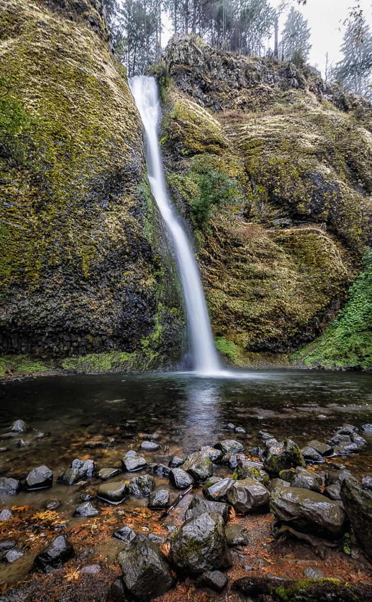
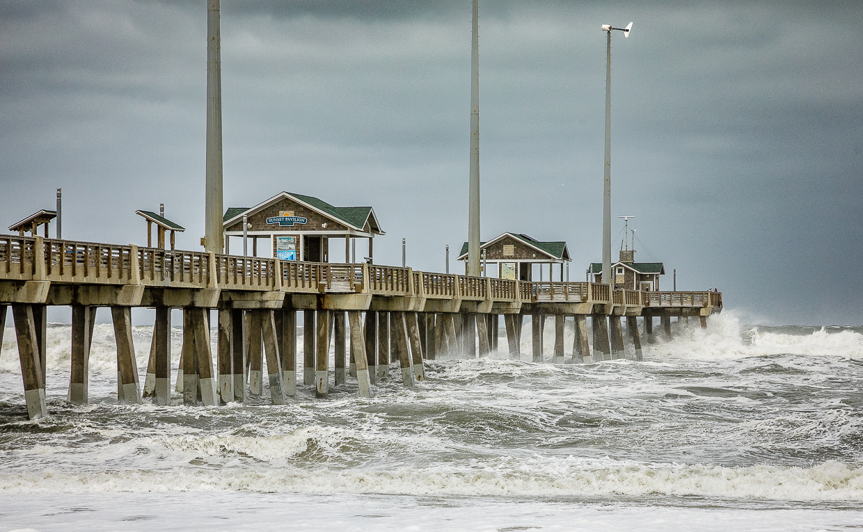
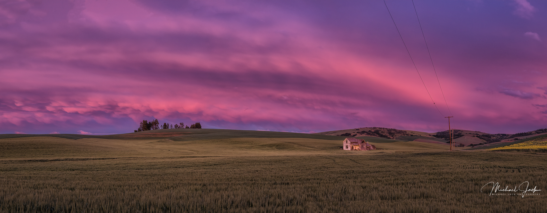
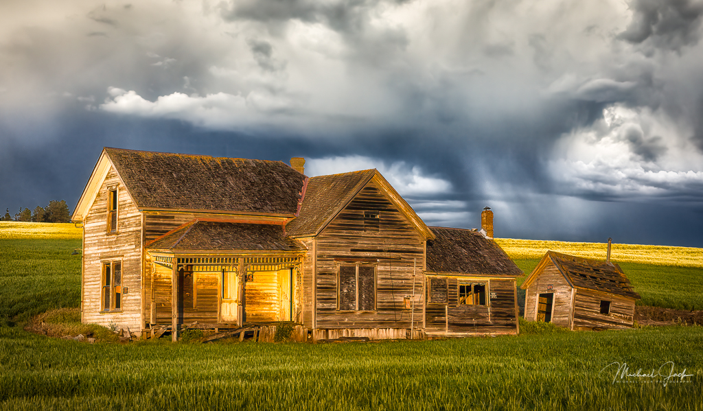
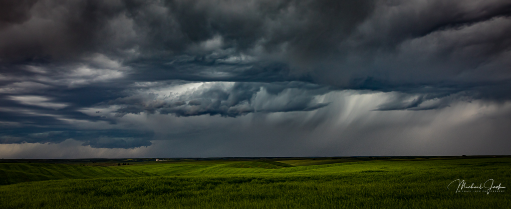
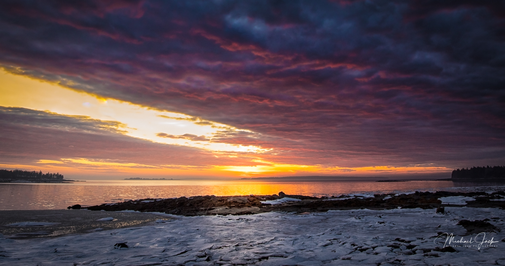
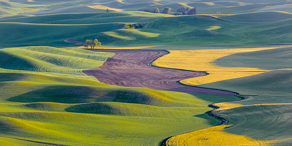
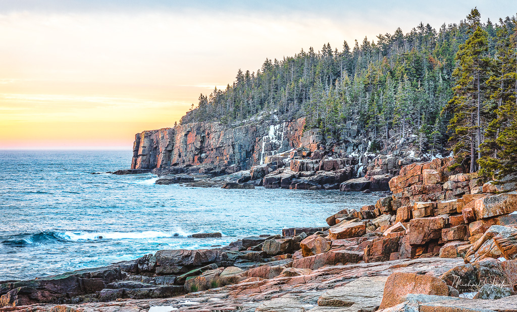
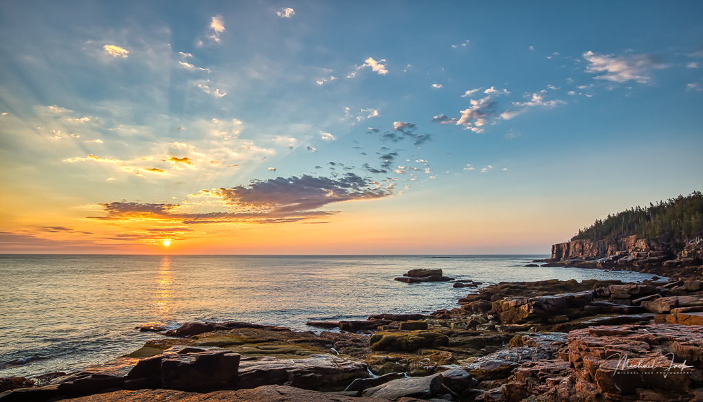
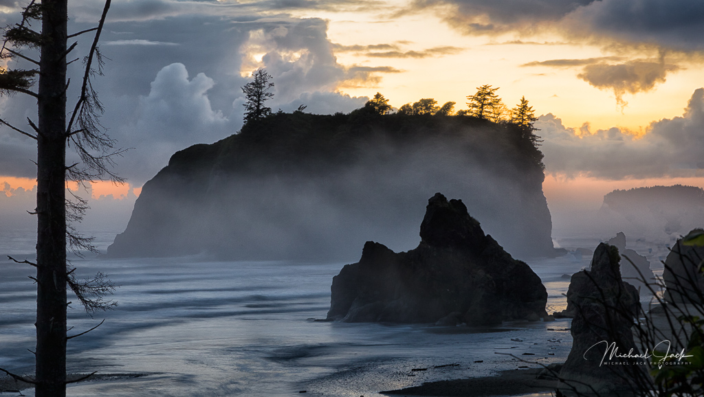
This is a wall-hanger, Arne. Well done. I like the composition with the focus on the clouds, limited sky and still a lot of detail in the shadows. I also like the color temperature. The warm color works really well to my eye. I agree with Arne (doing a lot of that....) about the right side. I would suggest maybe a radial gradient from the right side to reduce the exposure to the rest of the image. Another suggestion is if possible to pull out just a bit more texture in the tree areas which appear almost totally dark on my screen. |
Sep 4th |
| 36 |
Sep 20 |
Comment |
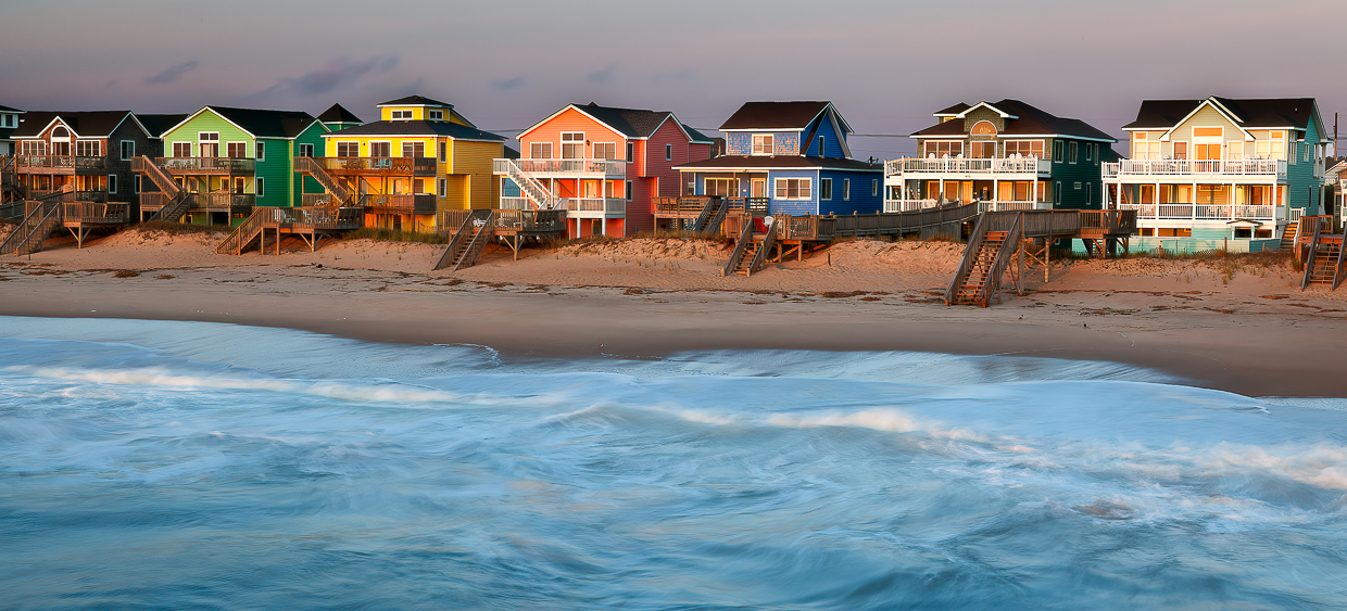
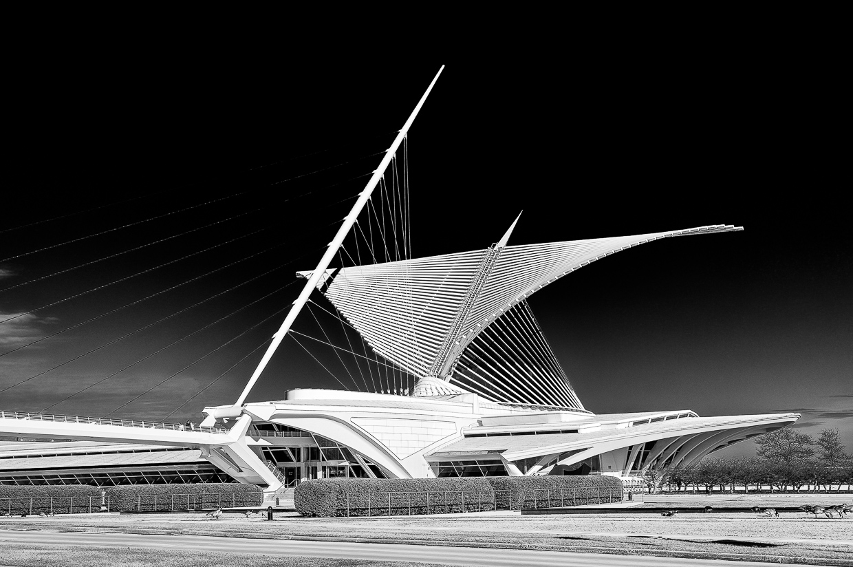
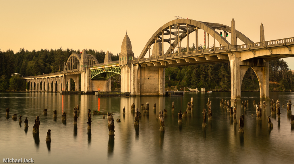
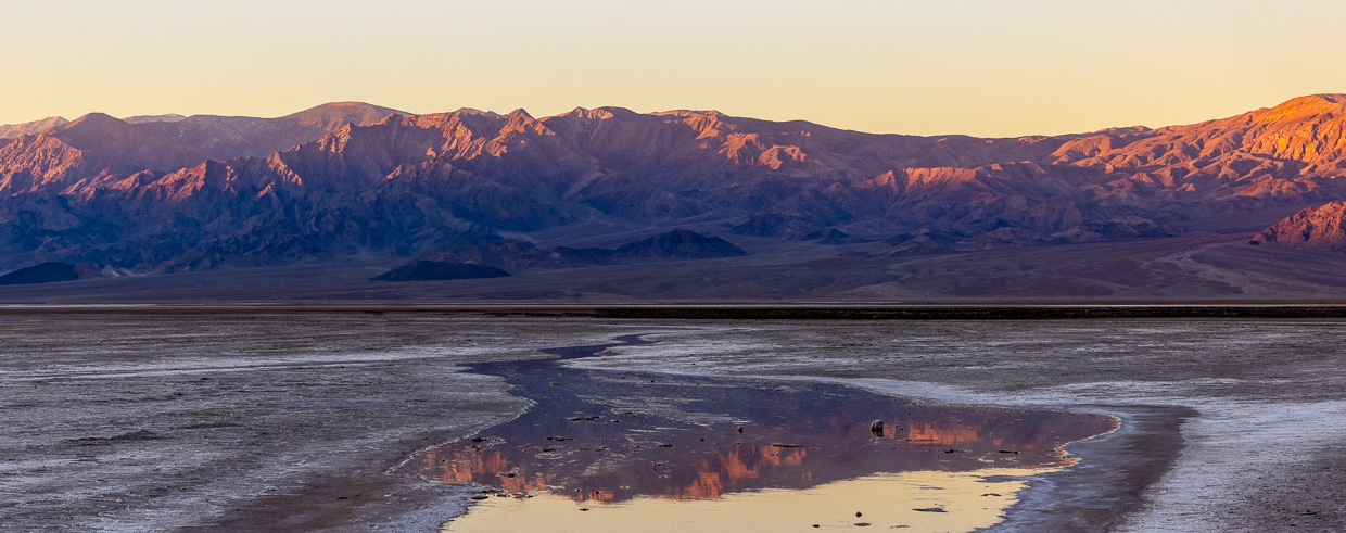
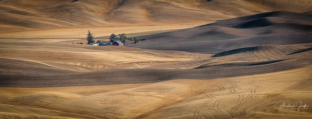
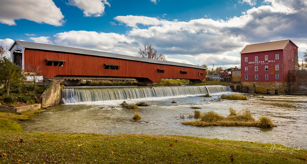
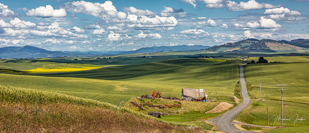
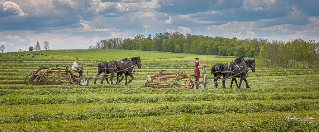
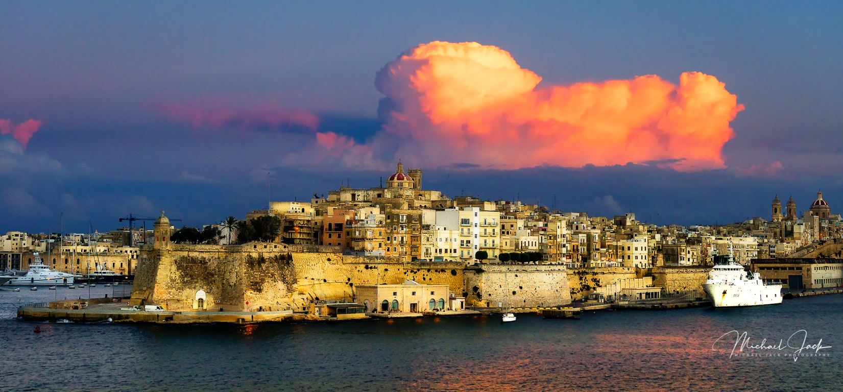
Great processing on the sky. I agree with Arne's suggestion that the pano was a good decision and cropping in from both sides would be a consideration, especially from the right which appears to have little of interest. I agree with doing more processing to the buildings - maybe consider adding more clarity and increasing the exposure a small amount. |
Sep 4th |
| 36 |
Sep 20 |
Comment |
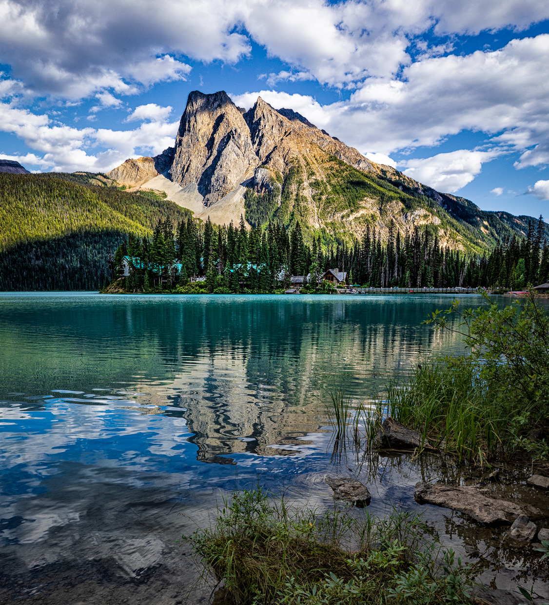
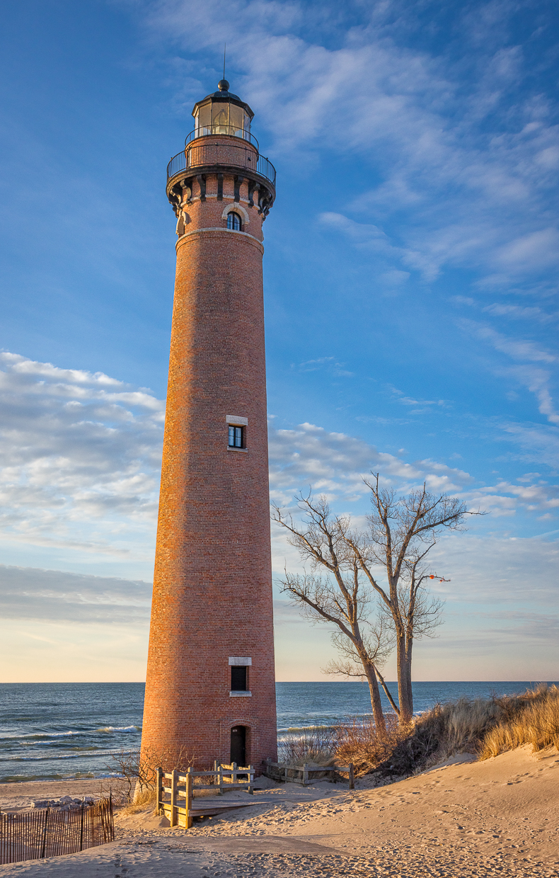
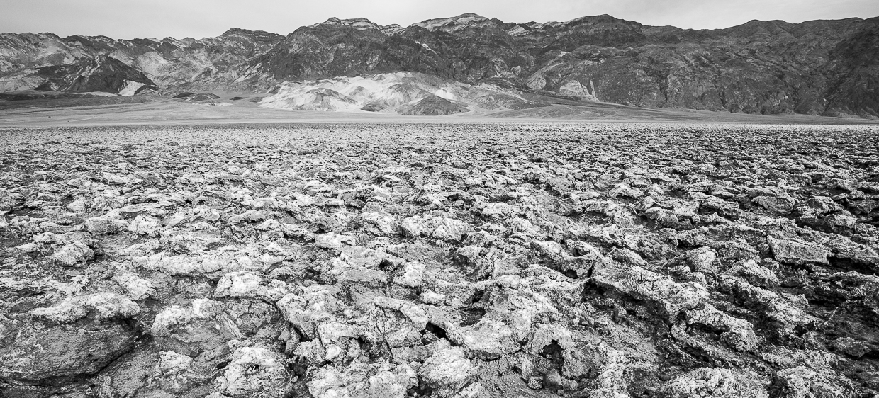
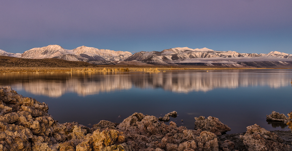
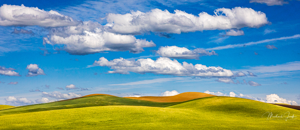
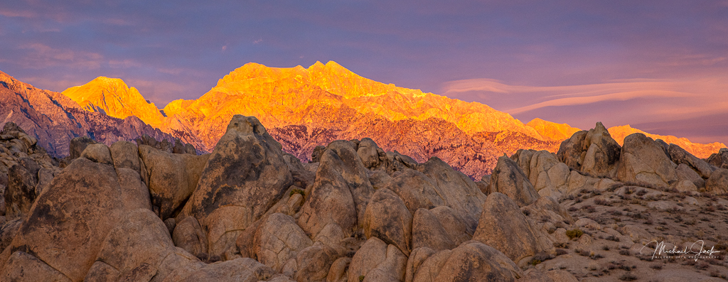
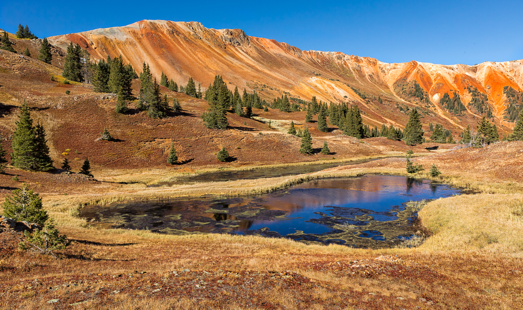
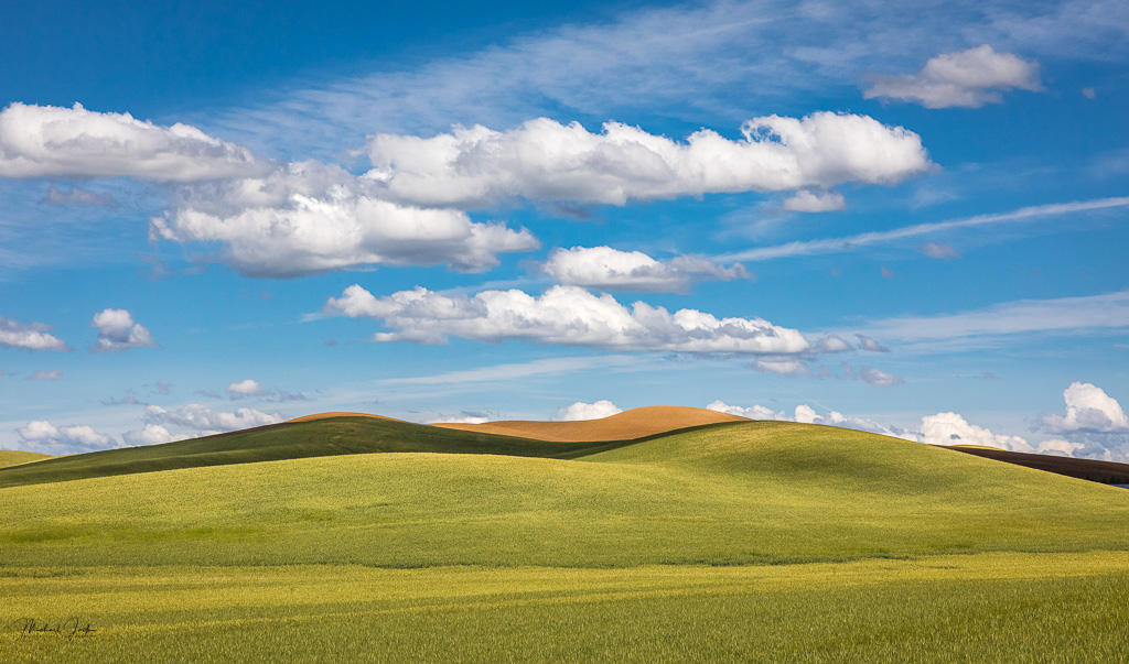
A well-exposed and composed image for mid-day. Adding just a bit of foreground helps provide depth to the image, and not included much sky was a good choice. The saturation added to the image, but retained the natural look which for me is good. The mountain did look a little over sharpened to me, but it could be my screen. I would consider a subtle vignette too. |
Sep 4th |
| 36 |
Sep 20 |
Reply |
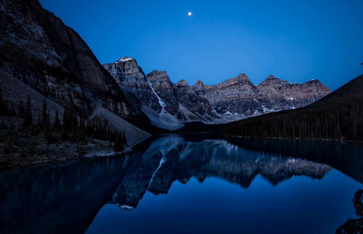
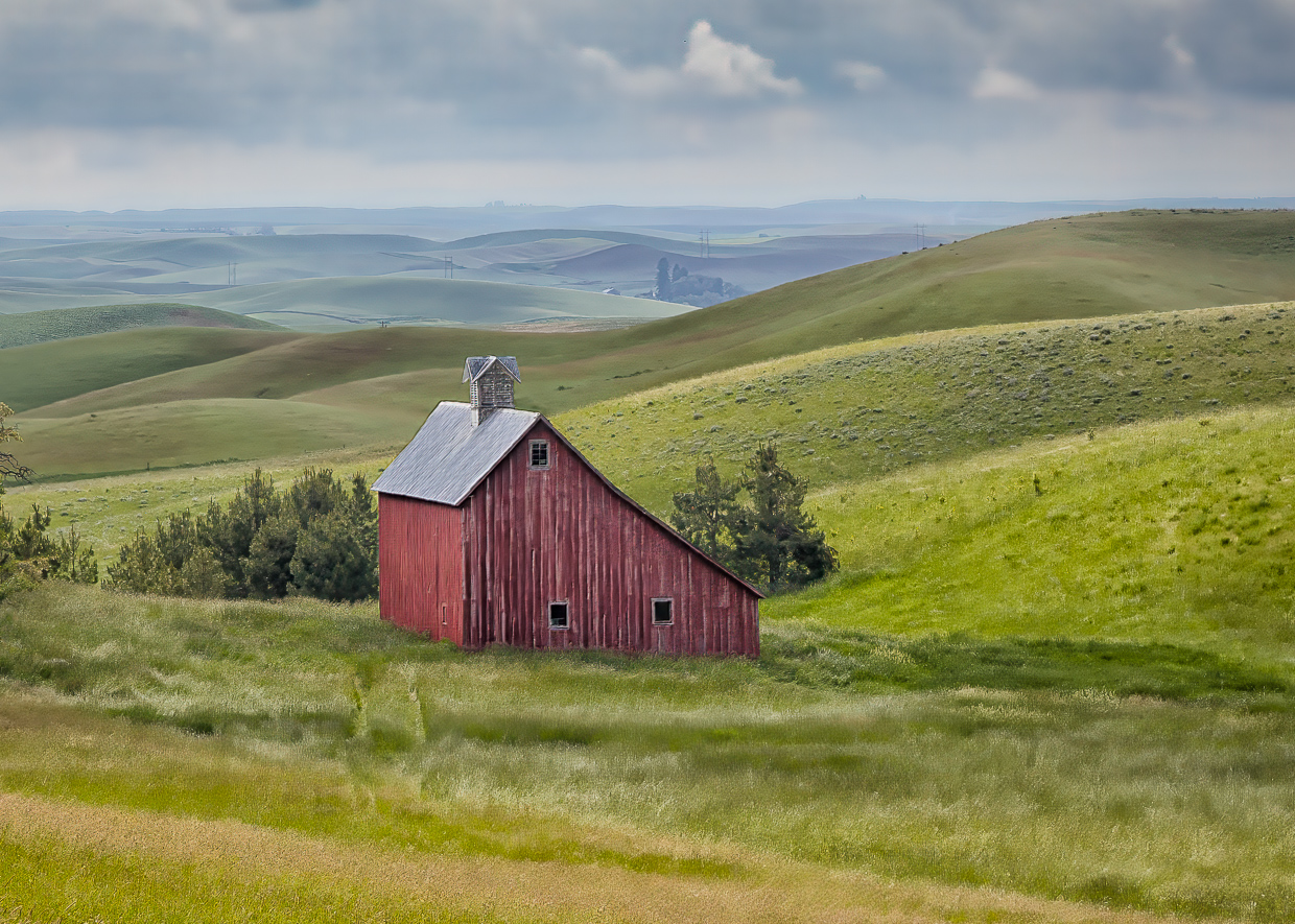
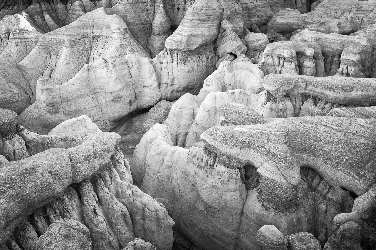
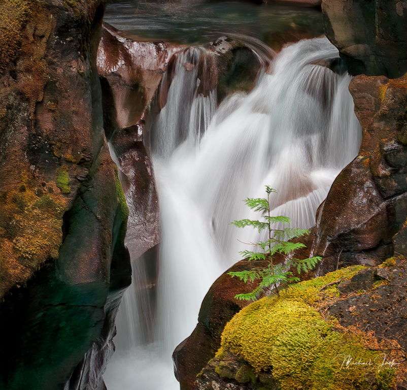
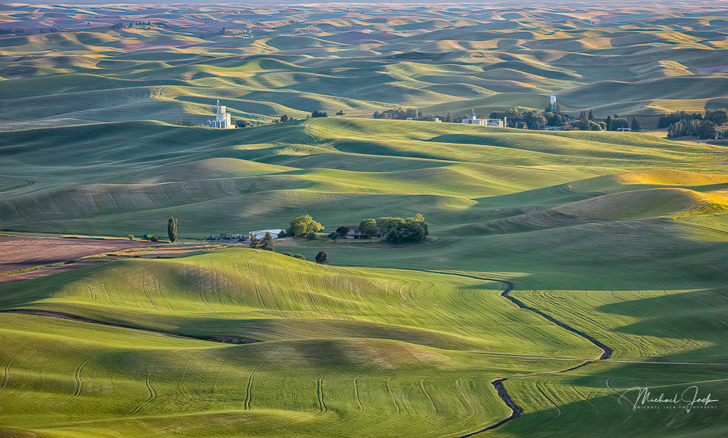
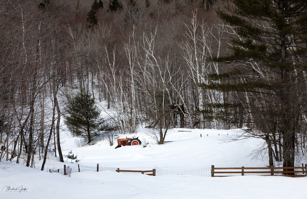
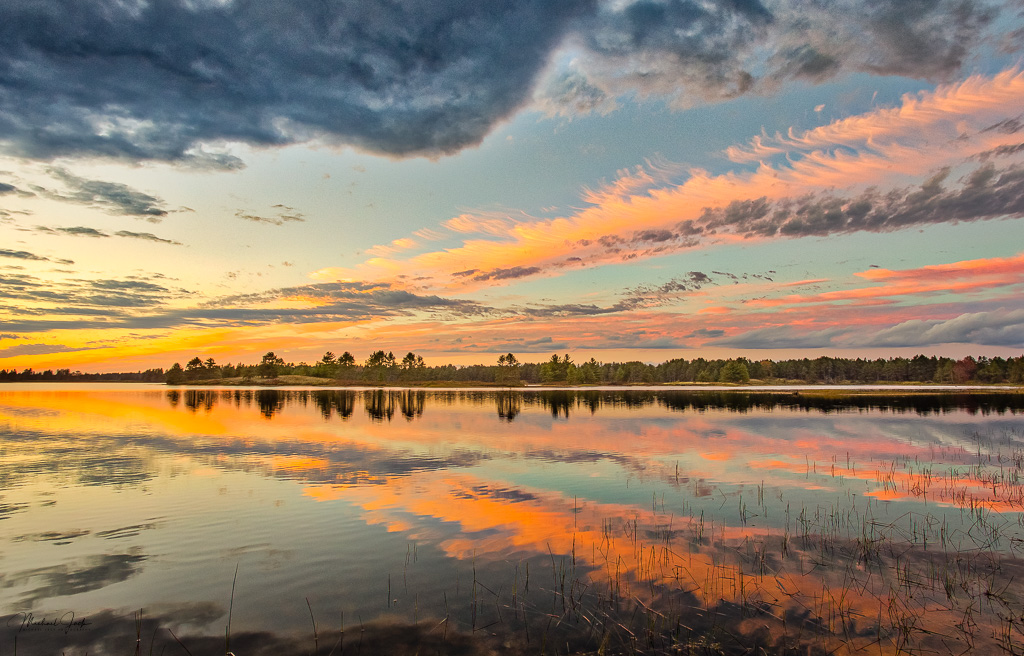
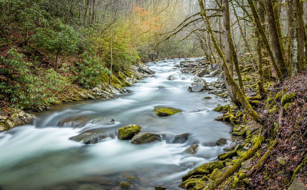
I am sure you know more about what you are doing than me. I saw the three white trunks bottom right as small distractions that pulled my eye out of the main scene. For me, just reducing the brightness of the bottom right tree and trying to pull out a little more texture/detail out of the trees above it and reducing the trees white brightness just where they exit the frame (my eye follows the white line out of the frame) might keep the eye more in the image itself. Just a suggestion. |
Sep 4th |
| 36 |
Sep 20 |
Comment |
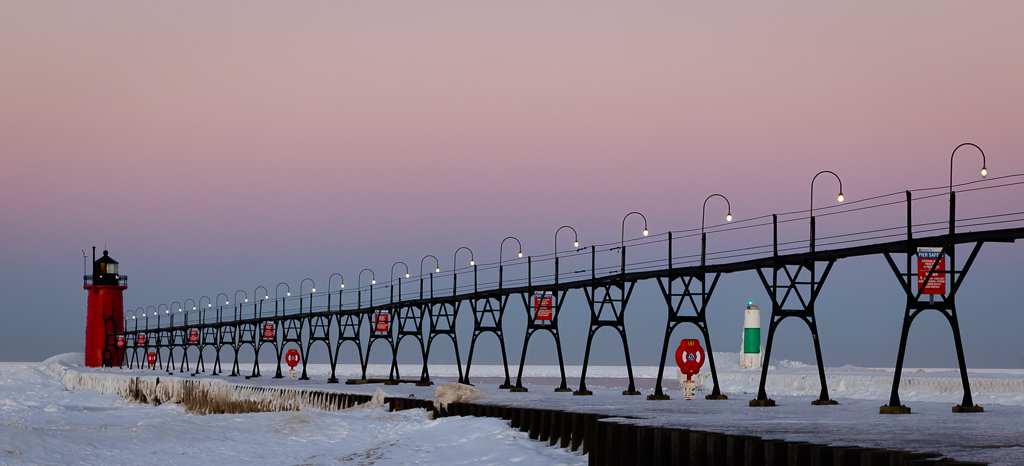
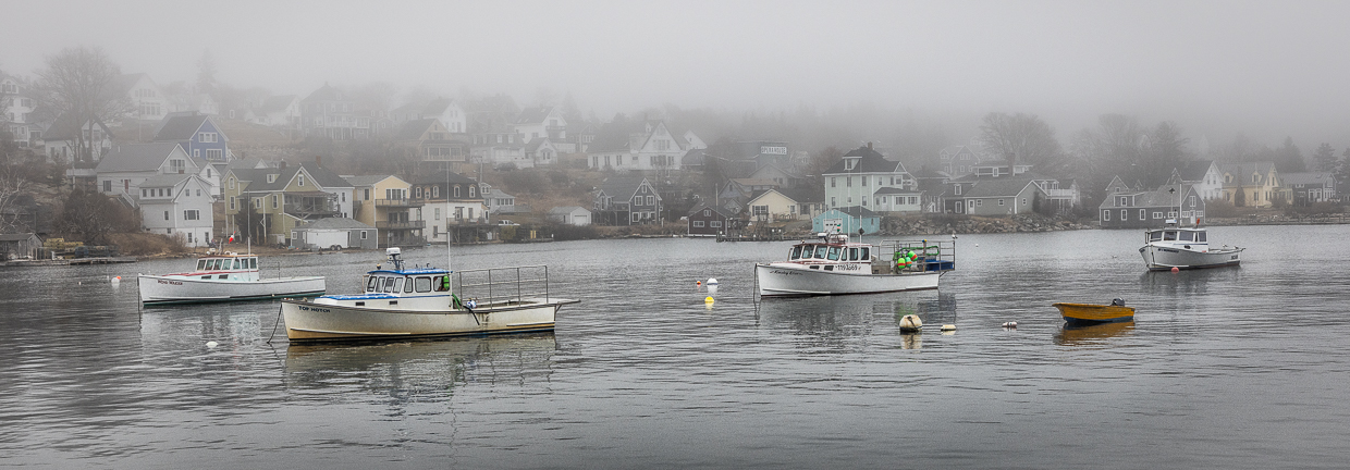
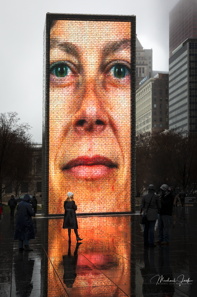
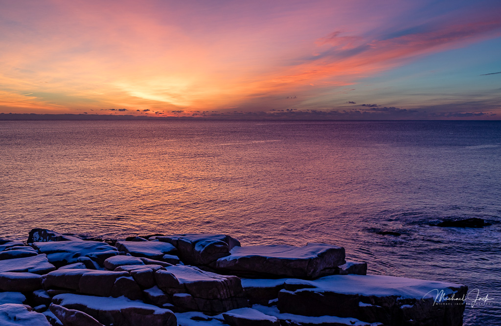
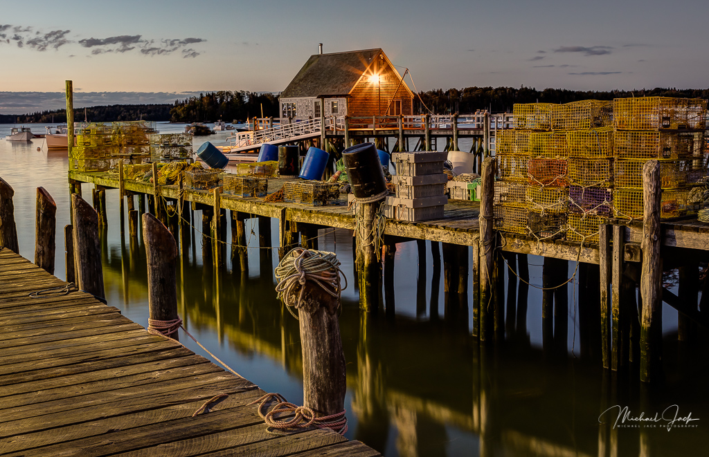
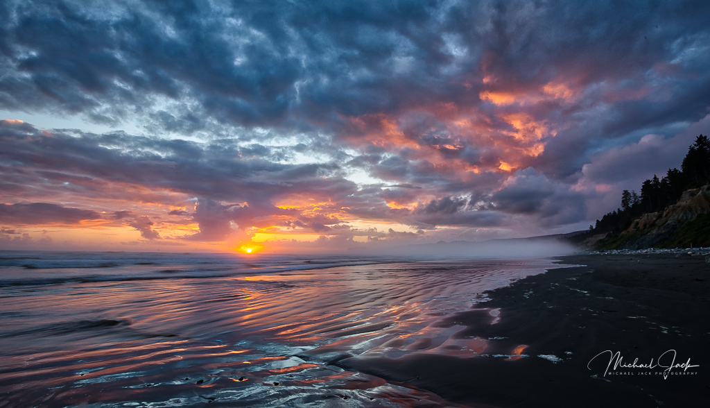
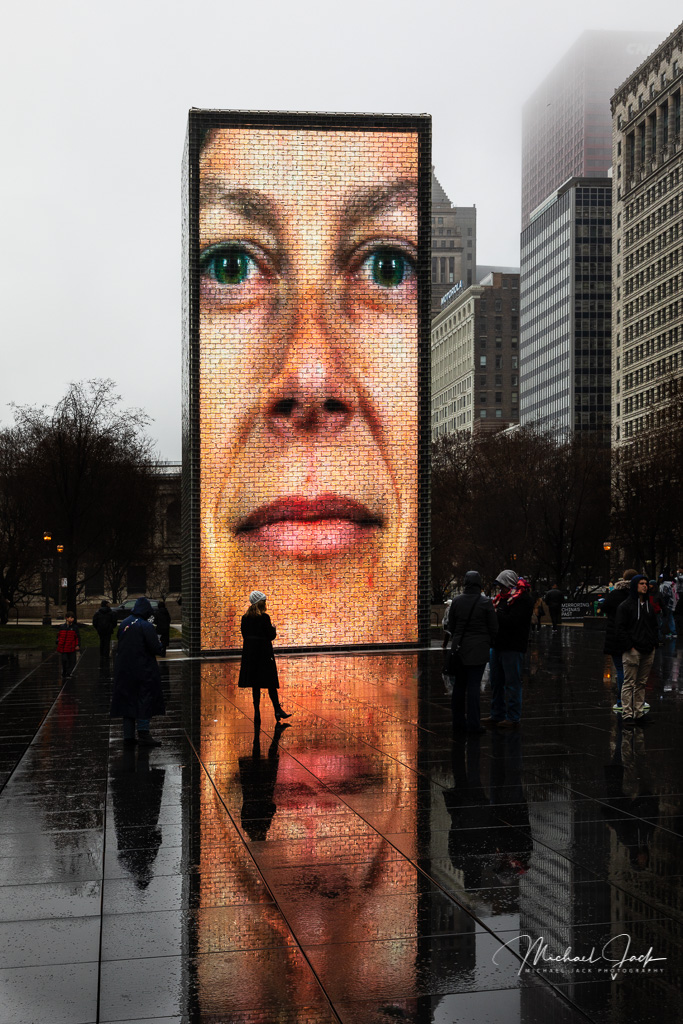
This appears to be well composed to me, and I like the idea of having the camera at a low angle to capitalize on the reflections, the starburst of the lights and overall exposure. To my eye, at first glance, it appears to be a really flat image so my first thought was it needed a lot more clarity and contrast and then I read your comments. If you were trying to create a foggy feeling, I would consider pushing the effect a lot more so it is clear that a fog/heavy rain is present. |
Sep 4th |
| 36 |
Sep 20 |
Comment |
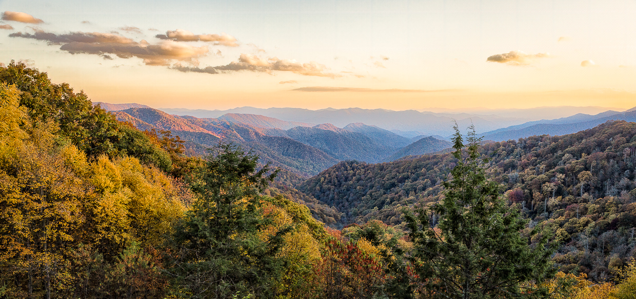
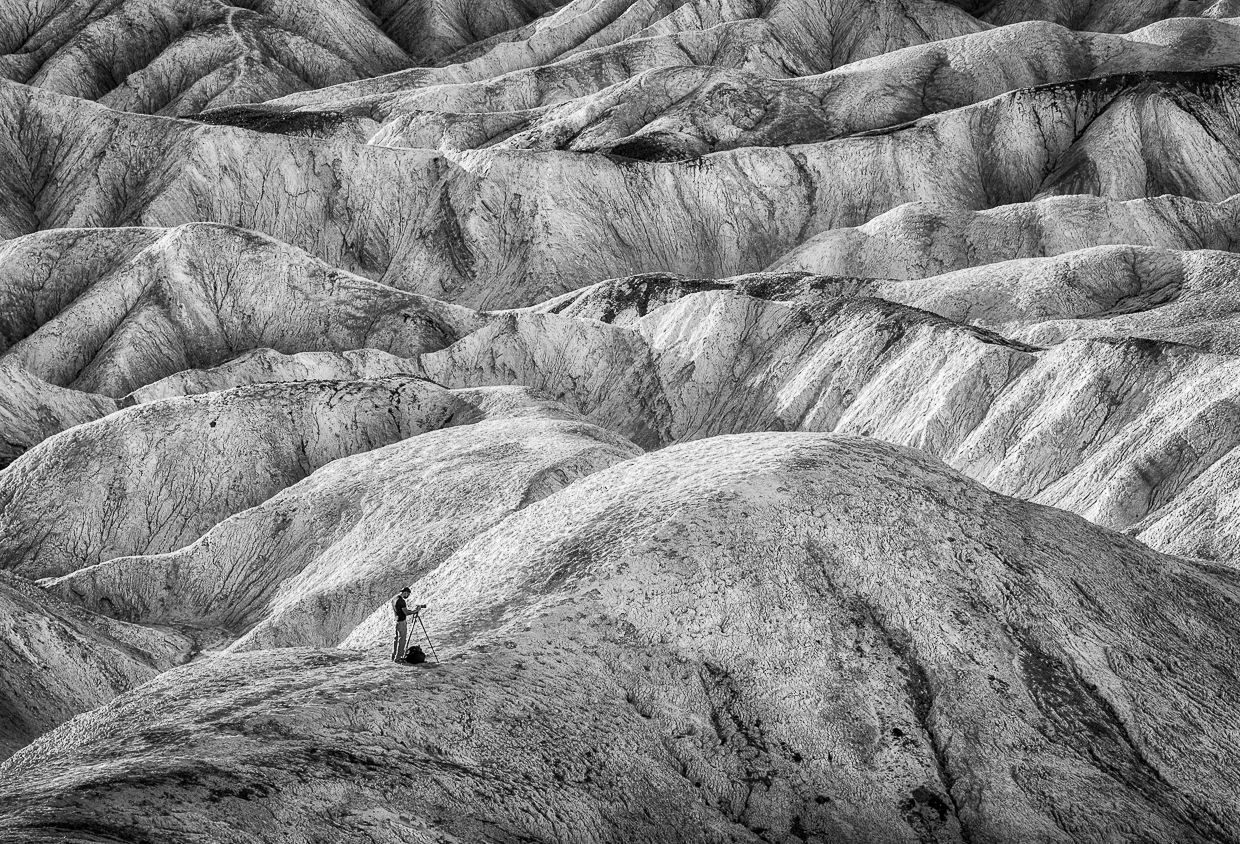
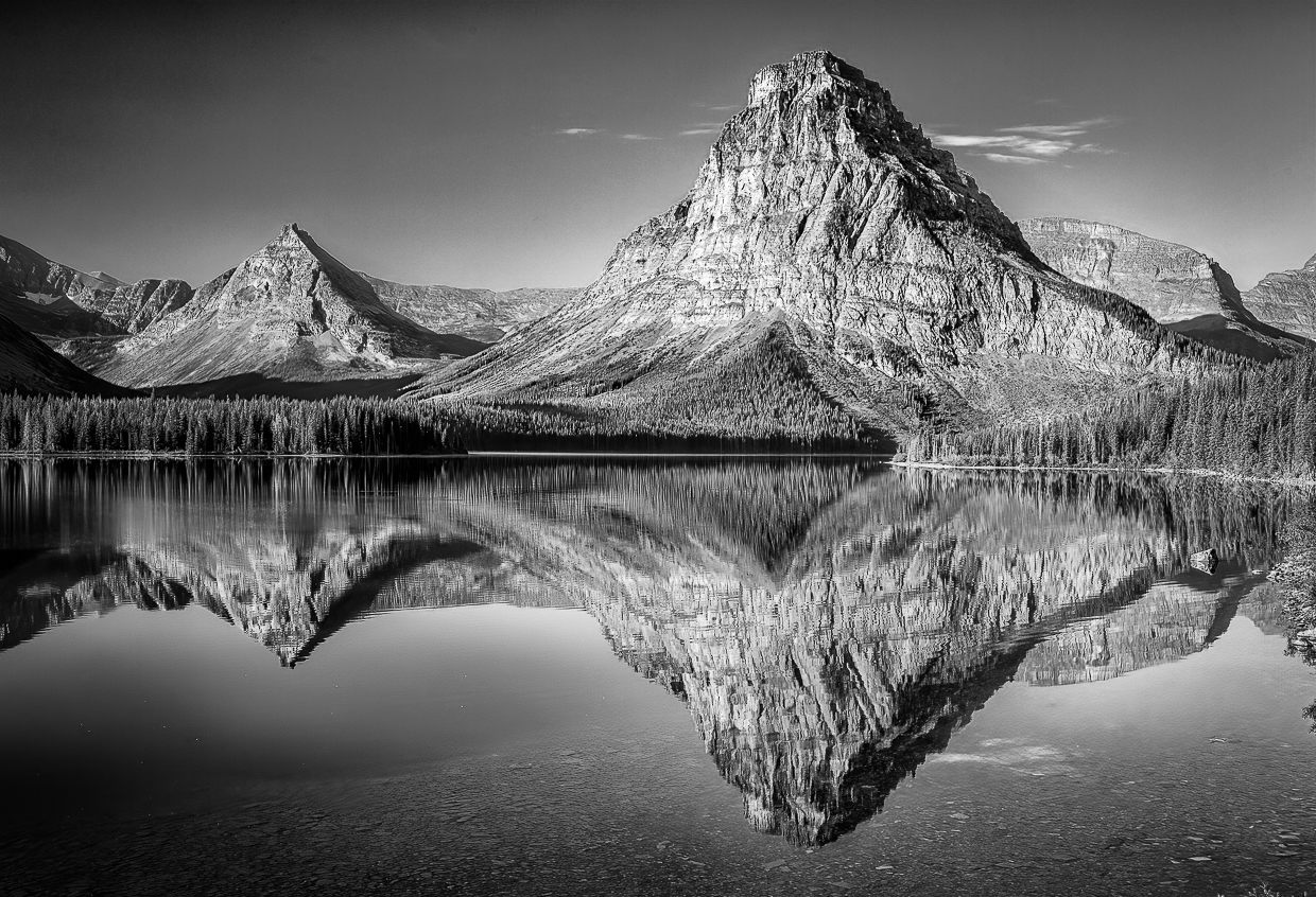
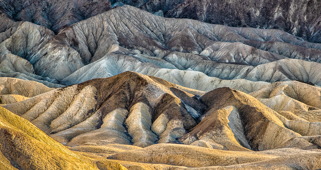
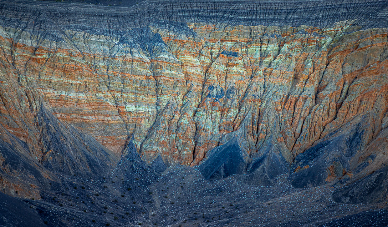
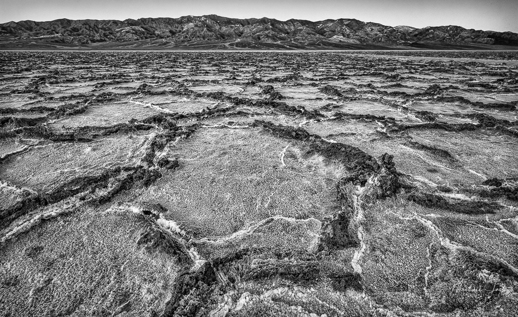
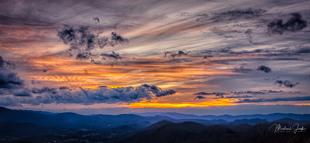
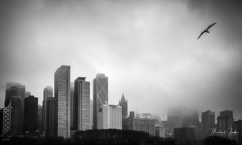
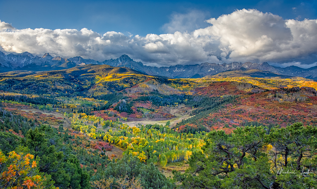
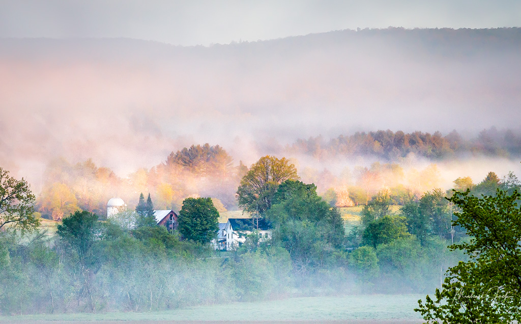
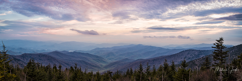
Nice work on a B/W conversion - it appears you worked in the full tonal range and achieved a strong contrast. I like the way you captured the layers of the mountains and did so sharply with no evidence of over sharpening. The composition works for me to with the upward lines leading the eyes into the fog and sun. I agree with Arne about the crop - right now the landscape is about 1/2 the image and the top sky is bright pulling my eyes up. I would consider cropping down to the darker part of the sky, leaving adequate room for the sun. A personal quirk would be to consider slightly taking the bright tree trunks down a notch in the bottom right to keep from being a distraction. |
Sep 4th |
7 comments - 1 reply for Group 36
|
7 comments - 1 reply Total
|