|
| Group |
Round |
C/R |
Comment |
Date |
Image |
| 36 |
Apr 20 |
Reply |
I wondered how it would look in monochrome but have not done that yet. Thanks for the view. |
Apr 7th |
| 36 |
Apr 20 |
Comment |
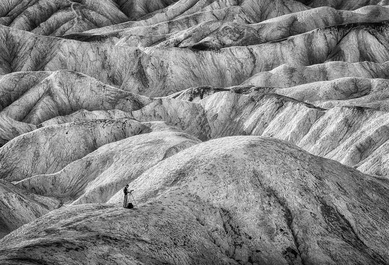
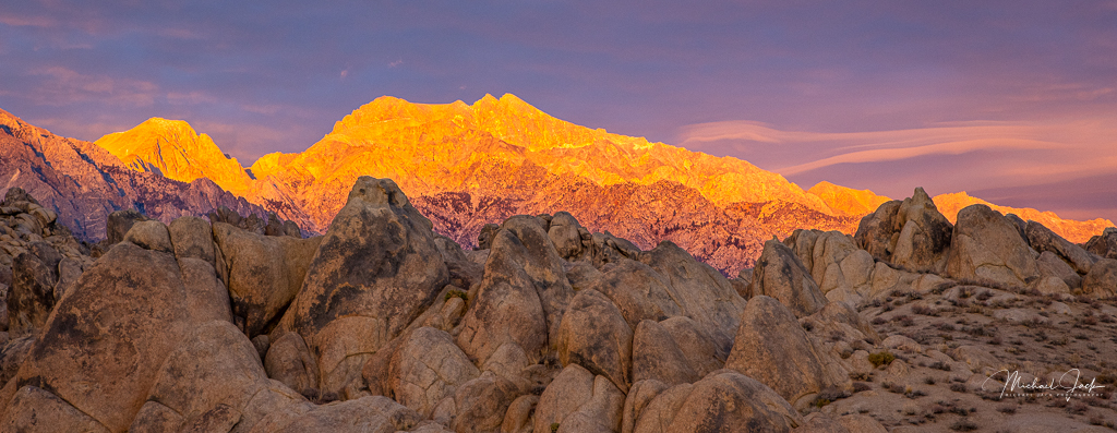
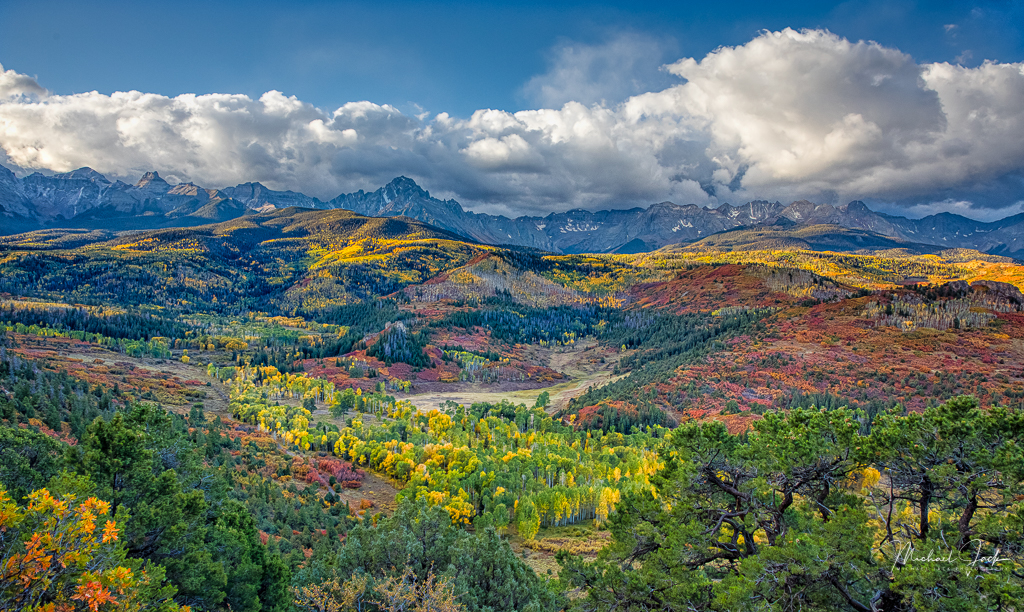
I agree with Larry's comments about the sky and what appears to be blown out rock on the bottom right. To me, I think your initial image was the right composition because the heavy rocks on the bottom right balanced the rise of the mountains on the top left of your image. I might try to see if you could salvage the exposure and texture of the rock on the bottom right and then reduce the exposure in that corner to keep the eye from going there. I might even try to really cheat and if you have new PS do a content aware fill using the other rocks as reference or cloning in some rock detail. Agree that is work - and cheating. Also, you may want to watch to make sure you have separation of subjects. The rock in the foreground touches the shadow of the mountain so if you has raised your angle slightly you could have a separation. |
Apr 5th |
| 36 |
Apr 20 |
Comment |
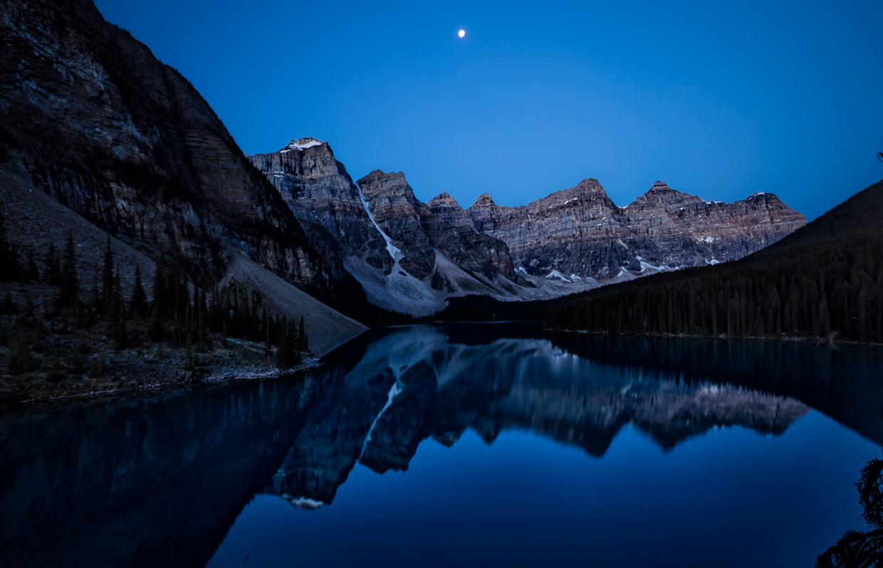
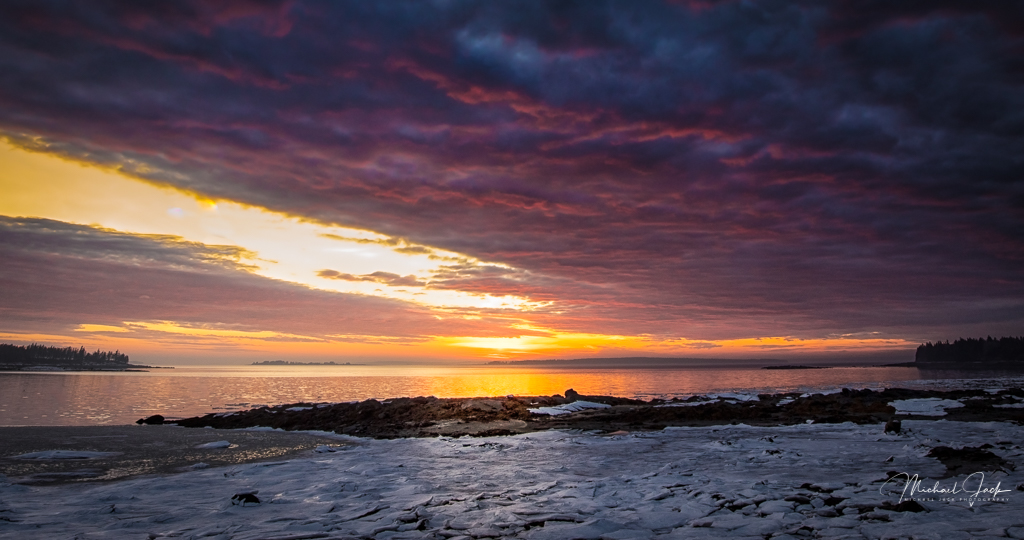
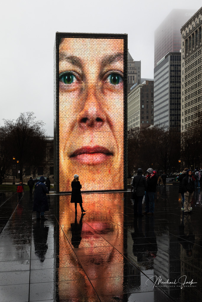
I like the dark, moody look of this image and the dark sky. I also like that I can see some texture in the land but the foreground is mostly in silhouette which forces my eye up to the cranes and smoke stacks. My initial reaction was the image is not level, but I might be influenced by the background. You might check that though. While I like where the image ends with the white smoke converging into the dark, if you had a redo I think I might have composed a bit to the right to leave a little more room for the tower in the bottom right and balance the image better between smoke and cranes. To my eye it appears you might be able to add more tonal range by moving the white slider to the right so the smoke approaches closer to white without blowing out. Like this image though. |
Apr 5th |
| 36 |
Apr 20 |
Reply |
Great suggestion; appreciate that |
Apr 3rd |
| 36 |
Apr 20 |
Comment |
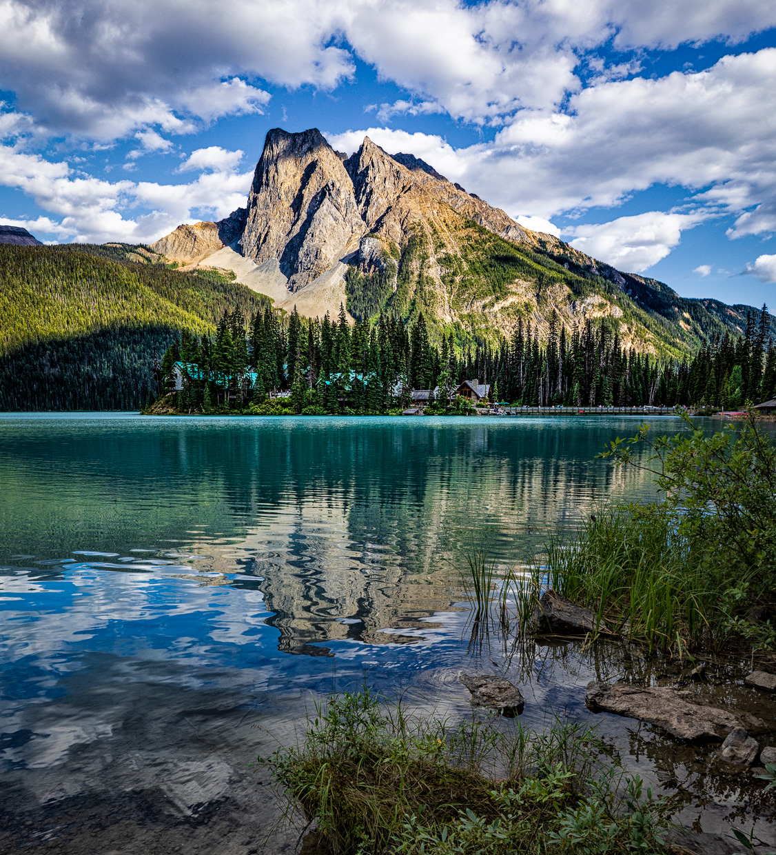
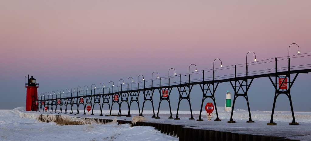
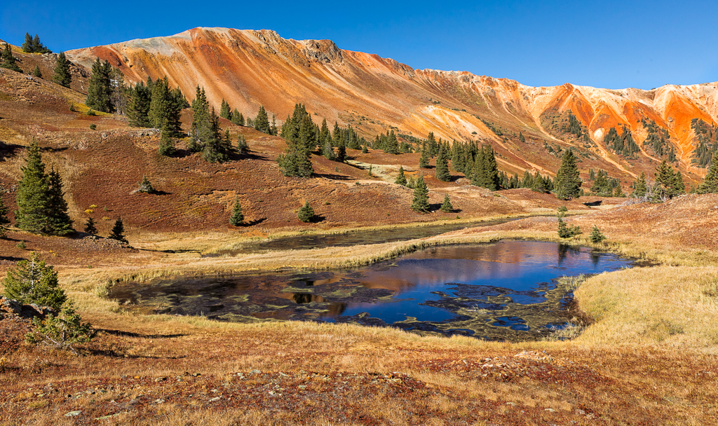
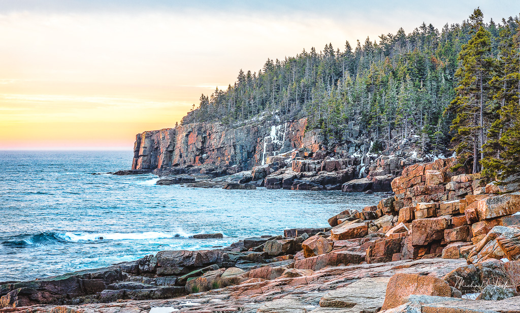
To my eye this is a great composition. The curvature of the cliffs keep my eye in the image and then force me to look in the valley and then follow the top around again. The clouds add interest to the image from both their presence and the shadows they create. I like where you cropped (or shot) the sky. You must have done a good job on the repair since I can't see it. One alternative to the repair is to select a like area, create a separate layer with it, feather a mask with the selection and move and resize it via transform to blend it in using one of the layer blend modes. One other comment, again to my eye, the image looks over sharpened and is almost crunchy. Others may not see it that way so that is just me. |
Apr 3rd |
| 36 |
Apr 20 |
Comment |
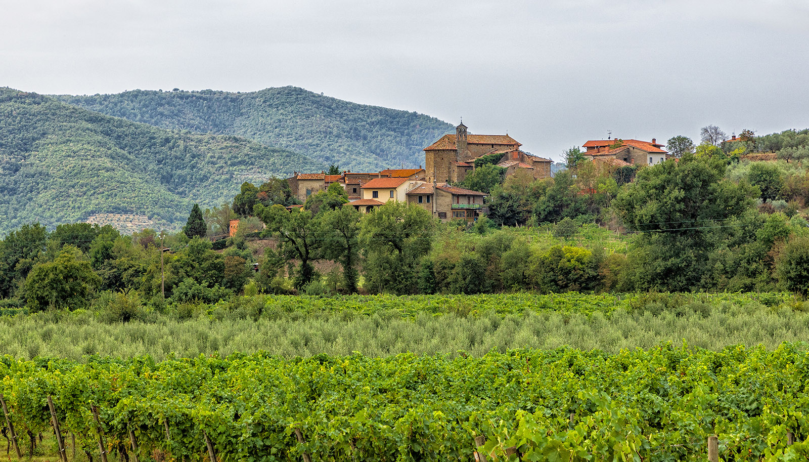
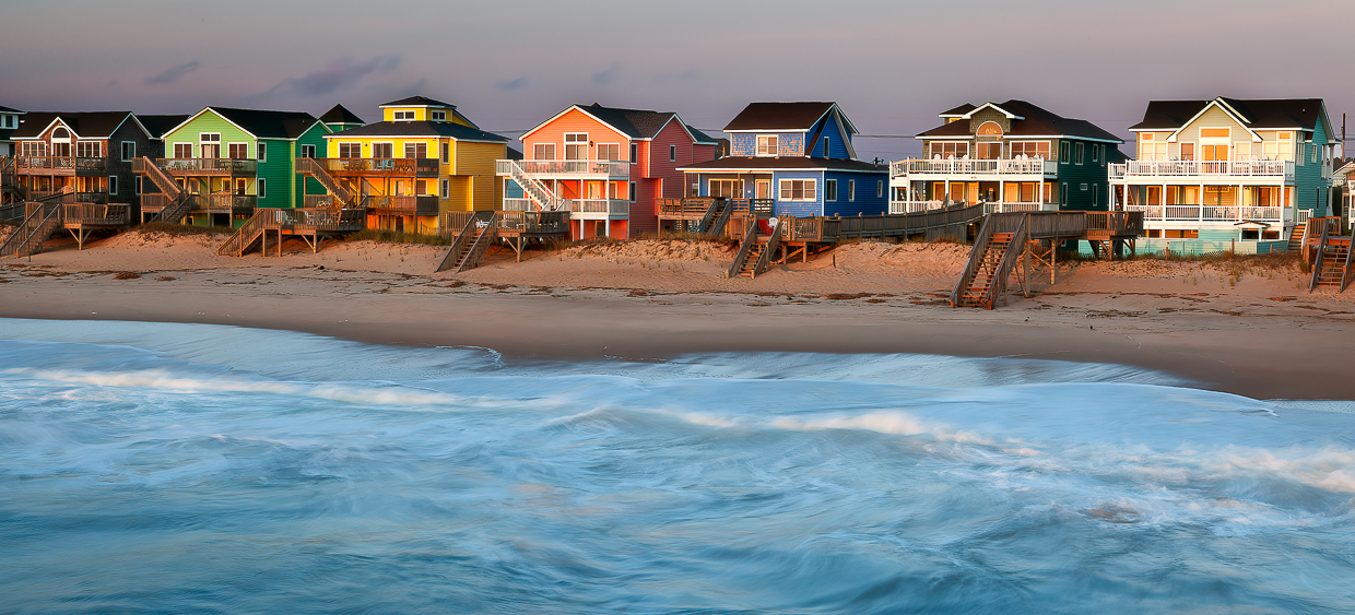
I like the line of the shore leading to the village, the upward slope of the hill from the water which adds interest to the composition, the individuals on the beach to give interest and a sense of scale, and the choice where to crop the image on the right. The image seems sharp and well exposed throughout. I would think about cropping more out of the sky. Depending on your artistic bent, you could consider adding a bit more drama to the sky by brushing in some clarity or dehaze. It almost looks to me like there was more contrast in the sky in the original image than your final one but I could be mis-seeing. It was fortunate you were in Italy in 2016 and not today.
|
Apr 3rd |
| 36 |
Apr 20 |
Comment |
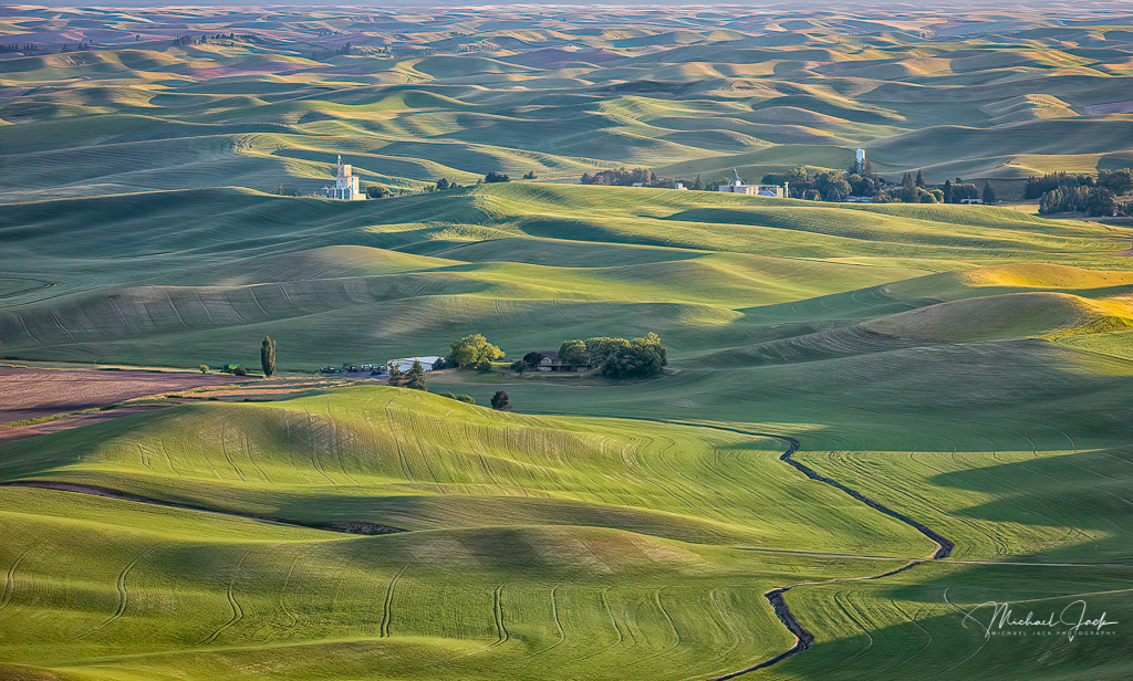
Love the color in this image. To my eye it looks sharp throughout, the choice of lens gives a good perspective feel, and the angle of the shot gives more energy to the shot. I know you like to keep your shots realistic so am hard pressed to make any recommendations other than maybe darkening the bright green triangle at the upper right of the image. Nicely seen. Hopefully next month we can see some lavender field shots.... |
Apr 3rd |
| 36 |
Apr 20 |
Comment |
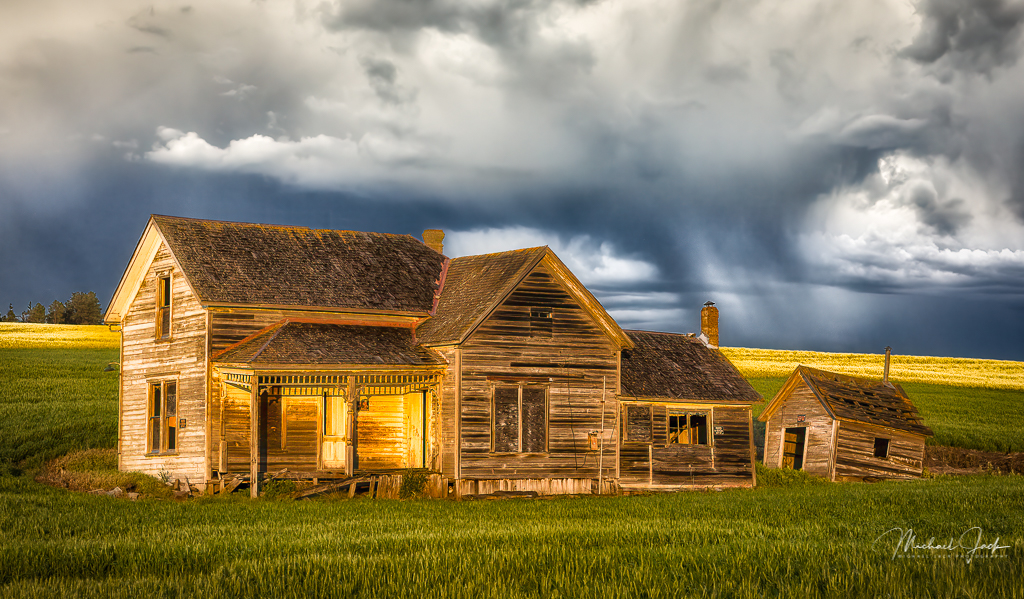
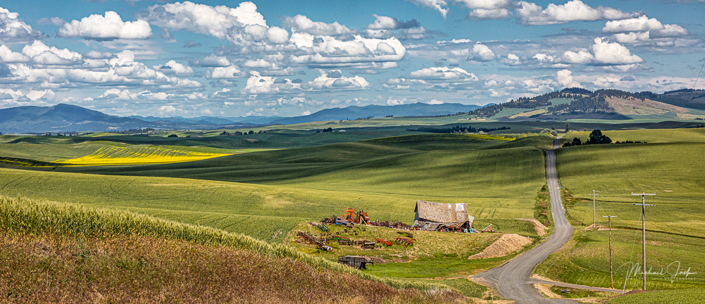
I can't tell you how many times I have taken shots of this cabin and later considered them uninspired. This is a very creative, thoughtful, well-composed image. My eye went immediately to the warm yellow light. Capturing the fence at an angle lets my eye follow it up and around to frame the cabin. If you had taken it straight on, it would have formed a barrier to the house so well done. I agree with Arne that I would darken the grass in front and the treetops behind the cabin and the tree on the right - some more or less depending on taste. I would consider darkening the light on the side of the chimney to make it look a bit more realistic. Overall a really awesome image. |
Apr 3rd |
6 comments - 2 replies for Group 36
|
6 comments - 2 replies Total
|