|
| Group |
Round |
C/R |
Comment |
Date |
Image |
| 36 |
Mar 20 |
Reply |
This is it |
Mar 8th |
| 36 |
Mar 20 |
Reply |
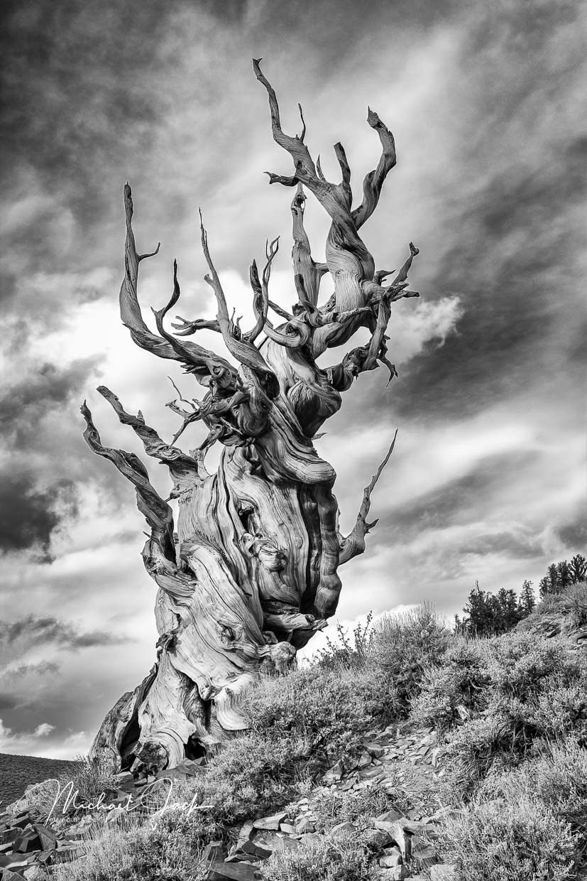
The revised one looks better to me. You have great color in the color image, but that would have detracted from the tree so I think your B/W conversion made sense. |
Mar 8th |
| 36 |
Mar 20 |
Comment |
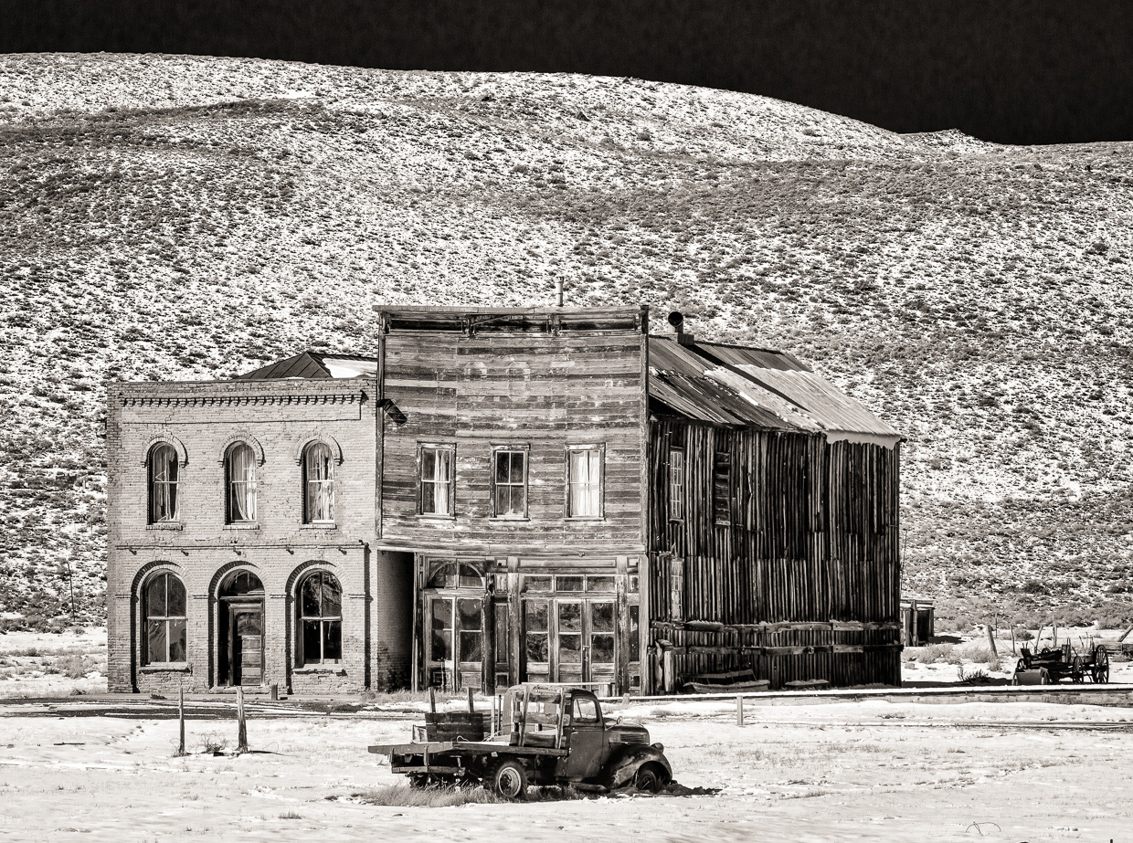
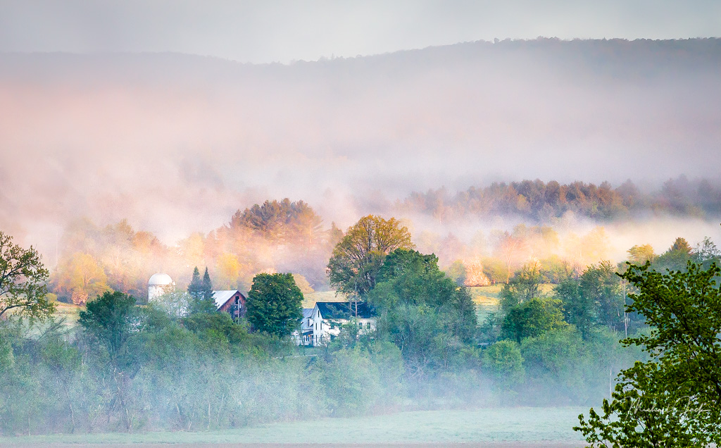
A nicely composed country road. The saturation appears right to my eye to bring out the fall colors. It is good you didn't include the sky. The shutter speed appears more than fast enough to have a sharp image so it appears with an open aperture you focused down the road rather than using a hyperfocal focus point which led to some softness closer in. I agree you could crop in from the left but alternatively you could just take a brush and darken the tree on the right. Make it three votes to have tried a lower perspective and then select which view you like best. You may want a shorter lens if you do that, otherwise the road dominates the image. |
Mar 8th |
| 36 |
Mar 20 |
Comment |
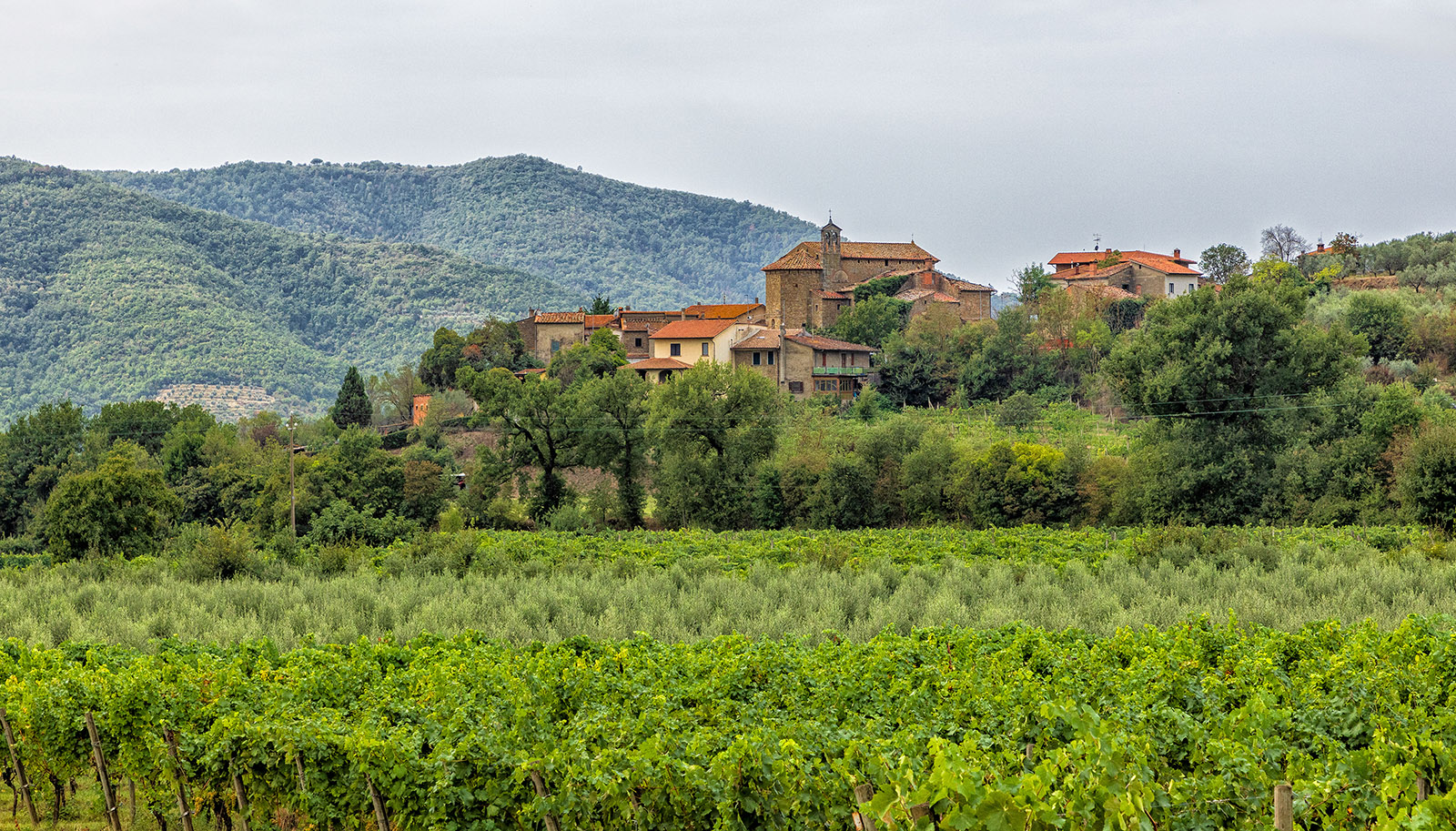
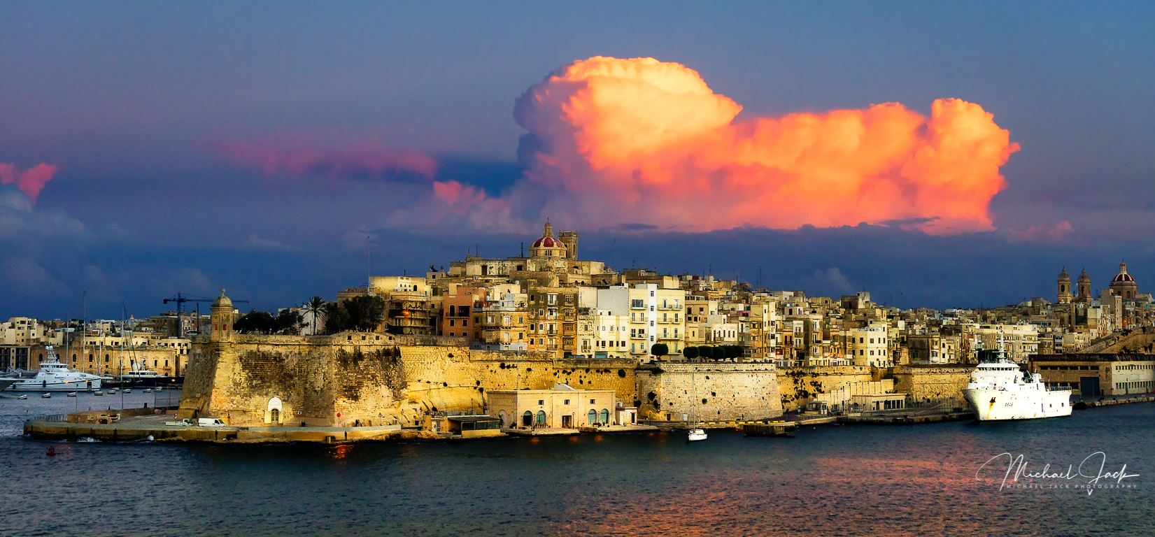
I agree with Larry's suggestions about cropping from both sides. To me this image gives a great sense of place and mood. With the cropping I like the composition with the castle rising from the landscape. The exposure seems to work well as well to create the scene. A few considerations - my eye first went to the tree in the middle front of the image and later found the castle. These changes would be subtle, but I would consider slightly taking the highlights out of the front tree and conversely bringing up the shadows in the castle to take the eye there first. You might consider adding a bit more drama to the sky, but that is a personal choice. |
Mar 8th |
| 36 |
Mar 20 |
Comment |
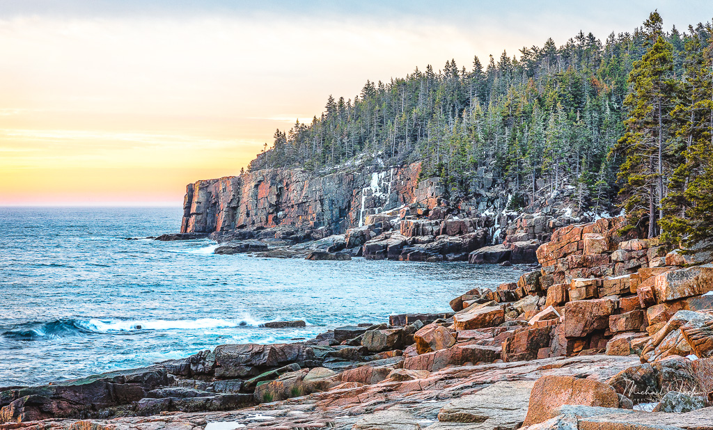
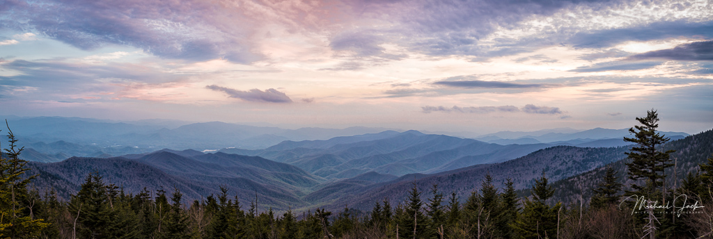
This a nicely composed and cropped image. I like you included the trees in the foreground and got them sharp, agreeing with Larry's comments. The clouds make this a different, and much better, image of the mountains. The color balance looks perfect to my eye. This may be an over reach, but I wonder what the image would look like if you took the LR circular filter over the mountains and see what a bit of dehaze would do. |
Mar 7th |
| 36 |
Mar 20 |
Comment |
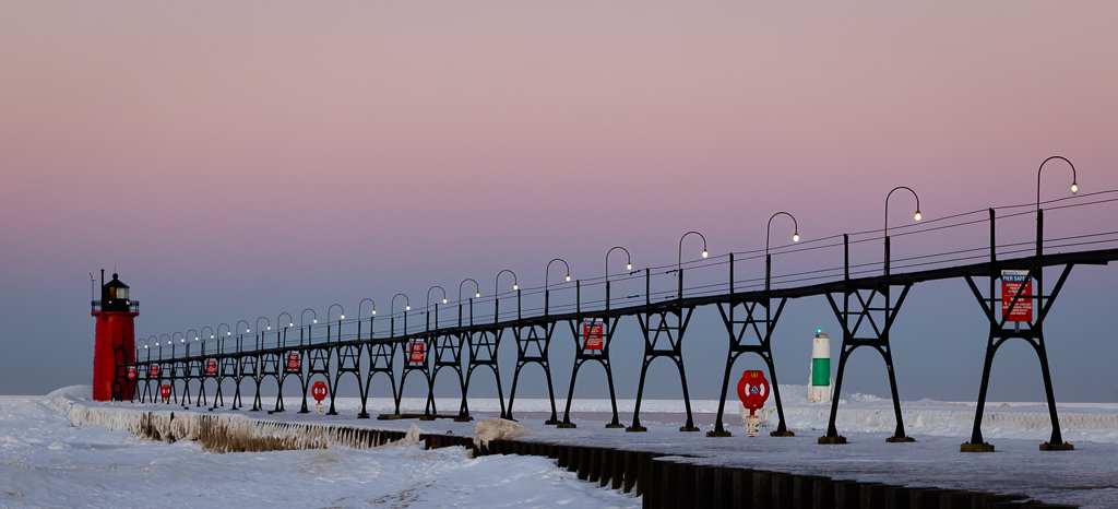
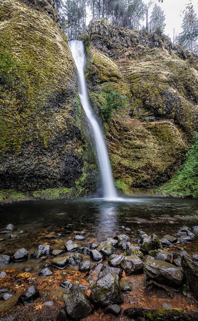
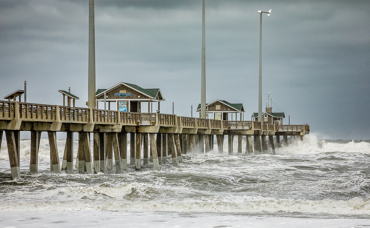
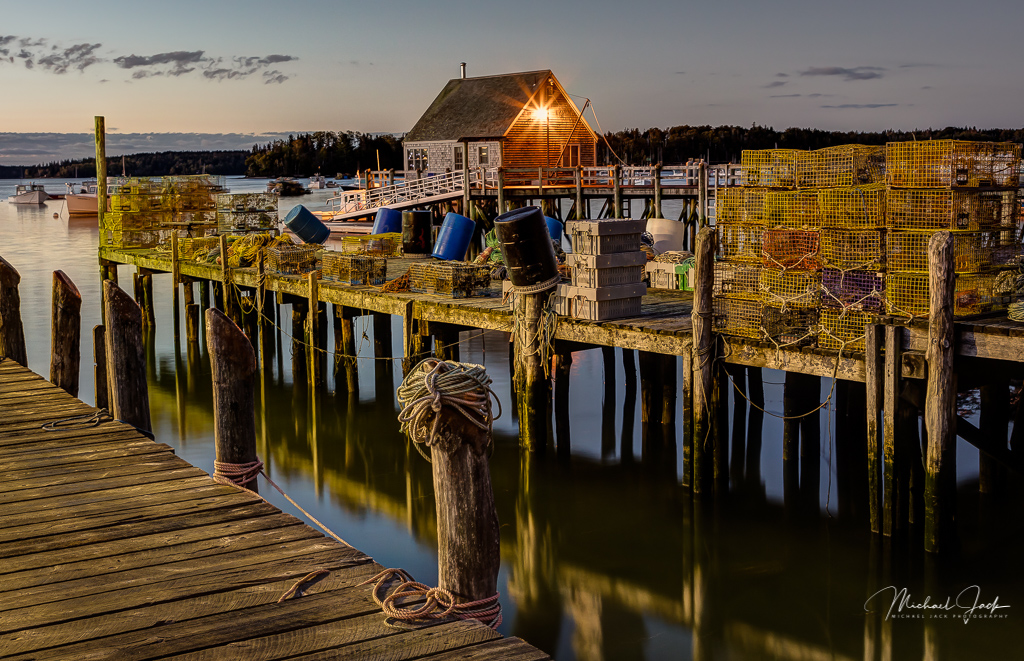
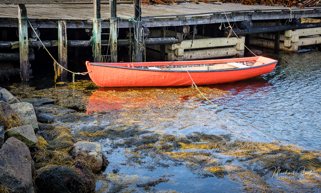
This is a really creative image with a great choice of a long exposure. For that long an exposure, you did an outstanding job of keeping the peer very sharp. From only my opinion, since the water line disappears but the edge of the pier is still clearly visible, I might consider adding a fog effect at the end of the pier so it also fades into the ether. I feel the foreground rock is a bit close to the edge of the frame, but agree with the choice to include a foreground element which adds interest to the image. |
Mar 7th |
| 36 |
Mar 20 |
Comment |
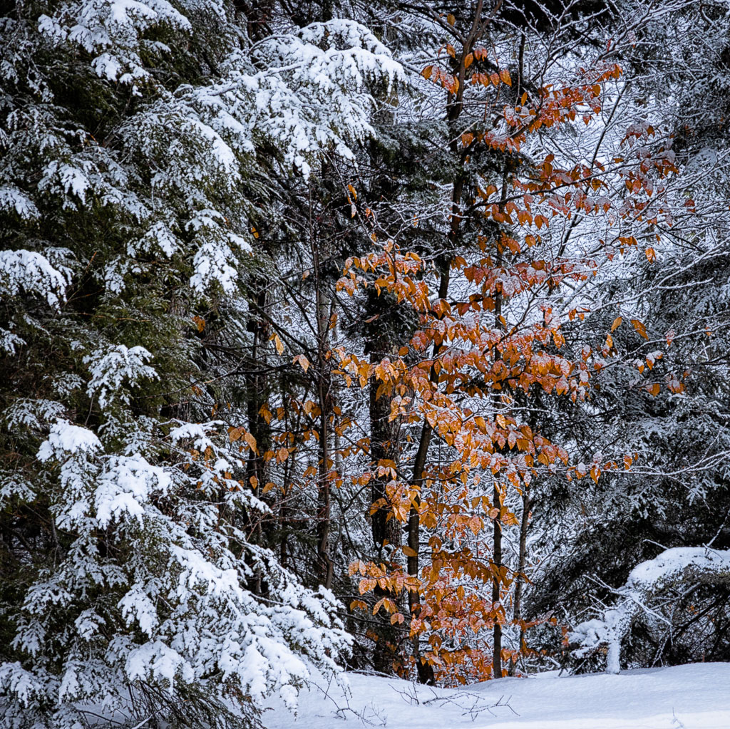
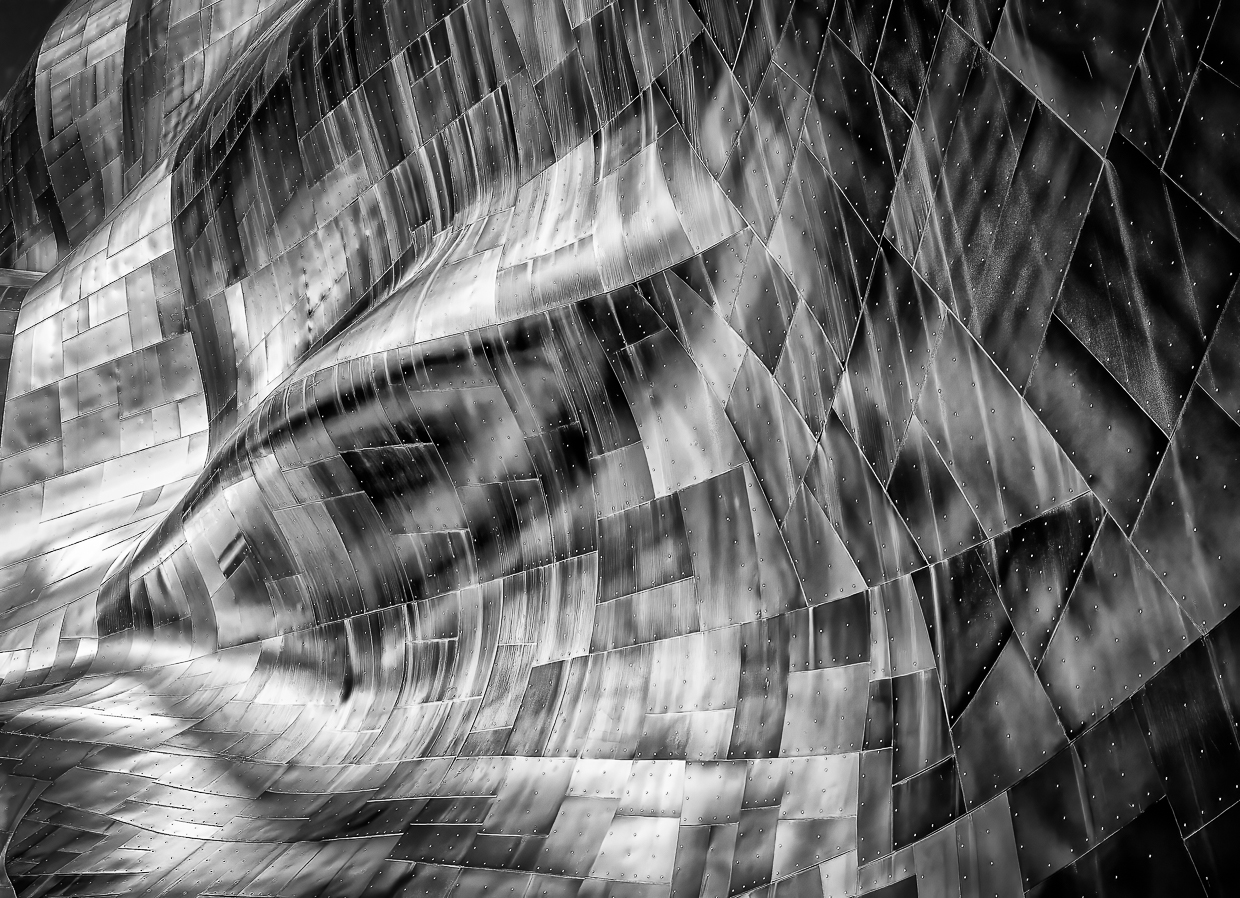
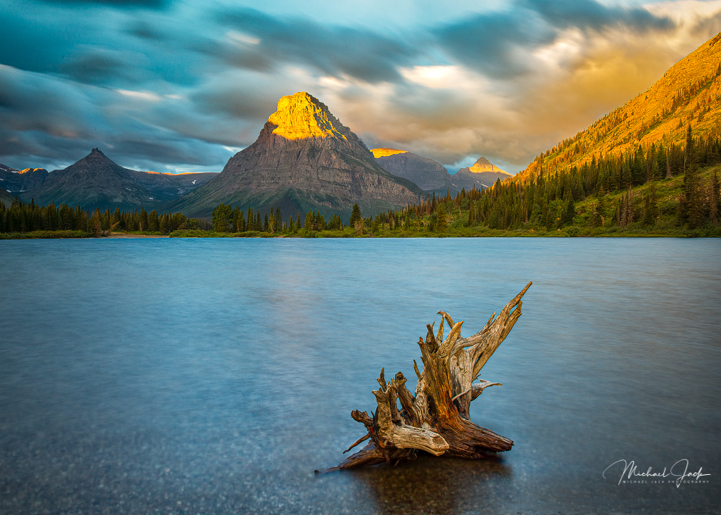
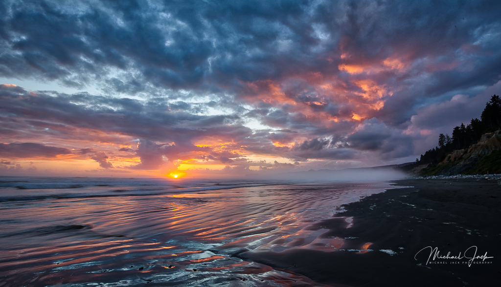
To me this is a really strong composition with the placement of the driftwood and the choice to use a long exposure to take the waves out of the water which would have competed for attention. Good sky and vignetting too. For me, the trunk looks a little over sharpened, and it appears that led to some artifacts at the edge. Overall, a wonderful fine art image though |
Mar 7th |
| 36 |
Mar 20 |
Comment |
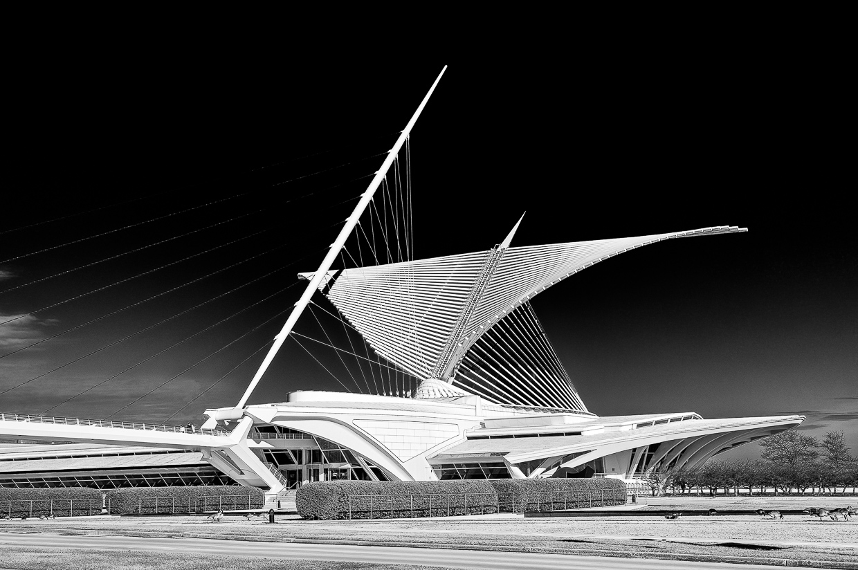
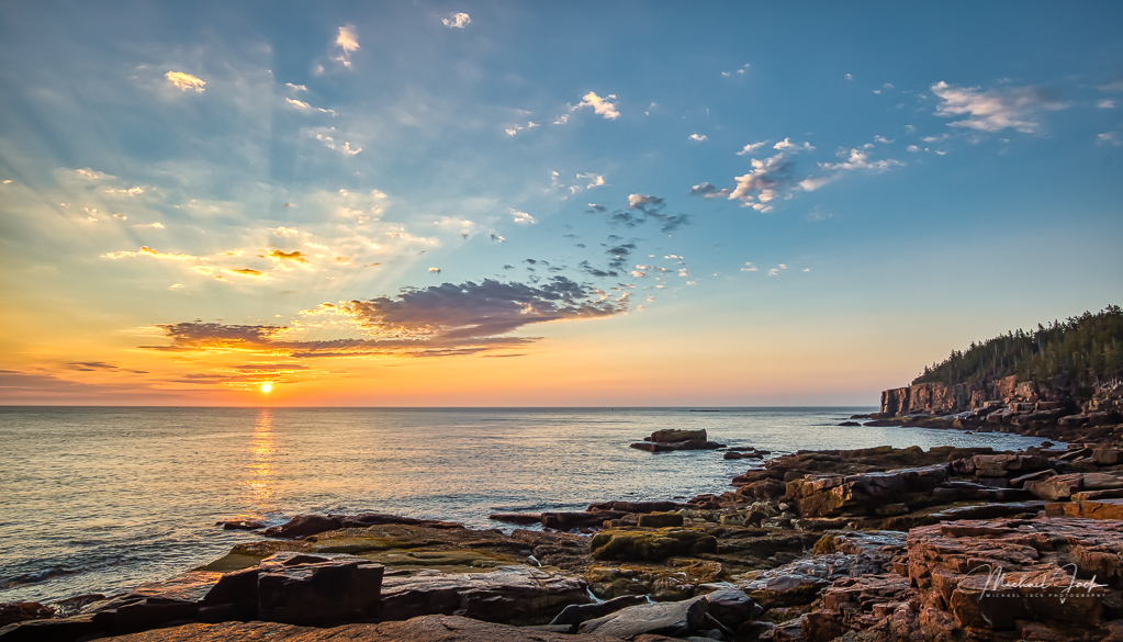
This is one where I differ with Larry. I like the keystone perspective because to me if adds a sense of majesty. Technically it looks good to me, and you have a complementary sky. I like the space you left next to the flag poles which would be lost if you straightened the image. My only suggestion is to my eye the building does not look level so if correct, you may want to level it using the structure of the building to do so. I realize sometimes something may be correct but the eye perceives it differently. I would go with the eye view. |
Mar 7th |
6 comments - 2 replies for Group 36
|
| 67 |
Mar 20 |
Comment |
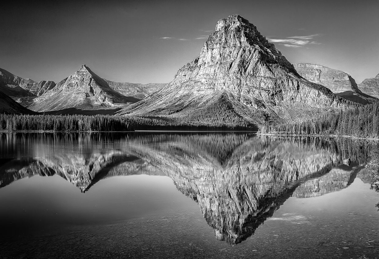
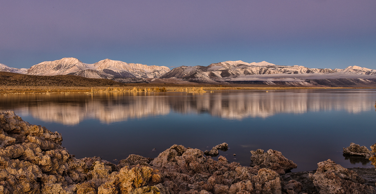
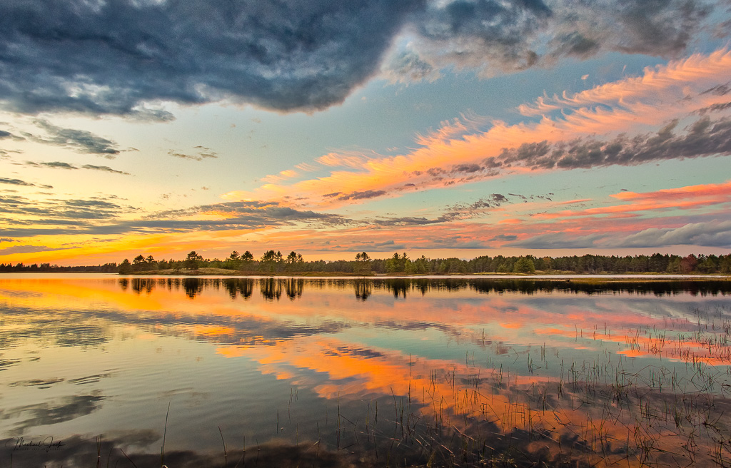
This is one of those wow images. With the reflection in the lake it makes sense to put the horizon in the middle. I like you got sharpness in the foreground as well as the background. It appears to me the sky has a lot of noise, and I see artifacts where the dark mountains meet the sky - maybe some oversharpening (or a bad eye on my part....). A couple of suggestions - I would consider darkening the bright part of the grass in the lower left hand part of the image and maybe pull back the saturation a few points. The rule of thumb is that a reflection is generally one stop lower that the item being reflected. In this case the water is brighter than the mountain so I would consider bringing up the exposure in the mountain and lowering it in the reflection to make it look more natural. |
Mar 9th |
1 comment - 0 replies for Group 67
|
7 comments - 2 replies Total
|