|
| Group |
Round |
C/R |
Comment |
Date |
Image |
| 36 |
Jan 20 |
Comment |
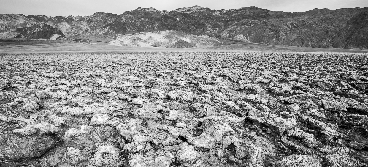
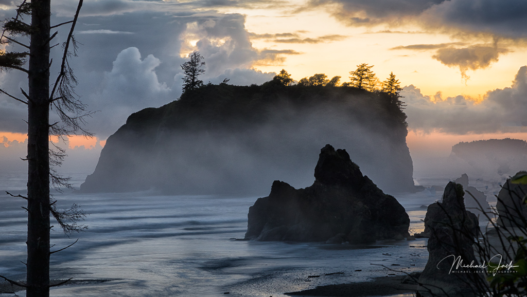
Add one more vote for the preference for B/W. This certainly has some of the Adams characteristics. I liked the way you darkened the bottom and sides to keep my eye centered in the image and the sky replacement definitely adds interest. It may be the way I see the image on my screen, but to me, the mountain looks a bit oversharpened or crunchy so I would consider backing off the related sliders some |
Jan 16th |
| 36 |
Jan 20 |
Comment |
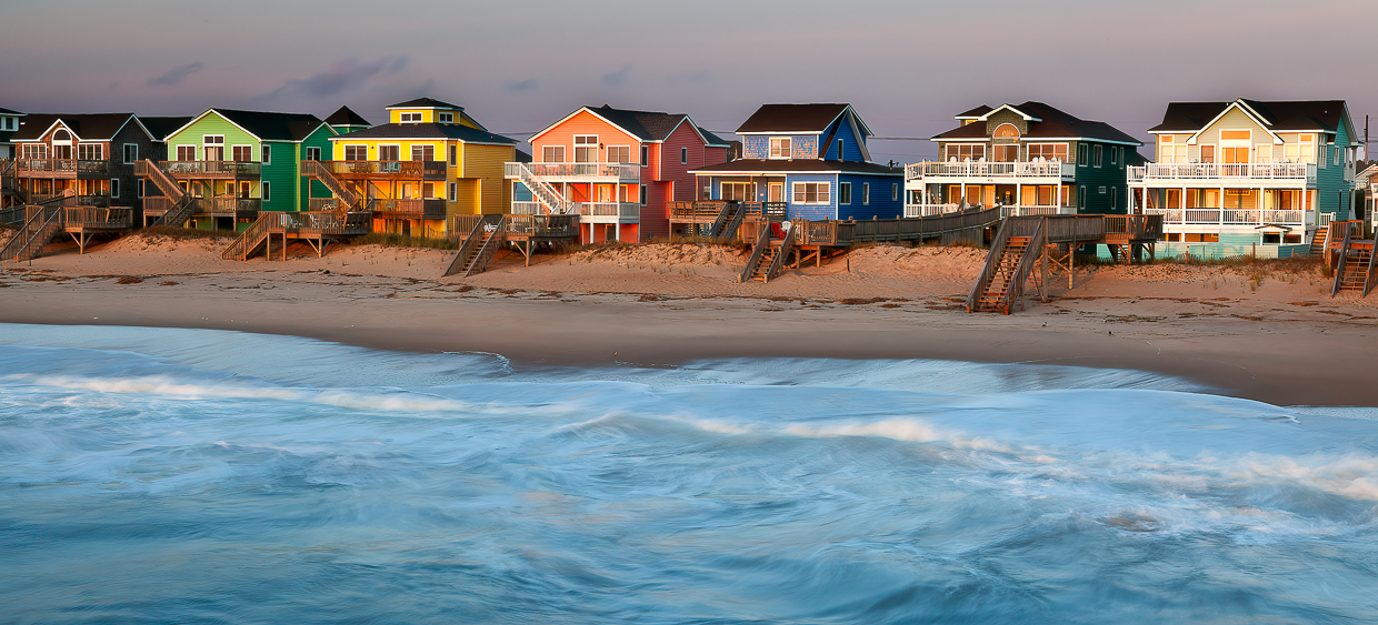
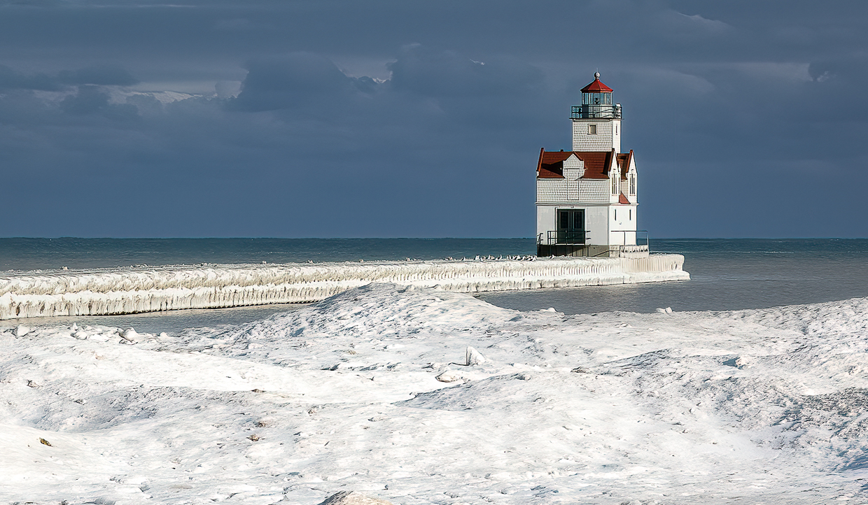
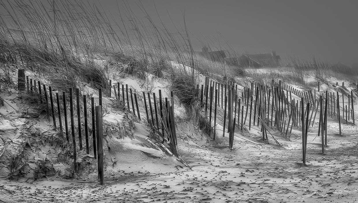
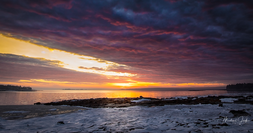
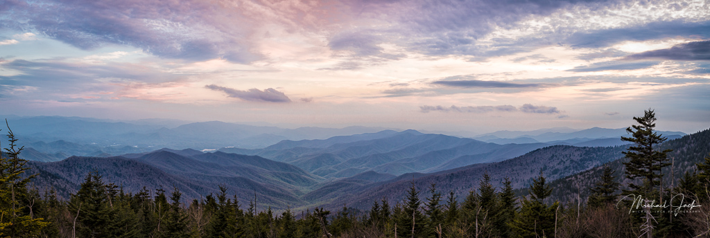
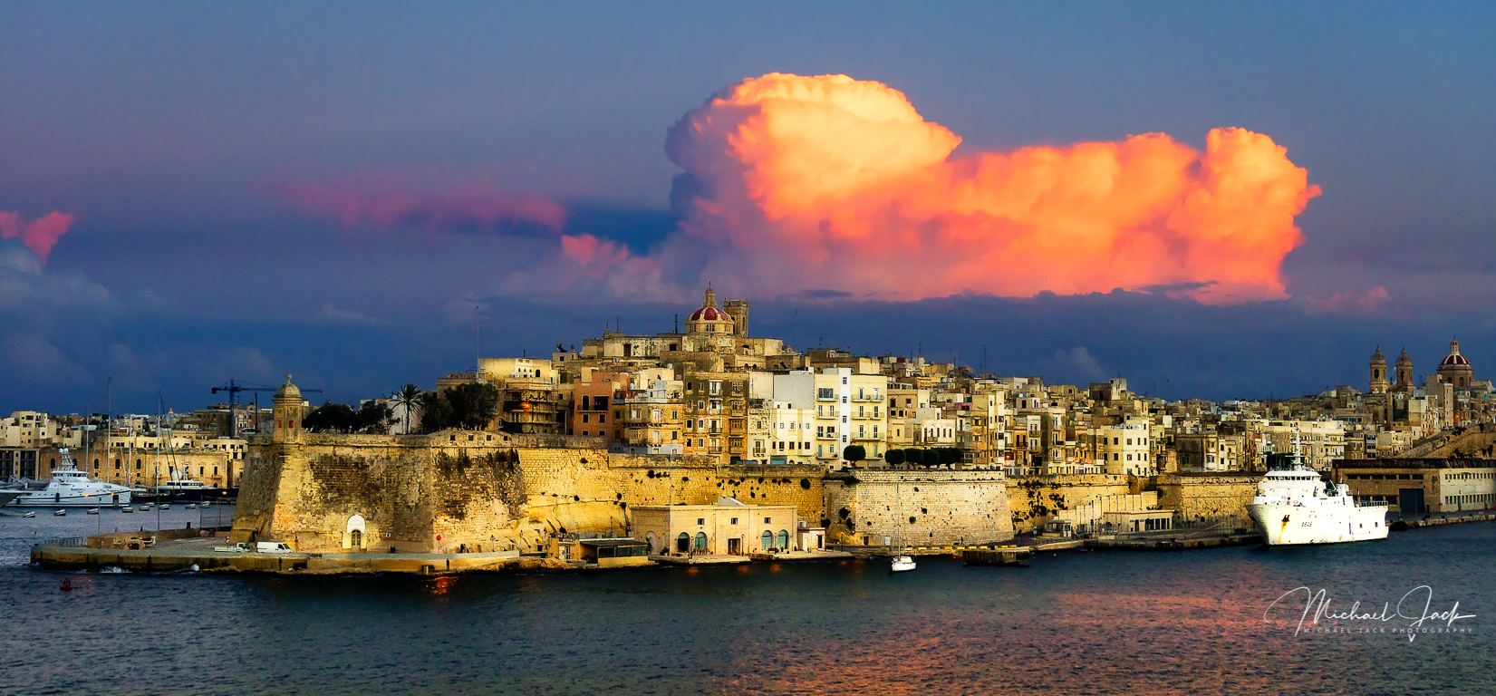
I also like the color in the clouds and cloud structure and agree with Larry that you could consider cropping up some from the bottom. I don't think I would go as far as Larry but would probably darken the water and beach just slightly and conversely bring up the shadows in the buildings (I seem to say bring up the shadows a lot so maybe I could just say recommendation #4 to shortcut it.) To me, making the buildings lighter keeps my eye from dropping to the lighter water and beach and creates a layer of separation from the lower clouds. |
Jan 7th |
| 36 |
Jan 20 |
Reply |
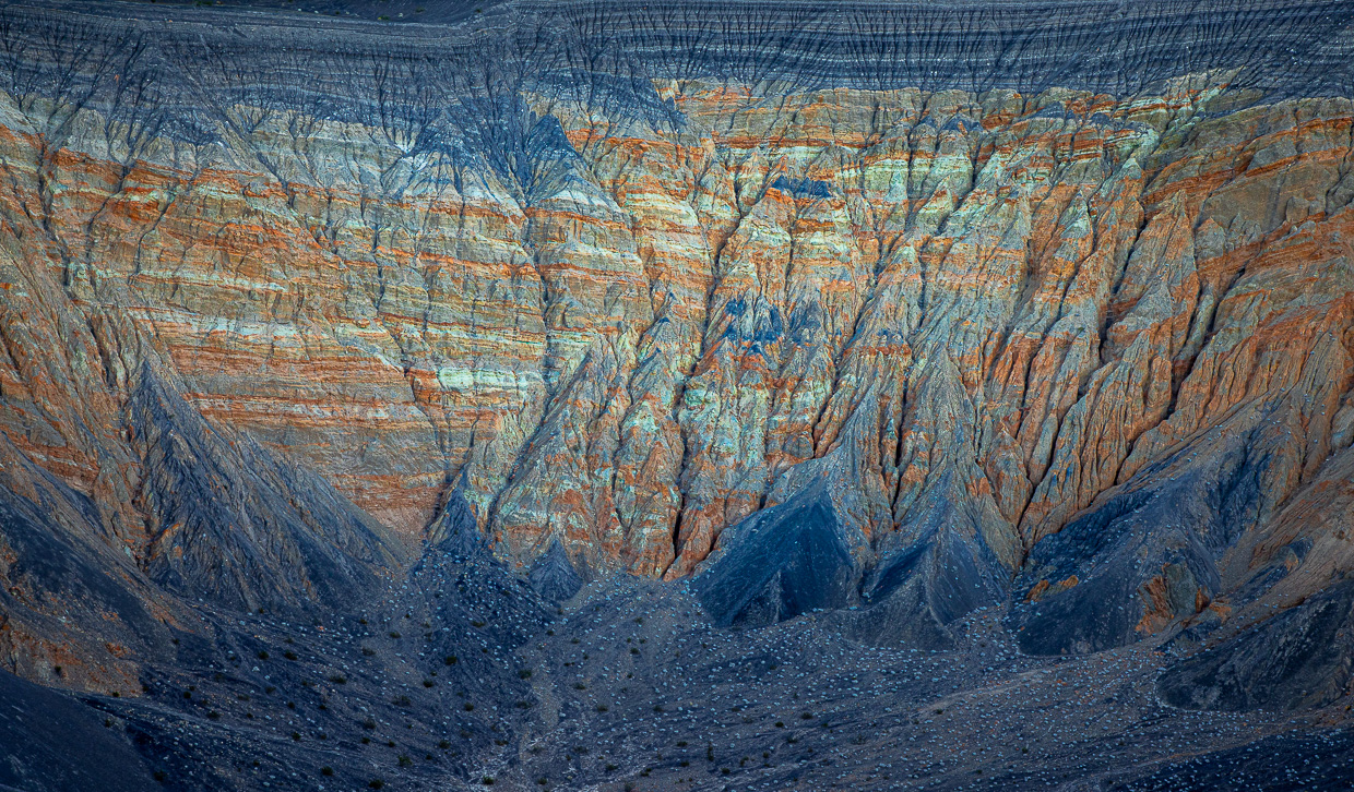
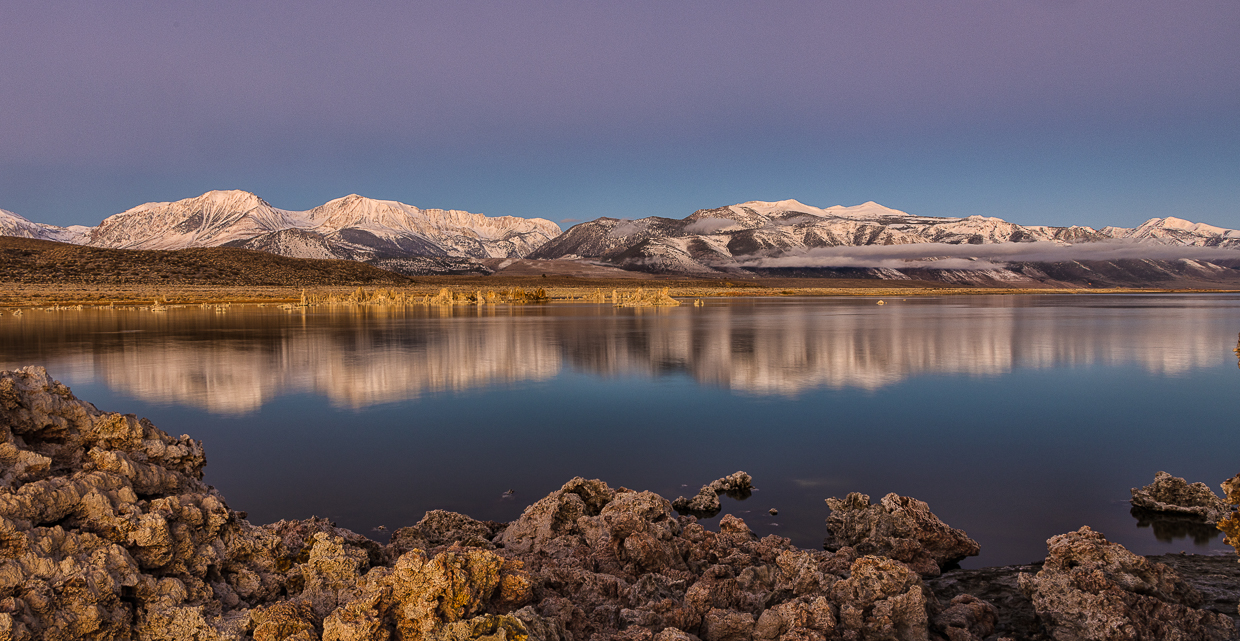
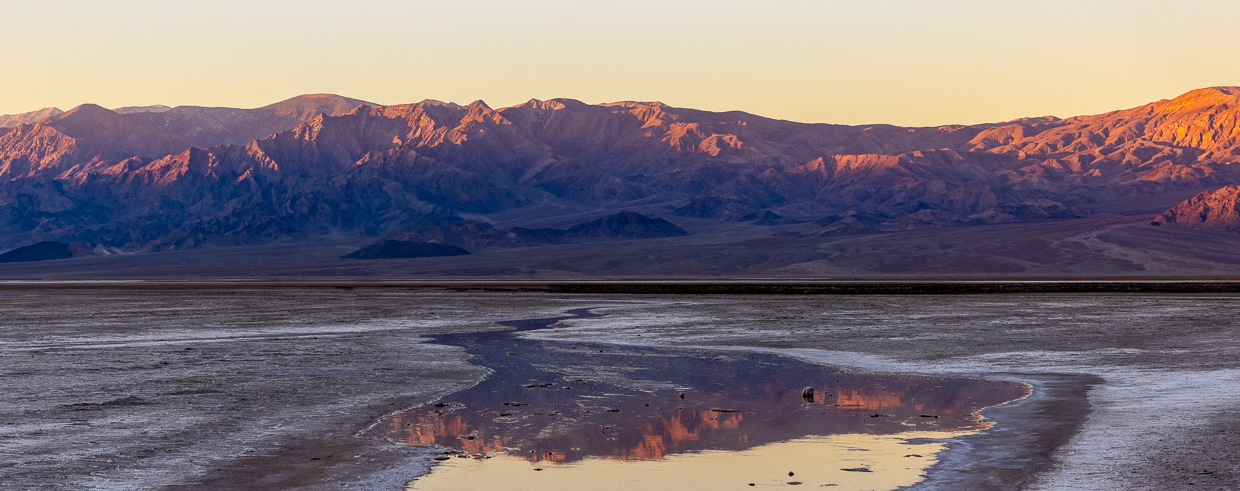
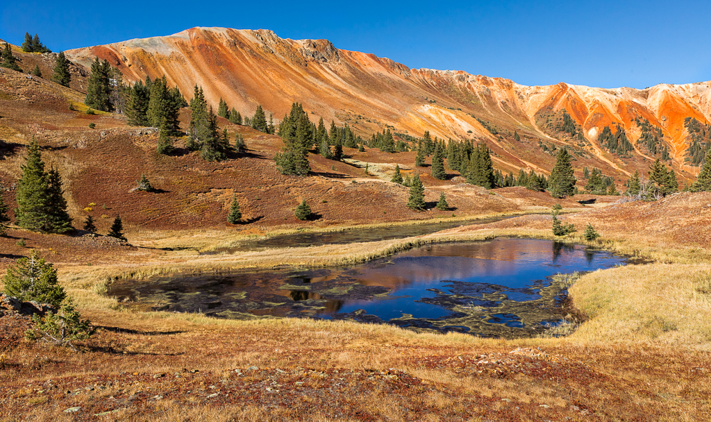
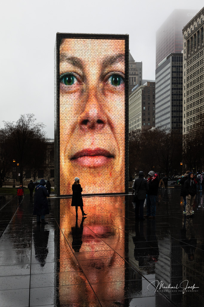
I agree with your suggestion on the crop. I did use clarity/dehaze to try to enhance the reflection but maybe there is more there. The color of the peaks is pretty accurate and contribute to the name of "red mountains." Admittedly I would have your reaction if I had not been there. |
Jan 7th |
| 36 |
Jan 20 |
Reply |
You did indeed comment on the sign. Good eye and sorry I missed your comment. |
Jan 7th |
| 36 |
Jan 20 |
Comment |
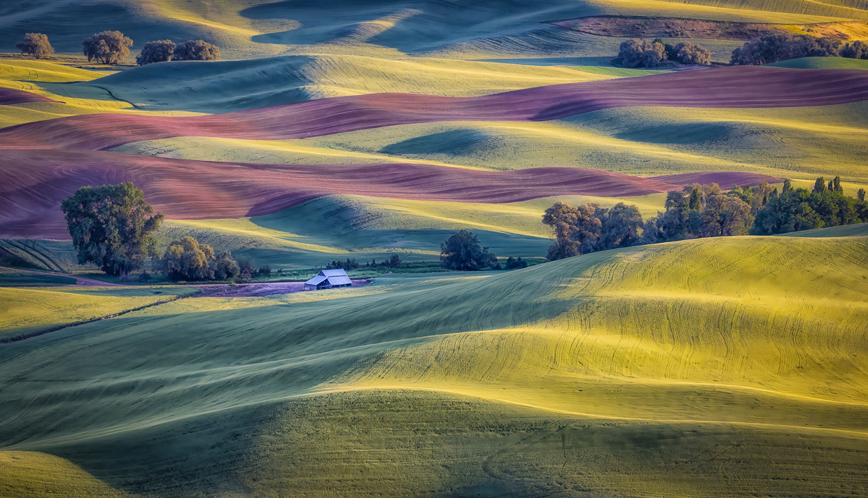
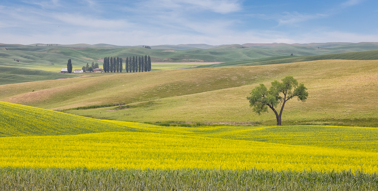
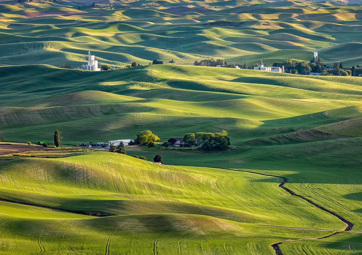
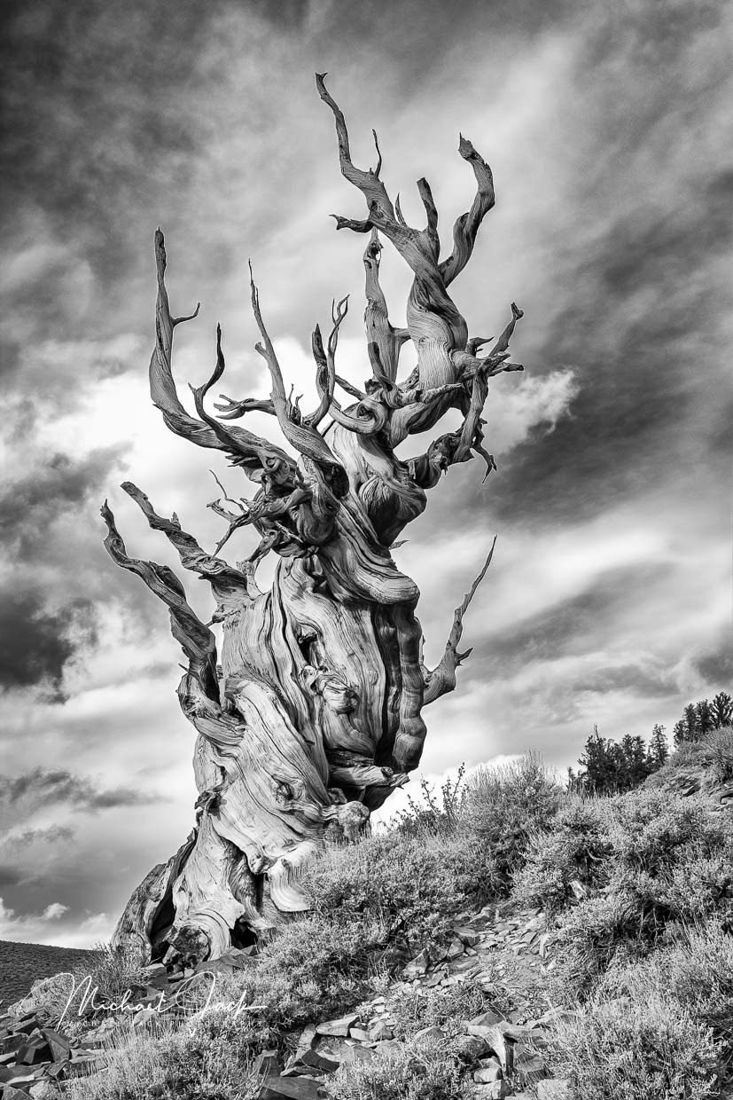
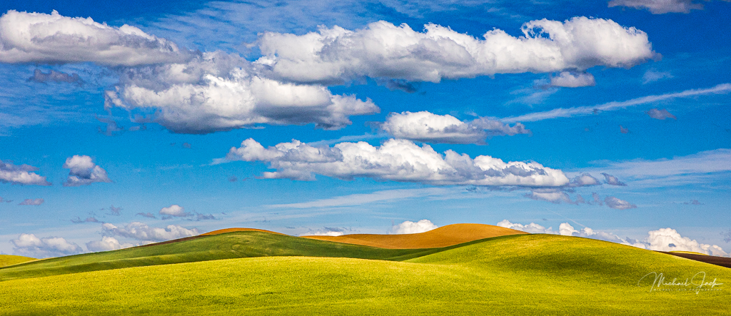
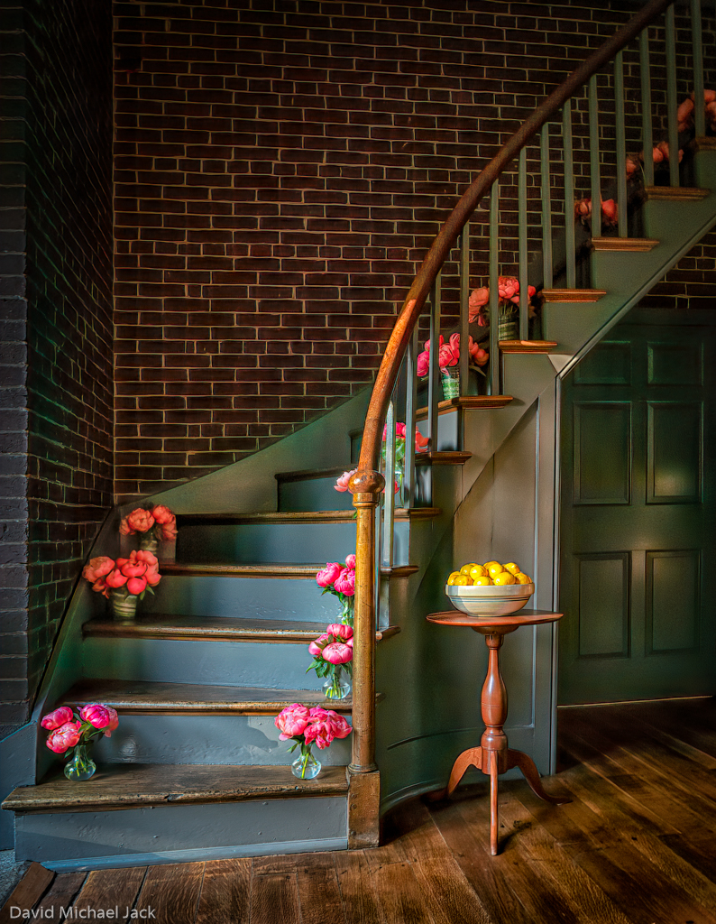
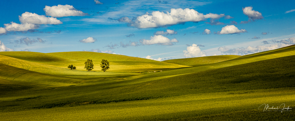
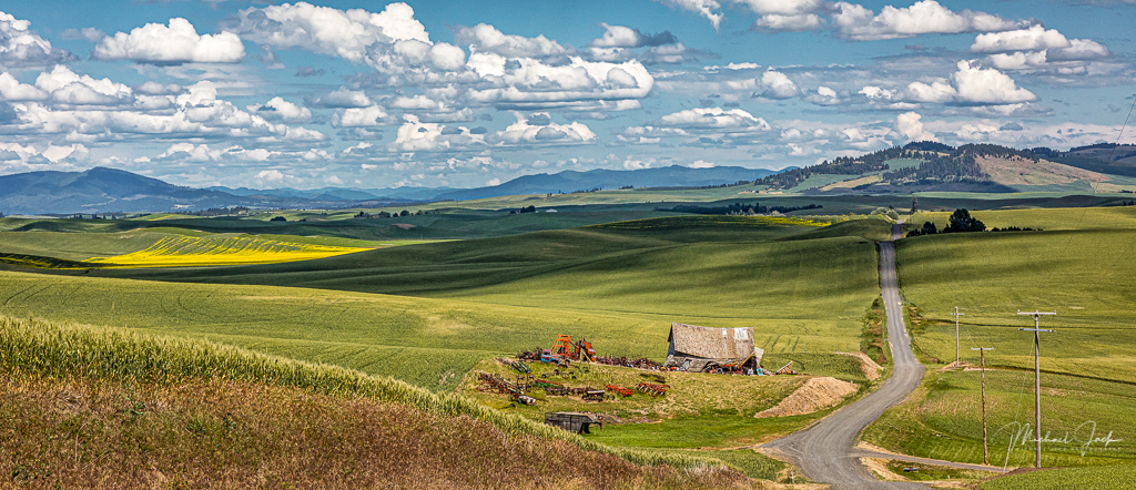
This is a beautiful image color-wise. I really like the composition with the flowers in the foreground followed by the upward sloping brightly lite hills. I wonder if it were windy because at f32 most of the image looks sharp but the sunlighted hills appear soft to my eye. My suggestion is to bring up the shadows in the landscape to differentiate it from the clouds. |
Jan 6th |
| 36 |
Jan 20 |
Comment |
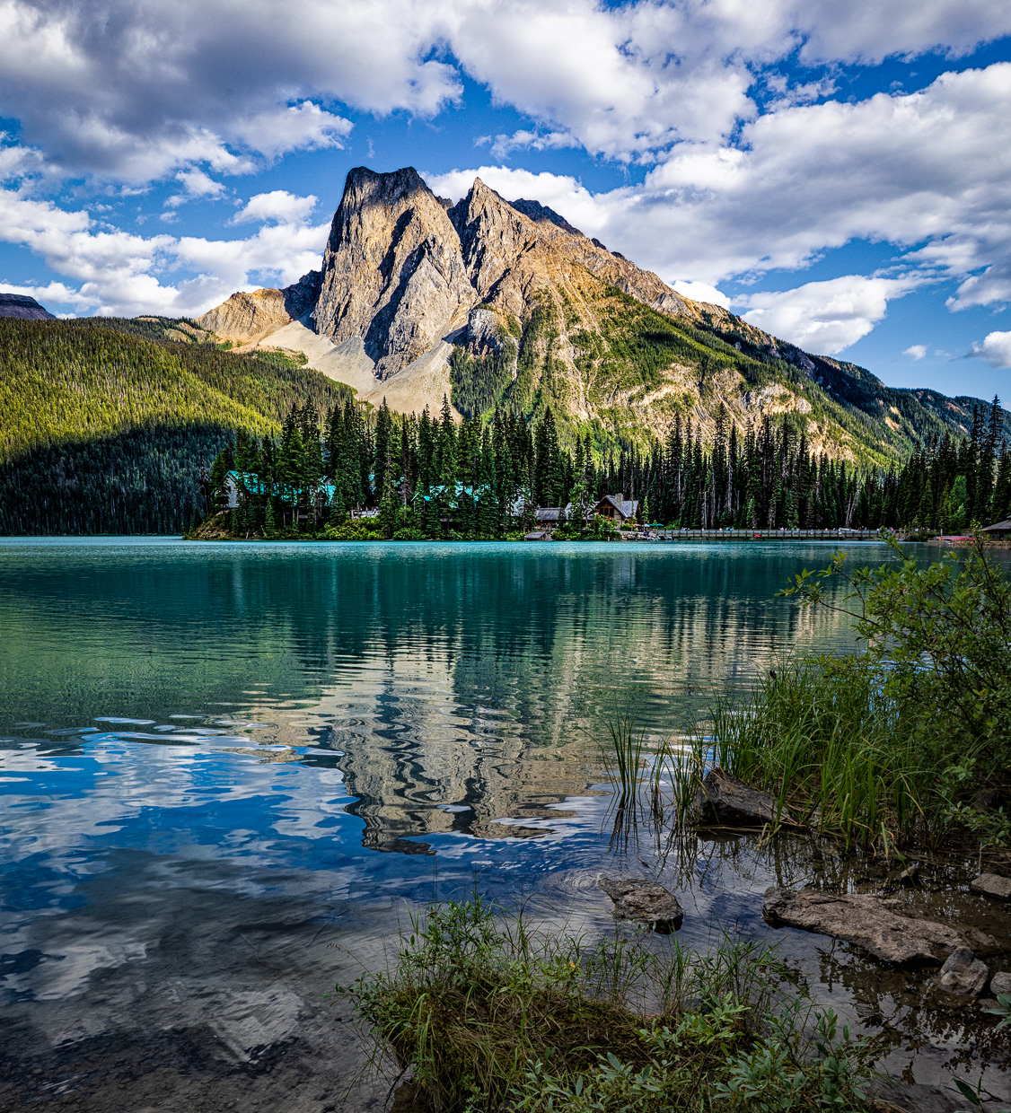
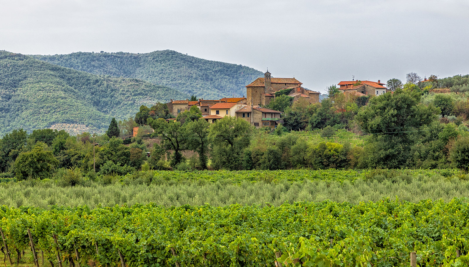
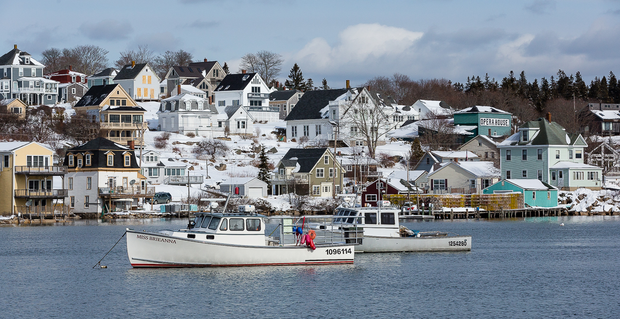
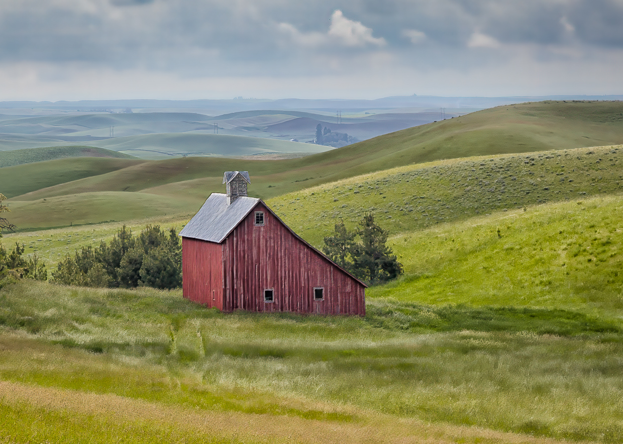
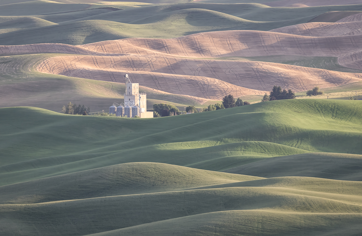
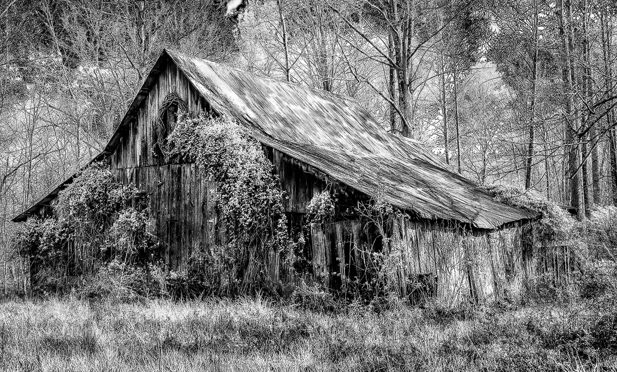
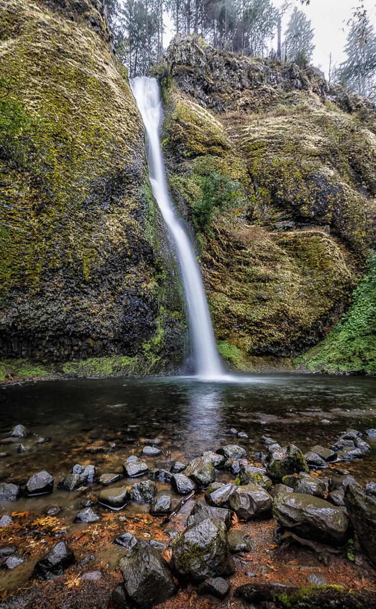
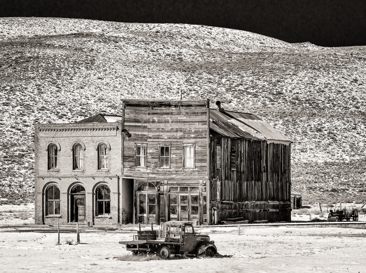
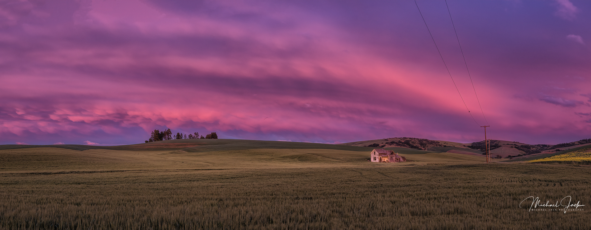
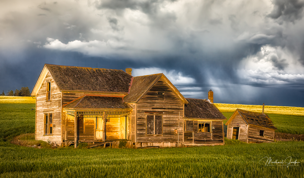
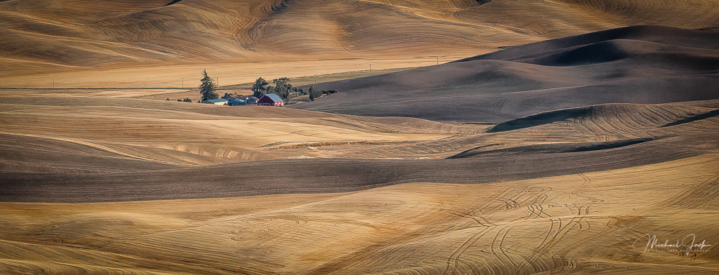
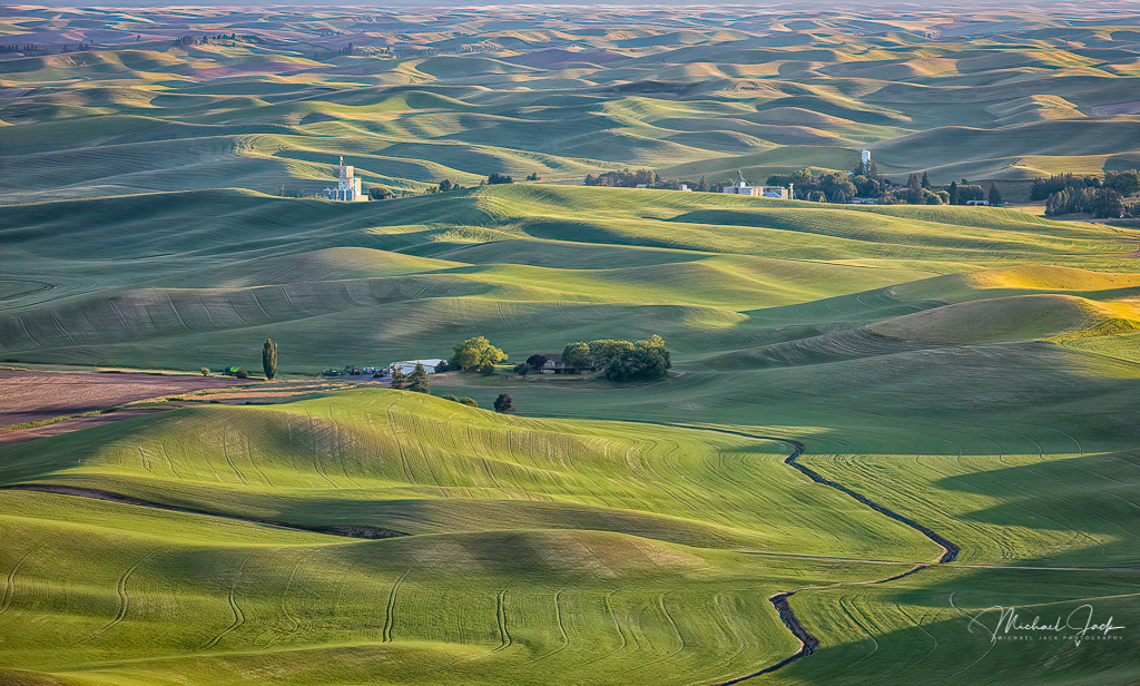
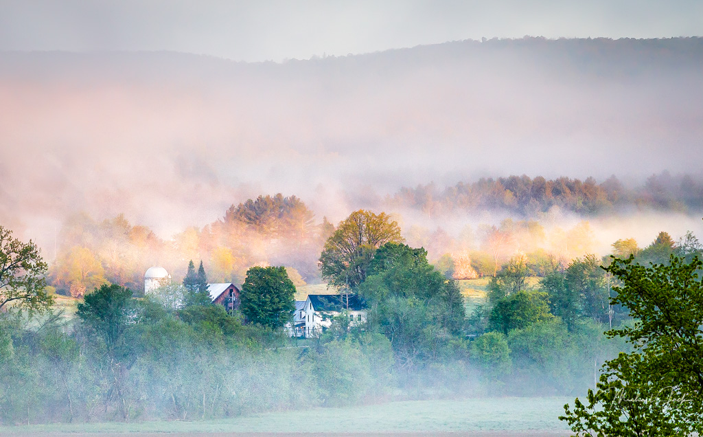
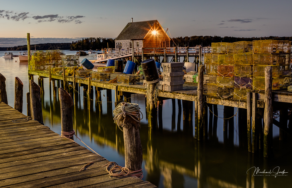
I envy your travels.... I like the layers in this image and the depth they provide. It is amazing how sharp this image appears with f5.6. I like the placement of the house in the foreground and the leading line heading to the next group of buildings. To my eye the image seems a bit flat so my suggestion would be to up the contrast through perhaps clarity and add a vignette or alternatively, lighten and increase the contrast of the group of buildings in the center. |
Jan 6th |
| 36 |
Jan 20 |
Comment |
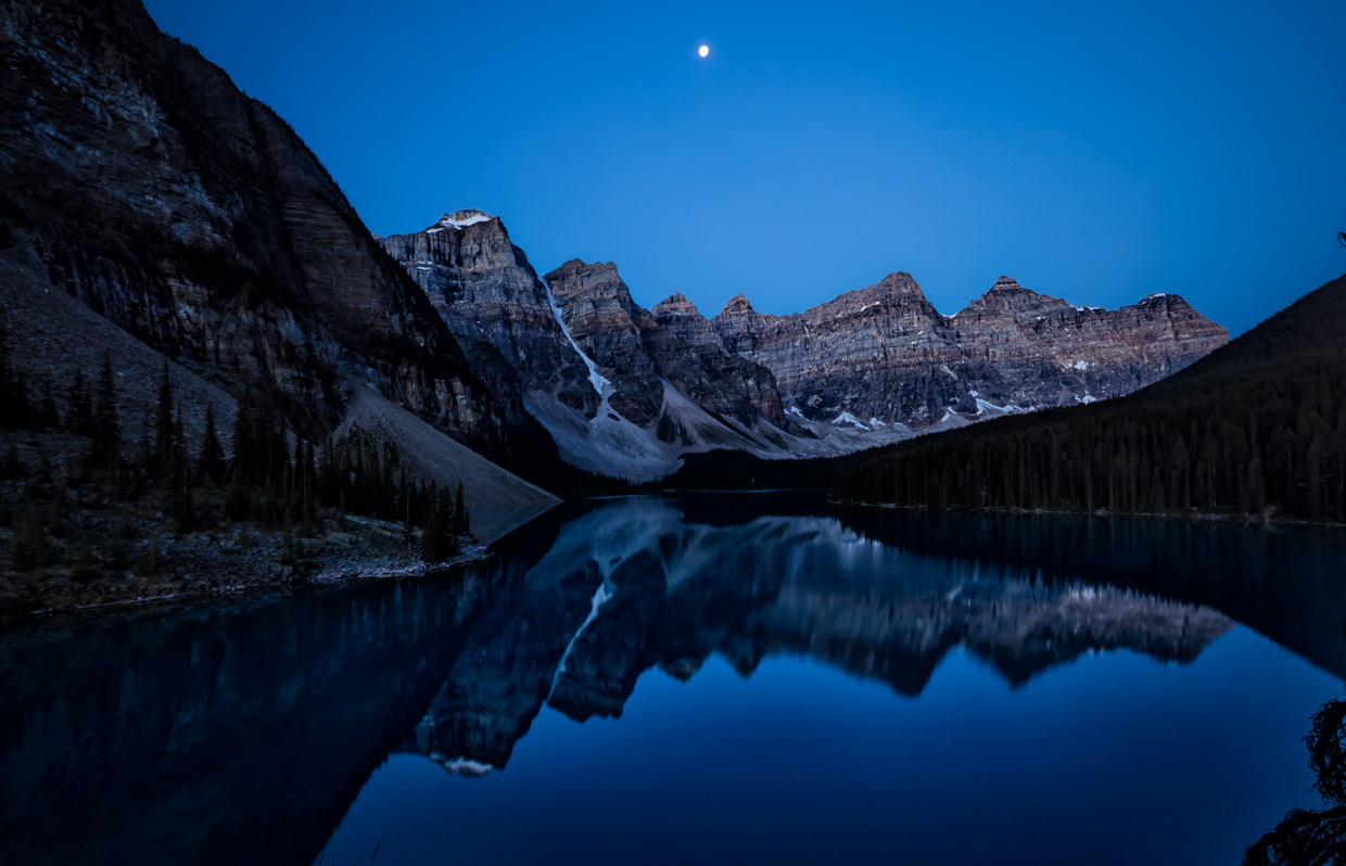
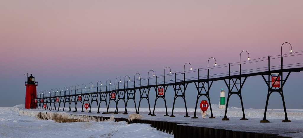
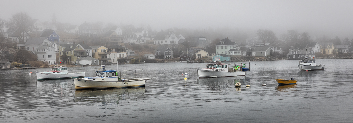
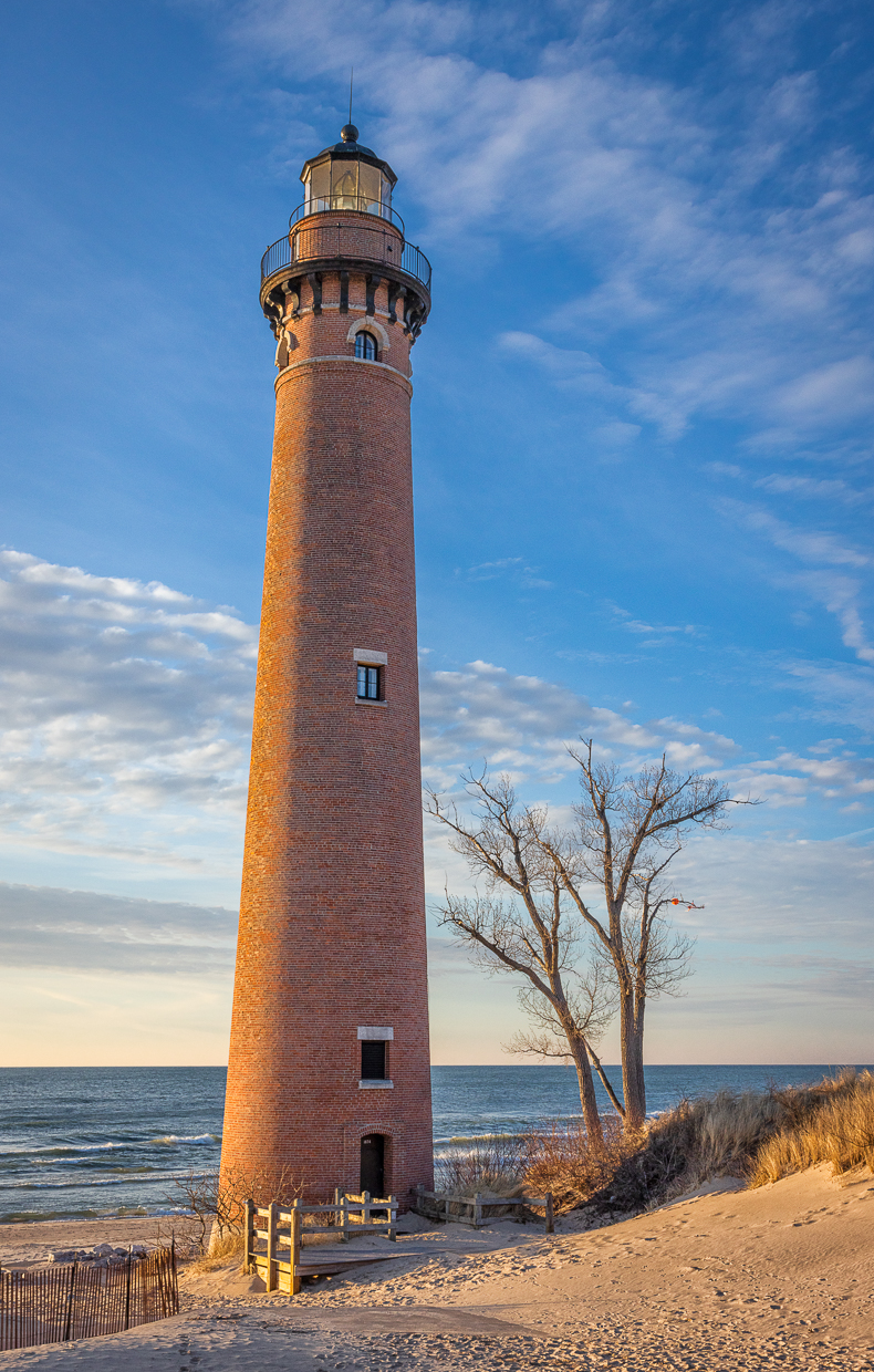
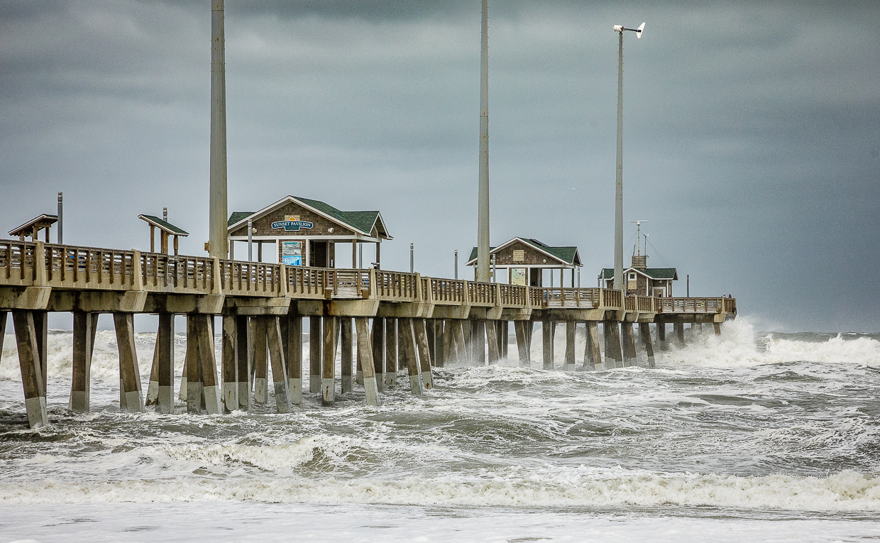
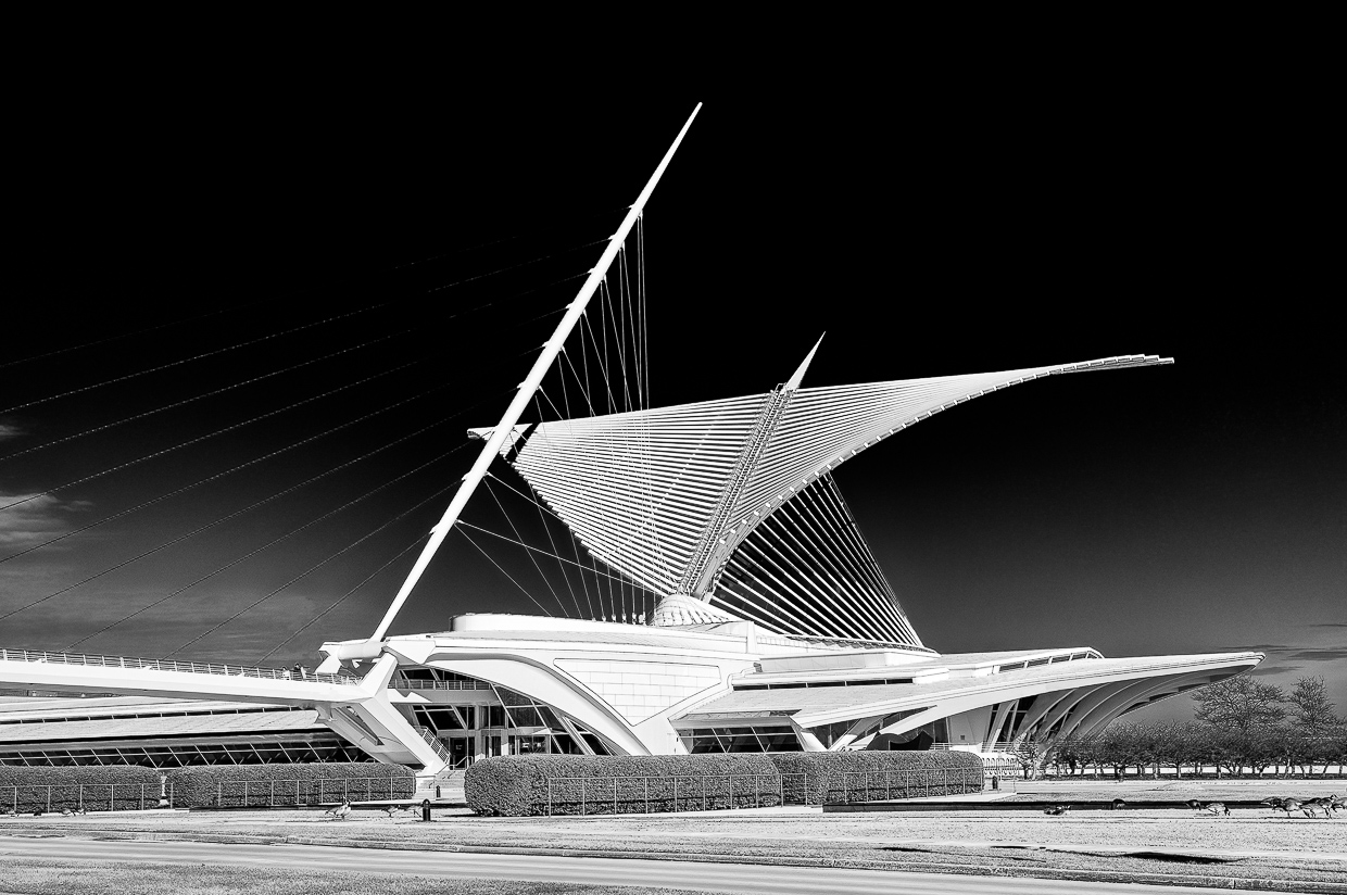
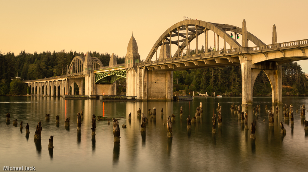
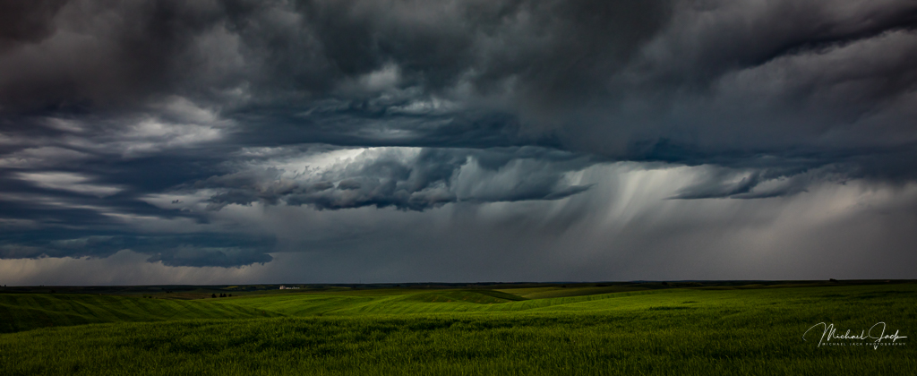
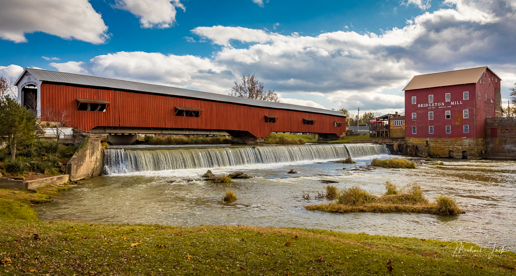
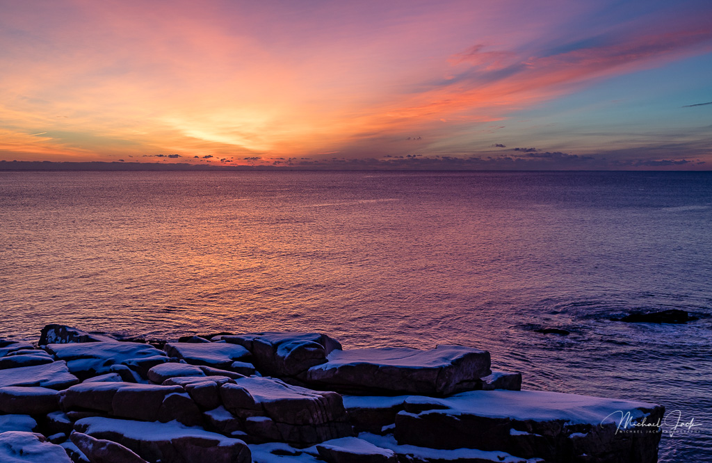
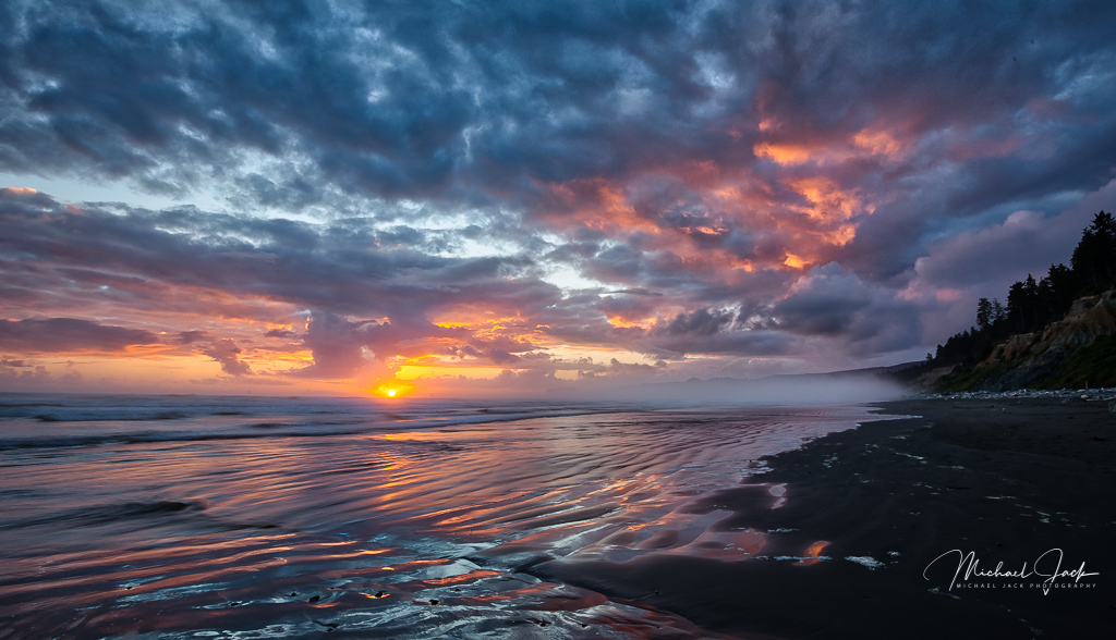
To me this is a very sharp, well-exposed image with great color. Nicely done. Your choice of f22 to get the star burst effect is nice too. My only suggestion is to crop about 1/2 of the water away and maybe reduce the exposure of it. The reflected light is bright enough my eye lingers there. That being done, I think the really interesting cloud movement and reflections becomes more noticeable. If I wanted to get really, really picky, I would have moved the camera so the whole arena sign would be included. |
Jan 6th |
| 36 |
Jan 20 |
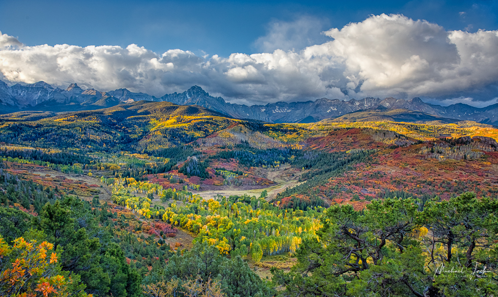
Comment |
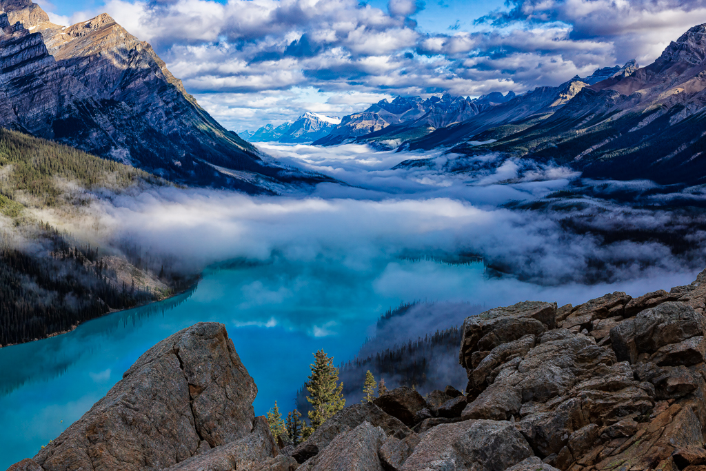
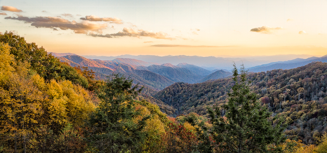
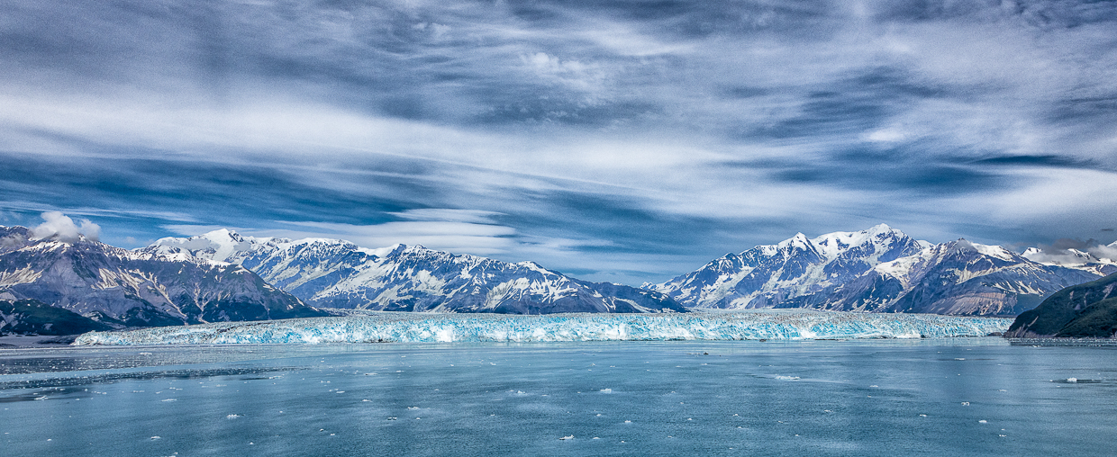
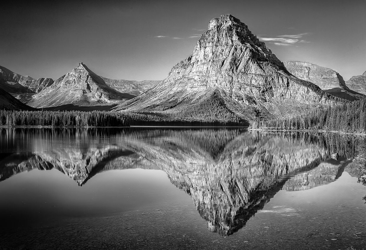
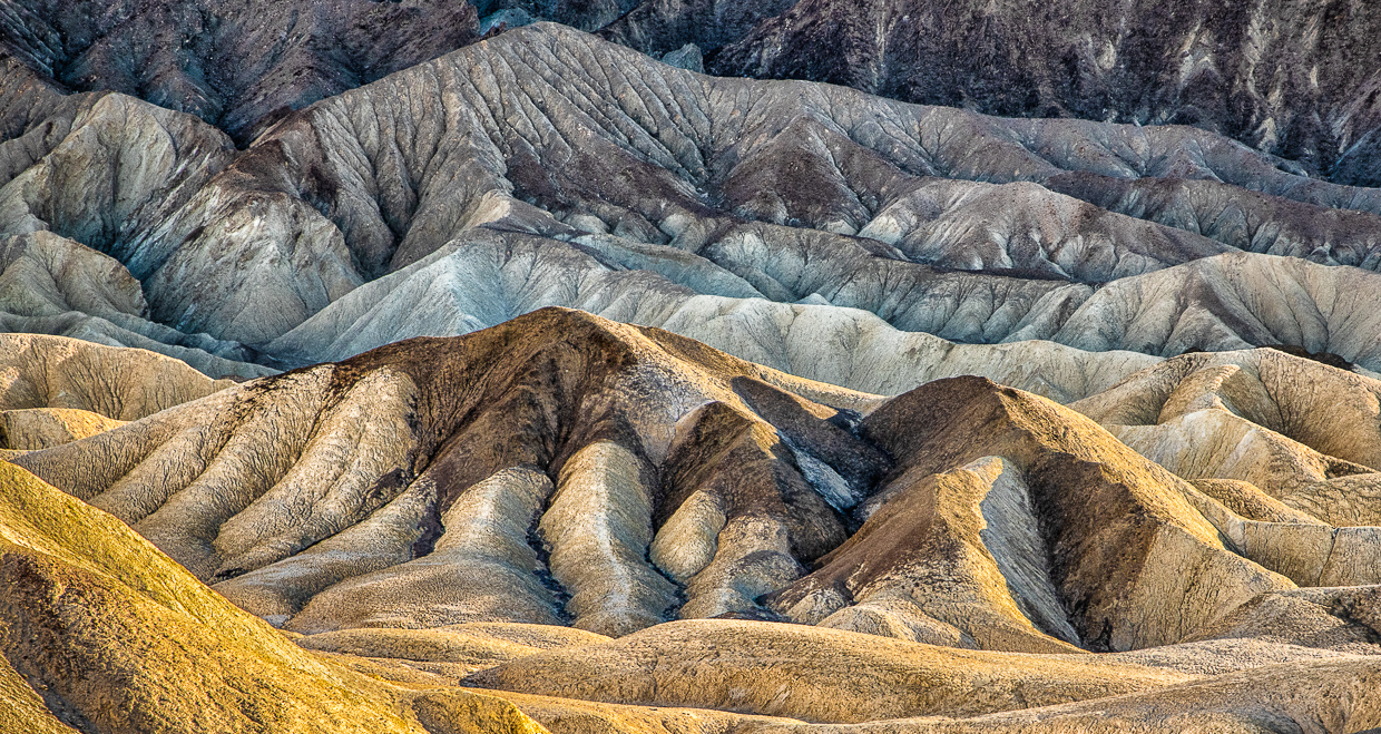
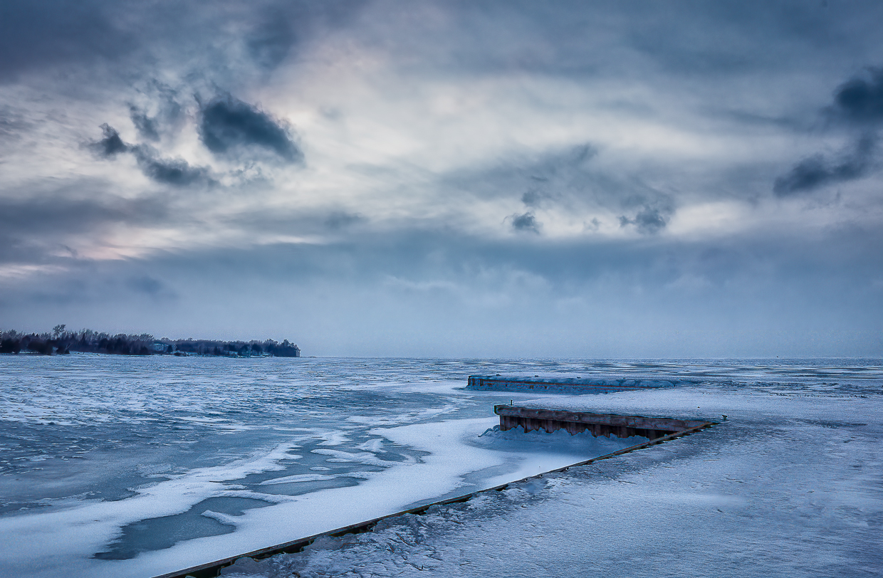
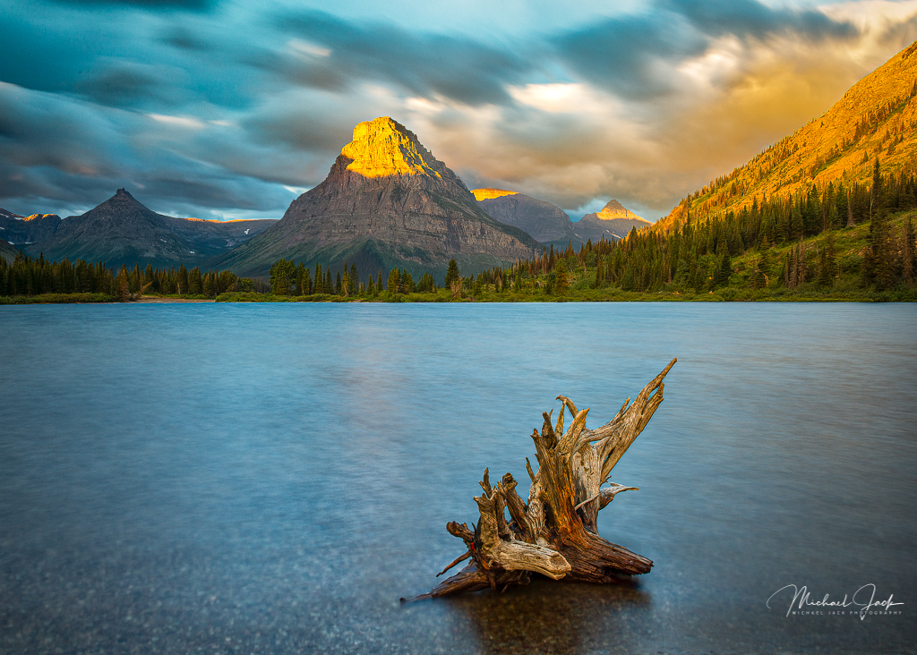
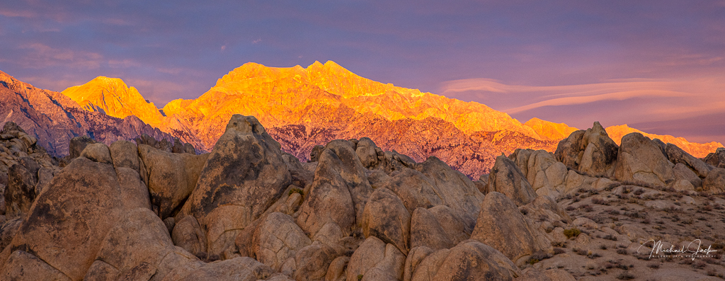
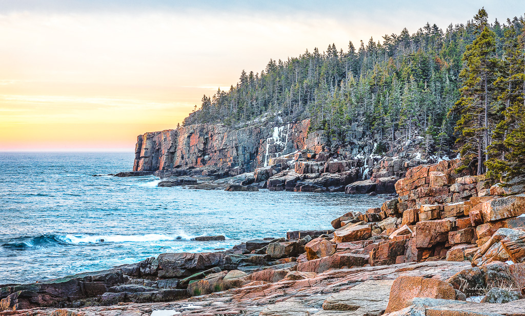
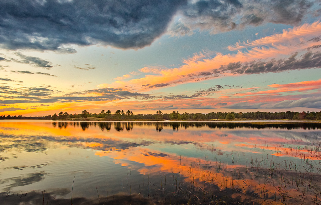
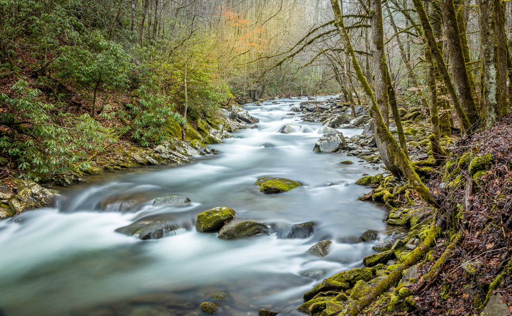
I like the way you composed this image with the higher mountain on the right, which with the lines in it, gives the image a lot of energy. The amount of sky and lake in the image look about right to me. The only suggestion I have is to bring out slightly more detail in the shadows. Too bad it was too windy to enable you to get reflections in the lake and there were no clouds but you made the best of what you had. |
Jan 6th |
6 comments - 2 replies for Group 36
|
6 comments - 2 replies Total
|