|
| Group |
Round |
C/R |
Comment |
Date |
Image |
| 36 |
Jul 18 |
Reply |
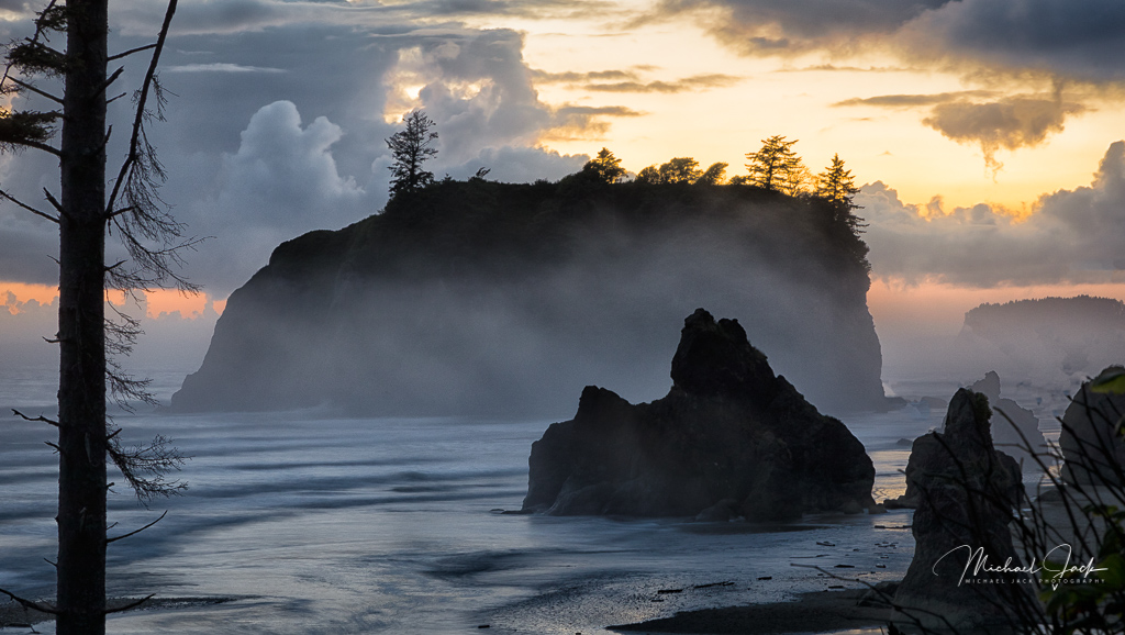
Thanks for taking time to do this Richard. It does look better without the distractions. It was about the sky, fog and sea stack. I know one photographer who crops by cropping out everything and then expanding the crop until the subject is clear. I have watched and it is in fact different. |
Jul 12th |
| 36 |
Jul 18 |
Reply |
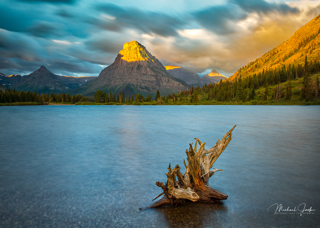
Thanks Bill. I agree about the bottom right branch. Unfortunately there was only one narrow opening for this shot so I could not eliminate the tree. You and David are right the image would be better without it. I think I will use Le Tho Gia's argument and say this was part of the environment.... |
Jul 10th |
| 36 |
Jul 18 |
Comment |
Beautiful colors in this shot. I like the way the tree branch falls within the space on the side of the rock or mtn and the darker ground near the bottom of the image which gives more depth to the landscape. It looks like there might be more contrast in the clouds, but I think adding more structure and contrast would compete with the tree. I would just keep it simple as you have. The only suggestion would be to "heal" or clone out part of what appears to be dead limb that touches the rock. |
Jul 7th |
| 36 |
Jul 18 |
Comment |
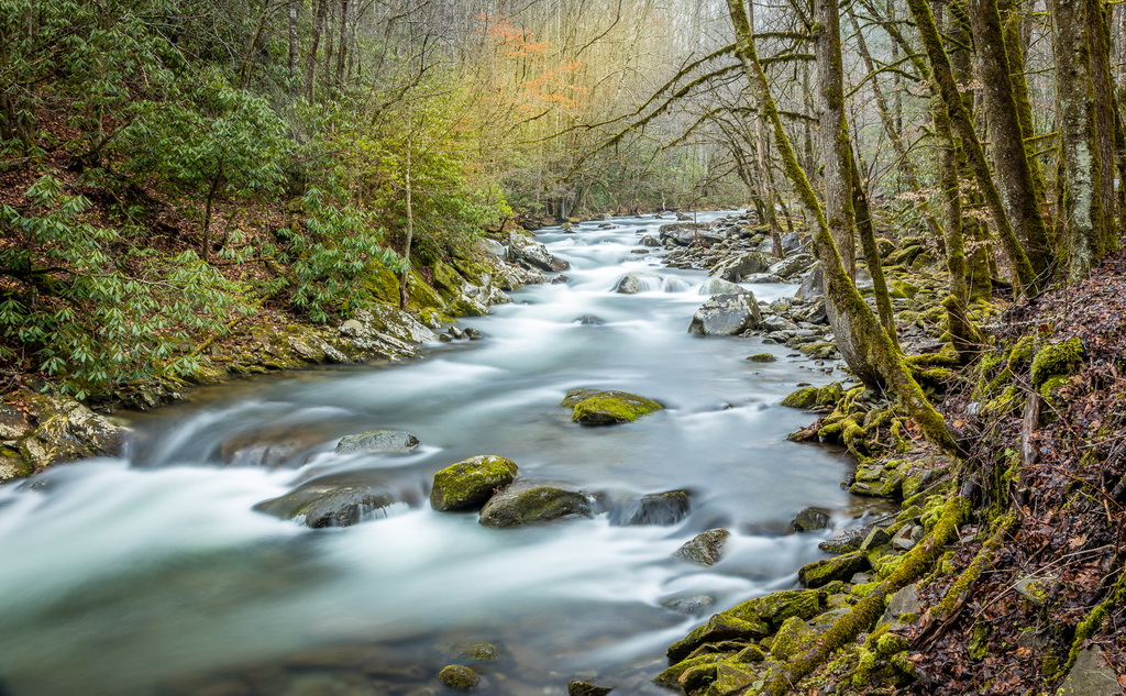
This is a well laid out shot. The opening draws the eye but then you can follow the river all the way through the image; the flow is not cut off anywhere. The shutter speed was good to give a sense of motion of the water while still leaving good texture. I really don't have any suggestions for this image. |
Jul 7th |
| 36 |
Jul 18 |
Comment |
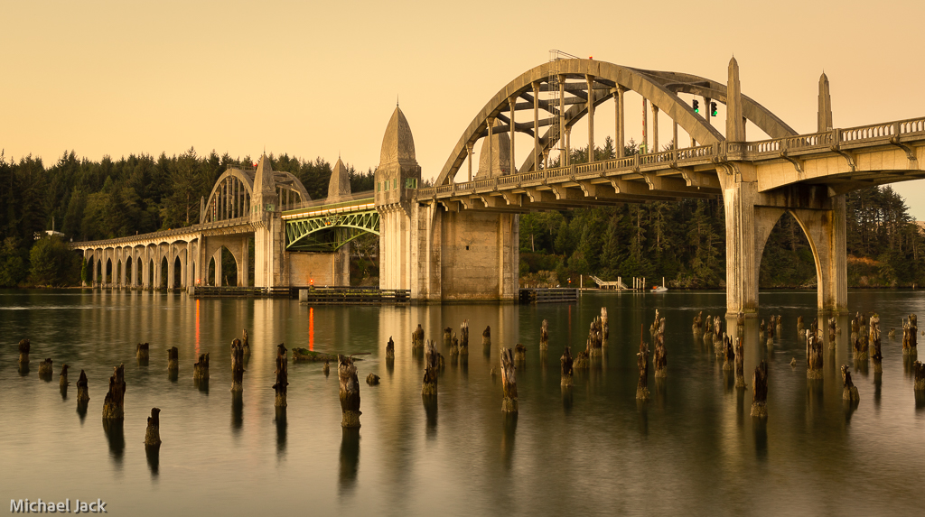
Great time of day for this shot. I like that you split the image in half where the reflections are because they are as sharp as the trees. Nice low position on the path to lead the eye to the area of interest and the use of the tree on the left to block the eye from going out of the frame. The only nit pick I have is to clone out or darken the object on the left. |
Jul 7th |
| 36 |
Jul 18 |
Comment |
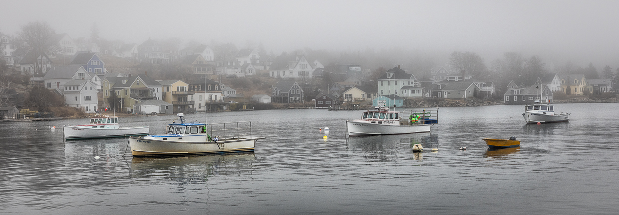
I like the moodiness in this scene, the leading line of the dock and the reeds providing some foreground interest. It definitely needs to be leveled though. After several months of commenting, I suspect everyone is thinking, okay it's Michael, he will suggest cropping down from the top. Yep, especially in this image. I am torn between keeping the scene really foggy and maybe enhancing it or trying to bring out more drama and texture in the clouds, but I think you made the right choice. |
Jul 7th |
| 36 |
Jul 18 |
Comment |
Great exposure for the sun lite conditions. I liked just a hint of perspective. the angle of the shot and where you placed the aisle plus the patches of sunlight on the floor. I might slightly darken the very top of the image to reduce the bright spot. It looks to me like the floor is leaning slightly but you have the verticals all lined up. Making a difference would require something like a skew transform adjustment. |
Jul 7th |
| 36 |
Jul 18 |
Comment |
It is not everyday you can capture a bear in the clouds (left side). Nicely seen image. You might crop down a bit from the top, maybe 1/2 way from the current top to the top of the clouds. It looks like you may have pushed the processing of the clouds enough to get some halo around the trees. If you wanted to go to a lot more work you could do selection or luminosity mask in PS to eliminate this although the current version of LR has a mask feature for either color or luminosity which might help as well. I know you like to keep the image true to the situation. Personally I would have taken out the black spot in the road and the white sign. |
Jul 7th |
6 comments - 2 replies for Group 36
|
6 comments - 2 replies Total
|