|
| Group |
Round |
C/R |
Comment |
Date |
Image |
| 36 |
Jun 18 |
Reply |
I agree with Arne that I would not want to cut the top off the building; it is pretty tight to begin with. However, the transform commands in PS could be used to pull the buildings back and not cut the top off like the LR perspective changes.
|
Jun 11th |
| 36 |
Jun 18 |
Reply |
I really like this one (but then I should...) |
Jun 10th |
| 36 |
Jun 18 |
Comment |
Nice blend of color, architecture, interesting sky and street photography. Just a few comments: The reaction I get to the buildings, especially the Apoteket building is that they are leaning over so I wonder if you did a perspective adjustment. If so, I would back it off a bit just to gain a slight bit of perspective and avoid the "leaning in...." Others may not have the same reaction though. The buildings could use some exposure brightening and contrast, especially all the signs on the side of the building. The yellow building seems a bit flat to me so I would try to make it pop more. Nice place to be. |
Jun 10th |
| 36 |
Jun 18 |
Reply |
Good eye, thanks Bill |
Jun 10th |
| 36 |
Jun 18 |
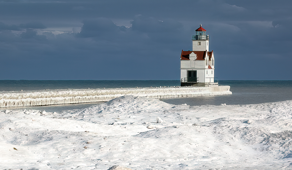
Comment |
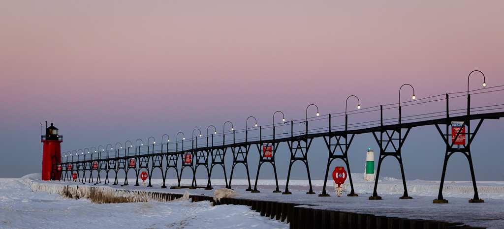
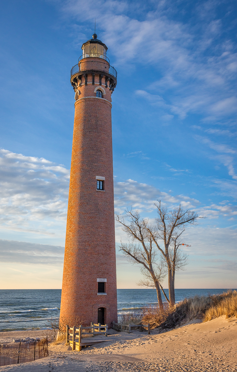
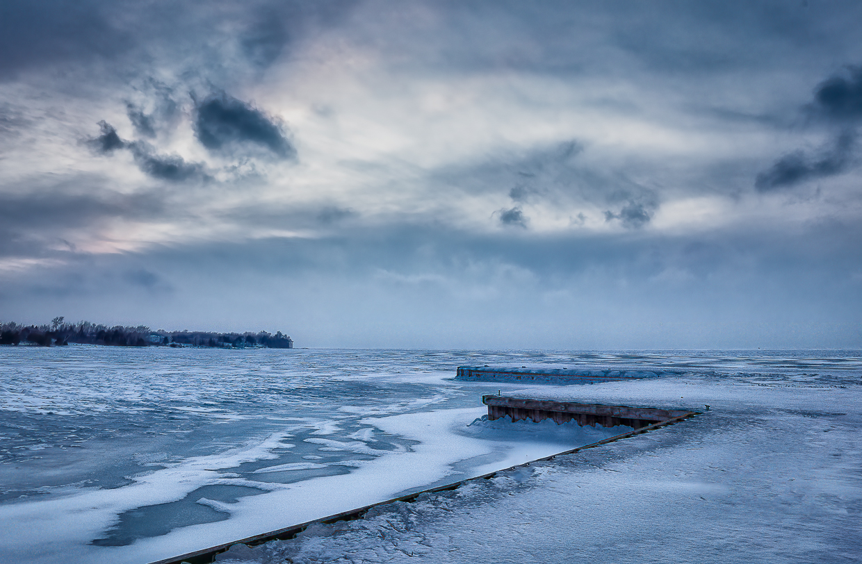
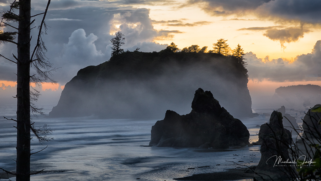
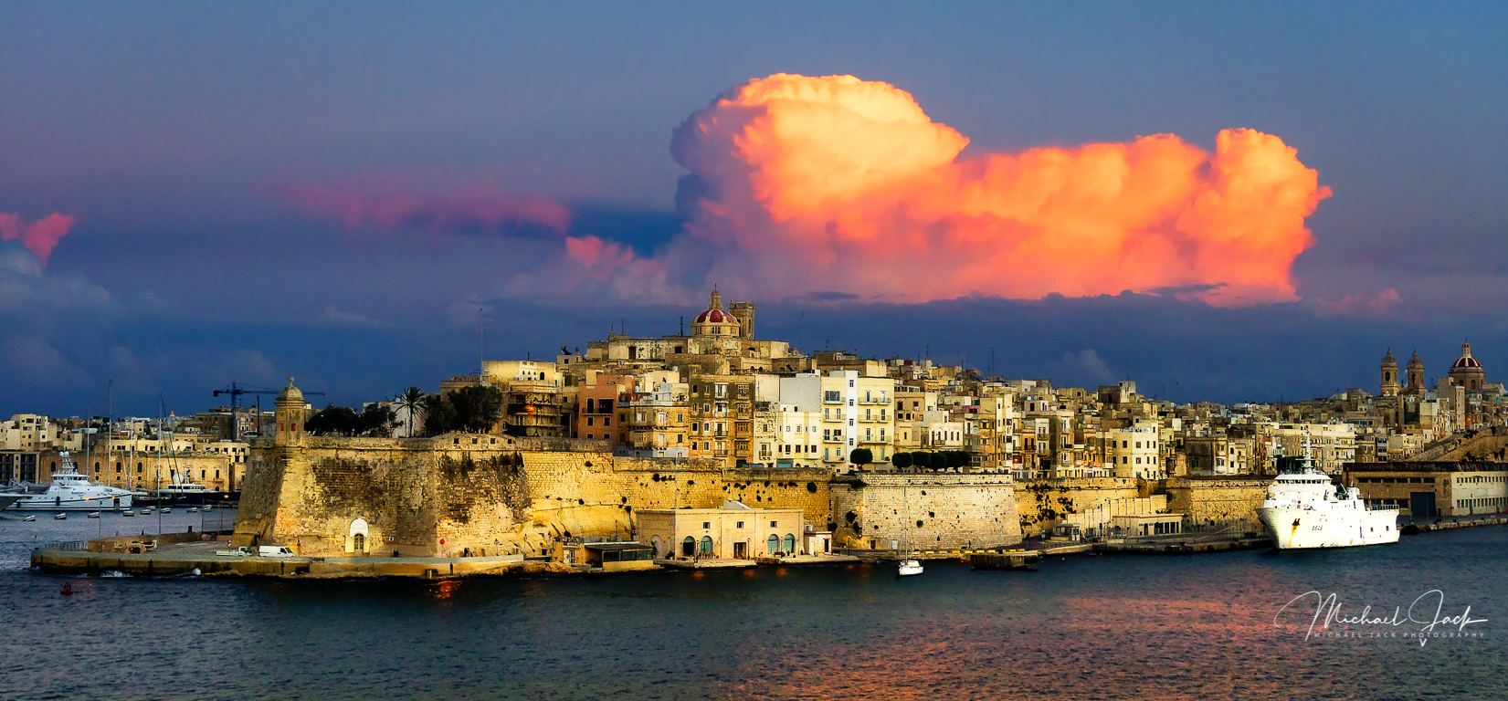
Nicely balanced composition with the clouds and lighthouse. Some suggestions for editing: Crop up from the bottom to eliminate maybe 1/2 the water - the interest is the lighthouse and the clouds. If you PS skills are there, use luminosity masking, or at least select the sky and add additional detail to the clouds by using curves. See if you can get any kind of texture from the darker cloud at the top of the image. I would lighten the lighthouse itself to make it stand out more and clone out the white sign on the road or walkway to the lighthouse. |
Jun 8th |
| 36 |
Jun 18 |
Comment |
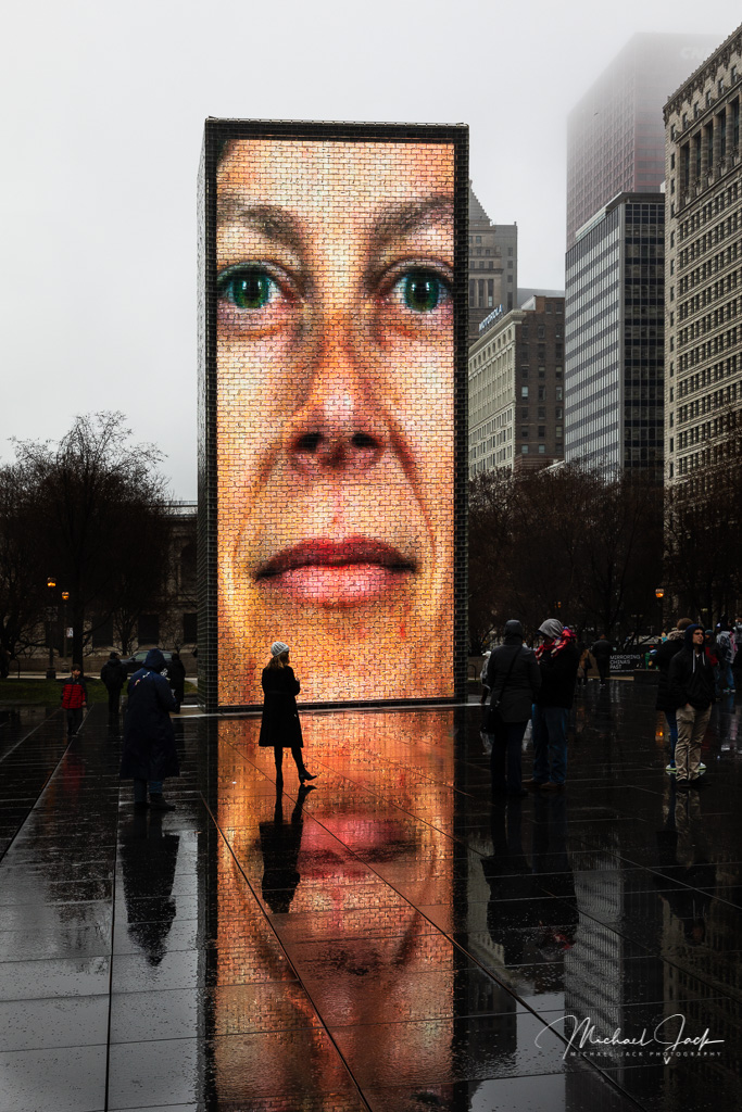
Sharp capture for a night scene, and I like the choice to leave the image really warm rather than changing the white balance. I agree with Le Tho about toning down the reflections a bit since they are as bright as the buildings which gives the image a HDR look. You might try cropping down just a bit from the top, but not into the top of the hill on the right. |
Jun 8th |
| 36 |
Jun 18 |
Comment |
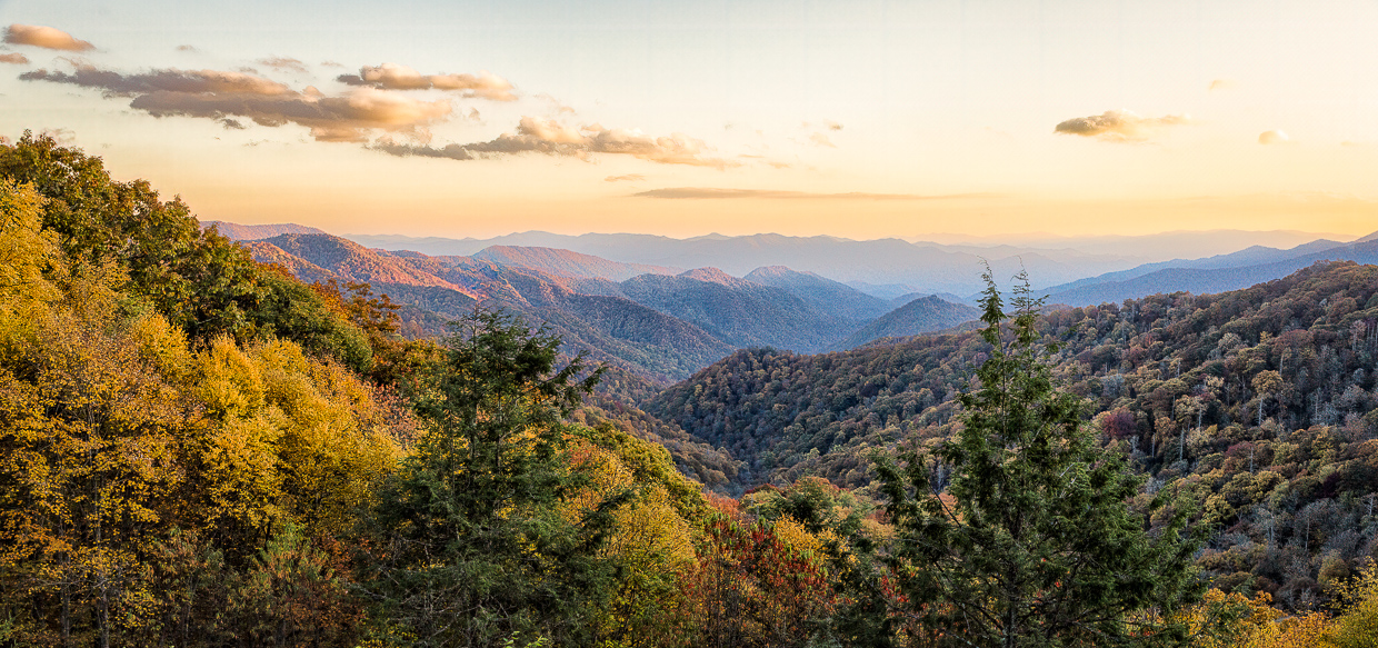
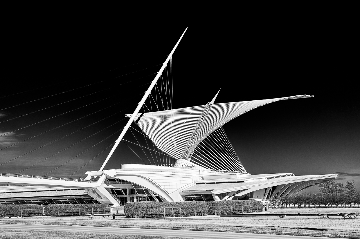
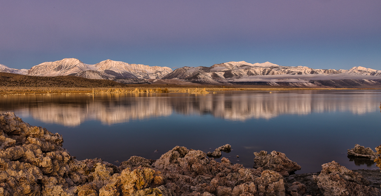
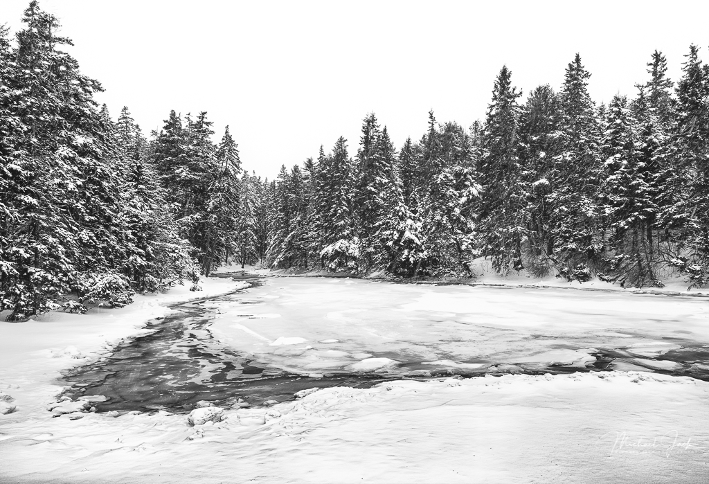
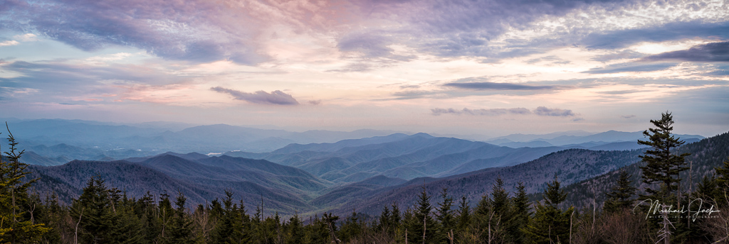
I agree with you on using the trees to frame the edges. The stream, tree line and mountains yield a nice foreground, middle and background to the image. Like your treatment of the sky, the exposure highlighting the mountains, and the sharpness of the image (love the Canon 24-105 lens). The time of day seems to complement the texture of the mountains. What would I do differently - darned if I know other than maybe pulling out the red/orange color in the mountains a bit more. |
Jun 3rd |
| 36 |
Jun 18 |
Comment |
Interesting photo. Good job on the exposure and post processing. I am struggling with the composition on this one, however. Initially my eyes follow the vanishing points of the blue lights and windows thinking it was leading to something, but at the end, there is nothing there to see. I wonder if you could have moved around to get the lights to lead to something of interest, like the triangular window. |
Jun 3rd |
| 36 |
Jun 18 |
Comment |
Excellent capture of the church. Liked that you gave it a slight perspective to enhance the feeling of height. Nice texture in the clouds. Some observations and ideas. If you had time, waiting until the white bus moved on and you only had cars would have moved a lighter distraction. Cropping in just enough from the left to eliminate the red "do not enter" sign is something to consider. Finally, you might just subtly lighten the front of the church and darken the building facade down the street behind the church to keep the interest on the church itself. |
Jun 3rd |
6 comments - 3 replies for Group 36
|
6 comments - 3 replies Total
|