|
| Group |
Round |
C/R |
Comment |
Date |
Image |
| 11 |
Apr 26 |
Comment |
I agree with other's comments. Especially brightening the aqueduct given the original image. The sky works very well. I'd consider selecting the aqueduct, and if you are using Lightroom, increase texture, and maybe dehaze. |
Apr 15th |
| 11 |
Apr 26 |
Comment |
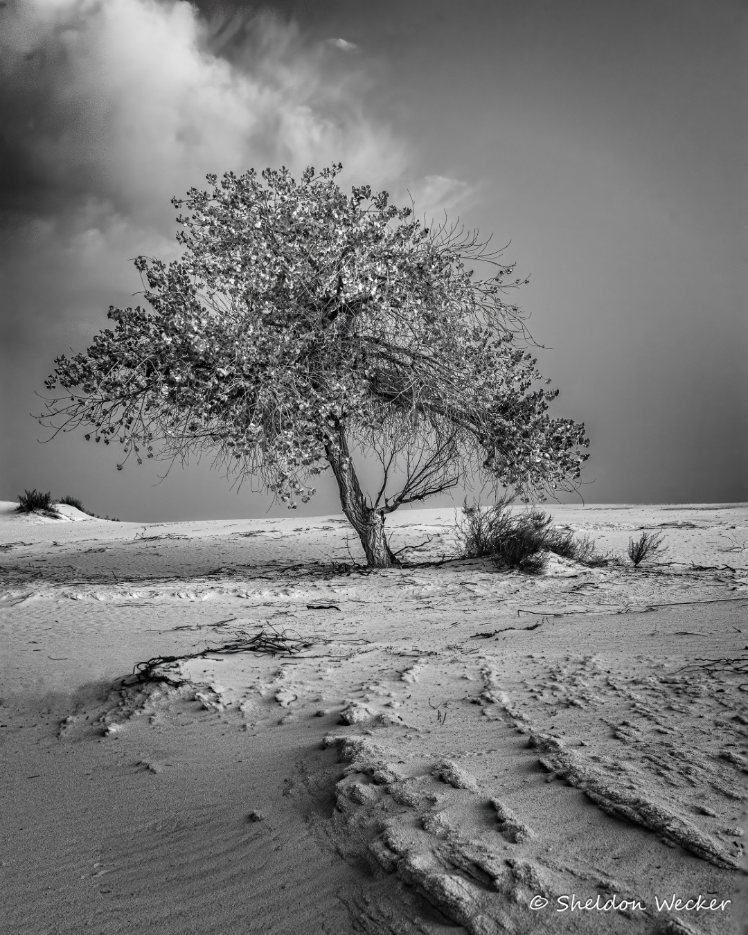
Perhaps I'm an outlier here, but I prefer the color image. While the brightening of the tree does make it pop, I don't think the very bright tree fits the background. I'd try backing off a little on the darkness of the background and sky. |
Apr 15th |
| 11 |
Apr 26 |
Comment |
Nenette, I also prefer the original composition. I think the cars add to the image - leave them in. A lot of the shadow areas are blocked, you can see more detail in the trees in the color version. There also is a bit of a halo at the top edge between mountains and sky. |
Apr 15th |
| 11 |
Apr 26 |
Comment |
I also favor the original composition, but I would crop a little up from the bottom to turn the lower part of the swirl into a leading line, and move the cupola closer to the center. |
Apr 15th |
| 11 |
Apr 26 |
Comment |
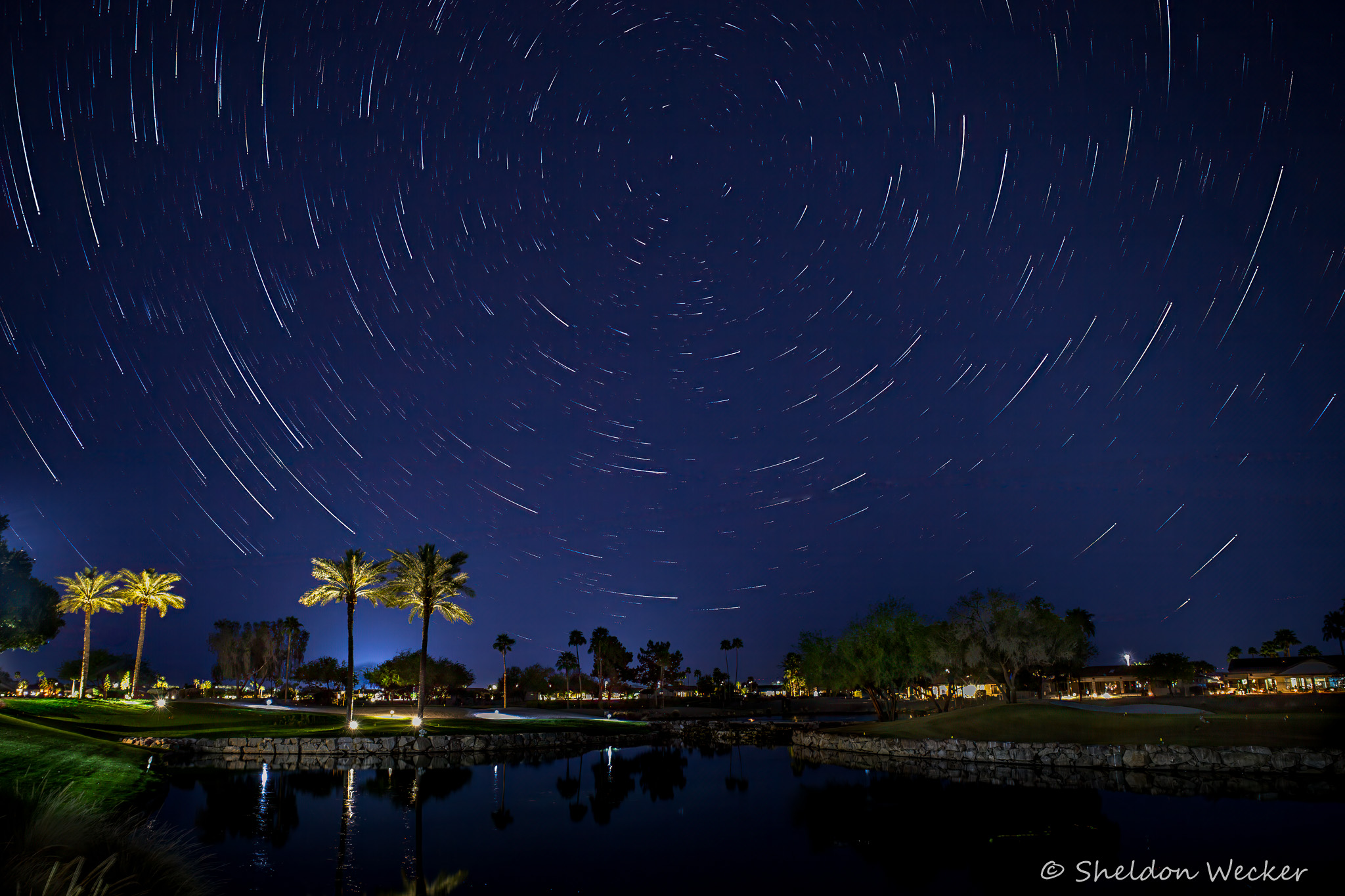
Perfect timing. Great work freezing the motion and dealing with high iso. |
Apr 15th |
| 11 |
Apr 26 |
Comment |
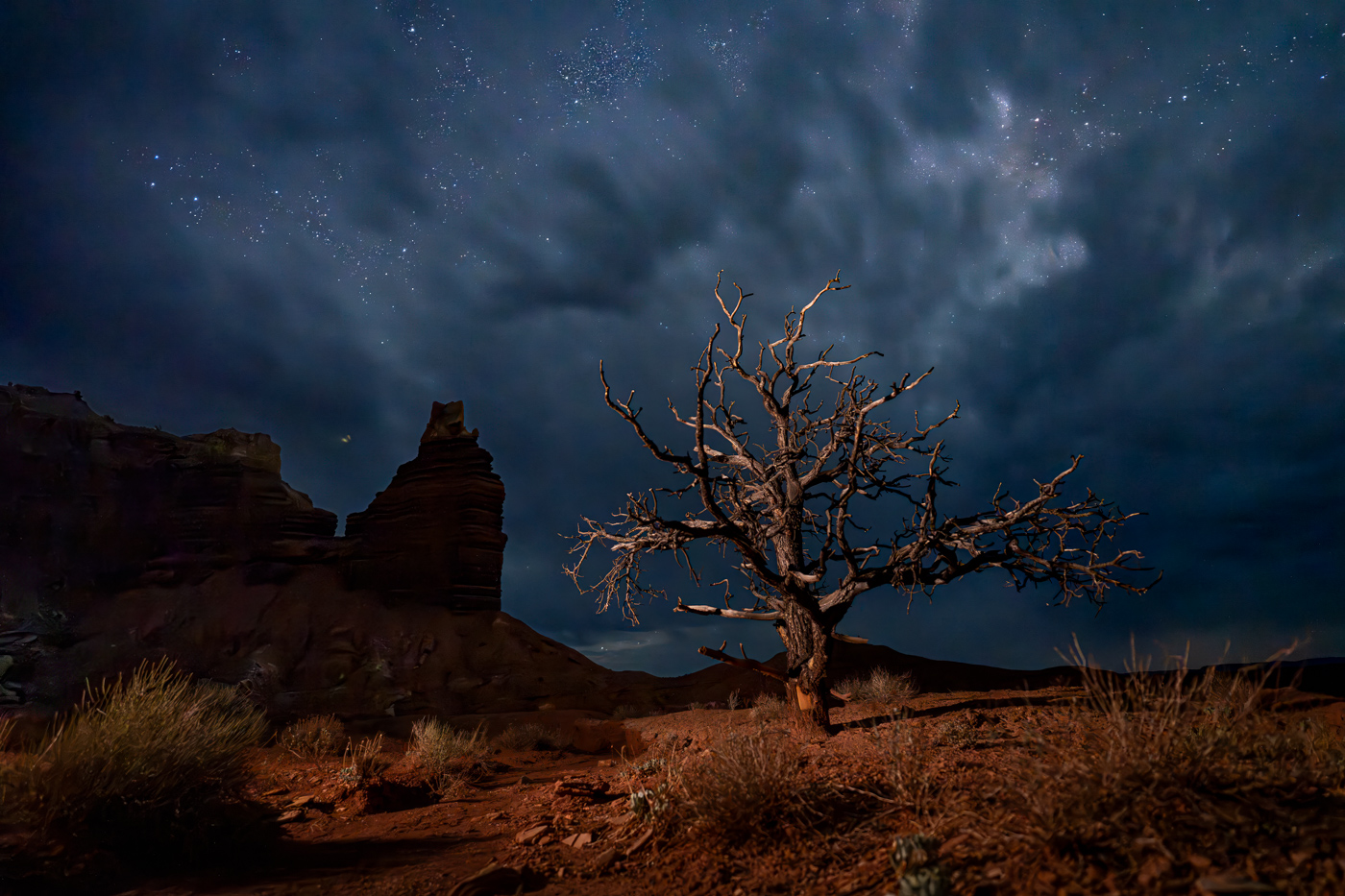
Beautifully done. Congratulations. One small quibbel. In the color version, the marble around the base of the altar shows beautiful detail. Much of that has been lost in the conversion to monochrome. |
Apr 15th |
6 comments - 0 replies for Group 11
|
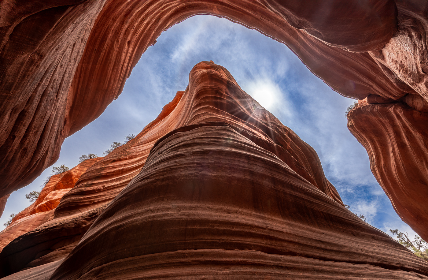
| 17 |
Apr 26 |
Comment |
Good vantage point, I like the texture in the arch panels. For me, the sky is too dark, especially since there is a large area at the top that's just black on my screen. Is there some detail in that area in the original? If so, perhaps selectively brighten/edit it to bring it out. |
Apr 16th |
| 17 |
Apr 26 |
Comment |
Its truly a remarkable place. I'm fortunate to live only a three hour drive away. Arizona has wonderful landscapes - I'll be at a workshop in Monument Valley tomorrow. Nice use of vegetation to create foreground interest. Nice composition with foreground, midground and background. I think the image would benefit from increased vibrance (lightroom speak) to bring out the different colors in the canyon, and perhaps selectively brighten the area in the lower right corner that looks blocked on my screen. |
Apr 16th |
| 17 |
Apr 26 |
Comment |
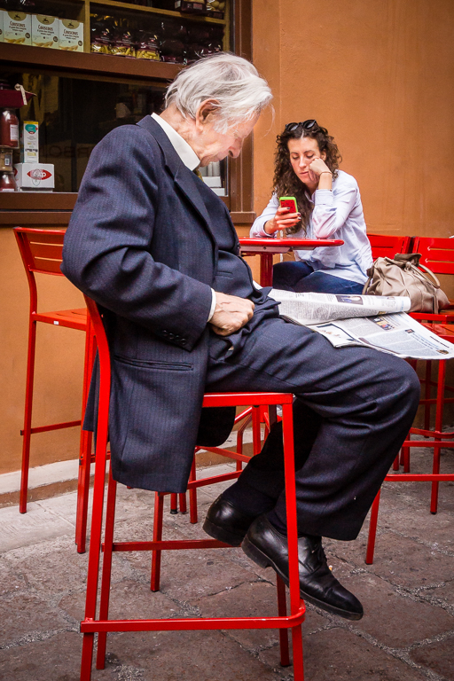
The monster just left of center is frightening. I'd crop from the right to help emphasize him as the subject, maybe to the edge of the leaf umbrella. Maybe even as far as the umbrella handle to lose the man in the right corner. Maybe increase contrast. I assume the blouse of the woman with her back turned is white, but it looks gray on my screen. |
Apr 16th |
| 17 |
Apr 26 |
Comment |
Very nice. The shadow at the bottom is critical, without it the sushi would just be hanging in the air. The negative space on the right helps emphasize the subject, but maybe crop a little of it out. I'm impressed by your discipline. I would have eaten the sushi before the shot was set up. |
Apr 16th |
| 17 |
Apr 26 |
Comment |
Very interesting image. If you hadn't told me its a waterfall, I wouldn't have guessed. I love the different shapes and contrasting colors - I think it would work well as an abstract if processed to emphasize them. Consider cropping out the dark area in the bottom left corner, and cropping a little from the right to move the waterfall out of the center. |
Apr 16th |
| 17 |
Apr 26 |
Comment |
Very nice image of an interesting subject. I like the composition. The two people looking in the window help balance the image left to right. Too bad they aren't wearing period dress. Perhaps brighten the image a little. I'd love to see the histogram, but I bet its heavy on the shadow end. |
Apr 15th |
6 comments - 0 replies for Group 17
|
12 comments - 0 replies Total
|