|
| Group |
Round |
C/R |
Comment |
Date |
Image |
| 11 |
Aug 25 |
Comment |
I love the subject, good call on the crop.I think brightening the sky would make the people stand our more, and adding a little dehaze to the trees would bring out some detail. |
Aug 22nd |
| 11 |
Aug 25 |
Comment |
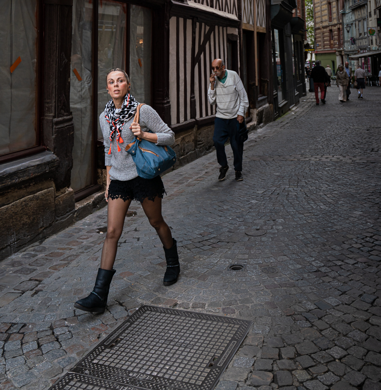
I like the symmetry in the image. The two men are almost mirror images of each other, facing towards each other, both with canes, similarly dressed. I'd consider cropping out the taxi sign on the left, and then cropping from the right so the two men are dead center. I think that would emphasize the symmetry. Nice job. |
Aug 22nd |
| 11 |
Aug 25 |
Comment |
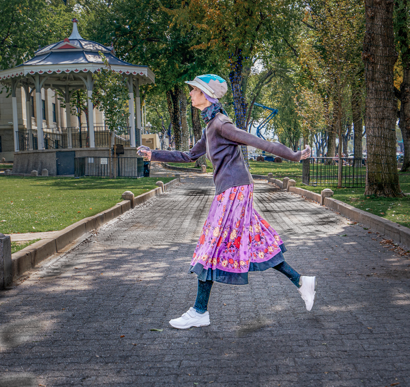
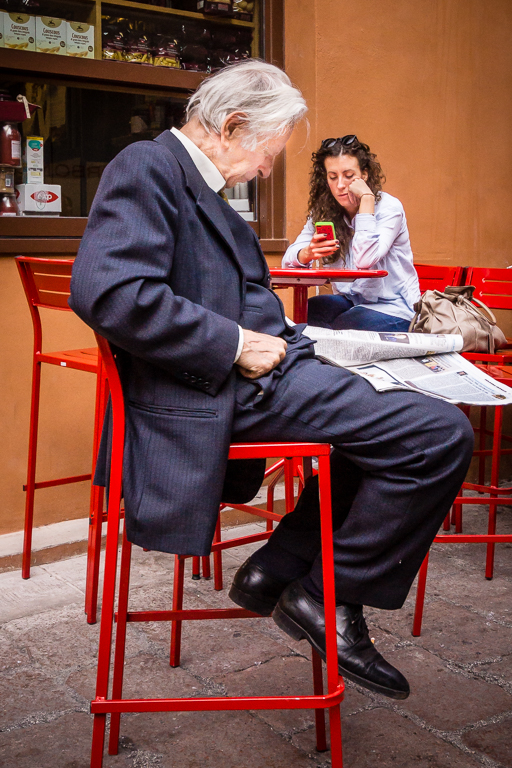
I really like this image, especially in monochrome. The crop and eliminating the distraction of the walker in the upper left corner enhance the composition. Monochrome emphasizes the lonely/sad expression on her face much more than the pastels in the color version. I can think of no changes I would make. |
Aug 17th |
| 11 |
Aug 25 |
Comment |
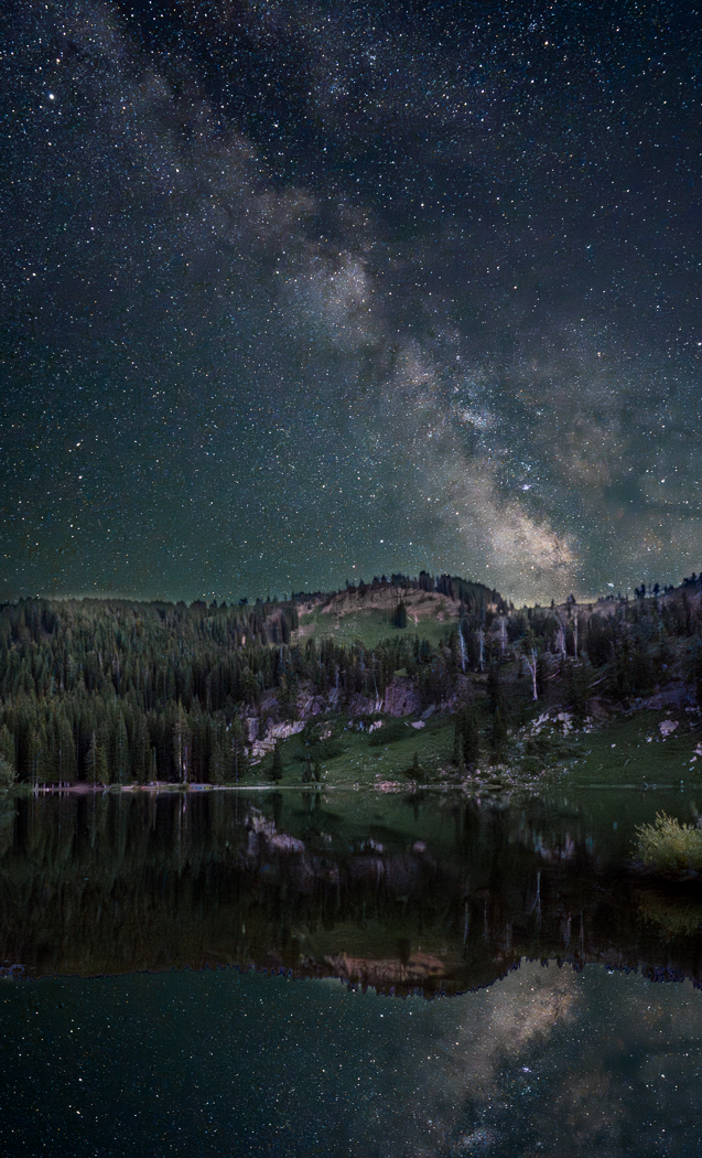
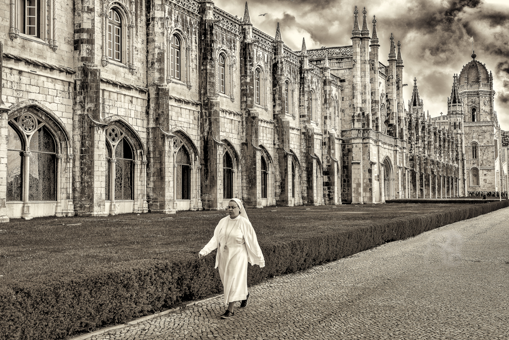
Monochrome conversion covers the full range from black to white. For me, the image would benefit from a crop from the bottom, about one fifth of the way up. It would add balance to the image and make the eye more prominent. Question regarding IR camera conversion, is it difficult? is it reversible? I thought permanently removing the cameras internal ir filter was required. |
Aug 6th |
4 comments - 0 replies for Group 11
|
| 17 |
Aug 25 |
Comment |
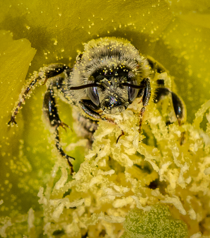
Great composition, bat's eye is tack sharp, good saturation. Two small suggestions, decrease brightness of the flower a little to keep attention on the bat, and add a thin white stroke to the edge of the image so that on our screens we can see where your image ends and the monitor background begins. |
Aug 22nd |
| 17 |
Aug 25 |
Comment |
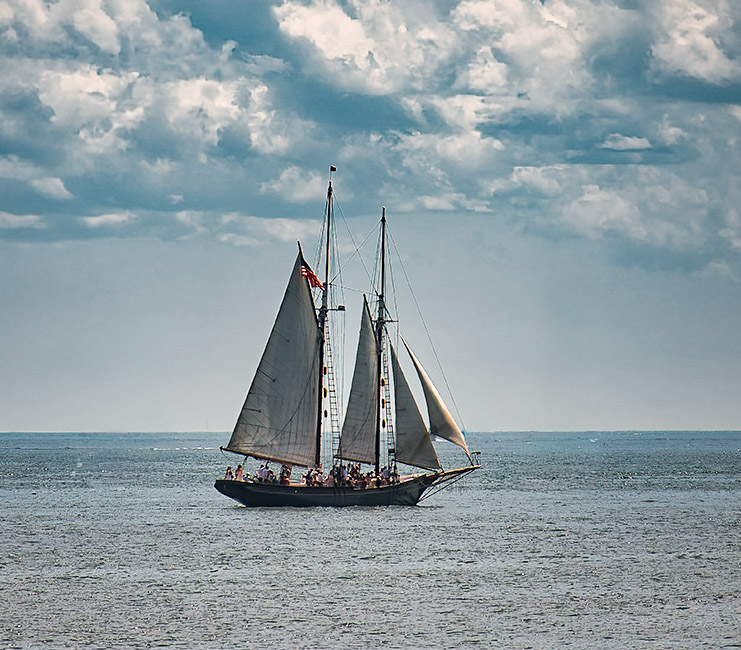
Beautiful Schooner. I once sailed from Mackinac Island to South Haven Michigan on a replica of Schooner America as one of the crew. Got to help raising sails, and steer. Great Fun. The schooner is the subject of the image, I find the other boats distracting. Also, image is overly blue. I made a few edits that demonstrate what I'm suggesting. BUT, if your objective is a photojournalism type photo or vacation record, leave them all in - just change white balance. |
Aug 22nd |
 |
| 17 |
Aug 25 |
Comment |
Great image. Dark edges add to the mood. I wouldn't change anything. |
Aug 22nd |
| 17 |
Aug 25 |
Comment |
Everything in this image is right. Colors, composition, blurred background, all of it. |
Aug 22nd |
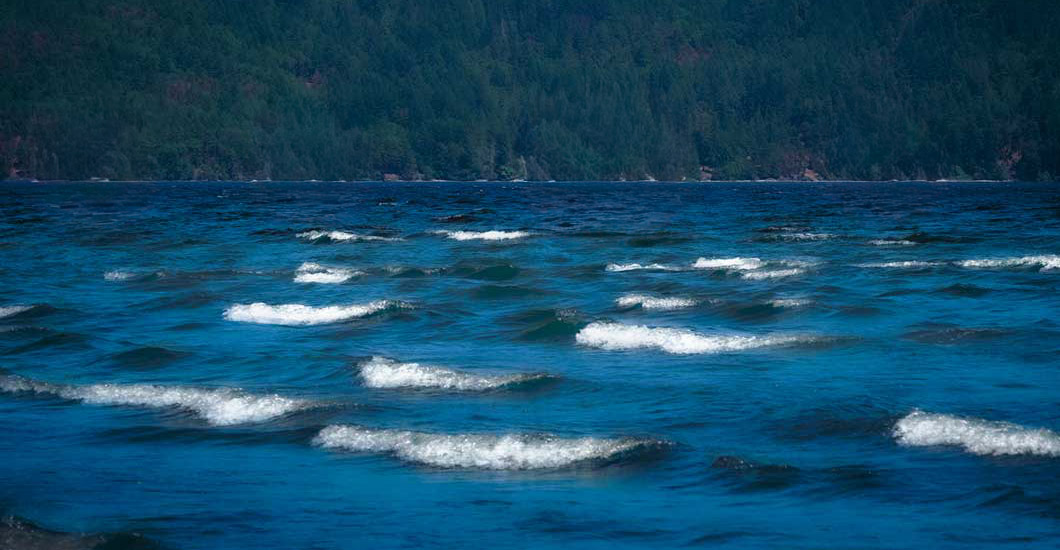
| 17 |
Aug 25 |
Comment |
Before I moved to the desert, I used to race sailboats on Lake Michigan. I agree with others regarding cropping from the top, I think enough to put the horizon about 1/3 down from the top. I'm also bothered by the sailboats. They are too small to be the subject of the image, don't add to the composition and appear out of focus. I think the subject of the image is the waves, and removing the sailboats keeps your attention focused there. |
Aug 22nd |
 |
| 17 |
Aug 25 |
Comment |
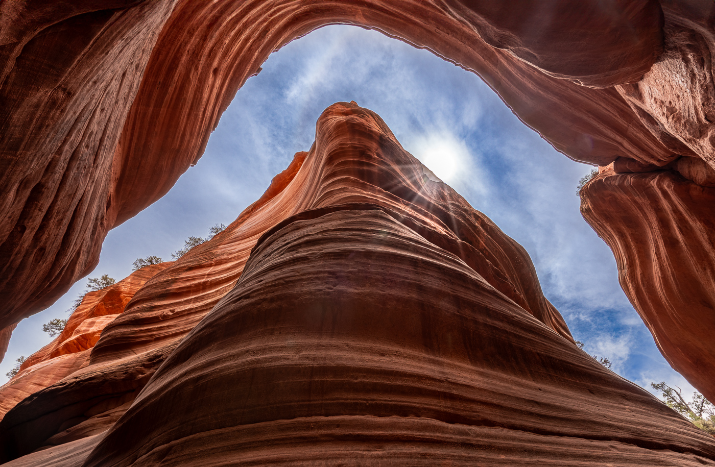
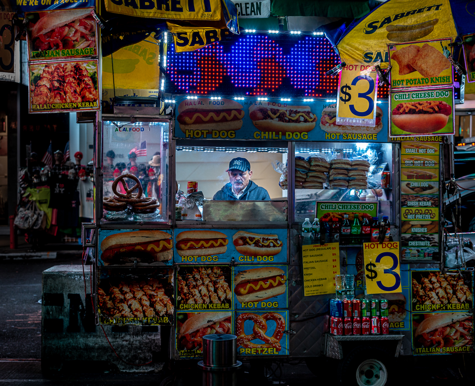
Great photojournalism image. I like the colors and that I can read the text. One suggestion, either move the top crop down a little or up a little. The arch just barely touches the top of the frame, which I find distracting. |
Aug 22nd |
| 17 |
Aug 25 |
Reply |
It does look like a hot dog on a rock! |
Aug 17th |
6 comments - 1 reply for Group 17
|
10 comments - 1 reply Total
|