|
| Group |
Round |
C/R |
Comment |
Date |
Image |
| 11 |
Jul 25 |
Comment |
Peter, I think you are right - the color contrast that makes the bridge stand out in the original is missing in the B&W. I tried an edit using the LR B&W 7 preset which helps a little I think. Unfortunately, there are no clouds or detail in the sky. |
Jul 28th |
| 11 |
Jul 25 |
Comment |
Very engaging, moody photo. I can't think of anything to add (well just maybe crop in from the right between the two haystacks so that the one on the edge isn't cut) |
Jul 28th |
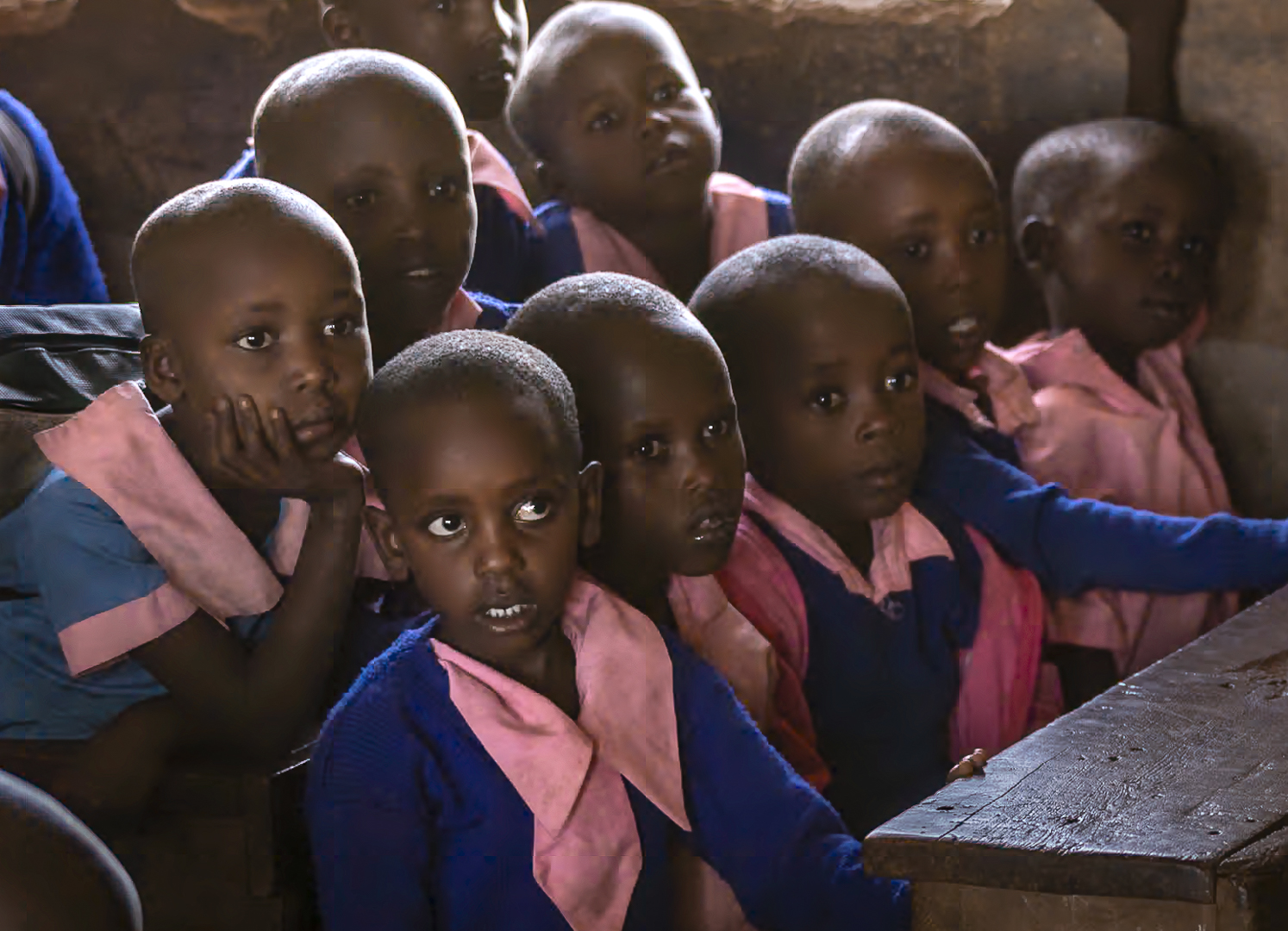
| 11 |
Jul 25 |
Comment |
The symmetry of the two boys body posture makes the image! my only suggestion would be to decrease the brightness of the reflection of the boys in the water. It takes my eye away from the boys, and is a little disturbing since their heads are cut off. |
Jul 28th |
| 11 |
Jul 25 |
Comment |
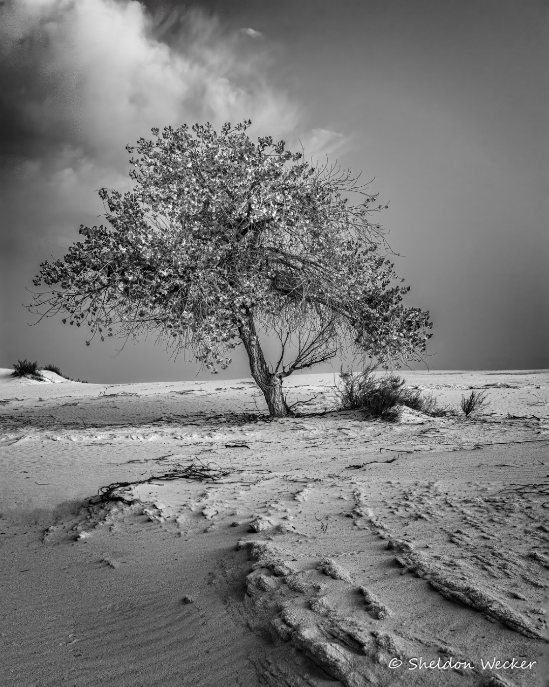
Great composition. I love the texture in the tassels and the way the hairs on the stem stand out against the background. The crop suits the subject well. |
Jul 28th |
4 comments - 0 replies for Group 11
|
| 17 |
Jul 25 |
Comment |
Very colorful and good eye focus. One suggestion, which has more to do with the presentation than the picture. On my display, the black background in the photo isn't distinguishable from the black background surrounding the photo. As a result, the composition appears out of balance - even though I suspect it isn't. Putting a thin white stroke around the picture would clearly separate the photo from the black screen background and I think help the presentation. As I think about it, I probably should have done the same thing for the picture I submitted this month. |
Jul 28th |
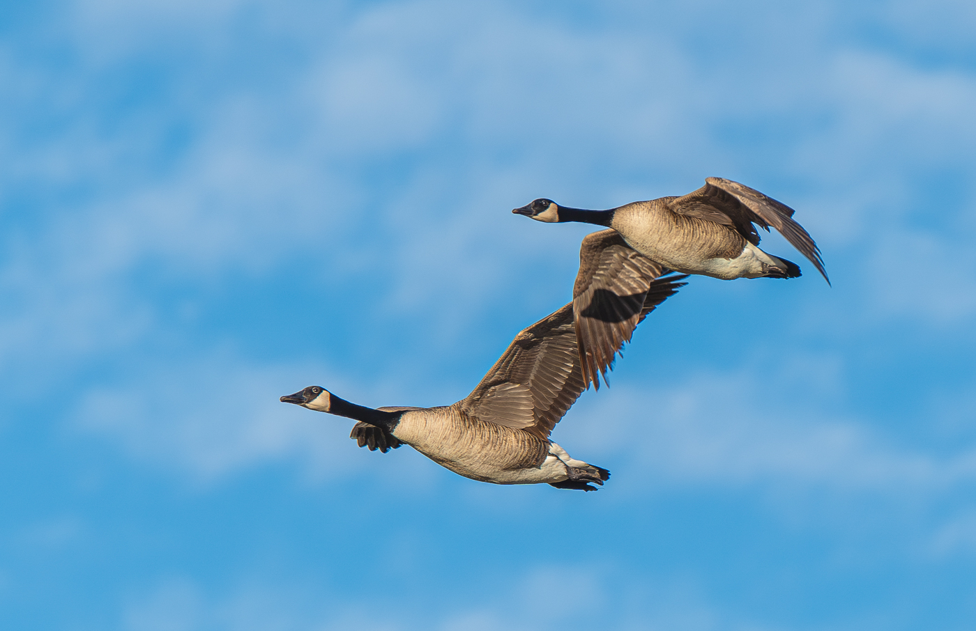
| 17 |
Jul 25 |
Comment |
Great capture. You nailed focus on the birds eye. Two things to consider - one is to increase contrast, the image is a little flat to me, and the other is to apply a radial gradient so that the bird on the right is a little more prominent - clearly making it the subject. |
Jul 28th |
| 17 |
Jul 25 |
Comment |
I like the choice of subject and overall composition. The picture would benefit from use of a tripod or other stabilizing device, not just because exposures could have been longer, but because to me the parts of the image that aren't moving appear blurred, probably from camera shake. Toning down the bright lights would also help keep focus on the foreground. |
Jul 28th |
| 17 |
Jul 25 |
Comment |
Great portrait! excellent lighting and pose. Love the colors. Have you tried lens blur in Lightroom/Adobe Camera Raw. I think it would let you blur the background while keeping the subject sharp. |
Jul 28th |
| 17 |
Jul 25 |
Comment |
Very interesting contrast between the sun and the Cathedral, both from a color/brightness an old/modern perspective. Was the sun centered in the Cathedral? If it was, was it possible to move a little left so that the picture was more symmetric. Shooting from a lower angle might also have brought the sun higher up in the image. |
Jul 28th |
| 17 |
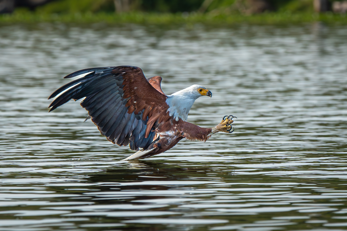
Jul 25 |
Comment |
My comments apply to the new version. I like the composition and the way that the image and reflection blend together. For me, the bird seems a little small, and the fish especially gets lost - I wouldn't have noticed it if you hadn't mentioned it. Some things to try include tighter cropping, and/or a vignette to make the bird more prominent, and perhaps selectively brighten the fish a little to make it more noticeable. |
Jul 28th |
6 comments - 0 replies for Group 17
|
10 comments - 0 replies Total
|