|
| Group |
Round |
C/R |
Comment |
Date |
Image |
| 17 |
Apr 23 |
Comment |
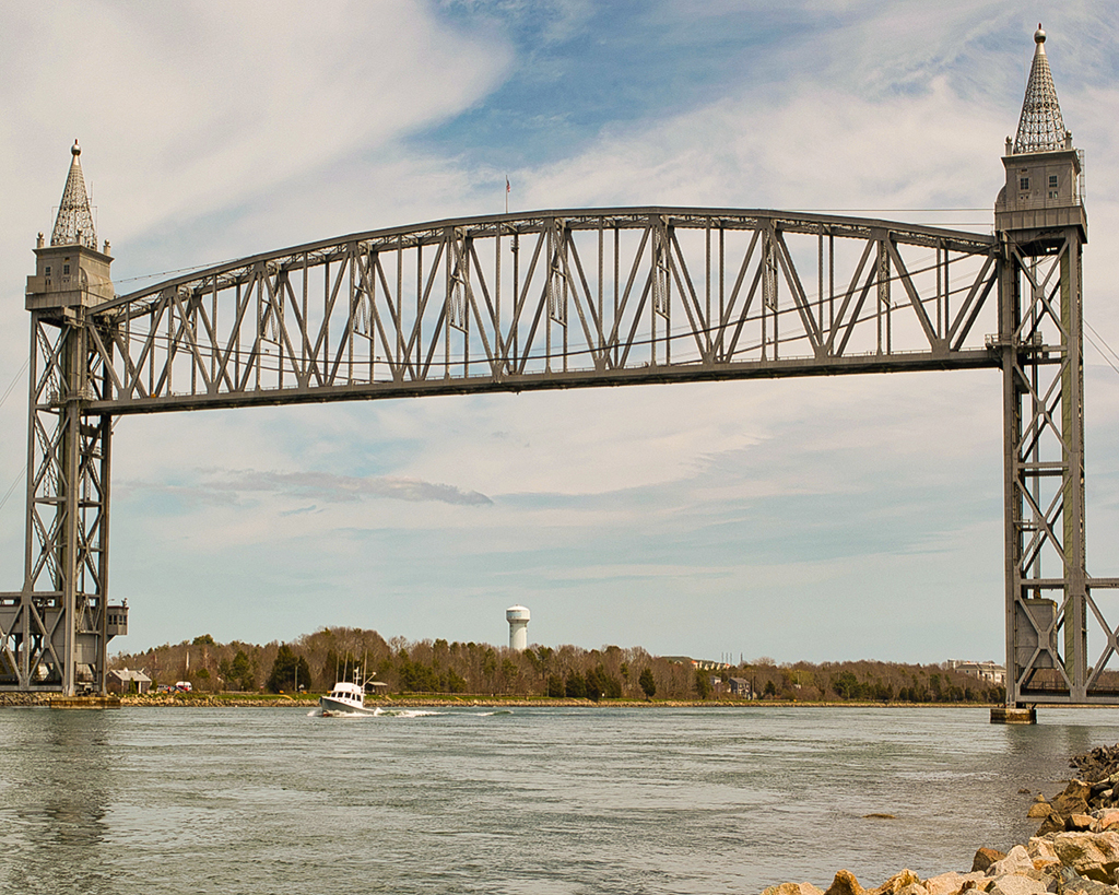
Great sharp silhouette, beautiful colors. Rather than crop at the top, can you add a little of the water at the bottom? |
Apr 16th |
| 17 |
Apr 23 |
Comment |
A good record of an interesting bridge mechanism. I was curious why this type of bridge rather than a drawbridge. According to Wikipedia, its simpler and less expensive to build, but limits the height of ships that can pass under it. The picture has an overall blue cast on my monitor. I edited it in Photoshop - using the white balance picker off the tower as well as auto white balance. The results looks more realistic to me. I also made a few adjustments to clarity and detail as others have noted. The crop does feel tight. |
Apr 16th |
 |
| 17 |
Apr 23 |
Comment |
Very nice treatment of the subject. Great composition - the reverse vignette plus sepia monochrome work well together. Many layers - rocks waves - sky - provide great sense of depth. |
Apr 16th |
| 17 |
Apr 23 |
Comment |
Great pose - excellent sharpness on beak and eyes. The sharpness of the feathers could be increased by using a smaller f stop, but then the background wouldn't be as blurred. Consider a crop from the right - you can eliminate most of the weed sticking up in front of the bird without taking away from the bird itself. It would also eliminate much of the fuzzy white area in the lower right corner. |
Apr 16th |
| 17 |
Apr 23 |
Comment |
I really like the waving pattern of the fields in the photo. A couple of things to consider. I agree with the comments about the brightness at the top of image. Perhaps darkening that area and increasing contrast there to match the contrast between light and dark fields in the bottom 2/3rds. |
Apr 16th |
| 17 |
Apr 23 |
Comment |
I really like the composition, the feeling of depth and the drama from the rising steam. Saturation is good too, brings out the color without being "overcooked". Some things to consider. Crop from the top to eliminate 1/4 to 1/3 of the sky. I think it would help address the "washed out sky" comments and bring more attention to the train. I've tried sky replacement but generally don't like it. I find it very hard to match the lighting and saturation of the sky to the rest of the image without it looking artificial. Also, I would consider darkening the walkway in the bottom third of the picture to help keep your eye on the train. |
Apr 16th |
6 comments - 0 replies for Group 17
|
6 comments - 0 replies Total
|