|
| Group |
Round |
C/R |
Comment |
Date |
Image |
| 17 |
Nov 22 |
Comment |
Well composed image of a classic scene. I'd consider increasing contrast - I don't see any true blacks in the image. The sky especially has dramatic potential if contrast is increased. |
Nov 16th |
| 17 |
Nov 22 |
Comment |
Beautiful scene and great colors. If there is room in the uncropped image, I'd consider adding to the bottom so that the blue sky is reflected in the water below the trees - completing the mirror image. |
Nov 16th |
| 17 |
Nov 22 |
Comment |
The eyes and eye contact make the picture. I almost didn't notice the foreground items. I do think they add to the balance since so much of the image is on the right, but I don't think the bag and can are up to the standards of the rest of the image. Maybe just the glasses. Well done. |
Nov 16th |
| 17 |
Nov 22 |
Comment |
I like the colors, and the feeling of depth the image has. I'd consider making the boat more prominent - cropping from the right and adding on the left (if there is room in the unedited shot) to put it in a rule of thirds position. Also darken the bright sand in the foreground. |
Nov 16th |
| 17 |
Nov 22 |
Comment |
Nothing much to add to Peter and Priscilla's comments. I like the background is blurred - what focal length/f stop did you use? How did you edit the photo?
|
Nov 16th |
| 17 |
Nov 22 |
Comment |
I'm a Calatrava fan - and visited this Museum several times since it was a short trip when we lived north of Chicago. The color of the sky doesn't concern me as much as the brightness - the bright areas of the sky keep drawing my eye away from the building. The building is also lost somewhat in the background. Perhaps moving to the left or closer in along the breakwall would eliminate the overlap with the tall building in the background. |
Nov 16th |
| 17 |
Nov 22 |
Reply |
what do you think of the version I posted as a response to Peter Elliston? |
Nov 12th |
| 17 |
Nov 22 |
Comment |
I think I like this version better |
Nov 8th |
 |
| 17 |
Nov 22 |
Reply |
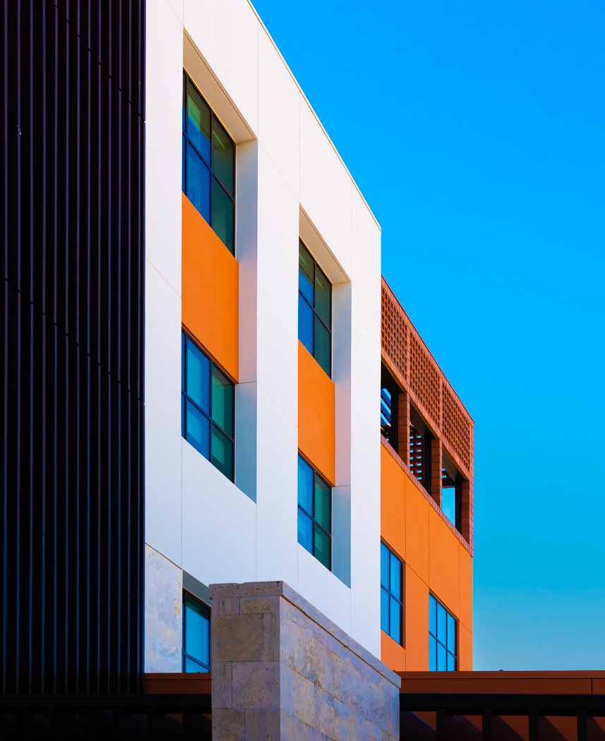
Peter - Thanks for your comments. I agree with you. I have a love/hate relationship with the pillar. Its the colors and the lines that draw me to the image. I tried taking out the pillar, but that just left a lot of empty space and the image was boring. It does add some depth to the image, and emphasizes the other image elements because its so different. I submitted the image at least in part to see how other people reacted to it, and what they might suggest. |
Nov 8th |
7 comments - 2 replies for Group 17
|
7 comments - 2 replies Total
|