|
| Group |
Round |
C/R |
Comment |
Date |
Image |
| 17 |
Apr 20 |
Reply |
Thanks Glenn |
Apr 14th |
| 17 |
Apr 20 |
Reply |
Thank you Sharon |
Apr 13th |
| 17 |
Apr 20 |
Reply |
We have a Toto bidet (bought previously when I had some shoulder mobility issues). Helps, but its like short form income tax. Doesn't totally eliminate paperwork. |
Apr 13th |
| 17 |
Apr 20 |
Reply |
Wow - how did you get fresh lettuce? |
Apr 11th |
| 17 |
Apr 20 |
Reply |
Its hard - constant distractions from the news, both civil and financial, and the challenge of managing our toilet paper inventory. |
Apr 9th |
| 17 |
Apr 20 |
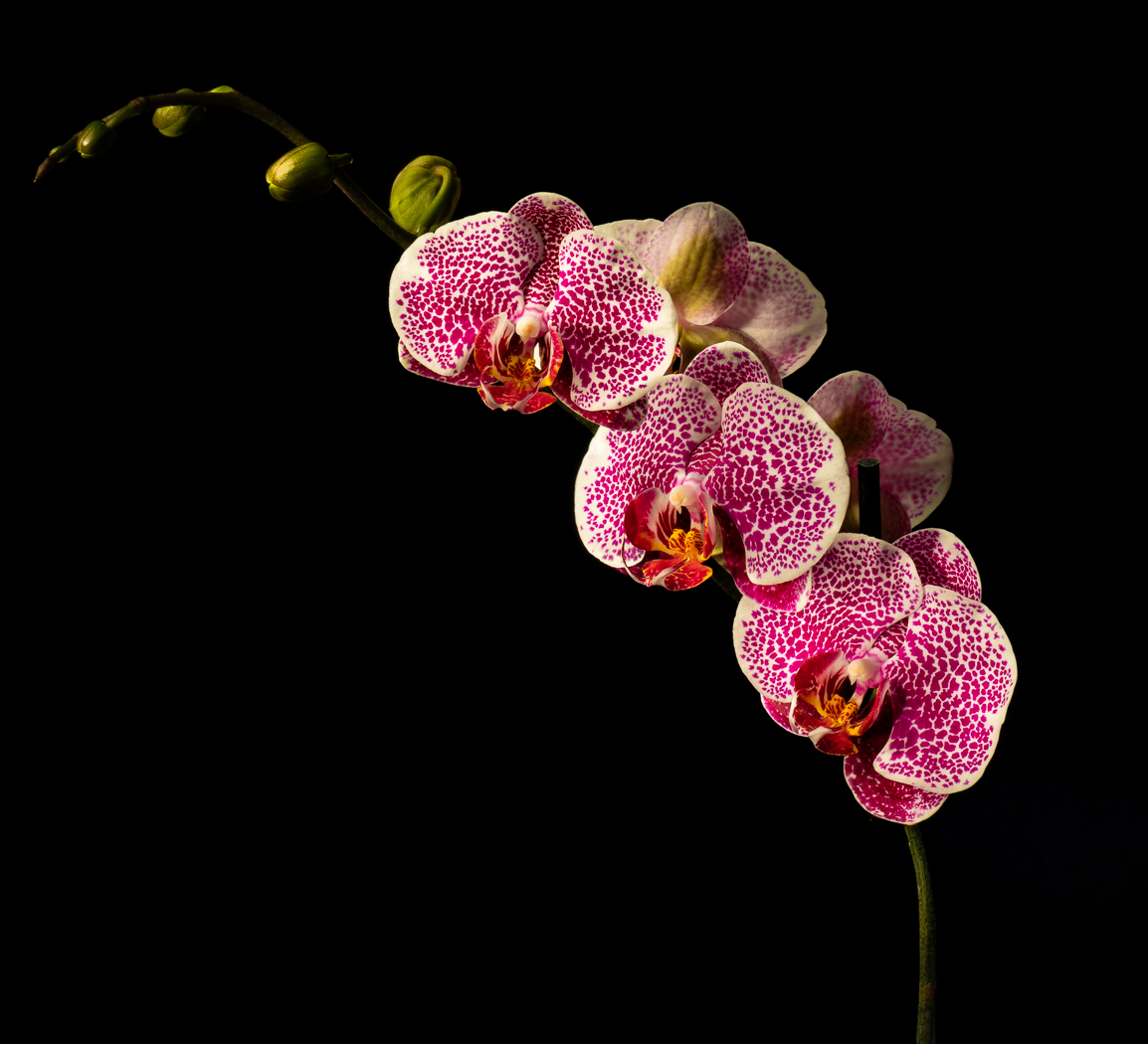
Reply |
Thanks Dick, I've never seen so many blooms, all "perfect" so close together. Magnificent plant, now displaying a second round of blooms, but not as many. |
Apr 9th |
| 17 |
Apr 20 |
Comment |
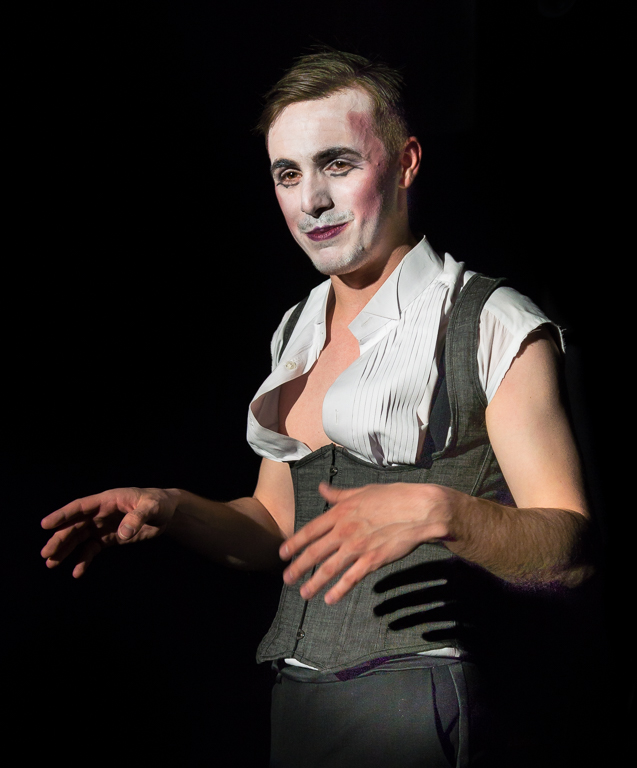
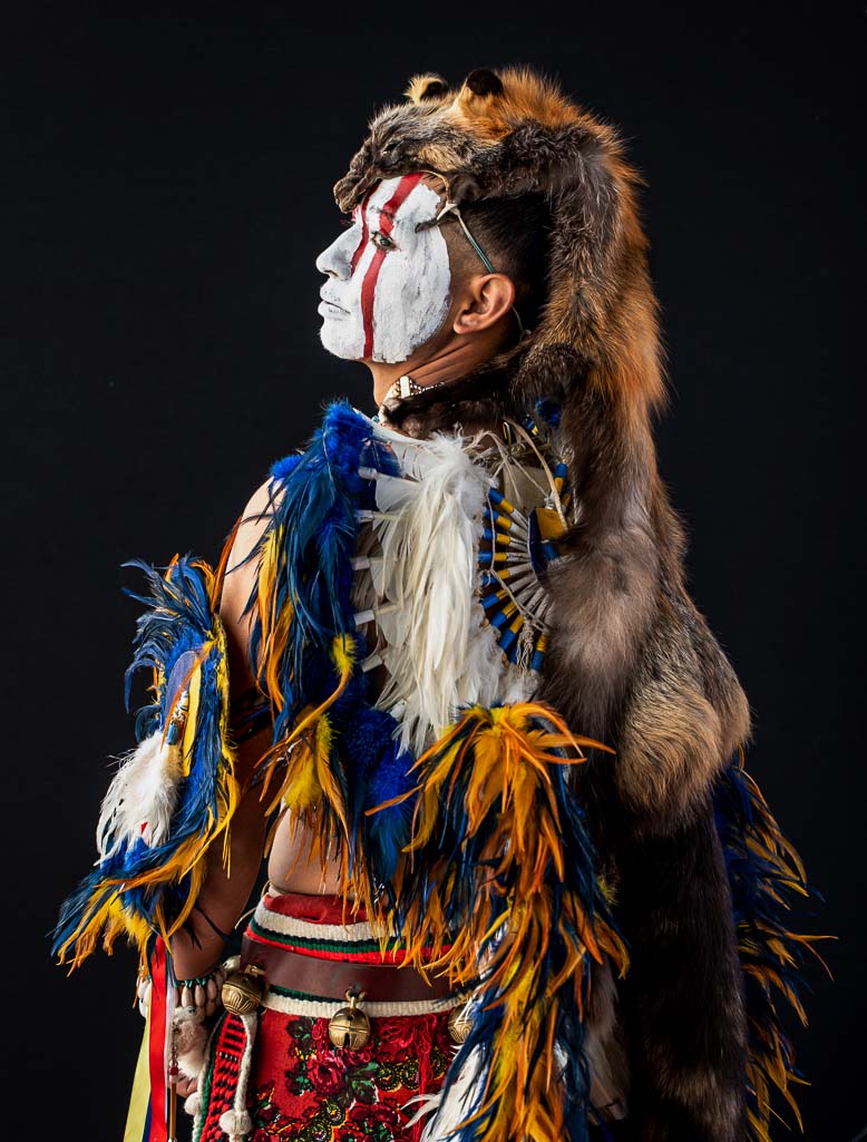
Stunning image, great pose, great sharpness, saturation, lighting. Was the backdrop black, or did you cut him out of the background? Two small suggestions. IMHO if the image was cropped a little from the bottom, his face would be more prominent. Also, on my monitor, his face almost appears blown out. Decreasing highlights and increasing clarity brings out more of the texture in his face paint. I took a shot at making this changes - hope that's ok. |
Apr 8th |
 |
| 17 |
Apr 20 |
Comment |
Stunning image, great pose. Was the model posing against a black backdrop, or did you cut him out from the background? Two thoughts. Cropping a little from the bottom would make his face more prominent without losing much of the costume. Also, on my monitor his face almost appears blown out. Decreasing highlights and increasing clarity on his face brings out some of the texture in the makeup. I took a shot at these changes - hope you don't mind. |
Apr 8th |
| 17 |
Apr 20 |
Comment |
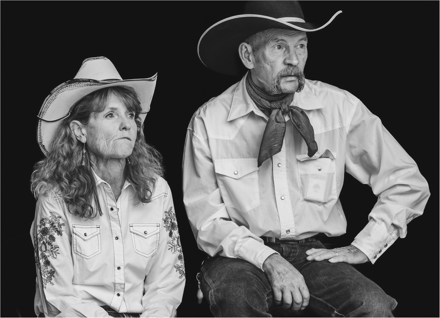
This is a stunning image. Was the model posing against a black background, or did you select him out from the background? I have two suggestions. On my monitor, I can't see any detail or texture in the white makeup on his face. Perhaps decreasing highlights and increasing texture/clarity would bring out some additional detail there. I also think cropping from the bottom a little would make his face more prominent, without losing much of the beautiful costume. I took a shot at these changes and included them. Just my two cents, hope you don't mind. |
Apr 8th |
| 17 |
Apr 20 |
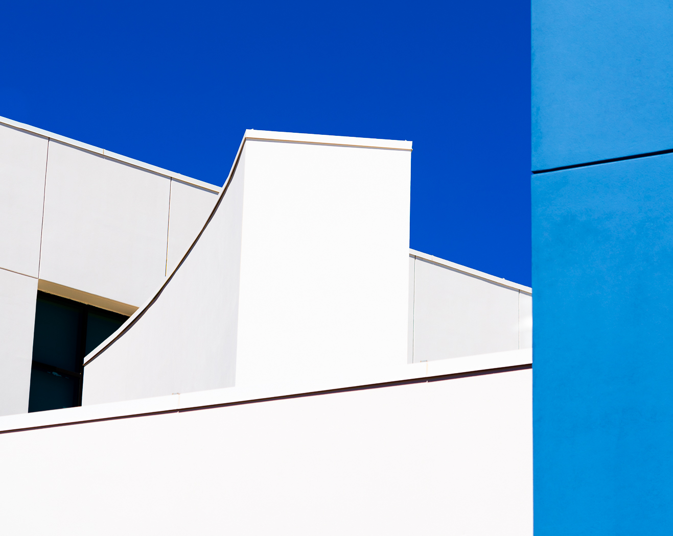
Comment |
The colors certainly work well together. Personally I prefer the graduated blue blackground to black. I'm also trying to use my newfound time to brush up on photoshop skills, especially selections. Another variation might be to continue the wave all the way across the canvas, and move the couple a little to the right and make them a little bigger. |
Apr 8th |
| 17 |
Apr 20 |
Comment |
I like how the colors and shadows work together, and the sense of depth the included foreground provides. The brightest objects in the image are the dried grass (if that's what it is) in the foreground, and the white barn in the distance. My eye keeps coming back to them instead of the rolling landscape. I think darkening the highlights in those areas would help - at least for me. |
Apr 8th |
| 17 |
Apr 20 |
Comment |
Great feeling of depth and motion in the waterfalls. I especially like the contrast between the blur of the rapid moving water over the falls compared to the relative sharpness of the pool in the foreground. I don't know if it was an option, but I would have liked to see more of the falls at the top of the image - I think it would add to the feeling of depth and help set off the sunlit rock at top center. |
Apr 8th |
| 17 |
Apr 20 |
Comment |
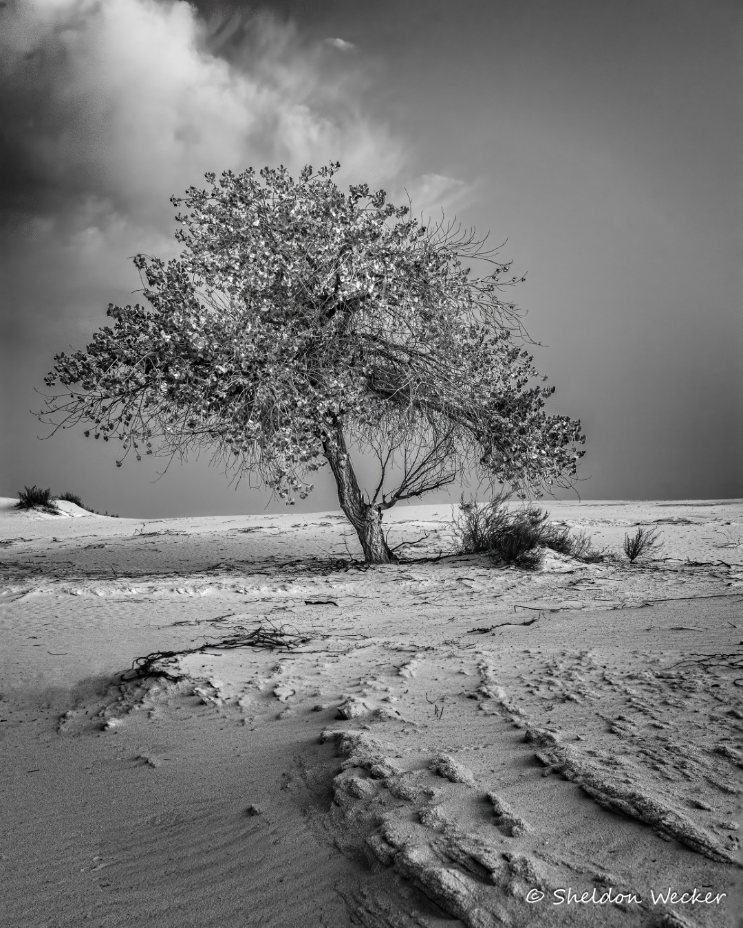
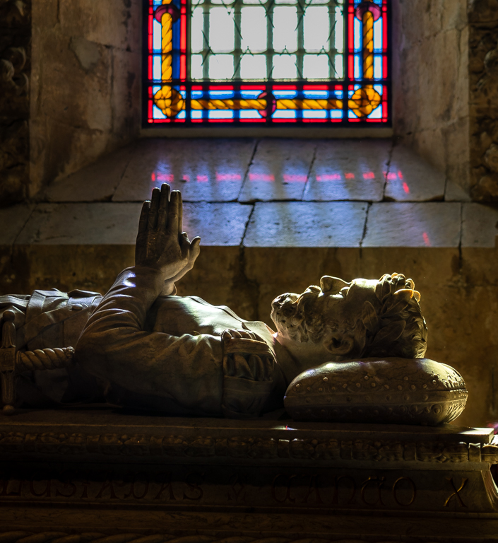
Monochrome suits the subject. From the crispness of the shadows, it looks like it was a very bright day. I would have liked to see a little more detail in the running gear and Engineer's face. On my monitor they are a solid black. Its hard to capture detail in the shadows without blowing out highlights under those conditions. |
Apr 7th |
7 comments - 6 replies for Group 17
|
7 comments - 6 replies Total
|