|
| Group |
Round |
C/R |
Comment |
Date |
Image |
| 36 |
Dec 18 |
Comment |
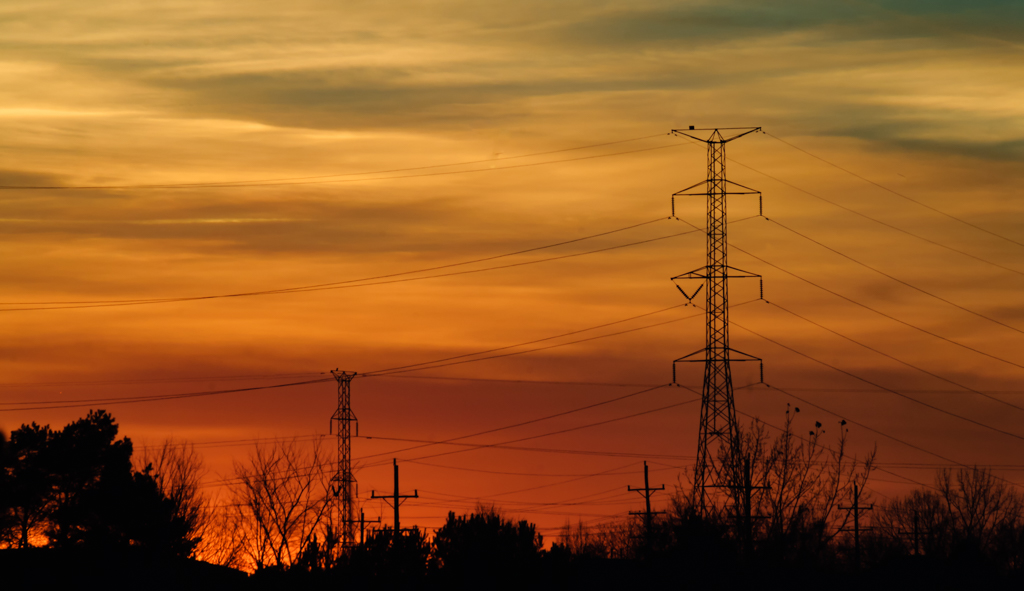
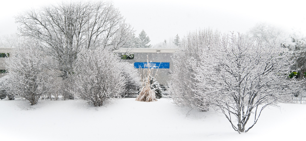
This would be a great one to make a panorama photo using multiple portrait photos and stitch them together. The bottom is too narrow, not balance and the image become more just a photo of pretty sky. It's absolutely stunning color and you manage very well on the exposure. |
Dec 13th |
| 36 |
Dec 18 |
Comment |
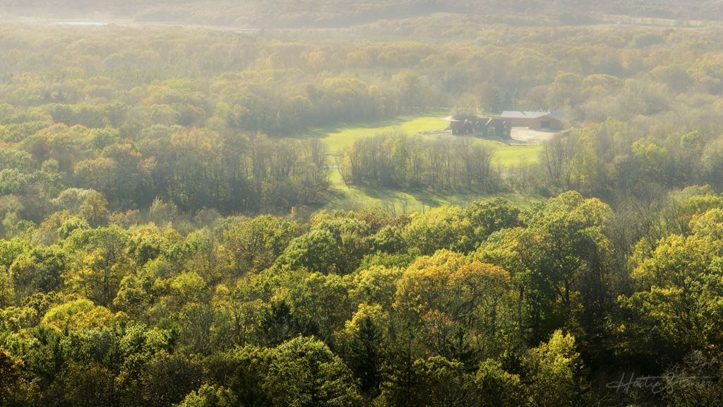
The composition is too much half half split. For the sky I would crop out the top orange cloud right at the edge of the image. The grass could use some more light. I actually like the little trees on the right side and the slight purple color of the sky right there. I would not crop them out, personally. |
Dec 13th |
| 36 |
Dec 18 |
Comment |
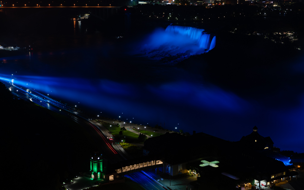
I feel that the foreground is super sharp but the rest isn't. Where did you focus at? The waterfall appear to be overexposed, try lower the highlight, the detail might show better. |
Dec 13th |
| 36 |
Dec 18 |
Comment |
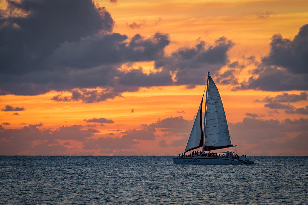
Great composition and the lighting are perfect. The sun ray are beautiful. I don't have any suggestion. |
Dec 13th |
| 36 |
Dec 18 |
Comment |
Very nice seeing and capturing the rainbow this way. Rainbow to me is alway high up there cannot-be-reached feeling. The composition is fine, got a nice balance to it. The image appears a bit too saturated on my monitor, and lacking of layers somehow. The hill at the foreground is a bit bright maybe can tune down a bit. I think maybe try to bring up Nik Viveza (if you own Nik) to try some adjustment to get some layer/tone for the mid-ground. |
Dec 12th |
| 36 |
Dec 18 |
Comment |
Nice angle capturing the city and nice composition. I would crop about 1/3 of the sky & agree with Michael's cropping the white wave. The image could use some contrast/curve, maybe a bit dehaze. Nice job on the panorama stitch. |
Dec 12th |
6 comments - 0 replies for Group 36
|
| 55 |
Dec 18 |
Comment |
Your HDR performed just right without overdoing it. The leaning of the building pointed right to the dramatic sky. I would correct the perspective just slightly so the cute blue structure on the left feels a little less "crshed" look. I like the graffiti on the building. Agree on Matt on the dust spots cleaning (in the sky). |
Dec 26th |
| 55 |
Dec 18 |
Comment |
Great composition and motion. Definitely making me feeling that I should get that 70-200 lens too. I have no further suggestion on the image. Too bad it wasn't good weather with some nice lighting. Definitely a keeper. |
Dec 17th |
2 comments - 0 replies for Group 55
|
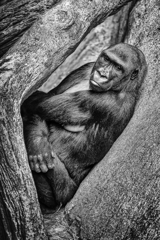
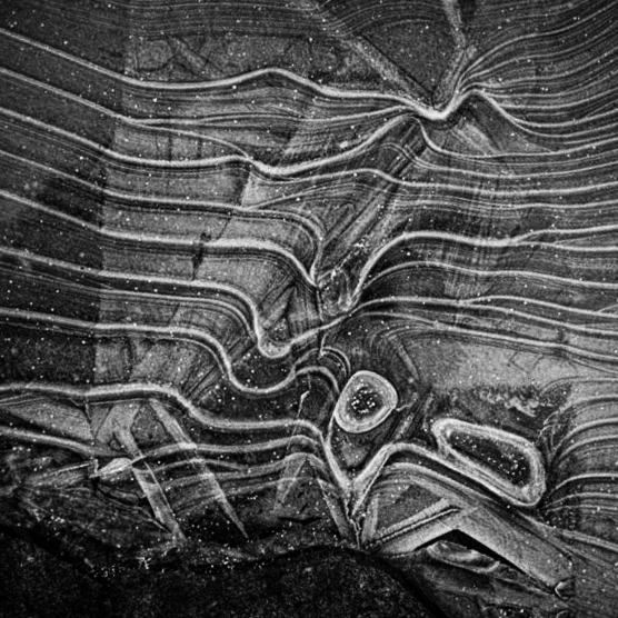
| 62 |
Dec 18 |
Comment |
I love the conversion and it's a very interesting image with great pattern. Personally I would choose to leave some more bottom from the image to balance out the patterns above (like having a solid base). Just my take here.
Forgot to mention that I also rotated the image slightly to the right. |
Dec 14th |
 |
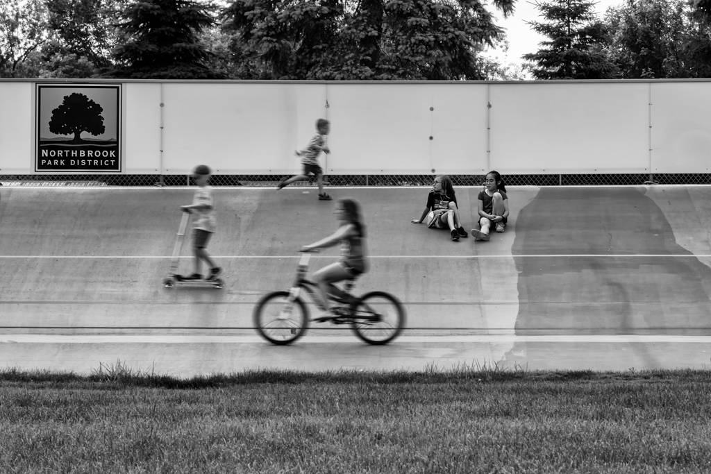
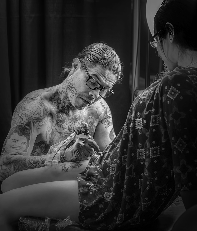
| 62 |
Dec 18 |
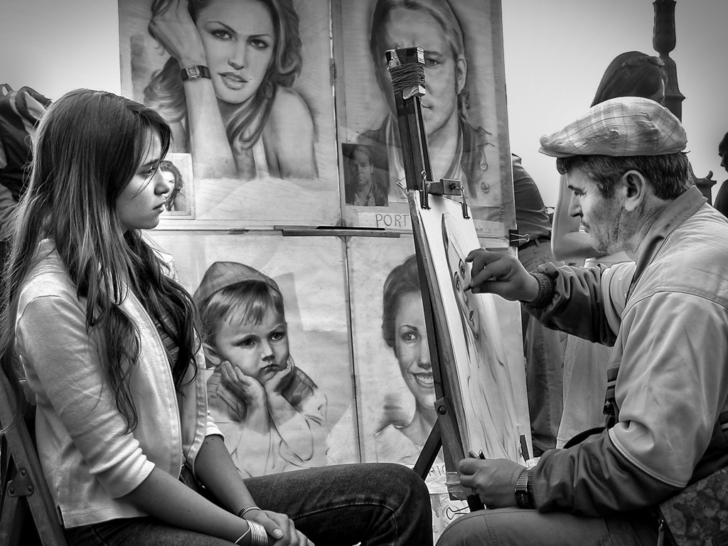
Comment |
Great composition and I like the mood. For the lonely feel, I agree with Steve about remove all people in addition to the bike removal from Oliver. In addition to that, I suggest to move the person on the right more to the left, in the middle of the deck since there is some overlapping with the background.
Did you do any noise reduction? ISO 6400 shouldn't be too bad to handle the noise. |
Dec 13th |
| 62 |
Dec 18 |
Comment |
Great capturing the action here. I totally agree on the crop by Oliver, and also agreed on color is better for this since the background the color version is already pretty muted. The color monkeys bringing life to the image. |
Dec 13th |
| 62 |
Dec 18 |
Comment |
He's so cute! It would be a great holiday postcard but it's blur on my PC too. I am not sure sharpen it would do the trick, since it looks like motion blur to me. The 1/15 shutter speed indoor without a flashlight would give you the motion blur. I would put ISO to auto ISO, and put your shutter faster and try to take another one if you could. |
Dec 13th |
| 62 |
Dec 18 |
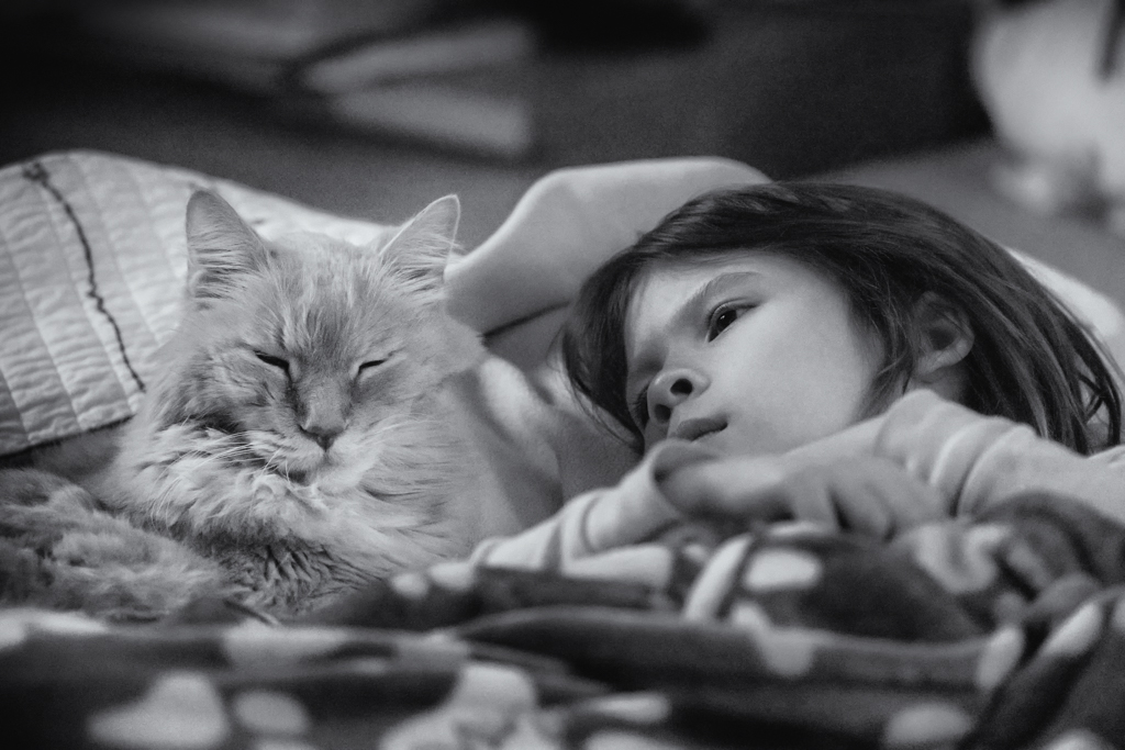
Comment |
My cat who passed away in April look just like yours. Too bad I never thought of getting a macro photo of her. This is a very well done image of the cat. Personally I would keep the image as color version. It's not because the B&W is not good but I think your color version interpreted the cat very well and had very good lighting.
In the B&W version, I feel there are some places are too bright (overexposed on my monitor and start thinking maybe my monitor need a calibration). Mainly the left eye and some white fur near the nose. I adjust these two area. |
Dec 13th |
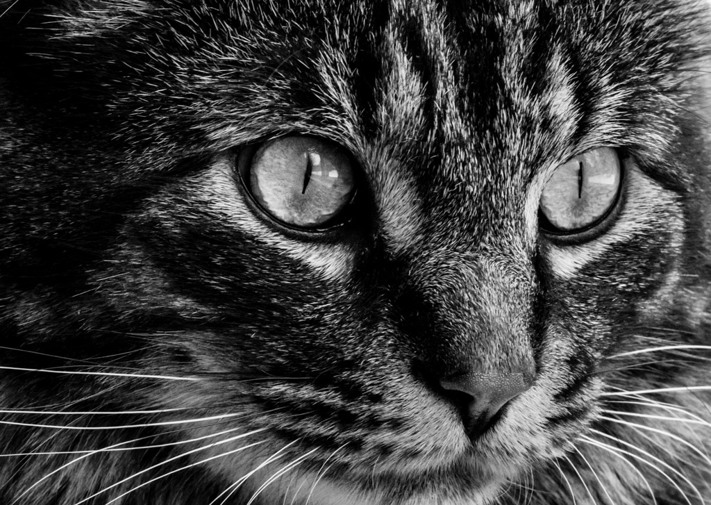 |
| 62 |
Dec 18 |
Comment |
Great conversion to B&W. The lighting are well done but I still found it has some overexposed places. Also I would tune down more environment lighting to bring the focus to the middle. I have a sample image here (didn't do anything about the halo at the bottom right, only burn the corner more). |
Dec 13th |
 |
| 62 |
Dec 18 |
Reply |
I like the changes. Also I attached the correct original |
Dec 9th |
 |
6 comments - 1 reply for Group 62
|
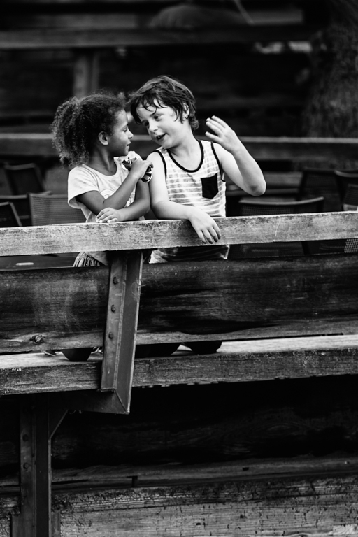
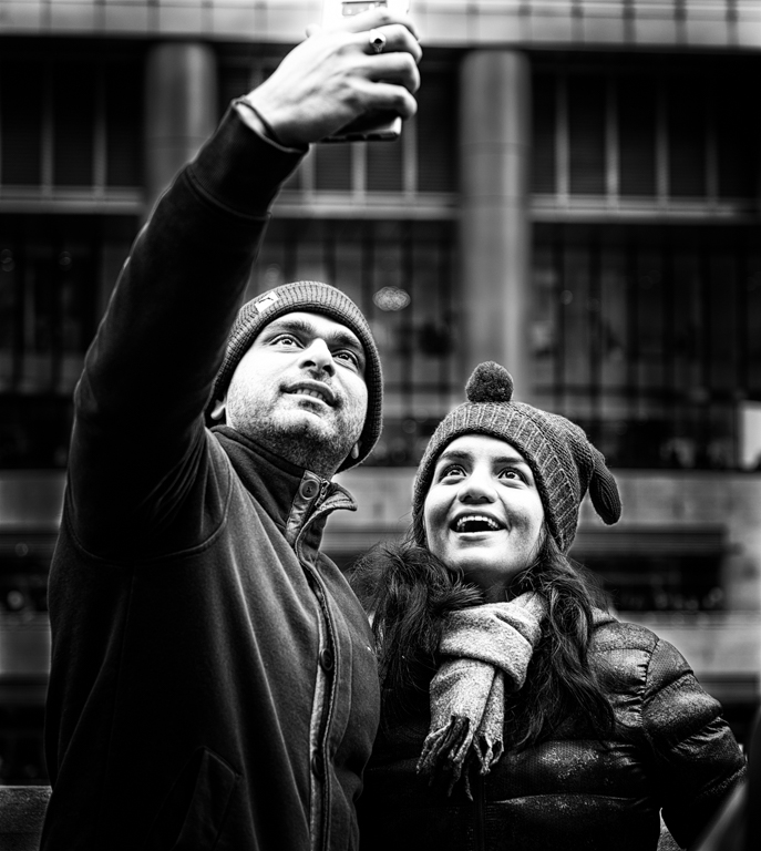
| 80 |
Dec 18 |
Comment |
I was saying the photo need some breathing room and your last edit made just that. It's an interesting looking and color. Try a bit more sharpen on the subject, or could be because the smaller size of the photo. |
Dec 26th |
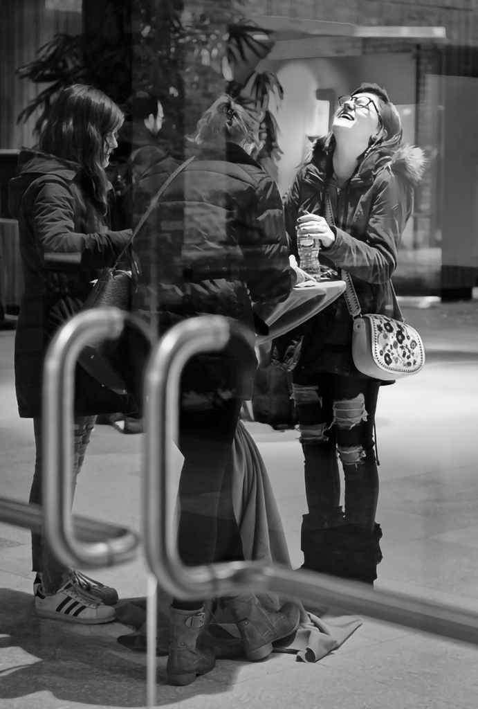
| 80 |
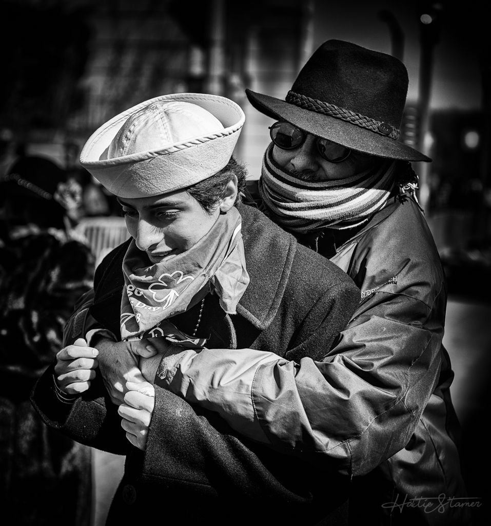
Dec 18 |
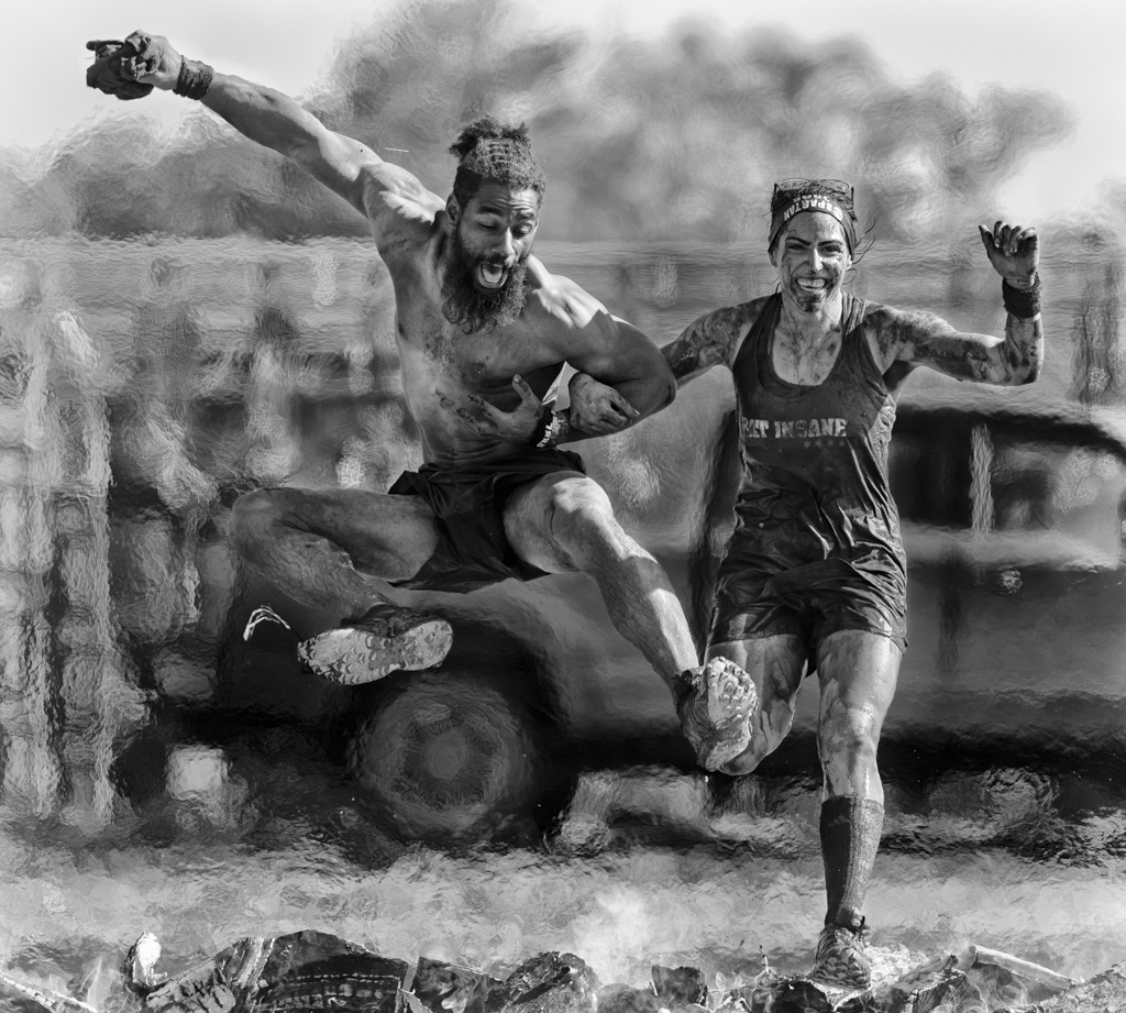
Comment |
Lol Richard. I cannot keep thinking why the one on the left giving a face like that. I agree about not cropping the lady on the right. Good BW on this one. |
Dec 26th |
| 80 |
Dec 18 |
Comment |
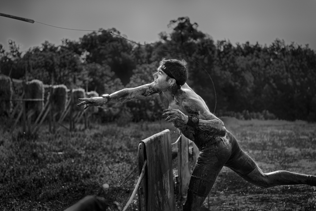
Excellent image and great eyes! Perfect placement of the feet. No comment for further improvement. |
Dec 14th |
3 comments - 0 replies for Group 80
|
17 comments - 1 reply Total
|