|
| Group |
Round |
C/R |
Comment |
Date |
Image |
| 36 |
Nov 18 |
Comment |
I like the composition and wouldn't need cropping, IMO. I agree with others to bring out more yellow, orange color in the mountain only (not the front grass). I do wondering if you also taken a photo with more water reflection or not. I can imaging it would look very nice to have more reflection here. |
Nov 27th |
| 36 |
Nov 18 |
Comment |
I like the color version in your original shot. The B&W lost the sense of time in this image (IMO). Sharp, good story here. However I agree that you should take a few more steps to the right. The composition would be much better. |
Nov 27th |
| 36 |
Nov 18 |
Comment |
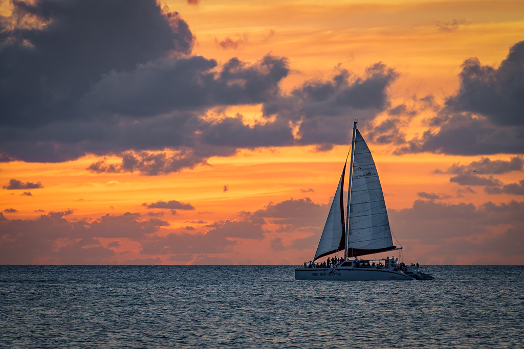
I like the image, the color and the calmness feeling. I would suggest have a bit more room to the left. Agree others about bring out the reflection of the left sail boat. Your latest editing seems a bit over saturated, lost some calmness there. |
Nov 27th |
| 36 |
Nov 18 |
Comment |
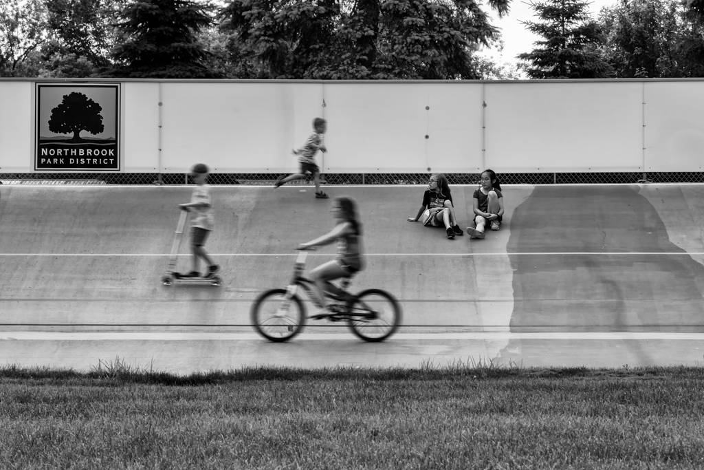
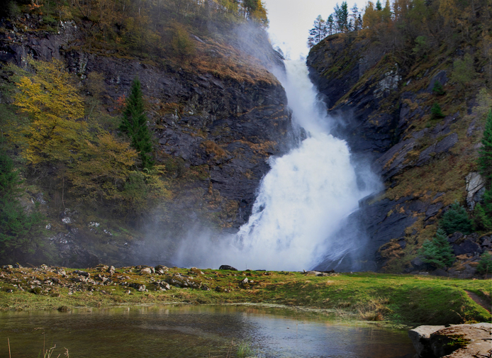
The image is a bit out of balance, would be nice to have more to the left. I usually love foreground but this one seems a bit messy and too bright. I like the mountain and the waterfall a lot and found there are quite some different color and texture to look at. I apologize for the following attempt (also I wasn't able to clone very well on the bottom left grass). Just a different idea, may not be a good one.
- cropped the image differently, more to the left since that's how the waterfall goes.
- cropped out a log of foreground (I wish I didn't crop that many rocks on the right, was trying to get rid of sticking out grasses on the bottom left)
- brought out more color, contrast, shades to the rocks around the waterfall |
Nov 12th |
 |
| 36 |
Nov 18 |
Comment |
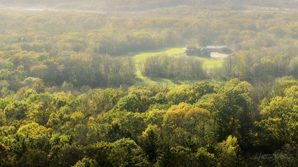
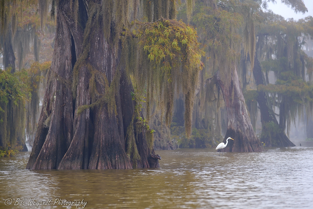
It's a great capture of the tranquil forest here, breathtaking beautiful there. I like the fog, but feel maybe the closer to you, should be less foggy. I did some adjustment, in my interpretation. I add a bit of dehaze, which seems slightly clear out the closer part of the tree, and left fog further distance. At least that's how I usually see things in the fog. |
Nov 12th |
 |
| 36 |
Nov 18 |
Comment |
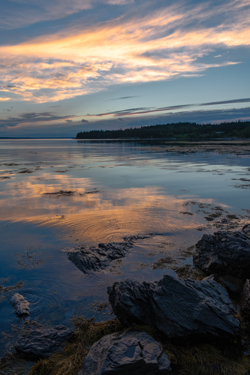
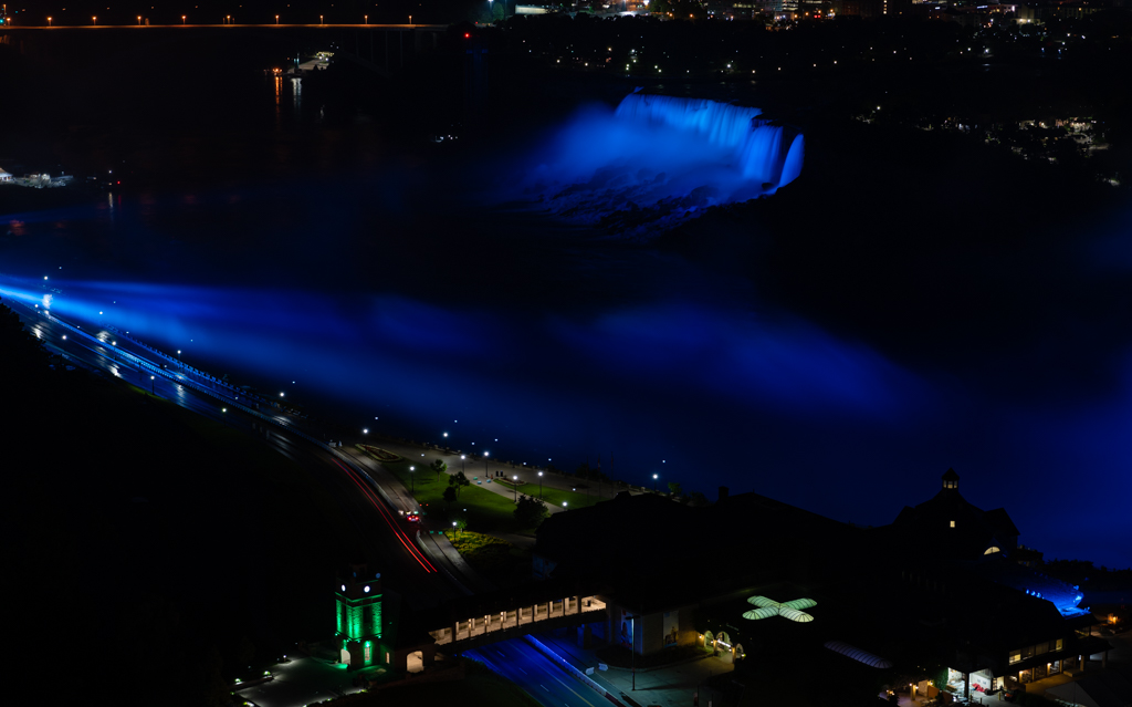
Agree with Bill, a bit too much water at the foreground since there isn't any foreground here. Beautiful color. Is there more on the right side rock? |
Nov 12th |
6 comments - 0 replies for Group 36
|
| 62 |
Nov 18 |
Reply |
Thanks LuAnn! |
Nov 12th |
| 62 |
Nov 18 |
Reply |
Will do. |
Nov 12th |
| 62 |
Nov 18 |
Comment |
It's so peaceful and the lighting is perfect thru the window. I think you nailed. |
Nov 11th |
| 62 |
Nov 18 |
Comment |
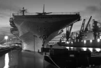
Great image and processing! Love the reflection off the water too. I don't have suggestion for improving it either, only wish the image is wider (more to the right), or maybe a slightly different crop (of course I don't have your fabulous post processing here). The reason for the crop, or wishing wider, is that I felt the boat is point to the right side, I feel more balanced if you can give more room to the right side. Or having a wider 16:9 or something like that, won't feel too centered. But I have to emphasize that I love the image. |
Nov 11th |
 |
| 62 |
Nov 18 |
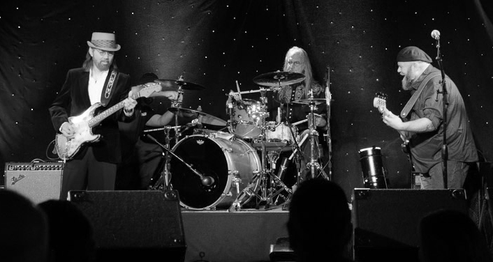
Comment |
I like the B&W version of this better, nicely captured and processed. My only two suggestions are:
- give more room (less cropped) on the left side for some breathing room
- darken the bottom stage if you don't crop it out
Attached my version of the crop (only did crop, quick conversion, nothing else). |
Nov 11th |
 |
| 62 |
Nov 18 |
Comment |
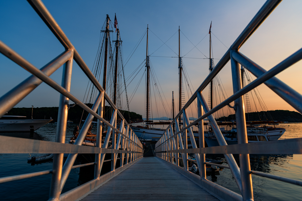
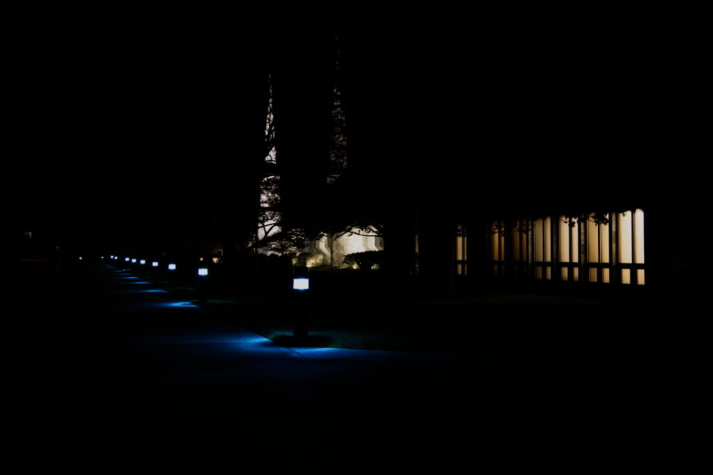
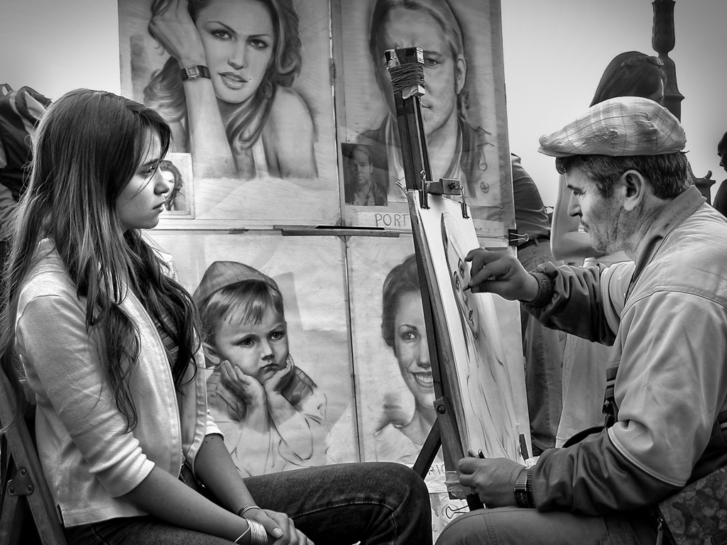
Perfect crop and process to the B&W. I agree of ditching the wide frame. I personally like to direct the light (or more light) towards the narrow end of the road. |
Nov 11th |
| 62 |
Nov 18 |
Comment |
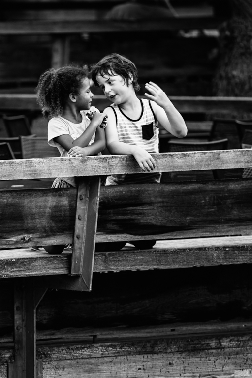
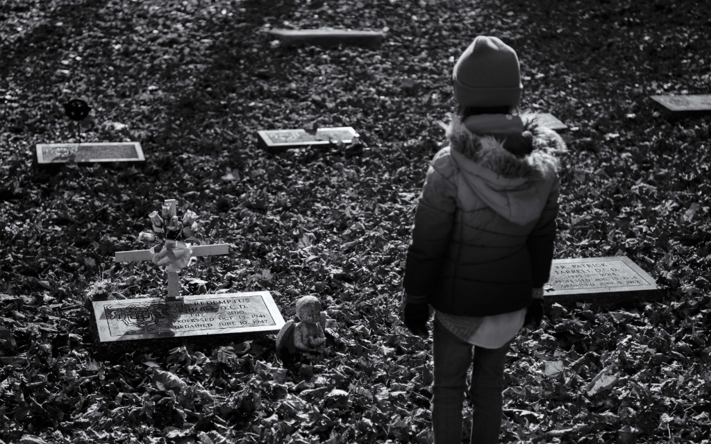
I think your conversion and post process are well thought and performed. Clean and simple. Only thing to pick on (lol) is that I feel since her skin tone is darker, maybe you can try darken her clothing (top) to have slightly darker shade of grey to further separate her skin tone. Just a thought.
BTW, how did you turn the black clothing to grey?? |
Nov 11th |
| 62 |
Nov 18 |
Reply |
I like your suggestion on cloning out that stone, thanks. In terms of relationship, there is none. We visited a cemetery, and she just stood there checking them out. I saw the mood that I like and just did a quite shot. |
Nov 10th |
| 62 |
Nov 18 |
Reply |
I do have a cropped version of this image. I took the image when she was just standing there checking out the stones, I didn't ask her to stage and never thought about kneeing either. Something to consider in future. |
Nov 10th |
 |
| 62 |
Nov 18 |
Reply |
I do like the lighting switch and focus here. Thanks Oliver. |
Nov 10th |
| 62 |
Nov 18 |
Comment |
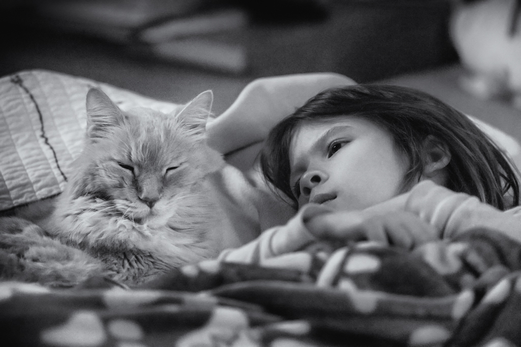
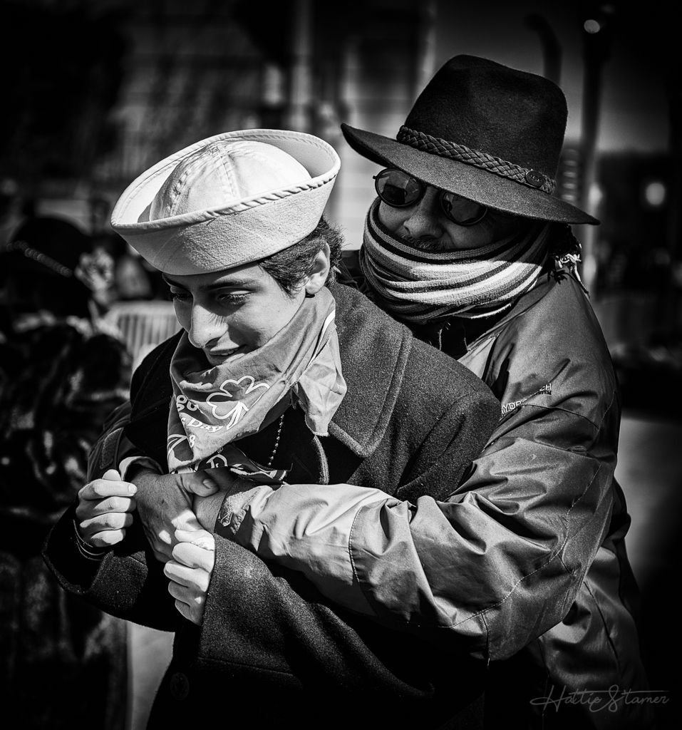
What a capture, concept, lighting. I found the lighting in the color version is more natural, and I really like the color version. In the B&W conversion, since you bright the girl's face and darken her neck/arms/hands, it feels like her face is floating, not part of the body. Another thing bothers me is the arms holding the photos, there is no skin texture at all which making them looks like added somehow. But I do like your image. Well done. |
Nov 10th |
6 comments - 5 replies for Group 62
|
| 80 |
Nov 18 |
Comment |
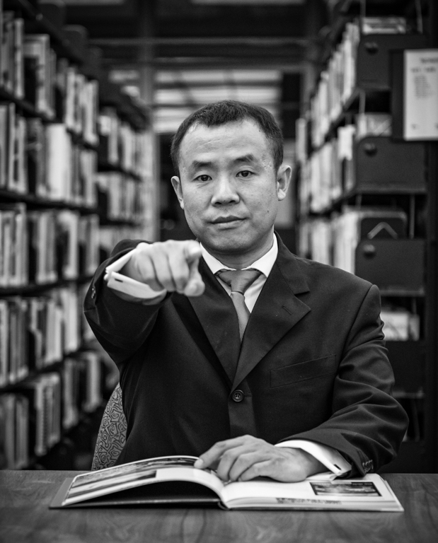
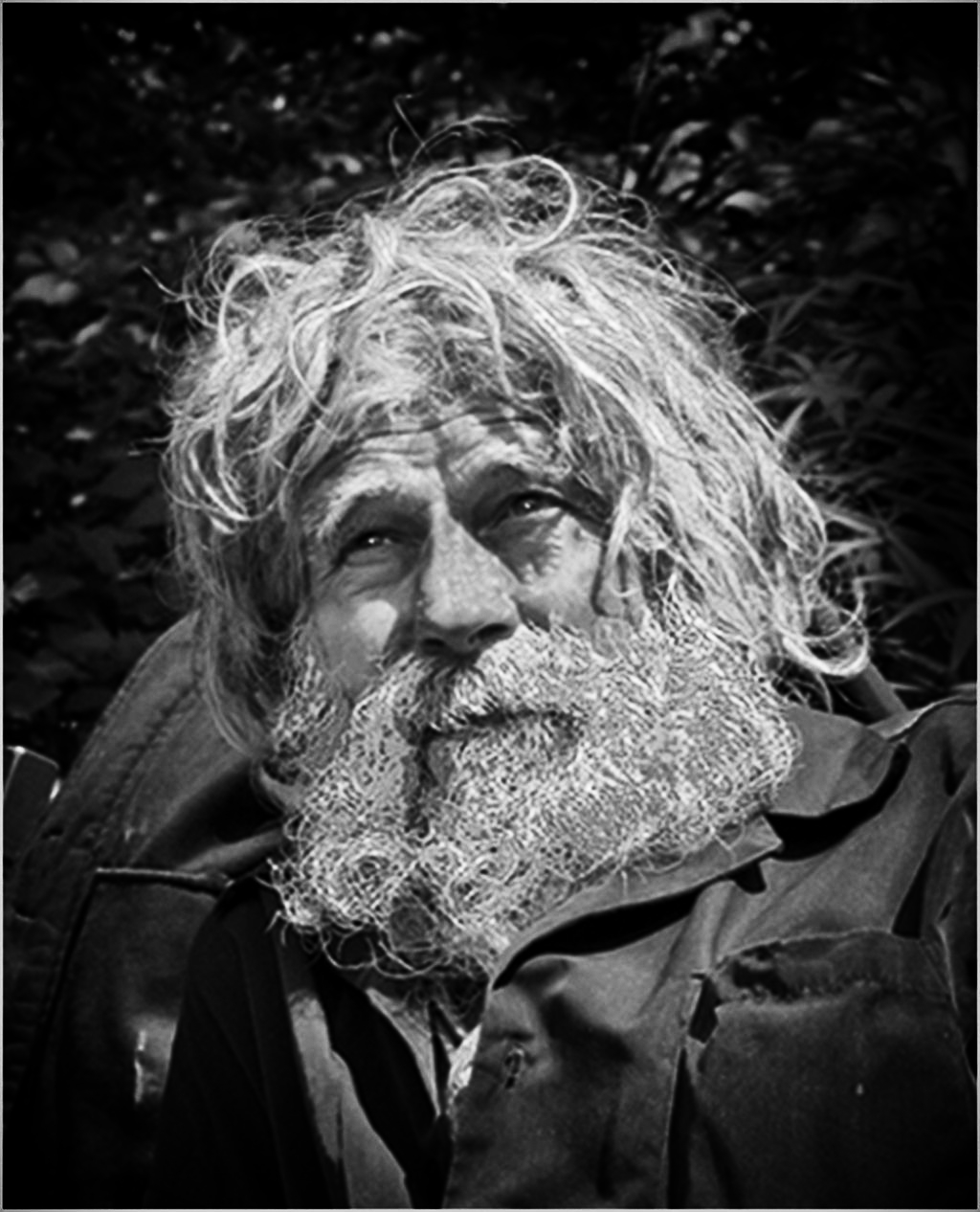
The image seems quite out of focus, something cannot do much in post-processing. It seems the whole face, including the beard is a bit blown out, mainly probably everything seem flat. I chose one of the Nik preset, and seems able to recover some shadows, which makes the guy looks more interesting. I did some vignetting/edge burning with the Nik too. |
Nov 10th |
 |
| 80 |
Nov 18 |
Comment |
There is a lot of story here to tell. I like the color of the image too. Although I attempted B&W with this, I end up like color version more. Very nice capture. I do have hard time seeing where the focus landed. Feels like you might be focused on the back "Goodlife" word because the front customer appears soft (could be just the size of the image is too hard to tell). The image could use some tune down on the blown highlight. In the end, I love the capture. |
Nov 10th |
| 80 |
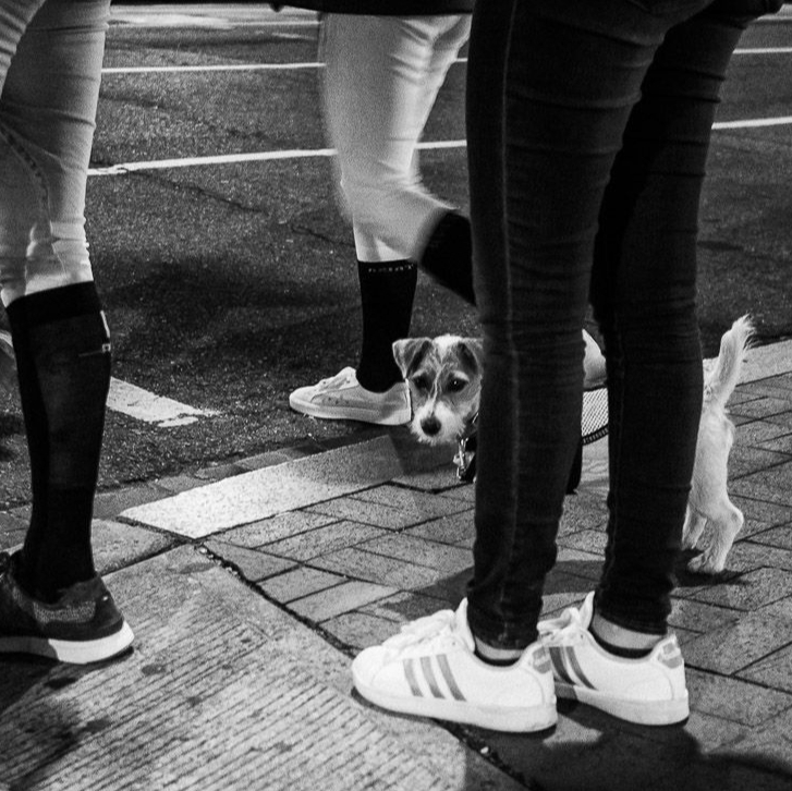
Nov 18 |
Comment |
The dog indeed is the image's soul, agree with Beverly, it makes the image. However, the foot on the bottom right kind of kill the image for me. Personally I would rather crop that out because that's what I saw first, and my eyes kept going there. I did a 1x1 crop here. Although I do like the pair of legs on the left a lot, but the bottom corner one is just too distracted, I rather loss half of the 2nd pair of legs. |
Nov 10th |
 |
| 80 |
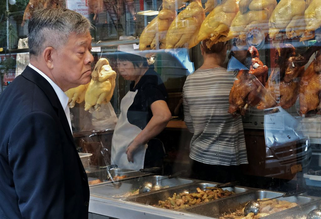
Nov 18 |
Comment |
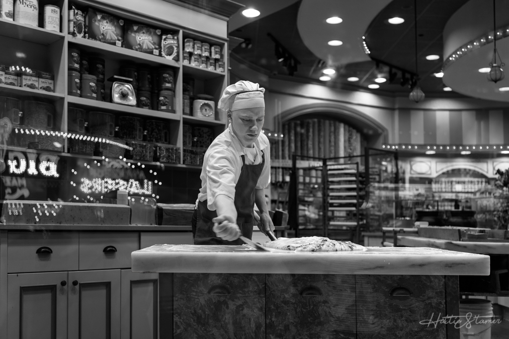
I like what you've captured. The customer turn his face perfectly; inside the store works, the goodies. However, the car is very bright and distracted. I did some changes (not the best PS skill but just trying to get my idea across:
- had a little dehaze (the chickens/ducks showing their true color)
- brought highlight down from the car
- add some curve (contrast)
- burn further on the super bright car |
Nov 10th |
 |
4 comments - 0 replies for Group 80
|
16 comments - 5 replies Total
|