|
| Group |
Round |
C/R |
Comment |
Date |
Image |
| 5 |
Sep 18 |
Comment |
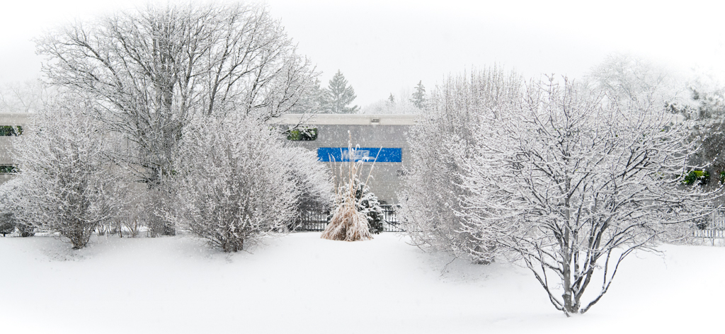
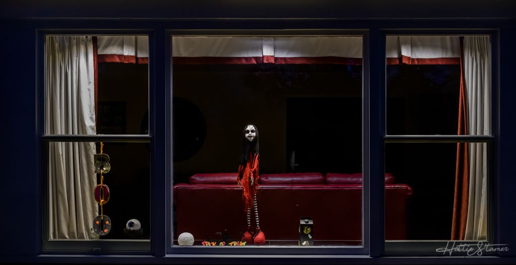
This is Hattie dropping by. This is a great capture. Beautiful color and detail. I would suggest to crop the bottom leave to make it cleaner. |
Sep 14th |
1 comment - 0 replies for Group 5
|
| 36 |
Sep 18 |
Comment |
It's a quite challenge for me to attempt a crop. I went with this one. With the small size of jpg "original", there is not much I can do with adjust color, nor I can properly attempt a B&W. I found the foreground is a bit over powering due it's size, then the green color also over powering the back color. That's why I'm thinking what if you try to convert it to B&W? Just a thought. |
Sep 8th |
 |
| 36 |
Sep 18 |
Comment |
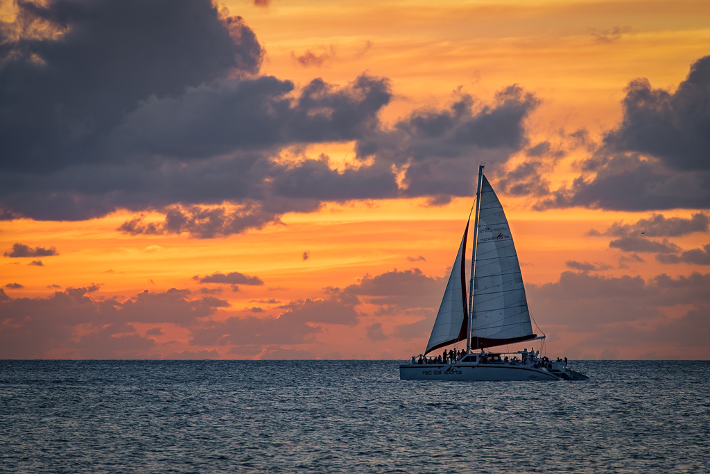
Beautiful sunset and color, totally agree on crop it to make it wider. I do feel the image has quite more noise than I like. There are so many layers of color and texture in the image, love it. |
Sep 8th |
| 36 |
Sep 18 |
Comment |
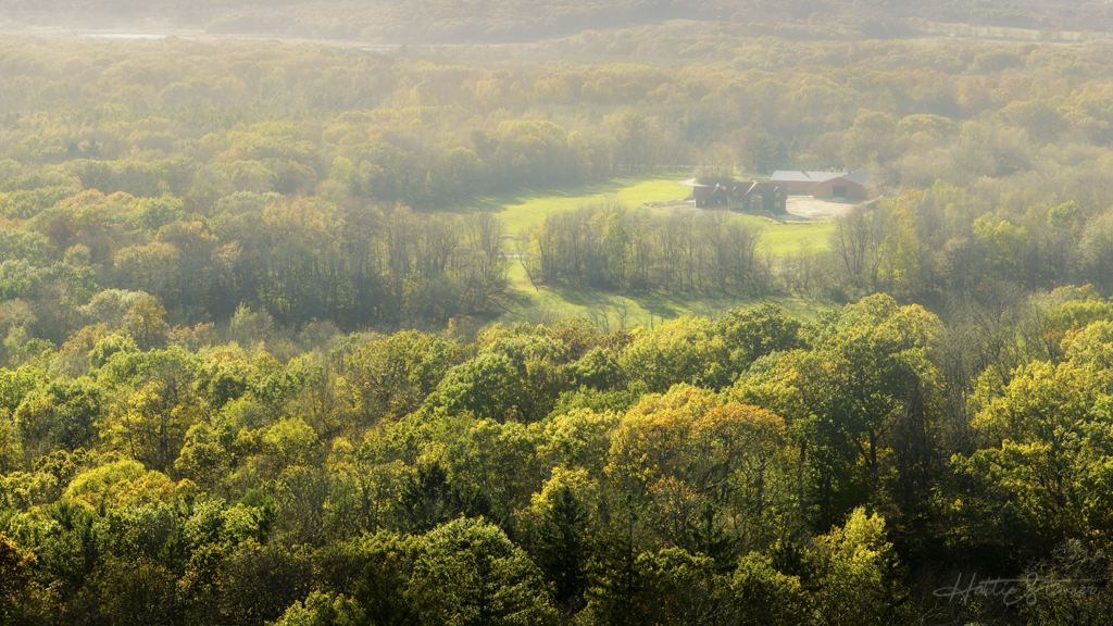
I like the composition and the color in this image. A bit too rich on my monitor, maybe tune town a bit. The lighting is a bit strong, especially on top of the bushes, bring highlight down a bit. Nice capture otherwise. |
Sep 8th |
| 36 |
Sep 18 |
Comment |
Perfect usage of the f/16. The star effect on the lights are beautiful. I like how the brightness and the shadows in the image, wouldn't change that. Only suggestion is maybe add a bit (or a bit more if you already have) to hide the top right corner 2 little street lights. |
Sep 8th |
| 36 |
Sep 18 |
Comment |
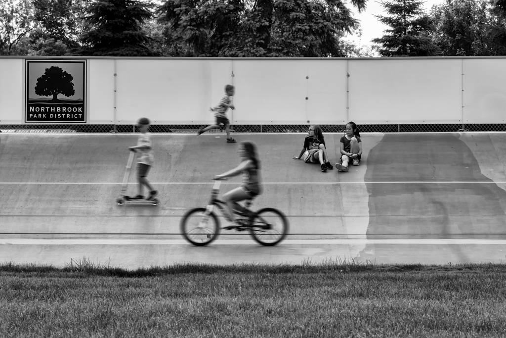
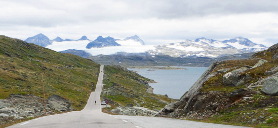
I like how simple this image is, fewer elements, clean. Nice composed. Although I wish it's more moody, like on a stormy day. |
Sep 8th |
| 36 |
Sep 18 |
Comment |
Lovely image you captured. Agreed with Bill's editing with to bring up dehaze and vibrance. However, I do not agree with the crop though. I like how the original cropped. The space on the right and bottom works well, especially the two kayakers were moving towards there. |
Sep 8th |
6 comments - 0 replies for Group 36
|
| 62 |
Sep 18 |
Comment |
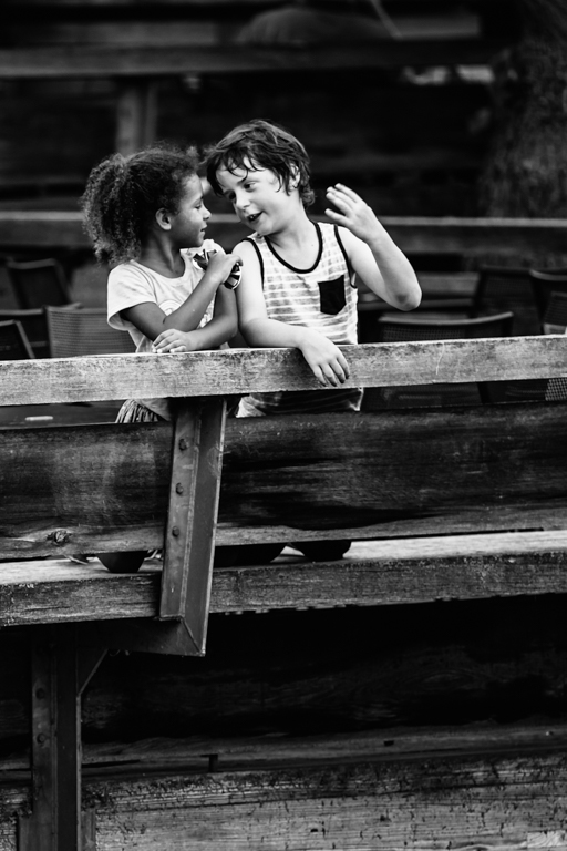
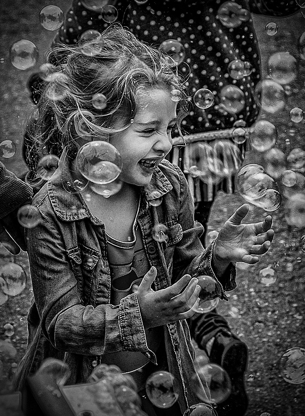
Although pandula's modification seems cleaner, but I like the background/environment in the original image, it make sense, more interesting in my opinion. The process of the B&W is beautiful (other than some highlight very slightly over, easy to bring back).
I do find the top and the bottom is a bit distracting. I did some cropping, vignetting, adjust over exposed highlight, brush the face/hands of the girl. |
Sep 29th |
 |
| 62 |
Sep 18 |
Comment |
Well, I found myself "a girl without a word" by looking at this image. Only thing I want to say to this is that: I love it! |
Sep 29th |
| 62 |
Sep 18 |
Comment |
You did a very good conversion from the color version. Although I love seeing the yellow bike, which is not often to see much at all, I think you did great to make it less the main subject due to the bright yellow color. I found the patch of bright light color right behind the chair keep getting my attention away from the boy though. Maybe try to keep the lighting just on the boy not the background. |
Sep 29th |
| 62 |
Sep 18 |
Comment |
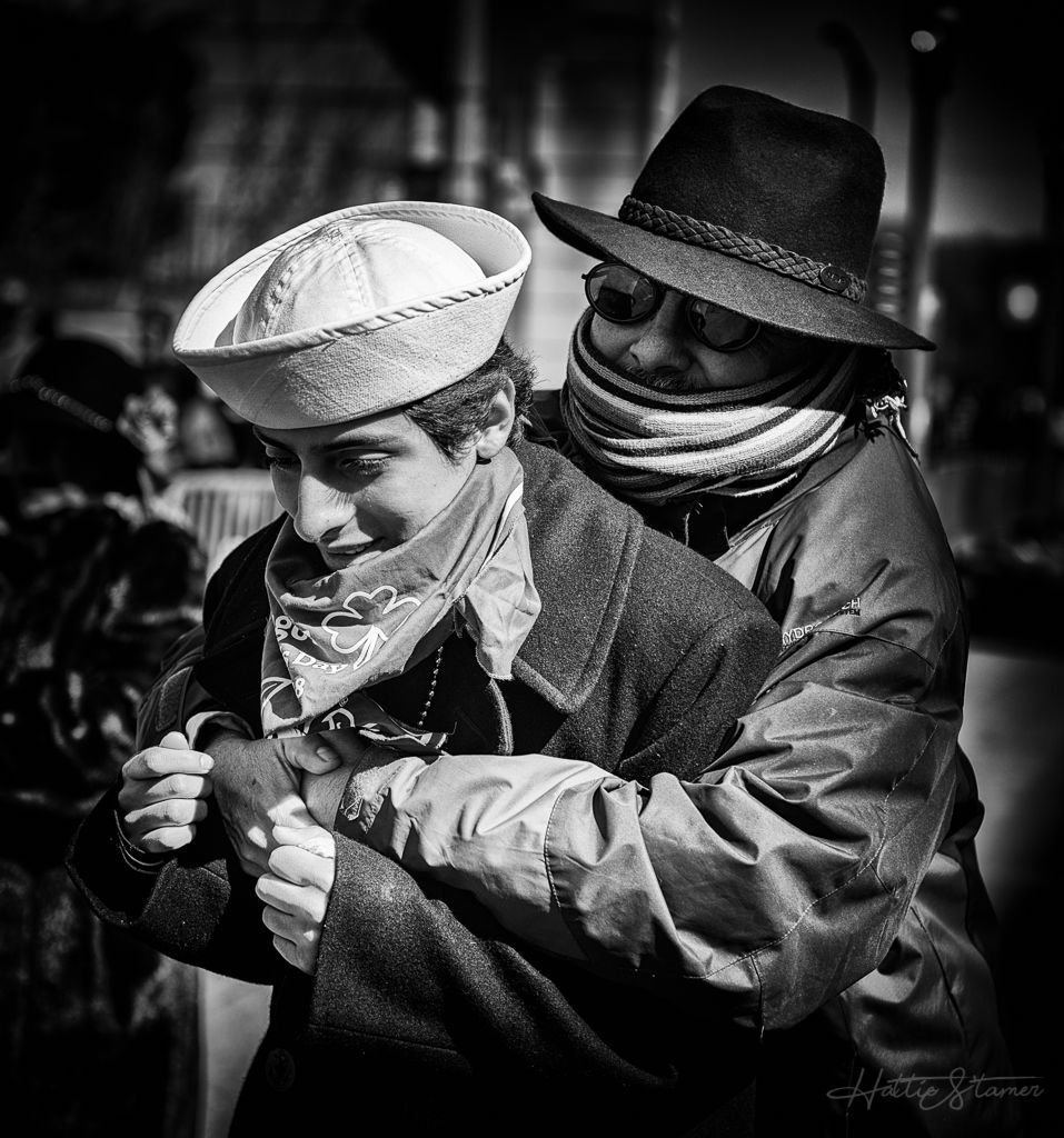
I love your style and how this image is. Other than feel a bit overexposed (I could be wrong) at her face, I like the composition, mood, shades in the image. Well done. |
Sep 29th |
| 62 |
Sep 18 |
Comment |
I like the composition, shades of color that you processed. Very cool looking guy here. I like brightness, tone that you processed as it. The only thing I can see is about the guy's head in the B&W version. There is some "lighterness" around his head. By judging by the shape (I could be totally wrong), it seems you might use a LR tool to try to bright up his face, abut end up leave the right around his head? If that's the case, maybe try to switch to use a brush. Well conversion to B&W, |
Sep 29th |
| 62 |
Sep 18 |
Comment |
(I swear that I thought I finished reviewing for this month!)
I like how the branch curved and give a very nice look to the subject. A bit cropping at the bottom would help eyes not being directed there. There are some petals seems overexposed. B&W conversion is definitely the right choice. |
Sep 29th |
| 62 |
Sep 18 |
Reply |
Thanks for the better name. I looked it up for it's meaning, perfect! |
Sep 13th |
| 62 |
Sep 18 |
Comment |
Thanks for all your comments. I do have another pic that the boy was not glaring at me. Wondering which one would be more a story. |
Sep 6th |
7 comments - 1 reply for Group 62
|
| 80 |
Sep 18 |
Reply |
Oh my bad, didn't read the camera spec about the smaller aperture. Yeah, agree that 1/125 is needed for this. I love Leica camera though. |
Sep 12th |
| 80 |
Sep 18 |
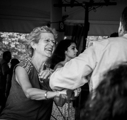
Comment |
You capture the great emotion of the lady in the party. Very pleasant. However, the head at the front is a bit distracting, as well as the guy's body on the right side is a bit too much. Here is what I did:
1. I cropped the image a bit, you can see if this works for you or not. Add some vignette (I didn't) to see how it works. The crop to me still tells a story, where you can see the lady was being asked for a dance (or dancing already), but put more focus on her. If you can put vignette, it should help minimized the distraction
2. I rotated the image a bit to straighten the image (used the post in the back)
If you take more photos in future, maybe try to open up your aperture, so you can blur out further on the distracted environment. Also it help to have lower ISO that way. |
Sep 11th |
 |
| 80 |
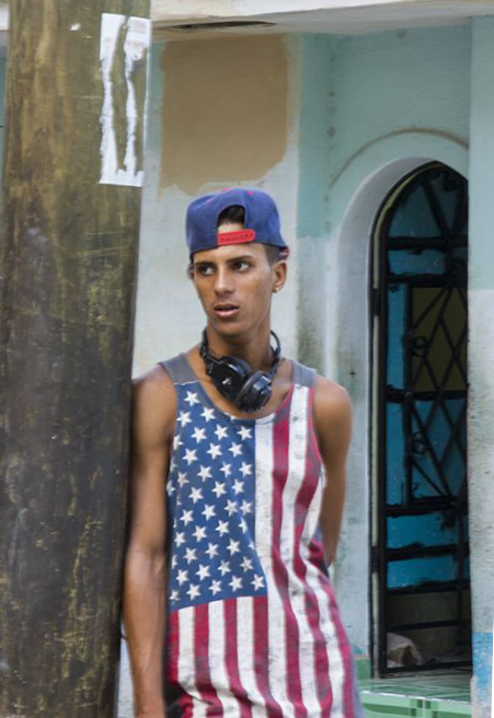
Sep 18 |
Comment |
Great capture of the boy, the look. I personally like to straighten the image (reference based on the door) which brought the tree more lean towards the boy. Definitely keep the white paper on the tree, it adds to the story. I included my crop (debating about if I should cut the rest of the top left corner out or not) here. It's great image with nice story. |
Sep 8th |
 |
| 80 |
Sep 18 |
Comment |
Is there a rule against removing objects? I really like how this image is framed, how it composed, beautiful color. I normally don't remove stuffs from my images, but wondering what if the metal long post on the right side of the person can be removed. The post brought some distraction for me. Still a nice story telling photo and nice color. |
Sep 8th |
| 80 |
Sep 18 |
Reply |
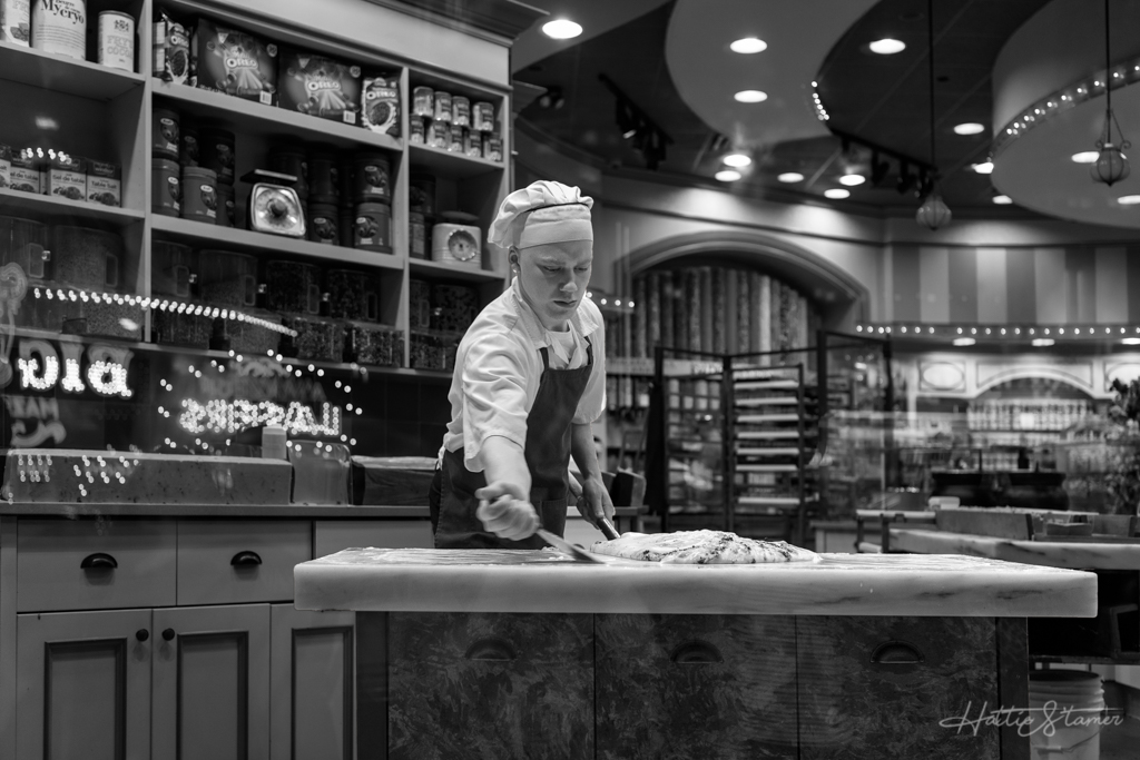
I see Richard. My thinking process was first I spotted a different window, there are two women working in, with a famous blueberry pie sitting by the window. I stood there for awhile, waiting for one of them giving me something more meaningful to take a shot with, but I got no luck for a long while. So I kept moving and a few steps away, I just spotted this window. I looking inside, no one but a few neatly lined up items, one item sitting at the window. The "Open" sign with a gorgeous golden reflection made me want to take a photo.
I liked to include some sign, and saw all signs only showed partial in my frame. I like that way, which for me they give some indication what the store/window is about, but no need to have anyone to focus on reading their entire menu. So I took the photo as is.
The 1st window I saw has a bigger opening, I like having people there, but this window is half open, I was glad it's clear of people.
Evans photos tells a lot of story. Thanks for thought about his name by looking at this image. :-) |
Sep 8th |
| 80 |
Sep 18 |
Comment |
I like this photo. Well composed. The elements are great, the sign, shadow, the white and red color. I would suggest maybe bring a bit more contrast to the image. Maybe leaving a bit more space at the bottom under the "SALE" shadow. I would making the "SALE" word bolder. Nice handle with the widow reflection, I couldn't tell it's a window. |
Sep 8th |
| 80 |
Sep 18 |
Comment |
Hi Richard and Colin, thanks for your comments. No I didn't not take any image of the whole building because that's not what making me want to raise my camera at the time. I was intrigued by the window with the "Open" light, the morning light, the quite empty inside, and the beautiful texture of the window/siding. I did not want to include the entire sign because there is no need for people to pay attention to the sign, to spend time to read. I purposely frame such way to express a feeling of calm and beautiful in my mind. The "OPEN" sign is the connection to the signs around it. The golden reflection is to compliment the opened store window.
I guess if I need to explain what I was intended for, I think I failed to express that in my image. I'll work harder next time for sure. :-) |
Sep 8th |
5 comments - 2 replies for Group 80
|
19 comments - 3 replies Total
|