|
| Group |
Round |
C/R |
Comment |
Date |
Image |
| 36 |
Jul 18 |
Comment |
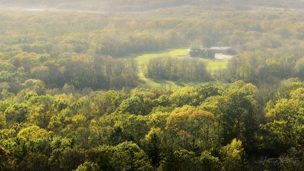
I like the color of the field/tree. The image needs slightly level job, a bit high on the right side. The over lapping trees is a bit distracted. Would be much cleaner without it. |
Jul 16th |
| 36 |
Jul 18 |
Comment |
Lovely image, well composed and nice color. The only thing I wish is be able to capture a bit wider. Feels like the left water cascade might have a lovely curve, am I right? A 16x10 with wider lens could be even better.
The top of the rock could use more breathing room. Feel a bit tight. |
Jul 16th |
| 36 |
Jul 18 |
Comment |
I'm late to the party. It's such a beautiful landscape and mood. Love the color, composition, feel - once removed the distraction from the tree and tune down the bush on the bottom left. Much cleaner! |
Jul 16th |
| 36 |
Jul 18 |
Comment |
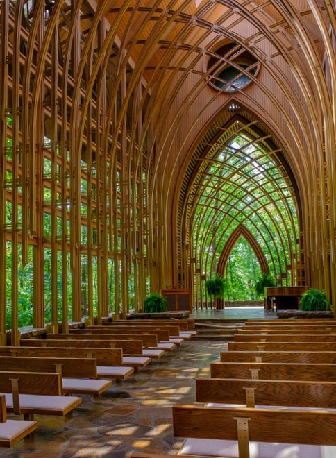
A magnificent chapel that you have captured. I would correct the perspective (did a level to straighten it out, since it seems tilted to the left). The row closest to the bottom right seems too big and getting too much attention, so I cropped it out. |
Jul 7th |
 |
| 36 |
Jul 18 |
Comment |
Very dramatic scene and great composition. I like that among of the sky showing here. Only thing make me wondering is that did you apply lens distortion correction? |
Jul 7th |
| 36 |
Jul 18 |
Comment |
I figured that the "original" is your final B&W version (I didn't know we are able to send both original and final images). It's moody and foggy, perfect composition. I'll say you nailed it! |
Jul 7th |
6 comments - 0 replies for Group 36
|
| 62 |
Jul 18 |
Reply |
Lol, we always want something we don't have. |
Jul 18th |
| 62 |
Jul 18 |
Comment |
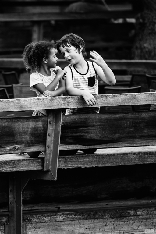
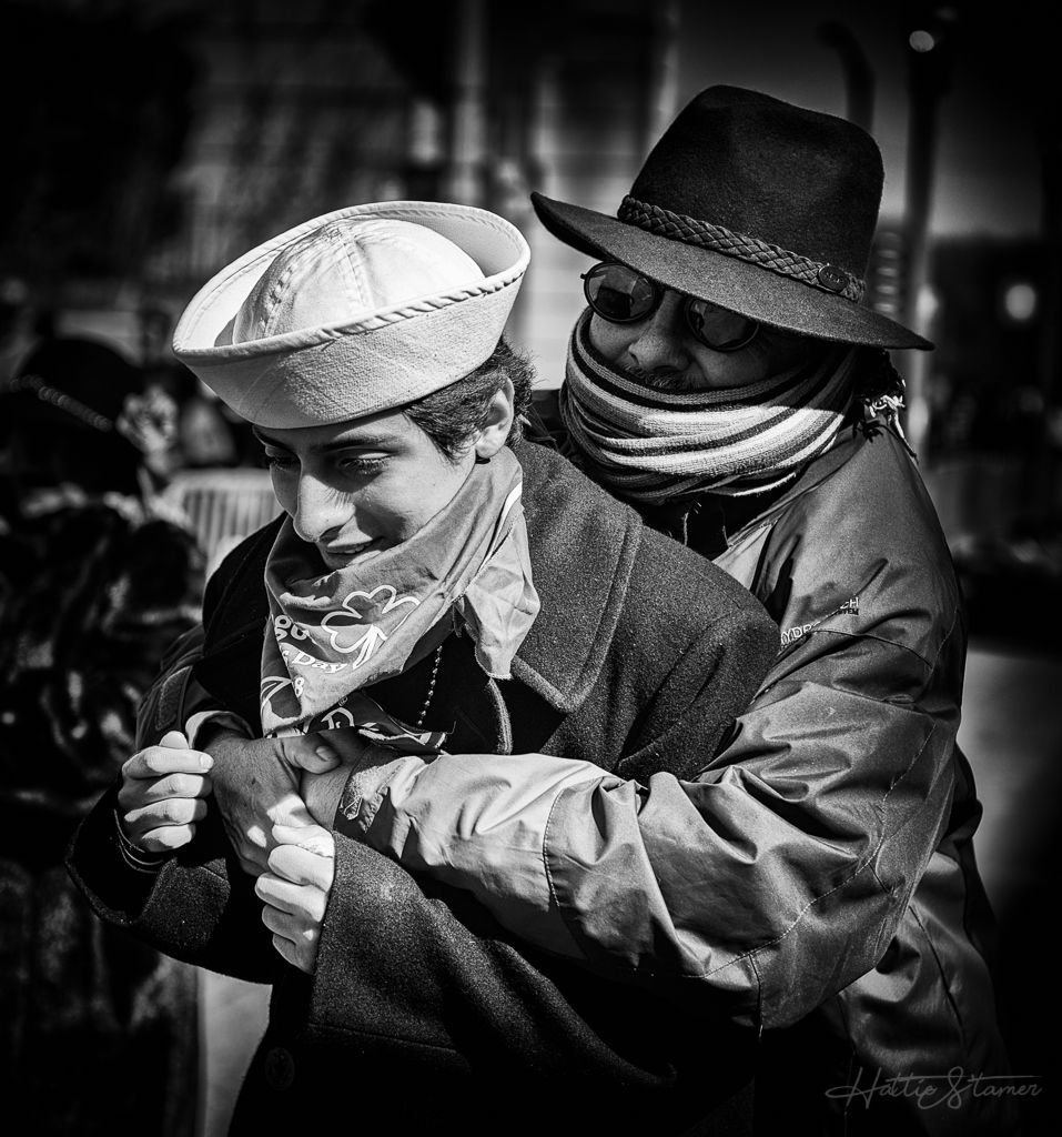
Nice capture of the eye contact there. Agree the cup should be cloned out. Try to tone down the highlight on the arms also. |
Jul 17th |
| 62 |
Jul 18 |
Comment |
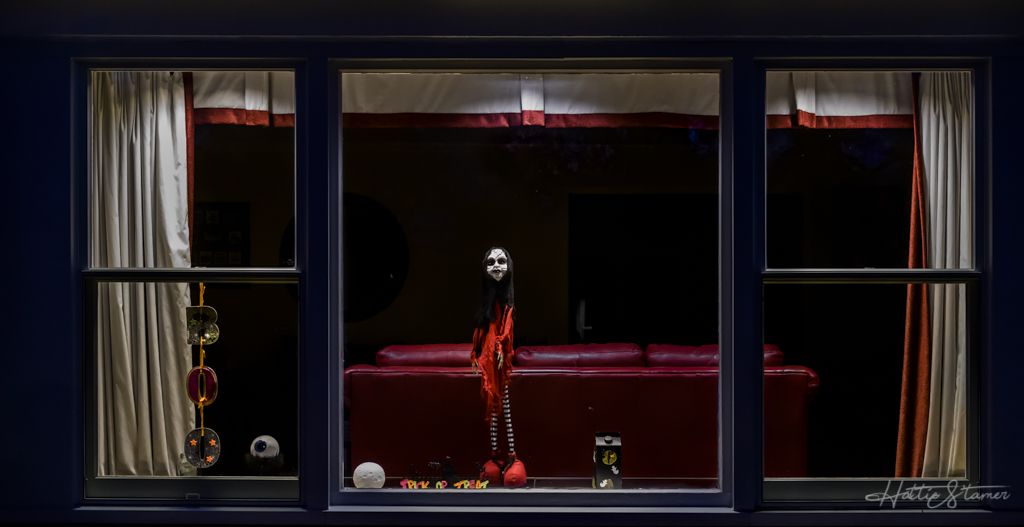
I like the mailbox too, perfect image to convert to Black and White. I feel the mailbox and the background are similar tone, need further separation. Sinc |
Jul 17th |
| 62 |
Jul 18 |
Comment |
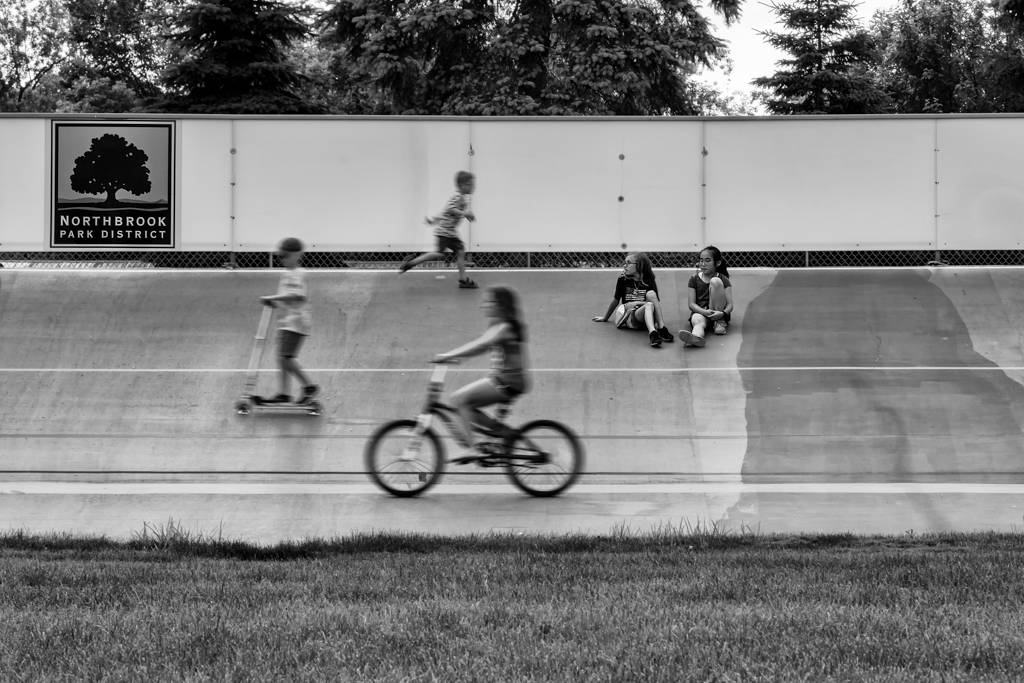
Very nice capture the players here and you successfully tuned down the bright ground, and redirected the light. I do have slight different idea of cropping, where I would crop more the right person, but leave more room for the left person. Just a thought. You have a very low res original file, my after cropping image looks like crap, but should still see where the cropping is. |
Jul 16th |
 |
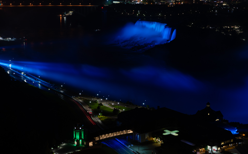
| 62 |
Jul 18 |
Comment |
It's a great image that you captured here. I like the dark night, moody. The B&W conversion successfully seperated the bottom right corner grass with the water, nicely done. However, I would like to have a bit more space between the grass and the dark reflection of the trees on the right side. The original sky has a patch of the clear sky peeking in the middle with is missing in the final image. I would try to bring that area out with a different shade to bring out the layers in the sky. |
Jul 16th |
| 62 |
Jul 18 |
Comment |
Nice capture and outstanding post-processing. I do noticed some halo around the horn, and a very dark line at the bottom right corner of the image. Well done |
Jul 16th |
| 62 |
Jul 18 |
Reply |
It is quite a difficult image to convert for me, I struggled. It seems like a good idea to have a dramatic sky as well. Thanks for the suggestions. |
Jul 16th |
| 62 |
Jul 18 |
Reply |
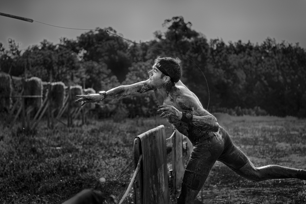
This was a very sticky muddy path to wall to the race field (from parking lot to the entrance). The path got narrowed down right here, where the right side was portable hand-washing stations. The guy on the right is a working, and I'm guess he might be holding a hose to refill water. I made my way passed this space, then I get myself stand stable before turn around to look back. When I saw the boy, I felt like raising my camera at the moment.
I had the hose hoping to add the impression of a narrow space right there. I'll try to crop it off when I redo this image. Blurring the back is a great idea. Thanks. |
Jul 16th |
| 62 |
Jul 18 |
Reply |
I guess my idea of "crushed some highlight and raised black to try to achieve some film like feel" does not seems working well, instead I made the image flat. I'll definitely going to rework on this image. Thanks. |
Jul 16th |
5 comments - 4 replies for Group 62
|
11 comments - 4 replies Total
|