|
| Group |
Round |
C/R |
Comment |
Date |
Image |
| 32 |
Apr 18 |
Comment |
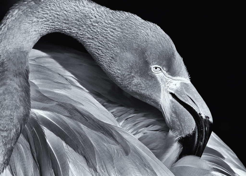
That is one beautiful color bird! I made an attempt, mainly brought some white back, bring some highlight to the beak and other areas to the feather. Matching some deeper color of some other feather area. Darken the background completely. Attempting on a cooler tone. May not be your interpretation though but the bird is too pretty not to play with the image. |
Apr 26th |
 |
| 32 |
Apr 18 |
Reply |
Agree with Stephen about showing full neck. |
Apr 18th |
| 32 |
Apr 18 |
Comment |
Hi, I'm Hattie Stamer from group 36 & group 62 (mono). Since Stephen poked his head to our group 36, I decided to visit your group. I love the composition and the expression of the bird, lovely. However, there seems more mid tone in this image, not much other variety. I like using NIK, but never used Topaz. In Nik, I would suggest to add control points to give some areas boosted with white or black to increase more interest in the image. Also, since the bird has color, not sure if you tried using a filter in either Lightroom or Nik to see if it add more shades. I don't have photo editing tool right now to try. |
Apr 18th |
| 32 |
Apr 18 |
Comment |
Hi, I'm Hattie Stamer from group 36. Since Stephen poked his head to our group, I decided to visit your group. I love the composition and the expression of the bird, lovely. However, there seems more mid tone in this image, not much other variety. I like using NIK, but never used Topaz. In Nik, I would suggest to add control points to give some areas boosted with white or black to increase more interest in the image. Also, since the bird has color, not sure if you tried using a filter in either Lightroom or Nik to see if it add more shades. I don't have photo editing tool right now to try. |
Apr 18th |
3 comments - 1 reply for Group 32
|
| 36 |
Apr 18 |
Reply |
Holy cow, I viewed this at home, way too bright and over killed with the color. Cannot trust photo app at all. |
Apr 19th |
| 36 |
Apr 18 |
Comment |
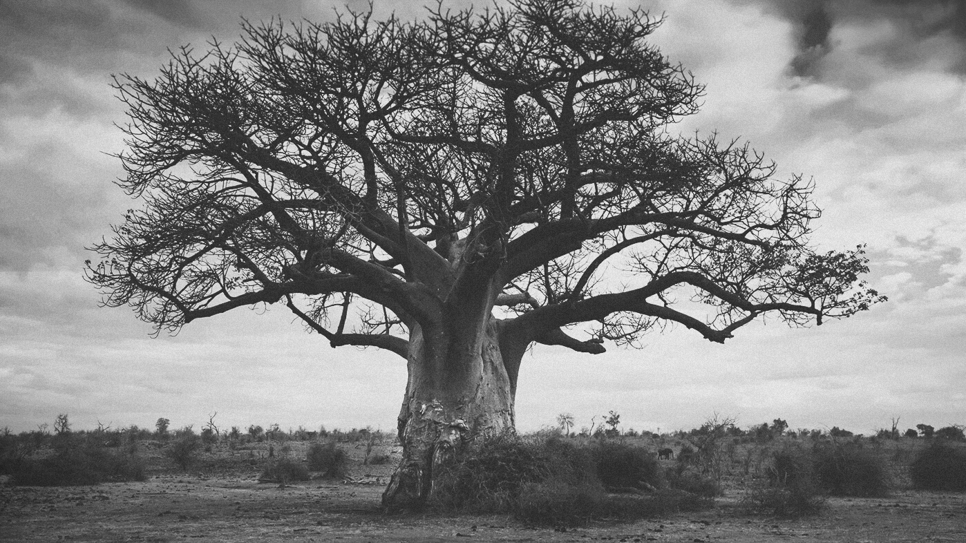
Apologize if I played your image a bit too much. First I cropped the image in 16*9 ratio, to give a wide angle lens feel. The tree top is cutting too tight. I think the image could use some mood to it. The elephant is hard to see, but my phone app cannot use a brush to brighten it a bit.
Noticed your ISO was very high, but the shutter speed is supper high. Maybe forgot to change the shutter speed back after photograph animal? |
Apr 18th |
 |
| 36 |
Apr 18 |
Comment |
When I brought up shadows and a bit contrast, I see more bright color on the ground at the front. Again it could be just my monitor problem.
I brought up shadow and played with tone curve on my phone app, cropped the bottom a bit. See my attached image.
The little house was cropped too tight to the edge of your image. You need some space there. |
Apr 18th |
 |
| 36 |
Apr 18 |
Reply |
Looks like could use some highlight tune down in my alt image |
Apr 18th |
 |
| 36 |
Apr 18 |
Comment |
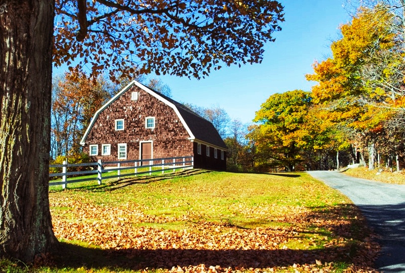
The photo need some contrast adjustment, and a bit cropping. Otherwise, nice looking barn. Again, using phone app (appologize for that), hopefully I didn't over did the contrast... |
Apr 18th |
| 36 |
Apr 18 |
Comment |
Thanks for all your valuable comments. The green on the top is the result of the burning sun color mixed into the blue sky peek thru the cloud. However, I believe my old Nikon does produce more orange color, which I tried to tune down.
About the power poles, I do agree you all it seem a bit too messy. Personally I like the both main power poles, one close and one further, which gives the depth that I was intened to photograph. I like the suggestions about removing the other smaller power poles to keep the image cleaner. Two is enough, three is the same line would be better (odd number is always better). The powerlines are another reason I wanted to photograph because it created the curves and without those, it'll be just poles. I do want to remove most of the trees though. Maybe I'll be lucky someday to see a better clear views of similar situation. |
Apr 18th |
| 36 |
Apr 18 |
Reply |
Obviously the phone didn't do quite a good job to control different tone of the black area, need a PC software. |
Apr 18th |
 |
| 36 |
Apr 18 |
Comment |
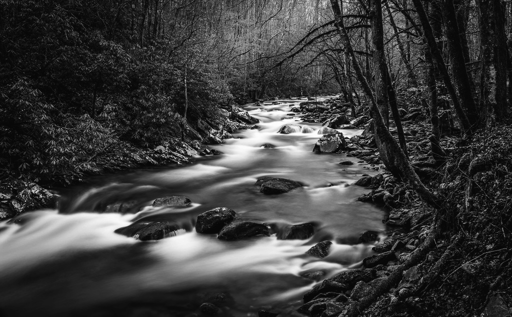
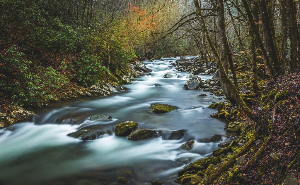
In my opinion, this photo will be perfect to make it moody. Such as darken the green, add some blue to the deep dark green moss on the rocks. Darken the sky. Try bring up the contrast to cause the mysterious effect, such as bring up more dark (don't care loss detail in dark), bring up most black point in tone curve to add fade to the image. I don't have PC photo editor.
Or try a B/W. My photo app can do some convertion. Let me try. Just an idea.
BW is easier on phone, the moody one need some color deepen, can't do. |
Apr 18th |
 |
| 36 |
Apr 18 |
Comment |
A great study hands with a great composition, nice shot. I'm not sure if it's my monitor not being calibrated, I tried on my phone, both seems to me the blue is too intense. I would tune down the blue a bit. It appears there are clouds but they all seems very blue. Did you by any chance sharpen the image? I feel it is a bit over sharpened for me. |
Apr 18th |
| 36 |
Apr 18 |
Comment |
(not reading others' reviews til I'm done first).
Nice shot of the place, and showing how close the houses are next to the a big slope. The house under repair is very interesting and stands out. It's a nice angle, and the houses seems leading somewhere, which I assume it's the ocean. It would be better to show further out to the right. I also found the dark area is a bit too dark for me. Maybe brighten the houses but darken the slope at the front a bit.
I do have to confess that I'm viewing this at work and my monitor is not calibrated. |
Apr 18th |
7 comments - 3 replies for Group 36
|
| 62 |
Apr 18 |
Reply |
Thanks for adding some space there, looks good. |
Apr 26th |
| 62 |
Apr 18 |
Reply |
What does it made out of? I looked up on the map for this place, so far, lol. |
Apr 6th |
| 62 |
Apr 18 |
Reply |
I looked at group 5, that was a good one by David. I also saw the one by Nick Muskovac in the recent round, and I have to say I like the original better. |
Apr 5th |
| 62 |
Apr 18 |
Reply |
That's why I said I can only limited cropping instead of moving the chair out of the way. I do like the perspective of the original, with the full body. Did I not say that. That's why some suggestions no need to take; that's why there are documentary category; and that's why some of us take photos going by feeling, not technical aspect. In additional, I'm sure if you moved the chair or arranged anything around, you won't get what you get in the current photo at all. Sometimes it's better leave as is. |
Apr 5th |
| 62 |
Apr 18 |
Reply |
I have LR access at home now. Just played with a little bit on the image, not saying it's better, just showing cropping the two places that I found a bit distracted to me. I cropped out partial ceiling, cropped out the stool and partial big thing on the side of the table, darken the salt/cups. |
Apr 4th |
 |
| 62 |
Apr 18 |
Reply |
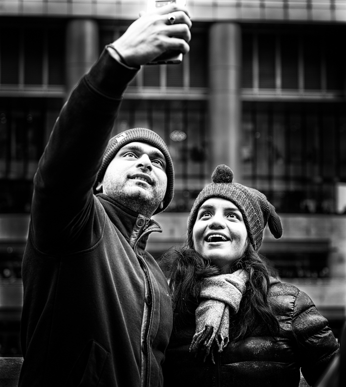
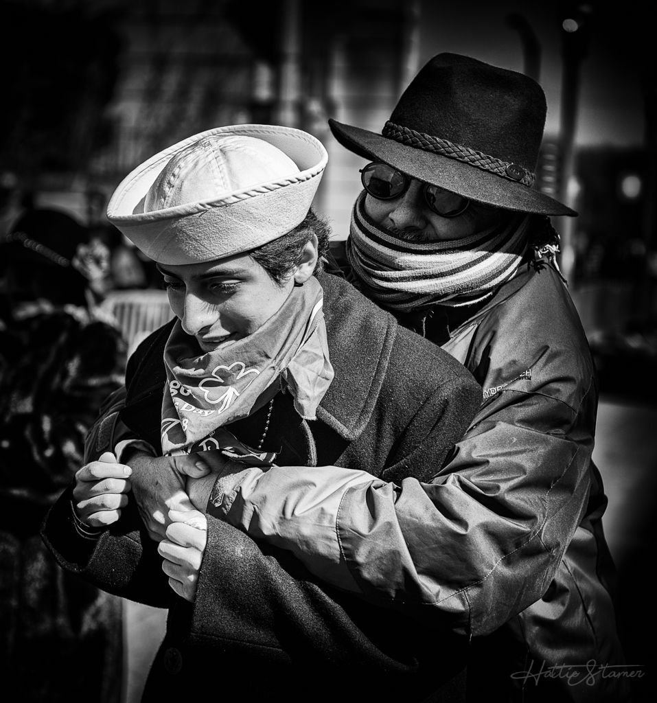
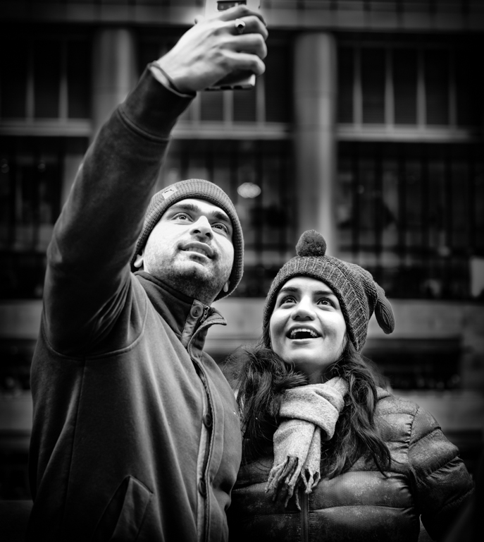
You brought out a very good point about the cell phone being close to the top of the frame. It was a quite a split second reaction between I spotted the couple, bring up the camera, move to the right to get the position that I wanted to show both of their face with the arched arm. The whole process of taking this picture is very sudden and everything goes by feeling (I do that a lot).
I do noticed that I tend to take shots pretty close to how I would like a photo to be the final composition instead of try to take lot more space(as a couple of my friends suggested, due to nowadays we have so many pixels in camera), unless my lens cannot reach. This might be due to using film camera before, there is no cropping, or taking too many photos to burn the negs. I also haven't got used to taking multiple photos to be able to pick (tend to take one shot if I see it looks like what I want in the preview, and then stop taking). I need to change this habit because memory is cheap. I'll look for putting more room to my framing. Thanks. |
Apr 4th |
| 62 |
Apr 18 |
Reply |
Thanks Oliver for your great input. My revised version have the main part of the cloth more brighten, but I chose to darken the back building because I feel it is more distracting. Not sure how is this looks like. |
Apr 4th |
 |
| 62 |
Apr 18 |
Reply |
Thanks for your complement. Yes, people everywhere were taking photos with their cell phones. |
Apr 4th |
| 62 |
Apr 18 |
Reply |
It is working in progress photos, that's why I didn't dig any old photos. Thanks for the tips for the film, I'll give a try. I don't have a macro lens, nor a tube yet. I'm thinking about getting tubes, which I assume it comes in a set? |
Apr 4th |
| 62 |
Apr 18 |
Reply |
On a side note, a month ago, I asked a friend who has a scanner to scan a few negtives for me. The quality turned out really bad. Did you just put the neg to the window and took a picture of it? |
Apr 4th |
| 62 |
Apr 18 |
Comment |
For this image, I avoided first reading other's comments. I like all the layers and textures for those mountains. Definitely bring a great depth of field. The cloud is very nice touch. The only problem I have is how you processed the back of the mount to be very dark. It's kind of distracted, become the main focus point for my eyes. I would suggest either give it a lighter shade of gray, or rather leave it as black. Well taken mountain. |
Apr 4th |
| 62 |
Apr 18 |
Comment |
Very nice shot and post processing on the image. I also agree with cropping more on the sky as Oliver suggested, but crop more left than he did currently. I personally found the mist is a bit heavy. You have one person walking on the track is a wonderful idea. |
Apr 4th |
| 62 |
Apr 18 |
Comment |
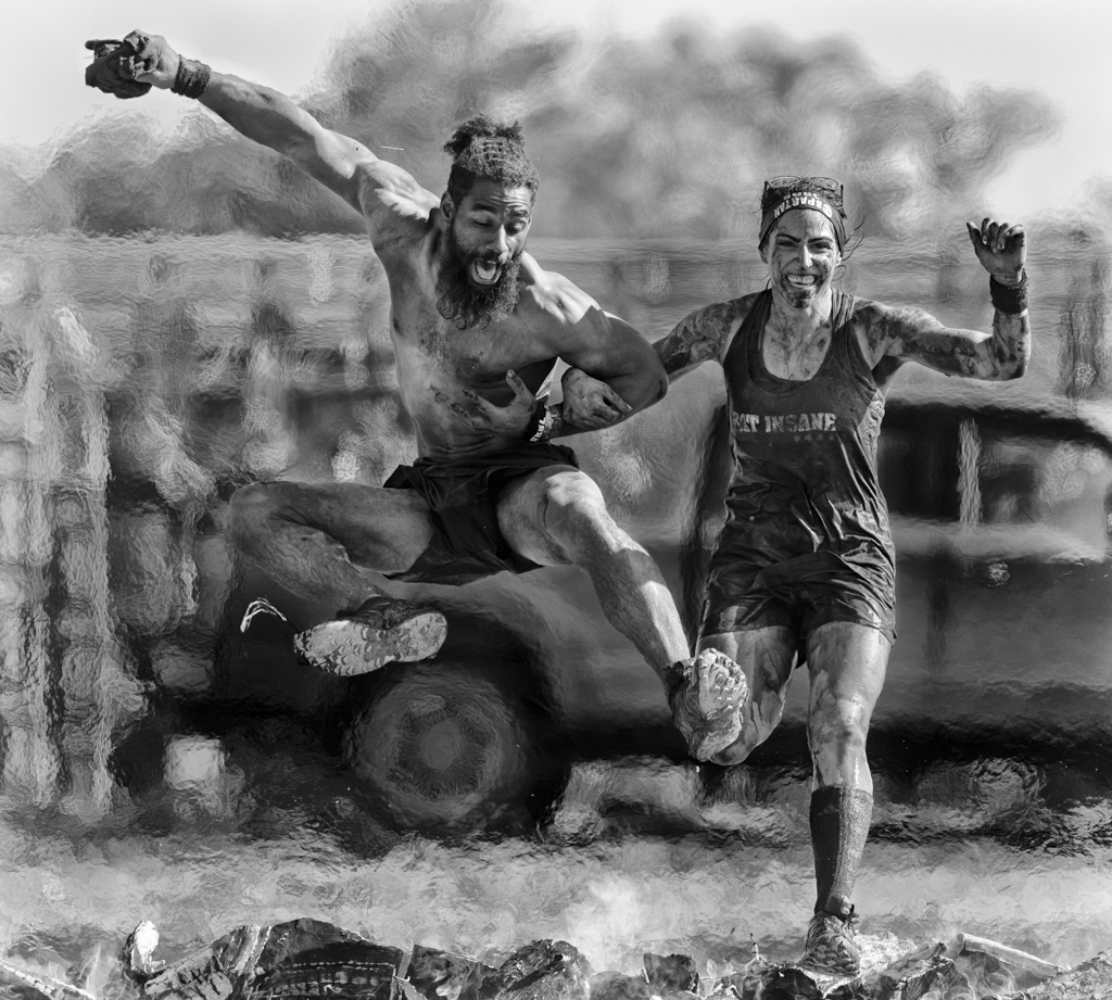
This is an amazing photo captured the motion. The color photo itself would do it, since the main kid has a bright yellow helmet and it stands out, but I love B&W photos. I do find the image is tilted to the left, it is bugging me.
I've tried some panning myself on train, only have one comes out ok. Found myself pan often faster then the subject itself. You did a awesome job here. |
Apr 4th |
| 62 |
Apr 18 |
Comment |
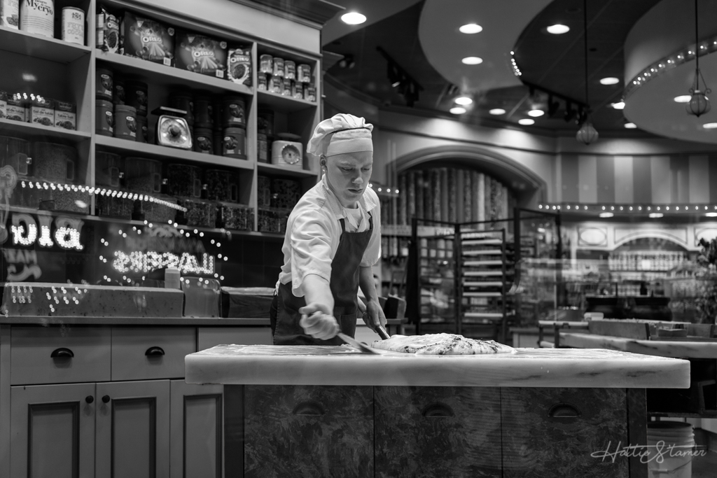
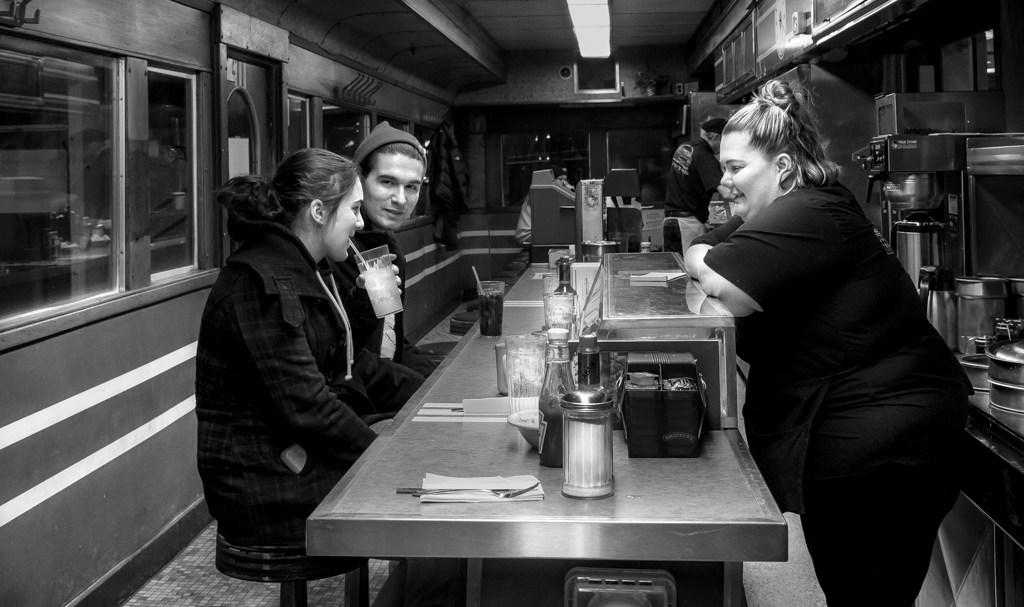
The photo is well taken, great interaction between characters and the face you caught one of them also noticed the camera. It's a great story.
I do find there are too many element in the photo, like the chef (he's overlapping with the person on the right, not exactly showing what his activities in there). Maybe try to position him so his head is not half missing. The bright ceiling light is quite a distraction, maybe try crop the image so only the end of partial ceiling light showing. The stuffs on the table, like the salt bottle, the closese stool etc, also a bit distracted.
I understand you want to get the whole dinner, but my eyes just kept going to so many places all around to see things. I'm new learner, so I may not make sense sometimes. |
Apr 4th |
| 62 |
Apr 18 |
Comment |
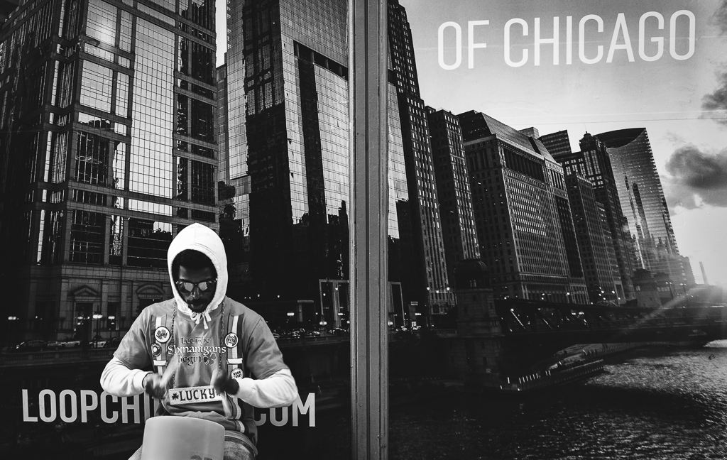
I love the photo here, and how you crop and handle the b&w. I'm a big fan of the window reflection, which I just finished a few of those myself. I don't have anything to add to this.
I do not know what "van" does LuAnn mean though. Someone please explain to me :-). |
Apr 4th |
5 comments - 10 replies for Group 62
|
15 comments - 14 replies Total
|