|
| Group |
Round |
C/R |
Comment |
Date |
Image |
| 10 |
Mar 26 |
Reply |
Hi Doug. Thanks for your comments and suggestions. |
Mar 18th |
| 10 |
Mar 26 |
Reply |
Donna, you are right. There are two interesting subjects here, but unfortunately they compete with each other. If you prefer to emphasize the sky, your crop for Meredith works very well. |
Mar 12th |
| 10 |
Mar 26 |
Reply |
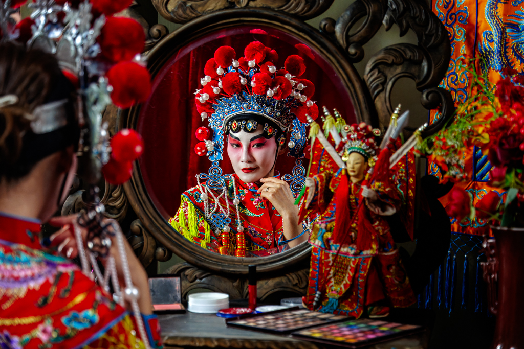
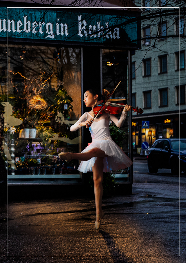
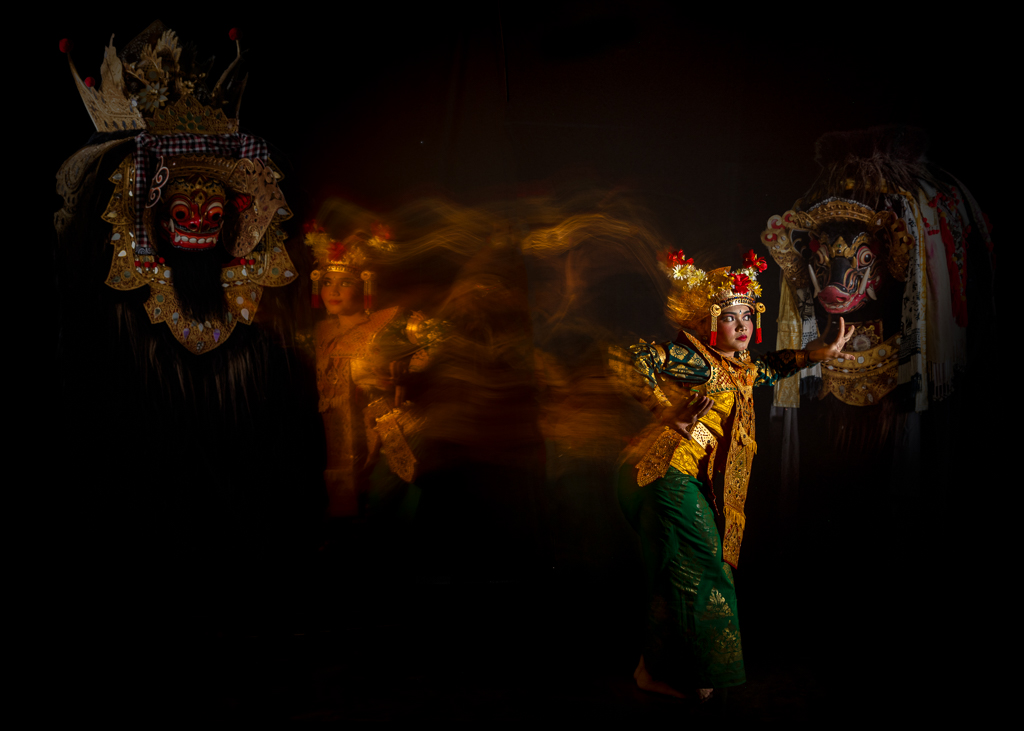
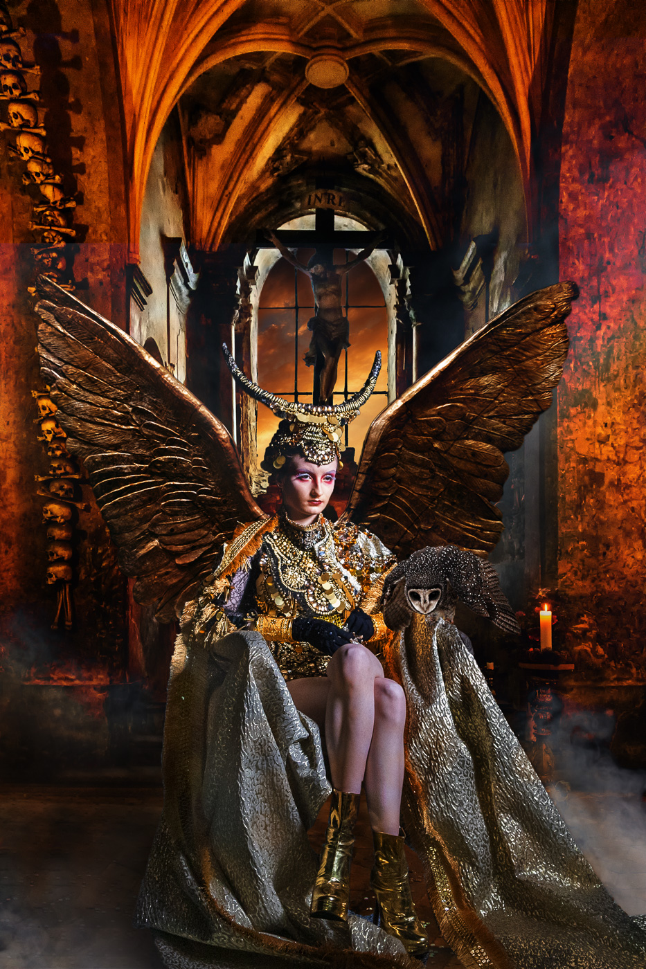
Hi Donna, thank you for your lovely comment. I'm glad you noticed that expression. She is actually just a regular model, not a professional performer, so I deliberately kept talking to her while taking the pictures. I mentioned that one of the well-known themes in Chinese opera is jealousy, and asked her to imagine she was playing a famous female warrior admired by the king, while many of the king's concubines were jealous of her. As she imagined the scene, she naturally began to show that slightly cynical expression. |
Mar 12th |
| 10 |
Mar 26 |
Comment |
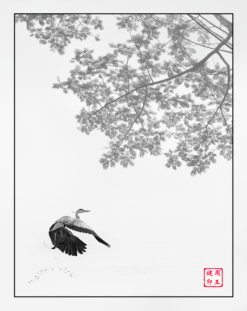
Hi Meredith. This is a wonderful image. It is simple, yet truly artistic. The elegant curve of the feather and its delicate reflection create a beautiful sense of balance and movement. I especially like how the fine textures stand out so clearly against the dark background, giving the image a very refined and almost sculptural quality. A minimal subject, but presented with great sensitivity and artistic vision. The one with the white soft frame is better. Beautiful work. |
Mar 10th |
| 10 |
Mar 26 |
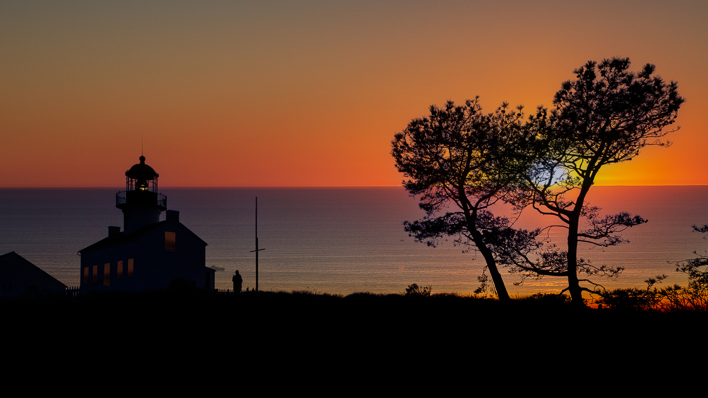
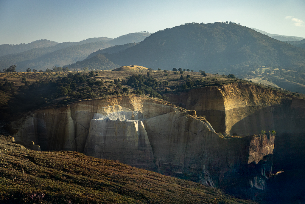
Comment |
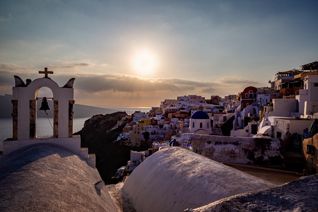
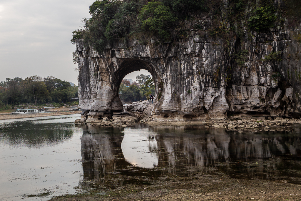
Hi Bob. I normally place my subject on the right with open space on the left. This image shows how reversing that convention can work effectively. Positioning the church on the left allows the expansive landscape and dramatic sky on the right to breathe. Emphasizing the sense of isolation and scale. The clouds and horizon act as visual counterbalance, keeping the composition stable rather than empty. This arrangement also creates a narrative flow where the viewer's eye first settles on the church and then moves outward into the surrounding land, reinforcing the mood of a solitary structure standing quietly within a vast, open environment. I would not change any thing. |
Mar 10th |
| 10 |
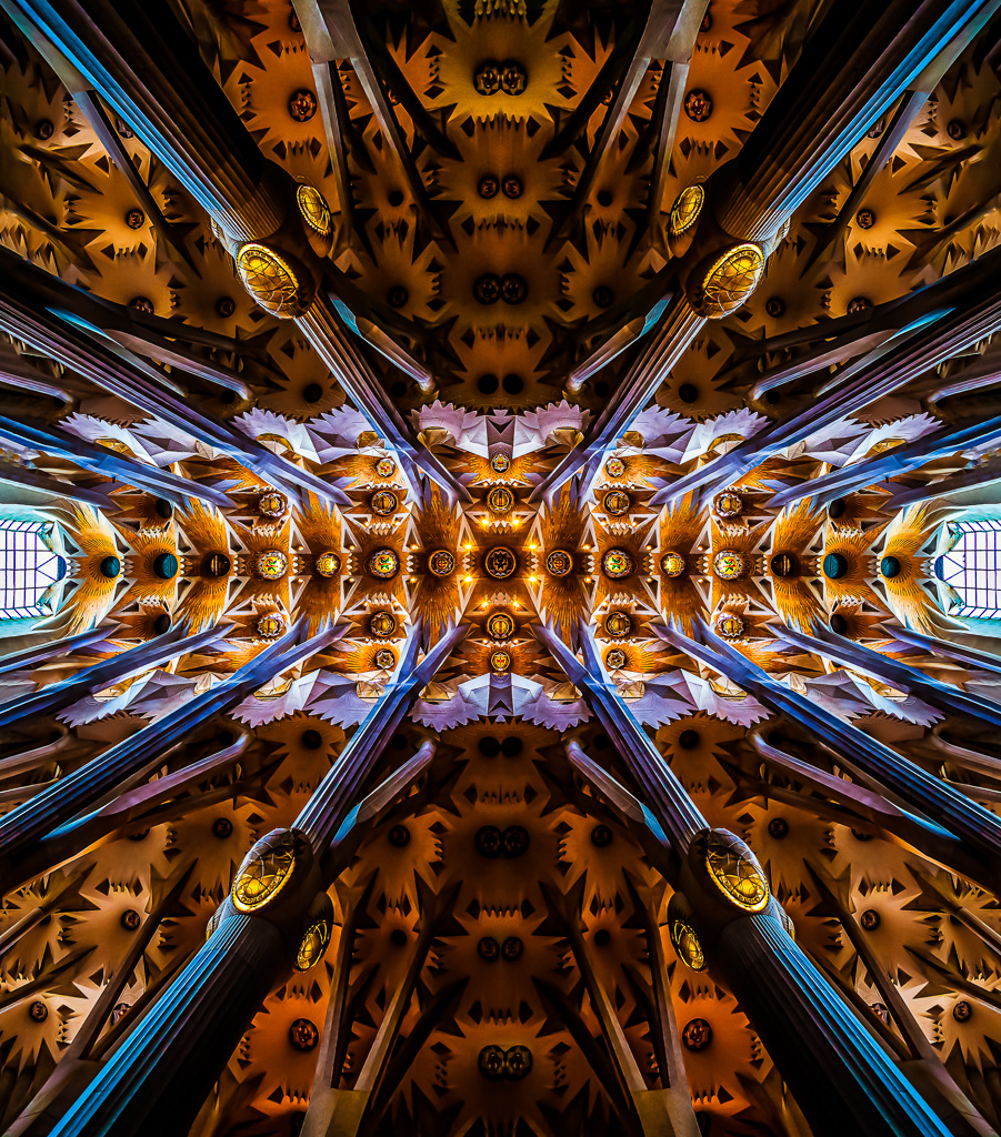
Mar 26 |
Comment |
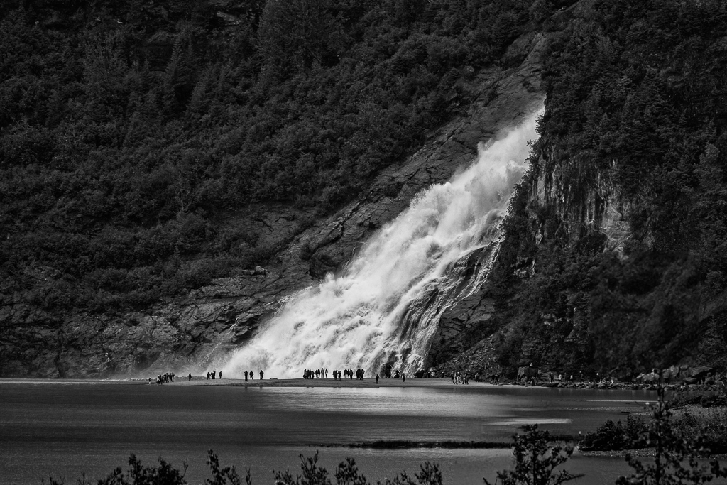
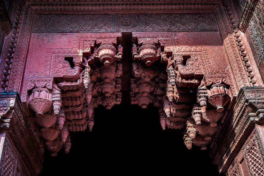
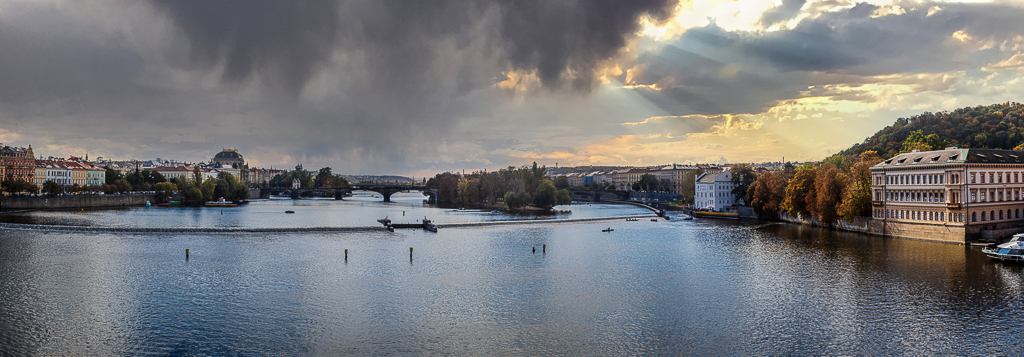
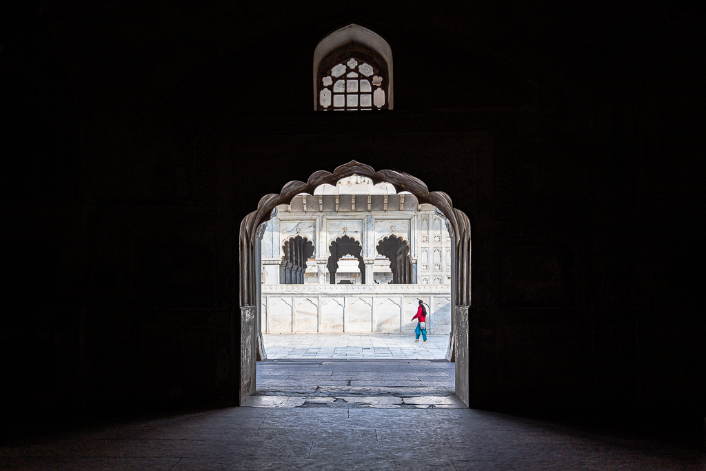
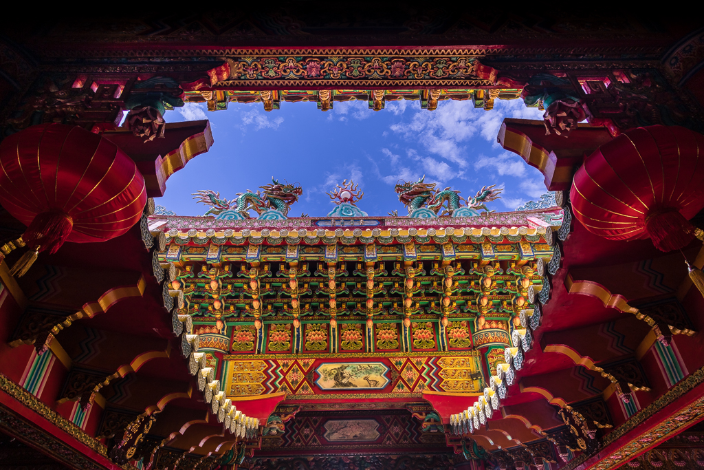
Hi Doug. I have taken similar shots at St. Vitus Cathedral in Prague, but I photographed them much wider to show the cathedral setting. It never occurred to me to frame it this tightly. Your close composition makes it feel unique and quite special. Beautifully done-I wouldn't suggest changing a thing. |
Mar 10th |
| 10 |
Mar 26 |
Comment |
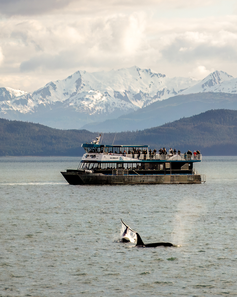
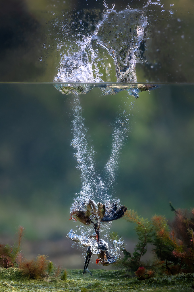
Hi Mark. I also joined a whale-watching excursion during my Alaska cruise, so I know exactly what that experience is like. You were definitely luckier than I was-I never managed to get a shot like this. You truly captured a special moment. I must admit, it makes me a little jealous! The shot, the crop, and the composition are all just perfect. |
Mar 10th |
| 10 |
Mar 26 |
Comment |
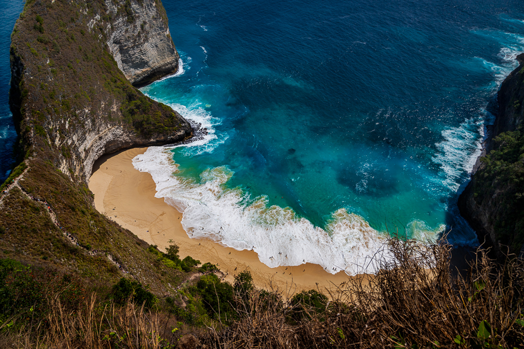
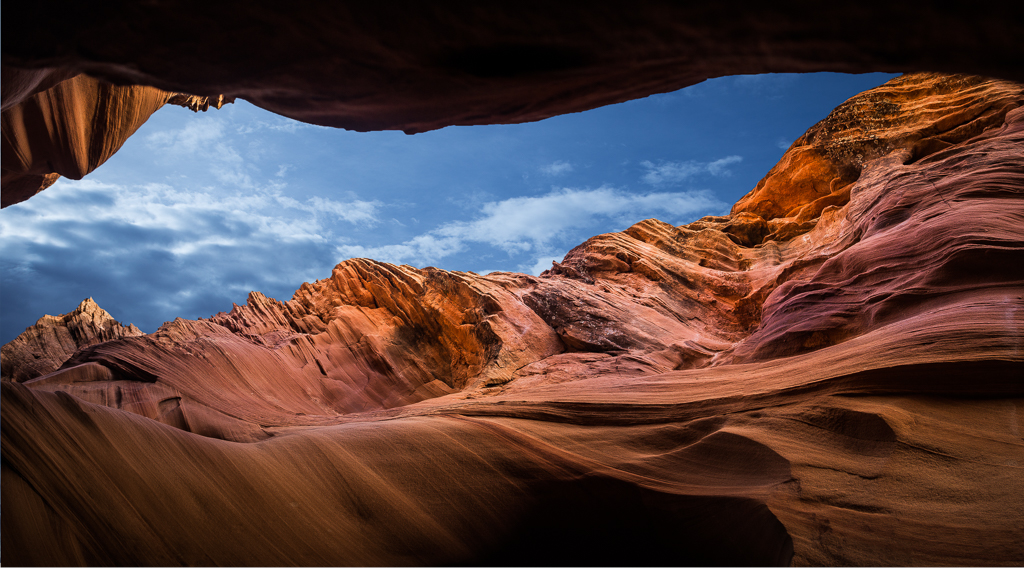
Hi Dona. The Z-shaped strip of land is the strongest compositional element in this image. Acting as a natural visual pathway that guides the viewer's eye through the scene and creates a sense of depth and movement. While the soft pastel clouds add beautiful atmosphere and balance the frame, the sky currently dominates the composition and competes with the Z line for attention. A moderate crop could strengthen the image by reducing some of the sky, allowing the Z shape to become more visually prominent while still preserving the mood created by the clouds. The artistic decision ultimately depends on intention: keeping more sky emphasizes the tranquil landscape atmosphere. |
Mar 10th |
 |
| 10 |
Mar 26 |
Reply |
Meredith. Your comments are really appreciated. |
Mar 10th |
| 10 |
Mar 26 |
Reply |
Bob. Thanks for nice comments. |
Mar 10th |
| 10 |
Mar 26 |
Comment |
Hi Peter. I really like the angle and perspective of this scene-it tells a nice story to the viewer. I personally find Silver Efex Pro from the Nik Collection one of the best tools for converting color images to black and white, especially when it comes to controlling tonality. In this image, I notice some black clipping where the pixels appear completely black-for example in the doorway on the right side, some of the windows and shutters, and the deep shadow under the bridge. If it were my edit, I might try lifting the black point slightly, reducing the overall contrast a bit, and opening the shadows selectively. For me, Venice canals always evoke a romantic mood, so I would probably lean toward a softer silver-gelatin style with richer tonal nuance. Of course, this is just my personal preference. |
Mar 8th |
6 comments - 5 replies for Group 10
|
| 34 |
Mar 26 |
Reply |
Hi Sylvia. Welcome to the club. Thanks for your comments and suggestions. Please share your favorite composites with us. See you next month. |
Mar 18th |
| 34 |
Mar 26 |
Reply |
Hi Angela. Welcome to the club. Thanks for your comments and suggestions. Please share your favorite composites with us. See you next month. |
Mar 18th |
| 34 |
Mar 26 |
Reply |
Bob, I can see that you're a very keen learner. One of the most frustrating moments in the learning process is when we get stuck and have no one to ask. Fortunately, you have many friends here who are happy to support you. Please feel free to send me a direct message anytime if you think I might be able to help. |
Mar 8th |
| 34 |
Mar 26 |
Reply |
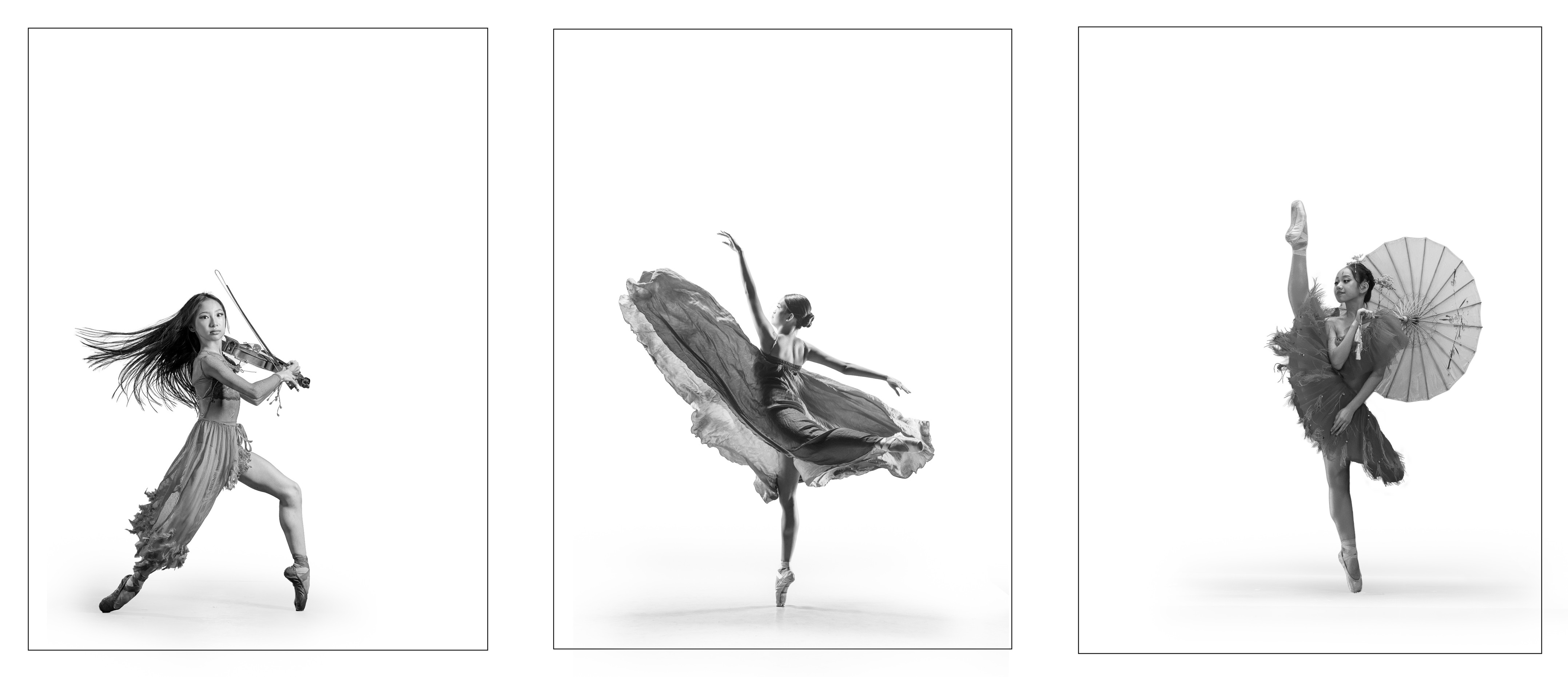
Hi Jan. Thanks for your suggestion to lower down the third dancer and add a bit of shadow to anchor her shoe to the floor. This one of the the tricky part with Hasselblad triptych. |
Mar 8th |
| 34 |
Mar 26 |
Reply |
Hi Judi. Thanks for your comments and opinions. |
Mar 8th |
| 34 |
Mar 26 |
Reply |
Bob. Photoshop offers an overwhelming number of tools, not only for photo editing but also for graphic design. It took me years to realize that I only needed to focus on the tools most relevant to my work and ignore the rest. The real challenge, however, is that my needs in Photoshop evolve over time. Eventually, I learned that the key is the ability to keep learning independently through the many tutorials available online. In the end, it all depends on our appetite for learning. |
Mar 7th |
| 34 |
Mar 26 |
Comment |
Hi Steve. I can see this psychedelic style has really become your signature. It might be interesting to see you explore other styles too, just to bring some fresh variation to your series. |
Mar 6th |
| 34 |
Mar 26 |
Comment |
Hi Jan. Your image really does resemble vintage house-shaped biscuit tins. Many of them were designed like colorful little buildings, cottages, or shops, very similar to the playful architecture in your artwork. Like, Huntley & Palmers, Marks & Spencer ... etc. Nice and sweet, Job well done.
|
Mar 6th |
| 34 |
Mar 26 |
Comment |
Hi Bob, your Original 3 clearly show your caliber as a photographer. At the same time, I truly appreciate your honesty in sharing that you're still struggling with surrealistic composites - I can really relate to that. I initially learned how to make composite from Tara Lesher - https://www.taralesher.com/ She provides very clear, step-by-step guidance with simple examples. Even now, I still shamelessly imitate her creativity and techniques as part of my learning process. |
Mar 6th |
| 34 |
Mar 26 |
Comment |
Hi Judi. The idea of changing the color mood works well and creates a strong atmospheric feel in the image. However, the gargoyles appear a bit too solid and prominent compared to the architectural setting. Darkening them slightly and making them partially transparent could help them feel more like eerie, satanic spirits flying on the space, which would better support the surreal mood of the composition. |
Mar 6th |
| 34 |
Mar 26 |
Comment |
Hi Bob, thank you for your comments. To be honest, this triptych is still far from the standard required for entry to the Hasselblad Masters. It's also not the genre I originally aimed for. The Hasselblad jury is very sensitive to any generative AI elements, and in the submission process there is even a specific question asking whether AI components were used. For this image, I only used basic AI-assisted tools such as noise reduction and sharpening. |
Mar 6th |
| 34 |
Mar 26 |
Reply |
Hi Steve. Thanks for your comments and suggestions. |
Mar 6th |
5 comments - 7 replies for Group 34
|
| 70 |
Mar 26 |
Reply |
Jerry, thanks. One of the most common pitfalls is over-editing. It's easy to get carried away and push things too far. If you're aiming for photo salon standards, be careful-over-saturation and excessive sharpening can actually lower your score. I just replace my old monitor with the new one, because I got feedback from many photography friends that my recent edits tend too far. :) |
Mar 22nd |
| 70 |
Mar 26 |
Reply |
Hi Bradford, thanks for your kind comments. You've reminded me that there are many types of bracketing in photography. In this case, I'm focusing specifically on exposure bracketing. I'm glad you brought up focus bracketing as well-if you have any good examples of when and how to use it effectively, I'd love for you to share them with us. |
Mar 18th |
| 70 |
Mar 26 |
Comment |
Hi Kirk. Beautiful composition-the fence creates a strong leading line that guides the eye naturally toward the ruins, and the lush greens contrast nicely with the dramatic sky. You might consider slightly reducing the saturation and lifting some shadow detail to keep the scene feeling more natural while preserving the mood. |
Mar 18th |
| 70 |
Mar 26 |
Comment |
Hi Brad. Fun and creative scene-the concept really stands out and grabs attention. For improvement, the main thing is cohesion: the lighting on the subjects feels slightly different from the background. I agree with Kirk post edit the dolphins feel more naturally placed in the environment. |
Mar 18th |
| 70 |
Mar 26 |
Comment |
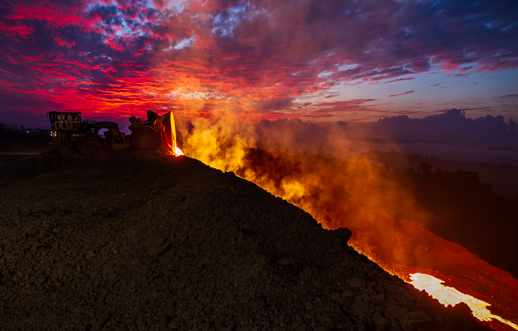
Hi Geoff. Striking capture-the rich red tones and clean isolation against the black sky make it very impactful. You might try adding a touch of contrast or clarity to bring out more surface details. |
Mar 18th |
| 70 |
Mar 26 |
Comment |
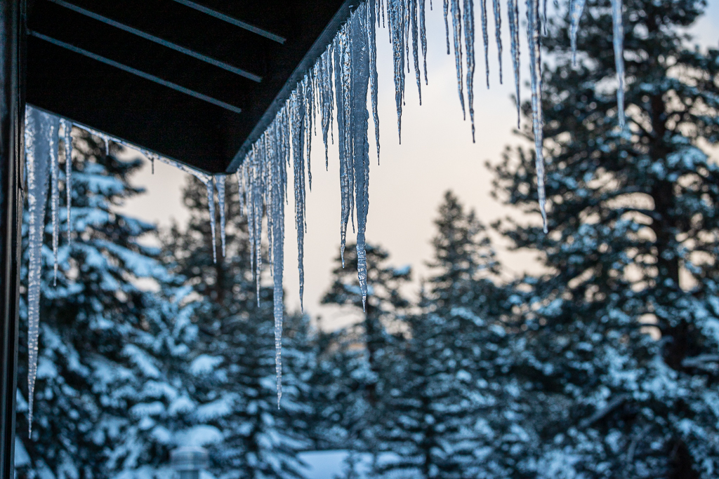
Hi Pierre. Beautiful layering and a calm, minimalist mood-the foreground ice gives nice texture and depth. It does feel a bit cool and muted overall; a slight warm-up in white balance and a gentle contrast boost could bring more life to the scene while keeping the atmosphere intact. Kirk has given you good suggestion for post edits. |
Mar 18th |
| 70 |
Mar 26 |
Comment |
Hi Jerry. Lovely shot-strong sense of depth with the natural framing from the arch leading into the alley. The repeating lines and textures guide the eye beautifully toward the subject in the distance. You might consider slightly lifting the shadows under the arch to balance the exposure, but overall it's a very atmospheric and well-composed image. |
Mar 18th |
| 70 |
Mar 26 |
Reply |
Pierre, when I shoot landscapes, I almost always use exposure bracketing. Some people see this as a bad habit, arguing that it can make us mentally lazy or less intentional in our decisions. But for me, the reasoning is simple: many of the places I visit are once-in-a-lifetime locations, and I may never have the chance to return. Exposure bracketing gives me greater flexibility later, allowing me to carefully choose and preserve the best details across different areas of the image. |
Mar 18th |
| 70 |
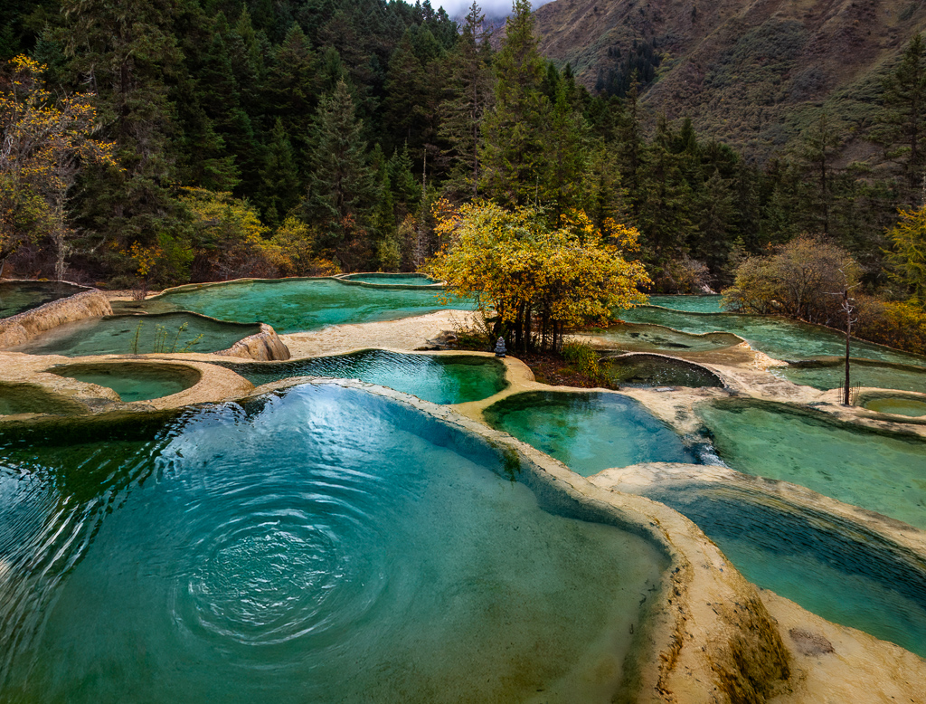
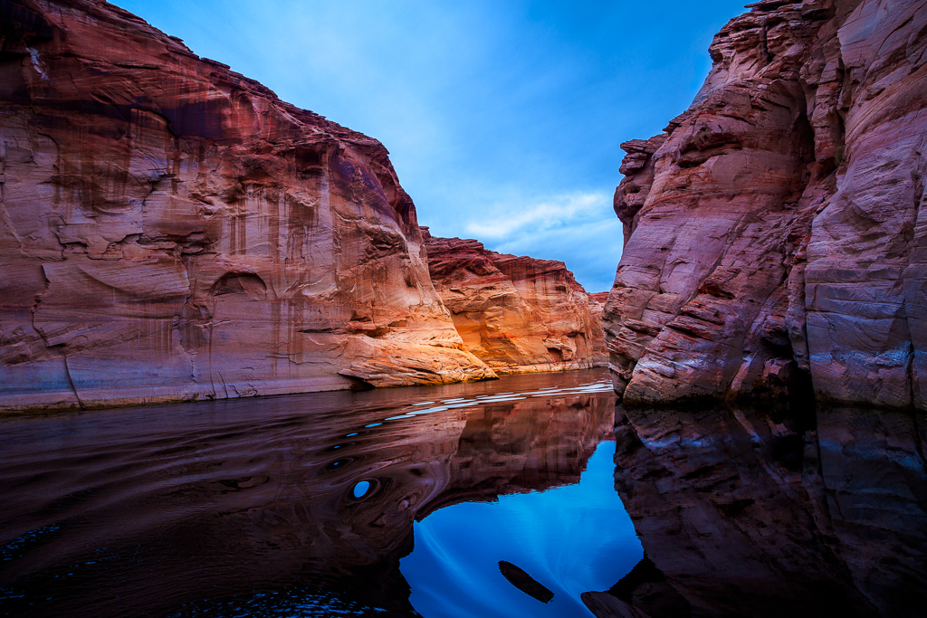
Mar 26 |
Reply |
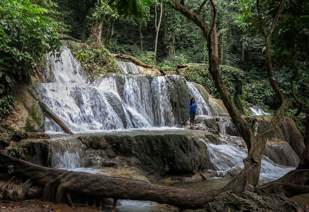
Hi Stephen. Yes, those are calcium carbonate pools, smaller than the "Cotton Castle" of Pamukkale in Turkey. Thanks for your question. |
Mar 13th |
5 comments - 4 replies for Group 70
|
16 comments - 16 replies Total
|