|
| Group |
Round |
C/R |
Comment |
Date |
Image |
| 10 |
Jan 26 |
Comment |
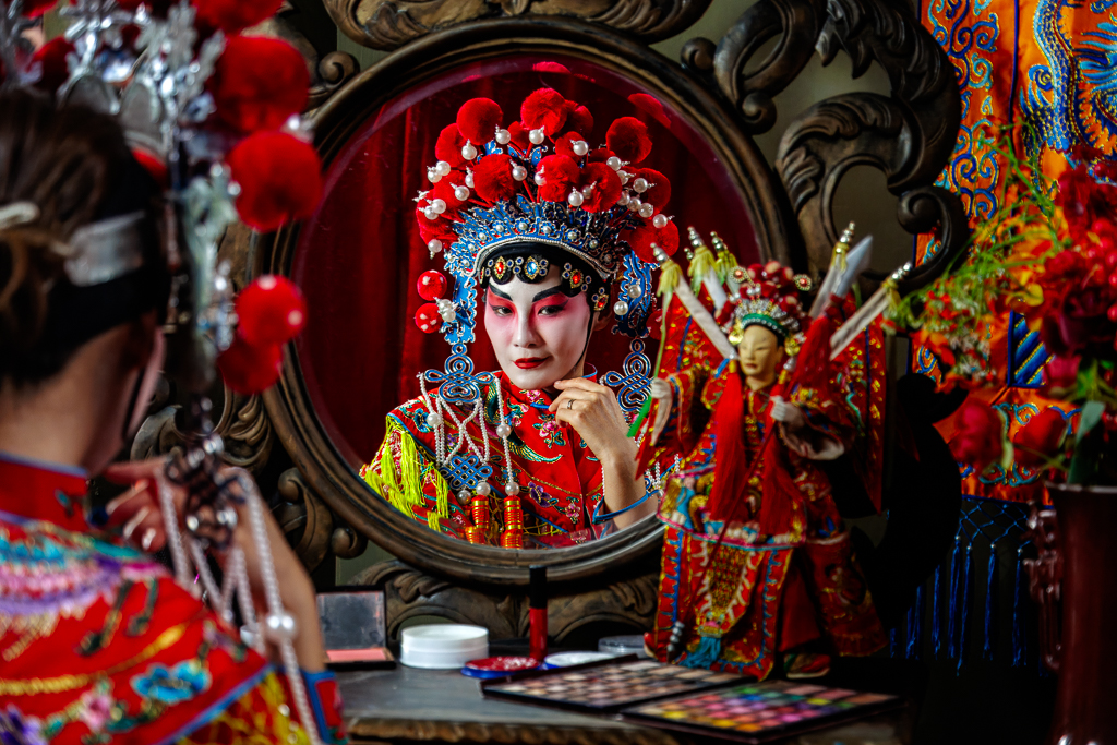
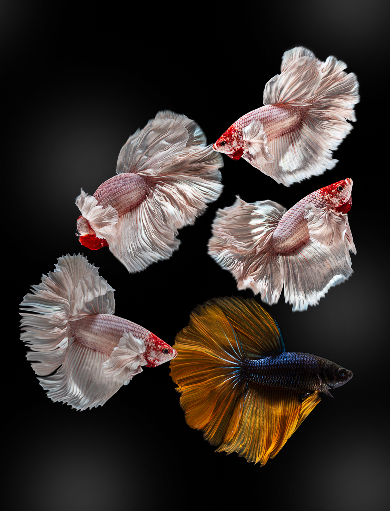
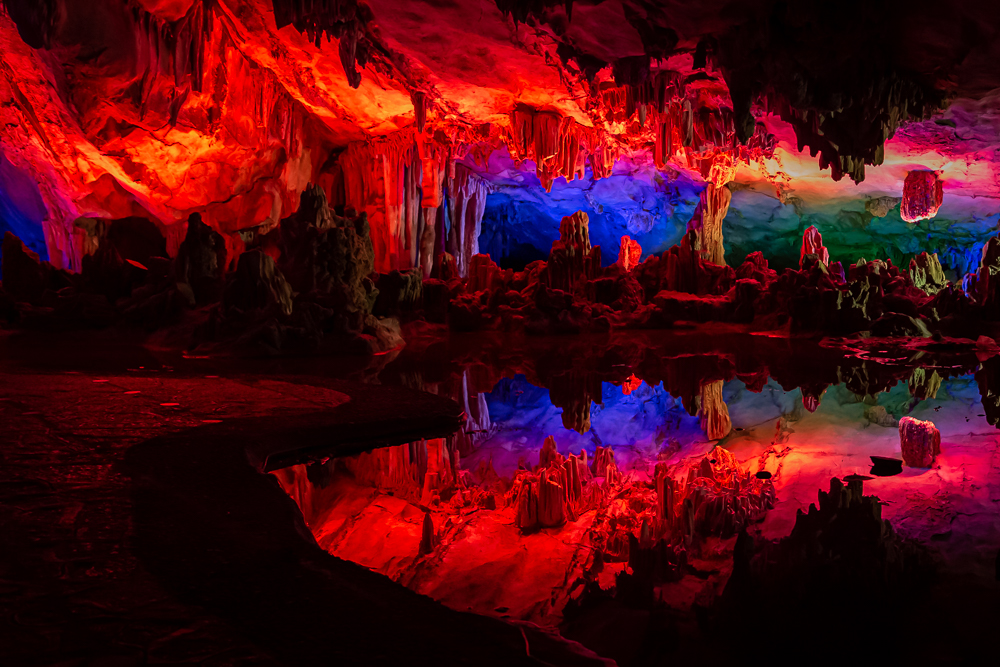
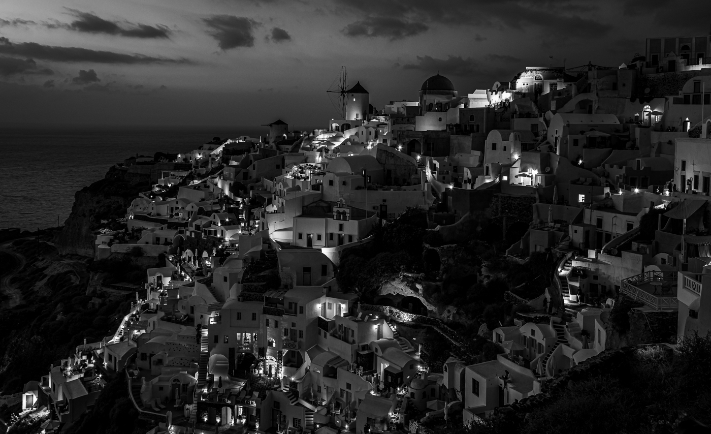
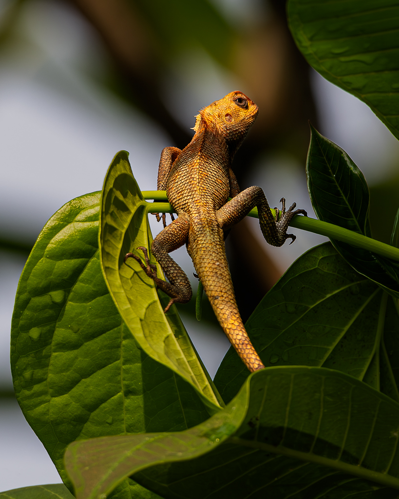
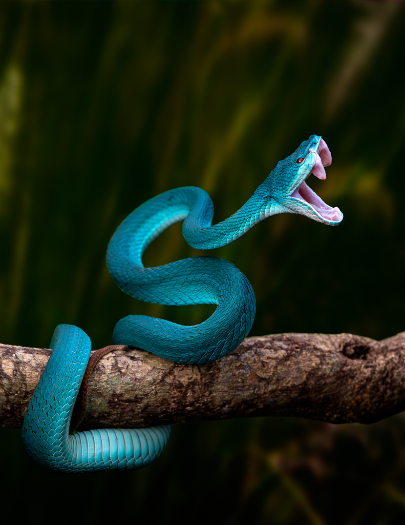
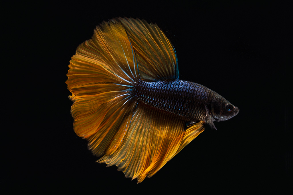
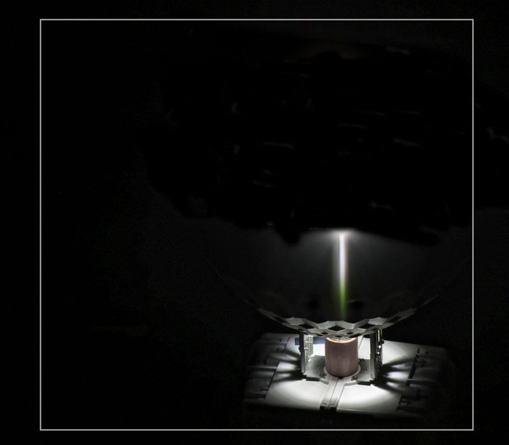
Hi Peter. The object is not too important to me. I really appreciate your idea of taking this unique object that make many people curious. You then position the object at the bottom right corner and allow black empty space. I did the same for some of my many minimalist design. But I normally did it on white background and add a tiny smooth frame to make it more defined. Just my two cents. |
Jan 21st |
 |
| 10 |
Jan 26 |
Comment |
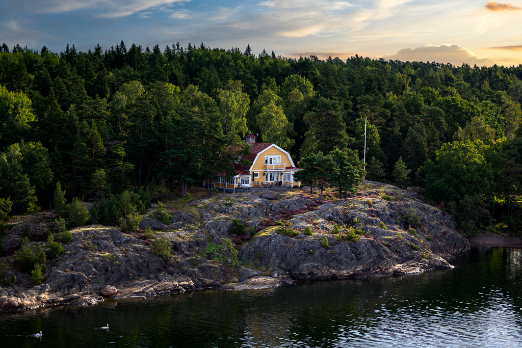
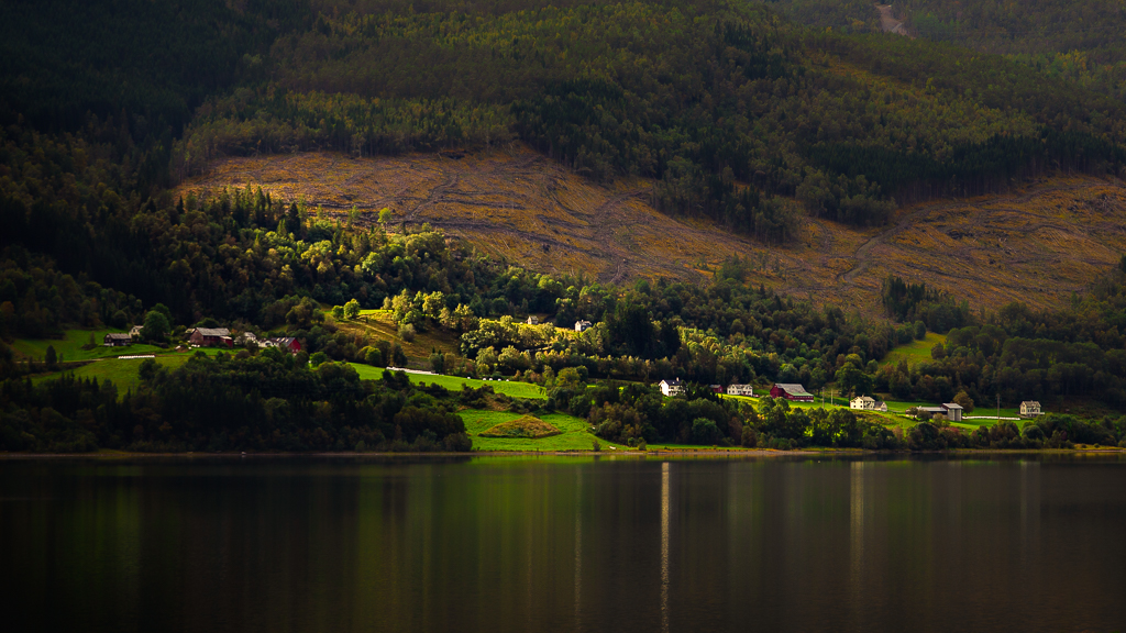
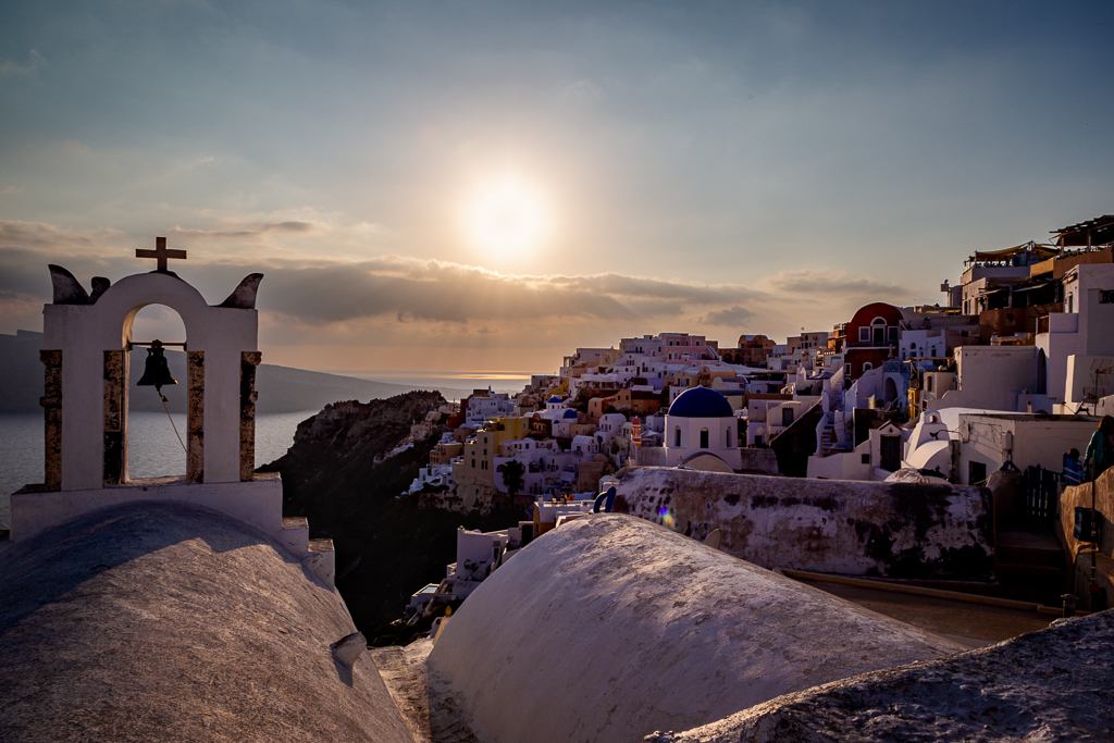
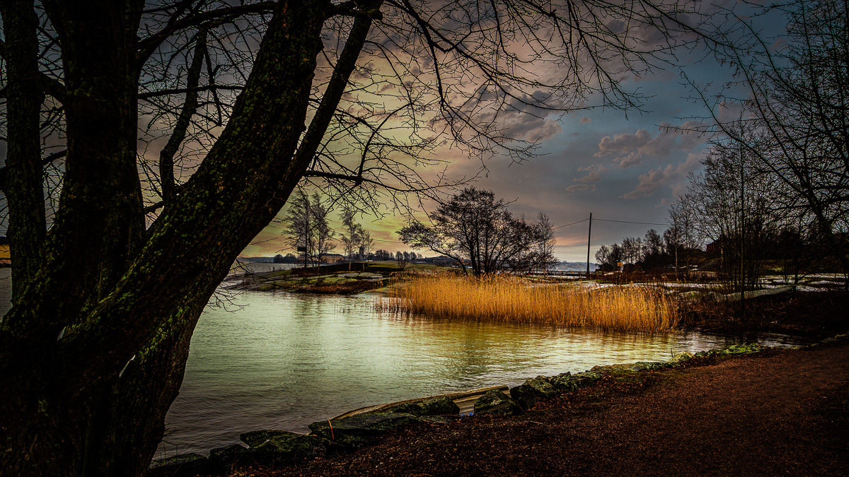
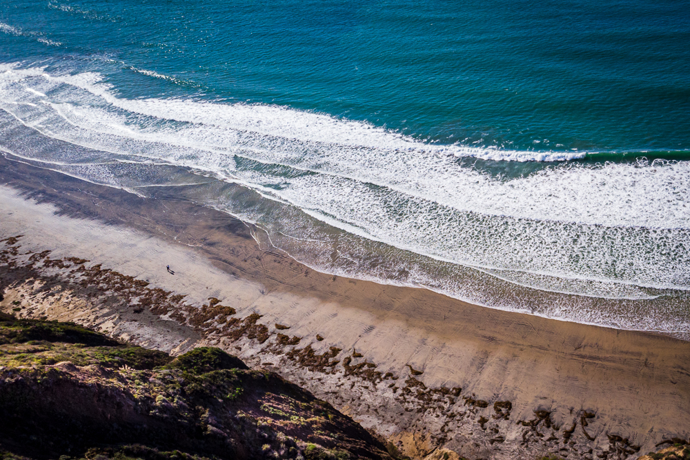
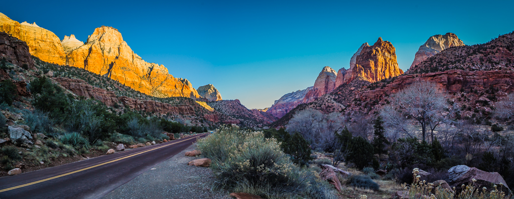
Hi Meredith. This coastal landscape is beautifully composed. The lighting is well-balanced. Upon close inspection. I did not see any over exposure spot in the sky. Sorry for being nitpicking. I saw very light halos around the rock edges. Overall, to me, you have created a visually compelling image that both powerful and serene. Nice work!
|
Jan 21st |
| 10 |
Jan 26 |
Comment |
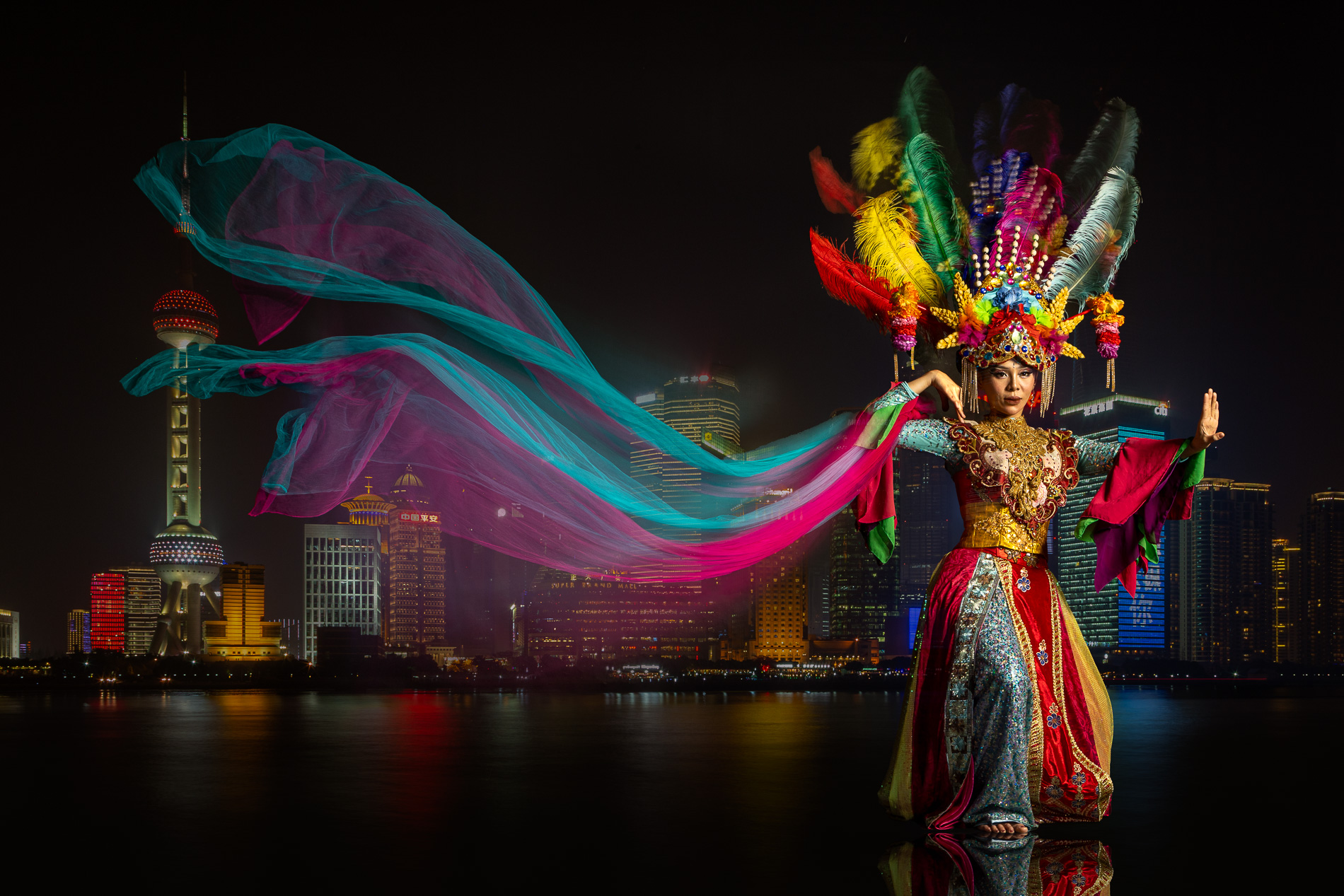
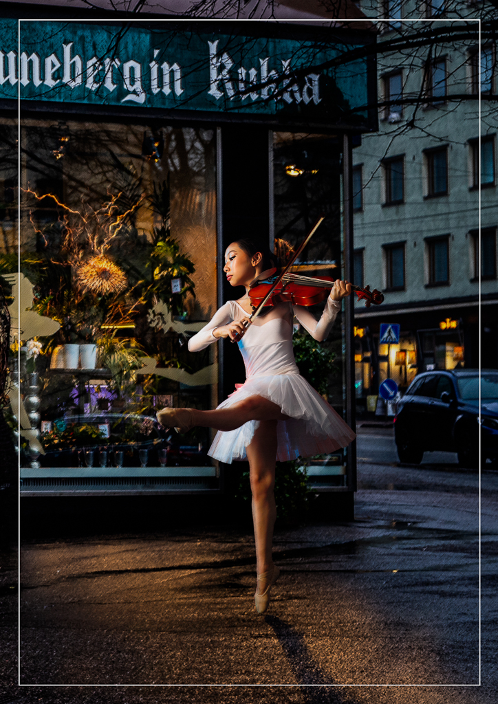
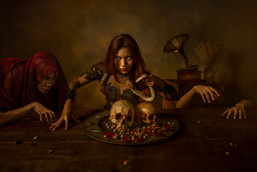
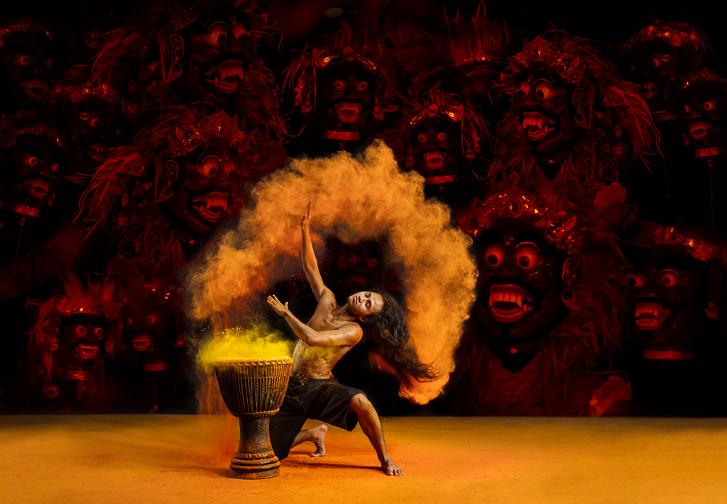
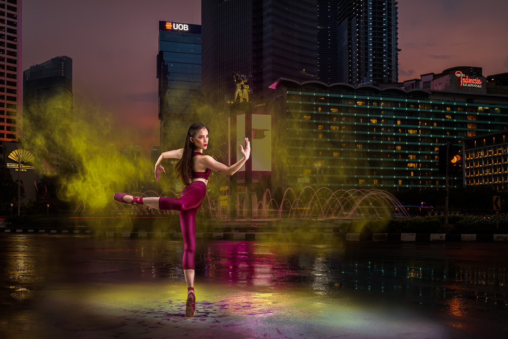
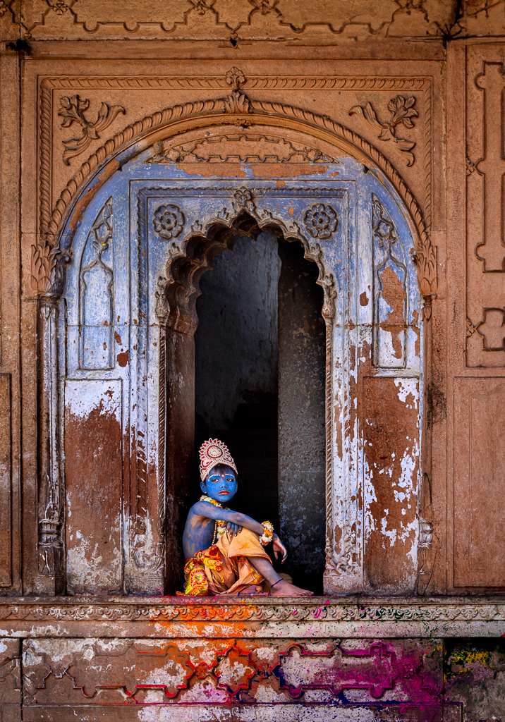
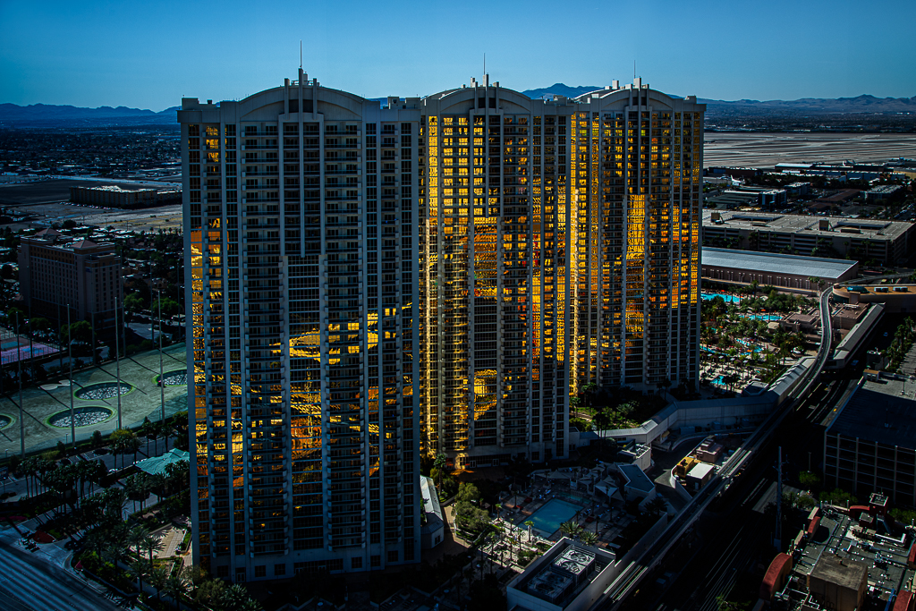
Hi Dough. Many friends commented the same. The dancer with her veil is beautiful set already. That's why I reduce the town background opacity to almost 90%. I make this way just to attract FIAP jury's attention. :) |
Jan 21st |
| 10 |
Jan 26 |
Reply |
Hi Meredith. Thanks for your nice words. I love photography since I was young. But I couldn't do much. Now as a retiree, I feel lucky. I could spend most of my time for photography. I try to keep my brain active by learning various photography techniques. |
Jan 21st |
| 10 |
Jan 26 |
Reply |
Hi Donna. FIAP stands for the
Fédération Internationale de l'Art Photographique. International Federation of Photographic Art like PSA in Europe. I purposely make the sphere on the left above the dancer scarf. It's an iconic landmark of Shanghai-China. Thanks for your nice comments, questions and suggestions. |
Jan 21st |
| 10 |
Jan 26 |
Reply |
Hi Bob. Thanks for you nice words. |
Jan 21st |
| 10 |
Jan 26 |
Comment |
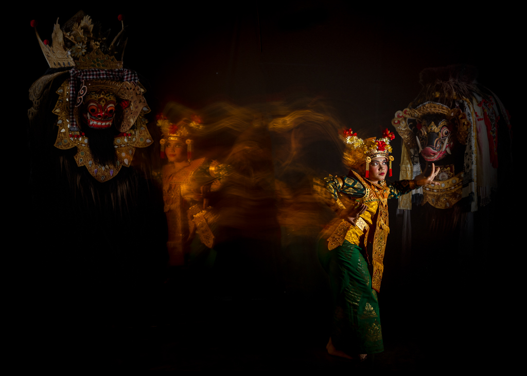
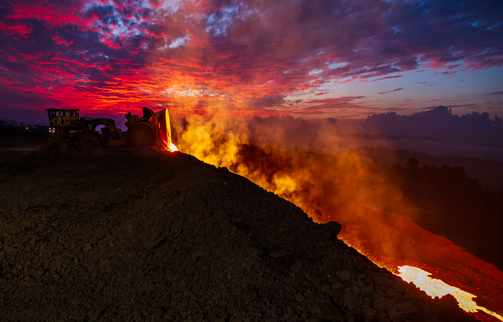
Hi Bob. I like the layered silhouettes and warm color gradient. It creates a dramatic and atmospheric composition. The bridge adds a subtle narrative element. The tonal depth and separation between foreground, midground, and background are well executed.
I saw visible halos near the sharp edges of the mountain ridges, particularly where the contrast strongly against the bright orange sky. This is likely a result of excessive sharpening or aggressive contrast adjustments. Reducing sharpening or using more refined edge masking would help.
Overall, it's a captivating landscape with strong visual storytelling. |
Jan 21st |
| 10 |
Jan 26 |
Comment |
Hi Doug. This is a simple dried leaf but you make it so beautiful with in depth sculptural study of texture, light, and form. The black background isolates and makes the subject even stronger. I am not familiar with Helicon but Donna and you mention about focus stacking technique. It makes me curious. Did do light painting technique here? |
Jan 21st |
| 10 |
Jan 26 |
Comment |
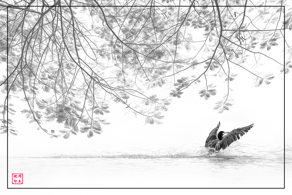
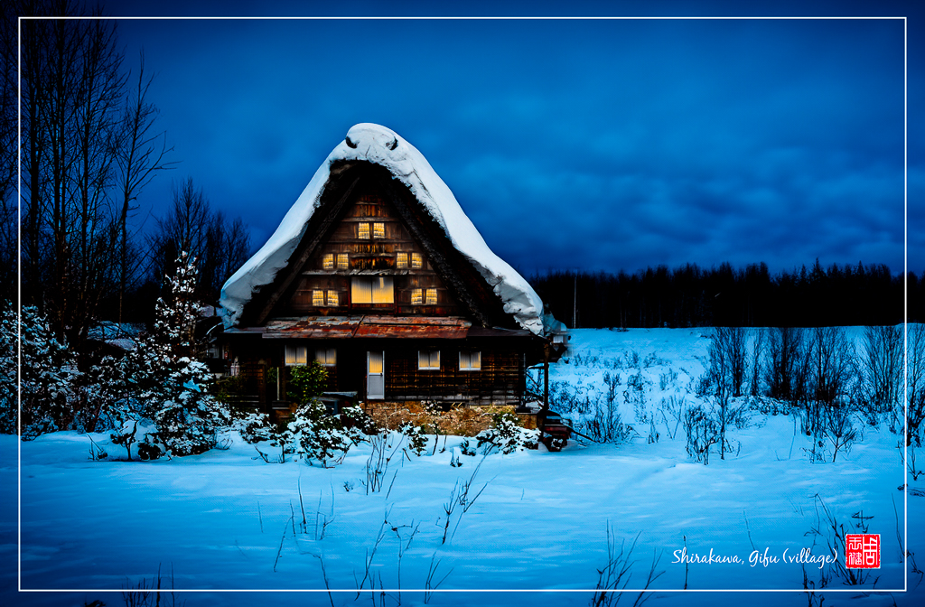
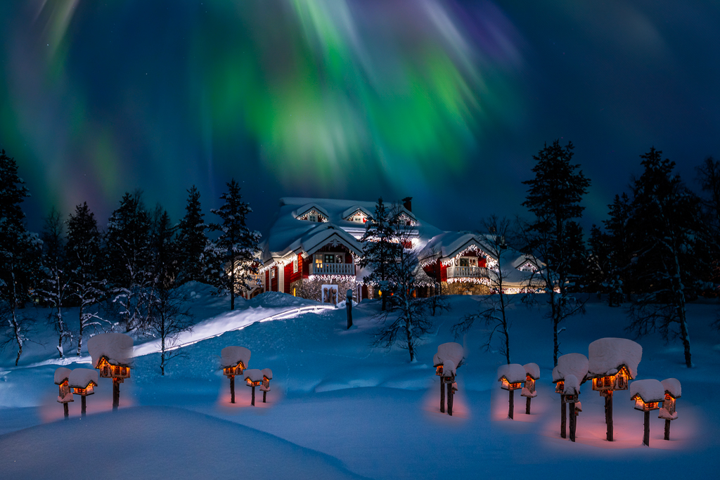
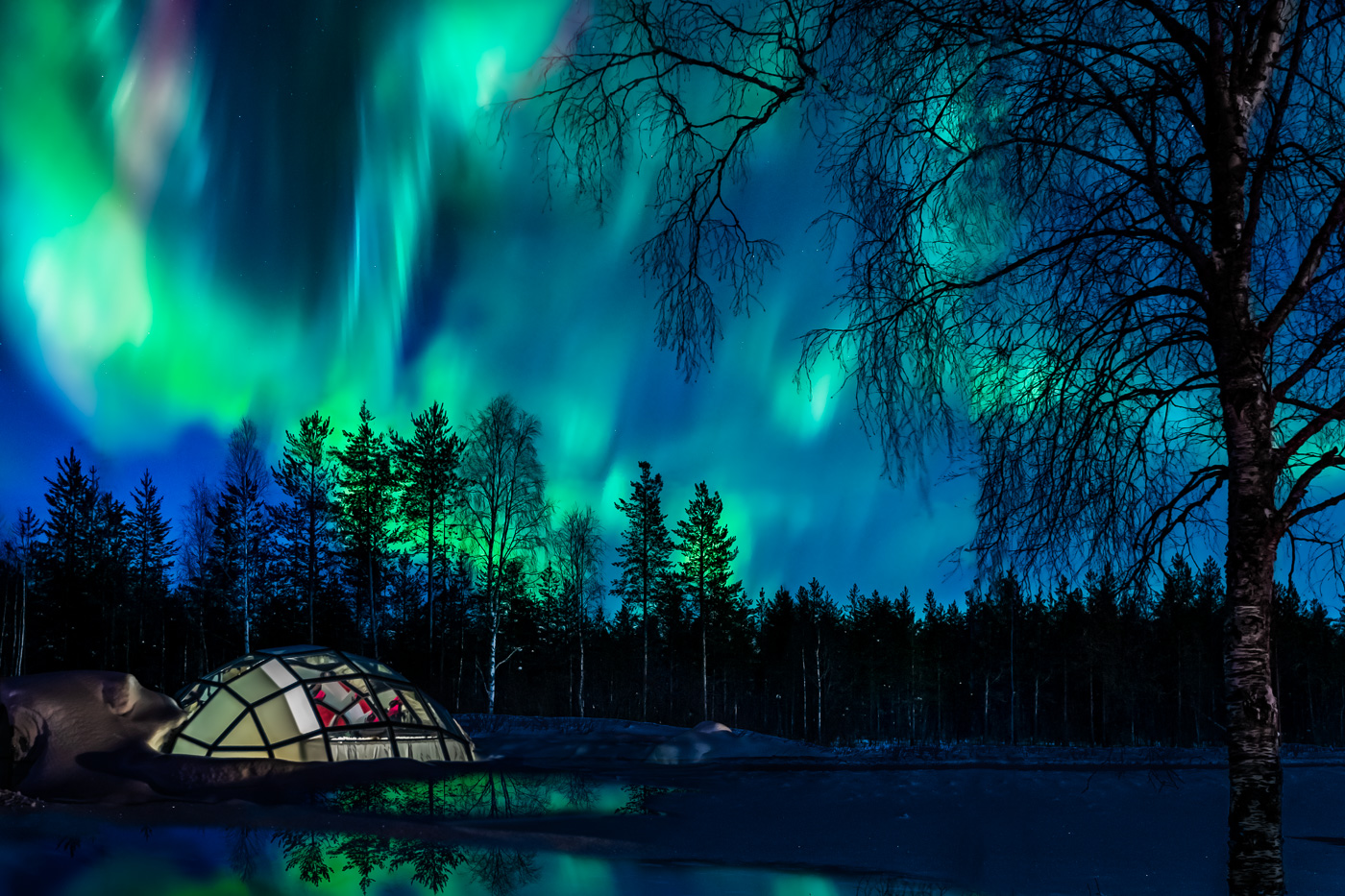
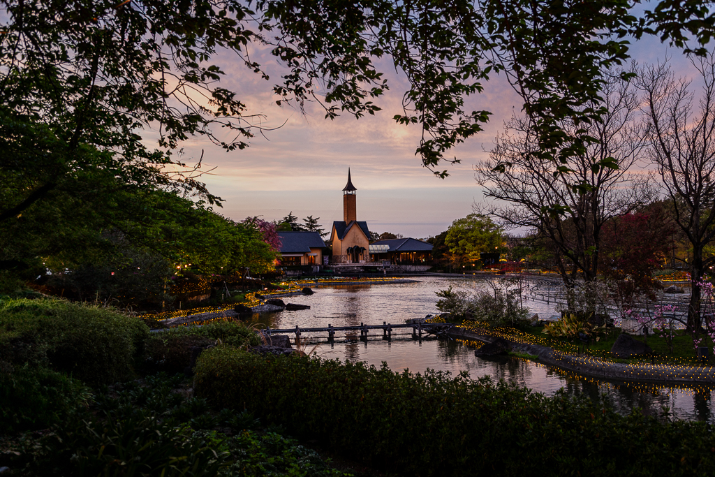
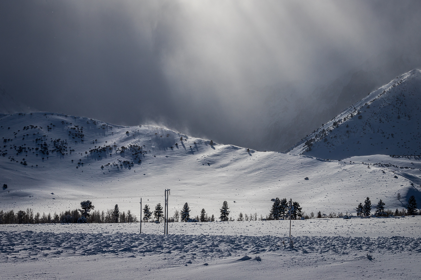
Hi Mark. This winter scene is really stunning. Tranquil frozen lake and snow-draped trees with glowing light installations. The illuminated conical structures add a magical festive touch. While the presence of ducks introduces making the composition feel both peaceful and enchanting. Beautiful image. No suggestion. |
Jan 21st |
| 10 |
Jan 26 |
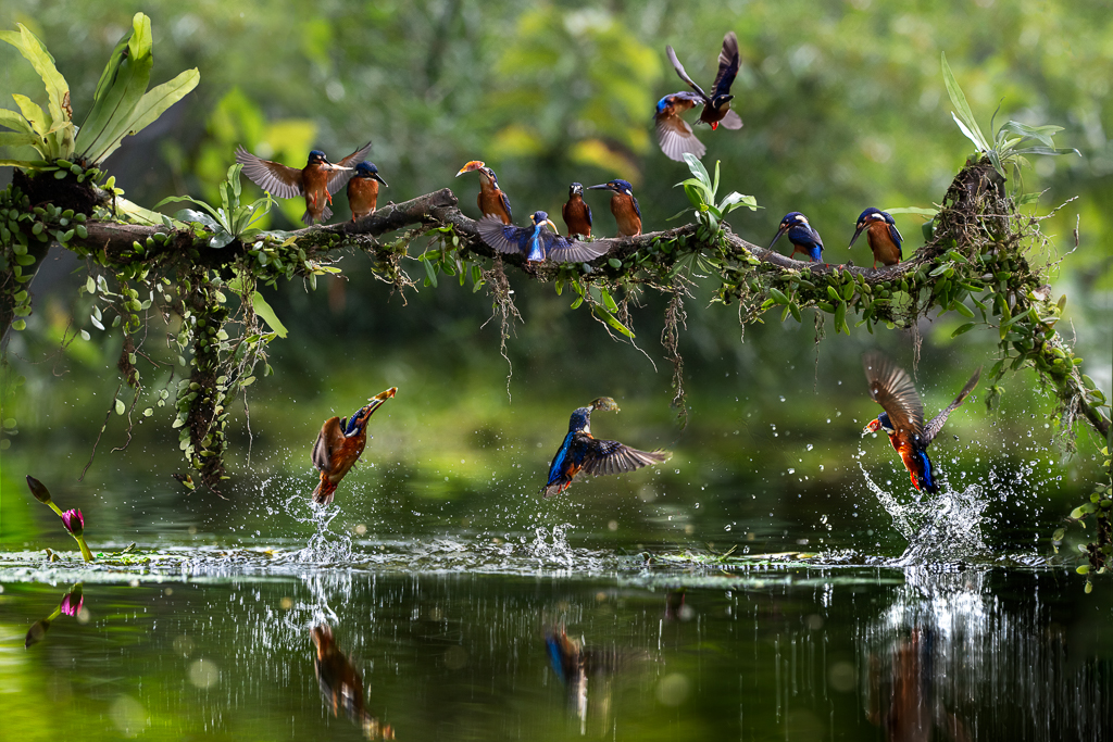
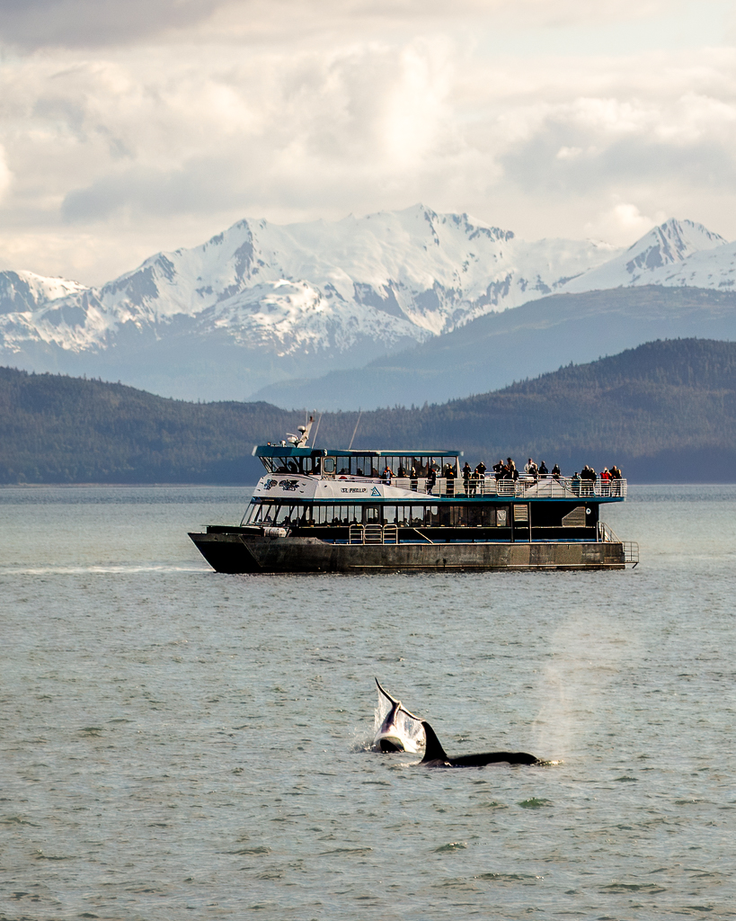
Comment |
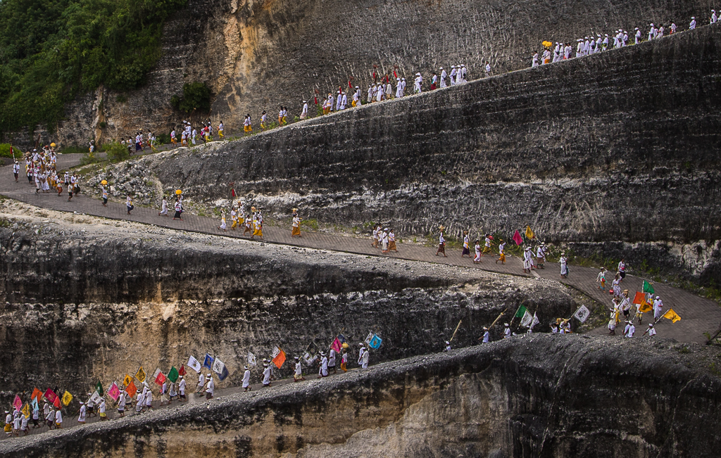
Hi Donna. What an awesome shot. Wow, the sun must be in your favor, you get ISO 640 at f 4.5 with 1/10,000 s. You are lucky to get two synchronized swan takeoff, showcasing grace, motion, and natural energy against a serene wetland backdrop. In order to enhance its impact. I would select and brightened the ducks a bit more and adjusting the contrast a bit to make them more obvious against clutter from the background vegetation. |
Jan 21st |
7 comments - 3 replies for Group 10
|
| 34 |
Jan 26 |
Reply |
Hi Jan. Thanks for your nice comments and suggestion. |
Jan 21st |
| 34 |
Jan 26 |
Comment |
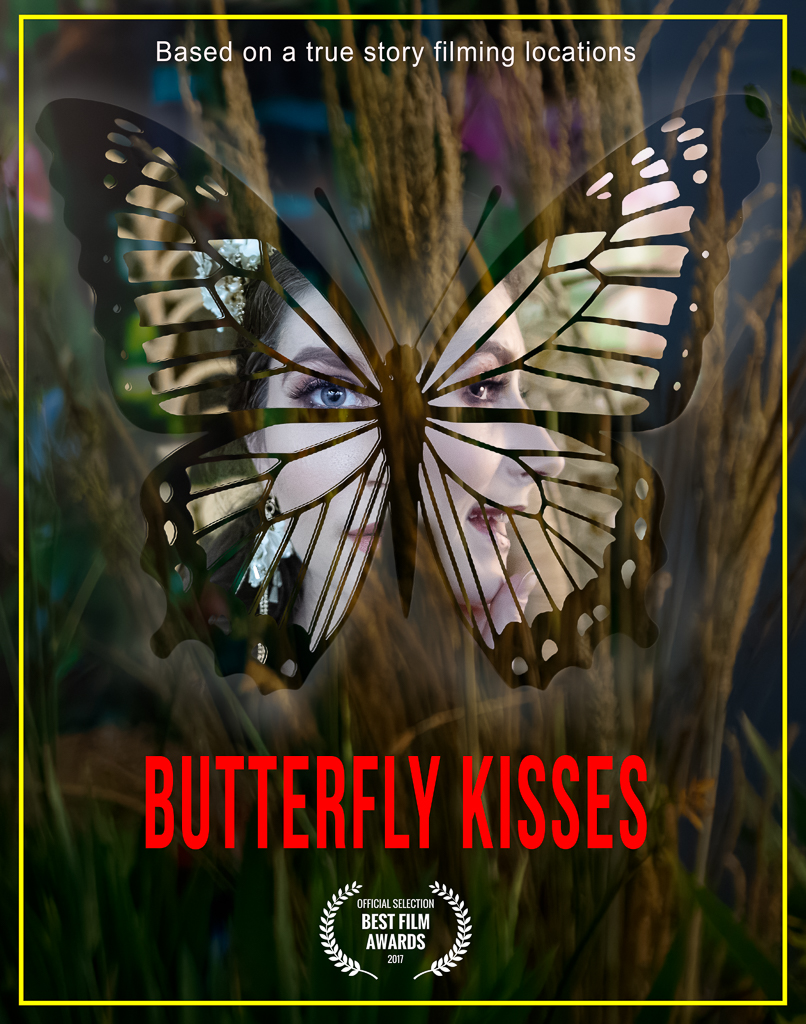
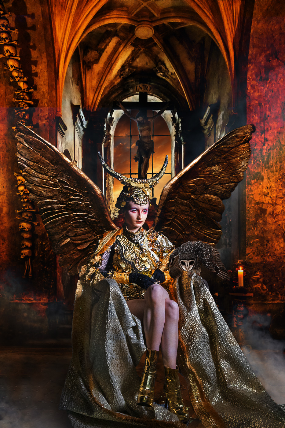
Hi Jan. This image is beautiful. I like the ethereal glow and soft-focus. Creating a dreamlike and spiritual atmosphere. To me, the high exposure and washed-out whites sense of mystery. You smartly make the eyes more defined draw the viewer attention. I suggest a bit of texture and detail in the facial contours that could enhance the emotional depth without losing the surreal quality. Additionally, introducing subtle shadow might add dimensionality and prevent the image from being too flat. Overall, it's a compelling piece of nice work. |
Jan 21st |
| 34 |
Jan 26 |
Comment |
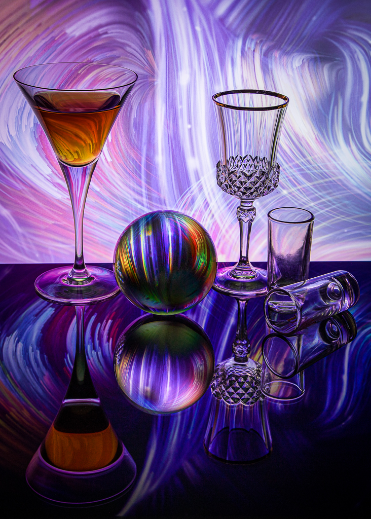
Hi Steve. This image exemplifies altered reality photography through its kaleidoscopic distortion of familiar objects-rubber ducks-into a psychedelic vortex of color, texture, and layered text. Good job Steve. |
Jan 21st |
| 34 |
Jan 26 |
Comment |
Hi Bob. I like the dramatic contrast between the dark blue and purple hues of the night and the bright flashes of lightning. It creates a tense and adventurous atmosphere. Its cinematic quality and symbolic depth make it ideal for use in storytelling. No suggestion. Job well done Bob. |
Jan 21st |
| 34 |
Jan 26 |
Reply |
Hi Deborah, thanks for nice words. |
Jan 10th |
| 34 |
Jan 26 |
Reply |
Hi Steve, thanks for comments and suggestions. |
Jan 10th |
| 34 |
Jan 26 |
Reply |
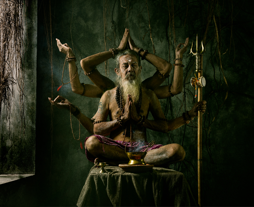
Hi Bob, thanks for your genuine question about text in this kind of photo concept. You make learn from the internet. This is the conclusion.
Yes, art photography can include text. Text may strengthen meaning when it supports the visual message, not just decorate it.
Text can function as a visual element, a narrative or concept, part of the real scene, or a minimal accent. The key is balance-text should not overpower the photograph. Even without text, the image should still speak on its own. |
Jan 10th |
3 comments - 4 replies for Group 34
|
| 70 |
Jan 26 |
Comment |
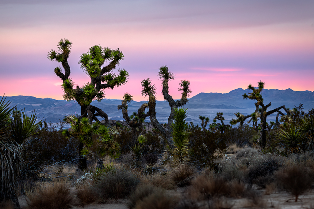
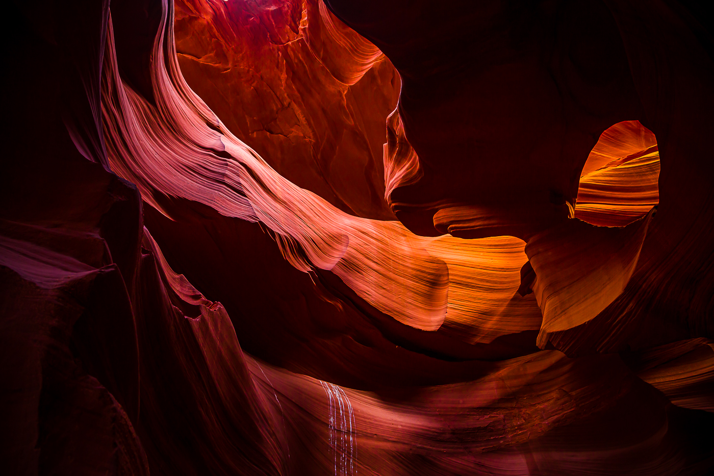
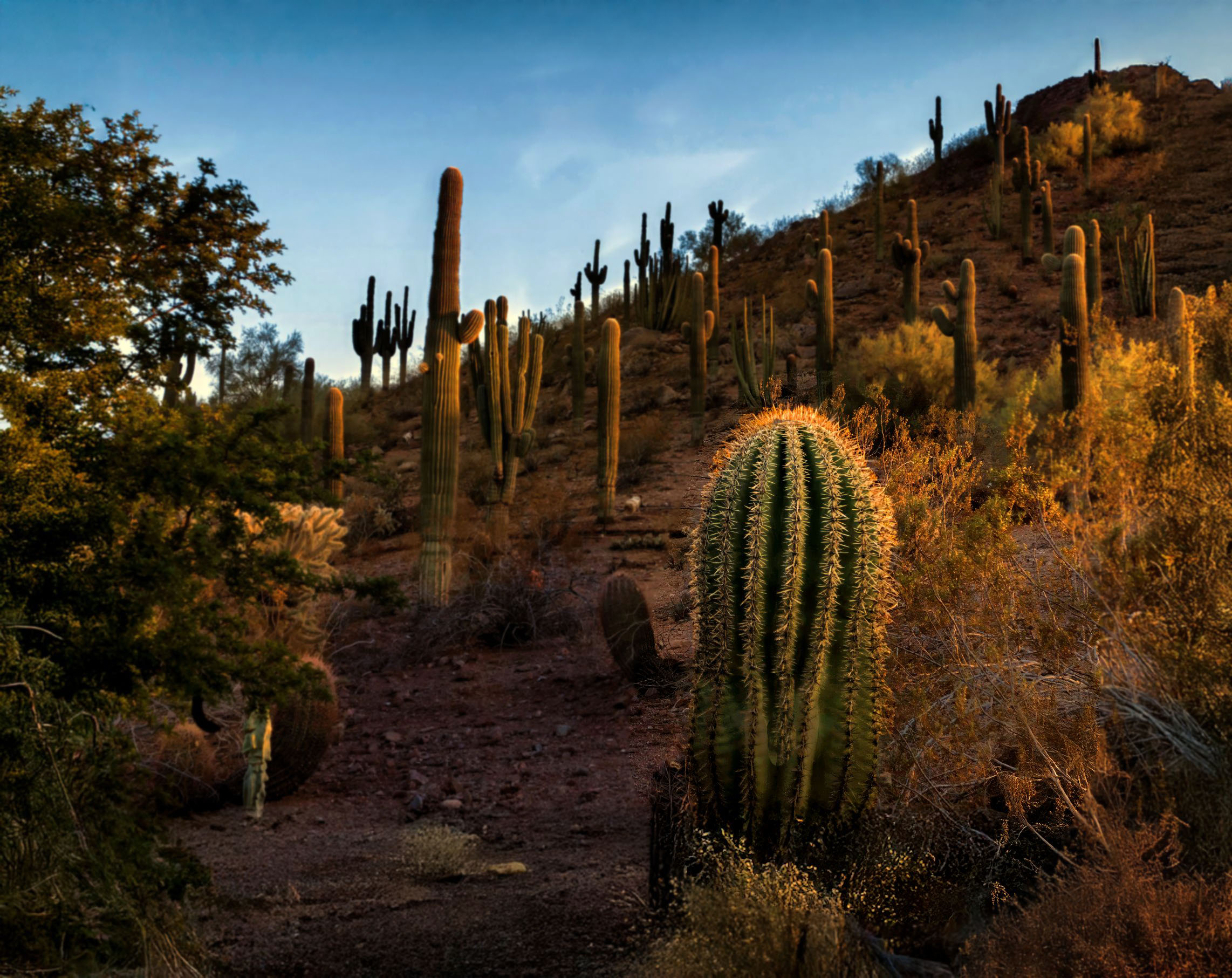
Hi Kirk. Wonderfull image. I also like how you set sun rays around cacti needles. It is sharp from front to end. I have slightly different approach. I normally choose one object in sharp focus and make the rest less sharp. I would also apply a bit of vignette to make my object more outstanding and dramatic. It's just a matter of taste and personal preference. |
Jan 24th |
 |
| 70 |
Jan 26 |
Comment |
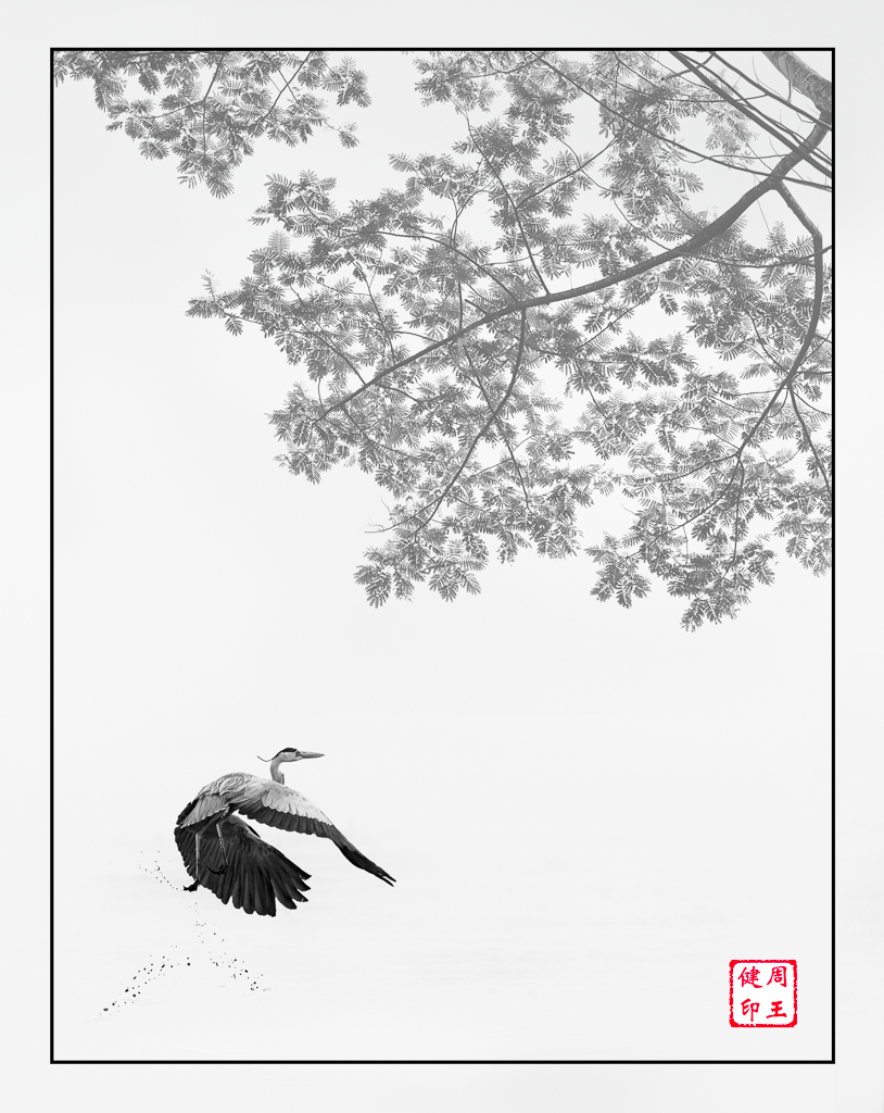
Hi Geoff. It's beautiful and perfect shot with nice compositions. I did not see any halos and color fringing that normally happened on dark tree branches with bright sky. To me. It's a perfect post process and finishing. The image size is too small. I suggest you make it around 1200-1400 pixels on the long side for more enjoy viewing. |
Jan 24th |
| 70 |
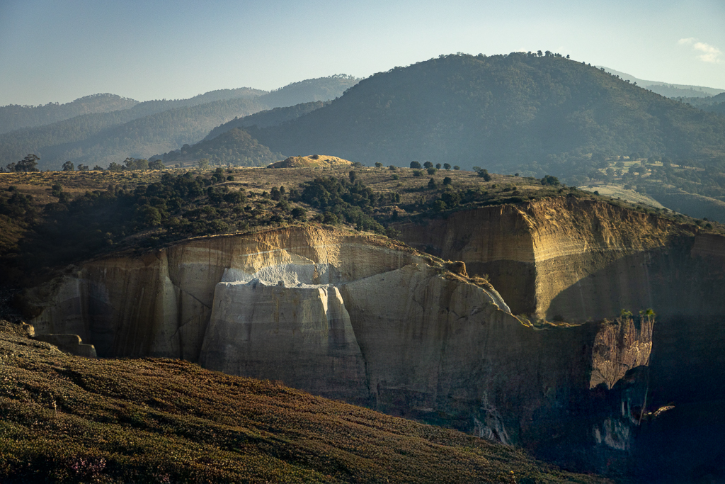
Jan 26 |
Comment |
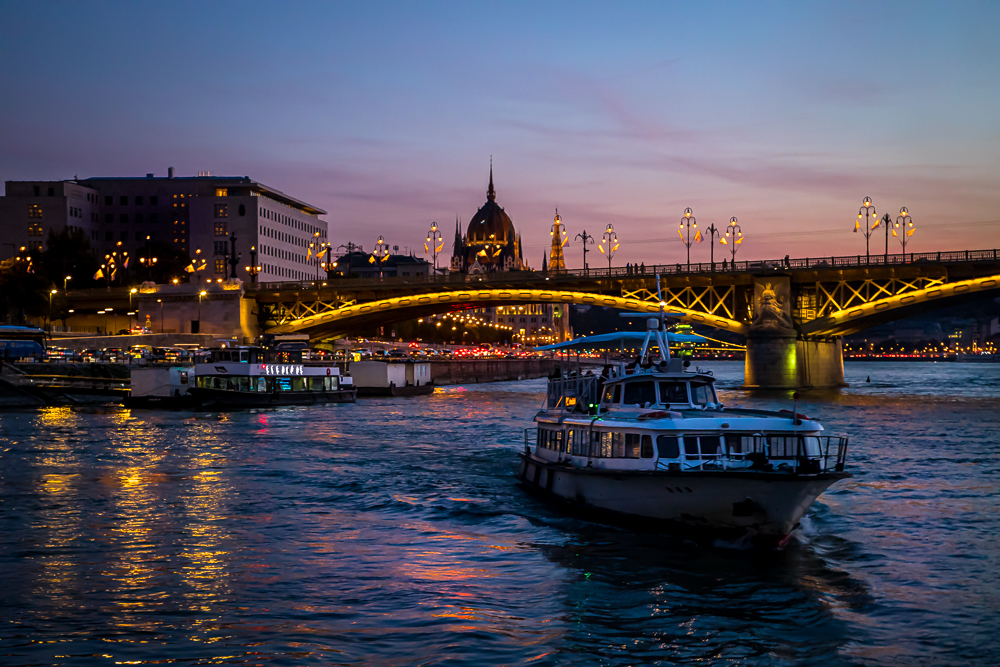
Hi Scott. I like the composition. Where you place the mountain at the bottom left corner and allow empty sky to the right. That was awesome. I wander if this image was a result of tight crop. I saw obvious noise and dust spots. I would normally refine it with Topaz AI before further editing it. Wonderful shot. |
Jan 24th |
| 70 |
Jan 26 |
Comment |
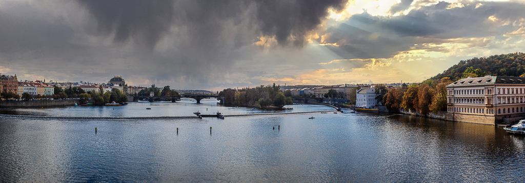
Hi Jerry. What a wonderful Nightscape of Budapest. I agree with Geoff. I specifically request for blue hour when attending Danube cruise in Budapest. It was so beautiful. However, I understand many times timing is not in our favor for photography. I also agree with Pierre to reduce the black adjustment slider to reduce black clips area. Good shot. |
Jan 24th |
| 70 |
Jan 26 |
Reply |
Hi Pierre. You give me a good lesson. I normally rely on my eyes but never double check with grid mode. |
Jan 24th |
| 70 |
Jan 26 |
Reply |
Hi Geoff. Thanks for your comments. |
Jan 24th |
| 70 |
Jan 26 |
Reply |
Hi Jerry. Thanks for your comments and suggestions. |
Jan 24th |
| 70 |
Jan 26 |
Reply |
My first silicone hood was flimsy. I bought the 2nd that was better. It was JJC LH-ARLII. |
Jan 24th |
4 comments - 4 replies for Group 70
|
14 comments - 11 replies Total
|