|
| Group |
Round |
C/R |
Comment |
Date |
Image |
| 34 |
Oct 23 |
Reply |
Steve. Thanks for your education. I really have no art background. I am also new to the world of surrealism, dada, ironic humor, pop art, graphic design and absurdism. I would love to see other artistic style of your work. |
Oct 18th |
| 34 |
Oct 23 |
Reply |
Sorry to confuse you. Should I say your images is more to psychedelic design? |
Oct 18th |
| 34 |
Oct 23 |
Reply |
My question relevant to this group. Most of your creative works posted here are those inspired by stereoscopic style? We would love to see your work other than this style if you have it. Thanks Steve. |
Oct 17th |
| 34 |
Oct 23 |
Comment |
Hi Steve. From your bio, I understand that you specialize in Stereoscopic Photography. Please educate me. Most of your post are those stereoscopic style? Do you have any link or reference that explain this photography genre? Thanks Steve. |
Oct 17th |
| 34 |
Oct 23 |
Comment |
Hi Mike. It's funny and entertaining. I can feel your sense of humors. Nice work Mike. |
Oct 17th |
| 34 |
Oct 23 |
Comment |
Hi Jan. I agree with Candy's comments. You have such creative imaginations. I may not like the end results but I am more on its creativity process.
I appreciate Steve Estill style comments. Giving suggestions by giving example for improvement. I think that's the main objective of learning process in this Digital Dialog. |
Oct 17th |
| 34 |
Oct 23 |
Comment |
Hi Gunter. One thing that I really appreciate you produce different design with different creativity every month. Super creative. |
Oct 17th |
| 34 |
Oct 23 |
Comment |
Hi Candy. I love your simple design and its soft color mood. It's perfectly done. No suggestion. Nice work! |
Oct 17th |
| 34 |
Oct 23 |
Comment |
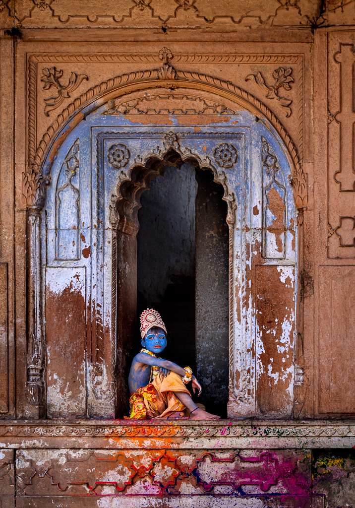
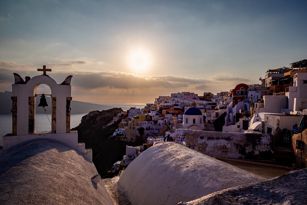
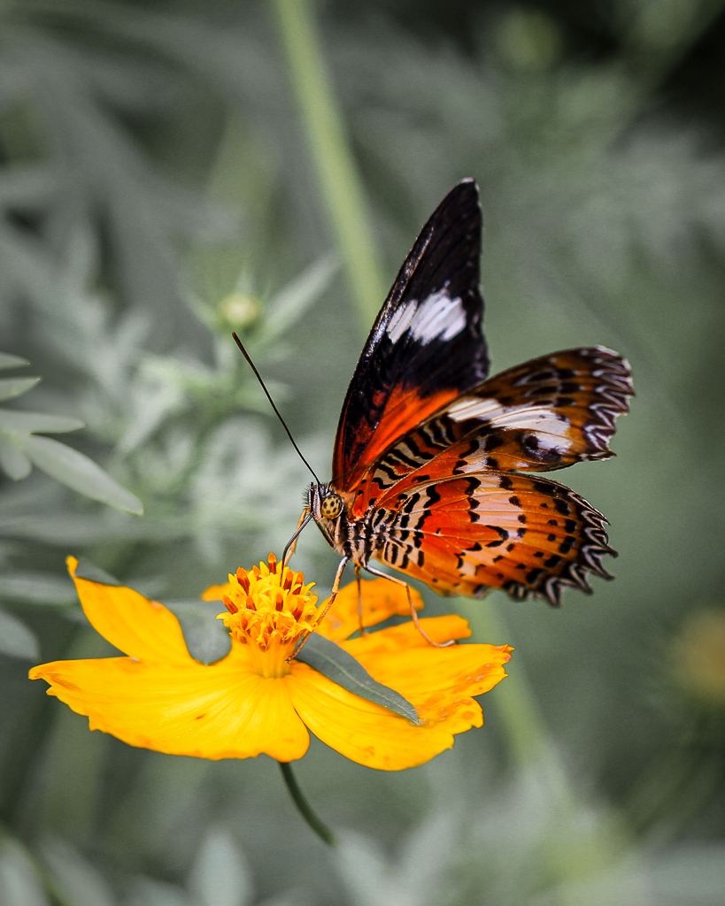
I agree with Helen comments. This is imagination, creation and mastering of photo editing tools. Art is an individual. We all have different points of view. I love to hear how Steve enjoy putting stones and steampunk in a place as he imagined. Good job Steve. |
Oct 17th |
| 34 |
Oct 23 |
Reply |
Hi Gunter. Thanks for your comments. |
Oct 11th |
| 34 |
Oct 23 |
Reply |
Hi Steve. You are right. The key of all is how to make judges wanting to see our image again. Thanks for suggestions and comments. |
Oct 4th |
| 34 |
Oct 23 |
Comment |
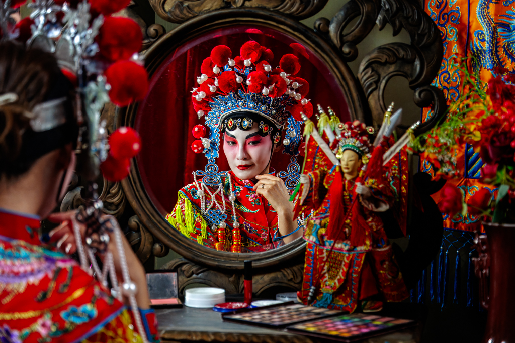
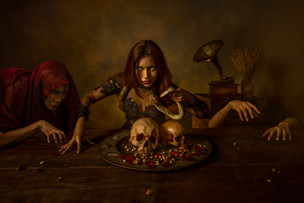
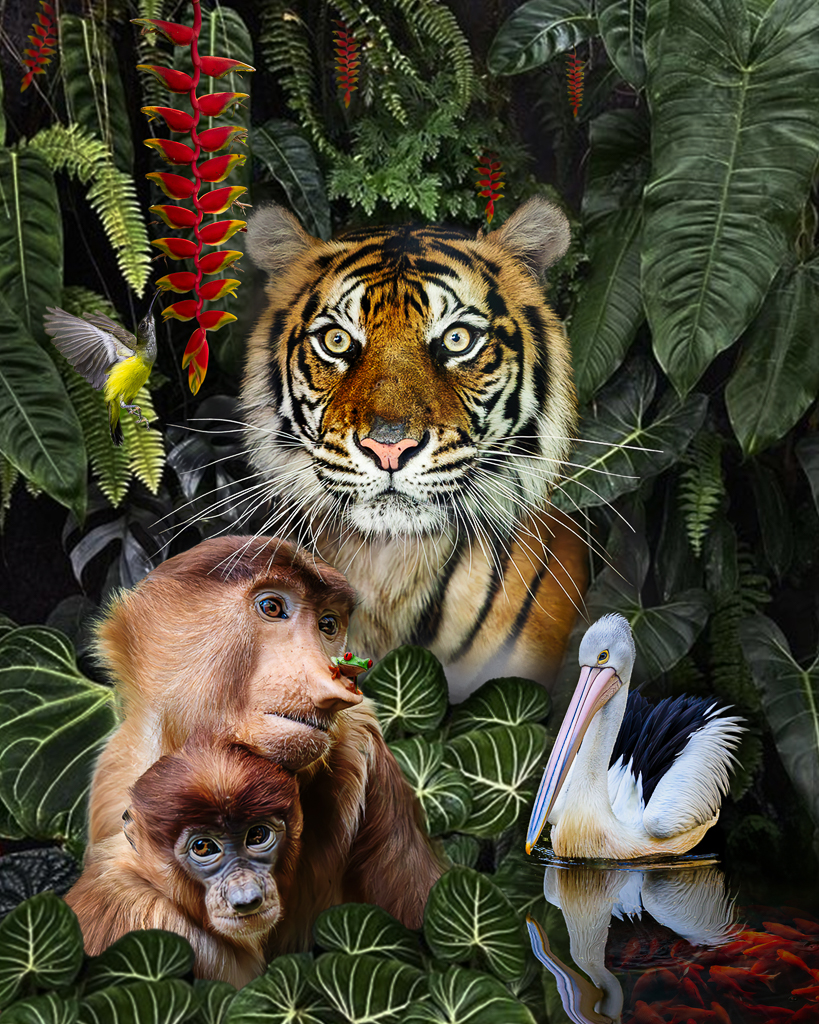
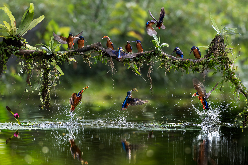
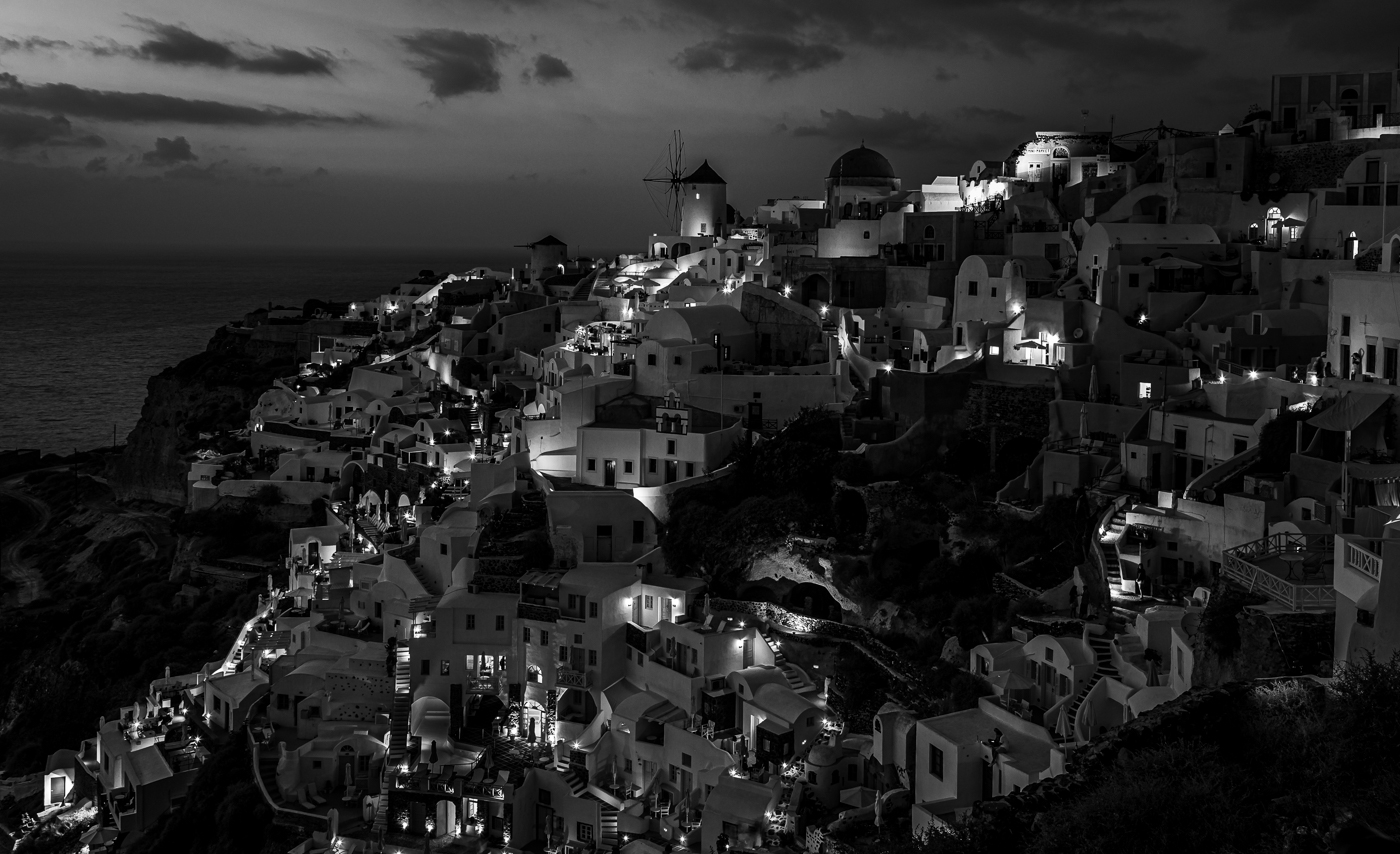
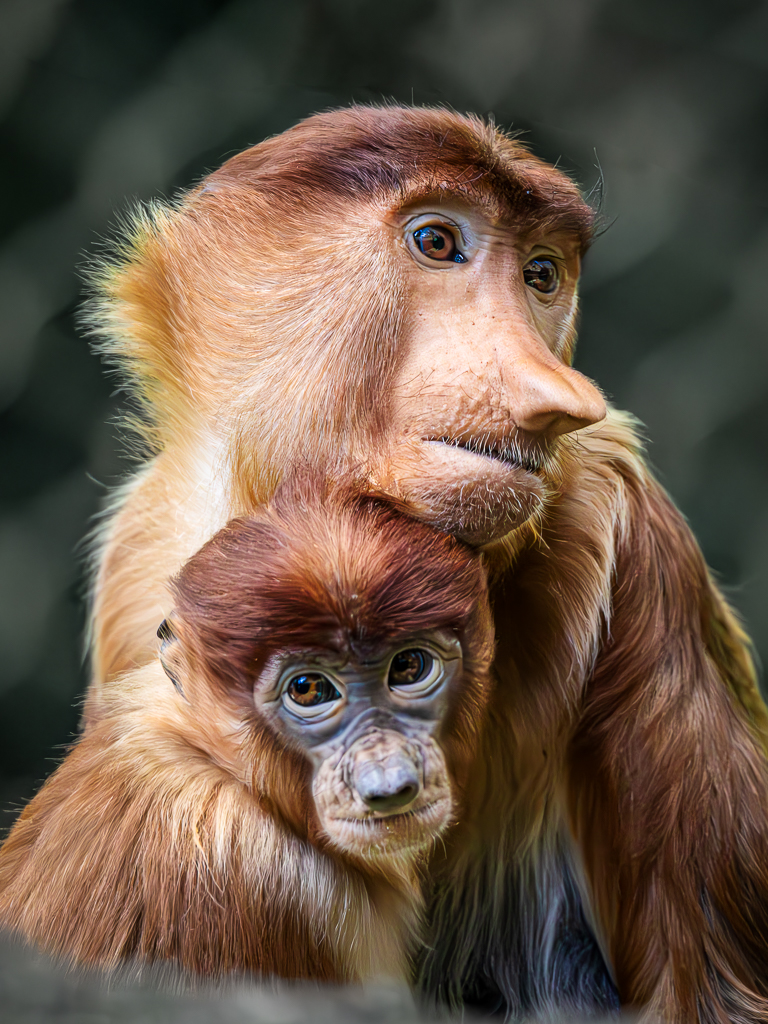
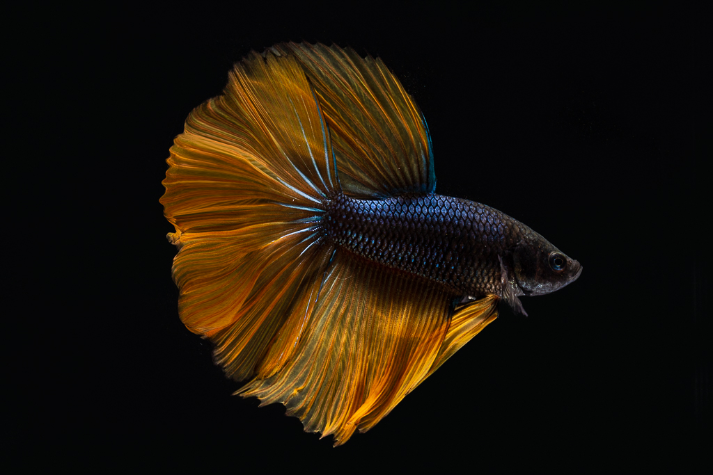
Hi Candy. Thanks for your comments and suggestions. I agree with your comments about the bird background. Mike and Jan also commented it. I have darkened the bird background substantially to make it look more natural. I also agree for dimming the tiger eyes a bit and remove the black spot from his nose. I really appreciate your time to thoroughly review this composite. |
Oct 3rd |
| 34 |
Oct 23 |
Reply |
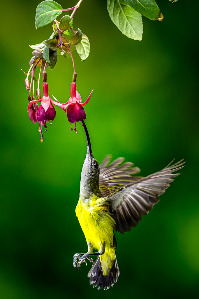
Hi Jan. I agree with you and Mike regarding the Humming Bird. It attracts too much attentions under the bright and similar color vegetation. I darkened and make it less saturate with Hue and Saturation Tool.
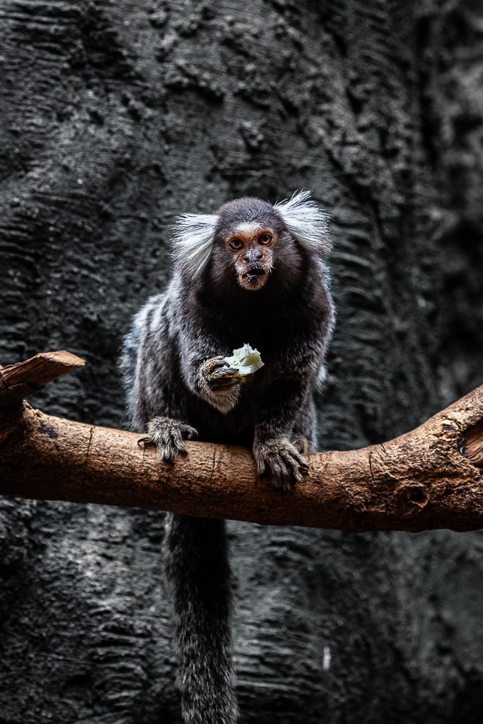
The leaves behind the monkey (especially the bright veins). I also make it less saturate and darker.
I am glad you spot the the bright side among the tiger neck. Indeed, I have cloned it before you commented it. I set the blending mode to Color Burn.
I learned one good words from you ... serene ... That's my ultimate aim of edit. Calm dan peaceful mood. Peace be with you and Steve (your husband).
I really appreciate your thorough analysis to my composite. |
Oct 1st |
| 34 |
Oct 23 |
Reply |
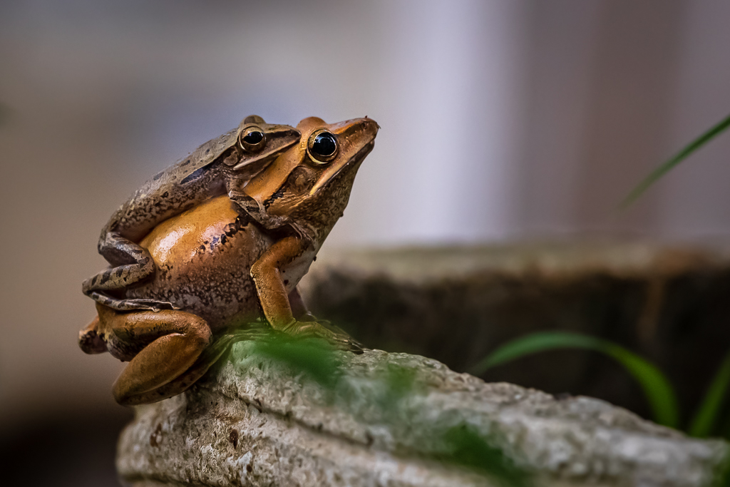
Hi Steve. I like to hear you like the Pelican and fish pond at the bottom right. Jan called it serene. Calm and peaceful. I am glad you like the monkey with the frog. Indeed the frog is so small. I am not sure if it will work as a point of interest. |
Oct 1st |
| 34 |
Oct 23 |
Reply |
Hi Mike, I am glad you spot the humming bird area. I know it was a bit awkward but I did not realize until Jan comments. I think the vegetation behind it should be less saturate and much darker. Thanks for your suggestions. |
Oct 1st |
7 comments - 8 replies for Group 34
|
| 70 |
Oct 23 |
Reply |
Tammy. Thanks for your kind words. Enjoy your time. |
Oct 27th |
| 70 |
Oct 23 |
Reply |
Hi Geoff. Thanks for your kind words. |
Oct 19th |
| 70 |
Oct 23 |
Reply |
Thanks Stefaan. I am with you. |
Oct 18th |
| 70 |
Oct 23 |
Reply |
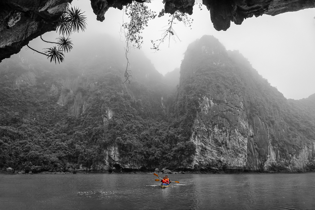
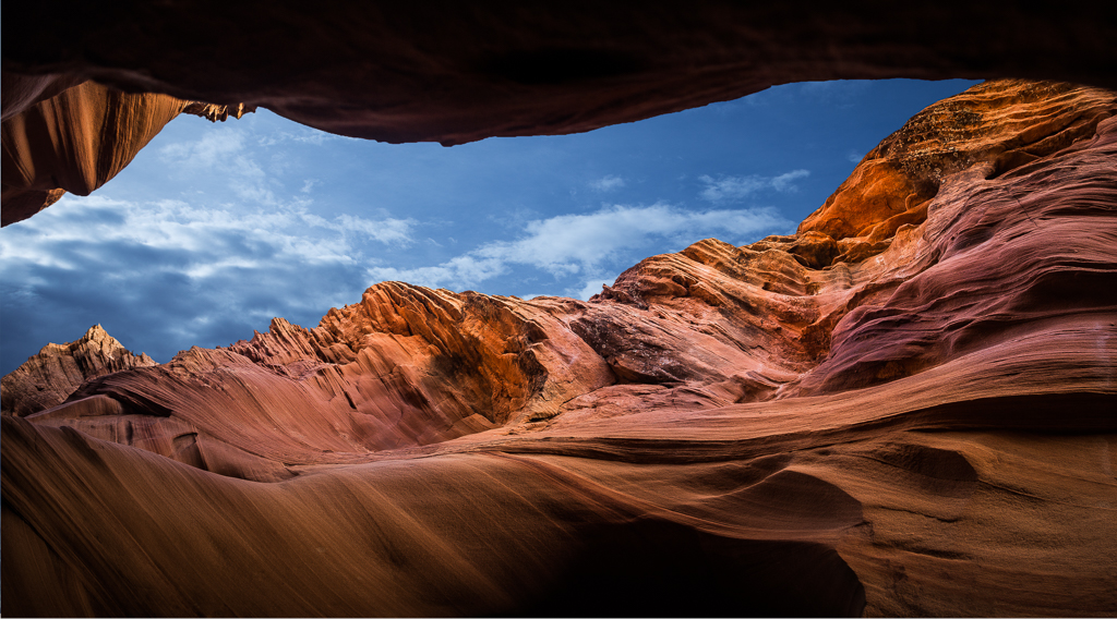
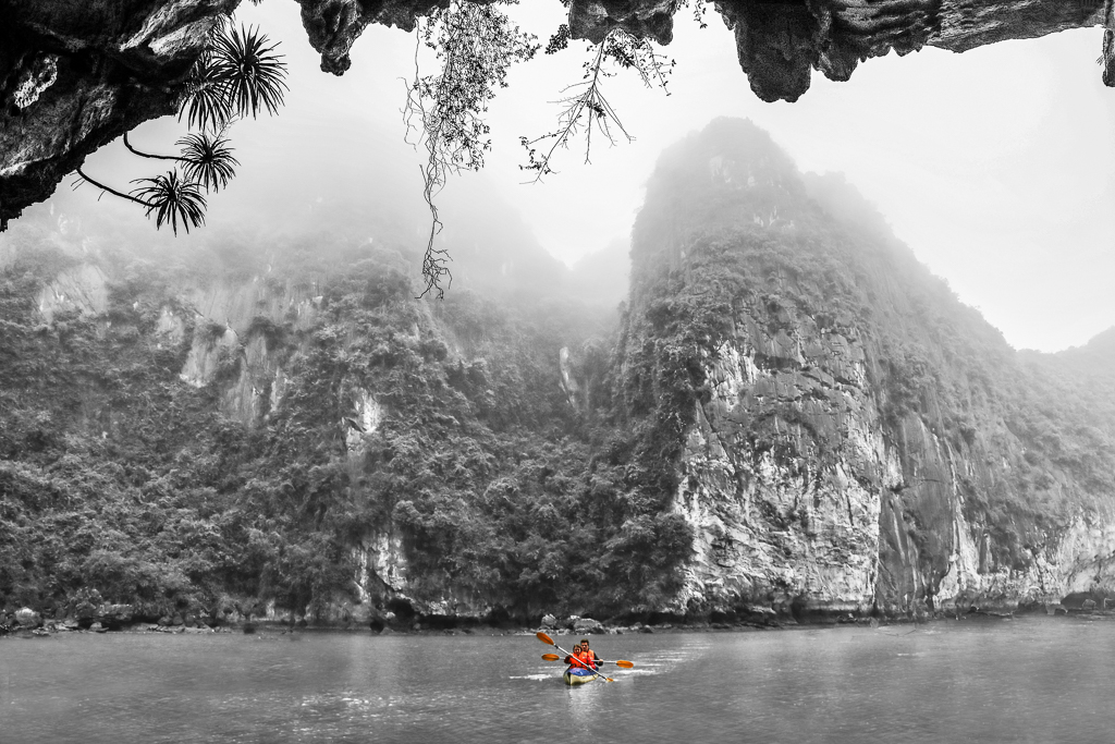
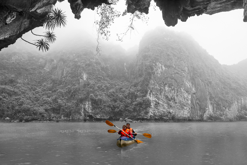
Hi Kirk. I am glad you like it. I send this image once for salon curation. My senior curator said: ... I wish the kayak is larger and the mountain was not that tall ... My PS skill was so limited so I could not fulfill her expectation.
What you and rest of the group members) think? Which is better the original scene or the manipulated one? |
Oct 18th |
 |
| 70 |
Oct 23 |
Reply |
It looks much more dramatic than the SOOC. Good work Stefan. |
Oct 18th |
| 70 |
Oct 23 |
Reply |
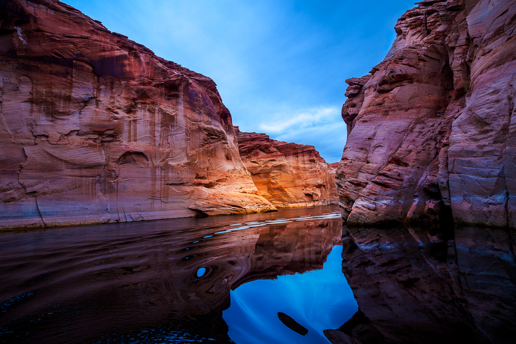
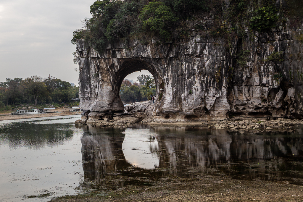
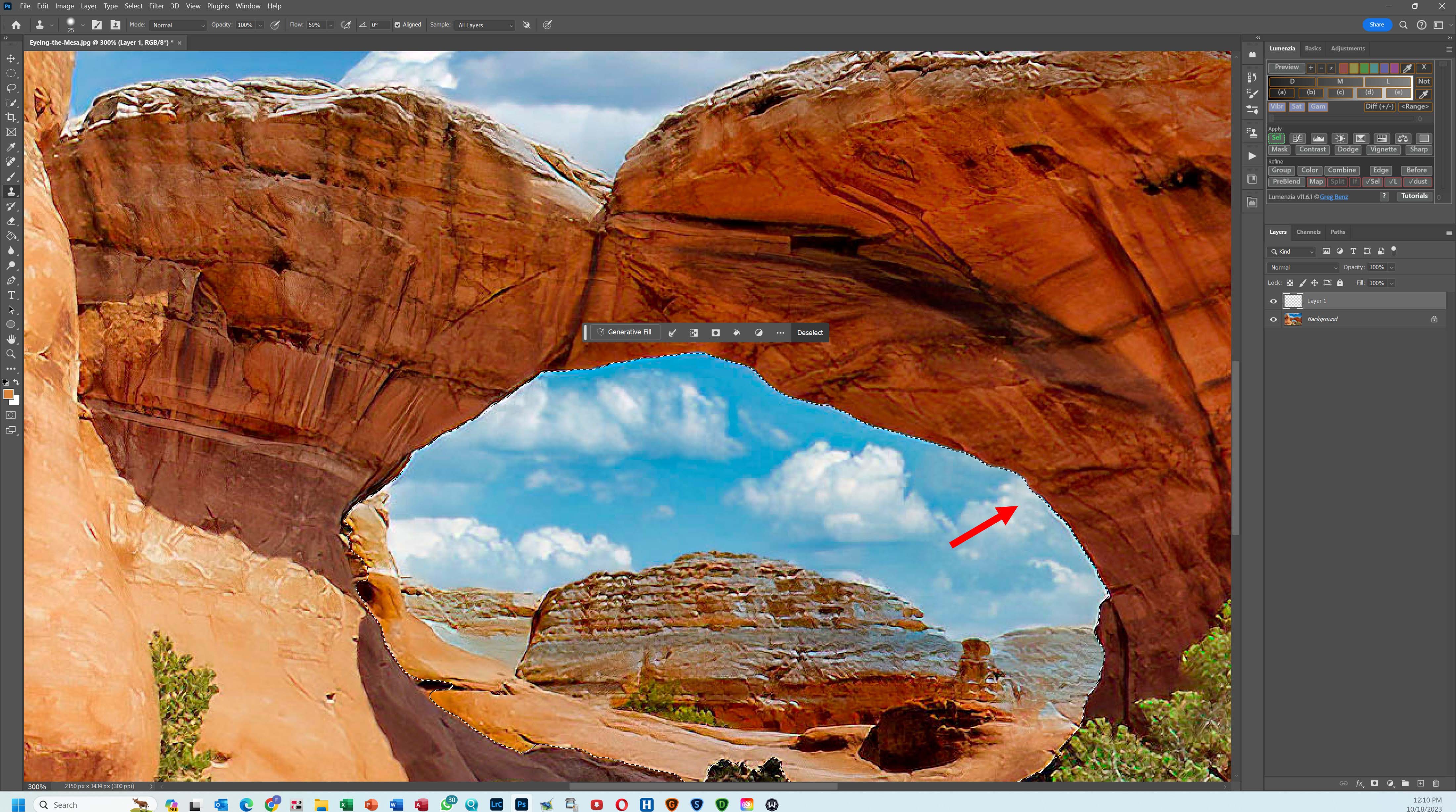
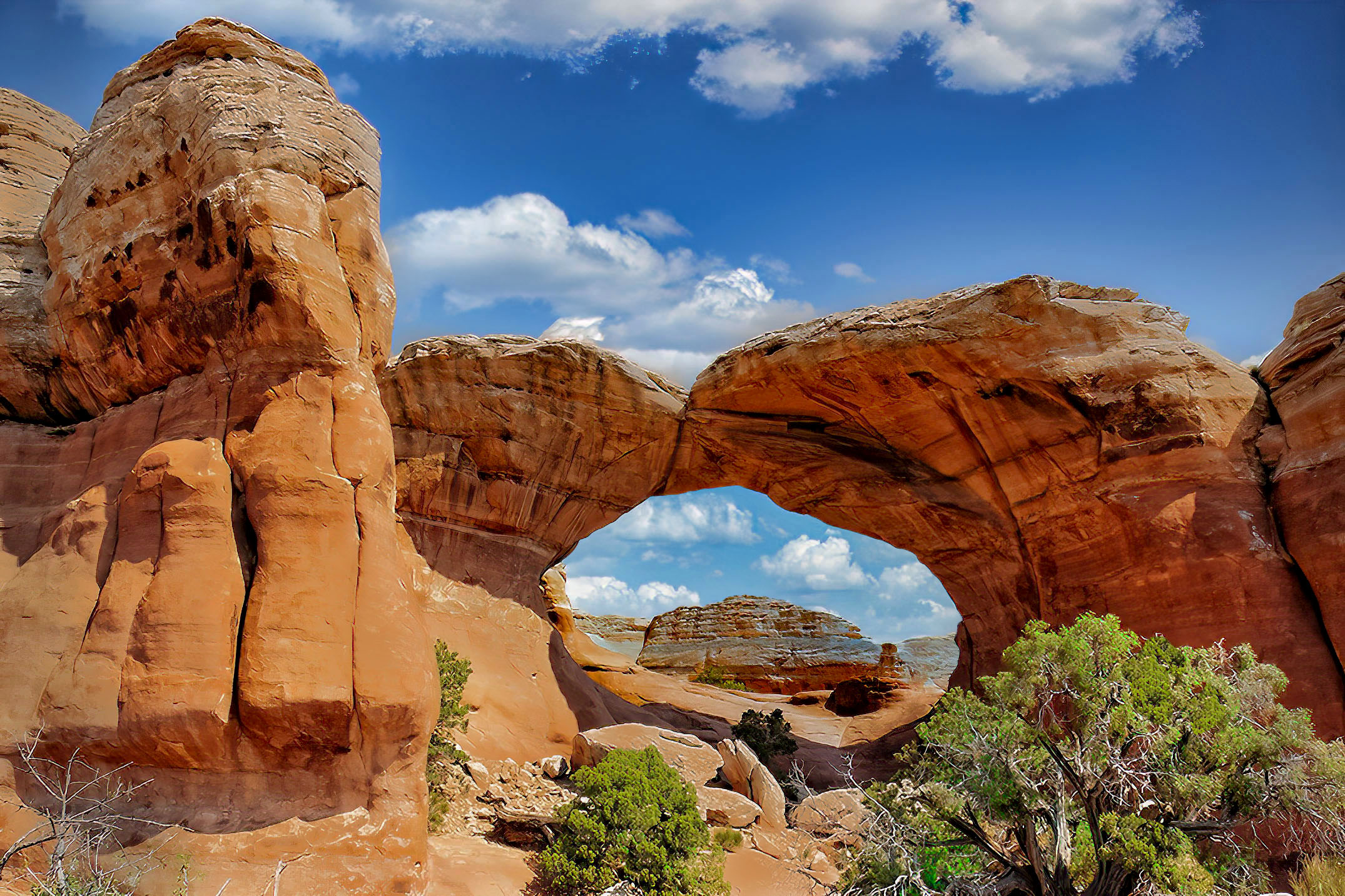
Halo removal can be very simple or complex. It is simple in your case. Make a selection of the sky around the arc and remove the halo by cloning sky pixels from its adjacent. Look at the red arrow. I did it partially so you can see the difference. In a more complex case. We have to select halo pixels by using luminosity mask tool. I hope this answer your question. |
Oct 18th |
 |
| 70 |
Oct 23 |
Comment |
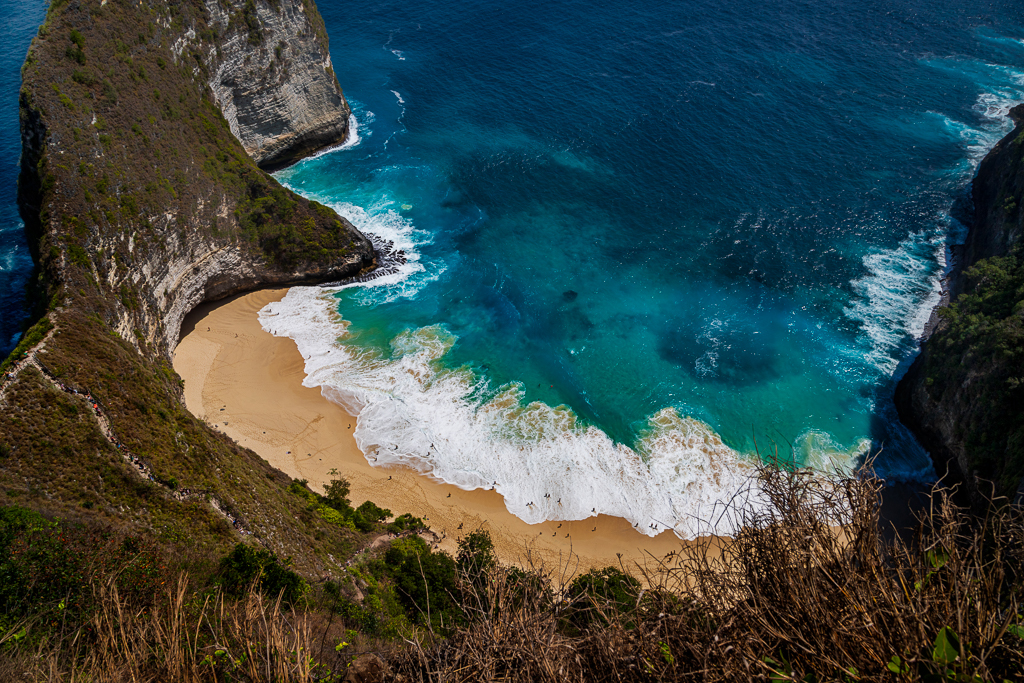
Hi Kirk. I appreciate Pierre suggestions. We got to be right at the time when we shot images. Like you, sometimes I got excited when seeing this kind of beautiful scenery and start to forget our basic shooting parameters. That's why. Like Pierre. I normally shot in 3 exposure brackets. My challenge now is how to help you overcome adjust this beautiful shot with OE (over exposure) spots.
The main problem with OE is the absent of pixels in certain spots. Darkening this area would results unnatural greyish spots. I normally clone or 'coloring' to fill up the oe gaps/spots using luminosity selection. In this image, I also remove a bit of halo around the arch. I wonder if you can see a slight difference from my edit. |
Oct 17th |
 |
| 70 |
Oct 23 |
Comment |
Hi Geoff. I agree with Pierre. Presence of visitors is one of the key success to this nature image. I love to see rim lights in front of dark brown matt background on the left and on the right. I also love to see great details of the yellow rocks in the upper middle. My suggestion is to softened (a bit) rock textures at the bottom especially around the visitors. Nice shots! |
Oct 17th |
| 70 |
Oct 23 |
Comment |
Hi Stefan. I shot with Fuji for a while. I believe when you say it's jpg SOOC (straight out of camera). I might want to dehaze part of the building on the right. Nice shots. |
Oct 16th |
| 70 |
Oct 23 |
Comment |
Hi Pierre. This image would not be interested without the red moon. I agree with you to set it as panoramic. Others may have different opinions, but I love to see how you allow empty space above and below the horizon. |
Oct 16th |
| 70 |
Oct 23 |
Comment |
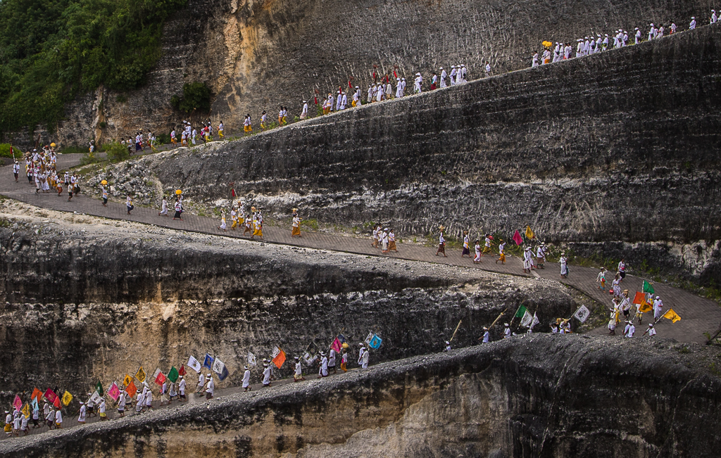
Hi Tammy. I have seen many Grand Canyon images. Including my own shots. This image is unique due to the present of red helicopter. I don't mind to include the red foreground. To me it's create more depth and more story to the picture. Job well done. |
Oct 16th |
| 70 |
Oct 23 |
Reply |
Hi Pierre. Thanks for your kind words. I allow the faded original background for a purpose. First, make the hanging vegetations look more outstanding. Second, I gradually make gradual contrast to make viewer attentions to the kayaking couple. Thanks for comments. |
Oct 11th |
5 comments - 7 replies for Group 70
|
| 90 |
Oct 23 |
Reply |
Hi Dan. Thanks for your kind words. Thanks for your suggestions. |
Oct 27th |
| 90 |
Oct 23 |
Comment |
Hi Tracy. I love to see the dynamics how the birds flock together and fly among swirling waves. IMHO, this would be good if the birds looked more obvious among the busy background. I tried to separate them in PS. But was not successful with this low resolution file. May be edited in RAW would be easier. The latest LR has new developed panel: Point Color in Color Mixer. I wonder if this could help separate the blue waves from the birds. |
Oct 17th |
| 90 |
Oct 23 |
Comment |
Hi Mathew. I like to hear how you use your images as a visual language to communicate your emotions and thoughts. I wonder if you know that PSA has specific dialog group called creatives. The section dedicated to altered reality lover who have longtime experience in Adobe Photoshop. I am also a member of group 34. |
Oct 17th |
| 90 |
Oct 23 |
Comment |
Hi Dan, I like the color combinations and composition. It's not just a bird picture. It's the entire scene. Nice work. |
Oct 17th |
| 90 |
Oct 23 |
Comment |
Hi Ginny, I feel sorry knowing your health condition. I am glad you are still having fun with your nature photography. |
Oct 17th |
| 90 |
Oct 23 |
Reply |
Hi Matthew. Thanks for your comments. I used Photoshop Denoise AI to reduce noise. It's a demo lens Canon RF 100-500 mm. But I found the pixels were not as smooth as this image for harsh sun light. |
Oct 13th |
| 90 |
Oct 23 |
Reply |
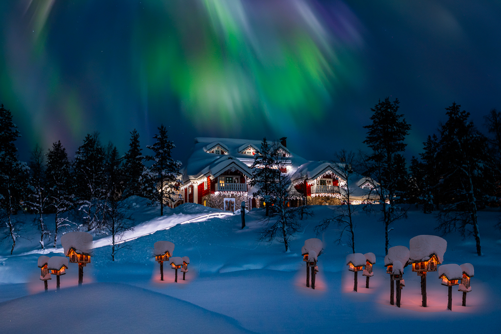
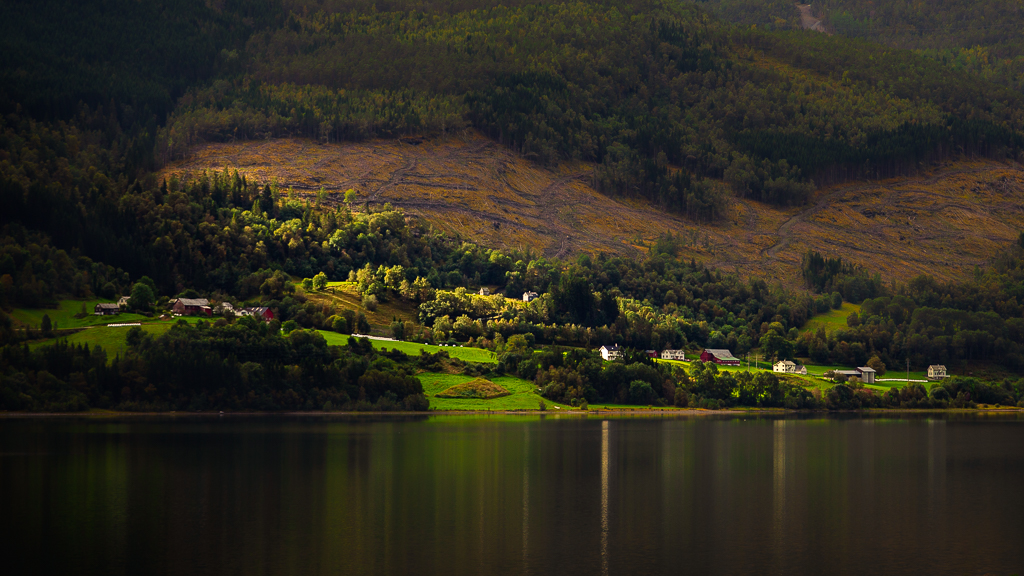
Hi Dan. I did not use this background for DDG 34 Oct 2023. |
Oct 11th |
| 90 |
Oct 23 |
Reply |
Hi Tracy. Sorry for this slow response. DDG 34 October 2023. Indeed. It's ISO 25600. I refined using PS AI Denoise. |
Oct 11th |
| 90 |
Oct 23 |
Reply |
Hi Ginny. Thanks for your comments. It's original background. If you have time, please review how I set another background for composite in DDG 34. |
Oct 3rd |
4 comments - 5 replies for Group 90
|
16 comments - 20 replies Total
|