|
| Group |
Round |
C/R |
Comment |
Date |
Image |
| 34 |
Sep 23 |
Comment |
Hi Gunter, for me, it's not just a creative composite. I really appreciate to see how you change original flower color to a vintage mood. I loved to see extra details of the flower petal into the finished image. No, suggestion. I just do not feel like to touch this excellent creations. |
Sep 26th |
| 34 |
Sep 23 |
Comment |
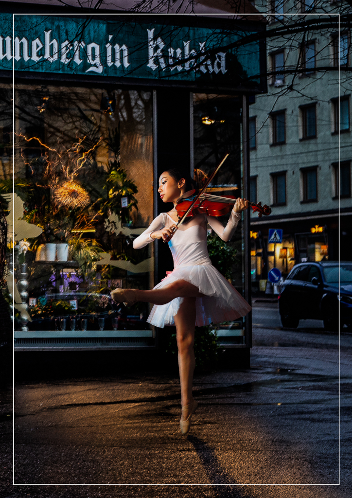
Hi Mike. I love the idea. I might want to steal it shamelessly for my grand daughter portraits. I would rather make larger flower frames. To allow the girl beautiful y hair untouched. I would then make the flower frame a bit more blurry and reduce its opacity. This would make the girl portrait stand out more than the flower frame. |
Sep 19th |
| 34 |
Sep 23 |
Comment |
My first impression when I saw slanting bus and slanting book. I thought you did it in purpose. I just realized after reading your response to Mike Cowdrey. I like the color combination and application of poster edges and oil paint. It makes the overall scene suitable for school principal office walls. Nice work Jan. |
Sep 19th |
| 34 |
Sep 23 |
Comment |
I agree with Gunter H. Original 2 is more appealing. It's calm, unique and more pleasing to my eyes. This could be just a matter of taste. |
Sep 19th |
| 34 |
Sep 23 |
Comment |
Hi Candy, I like the idea of adding animals into the scenes. The original 1 would not be that interesting without other elements like original 2 and original 3. |
Sep 19th |
| 34 |
Sep 23 |
Comment |
Hi Steve. Good to see you back. I love the idea to cut and flip the gladioli to make it symmetry. Another thing that I like here is the overall tonality with soft tone portrait in the middle. |
Sep 19th |
| 34 |
Sep 23 |
Reply |
Your comments are really energizing. Your kind words really challenge me to be more creative. Thanks Gunter. |
Sep 19th |
| 34 |
Sep 23 |
Reply |
Mike, thank you so much for your encouraging comments. I agree with you. I am not so much bound so much on definitions. My essential aim in photography is how to make my image more beautifully than its reality. Instead of just taking pictures, I like to create pictures to please my viewers eyes. |
Sep 19th |
| 34 |
Sep 23 |
Reply |
Hi Jan, thanks for your comments. I enjoyed reading the discussions you initiate about altered reality. |
Sep 19th |
| 34 |
Sep 23 |
Reply |
Hi Steve, thanks for your comments and excellent ideas using texture to tie the frames together. |
Sep 19th |
| 34 |
Sep 23 |
Reply |
Hi Steve, thanks for your genuine comments. |
Sep 19th |
6 comments - 5 replies for Group 34
|
| 70 |
Sep 23 |
Reply |
Hi Kirk. Thanks for your suggestion. I like the symmetry formed by this kind of crop. Awesome. |
Sep 20th |
| 70 |
Sep 23 |
Comment |
I like the composition, rock details and dynamic clouds. I agree with Stefaan proposal to convert this kind of image to BW. I found some images looks more stunning by removing its color distraction. |
Sep 20th |
 |
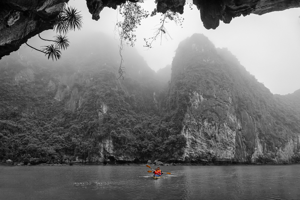
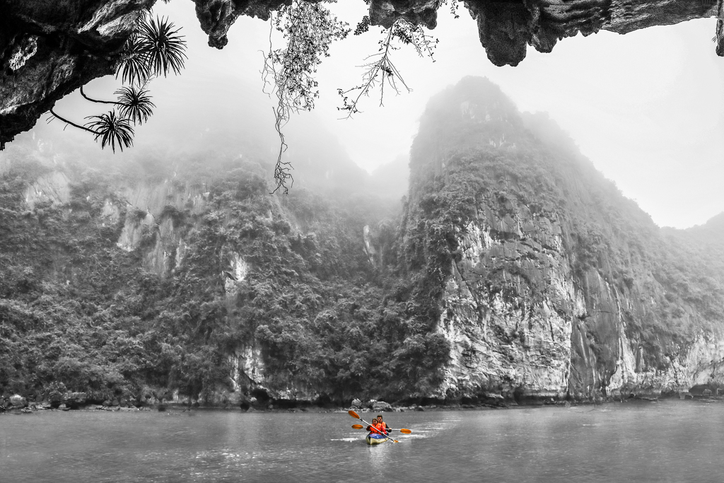
| 70 |
Sep 23 |
Comment |
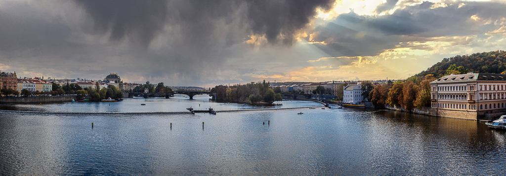
Hi Kathryn. I could never imagine this kind of scene was in Alaska. This is so much like Halong Bay in Vietnam. I love to see how you set the foggy and moody background. I might darken the sky a bit, but I definitely like smooth transition between sky and mountain with fog among the trees. I know how you suffer a bit of sharpness because you shot from moving vessel. My suggestion is only sharpened part of the standing stones. |
Sep 20th |
| 70 |
Sep 23 |
Comment |
I like you make it panoramic. My only suggestion is to make it a bit warmer to induce more feeling of Asian ethnicity. Nice work Geoff. |
Sep 20th |
| 70 |
Sep 23 |
Comment |
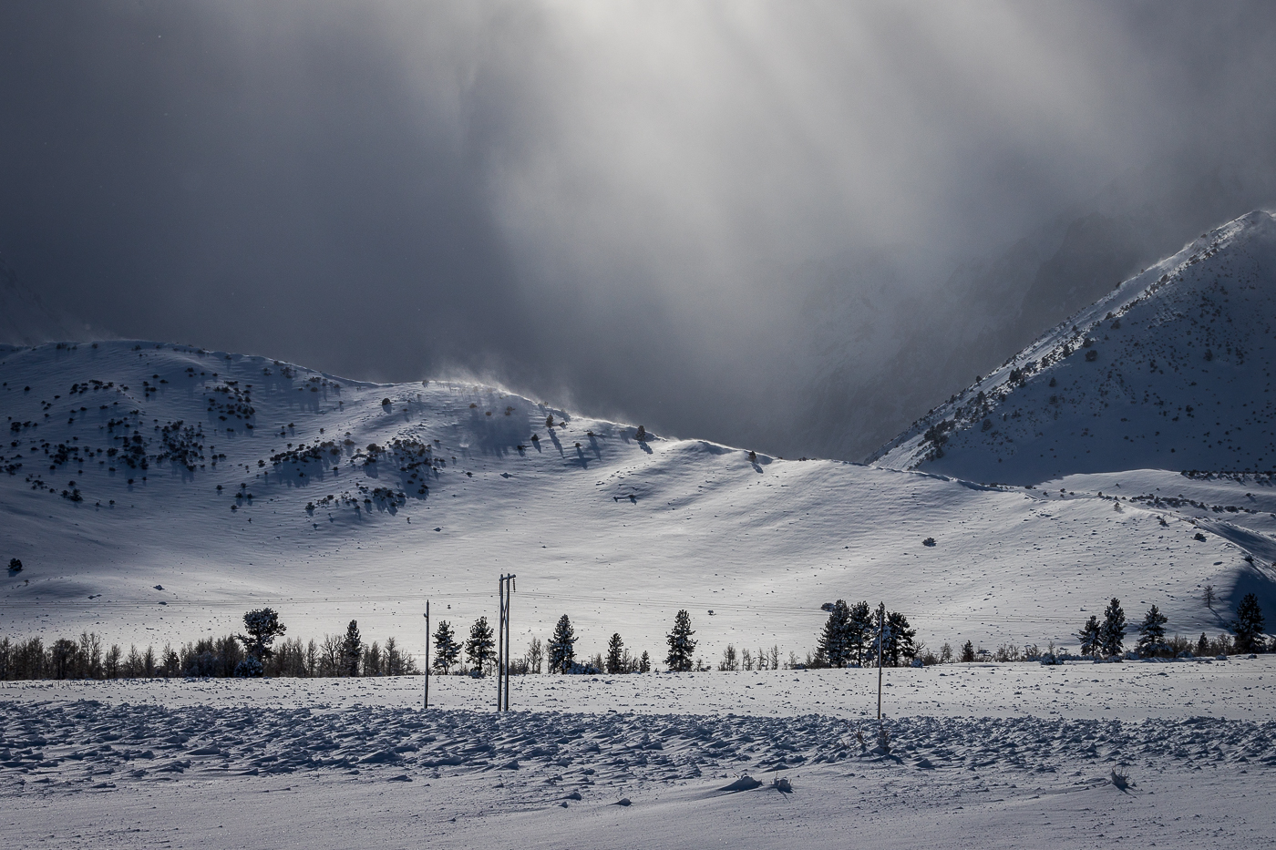
I love the cloud. To me, subject to this landscape is the cloud. My PSA senior mentor advice me to avoid obvious over exposure spots (white space with no pixel) in the cloud. Therefore, I partially cloned the cloud using luminosity selection for smooth transition. I also partially increased contrast of the cloud. The last part is cropping it so our viewer eyes will not go far way from our main subject. However, it's a matter of personal taste. Thanks for sharing this extraordinary image with us. |
Sep 20th |
 |
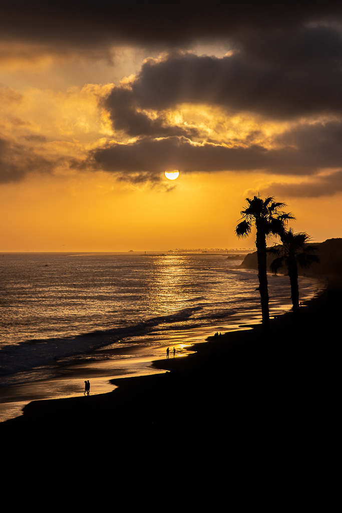
| 70 |
Sep 23 |
Comment |
Great shot at the right time of light. Composition wise, I feel like to see balance between left and right space of the sun. And, closer cloud to the sun. In this case, I used content aware scale by protecting the cloud and the sun. |
Sep 20th |
 |
| 70 |
Sep 23 |
Comment |
Nice composition. Leading lines and Interest Areas. It was not mentioned, like Stefaan, I wonder if this is HDR. I just love the mood. To me, the job is well done. |
Sep 20th |
| 70 |
Sep 23 |
Reply |
Hi Tammy. Thanks for your encouraging comments. |
Sep 19th |
| 70 |
Sep 23 |
Reply |
Hi Stefan, please review my answer to Pierre and you below. |
Sep 19th |
| 70 |
Sep 23 |
Reply |
Please review my answer below. |
Sep 19th |
| 70 |
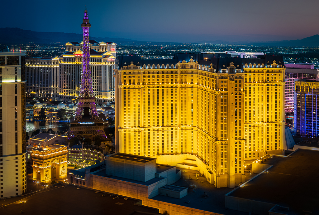
Sep 23 |
Comment |
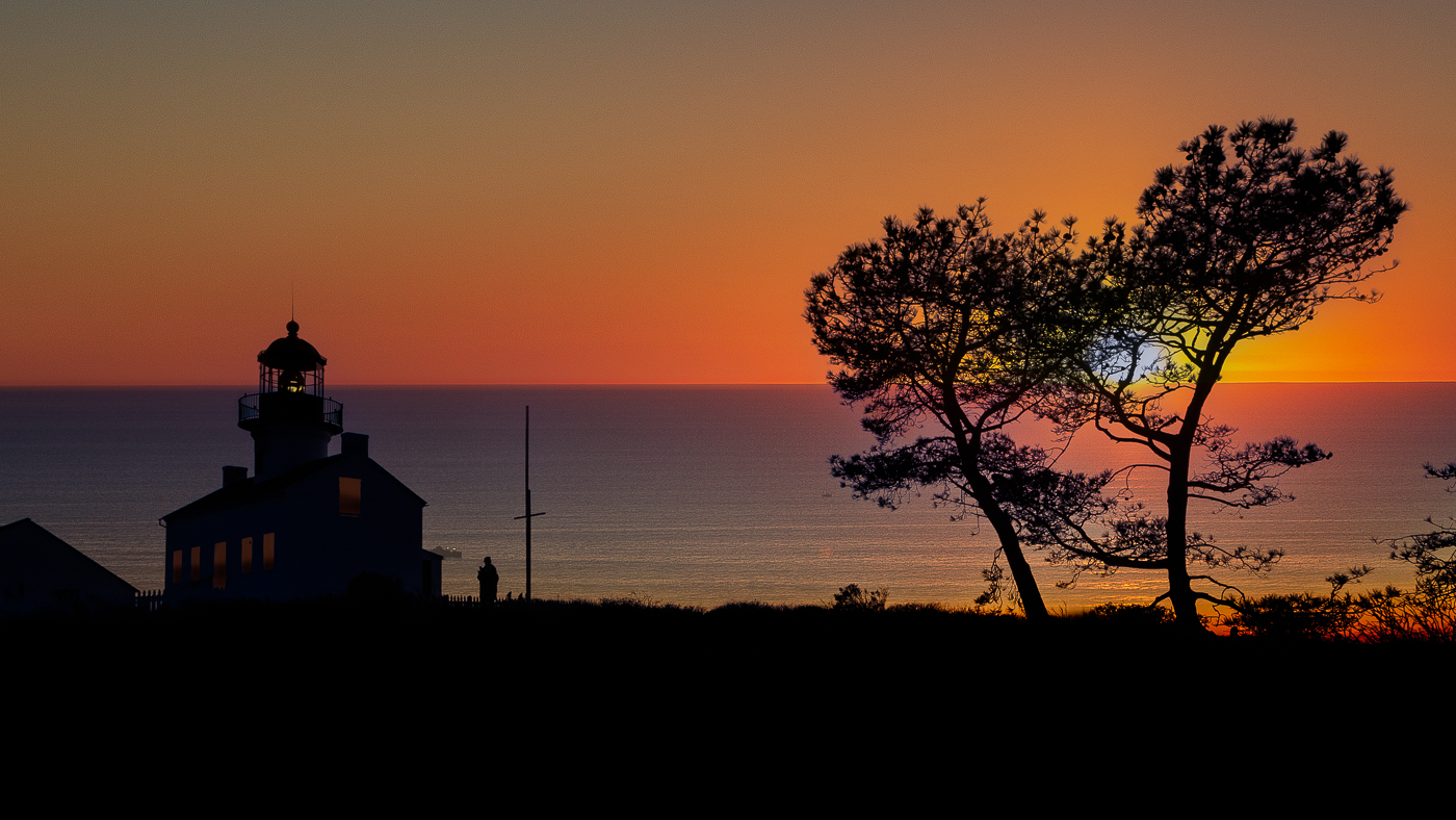
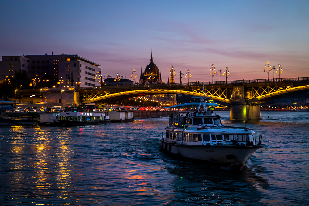
I normally do general adjustment in LR then transfer to PS as a smart object.
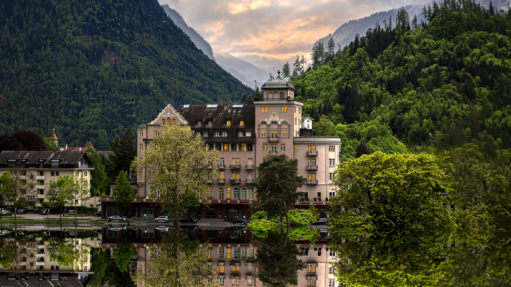
Please review PS layers as in my screen shot (picture 1). My priority objective was to lit up the building windows. So, I set a yellow/orange as light base and masked out the window by using luminosity mask. I also superimposed the sky (original and sunset) by using luminosity mask.
Luminosity mask is my key tool in this kind of edit. There are many luminosity plugin for photoshop. In this case, I used Lumenzia. The rest of the steps including creating water reflections are very basic. |
Sep 19th |
 |
| 70 |
Sep 23 |
Reply |
Thanks for your kind words Geoff. |
Sep 19th |
7 comments - 5 replies for Group 70
|
| 90 |
Sep 23 |
Comment |
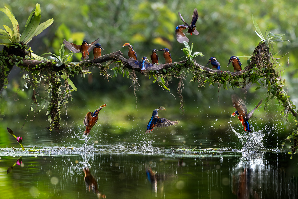
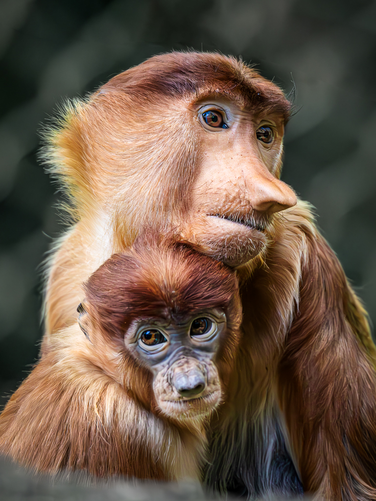
Hi Tracy. Welcome to the club. You got good lens choice. Canon RF 100-500 mm. It is lighter than my sigma 150-600 mm. You shot real wildlife while I just shot from the zoo. :) I love editing my animal portraits. I normally increase contrast around the animal face then sharpened and brightened the animal eyes. I learned to understand from my PSA senior mentor that our viewer eyes tend to ultimately stop at the animal eyes. It is also called fixation points.
|
Sep 19th |
 |
| 90 |
Sep 23 |
Comment |
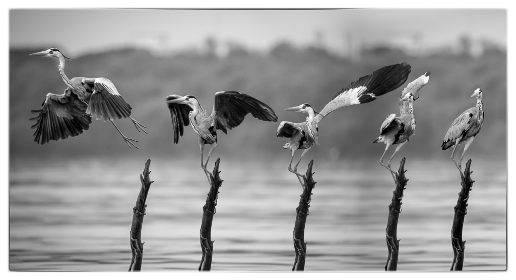
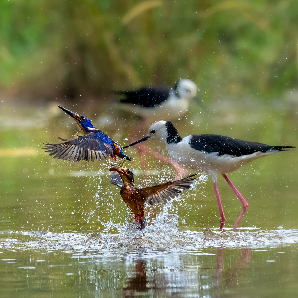
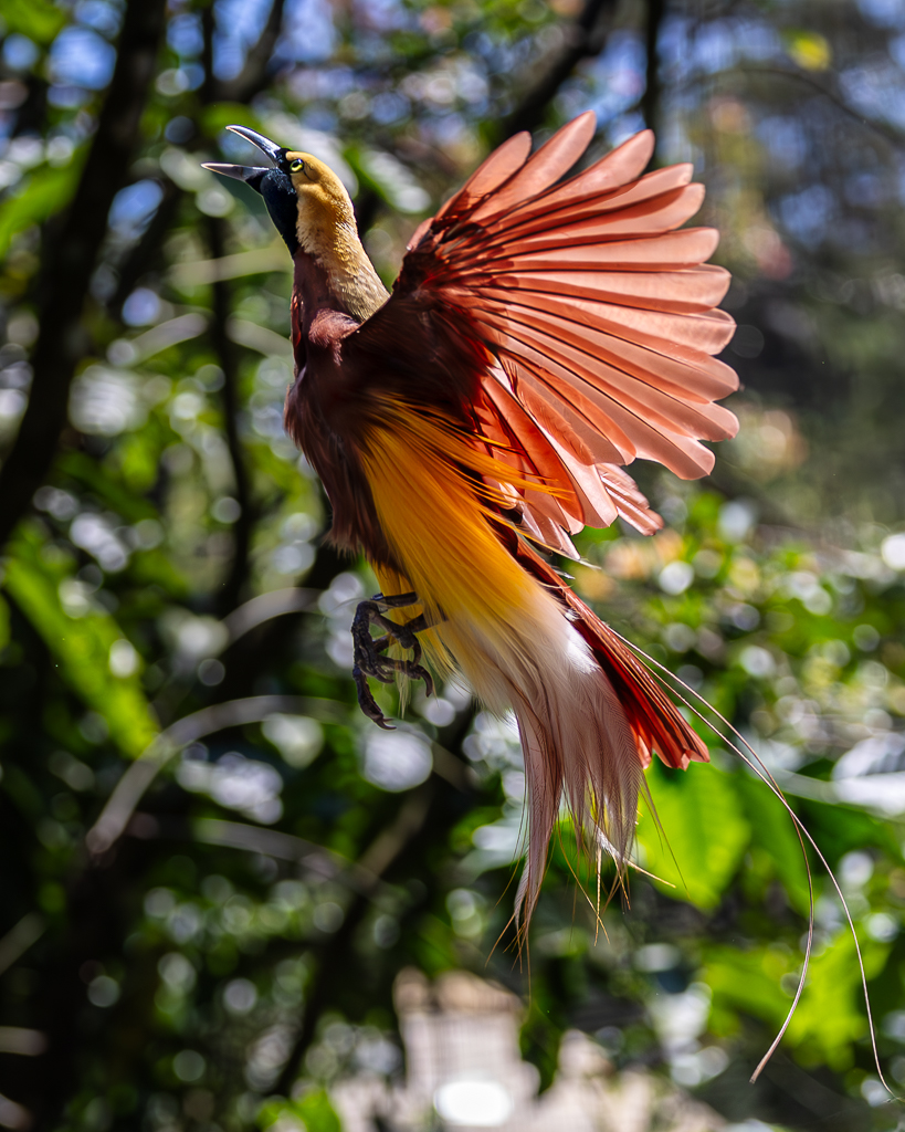
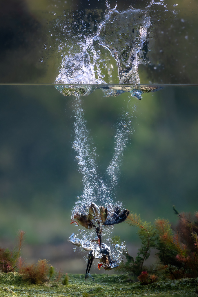
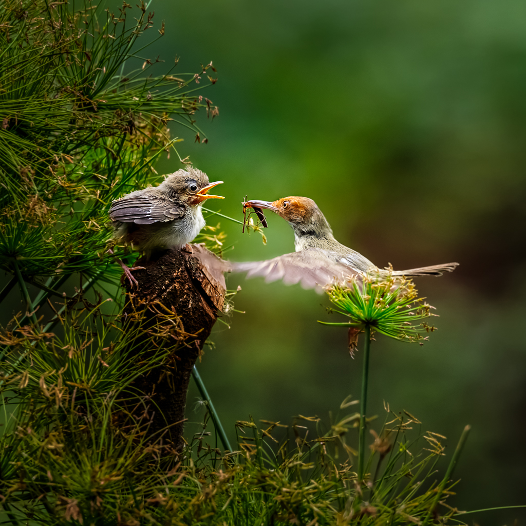
Hi Jack. What a great shot. I like your approach to first remove the mother bird. My humble concern is that the background and the foreground sharpness and clarity compete with the beautiful and unique fur of the chicks. I would tune down it in LR: reduce texture, clarity and saturation.
I would import two smart object layers to PS. The soft background and the original copy.
I would then mask the chicks from softer background, then increase contrast just part of the fur to make them more stunning. You are lucky to get this kind of candid shot. |
Sep 19th |
| 90 |
Sep 23 |
Reply |
I purposely show a bit of masking around the pistil to show my edits. |
Sep 19th |
| 90 |
Sep 23 |
Reply |
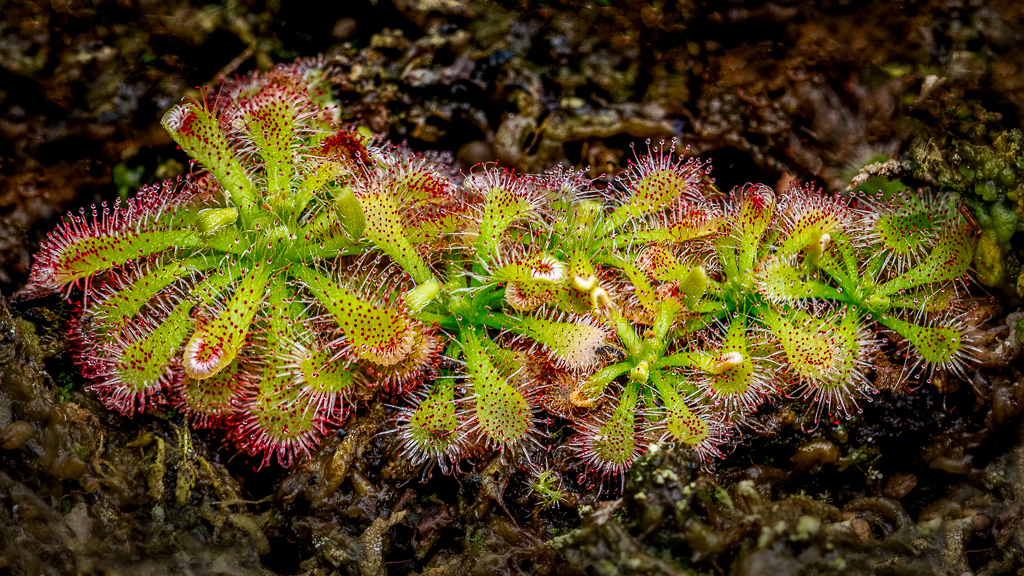
Hi Mathew. Welcome to the club. This is an honor to have you in this group contribute your perspective of fine arts. This flower is, indeed, a good example of effectiveness in removing color distractions. To me, the BW is more effective than the color. I partially increase contrast of the flower petals textures and tune down the pistil tonality. |
Sep 19th |
 |
| 90 |
Sep 23 |
Comment |
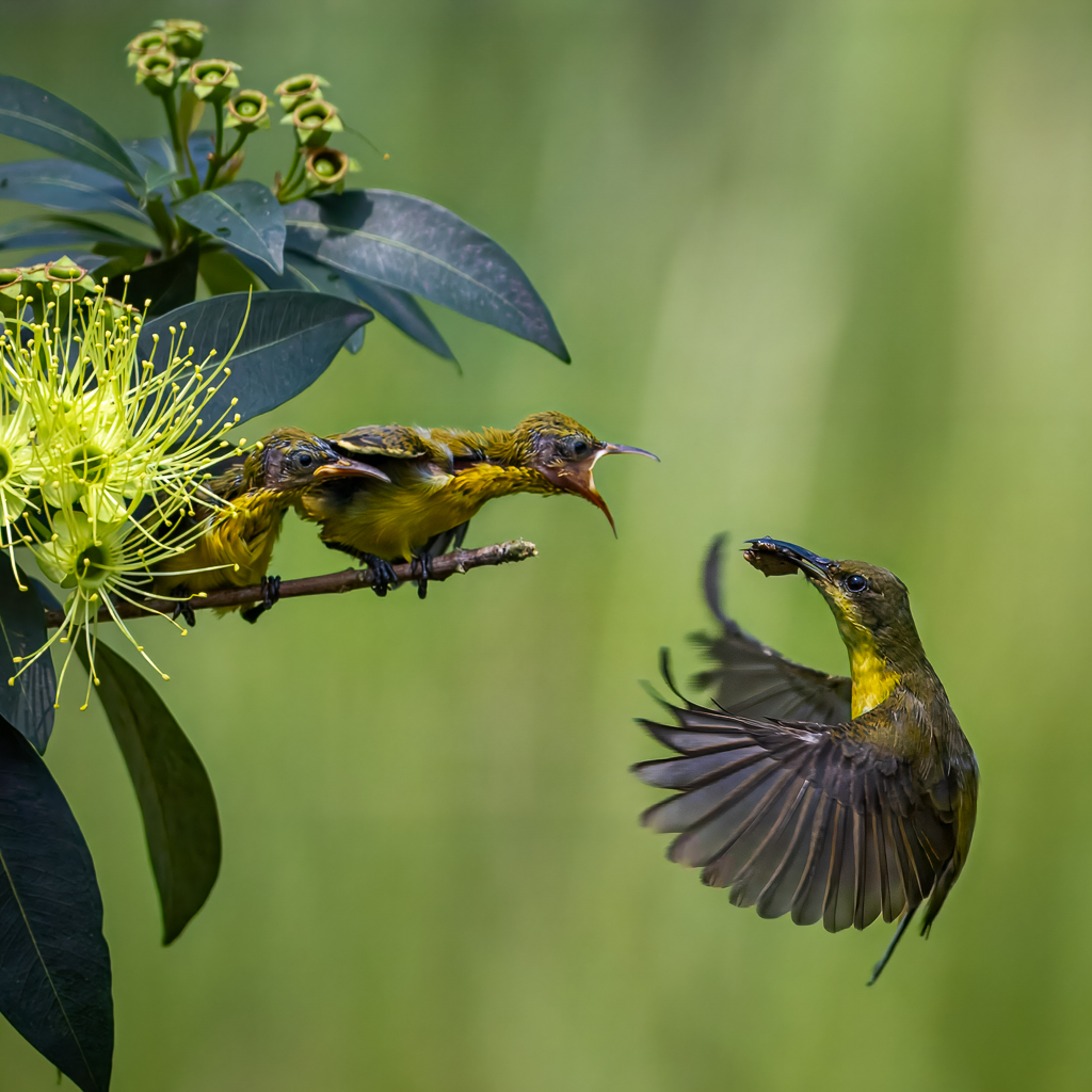
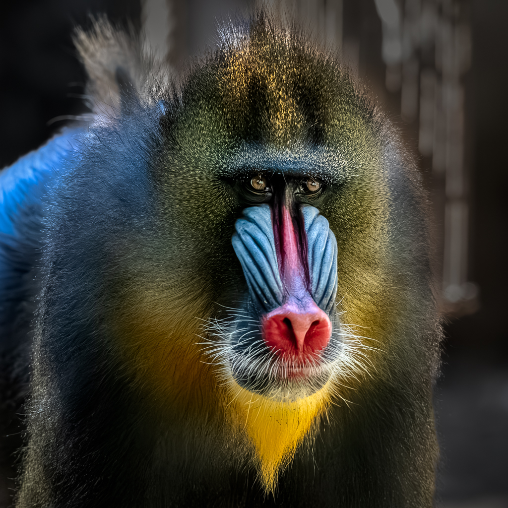
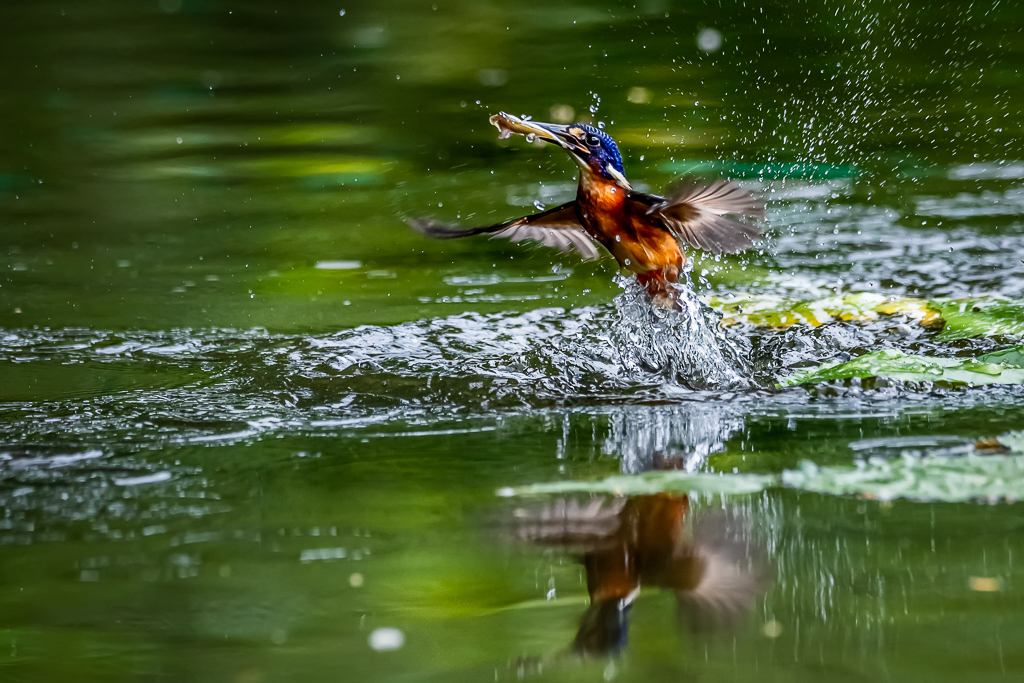
Hi Dan. This is a nice shot with appropriate camera settings. I can fully understand your struggle with exposure on the tail and lost of bird beak details in the deep shade. That's always my issues when editing my wildlife images. We need partial adjustment in the post process. In this case, my key tool is luminosity mask. This is to ensure smooth transition of areas to be adjusted. |
Sep 19th |
| 90 |
Sep 23 |
Reply |
Thanks for your comments. |
Sep 19th |
| 90 |
Sep 23 |
Reply |
Hi Mathew. Thanks for sharing your adjustment layers in PS. I wonder if highlight general adjustment in LR for RAW file is sufficient. Indeed, my experience, harsh light for animal images are more complex than human portraits. |
Sep 19th |
| 90 |
Sep 23 |
Comment |
Nice shot with appropriate crop and composition. I agree with the group opinions about the highlight issues. My guess, this could simply be controlled by using highlight adjustment in LR.
|
Sep 19th |
4 comments - 4 replies for Group 90
|
17 comments - 14 replies Total
|